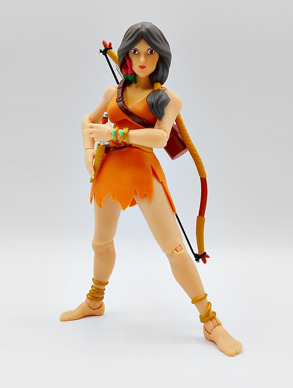
Last month I started checking out the newest assortment of Mythic Legions figures, centered around the return of the evil scourge, Poxxus. My first figure was the large and impressive Dragon Man Aracagorr, which was a mighty fine debut for the wave. And, yes, it’s taken me a few weeks to get back to it, but I really do have so much cool stuff to cover and three reviews a week can only take me so far. I’d love to do more, but it’s often a crunch just to keep up this pace. Anyway, today’s offering from the Realm of Mythoss is the powerful wizard, Samir Scrollwarder!

Unlike our giant dragon friend, who came in a window box, Samir comes in the usual bubble on card that we’ve been seeing with Mythic Legions from the beginning. The card art is generic to the wave, but you do get some character specific text on the side of the bubble insert, telling us that Samir is one of the good guys and Keeper of The Great Library of Agbendo. This presentation is both attractive and serviceable, as well as collector friendly, but I don’t tend to keep these packages. I will note that Samir came packaged with his blue robe off and in a baggie behind the bubble, but I’ve had him out long before I took this shot and opted to leave it on. But, let’s start out without the robe and see what we’ve got!
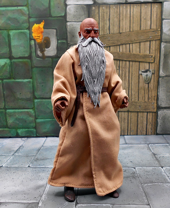
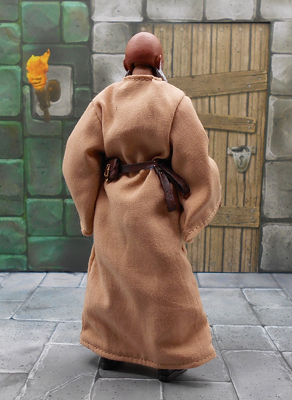
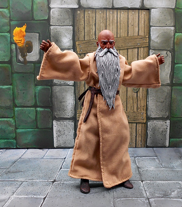
Straightaway, I love Samir’s classic wizard look. Long gray beard? Check! Bald Pate? Check! Robes? Check! And speaking or robes, let’s start there. Mythic Legions is a line known for its exquisite sculpting and paintwork, so the heavy use of softgoods is kind of a new thing for the line, and Samir is definitely the first of these figures in my collection to be fully dressed in cloth and showing very little sculpt on the body. For the record, the underlying body is fully armored, but I won’t be disrobing him. I’ll never display him without the robe, so you’ll have to take my word for it. His wizardly garment is immaculately tailored, fits the figure well, and falls about him quite naturally. There are wires sewn into the bottom edge as well as the sleeves to allow them to be shaped the way you want them and it serves the purpose very well, especially in those sleeves, which gives them a little added weight. How do wizards cope with those long dangling sleeves? It seems like they would constantly be knocking over dangerous potions or catching them on fire, while reaching over a candle to grab another book.
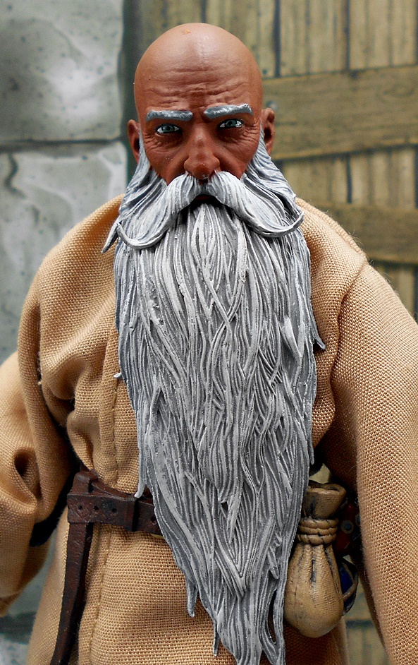
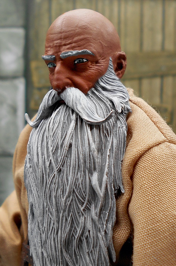
The head sculpt is very nicely done, giving Samir an ancient and wizened countenance. The long gray beard is intricately sculpted with strands of hair weaving around and crisscrossing each other. His skin has a rich brown pigment and I dig the creases in his brown and the crow’s feet radiating from the sides of his eyes, which suggest he’s been around a while and seen a lot. The painted eyes are a little flat when compared to some of TFH’s other efforts, making them serviceable but not exceptional.
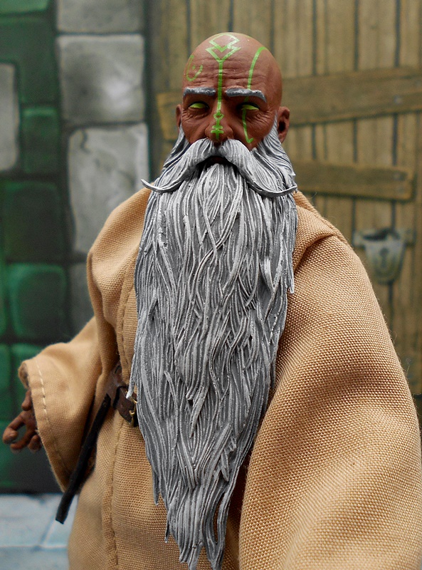
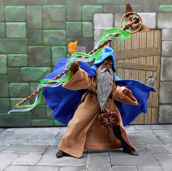
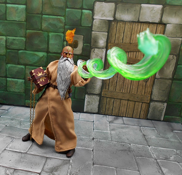
You also get a second head depicting the mystical arts welling up in Samir. This is mostly the same head sculpt, but here we get some green paint depicting arcane markings on his face and his eyes are painted entirely in green, showing the power within him.

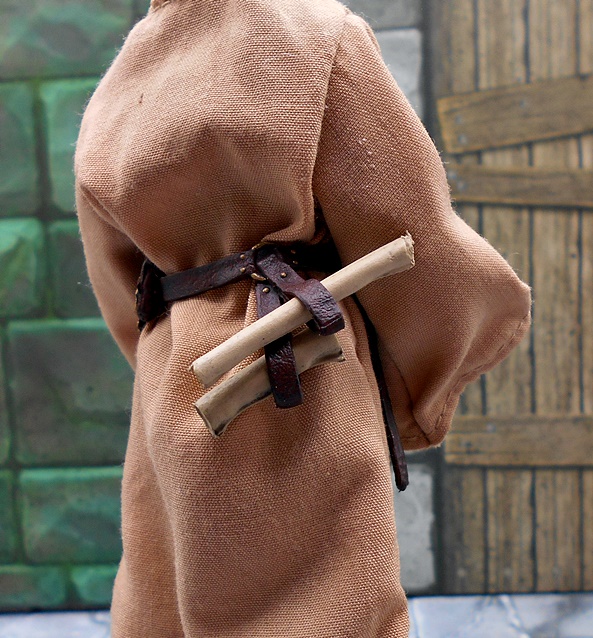
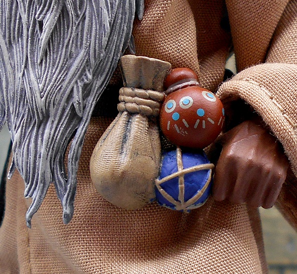
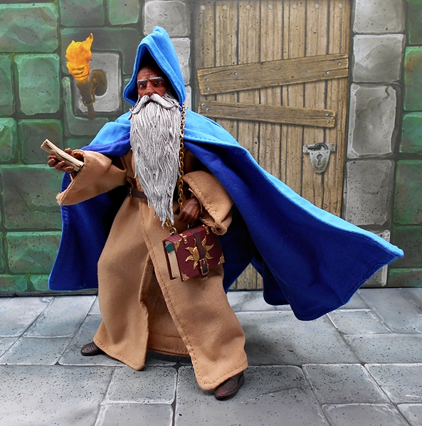
The robe is cinched at his waist with a brown plastic belt that tabs together in the back behind a sculpted pouch. The connection there isn’t terribly secure, so I do find it popping open now and again.. I may wind up using some poster putty to secure it, or just outright glue it, since I don’t really ever plan on removing the belt. You get some accessories for the belt, including a cluster of pouches and potion containers that clips on. There are also a pair of loops to allow him to keep a pair of scrolls at the ready. The scrolls are plastic and sculpted in rolls. The belt has some fine gold paintwork on the buckle as well as the fixtures on the pouch.

Articulation is standard Mythic Legions stuff. I believe the figure is built on the Elf-style body so despite being armored, it’s more lithe and feels a bit more agile than the bulkier knights. You get four sets of bare hands with Samir. These include fists, two sets of casting-gesture hands, and a pair to hold accessories.

Samir also comes with an mystical text from the Great Library of Agbendo The powerful tome has a sculpted belt around it, holding it permanently closed. There are some loose pages sculpted into the fore edge and a real chain so he can wear it around his neck and keep tabs on it. The covers have a realistic leather texture to them and there’s a golden sun emblem sculpted on the front as well as reinforced corners.

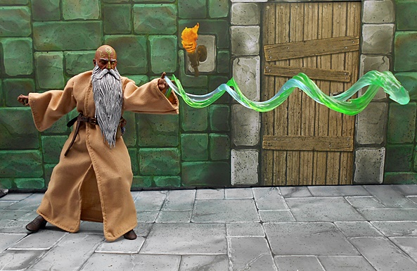
And finally, you get his magical staff and a magical effect part. The staff features a winged cobra at the top, encircled in a ring. The staff has several rows of rings and a spiral grip running down to the end. The entire staff is finished in a deep copper color. The swirling green effect part is meant to snake around the staff, but it also works really well to depict Samir launching a mystical attack from his hand. Snaking it around his arm inside the robe holds it in place really well and the figure is capable of supporting the weight of the piece without any help of a stand!

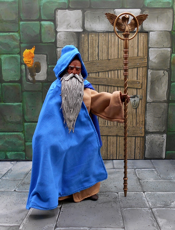

And here is Samir wearing his blue cloak. I had originally planned on shooting more of the review with the cloak on, but I was pretty impressed with the figure in just the brown robes and so I saved it for last. The cloak looks great on him and certainly adds some color. You get wires running throughout the edges of the cloak as well as around the opening of the hood and these make it easy to work with when posing the figure. It’s quite impressive that even with both the robes and the cloak on, the softgoods don’t look puffy or oversized on the figure and I think that’s a testament to how great the tailoring is. Ultimately, I will likely keep the blue cloak on him for regular display, but I’ll be open to switching it up now and again.


Samir feels like quite a landmark figure for the line. It not only introduces a very classic and traditional wizard design, but it also shows us how well softgoods can be utilized for these figures. Now, I’m not saying I want a lot of my Mythic Legions figures dressed from head to toe in cloth, but it’s nice to see how well TFH can do it when it’s appropriate. They also did a great job with his accessories and the magic effect piece turned out a lot more versatile than I had expected. We did get another wizard in this assortment… an EVIL wizard, but I’m going to hold off on him and try to mix things up for the next time I visit with this amazing line!