The First Avenger: Red Skull Movie Masterpiece 1:6 Scale Figure by Hot Toys, Part 1

This week I finally added Hot Toys’ Red Skull to my collection. It was an inevitable purchase since Cap’s movie was my favorite among all the stand-alone Avengers films, and “The First Avenger” Cap was my very first Hot Toys purchase. Buying Red Skull was a no brainer. Nonetheless, he kept getting pushed back again and again in favor of other stuff. Luckily, he’s hung around at Sideshow long enough for me to finally buy him. For all intents and purposes, Red Skull is two figures in one, so I’m going to look at him in two parts. Today we’ll cover the packaging and the Hugo Weaving likeness and tomorrow we’ll check out the real deal in his black jacket and all his skullified glory!

htmmrs1

In a way, I’m surprised this figure exists. Weaving has gone on record that he wasn’t enamored with the role and wouldn’t be interested in doing it again. Fair enough. Honestly, the film did a fantastic job developing Cap as a character, but didn’t do nearly as much to build up Red Skull as a formidable and multi-layered villain. Nonetheless, Weaving did a great job with what the script offered him, and I’m mighty glad he consented to lend his likeness to the figure.

htmmrs2

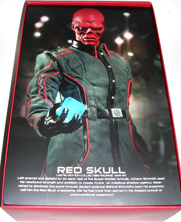
The packing is the same style used for The First Avenger Cap figure, which is great, because anything else would aggravate my OCD. The box has a faux leather deco with a giant and sinister looking Hydra emblem emblazoned on the front. It also has the name of the film on the bottom. I don’t think Red Skull would appreciate the fact that his figure’s box has Cap’s name on it and not his. Thankfully, the back of the box features a shot of the figure with his Skull head and leather overcoat, along with a list of the people who contributed to the making of the figure.

htmmrs3

Open the lid on the box and you reveal a cardboard insert covering the tray with yet another shot of the figure. This time it’s him in his uniform and sans coat. The cool thing about this packaging is you get a nice sampling of all the different display options the figure offers as you go through the process of opening it. On the inside of the lid, there’s an enclosed tray with the figure’s overcoat.

htmmrs4

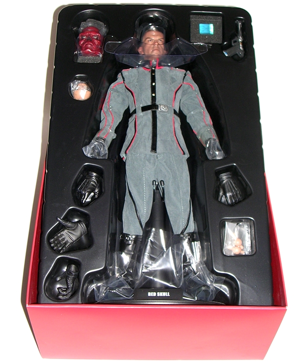
Lift the insert and you finally reveal the figure and get the first look of him as Johann Schmidt, with the Hugo Weaving head attached. The figure is flanked by the usual array of extra hands and accessories that one associates with Hot Toys releases.

htmmrs7

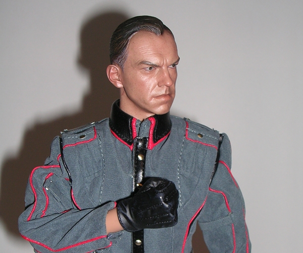
Here’s a surprise, the likeness is pretty fantastic. Hey, it’s Hot Toys, what do you expect? I have to imagine that Mr. Weaving has been reproduced plenty of times in action figure form, but it’s hard to imagine anyone nailed it quite as well as this one. He certainly has a very distinctive face, and I’d wager that that helps with the sculpting process. The skin tone is eerie and the eyes have that faint spark of life to them that only Hot Toys knows how to do. Schmidt offers a stern, but otherwise neutral expression. Besides the likeness being spot-on, they also included the incidental little scars by his ears that betray his mask. Very cool! It’s almost a shame that he comes with two heads, because I’m really going to be torn on which one to display the figure with, but more on that later.

htmmrs5

htmmrs6

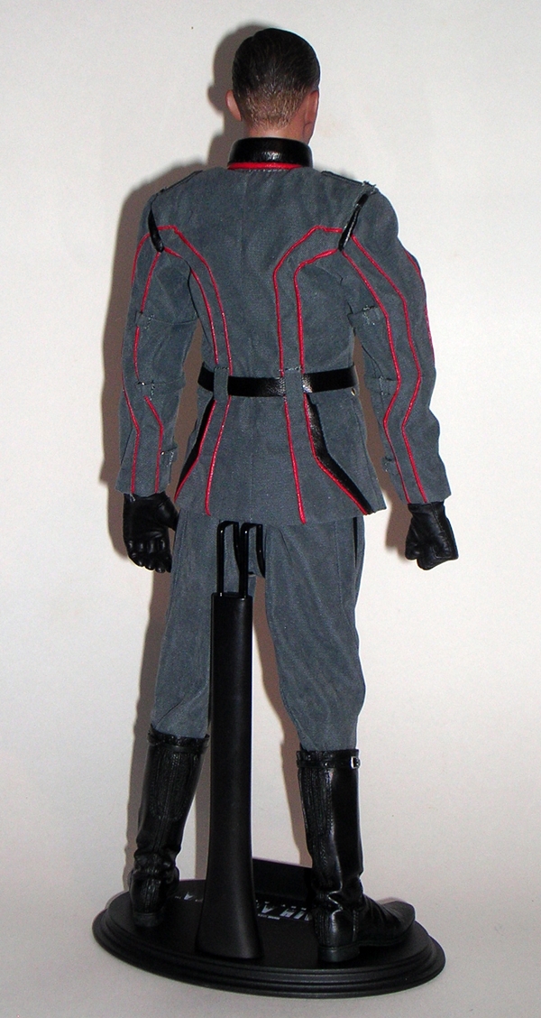
I really like the styling on Schmidt’s uniform. It’s very retro-future-nazi looking, if that’s a real thing and the material feels like it’s a nice quality. There are a lot of fashionable little touches to add to the complexity, like the straps on the arms, the pockets, and the epaulettes. The red piping is beautifully done and adds that extra little snap to what is otherwise just a solid grey outfit. I do think it could have used an extra Hydra insignia somewhere, but that’s really the fault of the film designers and not the figure. As it is, the only Hydra emblem is the one embossed on his belt buckle. The high collar is executed quite nicely. It’s glued down so to maintain its shape and it hugs the neck very well. I was afraid it would require a lot of futzing, but happily that’s not the case. The uniform looks solid right out of the box.

htmmrs8

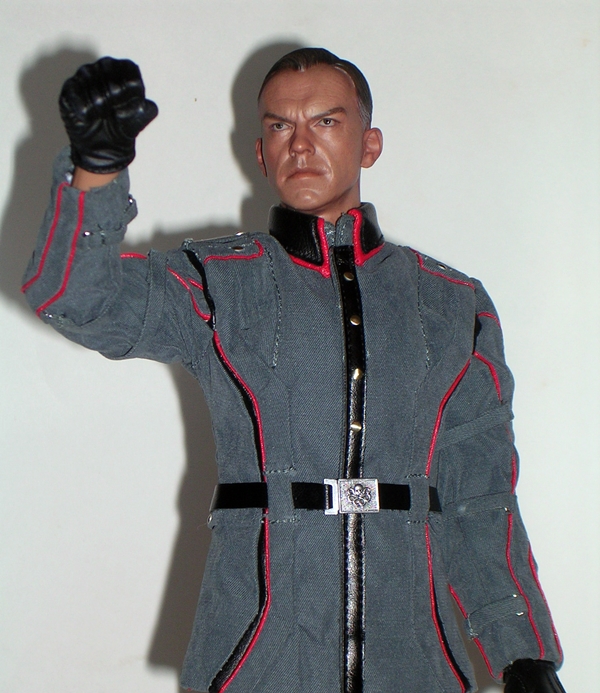
The figure comes with a total of six hands, all gloved. He’s boxed with two fists attached. There are three additional choices for the right hand. You get one open hand, one designed to clutch the cosmic cube, and one designed to hold his gun. There is only one alternative for the left hand, and it is a regular open hand. A cube clutching left hand would have been nice, as my preferred pose would be pistol in one hand cube in the other. You can still make it work with his open left hand, but not as well. I think this was a bit of an obvious oversight by the design team. You also get an extra set of posts for the hands in case you snap one off.

htmmredsk2

The articulation seems pretty standard for Hot Toys. I’m hardly an authority on the line, as this is only my fourth figure, but he can do most poses that I would want. The uniform offers a little bit of restriction in the shoulders, but it’s not nearly as restrictive as the shoulders of Captain America’s uniform.

htmmredsk3

And, I’m going to break there. I’ll go away and do some tinkering with the figure and when I come back tomorrow we’ll check out Johann transformed into Red Skull as well as the accessories.

Hail Hydra!!!

Marvel (Iron Man) Legends: Iron Patriot (Rhodey) by Hasbro

It’s time once again for Marvel Universe Legends Monday! This has been a polarizing summer of movies. Iron Man 3, Man of Steel, Into Darkness… battle lines have been drawn in the Interweb forums and fanboys have been having at each other over these films. I quite enjoyed Iron Man 3, although I’ll admit one of the sticking points for me about the movie early on was the use of the Iron Patriot armor. It took me a little while to come around and concede that copyrights being what they are, there was no way we were ever going to get Norman Osborne and The Dark Avengers, so having War Machine don the paintjob and the name only made sense. I can (begrudgingly) see that now and have accepted it. Debates over the use of the character aside, I love the aesthetics of the War Machine armor in the movies, and I must admit it certainly looks sexy decked out in the Iron Patriot colors.

im3ip1

We’ve already looked at the three figures that make up the first half of this Iron Man Legends wave. There’s not much new here. The character art looks fine and the figure is mounted on his tray beside the Iron Monger BAF part.

im3ip3

im3ip4

Iron Man 2 had its own line of Legends scale figures, and I’m guessing that this release is based off that War Machine mold, but I don’t own it and the Jameson is making me too fuzzy to do proper research, so I’m only guessing. Either way, I confess that I really love this sculpt. It’s both curvy and angular in all the right places and there are plenty of little panel lines to spruce things up. What I’m not as keen on are some of the plastics being used here, particularly the bare red plastic used for the hands and arms. It’s a little swirly, and it doesn’t hold up to the beautiful metallic blue and silver used for the rest of the figure. The quality also doesn’t feel quite up to par. It’s hard to put my finger on what it is exactly. The seams are a bit uglier than usual as well.

im3ip2

And speaking of paint, it’s worth noting that my figure has some stray paint on the face mask. If I was buying this guy off the pegs, I probably would have passed and tried to find a better one, but I got him sight unseen online. In retrospect, it sort of looks a little battle damage-y, so I can live with it. I am, however, really happy with the way the little tampo marks came out, particularly the Lt. Col. James Rhodes on the breast plate. It’s just a nice cool touch.

im3ip5

Patriot comes with a detachable shoulder mounted gun. There are two peg holes in the back so it can be positioned over either shoulder, but it really only looks right to me over his left shoulder. The gun features a swivel, as well as a hinge so that it can fold up or retract entirely behind his back. Of course, you can also just pull the whole thing out if you prefer.

im3ip6

im3ip8

Let’s roll out the articulation… The head is ball jointed and hinged as well, which gives it that little extra bit of movement that I love. The arms feature ball joints in the shoulders, swivels in the biceps, double-hinges in the elbows, and hinges and swivels in the wrists. The legs are ball jointed in the hips, swivels in the thighs, double-hinges in the knees, and hinges and swivels in the ankles. There’s also a ball joint in the torso that features a really nice range of motion. It’s also worth mentioning that the shoulder armor is soft, rubbery plastic so as not to impede the range of arm movement. What does bother me is that the sculpted armor on the wrists won’t let the left hand bend back to bring his palm repulsor to the ready unless you cock the arm at the elbow.

im3ip7

Despite my issues with the plastic and a couple of paint flubs, I still really like this figure. He’s far from perfect, and that’s a shame because he could have been a homerun if not for some of the niggling little issues. That having been said, he looks damn fine on the shelf and he really is fun to play around with. It’s too bad the QC guys were asleep on the job and let this one slip out the way it did. Not a terrible figure, but he doesn’t live up to some of the better work we’ve been getting out of the Marvel Legends line.

Zenescope’s Alice in Wonderland: Alice Liddle by CS Moore Studios

Ah, Zenescope, your comics are one of my favorite guilty pleasures. There’s nothing like a little gore, horror, and T&A to keep me coming back. I got hooked through Grimm’s Fairy Tales, but I think they really hit their stride with their Wonderland chronicles. That’s no small feat, since it seems like everyone and their mother has done a “dark and twisted” version of Lewis Carroll’s classic, but Zenescope’s treatment just scratches my itch. Enter the unique sculpting talents of Clayburn Moore and you’ve got a match made in heaven. Moore Studios is going to be producing a number of figures based on Zenescope’s books, and the first release in that series is Alice herself.

csmalice1

csmalice2

That is some striking packaging! Alice comes on a very large card and in a sizeable bubble. The card is bright and colorful and further enhanced by the use of a reprint copy of Alice in Wonderland #1 as a backdrop to the figure. The included comic features an exclusive cover for the release of this figure with a big portrait of Alice and her white rabbit. The figure is mounted in her tray, slightly off center with her stand and accessories surrounding her. “Ages 14+” …really? The back of the card promises future releases of Sela, Calie, and Queen of Hearts. I’m rather surprised they didn’t start with Sela, the star of GFT, but I’m looking forward to seeing her.

csmalice3

csmalice4

I’ve always been a fan of Moore’s sculpting talents. Sure, it helps that most of his subjects are gorgeous and half-naked chicks, but in this case he really outdid himself with the head sculpt. Moore managed to capture the beauty Alice from Robert Gill’s artwork and still add a modicum of his own personal style. It’s almost a shame that so much of her face is shrouded by her bangs, but it certainly suits the character design. I’m also pleased that they went with what appears to be painted flesh tones as opposed to bare plastic. As much as I love Moore’s figures, some of his past efforts have had a shiny, waxy look to the skin, but Alice here is perfect.

csmalice6

csmalice5

Speaking of perfect, let’s migrate down below the neck and check out that body. Oh my! The pose is strategically chosen to show off… well, let’s face it: T&A. Her back is arched and her arms are out to her sides. Yes, Alice does indeed spend most of the book parading about in this outfit, and the figure’s costume lacks a couple of small details, like garters on the stockings and laces across her cleavage. This version of Alice also sports a pair of stilettos, as opposed to flats. Still, artistic license aside, it still manages to hit all the right spots quite well. The half-corset leaves little to the imagination and as for the skirt, well it might as well not be there. The ruffling on her tiny outfit is nicely sculpted and I really dig the almost metallic sheen used for the blue paint. In fact, all the paintwork on this figure is expertly applied with sharp edges, and little or no bleed or slop.

csmalice9

If you’re familiar with Moore’s action figures, you know not to expect much in the way of articulation. Alice does little to buck that trend. She technically has six points of articulation, but the swivel cuts in her waist and neck are almost useless. She has swivel cuts up in her hips, so you can get her to do the splits, or sit in a rather suggestive way. But really, the most useful points of articulation here are the rotating cuts in the shoulders, and even those will only take you so far. Nope, this figure is primarily intended to stand there and look pretty, and she does that quite well.

csmalice7

You do get some accessories with Alice. I’ve never met a Moore figure that didn’t come with a stand. In this case you get a very nice little splotch of bright green grass with some mushrooms. The paintwork on the stand is exceptional, particularly on the shrooms. You also get a croquet mallet, a “Drink Me” bottle, and Alice’s white rabbit. All are nice pieces, but apart from crowding them around the stand, you can’t really do much for them. Alice isn’t even designed to hold the mallet.

csmalice11

csmalice10

Hopefully you can find Alice hanging around your local comic shop, along with some of Zenescope’s comics. If not, there are plenty of online alternatives, including Zenescope’s own storefront. Recently, they were doing a nice sale on their Wonderland titles, so I took the opportunity to upgrade my digital comics to TPBs and I tossed Alice into the shopping cart as well. At around $20, she is definitely a nice piece. If you’re a collector of Moore’s figures, you should find her a nice addition to your collection. If you read the Wonderland books, she’ll look nice on your Zenescope bookshelf. And if you just want a dead sexy figure celebrating Alice in Wonderland, you can’t go wrong here!

Star Trek: Captain Kirk and Khan by Diamond Select

Ever since the first reveal, I have been rather perplexed by Diamond’s new Star Trek… Figures? Statues? Collectibles? I don’t know what to call these things. They’re episode-specific dioramas that are exactly the same scale as the line of Classic Trek figures that they were putting out just a couple years back. It was a line that was subsequently shit-canned because they weren’t selling well enough. And granted, that’s a notion that is well illustrated with any stroll down the clearance section of that collectible action figure aisle at Toys R Us. Maybe Diamond is banking on more interest with a new Trek movie in theaters, but if that’s the case why not just bring out the actual figures again? Well, I’ll revisit that question more in a bit. For now, let’s look at the item in question. The initial assortment consisted of Spock and a Horta from “Devil in the Dark” but today we’re checking out Kirk and Khan from “Space Seed.”

stkak1

The package for this thing is enormous, at least it is for a card and bubble meant to hang on a peg. The bubble is massive and shows off both the Kirk and Khan figures along with the parts to the backdrop. Also visible in the bubble is Kirk’s extra set of legs and a pair of swappable hands. It’s a weird presentation that does a good job showing you all the pieces, but creates a crazy scene of disembodied human parts. The bubble is reinforced on one side with cardboard that features a nice side illustration of Kirk and a corner of the bubble has the Classic Enterprise. The idea here is to recreate the epic fight between Kirk and Khan in Engineering and give you a few different display options…

stkak2

No, you’re not looking at some tragic transporter accident. That’s all the pieces you get to customize Kirk in the display. There are two different sets of static legs, one set of hands clutching the conveniently club-shaped Engineering component, and a set of open palm hands. The Kirk torso is articulated with a rotating head, ball joints in the shoulders, hinges in the elbows, and swivels in the biceps. This begs the question… WHY NOT JUST GIVE US A FULLY ARTICULATED FIGURE? Can it really be more cost effective to include a second set of legs, when Diamond could have just repacked the Kirk figure they’ve already produced with this new head? We’re just talking about a T-crotch, knee hinges, and thigh swivels. The scale is identical… Diamond, you probably still have the figures sitting in your warehouse somewhere. I just don’t understand what they were going for here! PLEASE… SOMEONE MAKE ME UNDERSTAND!!! IT’S HALF A FIGURE ALREADY… JUST CUT OUT ONE EXTRA SET OF LEGS AND GIVE US THE OTHER HALF!!!

stkak3

Unlike Kirk, Khan is a completely static piece designed to peg into the console and be abused by Kirk. Khan has been released before by Diamond in this scale, but not in the red jumpsuit, so at least the new non-articulated sculpt here makes sense from a cost perspective. I’m very pleased with the sculpt, particularly the likeness. But in the end, this Khan is still just window dressing.

stkak4

stkak5

The Engineering section consists of a fairly large plastic base that plugs into the upright console. The wall behind the console is cardboard with two printed sides to give you two display options. The original piece was supposed to be plastic, but Diamond said it didn’t cost out in the end. I’m fine with it. It looks good and since a lot of the Classic Trek sets looked like cardboard anyway, it’s strangely appropriate. The only downside is durability and storage. I do love the console, and I’ll confess it’s the main reason I purchased this set first over the Horta one, because I thought it would be cool to have this backdrop for my proper Classic Trek figures. And indeed, Scotty looks awesome standing against it.

stkak6

stkak8

stkak9

Putting it all together, you do have several options to tweak the display, but the ensemble is designed for two specific configurations. The first has Kirk standing on the deck and pummeling Khan with the engineering rod. This is my least favorite of the options, because Kirk seems awkwardly bent and unless you tweak it just right it looks like he’s attacking Khan’s crotch with it. Kirk was a dirty fighter, but I don’t remember him beating on Khan’s balls with an implement. You can also use the open palm hands to make it look like Kirk is just slamming Khan into the console. Either of these poses make me wish Kirk’s head was ball jointed so he can look up at what he’s doing. But hey, since the hands with the rod are interchangeable with the hands on my proper Kirk figure, I can just use that figure in the display to much better effect. So again, I ask… Diamond, why didn’t you just pack the old Kirk figure in with this thing?

stkak10

stkak11

The other display option has Kirk doing a jumping kick into Khan. This configuration makes use of a clear plastic rod that pegs into the console and into one of Kirk’s sets of legs. The rod holds the figure in place extremely well and the illusion of mid-air-kick Kirk is really well done. I definitely prefer this display option as it looks a little more natural and you can tweak Kirk’s hands in a number of ways. Hell, you can even have him kicking Khan with the engineering rod raised over his hands for QUAD DAMAGE! Admittedly, “Flying Kick Kirk” makes better use of the unique Kirk that comes with the set, but I submit that Diamond could have just as easily bored a hole for the clear rod into a proper Kirk figure’s legs and still made it work.

stkak15

stkak14

stkak13

stkak12

If it sounds like I’m picking on this set, it’s just because I generally don’t understand it. That doesn’t mean I don’t like it. It’s an awesome display piece and it does a great job combining a bit of customization and playability of action figures with a statue-style environment. If we didn’t already have proper Classic Trek figures in this scale, I’d be even happier with this set, but as it is, it seems like such an odd thing to do. The photos above illustrate how well it works with the Classic Trek figures that Diamond already have made. At around $22, you certainly get a lot of stuff for your money, so it’s not a question of value, it’s just my own morbid curiosity as to how a set like this can be expected to sell better than a new round of proper action figures.

1,000 Articles!

Hey, folks… guess what?

1000

Yup, welcome to FigureFan Zero’s 1,000th article. Actually, this isn’t the article. I’m posting the article next. This is just me pointing out that I’m at 1,000 articles. Technically that makes this the 1,000th update and the next thing you read will be the 1,000th article.

Christ, I’ve kind of screwed this whole thing up.

Anyway, after three-and-a-half years of doing this nonsense, I’ve busted into the four digits. That’s 1,000 features of a middle aged guy gassing on about toys, action figures, and collectibles. Thanks to anyone who is still tolerating my daily alcohol-fueled ramblings illustrated by poorly lit pictures of cat hair clinging to toys. I’ll confess, I don’t remember all of it, but it must have been a fun ride for me, because I’m still doing it.

As for everyone else… I’ll try to do another 1,000 just to spite you.

Causality: CA-11 Down Force by Fansproject

Man, I have a crap-ton of third-party not-transformers on pre-order, most of which at this point are very, very late. I was sure I’d see the next Uranos figure from TFC before the end of June, or maybe one of Fansproject’s Headmasters, but nope, all of that shit has rolled over to July. Thankfully, I did get the next release in Fansproject’s (“Don’t call them Stunticons!”) series of Super-Evil-Deception-Robots- That-Transform-Into-Cars-And-Do-Stunts! Call me, Fansproject, I’m available to write your box copy! I’ll tap dance my way through all those legal loopholes! Anyway, this one bears a purely coincidental resemblance to a certain yellow Formula-1 racer named Dragstrip. Let’s check him out!

fpdownf1

I’m a big fan of the Causality packaging. The grid pattern is delightfully reminiscent of the package deco used for a line of transforming robots that I vaguely remember collecting in the 80’s. Was it ChangeFormers? No, that’s not right… but it was something like that. This package has a yellow tint to it, which gives the box a unique look while still being uniform enough with the others so that they all look great lined up on the shelf. You get a window that shows off the figure, which is boxed in his robot mode, along with some bitchin’ character art, and lots of actual photos that let the toy speak for itself.

fpdownf2

Inside, the figure rests in a plastic tray with his pistol beside him. Behind the tray you get a baggie with the folded color instruction sheet and his color profile card. There are no twisties or anything holding the figure in and the box is totally collector friendly.

fpdownf3

fpdown14

As usual, we’ll start with Down Force’s vehicle mode. While obviously inspired by G1 Dragstrip, this car is more at odds with the original G1 toy than either Car Crash or T-Bone. There are still some Formula-1 characteristics, to be sure, but the car is beefier and  rather more futuristic looking. I’m not a big fan of Formula-1 cars in my Transformers, particularly not Dragstrip’s’ six-wheeled model, so this was a good trade-off for me, but for others it may be too much of a deviation from the intended source material. The back of the car holds together really well, but the front assembly can unpeg rather easily when handled.

fpdown15

The car is cast almost entirely in yellow plastic. There are a few red paint apps to spice things up, most notably the stripe on the spoiler, and there is some silver paintwork up front over the front axle. The headlamp covers and canopy are blue clear plastic and there’s some black paint around the canopy. All told, it’s an attractive car, although possibly a little bland. Maybe some actual racing numbers would have helped it out. The design also makes it rather challenging to find somewhere to place his Decepticon faction sticker.

fpdown9

fpdown10

Transforming Down Force seemed like a nightmare the first time I did it. It’s not because he’s overly complex, but because the instructions aren’t at all helpful. Going from car to robot is somewhat logical, but going from robot to car didn’t feel intuitive until I did it a couple of times. Once I saw what was going on, I realized that this guy is by far the easiest of the three to work with.

fpdown8

So, let’s talk robot mode. Aesthetically, Down Force fits in quite well with his chums, T-Bone and Car Crash. The torso and legs are pretty simple looking and straightforward. The spoiler makes for good knees, although I’m not terribly keen on the tiny feet, but they aren’t a dealbreaker for me. They just seem vestigial and almost pointless. I like the design of the chest, which is probably the biggest nod back to the original G1 concept. Alas, like his car mode, Down Force’s chest doesn’t offer a prime place to slap a Decepticon logo on him.

fpdown11

The head sculpt is solid and fits the same style used for his brothers. I like the way the canopy on his back peeks up behind the head, and is actually connected to a nifty head reveal mechanic. I wasn’t sure at first about the purple and blue deco for the head, but it has grown on me a lot. It’s certainly distinctive!

fpdown13

fpdown12

Down Force’s shoulders are splendidly complex for such a little figure and definitely one of the stand out elements of the design. The way his fenders make up his shoulder armor looks great, but they aren’t without their issues. The parts that form the shoulders all fold together rather well, including those pieces that are attached by an arm with a ball joint at either end. The forward facing prongs even look cool, although I wish FP had found a way to sculpt them to look like guns. The problem with the shoulders, however, is that nothing really pegs into anything. If you manipulate Down Force’s arms by grabbing the lower arm, everything is fine. If you try to move them around from the upper arm, the shoulder assembly’s tend to shift apart. It’s a little annoying, but not nearly the fatal flaw that plagued Hasbro’s recent Blitzwing design.

fpdown5

fpdown4

fpdown7

fpdown6

I’ve been very happy with this line so far, and Down Force doesn’t disappoint. From initial pictures, I was a little worried that this guy wouldn’t fit in with the others, but now that he’s in hand, I can set those worries aside. Sure, he does feel a little removed from the first two figures, but I think that’s mostly because Car Crash and T-Bone shared a lot of the same mold. Nonetheless, the three can definitely hang together as a team. At around $59.99, he’s definitely pricey for what is essentially a big Scout or a small Deluxe, but such it’s about right for a third-party Transformer these days. That’s three down and two to go… Next up is Last Chance, hopefully arriving sometime this month!

Doctor Who: Clara “Oswin” Oswald (3 3/4″ Scale) by Character Options

Yesterday, I looked at the new 3 ¾” Doctor figure from Character Options, and I was less than delighted with the final outcome. I promise you that this initial wave of figures will improve as we get into the baddies next week, but not today. Today we’re looking at The Doctor’s sexy little companion, Clara. Hang on, I’m going to need to pour a glass of Jameson for this one.

dw334oswin6

There’s the packaging. It’s the same as what we say yesterday, so let’s not dwell on it.

dw334oswin2

CO had a few different outfits to choose from for the Clara figure, but they decided to layer her with two coats over her dress. The result is that she looks bulky, and that kind of dampens the appeal of this particular character. Knowatamean? Not that I think they could have accurately reproduced Ms. Coleman’s curves in this scale. Oh no. You would need plastic craftsmen far more talented than CO’s stable to make that happen. Anyway, the body sculpt is passable and there’s some decent paintwork for the pattern on her dress. The legs on mine came a tad warped out of the package, but she will stand on her own. She’s also nicely scaled against The Doctor as she comes up to just past her shoulder.

dw334oswin3

And then there’s the portrait. Wow. It’s weird, because I can kind of tell it’s supposed to be Jenna Louise Coleman, but it looks like she’s puffing out her cheeks and pulling a mad face. They got the hair right, and she does have a pretty round face, which is reflected here, but it’s a little too round and puffy and the paint on her eyes make them look like they’re bugging out of her head. There’s also a huge blue blotch of paint on the back of her head.

dw334oswin1

Articulation on Clara is different from The Doctor and I find that to also be weird. It’s supposed to be a cohesive line of figures, CO, so pick an articulation style and go with it. Anyway, instead of ball joints in the shoulders, Clara has simple rotating joints. To make up for it, she has swivel cuts in the biceps and forearms, and she has hinged elbows. She has hinged knees, and her head rotates. Presumably, she has a T-crotch, but her dress renders any articulation above the knees useless. You won’t get a lot of action poses out of Clara, but I suppose she’s articulated enough to make soufflés.

dw334oswin4

Clara comes with two accessories. You get the same figure stand that came with The Doctor, and you get a red handbag. The handbag seems pretty pointless. I don’t even recall her carrying it much in the show. Something more useful would have been cool, like maybe the laptop from “The Bells of St. John.”

dw334oswin5

All told, Clara falls in about the same level of mediocrity as The Doctor. The sculpt is barely passable and the articulation isn’t great. But Clara feels like a bigger disappointment simply because this figure is the reason we won’t be getting her in the five-inch scale. I’ve already got three different 11th Doctors in my 5-inch scale collection, so that wasn’t such a big deal. But with Clara, here’s where it begins to sink in. This is what we got instead of what would have surely been a better figure in the old scale, and there’s just no reason for it. Maybe if CO releases a console room, and not a cardboard one, it will be worth it down the line, but we’ve seen no indication that that’s going to happen. Next week, things in the 3 ¾” Doctor Who line will improve as I go through the rest of the wave.

Doctor Who: The 11th Doctor (3 ¾” Scale) by Character Options

 “Change, my dear, and it seems not a moment too soon.”

– The Sixth Doctor, The Caves of Androzani.

Yes, we are indeed getting change from Character Options, but I’m not so sure about whether it was a moment too soon. It’s no secret I loved CO’s five-inch scale Doctor Who figures, although I’ll concede that I bought a lot more of the Classic line than the NuWho figures. The reason, of course, wasn’t the scale, but rather the figures based on the current series were often victims of poor character selections and the releases were few and far between. I can tick off a dozen figures from either Series 6 or 7 that I would have bought in an instant, but we never got them. Whatever the reason, CO has decided to take the line to a more “standard” 3 ¾” scale, and I’ll concede that introduces some intriguing possibilities of The Doctor and company intermingling within my other collections. Of course, it also alienates all future releases from our existing Who collections, so whether it was worth the change remains to be seen. Today we’re checking out The Doctor!

dw334msd9

The packaging, for all intents and purposes, is just a shrunken down version of the card and bubble that we got with the last waves of 5-inchers. The card is generic with a TARDIS illustration on the front and a circular bubble showing off the figure and the accompanying stand. The bubble insert has the figure’s name and the “DWARTIS” logo. Seeing as how that hasn’t been part of Series 7b, I wish they would have dropped it from the package design. The packaging isn’t a big deal to me, as I rip them open and toss them, but that having been said, the presentation here is just stale. Considering this is a brand new line and a brand new scale, I think CO would have been smart to rebrand them into something different and more exciting.

dw334msd8

The back of the cards show the other figures in the line, as well as some of the cardboard playset-diorama things that are also available over in the UK right now.

dw334msd2

When the scale change was announced, there was a lot of complaining among collectors about how that scale couldn’t possibly hold the same quality of sculpt as the old line. Soon, CO showed off a prototype of The Doctor and it assuaged a lot of people’s fears. Unfortunately, the final product is nowhere near what we saw in that original teaser figure. It’s overall pretty meh. The head sculpt is barely passable and the closer you get to it the worse it becomes. Some companies, particularly Hasbro, have had some amazing head sculpts in the 3 ¾” scale lately, and in that context this figure doesn’t fly. I doubt most could identify it as Matt Smith, but if I told someone who it was supposed to be, some might say, “oh yeah, I can kind of see the resemblance now.” There have been horror stories looming about the paint on the face. Googly eyes, mad eyes, and boss eyes have been in abundance. I’m happy to say the paint on my figure isn’t overly terrible, although there is some stray paint near his chin. Overall, the head sculpt here seems primitive.

dw334msd3

As for the rest of the figure: You get The Doctor in his longer coat with vest, shirt, and bow tie. Bow ties are cool. The coat is sculpted in soft, rubbery plastic and hangs down below his waste and is securely glued to the torso. There’s very little sculpted detail to the coat, making it look smooth and rather unconvincing as an actual garment. The shirt and vest fare a little better. Ironically, I think the trousers and shoes look the best. The figure’s proportions are ok. Maybe his arms are a little long. His right hand is sculpted to hold his Sonic Screwdriver, which is provided.

dw334msd4

dw334msd6

Articulation on The Good Doctor is subpar when compared to the competition. His head can turn, his arms feature ball joints in the shoulders, hinges in the elbows, and swivels in the wrists. His legs have a standard T-crotch and he has hinges in the knees. He appears to have swivel cuts at the ankles, but mine don’t seem to want to turn and I’m not going to force them and risk twisting off his feet. You can get some poses out of him, but he’s still a rather stiff figure. Swivels in the biceps and ball joints in the hips would have helped a lot.

dw334msd7

dw334msd5

Besides the Sonic Screwdriver, The Doctor comes with a figure stand molded to look like the “DWARTIS” logo. Again, the DW thing isn’t being used anymore, so it feels kind of inappropriate here. On the other hand, the shape and style makes for a decent stand.It is, however, fairly large considering the size of the figure, and the peg is oddly placed, so if you have the logo facing you with the figure pegged on it, there’s a lot of wasted, empty space in front of the figure.

dw334msd1

dw334msd10

dw334msd11

And there we go. Character Options’ new 3 ¾’ line is off to a dubious start. Frankly, based on initial reactions around the InterToobs, I was expecting worse, and indeed comparing The Doctor to some of Hasbro’s best efforts make him look laughable by comparison.  I can certainly tell this is a first foray into the scale on CO’s part because it clearly shows. On the plus side, The Doctor does scale quite well with other leading lines, so you can finally do those Doctor Who-GI JOE-Star Wars-Marvel Universe crossovers that you’ve always wanted to do. At $10 each, these he isn’t priced too badly for an import figure and I’ll be looking at the rest of the wave in the near future. I’m not at all sorry I bought him, and as we’ll see other figures in the wave fared much better.  I’ll be back tomorrow to look at Clara.

Marvel Universe: Blastaar by Hasbro

While Hasbro seems to be dropping the ball on their movie properties, they have certainly upped the ante on Marvel Universe. I’m not just talking about the overall quality of the figures, but also the character selection. MU is a line that I was seriously considering abandoning last year, but I’m glad I didn’t because I would have missed out on a lot of cool figures. This Marvel Monday’s entry is a prime example of that. Oh yes, folks… it’s Blastaar!

mublast1

Oops, my bad… it’s MARVEL’S Blastaar, because somebody at Hasbro was sleeping on the job in the copyright department. In package, Blastaar just warms the cockles of my Fantastic Four Fanboy heart. The character art has him leaping right out at you and he’s a big boy that certainly fills up the bubble. This is one of those MU figures that offers up a satisfying heft when you pull him off the peg. He was the only one I’ve seen so far in the wild, and I probably would have punched anyone in the throat that tried to get to him before I did.

mublast2

The back of the card shows the figure, as well as the other two figures in this wave, and a little bio blurb of this big boy. Once again, Dazzler decks out the bottom of the card with some collecting advice. Can, I dig it you ask?  Oh yeah, Dazzler. I can dig it.

mubstr3

mubstr4

Blastaar is a fine example of the logical reuse of parts. The legs, torso and forearms are all recycled directly from Juggernaut (and various other MU big boys) and given a fresh coat of paint. He has a simple grey and blue deco, with the grey being very similar to the type used for Apocalypse, while the blue is slightly darker and features less of a sheen. The bracers on his wrists are new to the sculpt, as is the circlet around his neck. It all works quite well and ensures that Blastaar is a beefy enough figure to hang with the likes of Apocalypse and Thanos. Yeah, he’s a little generic, but it suits the character design.

mubstr5

While Blastaar’s body is somewhat generic, the head sculpt makes up for that in spades. This guy’s ugly noggin is packed with detail and personality. He’s got the one buggy eye, a mouthful of carefully sculpted and painted teeth, even something as simple as the ears are worthy of note. I’m also really pleased with the way his wild mane of hair came out. He looks like he’s about to start stroking out with rage. Fantastic!

mustr5

The articulation here is the same we’ve seen with most of the husky MU figures. There are ball joints in the neck, shoulders, hips, and torso. The arms have swivels in the biceps and and forearm, and the elbows are hinged. The legs have swivels in the thighs and just above the boots, the knees are double hinged and the ankles have single hinges. The characteristics of the buff sculpt impede some of the points of articulation, but he can still do a lot more than just stand there and look menacing.

No accessories, but Blastaar does come with the super wonderful tiny piece of printed cardboard that Hasbro suggests is a cool collectible. If I cared at all about the Comic Shot, I would at this point say that I would have preferred a Fantastic Four cover over The Avengers one. But either way, these get thrown out with the packaging, so I care not!

mubstr6

mubstr7

Sure, Blastaar is basically a kitbash with a new head, but I have no issues with these when they’re done right and this guy is done right. Yes, Hasbro could have made the costume a little more distinctive, but on the other hand the fact that I can walk into a big box toy aisle and buy a Blastaar figure kind of blows my mind. If this is what they needed to do to make that happen, I’m cool with that. I was already a fan of this buck and the head sculpt drives the whole figure home perfectly.

And… once again, I’m caught up on my Marvel Universe Collection features, so for the next four weeks, Marvel Monday will be changing over to features for the Legends scale figures. Unless, of course, I happen to stumble upon a boon of MU figures that I need. After that… well, we’ll see!