Here we are, the day before Halloween and my bold plans for a lot of spooky reviews have really shit the bed. Hurricanes and other nonsense sure saw to that. But, at least I made it here with one more shot at it, and I’ll probably keep it going a bit into November to make up for lost time. Over the last couple years, I’ve taken a look at quite a few of NECA’s Ultimate Universal Monsters, but oddly enough I have yet to touch on my favorite one of the bunch. Yup, it’s The Gillman, and he is not only one of my favorite creature designs of all time, but I absolutely love the movies. When I was about ten years old, they showed Revenge of the Creature in 3D on network television and it was a huge event in our house. We got the 3D glasses for the whole family, my Dad made Jiffypop and it was just a great time and a very fond memory.
We’ve seen the packaging for this line so many times now, and this one holds no surprises. It’s a window box with a folding front flap that features some poster art from the film. It took me a while to find this one at a decent price. He seemed to sell out online pretty quick initially and I don’t do a lot of toy hunting these days, so I had to wait for him to show up at regular retail price on Amazon again. The B&W version was around, but as neat as those are, I’m only going for the colored releases. Eventually patience prevailed and here we are!
And what a great design for an action figure! It’s well known now that the Gillman portrait was designed by Ex-Disney artist, Milicent Patrick, and she got zero credit for her work for a long time. And what a shame because it is some amazing work! It’s hard to say exactly what it is about this fishy-fellow that speaks to me, but I just dig him so much! The design certainly gave NECA’s sculptors a lot to sink their teeth into, and naturally they did a superb job with it. The bulk of the figure’s overlapping plates are covered with tiny scale texturing and it breathes all new life into a creature design that I was used to seeing in grainy low-resolution B&W film on a tube TV. There are some smooth plates over his tummy, as well as some smooth areas on his lower legs, but otherwise every bit of this guy is just packed with detail in the sculpt. From behind, he has a strip of fibrous fin that runs from from behind his neck, down his spine, and splits off to his upper legs, with similar tufts on the backs of his forearms. The paint consists of some different shades of muted green and copper, and some lovely gradients throughout.
You get three heads to choose from and all are very well done. These consists of a calm face, a slightly excited face, and a face with mouth open and ready to strike. Yeah, the last one looks more like The Gillman walking into his surprise party, but I still dig it. There’s lots of great attention to detail here, especially the little warts on his forehead and the paintwork for the eyes is excellent.
Articulation is standard stuff for these Ultimate figures, which means a lot of rotating hinges. The range of motion in the elbows and knees could be better, but I can’t say as I really need it in The Gillman. On the other hand, I would have liked him to be able to look up more to hit those swimming poses. And, if you’re looking for accessories here, you’re going to be disappointed, as there are none. Bubkis. You do, however get several sets of hands. That may sound great, but there’s very little variation between two of the sets, and I’m kind of left with just a pair of flat swimmy hands and graspy hands. It does kind of feel like NECA threw in some unnecessary hands here to bulk out the package. Jada did include some extras with their figure, including a net, a speargun, and a fossilized creature hand. You could argue the speargun isn’t a creature accessory, but I would have loved to get a net included with this release to beef it up a bit.
Lack of accessories aside, I do love how this figure came out and I’d say he tops the Jada version, both in paint and sculpt, hands down. He’s loads of fun to play with and was definitely a major gaping hole in my Monsters collection. And Gillman brings me more or less up to date with the NECA Universal Monsters that I’m after. I may pick up Jack Griffin eventually, but only if I stumble upon him at a good price. I do, however, still have some of NECA’s accessory sets to check out, so look for some of those to turn up here in the weeks ahead! In the meantime, Happy Halloween! And like I said, I’ll keep some of the spookiness going for a bit into November so I can get through some unfinished business!
If you follow Sixth-Scale figure news, than you probably already know that Hot Toys has launched a new brand of budget priced Sixth-Scale collectible figures based on the Marvel Comics license. When I say “budget” it’s important to note we’re still talking around $160 price range, but compared to regular Hot Toys releases these days that could be anywhere from $100 less to as much as half. The first offering was Wolverine, which seems like a no-brainer and between my curiosity and my desire to get a buddy for my Sixth-Scale Sideshow Deadpool from a while back, I went ahead and dropped a pre-order with the notion that I might cancel before it ships. But as more and more production pictures surfaced, I was impressed by what I was seeing, and so I let it ride. Was it a good idea? Let’s find out!
For starters the packaging and presentation here is off the charts. This is honestly better than what I get with most of my regular Hot Toys releases. The front of the box splits to open upwards and downwards, revealing an inner lid to remove. The reverse of the that lid has a line drawing of the figure with details on the articulation and features, along with some handling warnings. On the downside, some of the package elements are very fragile and mine arrived with a few small tears before even being handled. The figure is nested in a plastic vac-formed tray and everything about the package is collector friendly.
Here’s Logan out of the box and looking very iconic in all his 90’s glory. The figure is dressed in a yellow cloth bodysuit, which has a nice feel to it and fits perfectly. It’s snug, soft and flexible enough to work with the figure’s jointing, but it doesn’t feel delicate. It also has two smooth black tiger stripes sewn onto the shoulders. I would say the only thing to watch out for with this fabric is making sure it doesn’t get pinched or snagged in the joints. There is a pretty obvious seam running up the back, which isn’t ideal, but I guess it has to go somewhere. The undies, shoulder guards, boots, and gauntlets are plastic with a beautiful metallic blue finish and some added matte black striping and edging to the boots. The boots and gauntlets also have a leather-like texture to them, while the shoulders are left smooth.
The arms are bare and offer seamless elbow joints and sculpted hair and muscle that recreates the comic look very nicely. The material feels more like rubber, rather than the squishy silicone used on Phicen’s seamless figures. They still allow for some tight bending in the elbows and I don’t feel like tearing or creasing will be a problem. Seamless jointing on a figure in this price range is really impressive, especially when you look at what companies like Mondo are charging for figures with exposed joints. And as long as we’re talking about articulation, I’ll refer you to the packaging image for a look at the rundown on Logan’s posability. I’m very happy with the range in the elbows and knees, and the ab crunch is really well done. I’m also impressed at how the jointing under the fabric doesn’t look awkward or mechanical. The shoulder armor pieces peg into the shoulders to allow them to hinge and pop off rather than break if stressed too far. The wrists are on standard double pegged hinges, and if you want to go for the no claws look, you only have the one pair of graspy hands to work with. No clawless fists or relaxed hands at all.
Hono Wovie comes with just one head, but three swap out lower face plates. They did a really nice job with the mask, making it look as iconic as ever. The yellow part is sculpted to match the texture of the suit while the black areas have more of a leather-like texture. Of course, the eyes have no pupils and while the exposed area of the face is sculpted a little soft, I think the skin tone looks great. There’s no digging at the edges required to change the face plates. Just pop the head off and use a pen or similar instrument to pop the plate out through the exposed peg. The expressions range from upset to pure rage, with the middle one being a slight smile, but it’s not so much a friendly smile, but more like a “I’m going to enjoy shishkabobbing you” smile.
As I mentioned earlier, you only get one set of pre-Snikt hands and these can be swapped out for the fists with claws extended. The claws are plastic, but the paint makes them look like metal. The plastic used here really toes the line between feeling not ridiculously fragile, but also something you want to be careful with when swapping. There’s a little bend to them, but I can almost guarantee they would not survive a shelf dive. I was extra careful when posing the figure for pictures so he wouldn’t topple over onto the claws and snap them. I’d just say treat them with caution and you should be alright.
The only other accessories are two sets of effect parts for the claws. These are cast in translucent plastic and include two larger ones for the middle claws and four smaller for the outer claws. I give points for effort on these, they look really good when installed, but slotting them the blades into them is rather precarious and the larger ones feel like they are just a tad too heavy for the claw and I’m afraid it is stressing the thin connection point at the base. If I were to display these on the figure, I would just go with three of the smaller ones on one set of claws. They look just as good and I’m not worried about them stressing the claws as much.
Finallyl, we have the stand and it is very impressive for this price point. The base has matte black surface with yellow paint around the edges and Wolverine’s name near the front corner. For support, there’s a simple clear post and a weird curved crotch cradle. I’m not sure why they didn’t just go for the standard wire type, but it works just fine. If you want to personalize the display, there’s a plastic backdrop that’s designed to fit a comic book or the included cardboard art that needs to be cut out. It works like a frame where you remove the clear cover, slip in your comic, and close it up, then insert the whole thing into the slot at the back of the base. This is a fantastic idea and right now I’m using it to display my issue of X-Men Adventures #1 behind Logan.
In the end, I’m genuinely impressed that a company could put out a licensed figure this good at this price point. Granted, there’s no likeness rights to pay for, and I guess it’s possible that Hot Toys is releasing this figure under an existing Marvel license. The quality of the figure is excellent, and about the only complaining I could do is that I would have liked at least one more pair of hands, even if it meant sacrificing the effect parts. On the other hand, the stand is better than what I got with my last bunch of nearly $300 Sideshow figures, so that’s something! Whatever the case, I think the Hono formula is already a success as both versions of Wolverine sold out quickly. The next release should be Magneto with Iron Man and a Black Suit Spidey following. Of course, the prices are also starting to creep up to between $175 and 215, so it’ll be interesting to see how long the bulk of this line stays under the $200 mark. I’d like to be selective about what I pick up here, as I really am trying to limit my Sixth-Scale purchases to Star Trek and Clint Eastwood these days, but I’m sure I have a few more of these in my future.
It’s always exciting for me to sit down and spend some time with a new statue from J. Scott Campbell’s fantastic Fairytale Fantasies series. I can’t quite say as I’m All-In on these, as I’m not double dipping on variants, and I missed out on The Evil Queen. But, so far I’ve checked out four of these here on FFZ, including: Tinkerbell, The Little Mermaid, Alice in Wonderland, and Red Riding Hood. Cinderella hasn’t had her time in the spotlight yet, but I still bumped Sultana to the front of the line. Sorry, Cindy, you’ll get your turn soon! As always, these are limited and numbered polystone statues based on the Great J. Scott Campbell’s artwork and featuring ladies from popular fairytale stories. In this case, we’re taking a magic carpet ride through The Arabian Nights!
This box is absolutely huge! They do seem to be getting bigger, but in this case the jump up in size is really extreme. A lot of that is because this particular piece invests quite a bit into the base, creating a really beautiful scene. The art box is quite stunning, so much so that I ordered a print of the character art that the figure is based on, as I do like to display them behind the different statues. In the past, Sideshow offered collectors editions, which included metal art cards, but I didn’t see an option for that here. Sultana was limited to 1500 pieces, and at 17-inches tall, she is about on par with the larger ladies in this collection. There’s a bit of assembly required, but all the pieces went together quite easily. Let’s get her set up and take a look!
Hot damn, is she gorgeous! As mentioned earlier, it definitely feels like this line has been slowly increasing the attention spent on the bases to give the ladies some context and boy is that ever the case here. Sultana is posed reclining on her magic carpet and holding up the Genie’s lamp, while a giant manifestation of the Genie’s hand holds her aloft amidst a swirling circlet of mystical fire. I absolutely adore the composition here! It’s pure dynamic cheesecake that suits JSC’s art perfectly. Plus, this is a large piece and really dominates the display, especially when set against the earlier release like Tink and Mermaid, but I’ll come back to that a bit more at the end with a group shot.
Sultana’s beautiful curves mixed with the magical curling of the carpet compliment each other so beautifully! And while I’m here first and foremost for the lovely ladies, I have to say that the figure and environment are so perfectly merged here, it’s hard to appreciate one without the other. Sideshow could have easily made the carpet be the base, but the Genie hand and magical effects elevate the whole presentation both literally and figuratively and I’m very happy they went for that extra wow factor here. There is clearly an intended sweet spot when displaying the statue, slightly angled with Sultana gazing at the beholder, but she looks great when viewed from all over!
As for Sultana herself, there’s a bit of seductive flavor to her position on the carpet, with her right leg in front of her, bent at the knee, and her left leg tucked under her. Lounging, she arches backward a bit, leaning on her right hand, while her left gently holds the lamp: The method of her mystical propulsion, spewing tendrils of blue magical energy from its spout. Her outfit consists of some shiny mauve leggings with cuts in the sides to expose her legs, a bikini-like top around her chest, and billowy sleeves, cuffed at her wrists, but open to expose her arms. She has gold slippers with curled toe fronts and a purple sash around her waist that drifts behind her, going nearly translucent at the end to show its delicate makeup. Meanwhile strings of gold coins adorn her outfit, like fringe. All of this detail is beautifully done and exquisitely painted. The gold leaf is bright and luxurious and the sheen of her outfit gives off an exotic flavor. The skin tone is warm and even with just the right amount of shadow to enhance the sculpt.
The portrait does a great job of capturing JSC’s singular art style. It’s a style that I doubt is very easy to convey in three dimensions, but Sideshow’s wizards seem to have mastered it going all the way back to their Abby Chase Premium Format. The almond eyes and sloped nose are practically JSC trademarks and her smirking lips are pitch-perfect right down to the red gloss. Another string of coins is sculpted across her forehead, as are clusters that make up earrings, and her voluminous raven black hair flows in the breeze with just enough detail to convey the effect while not stepping on the toony style. There’s a bit of glossy finish that comes off of her complexion under the studio lights, but not when displayed in normal lighting.
The carpet is practically a character unto itself, with every bit of the intricate pattern executed as part of the sculpt. The raised patterns around the border are painted in gold leaf as is a mystical circle in the center. The tassels on the front and back are incredible in the way they lick up at the edge and I have no idea how they are able to get the material to behave that way. It’s worth noting that the bottom of the rug includes every bit of detail as the top, even though it can barely be seen.
And that brings us to the base, which is so well designed on so many levels. The engineering and balance is impressive in and of itself, as the carpet and figure rests on one post with the rest secured by magnets in the fingers. I was so nervous when I was setting this thing up, but nothing budged at all as I carefully carried this heavy piece from the display shelf to the photo stage. The Genie hand has an ethereal quality to it with both iridescent blue and white coloring. He’s also got an emerald green bangle and gold rings, some with more mystic symbolism. The mystical flames that lick up from the black circular base are painted so vibrantly that under the right light it looks as if there’s a light up function, and that’s just so damn impressive. The limitation and hand number is on the bottom of the base, but I dare not try to flip her over to get a shot. I preordered the moment it dropped and got 325/1500. Not too shabby.
And here’s a quick shot of her with the other ladies on display in my office. She definitely gels better with the three more recent releases, while towering over The Little Mermaid. They are all roughly the same scale, but the poses and composition do make some look like some are scaled slightly bigger than others. I think Tink comes off as the slightest, but being a little fairy, that’s understandable.
These Fairytale Fantasy reviews always turn into me gushing on endlessly, and I’m fine with that because it’s impossible for me not to get all giddy and worked up over these pieces of art. I make it no secret that Campbell is among my top favorite comic artists and to get quality pieces like these based on his art is like a dream come true. And so far, this is a line that started strong and keeps on impressing me as it moves forward. I’d hate to have to choose a favorite, but right now this lady is pretty far up there. With Sultana being the sixth of these gals on my shelf, that just leaves The Evil Queen, which sold out a lot faster than I had anticipated. I’m on waitlist, so maybe I’ll wind up owning her, but if not that’s OK too. The newest reveal is The Cheshire Cat, and I’m not quite sure whether I will add that one. It’s a striking piece to be sure, but leans a little far into Furry territory for my liking. As for Sultana, she’s still available through Sideshow at the time I write this review at the not so trivial cost of $400.
Oh boy, is my DC Multiverse collection backing up with new arrivals! The stacks of boxes are continuing to pile higher and I think I’m just going to have to do another opening party one night this week. I may even have to double up on these guys in the weeks ahead just to try to get sort of current. At this point deciding which one to check out next is just down to random grabs and today that turned out to be Cyborg Superman from The New 52!
Everyone seems to loathe The New 52, but it came along for me at a time when I had been out of DC Comics for a little bit and I used the reboot as a point to jump back on, as it was intended. I enjoyed most of it, but I will admit that a lot of the books I liked the most met with early cancellations. Supergirl was one of the longer lived books that I read regularly, which also introduced us to Zor-El as Cyborg Superman. Certainly not the version that most people wanted to see hit the DC Multiverse, but that’s Todd for ya.
Straightaway, this is just an amazing sculpt. The lower half retains the blue suit, but the sculpt is still all borgified with some deep crevices and techno-organic contours. Some red bleeds into the lower legs and the feet are very robotic looking. The upper torso is all bare metal with a sculpted S-shield on the front in red and yellow and the cape attaching at the front of the shoulders. The exposed silver has a crumpled aluminum look to it with some more intricate detail in the neck. The arms have parts of the suit cut away to expose the mechanical body with some mechanized sinew in the shoulders and upper arms. The right arm has some spiked fins, and an exposed robotic elbow joint, and ends with an elongated claw, while the left hand ends in a crumpled fist. Finally, the red cape is tattered and torn. From the sculpt to the colors, this is great stuff!
The head sculpt is pretty grizzly with the upper head looking like business as usual and the flesh on the lower jaw completely gone. There’s a subtle bit of silver marking to the flesh around the forehead and brow region, which makes it look like the flesh is starting to wear off. The eyes are painted red and the coif is sculpted separately giving him an immaculate hair line.
The articulation is nearly identical to what we’re used to seeing in this line, which makes this Supe Borg a lot of fun to play with. The one deviation is the right arm, which only has a single hinge in the elbow. I’m guessing this was to accommodate the aesthetics of the big robot hinge. It would have been cool to get some articulation in the claw’s fingers, but they’re probably too thin to make that work. Instead, they have a bit of a bendy quality to them, making it still useful for grabbing other figures.
Zor-El doesn’t come with any traditional accessories, although you do get a flight stand, which is always a nice bonus, as well as the usual collector card. The flight stand also has a peg on the base, so you can detach the post and use it as a regular stand.
I was excited enough about this release to preorder him, and I’m certainly glad I did. It’s no secret that DC Multiverse gets by with its fair share of generic painted bucks to save on budget, so when we get a figure with this kind of intricate sculpting it really feels like a treat. It’s a damn cool figure, and I think it’s a worthy pick up even for collectors who weren’t into the New 52 Supergirl book. There was a Platinum variant of this figure offered, but I generally don’t chase those down. But, if we do get a Hank Henshaw version of Cyborg Supes released down the road, I will definitely pick him up.
Howdy, Toy Hounds, as you know it’s been a crazy couple of weeks in my neck of the woods. Hurricanes and a long work week have taken their toll and FFZ had to take a mini hiatus while I recouped. Today’s review was meant for last week, but it was unfinished, and rather than re-write it, I wrapped it up and kicked it out for today. I would imagine the blog’s downtime will affect my plans to get all the Halloween content out, but I’ll likely extend that stuff into November if I have to. I have another pretty full work week this week as well, so we’ll see how it goes.OK… on with the toys!
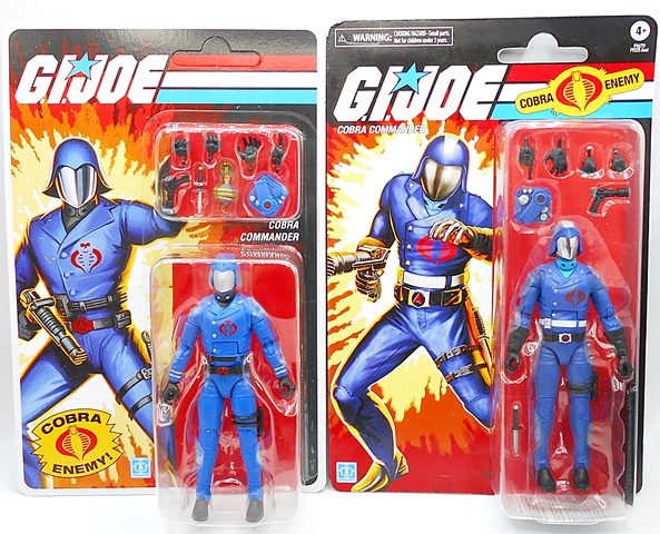
I had planned to get to the Classified Cobra STINGER this week, but work’s been crazy and we’ve got another hurricane bearing down on us, so I’m bumping it for when I have more time and am not so stressed. Instead, let’s turn our attention to the figure that a lot of Classified collectors have been waiting for… Retro Cobra Commander! Of course, we got a Classified Cobra Commander way back at the beginning and it was a solid figure that I still dig a lot. But since then Classified has steered into traditional designs a lot harder and just like the original Duke and Scarlett, he doesn’t quite fit anymore. Then we got a more traditional Cobra Commander, but you had to buy a $300 HISS Tank to get him, so that wasn’t cool. But even back then rumors were buzzing that we’d get The Commander in wider retail release, so I held off opening my HasLab one to wait and see. And here we are!
Just to try a little something different, I’m going with a comparison instead of my traditional in-package shot. On the left we have the HasLab figure and on the right the new Retro Carded release. There are key differences, albeit a lot of those are in the paint, and you got one extra accessory with the HasLab release in the form of a snake coiled around a globe. The card art on the HasLab version is more traditional and you get the separate compartment at the top for the accessories, whereas the new release has just one elongated bubble. I like the overall art and presentation of the HasLab version much more, which is convenient, because I doubt I’ll ever open that one. And based on what I’ve seen so far, I think I’m going to dig the new release a lot more than the HasLab figure. But, let’s not jump the gun!
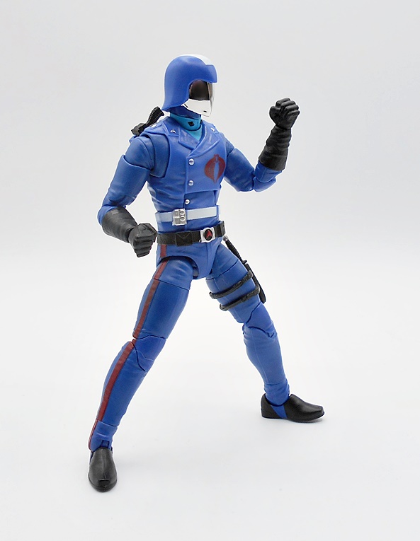
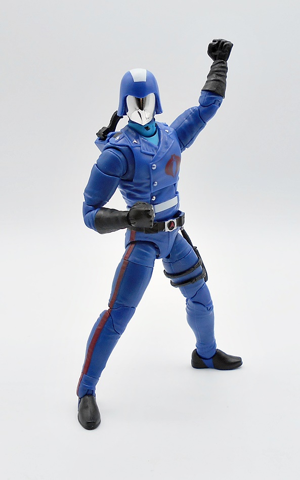
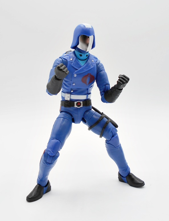
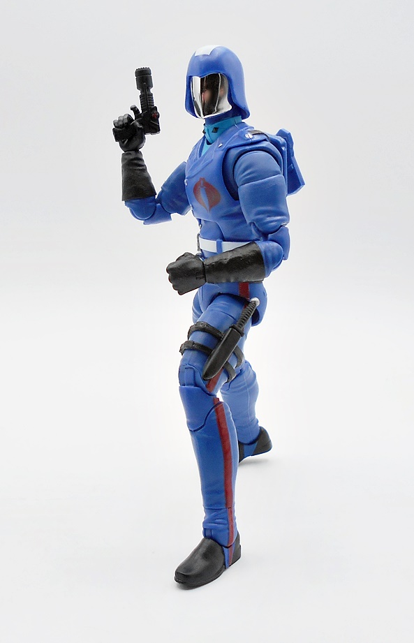
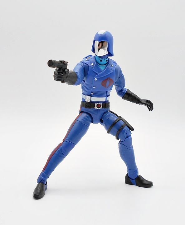
The uniform is as classic as you can get. He’s got the all blue suit, including the tunic with the buttons running up the right side, wide lapels, and a light blue turtleneck shirt peeking out from behind. Those black diamonds in his collar were always so iconic to me, even if I had no idea why they were there. He’s got the proper insignia this time, as opposed to the Mickey Mouse one on the HasLab release. The upper belt is painted white, while the lower belt is black with a silver buckle. He has matte black gauntlets and boots, with painted stirrups running down around the boots. There’s a knife sheath strapped to his left leg and he’s got a backpack to hold his trademark hairdryer pistol. The paint here is really on point, especially the silver buckles and the red striping down the trousers.
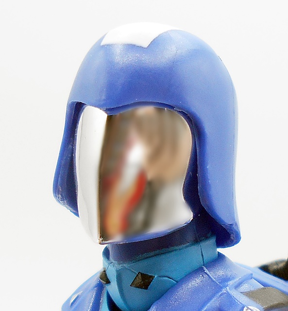
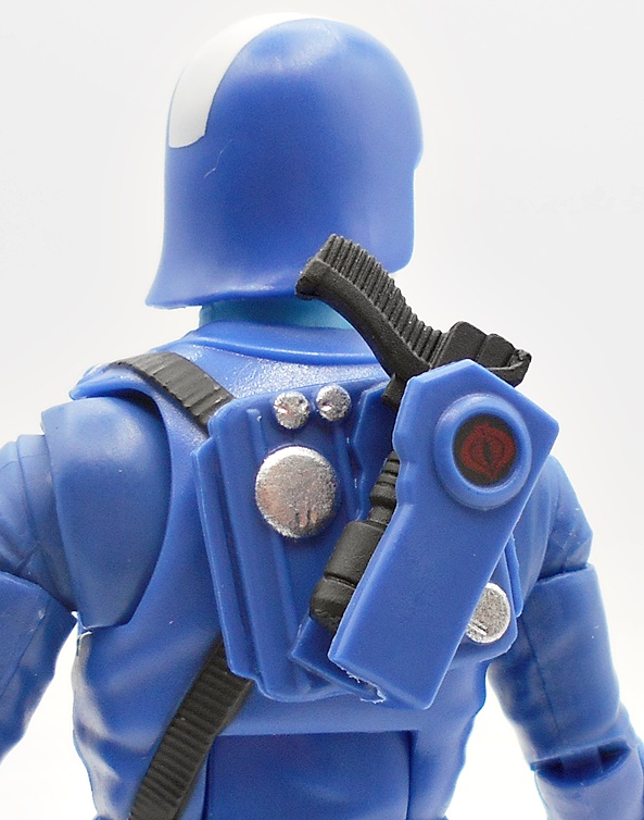
The helmet is very nice, particularly the vac-metal face plate, which is something I would have expected to see in a HasLab release and not a regular retail figure. The helmet features the white mohawk stripe from the cartoon and the edges of the helmet are much better defined against the face plate than the HasLab version. I dig this a lot!
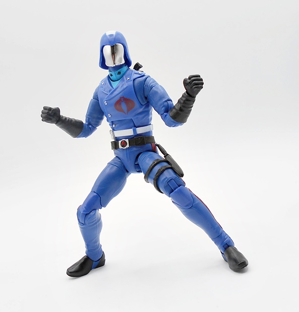
The Commander sports some excellent articulation, which is pretty much in line with the usual Classified system of jointing. You do get the butterfly crunches in the shoulders, which is great. There are also these strange swivels just above the ankles, which I don’t recall ever seeing on a Classified figure before. Usually the lower leg swivels would be at the tops of boots. But hey, I’m not going to complain about added points. As for hands, CC comes with a pair of fists, a pair of trigger finger hands, a right pointing hand, and a left wide grip hand, which is left over from the HasLab figure and designed to hold the globe that was omitted here.
The backpack holster does it’s job well. The sleeve is sculpted to hug the contours of the weapon and it stays put just fine. You get some silver paint hits to whatever those buttons are supposed to be and there’s a Cobra emblem on a black field inside the disk on the outside of the holster. This backpack actually has one additional paint hit that is missing from the HasLab release.
I couldn’t tell you why, but I absolutely love CC’s hairdryer gun. Next to the JOE laser rifle, it’s probably my favorite weapon in all of JOEdom. It’s just a neat sci-fi design with some excellent detail in the sculpt. the muzzle looks like it’s designed to spit out a vicious hot energy beam and I can just picture The Commander laughing maniacally as he torches invading JOEs entering his Command Center. I was pretty upset that we didn’t get one with the first Classified Commander, but now all is right with the world.
Of course, the dagger is removable from the sheath, and it’s a pretty cool little Fairbairn–Sykes style weapon. Alas, The Commander doesn’t come with a hand that’s very well suited to wielding it. The best bet is either of the gun-holding hands and it does work, but not quite ideal. It’s hard to imagine the Sunbow Commander going up against anyone in a knife fight, but I’d like to think of this Classified Commander as being just a tad more spicy and unpredictable.
I love that Hasbro is using this Retro Carded sub-line as a way to bring earlier Classified figures in line with the more traditional direction that the line has taken. As I mentioned earlier, I still like the first Classified Commander quite a bit, but there’s no doubt that this one will be The Commander that I display front and center in my collection. Hasbro did an excellent job hitting all of my favorite design beats, and I never would have thought we’d get a vac-metal face shield in a regular release. I know a lot of people out there are still hoping for a hooded version, and while I’d like to see that too, this helmet remains my favorite look for The Commander, so either way I’m covered!
Here we go again. Hurricane Milton was a direct hit about a dozen miles from my home. Everything is fine. Lots of landscaping damage, but the myself, the cats, and the house remain unscathed. I was without power for three days and it’s just been a really stressful week. Add to that I’m working some extra time at work over the next two weeks and something has got to give. Oh yeah, when the power came back my computer got fried too! Good times!
So, I’m taking this week off from posting new content as I try to get some rest and maybe recover the HDD from the down computer. I’m currently using an old spare, which does have everything I need to get up and running again whether I can recover the drive or not. My hope is to have some new content up starting next Monday, but I’ll have a better idea by the weekend. Worse comes to worse, it’ll be the second half of next week.
In the meantime, take care and hopefully FFZ will be back in action soon!
As promised, I’m trying to slip at least one spooky review into each week leading up to Halloween and for this week, I’m delving into World of Hammer Horror! It’s hard to believe that in nearly 15 years of toy blogging, this is the first time I’ve been able to check out a licensed figure from a Hammer film. And that’s a shame, because I freaking love these movies! If the toys and merch were more common, I’d be buying them. Christopher Lee and Peter Cushing have been scaring me since I was a young lad sneaking Hammer and Amicus films on Saturday afternoons as they were shown on the broadcast networks. That is until my parents would find out and object to the blood or partially exposed bosoms or both. And as I grew up and learned more about the company and it’s influences, the more I watched and enjoyed them. I’ve come close to picking up some truly higher end Hammer inspired pieces, but in the end my resolve held out. Until now, when Kaustic Plastik revealed they were doing both Lee as Dracula and Cushing as Van Helsing from the superb 1958 film, The Horror of Dracula. They were pricey, but my resolve crumbled like a vampire faced with a side order of garlic bread. In addition to the Deluxe version of the figure, I’ll also be having a look at the coffin accessory, which was sold separately.
The figure comes in a shoebox style package made with some nice heavy duty cardboard. None of that flimsy crap Hot Toys has been using lately. Also no plastic vac-formed trays. The figure and accessories are carefully nestled in foam. I’m not sure what the relationship between Infinite Statue and Kaustic Plastik is, but it reminds me of the whole confusing Executive Replicas/TB League thing. The box art on the front lets the figure do the talking, but I don’t think the picture they went with does a great job of selling the amazing figure that’s inside the box. This Deluxe version includes a second head, which is good because despite the enormous box, there aren’t a whole heck of a lot of accessories and extras included. I’m not sure the price difference between Standard and Deluxe, as the retailer I purchased this figure from only offered the Deluxe.
The Count comes out of the box all ready to go and looking damn menacing. Hopefully you are impressed by beautifully tailored sixth-scale outfits, because this is a figure that is dressed from head to toe with the bulk of the visible sculpting being in the shoes, hands, and head. The body is clothed in a an entirely black suit with just a hint of white collar exposed at the neck. The coat comes buttoned at the top, although you’re free to fasten the rest. Everything about this outfit is expertly crafted, from the immaculate stitching to the excellent fit. He’s got a coat, vest, and shirt layered onto him and nothing looks bulky or puffed out. Granted, a lot of my sixth-scale figures are wearing super-hero suits or sci-fi fantasy costumes, but still, this is the best rendition of a traditional suit I’ve ever seen in this scale. The cape is also fantastic, draping over the shoulders and falling about the figure naturally. It’s both substantial and yet light enough to behave properly in this scale. It can be folded back over the shoulders to show off more of the underlying suit, or enclosed around the figure entirely. It’s secured around the neck with a tied cord and is easily removable, but I doubt I’d ever take it off.
The stock head is superb with an excellent likeness to Lee in the makeup. I’ll say that it falls a bit short of the realism we get with Hot Toys, especially in the hair, but there’s no shame in that, as I’m still convinced there’s some kind of witchcraft involved in Hot Toys’ sculpts. Here we get a very lifelike skin tone, subtleties in the sculpt like the barely visible creases in the forehead, a hint of hair between the eyebrows, and even a bit of a whisker shadow across the upper lip. The teeth are a work of art all to themselves, making me wonder how long the sculptor referenced production stills to get them so right. Finally, the eyes are both intense and lifelike with a bloodshot tint to the whites. This is amazing work!
The alternate head is full-on post-feeding vamp mode, and if this wasn’t enough incentive to buy the Deluxe over the Standard, I don’t know what is. The mouth is agape with fangs a poppin and little blood trickles down the sides of his chin. The stock portrait itself was pretty intense, but this one is downright terrifying. I have absolutely no idea which head I’m going to go with for everyday display, but this might be one of those rare times where I’m actually doing a head swap every couple of weeks.
The bulk of the extras in the box are hands. There are four pairs of hands and these are mostly slight variations on some menacing, “I’m gonna get you” sculpts with grasping, bent fingers. They look great, especially with the large pinky ring on the left hands. You also get one gnarled pointy finger right hand in the mix. These swap out similar to most sixth-scale figures with a hinged peg connecting them to the arm, but the hand extends a little further than the wrist. This allows the sleeve to conceal the joint better, but makes the articulation point slightly more awkward, so it’s a bit of a compromise.
There’s only one actual accessory included in the box, and that’s the candlestick. The sculpt is really nice, with the holder painted to look like old tarnished bronze. The candle itself is white and you get a little sculpted flame at the top. One of the included hands is sculpted to hold it.
The base is a raised circular pedestal with the film’s title on the front. I like the design of it, especially the sculpted logo for the movie, which adds a lot more than a flat nameplate would have. Still, the base is very light and I’d go so far as to say it’s rather cheap feeling for a figure of this cost and quality. They should have maybe added some weights to the inside. The surface is magnetized to secure the figure’s feet to the stand and it works pretty well, but you still have to have the figure in a stance that will support him, as the leg joints aren’t the strongest I’ve seen. A support post would have worked better, and in this case you’d barely be able to see it under the cape.
You also get an art card with the figure, which looks nice displayed beside him. The back of the card expresses thanks to the purchaser, lists the people who worked on the figure, and states that the limitation is only 800 pieces. I would have loved to have an individual number assigned to each figure, but that’s not the case here. OK, let’s move on to the coffin.
I believe the coffin was available as in a very limited super deluxe two-pack with Dracula and Van Helsing. I pre-ordered the two figures separately, and it wasn’t until they arrived that I realized I needed to own the coffin too. KP offered it as a stand-alone, but it was sold out everywhere. Luckily, I was able to get one off Ebay for only about ten dollars more than the original asking price, so not too bad. It comes in it’s own branded box, encased in foam and all ready to go. Oddly enough, the box isn’t specifically branded to tie into the film. Instead it just states The Vampire Coffin, which is really weird since the coffin itself has Dracula’s name on it. Maybe some weird licensing issue.
It doesn’t reflect the same craftsmanship as the figure, as it’s basically just a resin box, but it still looks the part. You get some sculpted fixtures on the sides and on the cover, along with the Count Dracula Plaque, all painted to look like antiqued bronze. The inside has a plastic liner, sculpted to look like billowy cloth. There’s a pillow with a sculpted recess to cradle Dracula’s head, and a plastic lace border running along the inside top edges. It would have been cool if KP also offered one with sculpted dirt in the interior, but this one will do nicely!
The figure fits inside perfectly. It’s easiest to take the cape off, and probably advised if you’re going to keep him in there a while, so that it doesn’t get all wrinkled. Still, if you just fold it tight to the body he can go in with the cape on just fine. Like the figure, the coffin wasn’t cheap, especially for what it is. But I really felt that a figure this nice deserved it, so I popped down the $90.
It’s always terrifying when you put down a preorder on a pricey figure from a small company that you have no experience with. In this case it was my adoration for the film that made me do it, and I’m damn glad I did, because I am absolutely thrilled with how this figure turned out. I’m also mighty glad I preordered when I did because Dracula sold out pretty quickly after the figure released. At $299, he ain’t cheap, and while you could certainly argue that there isn’t much in the box in the way of extras, it’s still easy to see where the money went. The tailoring is impeccable, the portraits are excellent, and there’s very little to nitpick here. Add to that the crazy limitation and this will be a figure that I will display and treasure in my collection forever! And that brings us to Dracula’s nemesis, Dr. Van Helsing, and I promise to be back to check him out sometime before Halloween!
It’s been over a month since I last checked out some of Matty’s MOTU Cartoon Series, but I just got notification that the newest wave is shipping, so it’s time to revisit this fantastic line. I’m just one wave away from being all caught up and ready for the new additions. Luckily, these figures ship in waves of only two, so I’ll be current after today’s review! So far, we’ve been getting waves of one hero and one baddie, but this one is Oops All Villains! with Evil-Lyn and Webstor both on deck!
The Origins Cartoon Series presents some of the most beautiful carded figures I’ve ever seen. The colors, the perfectly presented figures in their bubbles, the Filmation style art on the cards. It all just pains me to tear into these. But I gotta get to my figures. If I didn’t collect so many damn lines, I would be buying doubles to keep these carded, but that’s just not happening. Although I still may pick up a second He-Man and Skeletor to leave carded and hang on the wall. Anyway, let’s get to ripping, and I’ll start with Webstor.
I don’t remember Webstor being in too many episodes of the cartoon, but when he made an appearance it was pretty memorable. He didn’t take no guff from Skeletor and seemed more capable than some of Snake Mountain’s other bufoons. I seem to recall him being billed as some kind of master thief, but if I’m being honest the whole reason I love this guy is because the figure looks so damn cool. The dark blue skin with the bright orange belt and chest emblem, mixed with a little black and purple tickles my eyeballs in every good way. And that’s good, because the body is pretty standard with only his monster feet and grapple backpack to set him apart from a standard MOTU buck. This cartoon version’s boots and chest harness are simplified when compared to the regular Origins release, and his belt is now limited to just one stud, right in the middle. And I gotta say, as much as I love the vintage-style Origins, these toony figures just look so clean and appealing to me.
The head sculpt is fantastic, albeit a lot less creepier than his vintage-styled counterpart. It’s much more human looking, with the pug nose replaced with a regular one and his mouth being all around less fangy. The eyes now have pupils and the bumps that make up his mohawk are more individually pronounced. The portrait just oozes Filmation style and a perfect likeness to his on screen counterpart.
What’s that, you ask? If Webstor is a spider guy, why does he need a grapple backpack? Why not just shoot webs out of his ass? Don’t know! But the backpack here is completely redesigned. The vintage-style release had a string that passed through the backpack allowing him to zipline, whereas this one has the string coiled inside the backpack and a knob to reel it back in. It certainly looks tidier, as you don’t have to wrap all that string around the backpack, but taking away the zipline ability hinders the fun factor a little bit.
The string and grapple hook are now orange instead of black, which adds to his excellent color palate quite well. The hook has three prongs and a nice spike at the end, making it seem like it would be really effective as a weapon. There’s nowhere to secure it when it’s not in use, but if you reel all the string into the backpack it kind of just hangs off the side pretty neatly.
The Cartoon Series figures have been coming with episode specific accessories, and in Webstor’s case he comes with the Grimalkin Statue from the excellent episode The Cat and The Spider. And I believe it was also Webstor’s first appearance! The episode sees He-Man and some archeologist wantonly breaking into the Cat Folks’ temple and desiccating it by destroying half of it and stealing the Grimalkin Statue, because… I don’t know, slow day at The Palace? The only thing missing was He-Man taking a dump on the altar before he left. Naturally, the Cats don’t like this and they send the sexy cat agent Kittrina to steal it back, but not until Webstor steals it first. Yeah, this episode is quite the rollercoaster! Anyway, the statue is pretty cool and an excellent accessory to toss in with Webstor. And I know we got a Kittrina figure in Super7’s Filmation line (she hangs out with my ThunderCats), but I really hope this Cartoon Series lasts long enough to get her again in addition to some of the other memorable one-off characters. OK, let’s move on to Evil-Lyn!
Obviously, she’s the big draw from this duo because she always seemed like Skeletor’s second in command and probably where he buried his bone. At least, I hope it was her and not Beast Man. I love this figure, but I want to get my one gripe out of the way first and that’s the skin tone being too yellow and toy like. Filmation depicted her a lot less jaundiced than the original toy, so I’m not sure why Matty didn’t tone it down a bit here. It’s not enough to keep me from enjoying it though. Evil-Lyn borrows from Cartoon Series Teela, though not as much as I would have guessed, as it seems to just be the arms and legs. But boy is this a total departure from the first Origins release. As we just saw with Webstor, many of these Cartoon figures feel like they’re just smoothed over and simplified, but Evil-Lyn is just completely different, and Mattel did a beautiful job sculpting her costume and the blue and purple deco really pops.
The head is also a homerun! The face is a beautiful sculpt with super clean paint and it looks like the helmet and head are separate sculpts because the lines between them are immaculate. The expression is priceless, as she looks like she’s completely done with your shit, He-Man’s shit, Skeletor’s shit and just about everyone and everything.
Evil-Lyn’s main accessory is her magic staff, which looks like a demon claw clutching an onyx crystal ball. The coloring on the staff matches the blue of her outfit, and she can hold this well in either hand. I like this a lot more than the one that came with the vintage-style release.
The episode specific accessory is titular Shaping Staff, hailing from what I believe to be one of the earlier episodes because I’ve seen it so many damn times. The staff has the ability to change people’s appearance and Evil-Lyn and Beast Man use it to fool their way into The Palace and kidnap King Randor by pretending to be entertainers performing a magic trick. It’s kind of a strange artifact, as it seems like an adept magic user could change their appearance without a specialized utensil, but I’ll allow it. The accessory itself is pretty simple, but I love that we’re getting a collection of all these crazy Eternian artifacts and I really want to display them all in a museum in my Castle Greyskull playset.
This was a really strong wave, even if it seems like Evil-Lyn’s gravitas would outshine Webstor’s. Truth is they are both excellent figures and while I’m obviously happy to round out Skeletor’s core team, Webstor was just as welcome. It’s a bit of a shame that they couldn’t have been more accurate with Evil-Lyn’s skin color, but at least it’s been toned down a bit from the first Origins release. These CartoonSeries figures have crept up to $20 each, I feel like that’s a few dollars more when they first came on the scene, but still well worth it to me. The next assortment is another All Baddie Wave consisting of Spikor and Clawful, and they should be shipping out any time now!
There’s no doubt about it, the advancements in 3D Printing have done a lot for the collecting community. From printing missing parts for toys, and accessories for action figures, to complete collectibles, the whole endeavor has come a long way and it absolutely fascinates me. But also prop replicas! And that’s what I’m checking out today: A Starfleet Issue Medical Tricorder as featured in Star Trek: The Next Generation! I remember the days when you’re only hope of getting a decent Trek prop was to mail away for a DIY resin kit from the back of a magazine at $50-60. And what you got was exactly that, an unfinished kit that needed all sorts of sanding and painting to make it look anywhere near presentable. Even some of the “props” people were selling at conventions for twice that price were pretty crude. I recently found an Ebay seller offering some phasers and Trek replicas at prices that were too good to pass up. I started with some phasers (which we’ll check out here eventually), but the Tricorder came in this weekend and I was really excited to show it off.
This is where I usually show off the box and packaging, but there’s nothing to show here. The Tricorder came carefully bubble wrapped along with a display stand and holster. The stand is the only assembly required, and you just have to tab it all together, easy-peasy. There are no electronics included in the model, so you can consider this based on a regular prop as opposed to a hero prop, which is meant to be seen up close and functional. This particular model has two configurations to choose from: medical or regular, so whether you’re part of an Away Team mission making a geological survey or you’re in Sick Bay trying to find out why all your crew are dying, this Tricorder has you covered! Let’s start with the regular version and work our way up! And just a disclaimer, I know next to nothing about 3D Printing, I’m not qualified to comment on printing methods or techniques, and I’m evaluating this solely as a finished collectible.
Here it is closed and set up on the display stand with the medical peripheral beside it. The model is printed in a rich gray with a matte finish. I think the color of the props varied over the years, but this shade of grey looks to be very close to what Factory Entertainment is using for their high end model. There’s has a bit of a metal sheen to it, where this one does not. Layer lines in 3D printed models tend to bother me a lot, but that’s not the case here at all. Yes, they are there, but for a model in this price range, I think they are absolutely acceptable. They’re most visible toward the top rounded edges of the model and even still, not a problem for me at all. The panel on the front top-left of the model is a sticker, while all the components on the top panel are fully realized details and I really dig the colors and detail displayed on that top panel. The stand is notched so that the Tricorder can be displayed closed or open.
The instrument panel is hinged with metal pins. There’s no resistance, so it just drops down ready for action. The connection feels really secure and the fit, whether it’s closed or open, is excellent. The display screen and buttons are all matte finish stickers applied to the recessed panels. The sticker material feels like it’s printed on substantial stock and I don’t have any worries about them peeling or tearing. The printing is sharp and everything looks really accurate to the prop. Even the faux lit indicators look convincing. This model is just a tad bigger than the old Playmates toy and feels great in hand, with a solid weight and durability. Let’s move on to the medical model…
To convert the standard Tricorder to specialized Medical Tricorder you remove the top component panel, which is held on by magnets and attach the medical peripheral. It slots in pretty deep and is also held on by magnets. You can then use the raised platform on the stand to display the component panel or you can just remove the pedestal altogether. All the details on the medical peripheral are fully realized parts of the model, rather than stickers and the expansion piece seats onto the Tricorder perfectly.
The hand scanner is stored in the top slot of the medical peripheral, secured by… you guessed it! Magnets! It can be easily removed to perform those focused scans that will tell you which alien virus is eating your crewman’s brains. This piece has a silver finish with a bit of a metallic sheen, green sensors surrounding the top edge and a red one dead center. The layer lines on this sensor kind of give it a machined metal look, which really works for me! You can also use the platform on the stand to display it outside the unit if you want to.
And if you are going on an Away Mission and you need to carry the Tricorder with you, the included holster will allow you to store it on your belt for quick access. The plastic holster has a clip on the back and it’s a perfect fit for the unit, which slides in and out very easily.
And finally here are a couple of comparison shots with my old Playmates Tricorder from about 30 years ago. It’s pretty banged up and the electronics don’t work anymore, but it still serves to show how much more detail you get in this version. The stickers are cut neater on Playmates and you don’t get the layer lines in the body, but I love the added detail in the top instruments, and of course the lack of the ugly battery compartment. The manufacture panel is also more accurate on this one, noting San Francisco on the second line. Playmates did make a Medical Tricorder as well, but the medical peripheral was part of the sculpt and you couldn’t switch between them, so that’s another win for this model.
I can’t say enough nice things about this set, and it’s hard to believe you can do better without spending a lot more money. Being able to go from regular to medical Tricorder adds a lot of versatility and the included stand and holster really adds to the value. It’s a great display piece for your personal quarters, which is what I’ll be using it for, but if you like to get into uniform and beam down to conventions, it’s absolutely perfect for that sort of thing. At the time I’m writing this, it is available on Ebay from Tankz3dtavern for $50 plus shipping. I’ve picked up a few other Trek props from him as well and I’ll be checking those out here in the near future.
October is here and the air is rife with spookiness and pumpkin spice! Last year I crammed all my horror related content into the week leading up to The Big Day, but this year I’m going to pepper it about the month, trying to do at least one spooky review each week and then toss some more in as we approach the finish line. I’d like to get through my entire horror backlog and come out of Halloween with a clean slate, but we’ll see how it goes. Back in August, I jumped the gun and checked out NECA’s Ultimate Frankenstein and Chair from The Bride of Frankenstein, but without having looked at The Bride herself because I hadn’t purchased her yet. But, I finally picked her up and so I’m going to kick off this year’s horror show with NECA’s Ultimate Bride!
I’ve had a few opportunities to comment on how weird and wonderful The Bride of Frankenstein is as a film. I touched on it a little in the recent review and a bit more back when I checked out Jada’s figure. I dig it a lot and usually include it in my October rotation rewatch along with some of the other Universal Monster films. You have to hand it to Elsa Lanchester for becoming one of the most iconic classic horror icons while having such a tiny amount of screen time. The packaging here is right in line with past Ultimate Universal Monster releases with a front flap depicting the movie poster, and opening to reveal a window showing the figure inside. Everything is collector friendly, and I have been keeping the boxes for these monsters, because they look really great all lined up and I dig the vintage poster art. You get a few different display options with The Bride, so let’s just start with how she comes out of the box.
The Bride features a white, flowing softgoods gown made of a very soft material allowing it to fall pretty naturally around the figure. It’s sleeveless and has a neck opening that laces up in the back, but comes with the laces untied. It’s a cool mix of hospital gown and wedding dress with a bit of a train trailing behind it. Mine is a little bit rumpled out of the box, but I’m sure that would steam right out. Displayed like this, you aren’t seeing a lot of detail, but the exposed arms are completely covered by sculpted bandages.
The stock head has a neutral expression and I’d say the likeness is decent, but maybe not quite up to NECA’s usual magic. Technically everything looks amazing, especially the work on the slightly parted lips and flash of teeth. But, I don’t think the eyes are quite there, or maybe it’s just a very specific expression they were going for that I’m missing. The eyes are a little too round and she could have used more lashes on upper lids. The iconic coif, on the other hand, is pretty spot on and they did include the scar running around the edge of the jawline, which is something that Jada missed on their figure. I don’t want to come down too hard on it, because it isn’t a case of poor effort or quality, but just not capturing the likeness as much as I would have expected.
There’s a second head that depicts her screaming and I’d say this is marginally better. Again, I think the eyes are too round, but that’s less notable with this expression. The work on the open mouth is really impressive with the glossy tongue and top row of teeth. I’ll also note here that the head swaps are done at the base of the neck, where the exposed skin meets the bandages. Why’d they do that?
Well, they did it to allow for the fully bandaged neck and head, and that’s pretty clever. This head has a piece that fits over the eyes so that the whole head is covered, or you can remove it and expose her eyes. The cover piece does not hold on as well as I’d like, but I really don’t ever plan on displaying it on the figure. Heck, I will probably never use this head either. Nonetheless, there’s some nice texturing on the bandages that make them look like gauze in some parts. You also get some silver painted staples holding the wrap together.
And yes, there is a fully bandaged sculpted body under that gown. The detail here is extremely sharp with crisscrossing lines representing her full body wrap. You also get a couple of coiled pieces of wrap to put dangle off her hands. It’s similar to what NECA did with their Imhotep figure. Articulation consists of a lot of rotating hinges, as is pretty standard with this line, and you get a ball joint under the chest and in the neck. There isn’t a huge range of motion in some of those joints, but I guess she doesn’t need to be an acrobat. She does come with two sets of hands: One pair with the fingers tight together and one pair with them splayed a bit further apart. As for accessories… that’s it. We’ve already seen everything she comes with!
The Bride is a fairly simple figure, and yet the fact that you do have several display options for her gives her a bit more mileage. And she looks outstanding when displayed with The Bride version of The Monster. But I’ll admit that this isn’t the slam dunk over the Jada figure that I thought it would be. Some things are done better, while others feel lacking. The paint on the portraits here are better, but I think Jada did a better job capturing her eyes. Jada’s figure also had a light brown wash over the bandages and had overall better articulation. You also got a few extra pieces with Jada’s figure, like the pylons from the lab. With all that said, NECA’s still edges out as my favorite of the two, but not nearly as much as I would have anticipated. Still, a great effort and I’m happy to add her to my Universal Monsters collection. I’ll be interested to see if NECA releases an accessory set for her that includes the table and lab accoutrements.