Avengers: Thor Movie Masterpiece 1:6 Scale Figure by Hot Toys

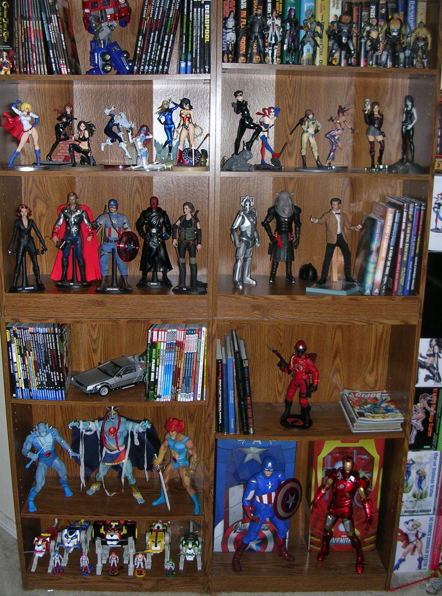
While I am most certainly not going for an entire set of Hot Toys Avengers, (sadly, my wallet won that fight) I have been cherry picking the characters I want the most. I kicked myself for not picking up the first Hot Toys Thor, but as was the case with Black Widow, sometimes taking a pass on a first effort pays off later. The Avengers Thor is said to be a huge improvement over the initial release and looking at photos of the figure online finally wore me down to the point where I threw him on Flex Pay. Four months later and the God of Thunder has shown up at my doorstep. I often do these figures in two parts, but Thor is a pretty simple, albeit spectacular, figure so I think I can probably do him justice in just one shot.

htmmthor1

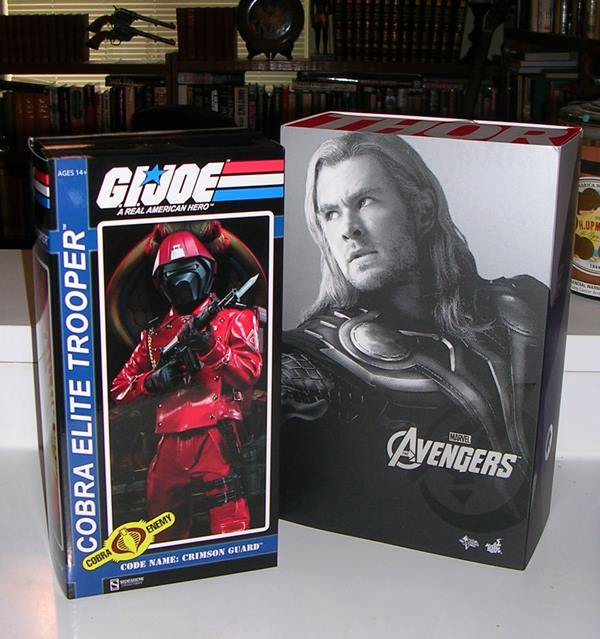
The packaging is designed to mesh with all the Hot Toys Avengers. You get a sleeve with a B&W shot of the character’s portrait and “The Avengers” in foil lettering. The top of the box has Thor’s name in big type and the sides have his Mjolnir symbol.  Pull the sleeve off and you reveal a window box showing off the goods. It’s a very basic presentation compared to some of Hot Toys’ previous efforts. I suppose it’s fair to expect a lot of bells and whistles in the packaging for a $200 figure, but honestly the simplicity doesn’t bother me a whole hell of a lot. Besides, the $200 price point is pretty much Hot Toys’ new bottom line. Sure, I do keep the boxes for these figures, but mainly as a means of storing the extra parts and in case I ever need to put the entire figure away at some point down the road. At the very least, your Avengers boxes will look nice and uniform on the shelf if you are collecting the whole line.

htmmthor2

The layout of the figure in the tray should be readily familiar to anyone who has picked up one of Hot Toys products before. The figure comes partially wrapped in plastic with the extra hands and accessories flanking him on both sides. In this case, the cape is passed through a slit in the tray, which seemed to do a nice job keeping it from getting all rumpled. The personalized figure stand is placed between the legs. Everything fits into the tray snugly. It’s a good economy of space without making everything seemed cramped.

htmmthor4

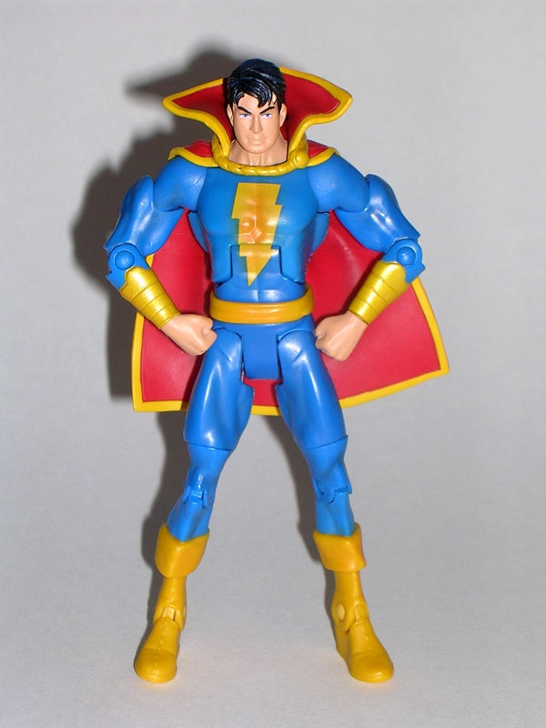
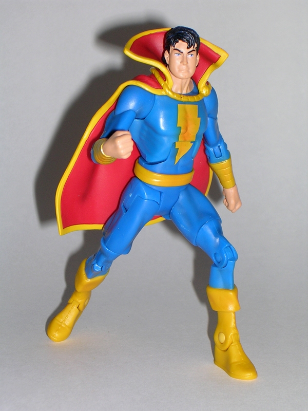
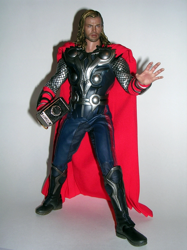
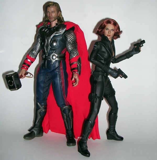
While Thor’s appearance varied a bit throughout The Avengers, Hot Toys recreated him in his full sleeved armor. I think that was a good choice because I absolutely love the scale armor turned out for the sleeves. It’s rubbery and looks dead on to the movie outfit. They also hide the joints, which would have been the big downside of a bare armed version. I suppose you could take the sleeves off if you wanted, but I tend to follow this rule about futzing too much with my $200 figures: I don’t do it. The arms also feature bracers on his wrists, which are strapped around bright red cloth sleeves. Yes, the rubbery sleeves do inhibit the arm movement, but not much more than First Avenger Cap’s uniform shoulders did. Sure, it would be nice to pose him with Mjolnir above his head calling down the thunder, but I knew that was an issue going in, so it wasn’t really surprising or disappointing. Articulation whores will certainly take issue at this, but I think the trade off was a worthy one.

htmmthor6

The chest armor looks outstanding. It’s sculpted with cutouts to show the garment underneath, giving the outfit a very convincing and layered look. I am a big fan of the armor design from the movie and it’s captured really well here. The pleather trousers have stitched stripes and the boots are actually two parts. You get the ball jointed feet plugged into the ankles and the top of the boot is separate. It still looks great and serves to offer a little more poseability in the ankles than stiff boots would have allowed. The trade off is that the ankle joints require you to fiddle about a bit to get him to stand in some positions. And then there’s the cape… by Odin’s beard, I love the cape! It’s bright red fabric and the way it hangs over the shoulder armor gives it that iconic hovering look that we’re so used to seeing in Thor’s design. The back of it is tailored to hang in folded layers. I was a little concerned that the cape was going to require a whole lot of adjusting to make it look right, but it’s designed to look fine right out of the box.

htmmthor5

Thor’s portrait has come a long way since HT first showed him off. Early shots were a bit spotty but the final product turned out just fine and I think the likeness to Chris Hemsworth is up to their usual impeccable standards. Yes, from certain angles the mouth can look a bit derpy, but let’s face it Thor isn’t necessarily the braintrust of The Avengers team. The hair is the only minor issue I have with the figure and that’s just because sculpted hair this long tends to take away from the realism of the rest of the head sculpt. But when you consider the alternative is rooted, I’ll take the lesser of two evils. The truth is it still looks fine and it’s flexible enough so as not to inhibit the head movement too much.

htmmthor14

htmmthor7

htmmthor9

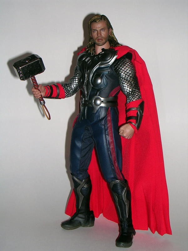
If you’re looking for an abundance of accessories, Thor will disappoint. You get a copious amount of hands (more on that in a bit)  and just two other items. But seriously, what does Thor need other than Mjolnir? It’s the one thing that was absolutely required to come with the figure and it is indeed a very nice piece. I knew the head was going to be die cast metal, but I was still surprised by how satisfyingly heavy it is. The grip on the handle is sculpted and painted and there’s a lanyard attached to the end.

htmmthor13

htmmthor11

htmmthor10

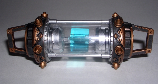
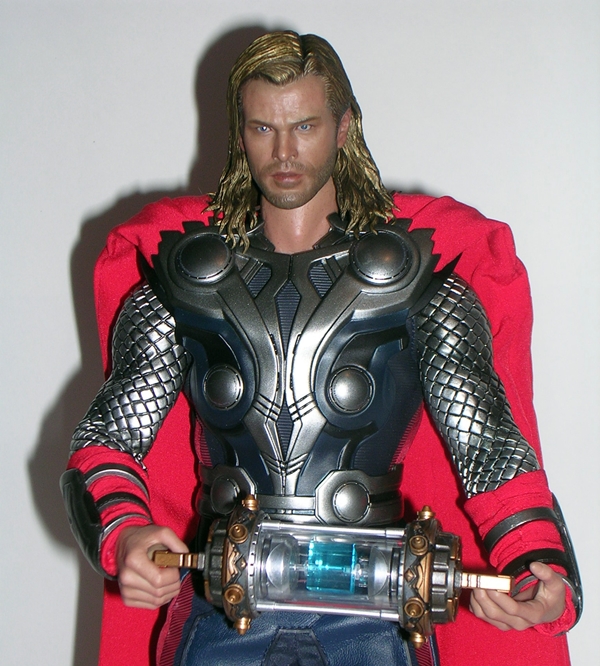
The other cool piece is the Cosmic Cube in the containment tube. Ha! That rhymes! Like Mjolnir, this is an extremely nicely crafted accessory. It’s also one that was really not necessary and so it makes for a great bonus. I had originally though this accessory came with Loki and not with Thor. Maybe it was issued with both figures, and I just missed that.

And no discussion of a Hot Toys figure would be complete without… HANDS! Seriously, does anyone actually use all these hands? Thor comes boxed with a pair of fists, but there are three additional pairs, which include two open hands, two partially open hands, two hands for holding Mjolnir. You also get an extra left hand, which seems to be designed for holding Mjolnir out at an angle. I’m not sure what that one is all about. It might be the one designed to hold half the containment tube so that Loki can hold the other. I’m not big on swapping hands. Obviously the right Mjolnir hand will stay put. The left one may vary between a fist and the open hand. You also get a couple of extra wrist posts in case you snap the ones on the figure by swapping out all these hands.

htmmthor15

htmmthor3

No doubt about it, Thor is another amazing effort from Hot Toys. I always have those little twinges of trepidation when ordering these things, but whenever they show up I’m always glad I did. He looks amazing on my shelf, and I really envy the collectors that are putting together this entire team because those displays are going to be EPIC! Granted, at $200 Thor ain’t cheap. He doesn’t come with a lot of stuff, but there’s nothing conspicuously absent either. Like I said earlier, $200 is the new bottom line for Hot Toys and for the most part, the days of the $160 figures are probably over. But hell, I still think he’s well worth it. The only downside is that now I’m seriously re-considering whether I need Loki on my shelf… and he is still available at a few retailers.

Masters of the Universe Classics: Icer by Mattel

Hey, it’s been a while since I’ve featured any MOTUC figures on FFZ. I’ve only purchased two this year, and one of those was an older figure off of Ebay. Truth be told, I had completely forgotten that the Filmation Sub was a thing and that I had subscribed to it. I’m pretty sure I was drunk when I did it, because I’ve never subbed the regular Club Eternia, so committing to this line seemed like a rather unusual thing for me to do if I were sober. Nonetheless, the first figure was released this month and arrived on my stoop this week. It’s Icer. I have absolutely no recollection of this guy from the cartoon, but I’m going to remedy that right now. Here, read this bit about the packaging, and I’ll be right back…

icer1

While technically part of a separate sub, Icer comes in the standard MOTUC packaging. There’s nothing on it anywhere to differentiate it from the rest of the line. Seems like at least a sticker saying “Look! It’s Filmation, Bitches!” might have been in order, but the packaging is about to be shredded and trashed, so I really don’t mind. It’s been a while since I last opened an MOTUC figure, so I’ll take the opportunity here to point out once again how much I love the presentation here. Big bubble, great Greyskull inspired deco, and a bio card on the back. I’m glad Matty never tinkered with the package designs, because they nailed it from day one.

icer9

Ok, so Icer appeared in “The Ice Age Cometh” Cometh? So, Masters of the Universe is Shakespeare all of the sudden? Well, believe you me, after watching that I can attest to the fact that it is not. Even as a kid, I found the Masters cartoon hard to stomach and since I’m writing this at 6:30 in the morning, I didn’t even have my pal Jameson to help me through it. Things start off shaky with 12-year old, Philip the Guard guarding the parking lot of Castle Eternia and Whiplash walking around the castle grounds in plain daylight like he owns the place and trying to jack royal vehicles. Philip messes up and promptly gets exiled to a weather control station in Eternian Siberia where he runs afoul of Skeletor’s minion, Icer. Seems harsh… does this kid have parents? Icer can melt himself to pass under doors and is understandably immune to the freeze rods, which the Eternian guard bewilderingly uses as their main defensive tool in Eternian Siberia… where everything is already f’cking freezing. He also talks in a monotone voice and makes lots of cold puns. After that, um… things happen… and, look, I’ll be honest, I couldn’t get through the whole episode… Let’s just look at the damn figure.

icer3

icer4

This figure is awesome! Icer is a fantastic use of a standard MOTUC buck, with minimal added sculpting for the head, fur cuffs and boots. What makes this figure work so well is the superb frosty ice effect of the semi-translucent plastic. The plastic varies from milky clear white to bright blue and has a snowy dusting over it that really makes Icer look like he’s been hanging out in the back of my freezer for too long. If Matty couldn’t pull of the ice effect, this figure would have crashed and burned, but they totally nailed it. Kudos!

icer5

The head sculpt features an angular chiseled shape, which works very well. There’s a little spray of snow frost on his forehead and the sculpted fur on his hood looks great, as does all the fur on the figure. Filmation purists may be pissed that Matty opted to not paint in his pupils, but I’m so very glad they didn’t. Truth is this figure doesn’t look much at all like the boring character art from the episode. Nope, Matty took the idea of the character and ran with it and we got a better figure for their efforts.

Icer features pretty standard MOTUC articulation. That means you get ball joints in the neck, shoulders, and hips. The arms have swivels in the biceps and wrists, and hinged elbow. The legs have hinged knees and ankles, and swivels just above the boots. Icer can also swivel at the waist and he has an ab crunch hinge in the torso.

Accessories! Icer comes with an icicle spear and a staff. The spear is cast in the same awesome icy looking plastic as the rest of him. The gold staff has a trident-like head and a little sculpted skull on each side. Both are excellent pieces.

icer8

icer2

icer6

icer7

I’m not sure what mindset I was in when I subbed Club Filmation, but right now I’m sure glad I did. Icer is a fantastic figure and while he didn’t break any records, he did sell out within a few days of the sale. I really only have one little gripe about Icer and that’s a stroke of metallic gold paint on his back. It’s no biggie, but a reminder nonetheless that Matty still needs to work on their QC, especially when they’re charging so much for these figures. I obviously don’t give two shits about the character from the show, but I love this figure and I’m thrilled to have him on my Masters shelf. Above all, getting him really reminded me how much I still adore this line, even though I haven’t been buying a lot of the figures lately.

Transformers Energon: Cliffjumper by Hasbro

Welcome to the first official Transformers Thursday. This will be the ongoing day of the week where I roll up my sleeve, dig deep into a random tote of Transformers and pull out something to feature. As promised during last Friday’s Ironhide feature, I’m back to look at Energon Cliffjumper, if for no other reason, so I can actually try out this combining gimmick. You see, kids, when two Voyager Class Energon Transformers love each other, they… well, let’s just say that one of them wears the other one as pants. There’s no package shot, so let’s jump right to Cliffjumper’s alt mode.

enercj7

enercj9

Ugh. I can usually find a lot of love in my heart for Transformers, but I seriously hate this alt mode. It’s like a completely unnecessary cross between a Dune Buggy and a Formula-1 racer. If I squint hard enough, I can kind of see a little Road Warrior battle-wagon thing going on, but it’s not enough to save my disdain for this vehicle. Funny enough, I think what really bothers me the most about it is it’s just so obnoxiously big. It’s like the designers were so proud of this monstrosity that they had to super-size it. Ironhide is a friggin truck and Cliffjumper practically dwarfs him. If this were a Deluxe figure, I might have been more accepting, but suffice it to say this is one Transformer that I would never display in his alt mode.

enercj8

enercj10

Unwarranted size aside, Cliffjumper looks like he’s a patchwork vehicle. The canopy doesn’t look like it belongs on the chassis, the spoiler hanging off the back looks out of place, and there’s that big gap between the back wheels and the side panels where the designers just gave up and left it open. The f’ugly deco doesn’t help matters either. What color is that canopy… ochre? With red windows? Toss in the brown and green chassis and some gold and grey highlights and the color palette used here is an absolute mess. Clearly this vehicle was designed with a hatred for life and little kids. Yes, the mold was recolored more sensibly as Beachcomber, but we’ll have to save him for another time.

enercj6

Transforming Cliffjumper has a few original ideas working for it, and fortunately when you get him into robot mode things improve a little. I do recommend caution with his missile launchers. They have hair triggers and almost always go off when I’m transforming him. I’m amazed I still have both the missiles. Anyway, like Ironhide, Cliffjumper has two configurations for his legs. The configuration shown above is what he’s supposed to look like, but I hate the stubby legs and the huge disfigured knees. Fortunately, you can extend his legs out to the combined configuration…

enercj3

Yup, I think that looks much better. Truth be told, I dig Cliffjumper’s robot mode. The spoiler may look odd on his alt mode, but it makes for a cool angled chest panel. I like the way his shoulders angle upward and the way his front wheels fold onto the front of his legs. The official mode has his back wheels angled to the front, but I prefer to tuck them behind his shoulders for a cleaner look. I’m not a huge fan of Cliffjumper’s head sculpt. The visor looks kind of goofy and the rest of the face is pretty non-descript. Still, all in all, this is a pretty solid and imposing looking robot. He can even wield his missile launchers in both hands.

enercj5

enercj4

And then there’s the combining gimmick. Each Energon Autobot could combine with another Autobot in their same size class, which basically amounts to one becoming the top half and one becoming the bottom. If that’s not enough for you, each toy could do either half. It was certainly an ambitious gimmick, but sadly it rarely worked well and sometimes intruded on the engineering of the toys as stand-alone figures. I’m going to give it a go here, and it should be interesting since I don’t have the instructions anymore and I can’t remember the last time I ever attempted this. I’m mating him with Powerlinx Ironhide because the color scheme on the two is fairly agreeable. Let’s try it first with Cliffjumper on top. Ok, that sounded wrong.

enercj1

Oh boy. First off, this took me forever. I finally resorted to some pictures of the combined mode and even then it took me a while to figure it out. The Jameson probably didn’t help. It’s clearly not worth the effort either. Cliffjumper’s torso mode doesn’t look too bad, but his arms are just riddled with awkward kibble. And what you can’t see is the back half of poor Ironhide hanging off the ass of this abomination begging for the release of sweet death. I’m not sure how this gimmick got green lit, but let’s try it the other way around and see if it’s any better.

enercj2

Ok, I would say that’s better, but given the alternative, that’s not saying a lot. There’s less kibble for the arms at least. On the other hand, the top half of Cliffjumper is still hanging off the back of the figure in a crumpled mess. I still don’t like it.

So, Cliffjumper’s crappy alt mode is just about redeemed by a rather cool robot mode. When I do have my Energon Transformers on display, I’m usually happy to have Cliff standing in the background towering over the Deluxes. He looks cool, so long as I never transform him and certainly never combine him with anyone else. In fact, I’ll likely be covering plenty of other Energon figures on Transformers Thursday, but I’m probably going to ignore the combined gimmick in most cases. It’s just not worth the effort to me, at least not with the Voyagers.

DC Universe Signature Collection: Freddy Freeman by Mattel

It’s time for another release from the Club Infinite Earths sub, and Matty is keeping on point by delivering another figure that is conspicuously missing from our shelves. Captain Marvel, Jr. was definitely on my list of characters that I needed for my display. Maybe he wasn’t high on that list, but he was definitely on there! His arrival also reminds me that Captain Marvel himself is vacant from my DCUC lineup. Yes, somehow I own both versions of Mary Batson, but there’s still a gaping hole in my collection where Captain Marvel should be. Note to self: Pick up the Black Adam and Captain Marvel 2-pack. Anyway, let’s check him out… oh yeah, and… KRAKOOOM!

cieff1

cieff2

Once again, the Signature Collection packaging consists of a delightful little window box. It’s collector friendly, it shows off the figure quite nicely, and it sports some rather excellent character art. No, wait… scratch that last bit… force of habit. I am not really digging the character art here. Freddy looks a little too Alfred E. Neumann to me. Anyway, there’s a bio blurb on the back, which contains the amazingly awesome phrase, “Captain Nazi killed his grandfather.” Oh yeah, shit just got real. Now that you’ve mentioned Captain Nazi on a package, you have to make the figure Mattel. YOU HAVE TO! Sorry, I don’t make the rules.

cieff3

cieff4

cieff7

Let’s kick things off with the portrait. I like the head sculpt here a lot. It doesn’t look much like the character art on the package, and as we’ve established, that’s a good thing. Mattel also resisted the urge to sculpt Freddy with a vapid, “I just took six halcion so I can pose for holiday pictures with the in-laws” smile like they did with Mary Batson. It’s not their best head sculpt of late, but to be fair, they’ve been doing a bang up job lately, so in this case even average is pretty good. I do like the way the tussled hair came out and all in all, they’ve managed to capture the youthful look of the character quite well.

cieff6

Freddy is appropriately built on the smaller DCUC body. I know that should be obvious, but I’ve learned not to take scale for granted in a DCUC-based line. I find it to be a good fit for the character, not too big and not too muscular. He’s just a smidge shorter than Mary. There isn’t a whole lot of unique sculpting here. Beyond the belt, boots and wrists bracers, the blue costume gets by with just the “Shazam!” lightning bolt painted on his chest. Aside from that, you have a new cape, which is excellent. The braid, border, and fleurs are all sculpted and painted.

cieff5

There are no surprises in the articulation department. You get a ball joint on the neck and shoulders. The arms have swivels in the biceps and wrists, and hinges in the elbows. The legs have the usual DCUC hip-joints going on, swivels in the thighs, and hinges in the knees and ankles.

cieff8

Freddy Freeman is what the Club Infinite Earths line is all about, folks. He’s another character sorely missing from the DCUC roster and he helps to complete a team. Ok, so he’s not the most exciting figure around, but in the spirit of turning a pithy DC-related motto on its ear… sometimes we get the figure we need and not the one we deserve. I’ll admit, with the CIE sub open right now, Mattel may have been better served delivering some more exciting figures to drum up interest, but then for a company often accused of playing games and dealing dirty, I applaud them for not doing so. Politics and business tactics aside, this figure is another solid addition to my shelves. He turned out great and I’m very glad to have him.


Reorganizing Shelves!

I had the day off today and I’m not proud to say I spent a good part of it near my computer checking Hasbro’s toy shop to see if the SDCC Exclusives would drop today. Guess what? They didn’t! Oh well… It was no big loss since the real reason I was waiting at home was for UPS to bring these beauties…

970430_201412330019392_1820409778_n

Of course, that led to some reorganizing of the only two display cases of toys that I allow in my Den-slash-Library. Still got some room to work with, which is a good thing because I’ve got a shit-ton of stuff on pre-order and I have a couple more Bishoujos and Mezco’s Cheetara sitting in my Pile of Loot at BBTS. I think I’m going to have to ship that this week.

DSCN2087

In case you wonder what takes up the rest of the room in my Den…

DSCN2089

Books!

DSCN2088

And books…

313048_10150367360573421_1072990514_n

And books…

302277_10150367352693421_498098153_n

And more books!

By figurefanzero

Marvel (Iron Man) Legends: Iron Monger Build-A-Figure by Hasbro

So, I was originally planning on doing Iron Monger next Monday and making that the last Marvel Monday, but I got an unexpected invite to The Pub tonight and I needed a feature that wouldn’t require a whole lot of time. Iron Monger is just that figure, so that’s why I decided to bump him up to today. Iron Monger’s pieces were spread throughout the Iron Man Legends wave, so to build him, you needed to buy Classic Iron Man, Heroic Age Iron Man, Mark 42 Iron Man, both versions of Iron Patriot and Ultron. We’ve got all the parts, so let’s pop him together! And by “pop him together,” I mean, almost break all the bones in my hand trying to get his legs attached to his torso. Holy hell, this guy ain’t coming apart again anytime soon!

mimlim2

mimlim3

Sweet Christmas, I love this figure! He’s not all that much taller than your average Marvel Legends, but what he lacks in length, he makes up for with girth. Giggity! Let’s start out with the plastic. I’ve given Hasbro some grief over their quality of plastics lately, particularly the crap they used for Ultron in this very wave. This stuff is glorious. It’s a deep, midnight blue with a subtle metallic sheen. Yes, it has that swirly pattern that I generally don’t like, but on the darker plastic, I think it looks phenomenal. Like Ultron, this figure has almost zero paint apps. You get a little red for his chest and visor, and some black on his arm cables. The look of the plastic was crucial, and the result is glorious.

mimlim4

As a comic based figure, Iron Monger is a great mix of minimalism and hyper-detail. You get large smooth surfaces like his shoulder armor, his chest and even his head. But then you also get some wonderfully sculpted detail on his lower abdomen and the access port on his back. The sculpting for the segmented fists are crazy detailed and even the soles of his feet have detail and thrusters. The particulars of the sculpt are all wrapped up in a figure that is superbly proportioned. You needn’t bother with any crazy poses, because he looks amazing, just standing right there on the shelf.

mimlim7

mimlim1

What’s that? You do want to bother with crazy poses? Well, that’s Ok, because Iron Monger brings some solid articulation to the table. You get ball joints in the neck, shoulders, elbows, hips, and ankles. The arms have swivels in the biceps and wrists. The legs feature swivels in the thighs and double hinges in the knees. Lastly, you get a very versatile ball joint in the torso. No doubt, this is a fun figure to play around with.

mimlim6

mimlim5

As far as I’m concerned, the whole point of BAFs and C&Cs is to deliver figures that are too big to fit in a regular carded figure’s package and price point. I’m looking at you Hit Monkey… You should have been a pack-in!!! Iron Monger was a good choice, because he’s certainly a big bulky slab of a figure. He’s a fantastic looking piece that will find a prominent place on my Iron Man shelf and while not every figure in this wave was a hit, even the weaker ones were worth buying to piece together this bad boy!

Marvel (Iron Man) Legends: Iron Man Mark 42 Armor by Hasbro

Yes, Marvel Monday is going on hiatus for a little while, folks. It was originally introduced to get through the huge backlog of Marvel Universe figures that I had to open, but now I’m more or less caught up, so I’m going to free up Monday for other things. When I do get some more MU figures, I’ll likely just deal with them whenever I can slip them into the week. Anyway, today we look at the last packaged figure in the Marvel Legends “Iron Monger Series” and tomorrow we’ll check out the Build-A-Figure himself.

mlmk42i

There’s the packaging. We’ve seen it before, I like it a lot, but I’ve got nothing new to add. I will take this opportunity to say that I have not been a big fan of the Mark 42 armor design. I thought it looked terrible the first time I saw it in stills from the movie and I didn’t like it at all when I saw the initial product images of the forthcoming Hot Toys figure. But here? For some reason I’m really digging it in this scale. That’s either a testament to the quality of this figure or proof that my initial feelings about the design were all gut reactions. Actually, it’s probably a little of both. Let’s get him out of the package and see what he’s all about…

mlmk42a

mlmk42e
So, my original issues with the Mark 42 design lie squarely in the deco. There’s just too much gold versus red. And the gold is more matte than it should be. Maybe I would have accepted it more initially if it were designed as one of the off-beat specialty armors, but no, it was being billed as the main armor for Iron Man 3. The deco hasn’t changed, so why doesn’t it bother me so much here? I think there are two reasons.

mlmk42g

mlmk42f
First, the sculpted detail helps to break it up a lot. Hasbro did a very nice job on this guy, and the figure is replete with plates and panel lines that make the gold a little less intrusive to me and maybe a little more logically placed. There’s a little more red in the legs then I remembered too, and that helps a lot. Overall, the intricacies of the figure’s sculpt persevere over the deco and make it work. The other issue is the size. On the big screen, on a big 1:6 scale figure, there’s just so much more of it. On this smaller scale it just isn’t that bad. I still think the figure would have worked better if the gold was more brilliant, but either way it still works for me. It’s kind of a shame that Hasbro didn’t produce a worthwhile 3 3/4″ scale version, of the same quality as the Iron Man 2 figures, because I probably would have liked it even more.

mlmk42c

mlmk42d
Hasbro packed the Mark 42 with lots of useful articulation. The neck is ball jointed and has an added ratcheting hinge, which works splendidly. The arms feature ball jointed shoulders, swivels in the biceps, double hinges in the elbows, and ball joints in the wrists. The only issue here is that the armor plates on the back of his hands do inhibit the wrist articulation a bit. It’s the same issue I had with the movie Iron Monger in this same wave. The legs have ball joints and swivels in the hips, double hinges in the knees, and hinges and rocker joints in the ankles. Alas, the hips are the funky hip joints that Hasbro will not give up on. Also, the sculpting of the thigh armor inhibits the movement a bit. You can’t really get him into that deep ground-pounding pose. But even despite some of the limitations, there’s a lot of nice potential here for posing this figure.

mlmk42h

The second half of this wave was certainly a strange one. Ultron was the figure I was anticipating the most and I was buying the Mark 42 just to complete my BAF. As it turned out Ultron was my least favorite and the Mark 42 was the shining star of this trio of figures for me. He’s probably tied with the Rhodes Iron Patriot as my two favorites in this assortment.  Sure, it’s still my least favorite of the movie armors, but Hasbro did some nice work on this guy and in the end it really won me over on the design. I’ll be back tomorrow for a quick look at the Iron Monger BAF.

Hellina by Skybolt Toyz

Alrighty, folks, I’m coming off two intense weeks at work and this is my first weekend off in three weeks. I’m anxious to spend most of it unconscious, so I’m going for quick and dirty today. Wait, did someone say dirty? Ah, 90’s Indie Comic Book figures! Leather! Boobs! Whips and Swords! What’s not to like? A while back I did a handful of features on these kinds of figures, so I decided to dig back into that dusty Tote of Shame and open up another one of these chicks. This time, it’s Hellina, a character I know nothing about from a comic book that I know almost nothing about. At this point, I should remind you that this tote is full of figures that I picked out of the inventory of a closing New Jersey comic shop at about $1 a piece. Her comic was produced by Lightning Publishing, and oddly enough this is not the first time I’ve featured a joint effort between Skybolt and Lightning. Nope, that first time was the action figure of Sinthia, Princess of Hell. Sinthia was a train wreck of a figure, so this may be a bumpy ride.

skyhell1

Hellina comes carded on a landscape-style card. It’s weird and it probably drove any retailer that had to find peg space for it crazy. Not that this is a figure that would have been hanging up in Toys R Us or KBToys. The left side has some nice artwork from what I understand is the cover of Hellina #1 and the bubble is situated to the right against a cheesy backdrop of “Hellina” in a diagonal staggered pattern. The package points out that this is a “Series II” release. As was often the case with these figures, Hellina would have been produced many times over as various repaints. The figure is mounted on the tray with her accessories down near her feet.

skyhell2

The back of the card does a rather thorough job introducing you to the character as well as the creator. I now know the name of Joe Zyskowski’s wife, when they were married, their son’s name, and when he was born. It’s just possibly a little too much personal information for the back of an action figure card. The cardback also has a couple of pages reprinted from Hellina: Hellborn #1 to help get you into the mood. Farther to the right there are some promotional shots of other figures offered by Skybolt. I never saw the Double Impact figures, but various versions of the other two are in that dreaded tote, and god knows, we already looked at one of the Sinthia figures. I find the overall presentation here to be clumsy, but you can’t deny that it attracts attention. Let’s rip this baby open.

skyhell5

skyhell7

Out of the package and we’ve got a ginger chick wearing a bondage harness. The portrait is pretty weak if you’re comparing it to the character art, but at least she’s not ugly and creepy looking like Sinthia is. Her hair is sculpted so as to be swept off to the side and the paintwork on her face is certainly competent enough. Overall, I’d say she looks a little too young and innocent to make this figure work, but it’s better than what I would have expected from Skybolt’s usual efforts.

skyhell3

skyhell6

skyhell4

Moving on to below the neck, Hellina is certainly a busty girl, emphasized by the awkward way she’s standing. She appears to have suffered a spine injury because her back is arched in a way so that her torpedoes are actually pointing upward. Her top  is clad in only a sculpted and glossy-black painted harness. She’s got arm bands, bracers, and thigh-high stiletto boots, with a generous helping of spikes all around. This is not a girl you want to cuddle with unless you want to get impaled. The paintwork on the figure isn’t too bad. There’s a little bit of slop and bleeding, but the skin tones look good, as does the glossy black used for the leather outfit and the metallic silver used for the spikes. Her wings, or cape, or whatever it is, attaches to her back via a peg and holds on pretty well.

skyhell8

skyhell9

The biggest downside of this figure is the articulation. Hellina sports only five points, but it isn’t the usual five basic points one might expect. Sure, the arms rotate at the shoulders and the head turns, but instead of having the legs rotate at the hips, she has swivel cuts just above her boots in the thighs and that’s it. This coupled with her awkward pose makes the figure almost impossible to stand. I often lament the uselessness of hip cuts on these figures, but here’s a good example of why they’re there. Without them, it’s almost impossible to tweak the figure into a standing position and the thigh swivels are all but useless. She does have peg holes in her feet, but there’s no figure stand supplied. Thankfully,  I have a generous supply of generic figure stands and blue-tack.

skyhell10

In addition to her huge, tattered cape, Hellina comes with a dagger and a whip. The dagger is a nicely sculpted and painted little piece. The whip is just a length of thin plastic hose with a handle on it. She can hold either accessory in either hand.

skyhell11

And that’s Hellina. She is certainly a product of her times, both in character design and action figure execution. Unless you’re a huge fan of the comic or are compiling an extensive collection of action figures in bondage gear, I can’t really recommend her as a worthy pick-up. Sure, I’ve seen far worse, and from this very company, but I she could have turned out so much better if the license had fallen to the likes of CS Moore Studios. Now that she’s open she’s destined to sink to the bottom of one of my miscellany totes, buried forever under a pile of McFarlane and Rendition figures. The sad thing is that there are still more variants of her in that tote of comic shop dollar figures, but I’ll save those for another day…

Transformers Energon: Ironhide by Hasbro

With Marvel Monday going into hiatus for a little while (Spoilers! Next Monday will be the last), I decided to introduce another theme day for the week, and that’s going to be Transformers Thursday (TFT). I know, today is Friday, but the whole Doctor Who trifecta bumped this one day. Planning, kids! It’s not just for breakfast anymore! Next week TFT will launch on time and feature a different Transformer figure plucked fresh out of one of the many totes in the Toy Closet. Today we’re starting with Energon’s Ironhide. Why? Because, why not? While I started getting back into collecting Transformers with Robots in Disguise, Armada was the first series since the G1 days that I was into collecting big time. When news came that it was ending and was to be replaced with a new line, I was sad and somewhat apprehensive about what would replace it. It’s hard to remember what I was so worried about…

engiron1

Oh yeah, now I remember! As I recall Ironhide was one of the first of the new Energon toys to be shown. It caused quite a stir and it’s easy to see why. Nonetheless, I was a shameful Transformers whore and I made many a midnight run to Walmarts everywhere until I came home triumphant. The packaging is long gone, so let’s jump right into Ironhide’s alt mode.

engiron2

For starters, I should point out that while I’ll stick to his stock name for this feature, I never call this guy Ironhide. I always call him Gears. Yes, it’s mostly because of the red and blue color scheme and the fact that he’s a truck, but partly because it amuses me to think of the little minibot becoming a big guy like this. Ironhide took a lot of people by surprise with his preschool-ish vehicle design, the ridiculous apparatus on top, and the fact that the designers did very little to hide the his head, which is stuck right on top of his roof. At least they made it so you could push down his helmet to hide his face. On the other hand, this is kind of like Ironhide thinking that if he can’t see you, you can’t see him. We’ll just play along.

engiron3

I still have no idea what the hell that mess on top of him is supposed to be. I presume it’s some kind of array of lights or sensor equipment? I like to think it’s a giant three lens death ray. I call it the Tri-raticator! Why else would a robot want something that stupid and ungainly mounted on top of them? It’s also the speaker system for some SFX. I’ve long forgotten what they sound like, and I’m sure as hell not about to invest in some new batteries to find out. The array turns and it also has a firing missile launcher. You can easily pop this whole assembly off the top of the vehicle, but it does leave a gaping hole, and considering that his head comes off with it, doing so feels like a cheat.

engiron4

The rest of the truck has some decent detail, despite looking very much like a Tonka Toy. The shock absorbers are actually sculpted in the wheel wells, the treads are sculpted on the tires and he has gas tanks sculpted on each side towards the back. The white paint on the running boards and fenders give the toy’s deco a little pop, but I really hate the use of the tan colored plastic. It doesn’t fit the rest of the deco well at all. Also, it’s well known I don’t care for painted windows on my Transformer vehicles, and the gold windshield and side windows aren’t helping Ironhide any.

engiron9

Transforming Ironhide is pretty simple, and the engineering is somewhat original. At this point I should note that as part of his gimmick (more on that later) Ironhide’s legs can be configured in two different ways. Pictured above is the official transformation, which gives him stocky legs with some ridiculously huge knees. I prefer to extend the legs out like this…

engiron11

Ah, much better! Not only does this mode give him more poseability in the legs, I just think it makes him look better proportioned and have better looking legs. As tepid as I am on Ironhide’s vehicle mode, I really do enjoy this robot mode a lot. It does still have a little of that preschool toy vibe to it, but there’s just something about it that I dig. The apparatus behind his head doesn’t look nearly so bad, although poor Ironhide has absolutely no peripheral vision, because he has a giant gun and missile launcher mounted right next to each of his ears. The chest design is pretty cool with a nice satisfying Autobot emblem sculpted right in, and I love the way the side panels of the cars open up like gullwing doors and form his shoulder armor. Great stuff!

engiron12

engiron10

Ironhide sports a solid amount of articulation and some super satisfying ratchet joints to boot! The entire weapon assembly turns his head. His shoulders will rotate and have lateral movement and his elbows are ball jointed. His legs feature full rotation and lateral movement at the hips and have both swivels and hinges in the knees. The combining gimmick unfortunately robs him of any articulation in the torso, but he’s still loads of fun to play with.

Combining gimmick, you say? All the Voyager and Deluxe Class Autobots could combine with another figure in their size class. It’s not a gimmick that I was overly fond of, as it often had very mixed results and sometimes intruded on the design of the figure. I’ve gone long enough, so I’m going to swing back next Thursday with a look at Energon Cliffjumper and we’ll see how this whole combining thing works out.

engiron5

engiron6

engiron7

engiron8

But before calling it quits for today, I should point out that Ironhide was repainted and re-released as “Powerlinx Ironhide.” Just like I call regular Ironhide Gears, I always call Powerlinx Ironhide Hound and consider him another character. It’s pretty obvious that this repaint was intended to be Hound and I think the homage works quite well with this toy. I’ll even go so far as to say I like this figure better because the tan plastic fits better with the military style deco.

engiron14

engiron13

I like both of these figures a lot more than I probably should. The Tonka Toy vibe of their alt modes make them stand out like sore thumbs on my display shelves. On the other hand, I find a lot to love about their distinctive robot modes and they are undeniably fun to play with. It’s true the design on these guys doesn’t mesh well with a lot of other Transformers in my collection, but taken on their own, or at least with most of their Energon peers, they certainly have their merits.

Doctor Who: Cybermen (3 ¾” Scale) by Character Options

Alrighty, time to wrap up the look at the new 3 ¾” Doctor Who figures with the Cybermen! The Series 7 episode, “Nightmare in Silver” gave these guys their first real upgrade since their return to the show in 2006. It’s a much sleeker and more agile look than the Cybermen have had in a while. In fact, they now look like Tony Stark may have had a hand in their redesign. Let’s see how they turned out in the new 3 ¾” format.

dw375cyb9

There’s the packaging and it’s the same as we saw yesterday with the Ice Warriors. There’s a personalized insert in the bubble and the Cybermen come with the generic “DWARTIS” figure stand. Once again, I am unable to resist troop building these guys.

dw375cyb6

The sculpting on these guys is definitely well done, albeit it does strike me as a bit soft in some areas, particularly the head. Although, it may be because the new heads are more rounded and I’m still not used to seeing that. I’m not a big fan of the disc in the center of the chest. The discs were only ever on the last design and when it’s carried over to this new body, it really does look way too derivative of some of the Arc Reactor in the Iron Man armors. Of course, that’s a gripe with the creature design and not the figure. The figure is excellent, with all the various plates and panel lines of the new design wonderfully recreated. I love the sculpted spine in the back and the figure even achieves a look of convincing layering between the armor plates and the softer joint segments.

dw375cyb1

dw375cyb2

Obviously, there isn’t a lot of dynamic coloring on this figure. The cybermen are black and silver and that’s it. The figure is cast in grey plastic and painted entirely in a metallic silver, which overall looks pretty nice, although some figures have inconsistencies in the paint. The deco makes them look a bit weathered, which I’m pretty happy with, but if you’re looking for your Cybie to be super shiny and fresh, it may disappoint a bit. Coincidently, this is the kind of paint I would have liked to see on the Ultron figure that I looked at on Monday. So in that instance, Character Options 1, Hasbro nil.

dw375cyb3

dw375cyb5

dw375cyb4

The Cybermen have the same basic style of articulation as the Ice Warriors. The head is ball jointed. It can turn fine, but the rest of the head movement is a little shallow. The arms feature ball joints in the shoulders and hinges in the knees. Again, the lateral shoulder movement is a little restrictive because of the shoulder plates. The legs feature ball joints in the hips and hinged knees. You can get some Ok poses out of these guys, but I would have really liked a swivel in the waist or a ball joint in the torso. Still, considering how crappy the articulation has become with other lines in this scale, I’m not going to harp on it too badly. This is actually better articulation than most of Hasbro or Mattel’s current film-related efforts in 3 3/4 inches.

dw375cyb11

dw375cyb10

And there you go, we get the new Cybies exclusively in the 3 ¾” format. I absolutely love these figures, but only getting these in the new scale format… I gotta be honest, folks, it really stings! I’ve got every incarnation of the Cybermen in my five-inch collection (well, except for the “Revenge” versions, which have yet to come Stateside), so not being able to add the latest versions to that display really sucks. This is the first time the scale change has really pissed me off, but I’m sure it will not be the last. But hey, at least the figure is really good.

dw375cyb7

dw375cyb8

And that wraps up this initial wave of Doctor Who figures. Fan response to this new line has not been very favorable, although my dealer has now sold out on all but The Doctor on two or three occasions. It’ll be interesting to see what the future holds for the line, and whether we’ll be getting a new wave from the 50th Anniversary special and the Christmas special. I suppose it’s possible we could get a 10th Doctor in the scale, since Tennant is reprising his for the 50th. The Zygons are also appearing and I could easily see myself buying three or four of those. I will say that the biggest opportunity for going small scale was more playsets and vehicles, and I’m not real keen on those cardboard environments. If we don’t at the very least get a TARDIS console room, I’m going to be pissed.