Transformers Cybertron: Unicron by Hasbro

We’re dipping our toes back into the Transformers pool today to look at a figure that is not from my new receivings pile, but from out of a tote in my closet. Yesterday, I was chatting with one of my fellow toy collector friends and we were talking about Gaia Unicron, when the subject branched out to Unicron in general. I lamented about how I sold my Armada and Energon Unicrons and that I never got to pick up the Amazon exclusive reissue. Well, eventually today’s figure came up and I commented that I picked him up back in the day, but was never motivated enough to open him because I didn’t see the merit of having a Deluxe Class Unicron. I was immediately assailed by a treatise on how cool a figure he is, which ended in with the simple directive, “Open that shit up!” So I did.

It’s been a long time since I’ve seen the Cybertron packaging and overall I think it was pretty cool and the design holds up quite well. Unfortunately, I was a little drunk when challenged to open up Unicron and I dove right in before taking any in-packaged shots. I’d steal someone else’s picture, but y’all are more than capable of doing that yourselves via the googles. I was still quite the completest back in the days of the Unicron Trilogy toys and that meant even though this version of Unicron confused the hell out of me, I still bought it. Despite the fact that I owned all the DVD’s, there wasn’t enough alcohol in the world to get me through watching the Unicron Trilogy cartoons, so I just wrote this figure off as some point of the continuity that I wasn’t hip to. In any event, Unicron comes carded in his Cybertonian mode, which is most decidedly not a giant planet-gobbling moon. And that seems wrong to me on every level.


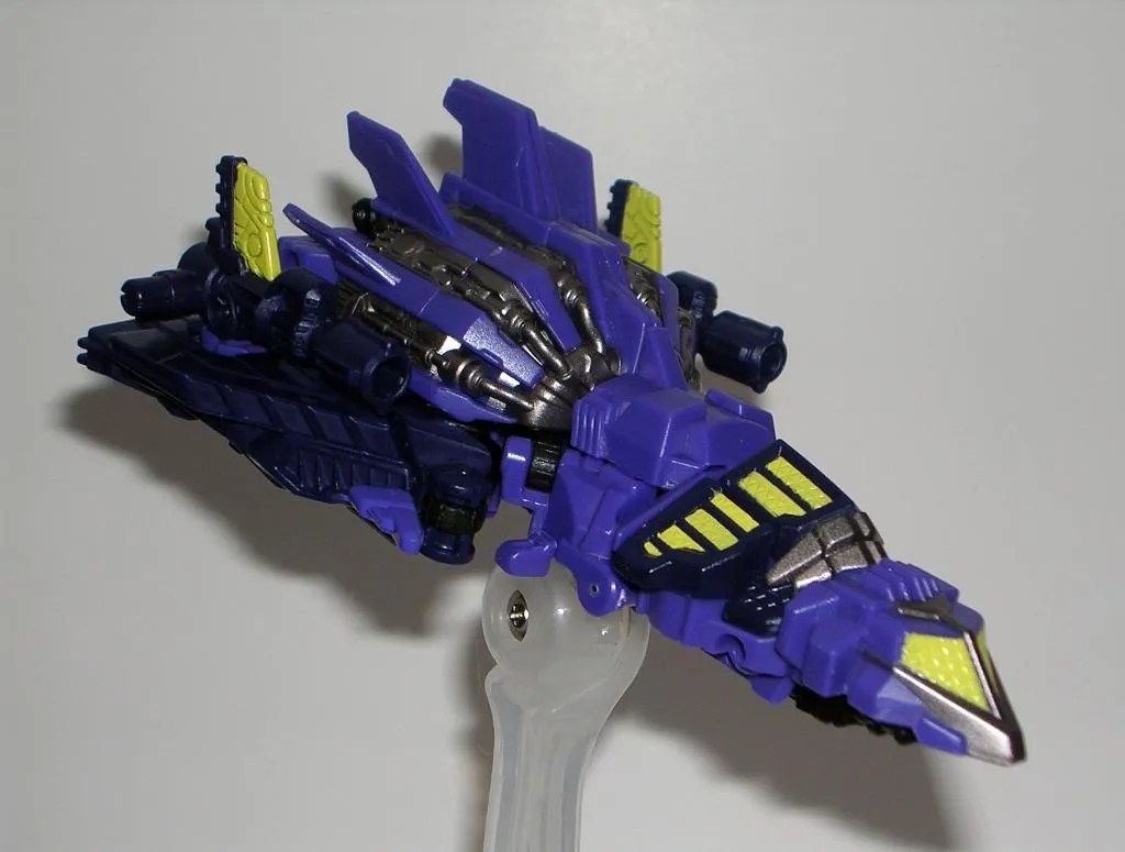
Out of the package, and we see that Unicron is a small Cybertonian tank. My instincts tell me to drop it on the floor and back away in horror, but truth be told, I’m really intrigued by the creativity of this design. Like all the toys from the Cybertron line, Unicron is loaded with awesome sculpted detail right down to the tiny panel lines and circuitry patterns on his armor. Besides looking rather badass, I can’t deny that if Unicron were a Cybertonian tank, this is exactly what he would look like. He has the same orange coloring and his rounded chassis is certainly reminiscent of the hemispheres of his planetary form. He’s still got the skeletal-like spines coming off of his sides, a pair of pincers on the front, and even a jagged opening hatch that looks similar to his planetary mode’s mouth. Part of me wants to see this mode in a different paint job, so I could be less biased, but then there is genuinely so much of Unicron in the design, I don’t think it would work as a different character. You win, Cybertron Unicron alt mode… well played.

Tank Unicron’s main armament is his firing missile cannon, which can be raised and lowered and moves ever so slightly from side to side. He also sports a nice little ball jointed gun. However, being a Cybertron toy, Unicron also comes with his own Cyber Key, which activates his hidden power up weapon. I rarely had much use for the Cyber Key features, but Unicron’s is especially cool because it opens the mouth hatch and reveals a three-barreled assault cannon. Yep… cool!

Transforming Unicron to his robot mode isn’t too bad, but there are a lot of ball joints supporting plates that have a habit of popping off. I also quickly learned to do myself a favor and remove all of the spines before even attempting to convert him. But that’s nothing compared to the task of changing him back into his tank mode. Study the configuration under the vehicle mode carefully, because if you don’t know what you’re doing transforming him is an exercise in tears and recriminations that will likely haunt your dreams for many nights to come.


In robot mode, Unicron looks all kinds of awesome. Just like his tank mode, there are all plenty of nods to the Unicron design that we all know and love. The shoulder designs are lifted directly from Armada Unicron, as are his pointy feet. But the dead giveaway is his head sculpt, which is pretty close to the horned planet gobbler of old, only with a more rictus grin. His missile cannon is placed on his right shoulder, which makes it still perfectly functional as a weapon in robot mode. The hidden Cyber Key-activated hatch makes up his chest, also allowing that weapon to be accessible while in robot mode. You can clip his spines back onto his leg armor to further the classical Unicron look, but they also make really cool weapons when placed into his hands.

The downside of Unicron’s robot mode is the ball joints in his hips and the hinges in his legs have difficulty supporting his upper bulk. He’s prone to fall backwards and those giant wheels on his backpack don’t help things any either. Another issue is while the armor plates on his legs do tab into place, the tabs don’t hold and the armor tends to fall away from his legs when I’m playing around with him, standing him, looking at him, or sneezing while two rooms away.


In the end, I’ve got to confess that this is a very cool figure. The tank and robot modes are both beautiful and very reminiscent of Unicron’s more familiar appearance. The Cybertron toys were always great for their detailed sculpts and wildly imaginative designs, and Unicron here is a perfect example of that. The fiddly nature of the transformation definitely requires patience, and I can’t help but wonder how this figure would have turned out if he were a Voyager or an Ultra Class. I think the transformation would have worked better, but more importantly it would have been easier for me get behind this figure as Unicron if he were bigger. He’s so detailed and complex that I think the mold would have worked fine in the larger scale without much tweaking and I rather think the end result would have been glorious.

Cybertron Unicron can still be had on the secondary market for cheap if you know where to hunt for him. On the other hand, if you want to get fancy, the mold was reissued by Takara in Japan earlier this year as Ark Unicron. The Takara reissues usually feature better paintjobs, but that comes with a price. While the Cybertron version shouldn’t set you back for more than $15 on Ebay, the Takara reissue will be closer to $45 at specialty e-tailers. That’s a lot of energon to fork over for a Deluxe, even if it is Unicron.

Star Trek: “1701 Collector Series” Boxed Set by Playmates

Yes, there are still a ton of Playmates Trek figures sitting on my receivings pile, so I thought I’d knock out the last of the boxed sets before tackling some of the single carded figures. This time, we have a curious conglomeration of three figures in one box, related only because they were previously released in ridiculously low limitations of only 1,701 pieces each. Get it? 1701?? Yes, it’s a clever little production joke, unless you were one of the collectors hoping to buy one of these figures only to discover that they were understandably impossible to find. Well, eventually Playmates submitted to reason and we got all three figures in one convenient and easy to find boxed set.

Playmates’ Star Trek packaging tends to be hit or miss, but I think this box is an overall hit. It’s a tastefully executed window box with the old movie style logo, and that logo happens to be my favorite. The front of the package displays all three figures in a tray with their gear arranged around them. Each set is individually numbered, and look, I got set #1779. How friggin ironic is that? I could never find these figures on the pegs when I wanted them, but when I buy the reissued set, I miss the original production run by only 78 pieces!!!

The back of the package shows each figure displayed with one of their accessories. If you look closely, you can see that Lt. Yar is about to shoot herself with her own phaser. Each figure has their own little file card and pictures indicating what each of their accessories are, because quite frankly, with Playmates it’s sometimes hard to tell.

Let’s start with Captain Picard as featured in the Season Six episode “Tapestries.” The story saw Picard plunged back into his own past by “Q” so that he could relive a slice of his Starfleet Academy days. This is the figure I wanted the most out of the set, not only because “Tapestries” is an excellent episode, but because I adore the movie-style Starfleet Uniform so much. It was a really easy figure for Playmates to churn out as it’s just a kitbash of Picard’s head on the Generations Kirk body. As a result, the figure is technically not screen accurate. Besides being way too chunky to be Picard, he’s depicted with the white collar from the feature films that wasn’t worn under the tunic in “Tapestries.” Personally, I’m happy for the inaccuracy, since I thought the Starfleet tunic looked ridiculous without the collar under it.

Playmates slashed way back on the articulation for the Generations line of figures, so Picard here suffers only the five basic points. You get swivel cuts in the neck, shoulders and hips. That’s it.

Picard comes with an interesting mix of blue recreational Starfleet accessories, which include a drinking glass, a three-dimensional chess board, a dom-jot stick, and a Starfleet duffel bag. I don’t usually get all pissy about Playmates’ accessories because I just assume they’ll be crap, but I was really looking forward to having a halfway decent 3D chess board for my Trek figures. Too bad this thing is all warped (no pun intended!) and useless right out of the box. Picard also comes with a generic Starfleet insignia figure stand.

Next up is Lt. Tasha Yar from the Season Three episode,“Yesterday’s Enterprise” not to be confused with the very common Season Seven single-carded release of Lt. Yar in her Season One uniform. Confused? The Season Seven series finale “All Good Things…” involved flashbacks to events during the very first episode “Encounter at Farpoint” in which Yar was still alive and wearing her Season One uniform. As the good Doctor would say, it’s all timey-wimey kind of stuff. The two figures are practically identical, with the only real differences being this one having a remolded high collar and no tan piping on the pant cuffs. She’s essentially wearing the updated Starfleet uniform design she would have worn if she hadn’t gotten herself killed by the dreaded Tar Monster of Vagra II. It’s a cool figure to have if you want to pretend that Denise Crosby never got too big for her britches and quit the show only to come crawling back later as her own half-Romulan daughter.

Lt. Yar makes out much better than Picard in the articulation department. She has a swivel cut in her neck, her arms rotate at the shoulders, have swivel cuts in the biceps and hinges in the elbows. Her legs rotate at the hips and are hinged at the knees. She can also swivel at the waist. Unfortunately, both of the bicep swivels on my Yar figure are stuck. Sometimes you need to give them a little force, but too much will twist the arms right off at the joint, and that’s what I’m afraid will happen to Yar’s arms if I use any more force.

Yar comes with a mix of new and old Starfleet gear, all cast in a blue-green plastic. You get old movie style hand phaser and tricorder, a pair of isolinear chips, and a Next Generation era hand phaser. You also get a generic figure stand.

And that brings us to Lt. Reginald Barclay as featured in his series-hopping appearance in Star Trek Voyager. The episode was entitled “Projections” and like a lot of Voyager it was a bullshit misdirection of a story that made you long for a time when Star Trek was about exploration, diplomacy, and outer space brinkmanship, as opposed to facing fabricated dilemmas brought about by computer malfunctions. There was nothing clever or entertaining about it, other than the fact that Voyager sucked so much it needed to bring in a cameo by a third-rate character like Barclay to prop it up after less than twenty episodes. What makes it even sadder is that it wasn’t even Barclay, but rather just a fake out like everything else in the episode. Yes, this is a figure based on fake Barclay.

The Barclay figure is a mixed bag. I love Dwight Schultz as much as the next guy, but this figure’s Jiffy Pop head makes it look like it’s based on Schultz playing Hector Hammond in a Starfleet Uniform. And while on paper that sounds kind of awesome, it doesn’t work so well for the figure. But Playmates Trek figures always were stylized portraits of the characters, so I’m probably being a little too hard on Reg here. My figure does, however, have a pretty unfortunate paint gash on his right shoulder. Barclay is based on Playmates’ Voyager body, which represented the pinnacle of articulation in the Trek line. That means that he has all the same articulation as Lt. Yar, and most other Next Gen figures, only with additional swivel cuts in the thighs.

Set phasers to sarcasm, “Hurray for purple Starfleet gear!” Yes, Barclay comes with an array of accessories all cast in glaringly inappropriate purple plastic. You get a computer terminal, a PADD, a medical tricorder and a phaser. You also get a figure stand based off of the Voyager style comm badge.

There’s no doubt about this set being geared toward the real collectors out there. I wouldn’t consider any of these “must own” figures for anyone other than the real completists or Trek-obsessed nut jobs like myself. But even I would never have shelled out collector prices for any of these figures back when they were actually rare. But now, thanks to the miracle of reissues, what were once individually very expensive figures set me back a mere ten bucks for all three. It’s a fine example of the fact that a lot of times figures are prohibitively expensive just because they’re rare and not because they’re anything special. “Tapestries” Picard is certainly the most interesting figure to me. He’s a cool one-off and I wish head swaps were easier on these figures as I’d like to take Playmates’ Cadet Picard’s head and put him on this body. Yar is an interesting enough curiosity, but I was perfectly content with my Season Seven/Season One version. As for Barclay… well, he’s Barclay. I didn’t already own a figure of the character, but I’d much rather have him in his regular Next Gen Starfleet uniform as opposed to his one-off fake appearance in a shitty Voyager episode. But, at least he’s another Starfleet Officer to add to my Voyager shelf. In the end, I bought this set mostly as an inexpensive curiosity, and I’ll likely keep these figures boxed, rather than integrate them with the rest of my Playmates collection.

Marvel: Bishoujo X-23 Statue by Kotobukiya

Today’s item was one of those rare instances where I heard that Koto was doing the statue before I actually saw the prototype. My first thoughts were that they overreached with this one. There are plenty of Marvel ladies that are well suited to this line, but Laura Kinney’s history features some hardcore shit and her character is built on a foundation of pain, suffering, and tragedy. Could Koto and Shunya Yamashita successfully pull this one off and give X-23 the cutesy bishoujo makeover? Let’s find out…

x23bish8

If you own any of these Koto statues, then you know what to expect from the packaging. X-23 comes in a white window box adorned only with some examples of the original character art and some shots of the statue on the back. The box is shorter than many of these usual packages to conform to the statue’s crouching posture. You can get a pretty good look at the goods through the window, but as always, parts of the statue are wrapped in protective plastic and nestled between two clear plastic trays, so you can’t really get the full experience until you remove her from the box.

x23bish9

Before getting to the statue, here’s a word of warning: X-23’s claws are pegged into sockets and they can fall out, probably so that if they are stressed they will detach rather than break. Two of my statue’s claws fell off while taking her out of the package. I didn’t realize it and thought I was dealing with a QC issue of missing claws. Fortunately, a little search of the carpet turned them up before FigureFeline could snatch them and carry them off to his bottomless lair of plunder behind the sofa. Apart from the removable claws, the only other thing you need to do is plug the statue into the base. Doing so required me to stretch out her legs a bit so that each of her feet wound up in the appropriate place on the stand. It was a little more effort than is usually required with these statues, but all worked out fine in the end.

x23bish6


As mentioned, X-23 is posed down on one knee. She’s the same scale as any of the other recent statues in this line and she has a satisfying heft to her, but her posture makes the statue a lot shorter than most.  I think it’s a great pose for the character as it manages to convey a little poise and action at the same time. She has all four of her knuckle claws extended. Her left claws are touching the ground, while her right hand is cocked at the elbow and ready to strike. Her right foot has its claw extending from her boot. She looks like she might be recovering from a strike and getting ready to pounce back into action again.

x23bish2

x23bish3

Moving on to the details… let’s start with the head. X-23 is an interesting statue because rather than going for overall cheesecake, most of the cutesy element is confined from her neck up. I think the sculptor did as good a job as possible melding the spirit of the Bishoujo line with X-23’s character, which in itself was no easy task. That having been said, something was definitely lost between the original artwork and the final sculpted effort.  For starters, the artwork featured eyes with more personality and character, whereas the final product’s eyes have more of a generic anime look. The artwork also featured an interesting little smirk on her lips and the final went with more of a cutesy little smile. Ultimately, I see more of X-23’s attitude in Shunya Yamashita’s art than I do in the statue; nonetheless what’s here is still plenty good. X-23’s hair is sculpted in a nice, dynamic wind-blown fashion and features that cool translucent effect at the edges.

x23bish4

x23bish5

From the neck down, it’s hard to argue with anything this statue offers. X-23 is wearing skin-tight black pants, high, chunky boots, and a black sports bra-looking affair. The black finish on her clothes varies from matte on her boots and kneepads to high gloss for her top, pants, and sleeves, and all of it contrasts beautifully with her light skin tone. She has excellent sculpted detail in her abs, and I love the way her shoulders hunch up suggestively. Other great little touches include the silver skull emblems and individual buckles, along with the intricate treads on her boots, the medallion hanging from her choker, and her gilt chain belt.

x23bish6

X-23’s base isn’t one of the more intricate designs we’ve seen in the line. It’s a simple grey circle designed to look and feel like concrete. It’s a wonderfully rough and realistic texture that balances out the soft leather and skin of the figure itself.

x23bish7

While it may sound like I had issues with this statue, I still think X-23 is another solid effort by Koto and I’m very satisfied to have her in my collection. Keep in mind, I’m not a hardcore fan of the character, but rather a casual fan by way of my love of all things X-Men. My guess is that this statue will be better received by Bishoujo collectors rather than diehard fans of the character, finding themselves considering a place for it in their X-23 collection. But then I could be completely off base on that. She’s been available for a little while now, and set me back about $50 shipped. It wouldn’t feel like a Bishoujo feature without me mentioning how I think these are some of the best valued statues on the market… and hey, I just did!

Transformers Fall of Cybertron: Blast Off by Hasbro

Yesterday’s Lego set was a brand new purchase, so it didn’t help me weed out the receivings pile that has been growing ever larger over the last couple of weeks. In an effort to start chipping away at that, we’re going to delve into some Transformers. Later in the week I’m going to check out an older one from the Cybertron line, but today’s feature is one that should be showing up on the pegs by now. It’s another Combaticon from the Fall of Cyberton game. A game, I might add, which I still haven’t finished because my Xbox is still lying in pieces on a desk in my spare room.


Ah, the new Generations packaging. I never tire of admiring its beauty. But we’ve looked at it more than a few times now, so I’ll try not to dwell on it. Blast Off comes carded in his robot form and the package points out in various ways that he is but one component in your quest to… BUILD GIANT ROBOT!!! Delightful! You get a pretty cool little bio on the back along with the welcome return of Tech Specs. As usual, I’m going to start with Blast Off’s alt mode.

Awww, yeah. Now that’s a cool alt mode! Blast Off pays homage to his G1 roots with a purple space shuttle as his vehicle mode. Of course, he’s a Cybertronian shuttle. But, “FigureFan, that makes no sense. Blast Off was created on Earth by Starscream so he shouldn’t even have a Cybertronian mode.” Well, my friend… Firstly, Blast Off was given a new body on Earth, but his Spark (or whatever they called it in G1) was stolen from Cybertron to give him that new body. Obviously he had another body before his Spark was imprisoned on Cybertron, so maybe this is his original body. Secondly, Blast Off’s new body was a derelict WWII fighter that miraculously turned into a space shuttle, so this is all bullshit anyway. May I proceed?

I absolutely love this shuttle design. It has the vague profile of an Earth-type Space Shuttle, but it’s beefier and obviously built for combat. The detailing in the silver engines is really striking for a Deluxe Class figure and makes this thing looks like it’s ridiculously overpowered. I’d like to imagine it leaves a trail of thick, black exhaust fumes wherever it goes. Everything about Blast Off’s hull looks jagged, like he was made to inflict pain and destruction.

The coloring is almost perfect. The traditional Decepticon purple looks great with the black accents and the silver-grey of the exposed engine. I’m not terribly keen on the fluorescent yellow. It’s bright and gaudy and while I think it would have worked ok for just the window area, I don’t like it at all on the weapons. If Hasbro had just toned down the yellow a bit, I would have had zero complaints.

Blast Off has a pair of detachable weapons that are very reminiscent to the weapons of the G1 toy. You can clip them onto his wings in two different configurations. One way gives him extra tail fins on his wings, the other way extends his wing tips just a bit. Either way you clip them on, they provide him with some serious wing-mounted cannons.


Transforming Blast Off is fairly simple and when you’re done you one very cool looking Decepticon warrior. He has good proportions and, like his shuttle mode, he’s brimming with sculpted detail. He doesn’t really have any feet, and while he stands just fine, I think some actual feet would have complemented his aesthetics quite a bit. I do love the way his giant engines form his shoulder armor, they give him a powerful, linebacker kind of look. Or maybe he’s cosplaying World of Warcraft. The head sculpt includes two beady yellow eyes and a mouth plate. I can’t say as I remember his G1 headsculpt all that well, so I won’t comment on the homage. You have a few options on what to do with his wing cannons. He can hold them like guns, or you could clip them onto his arms two different ways.


So where’s the problem? The problem is with articulation and the design of Blast Off’s arms and shoulders. While the shoulders do peg in during transformation, they still float around on a ball joint. When you articulate the arms at the shoulder, the entire shoulder plate has to move with it and I can’t help think how much better Blast Off would have been if the shoulders remained static while the arm moved. It also inhibits the arm’s articulation a lot and will pop out if you try to over articulate it in the slightest. The legs feature ball joints at the hips, swivels in the thighs, and hinges in the ankles, which is all very good in theory, and yet the legs still feel kind of stiff. I think it’s because there are no feet.


Blast Off and Onslaught really have a lot in common. Both are amazing looking figures, but have some serious design flaws in their arms. And like Onslaught, I’m going to give Blast Off a pass despite his design shortcomings. His shuttle mode is one of my favorite Transformers alt modes in a long while and his robot mode is no slouch either. The toy is packed with great coloring and superbly sculpted detail, making him feel like Hasbro actually put about fifteen bucks worth of love into this figure. Alas, the design of the shoulders and the overall articulation make him not all that much fun to play with in robot mode. I’m sure a lot of this has to do with having that third alt mode (i.e. Bruticus’ right arm), but it definitely detracts from him as a stand-alone figure. Still, I have no regrets having picked him up.

Star Wars: Desert Skiff (#9496) by Lego

I’ve been hankering to build a new Lego set for a while now and while I tell myself I went down to the Wally World to get some provisions for the week, it was really to scope out the Lego aisle and see if I could get into any trouble. Normally, getting Lego sets this time of year can be slim pickings, but they had all the new Hobbit sets and some other odds and ends. The Lord of the Rings “Mines of Moiria” set was really tempting, but I really didn’t want to drop a lot of money, as besides the usual Holiday spending, I have a number of pre-orders scheduled to hit my bank account any week now. In the end, I did something I swore I’d never do… I got a Star Wars Lego set. Star Wars was the only line with some good looking low-to-medium sized sets on the shelf, and since I’ve already expressed my love for the Tattooine Desert Skiff a little while back, it should be no surprise that was the set I ended up with.


There’s the box. It’s got a landscape orientation to it with a shot of the completed set on the front and back and various panels to show the goodies that are included. It’s also got Darth Maul’s ugly mug on the right corner. Are we back to putting his face on everything again just because he came back for Clone Wars? That’s apparently the case, because they’ve even got his face on every other page of the instruction book. Blah! Inside the box you get the usual instruction booklet, three loose long bricks, and three numbered baggies containing a total of 213 pieces. The pieces build the Skiff vehicle, the Sarlaac and four minifigs. As always, we’ll start with the minifigs.

I don’t envy Lego trying to decide which four minifigs to go with in this set. There were lots and lots of options and whoever they went with, the roster was inevitably going to feel incomplete. In the end, they decided on Jedi Luke, Lando in Skiff Guard Disguise, Boba Fett, and Kithaba… Wait, Kithaba? Really, Lego? We couldn’t get a Weequay? I wanted a Weequay. Boo! But, hey… Boba Fett! I’m sure he’s been done a billion times, but since this is my very first Star Wars Lego set, I’m glad to have him. Let’s check out the good guys first…

Luke is nothing special, but then he didn’t really need to be. He’s got a black body with the robes printed on the torso. The head and hair are unremarkable, and he only has one printed face. I do dig his lightsaber, though, and he’s a competent enough minifig. Lando is a little more exciting. Lego did an awesome job with his helmet and pike. Unfortunately, he lacks a hair piece, so you can’t really display him sans helmet, but that omission is the only flaw in an otherwise excellent minifig.


Moving on to the pair of scum and villainy, we’ve got Kithaba and Boba Fett. I don’t have a lot to say about Kithaba. He’s ok. He’s got nice, bright red pants and a dewrag for his head. His printed face is good and he comes with a little holdout blaster. Boba, on the other hand, well he’s the man, and he’s downright awesome. Besides the printing on the body recreating his armor, he has his trademark jetpack and half-cape, sash, thingie. His helmet is amazing and it fits over a head with a printed unshaven face. The targeting arm clips into the helmet and can rotate. It looks a little big, but if it were any smaller it would get lost too easy. Lego generously provided four of the arms as replacements, because chances are you’ll lose this one too.


Let’s get the Sarlaac out of the way first because I’m not all that crazy about it. It was a nice bonus to round out the set from a play-ability standpoint, but I really hate the Special Edition version of the Sarlaac and this Lego interpretation kind of looks like Audrey II in a kiddie pool. I’m probably being way too hard on it. It does have a pair of poseable tentacles and the mouth does open up and you can fit a minifig inside it. I think a lot of my criticism of the Sarlaac doubles back to my feeling that this set should have been bigger, but I’ll come back to that thought later.


The Skiff is excellent. At first, I thought it would be undersized, but it seems to be scaled pretty well to the minifigs, particularly when I compare the way the Kenner/Hasbro toy was scaled to the 3 ¾” figures. The Skiff was a fun build, and hits all the major design points of the original vehicle model. It holds together really well (despite the fact that you can see a loose brick in my pictures) and comes with three short, clear pylons for it to stand on and give it a levitating look. You can also string them all together for one really tall, albeit precarious, stand. I really like the overall two-tone brown and tan color scheme as it’s suggestive of an animated version of the likes you might have seen in the old Droids cartoon.

The Skiff includes a couple of cool play features too. The box on the deck opens up to store weapons (two bonus holdout blasters are included), the rear rudders are completely articulated, and the gangplank swings out from one side. And no, I’m not going to bitch that it just doesn’t slide straight out, because obviously sacrifices had to be made. You have a pilot station on the back for Kithaba to stand and work the controls. I also really dig the little flick-firing missile launcher mounted under the vehicle. It’s a nice little added design bonus.

At $24.99, I think this is one of the better priced Lego sets I’ve picked up in a while and with all the Holiday sales going on, you can probably even do a little better on the price if you hunt around. The four minifigs and the great vehicle make me happy enough with the purchase, so the Sarlaac is just gravy. The set is a good enough value that I may wind up grabbing a second so that I can have two skiffs and an extra Kithaba and then trade away the figures and Sarlaac.

Truth be told, I’ve been admiring a lot of the recent Star Wars Lego sets, so I think today’s purchase was inevitable and I’m pretty sure  it will end up being some kind of gateway floodgate. As Obi-Wan said, “Let’s go! You’ve taken your first step into a larger world… a world where you sign away even more of your monies to some company in Denmark.” Or something like that. As for today’s set, I honestly wish Lego had gone a little bigger on this one. It’s not that the Skiff feels undersized, but they could have gone for two skiffs, more minifigs, and a larger Sarlaac base. As it stands, though, it is a fine set. You get everything you need to have a battle and while I still can’t approve of the “Audrey II” style Sarlaac, Lego did the Desert Skiff proud with this model.

Watchmen Series 1: Modern Nite Owl by DC Direct

Ok, so I had originally planned on being back yesterday with a look at Modern Nite Owl, but I got a little tripped up for time, (surprisingly enough alcohol wasn’t involved) so Watchmen Week is spilling out into one more day. I was probably going to just take today off anyway, so everything worked out for the best. So let’s press on. The Doomsday Clock is just about up and I really want to put this week to bed…

Here’s our last look at DC Direct’s brilliant Watchmen packaging. Brilliant or not, after a week of the same packaging, I’ve got nothing else to say. Which is good, because I also completely forgot to take a picture of the boxed figure before taking out the trash (this time, alcohol was involved). Nonetheless, if you’re hankering to see one more boxed Watchmen figure, you’ll get your wish at the end of today’s feature.


In the film, Nite Owl’s character design went in a similar direction to Ozymandias. The costume favors some level of realism over dynamic design and in the end you get something pretty simple and serviceable not unlike a modern Batman motif only with owls (What? A guy can dress like a bat, but not an owl?).That’s not a criticism, mind you, the new outfit design worked really well on screen and as it turns out DC Direct crafted it into one great looking figure.

The tiny scale patterned texture on the suit really makes Nite Owl stand out and it’s rather reminiscent of chain mail armor. It’s also easily my favorite thing about this figure. The sculpted striping and reinforced portions of the suit’s design give him a decidedly Art Deco vibe. The cowl is layered on the figure as a separate piece of plastic and meshes with the pliable, soft plastic cape very nicely. The head sculpt is as solid as it gets, with excellent detailing on the hood and what you can see of the face offers an appropriately stoic expression. The impressive sculpt is rounded out with some exceptionally nice paintwork with a two-tone coppery finish that really ties the whole figure together. For a guy in an owl themed suit, this figure turned out pretty majestic looking and even downright artistic.

Nite Owl’s articulation offers the best we can expect from this line. The neck and shoulders are ball jointed, the arms feature hinged elbows and swivels in the wrists. The legs have a standard “T” at the hips and hinges in the knees. It’s also worth noting that his crescent boomerang is removable from the belt (it just pegs in) although DCD didn’t have the foresight to put a peg hole in his palm, so he really can’t hold it all that well. Bummer!


Had DC Direct decided to phone this guy in, Nite Owl could have turned out looking mighty bland. Instead they went above and beyond with some beautiful, detailed texturing in the sculpt, great looking paint, and solid articulation. I think I recall saying the same thing about Dr. Manhattan, but it rings true here as well. He’s certainly one of my favorite figures in the line and that’s saying a lot. If you discount the inconsistent articulation, DCD’s line of Watchmen figures is an all-around fantastic set. They display wonderfully on my shelf and the extra variant figures are a really nice bonus.

And yes, folks, I realize that I did leave one figure out this week: The exclusive variant of The Comedian. Since I already featured the regular version of Comedian a while back, in that incredibly lazy link at the beginning of the week, I didn’t really see the need to revisit the whole figure just for the sake of the younger, unmasked variant head, but just to be complete, I’ll leave you with a shot of that figure in package.


Phew… that was a long week and it’s time for me to hit snooze on the Doomsday Clock and go back to bed. I have a couple more themed weeks planned for December, but next week is just going to be a little bit of everything as I try to clear out some of the things still kicking around on my receivings pile.

I’ll see y’all tomorrow with a little Lego action…

Watchmen Series 2: Classic Nite Owl by DC Direct

One of the things I sometimes regret not collecting was that line of DC Origins two-packs by DC Direct. The idea of getting a classic and modern version of the same character in one package really appeals to the inner historian in me. That’s kind of like what we have here with the Classic and Modern versions of Nite Owl. Granted some of the appeal is lost by the fact that Classic Nite Owl was created for the very same funnybook as Modern Nite Owl, so there’s no real history there, but I still think having both as figures is kind of neat.

Hopefully, I’ve established my love for the Watchmen packaging by now. Classic Nite Owl comes in the same peg-friendly window box that we’ve been seeing all week. His stand is not secured to the back insert, so that gives you one more undamaged backdrop display for your figures. Otherwise, there’s nothing new to be said.


So here’s my dilemma with Classic Nite Owl. On the one hand, I am not a big fan of his costume design. On the other hand, this figure represents an especially nicely sculpted and faithful reproduction of that design. So, let me get my personal feelings on the aesthetics out of the way. I get that this is supposed to be a vintage costume, but even with my love of retro Sci-Fi and Superheroes, this get-up just doesn’t work for me. It’s hard to take him seriously in those goofy yellow shorts, and his tunic just reminds me of a polo shirt. I do, however, like the owl-styled aviation cap, and the boots and gauntlets are fine. He even has one of his crescent boomerangs tucked into his belt. I get that the art designers were going for a certain cheese factor with the older characters, but so many of the other costumes look good, I just think Classic Nite Owl looks out of place.


Now, with all that having been said, the execution of the figure is top notch. The sculpted detail on his tunic is fantastic. You can see every last stitch, and I love the way the “fabric” bunches and pulls in all the right places. The head sculpt is also great, and again you can see all the little stitches in the flight helmet and the eye mask is sculpted, rather than just painted on. The figure sports a pretty basic color scheme, with the tunic, eye mask, and cap all grey and with yellow fringe and matching yellow shorts. The boots and gauntlets feature matte paint to give them a sweet, burnished leather look, and the flesh tone is all clean and free of splotches. From design to figure, there’s really nothing to complain about here at all.

Spinning DC Direct’s Wheel of Articulation, we find that Classic Nite Owl hit the jackpot. His neck isn’t ball jointed, but that’s because high belted collar. The head does, however, turn side to side. His arms feature ball joints in the shoulders, hinges in the shoulders, and swivels in both the biceps and the forearms. His legs feature a standard “T” in the hips and hinges in the knees. The sculpting on the tunic inhibits the shoulder articulation a bit, but still… not bad.

And that’s Classic Nite Owl. If you dig the costume, you’ll get a lot more mileage out of this figure than I do. But even with my lackluster feelings toward the character design, I still can’t deny this is one of the better efforts in the line, he’s close to the original Silk Spectre in terms of the amount of love DCD seemed to pour into him. You get a great sculpt, solid paint work, and decent articulation for the line.

I’ll check back later on tonight to wrap things up with Modern Nite Owl.

Watchmen Series 1: Ozymandias by DC Direct

Sorry if I popped a gasket yesterday. It was a long day and coming back later to be so disappointed by Silk Spectre II after being rather impressed by her mom… well, it really put a damper on my evening. I’m back, refreshed with a couple pre-emptive belts of Jameson to steady my nerves, and ready to tear open the next figure in DC Direct’s Watchmen line. Today I’m limiting myself to only one, and he doesn’t even have a variant, so hopefully things will go a little more smoothly as we take a look at Ozymandias. I don’t have a hell of a lot to say about this figure, so we should be able to get through today pretty quickly.

Once again, here is a look at the Watchmen packaging. Let’s take a moment together to bask in its beautiful deco, its collector friendly design, and its uncanny ability to stand on the shelf or hang on the peg. It is the alpha and omega of action figure packaging, and I’m about to shred it to pieces to get to my toy inside.


In terms of character design, the film version of Ozymandias, as wonderfully played by Matthew Goode, was quite a departure from the Ozymandias we saw in the panels of the Watchmen funnybooks. While the fanboy in me originally raged against many of these changes, I can certainly see why the designers went with this more modern look to assist with mass audience consumption, so I don’t begrudge them this change at all. What’s here isn’t the most exciting character design, but it’s more practical and probably far better suited to the action figure treatment than his comic garments.

Gone are the primary colors, replaced by a far more subdued, yet still snazzy looking coppery-bronze armor. I was pleasantly surprised the film designers didn’t go more overboard Egyptian on his motif. As it stands all we get is a very subtle Eye of Horus style emblem on his belt. The rest of Ozy’s costume features a basic muscle-sculpted body suit with armor reinforced around the shoulders, gauntlets and boots. He also sports a standard soft, pliable plastic cape. There’s a little shimmer to the paintwork, which helps keep the figure stride the line between being too gaudy.

Ozy’s portrait is pretty solid, if not remarkable. The likeness to Goode is definitely there. The headband and eye mask are both sculpted as well as painted, and while there’s a wee bit of slop around the flesh paint, it’s nothing bad enough to bother me. All in all, this is a competent job on the head, DCD.

Oh, looky here… Ozymandias apparently hit the jackpot while spinning DC Direct’s Wheel of Articulation. He came away with ball joints in the neck and shoulders, hinges in the elbows and knees, swivel cuts in the wrists, and a standard “T” joint at the hips. You won’t get him into any crazy action poses, but there’s enough serviceable articulation here to work with.

Ozy’s redesign wasn’t the most exciting thing to work with, but what’s here is certainly well executed. He’s a good looking figure with decent articulation for this line. As always, the figure stand is a nice bonus even if he can stand fine on his own, but what’s really missing is a little Bubastis figure to put beside him. It wouldn’t have taken up much more plastic than Dr. Manhattan’s legs and a static piece would have been fine. On the other hand, Bubastis didn’t exactly play a large part in the film, so I guess I can understand leaving him out.

And that’s another Watchmen figure in the bag. I should be able to wrap up everything tomorrow with a look at both Classic and Modern Nite Owl.

Watchmen Series 1: Silk Spectre II by DC Direct

Here I am, back as promised, to take a gander at the second lady of The Watchmen: It’s Silk Spectre II (aka Laurie Juspeczyk). Wow, I am torn on this figure. Let’s dig right in and see why…

There’s the packaging. Laurie looks awesome displayed in this wonderful window box, but there’s nothing here different from the other Series 1 figure packaging, so there’s not a lot new to talk about. Moving on…


Silk Spectre represents a great combination of solid sculpt and excellent paintwork for the body, and some passable work for the head. The portrait isn’t perfect, but it’s a lot closer to the lovely Malin Akerman than the original Spectre figure was to Carla Gugino. Still, likeness aside, I don’t think the quality of the sculpt and paint live up to the previous figure. I think the big sticking point for me is that the paint on the eyes just looks rather cartoonish to me. Her long, straight hair is executed pretty well, but renders her head articulation almost useless. What’s here for the portrait certainly isn’t at all bad, but it’s just not amazing.

The body on the other hand is great, and I mean that in more ways than one! Yes, DC Direct captured Spectre’s feminine form quite well, but they also really knocked the outfit right out of the park. The mix of matte yellow and high-gloss black used for her costume is clean and spot-on to the source material. The fine silver paintwork on the zipper is impressive for a figure in this scale and price range, and really ties everything together. All the lines along the components of her outfit are actually sculpted to give the figure a nice layered look and add a lot of credibility to the appearance of her costume. Spectre is sculpted standing with her hands clenched into fists and her posture is ram-rod straight. And that, my friends, leads us to her articulation…

Let’s not mince words: Silk Spectre’s articulation sucks and there’s no reason for it. I could somewhat forgive Rorschach because he had the trench coat, but there’s no reason for Laurie here to have less articulation than her mother. Here’s what you get: A ball jointed neck, ball jointed shoulders, hinges in the elbows, and swivel cuts in the thighs. That’s it! The head and arms are about on par with the rest of the figures, so I won’t complain much about them, but where’s the “T” joint in the hips? Where are the hinges in the knees? What the fuck is the point of the swivels in the thighs??? When you tweak them even one jot and she can’t stand and her feet don’t look natural in any other position. Besides, every other figure in this line is sporting some ability to adopt something of a trademark pose, while Laurie here just stands at attention. Why, DC Direct? What happened here? Did you just spin a giant wheel to randomly decide which figure gets blessed with articulation and which gets cheated? Oh, holy hell, I need a belt of Jameson.

If I had opened Silk Spectre II right after opening Rorschach, I think I would have been a lot less disappointed. But after finding decent enough articulation on Comedian, Dr. Manhattan, and the original Silk Spectre, I really got my hopes up that Rorschach was an exception that was hampered because of his trench coat. The truth is Laurie looks really good on the shelf, flanked by her fellow Watchmen, but there’s just no excuse for DC Direct limiting her articulation as much as they did and that makes her all the more frustrating a figure. Scratch that, she’s not a figure… she’s a semi-articulated statue, and if I’m going to display a statue on my shelf, I’d rather have something a lot more dynamic looking than the way she turned out. Damn you, DCD, you were doing so well and now this!

I’m going to go off and drink heavily collect my thoughts and tomorrow, we’re going to move on to the smarty-pants villain of the piece… Ozymandias.

Watchmen Series 2: Silk Spectre by DC Direct

Wow, it’s Thursday already! The Doomsday Clock is still counting down and I’ve still got a lot of figures to look at this week, so I better get my ass in gear. Today I’m cramming two figures into one day because I really want to get through all of the Watchmen figures by Saturday, so we can move on to other things. Let’s start out with the original Silk Spectre, aka Sally Jupiter, and later today we’ll move on to Silk Spectre II, aka Laurie Juspeczyk. I can’t say as I’ve ever looked at figures based off mom and daughter superheroes before, and I blame that solely on the fact that nobody made decent Incredibles figures. Yeah, I’m still bitter about that. But I digress… let’s go!

Since we’ve already seen DC Direct’s Watchmen packaging and I’ve got to cover two different figures today, let’s not spend a lot of time on the boxes. Suffice it to say, I love everything about the in-package presentation. DC Direct didn’t stand on chronological ceremony and so the original Silk Spectre wasn’t released until Series 2. On the other hand, DC Direct was kind enough to give us Sally Jupiter in her prime and in her superhero garb, as opposed to a figure of her older self in a bathrobe quaffing down tumblers of gin. Good call, DCD! I have a weird affinity for 50’s style superhero and science fiction designs, toss in a pretty lady and this figure really scratches my itch. But before we get into the costume, let’s talk portraits…

The original Silk Spectre was played by Carla Gugino. I honestly don’t see a lot of her in this head sculpt. The mouth is too small and the face isn’t rounded enough. Now, setting likeness aside, this figure still sports a drop dead gorgeous head sculpt. The face is beautiful and it features immaculate, potentially perfect, paint apps, all capped off with a really great vintage style hairdo. I suppose if you have a real attachment to the actress, the lack of likeness may be a sticking point, but I’m just so pleased with how great the head looks, I’m willing to be all sorts of forgiving on this point. Seriously, DCD, bravo on this one, as far as head sculpts go, this one is an absolute homerun and quite possibly one of your best efforts.


The rest of the figure is spot-on right down to her glorious example of 50’s cheesecake costuming. The dress is sculpted with realistic pleating and the skirt bellows up in the back to give a nice glimpse of her tushie. The yellow paint apps on the dress are darkened to make it look like her black undergarments are showing through. It’s a nice effort, but I don’t think it works quite as well as the designers’ hoped. The rest of the figure’s paint looks great. Painted skin tone often shoes up as dirty and smudged when it isn’t executed right, but that clearly isn’t a problem here. They also used a beautiful high-gloss black for the glove over her right arm.


Sally’s stockings and high heeled boots are a mix of sculpting, more high-gloss black paint, and the old mixed-media fishnets that DCD and Mattel like to use on some of their DC ladies. While the fishnets still have the problem of unsightly bunching on the back, the limited use of them here make them work a lot better than on previous efforts like Zatanna or Black Canary. In fact, this is easily the best execution of this stockings approach I’ve seen on a figure yet.

Silky-1 sports solid, albeit not super, articulation. Her neck is ball jointed, which allows for a decent amount of movement for her pretty head. Her arms rotate at the shoulders and are hinged at the elbows. She has a swivel cut in her left wrist, but oddly enough not in the right. Her legs feature a standard “T” in the hips and hinges in the knees. The sculpted skirt inhibits her forward leg movement at the hips pretty badly, but there’s just enough poseability here to give you a limited  variety of display options, but the figure really screams for some swivel cuts in the biceps and thighs. Close… oh, so close. Her articulation allows her to stand perfectly fine on her own, although she does come with the same gantry-style figure stand as the other figures.

In case you haven’t guessed, I am totally digging on this figure. She’s a beautifully crafted effort on DCD’s part, especially since she’s based on a character that doesn’t have a huge amount of screen time compared to the others in the line. One might not expect her vintage looks to hold up in action figure form, but the end result is one sexy piece of pin-up style plastic. Sure, the likeness isn’t there, and I understand that’s going to put off some collectors, but I’m still so very  enamored with the end result, I just don’t care.

I’ll be back later tonight to see how well Sally’s daughter fares with Silk Spectre II.