DC Icons: (#14) The Joker by DC Collectibles

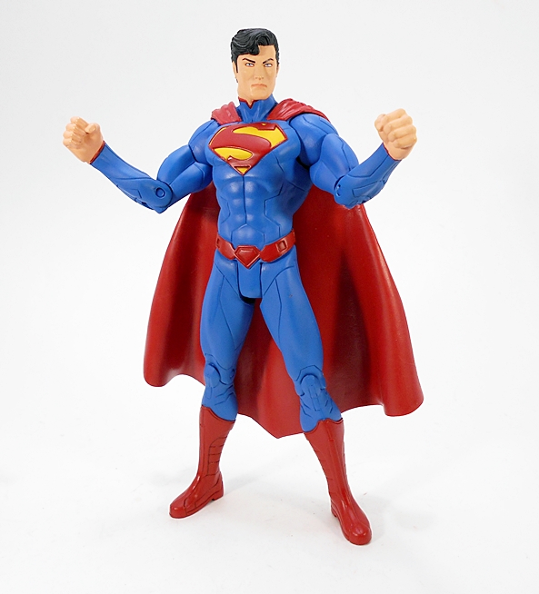
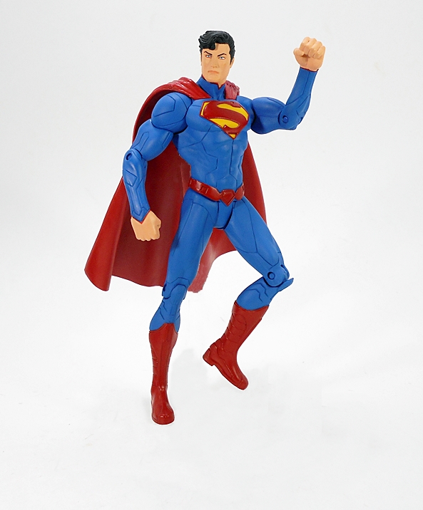
DC Collectibles is ramping up their DC Icons line to epic proportions in 2017 (seriously, there are a ton of these things coming out!), but for now, 2016 has been experiencing some delays in the last two waves. And yet, here we have The Joker from “A Death in the Family.” I don’t know what the deal was with him, but he slipped out to online retailers about a month before his wave was due to hit the pegs. I was going to wait and pick up the whole shebang when it shipped, but in the end, I just couldn’t resist getting him early.

dcijok1

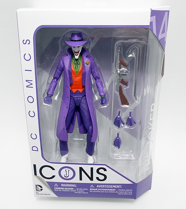
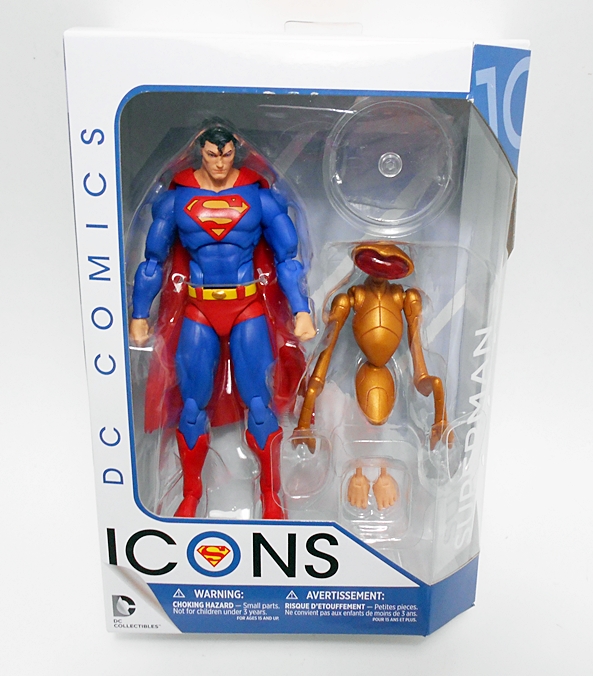
The package design is exactly the same as what we’ve been seeing all along. You get a nice, clean window box with a spiffy angled edge. The side panel has the figure’s name, number, and the source comic he’s based on. Everything is collector friendly and if space wasn’t such an issue, I’d certainly be keeping these packages. Sadly, they have to go to make room for more figures. So, let’s get him out of the box and check him out!

dcijok2

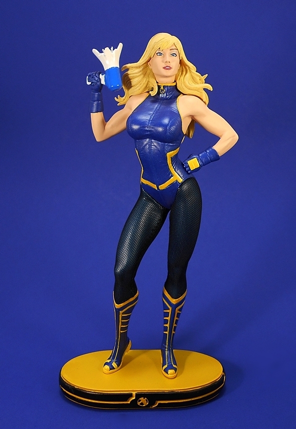
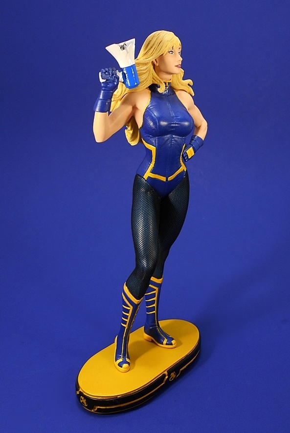
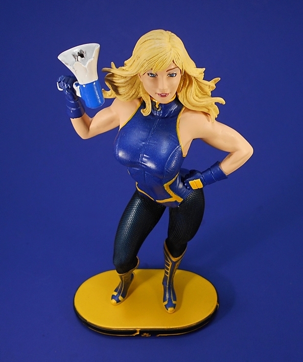
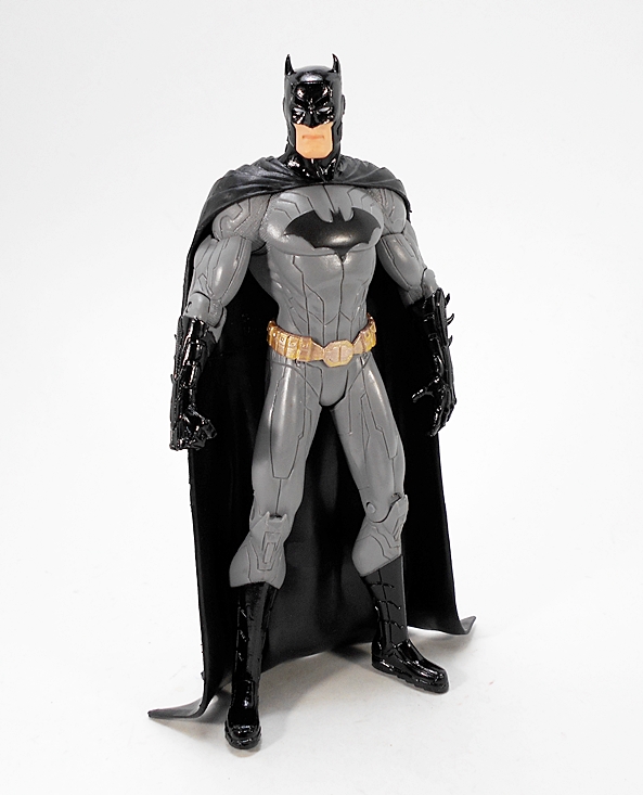
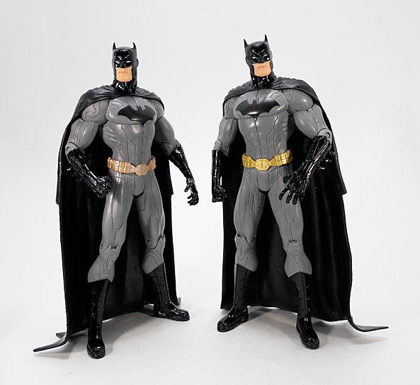
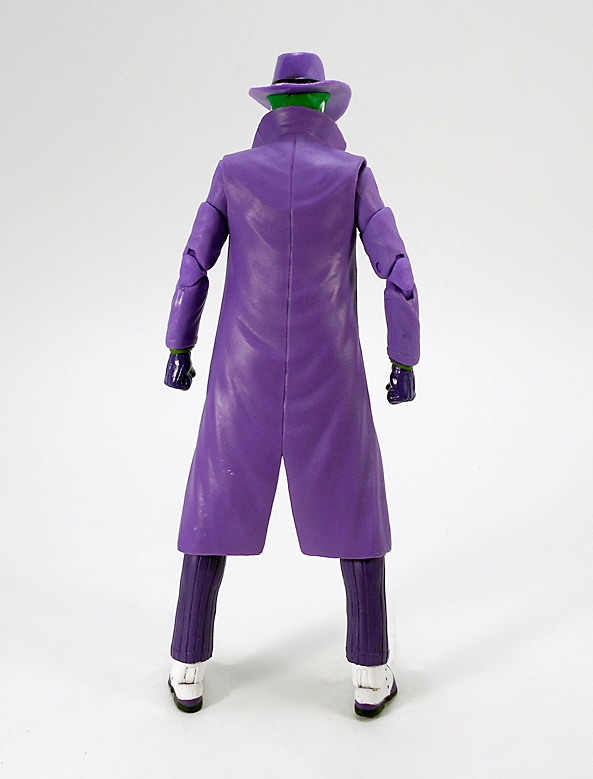
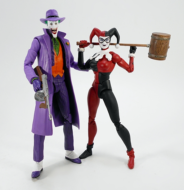
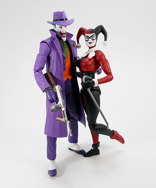
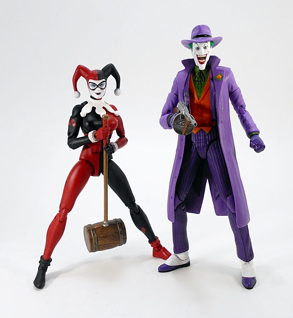
Damn, I love the look of this version. For a character that has spanned comics, cartoons, TV and film, it would be impossible for me to pick a favorite incarnation of The Joker, so many of them have their merits. I could definitely pick a least favorite, but why pour gasoline on that fire? With that having been said, this figure takes some of my all time favorite elements of the character and blends them together into a why-so-seriously great look. The purple high collared trench coat, the pimp hat, orange waistcoat, striped trousers, and spats is the epitome of Joker outfits for me, and I particularly love the long and lanky body that this guy is built on.

dcijok3

Complaints? I have a few. The way the waistcoat is painted on below the ab-crunch doesn’t look all that great, but I don’t see any other way around it. There are also a few stray marks of paint on my figure’s coat, but nothing too bad.

dcijok4

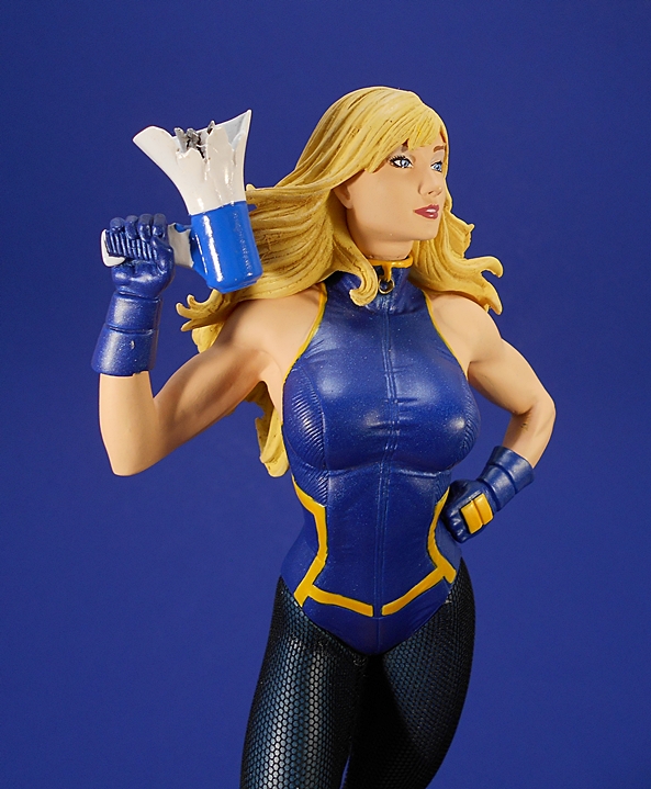
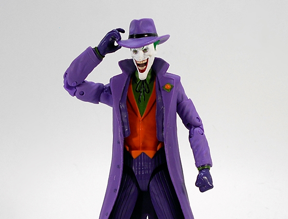
The head sculpt here is fantastic. I love how they did the mouth. You can see straight between the teeth and there’s all kinds of detail in there, including his tongue. The paint on the face is pretty solid too, so long as you don’t get in too tight. He’s got some sparkly eye makeup and the bright green they used for his eyebrows and hair is perfect.

dcijok5

dcijok6

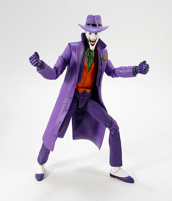
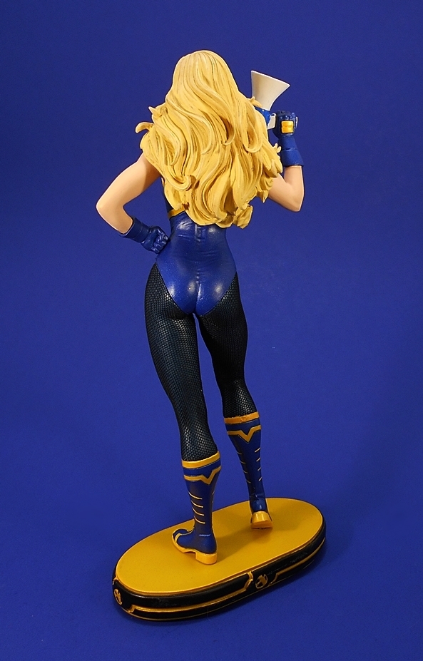
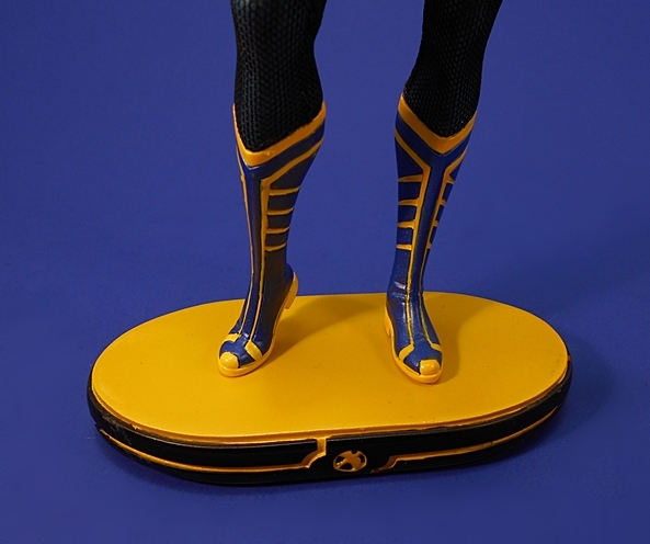
The articulation here is consistent with what we’ve been seeing. The arms have rotating hinges in the shoulders and wrists, double hinges in the elbows, and swivels in the biceps. The legs are ball jointed at the hips, have double hinges in the knees, and the ankles feature both hinges and lateral rockers. There’s an ab-crunch hinge in the waist, and the neck is ball jointed. You get a total of five hands with the figure, but they aren’t complete sets. The figure comes with a set of fists, but the other three are all right hands. Here’s my biggest complaint with the figure, but first, let’s look at the two accessories.

dcijok11

dcijok10

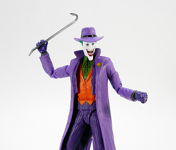
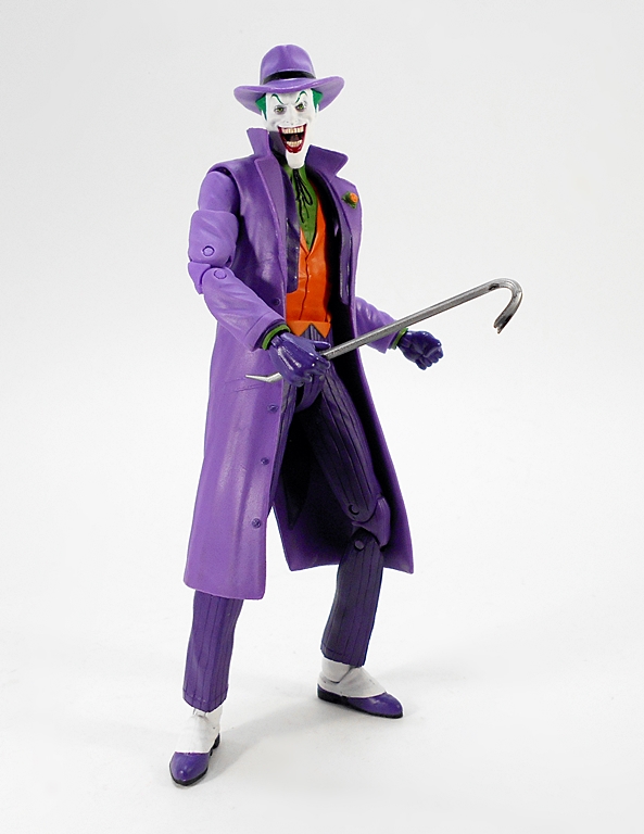
First, you get this nifty crowbar. There’s a hand designed to hold it, although the crowbar tends to slide in the grip. There’s a gap between the fingers if you want to pass it through and have him hold it that way, but I think it looks a little awkward.

dcijok8

dcijok15

dcijok9

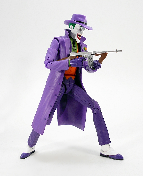
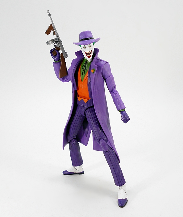
And then there’s my favorite accessory, the Thompson sub-machine gun. This thing is absolutely fantastic. I mean, just look at the paint apps and sculpt on this little weapon and compare it to what Hasbro is doing with their Marvel Legends weapons. It’s night and day. I think this is even better than most of the incredible small arms NECA is putting out with their figures these days. And that’s high praise indeed! Unfortunately, DCC included what appear to be two slightly different right gun holding hands, instead of a left hand to grab the front grip of the gun. They were already including an extra hand, so why make it an additional and unnecessary right hand. I’m baffled by this.

dcijok12

dcijok13

dcijok14

dcijok16

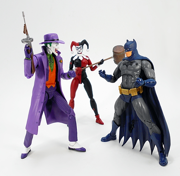
Hand issues notwithstanding, this Joker is another top notch addition to my DC Icons shelf. This entire line has been quality from day one, and it’s exciting to finally be expanding on some of the more tightly related characters in the DC Universe. The Joker looks great alongside Harley or facing off against Batman. The fact that DCC is expanding this line next year pleases me to no end, and I’m particularly excited to pick up Firestorm when the rest of this wave finally hits.

Cover Girls of the DC Universe: Black Canary by DC Collectibles

It’s DC Friday again and I’m giving the action figures a rest this week to check out another statue. I’ve actually got a few DC statues waiting on deck for the spotlight, but since I’m getting a little backlogged on the lovely Cover Girls of the DC Universe, let’s go with Black Canary, a relatively recent release from that line!

cgbcan16

There isn’t much to say about the packaging that I haven’t said a dozen times over. The goods come in a fully enclosed box with some shots of the statue and adverts for Catwoman v2 and Power Girl on the back. Inside, the statue is sandwiched between two styrofoam bricks and the only assembly required is to peg the feet into the base. If this is your first time checking out one of these statues with me, they’re cold cast porcelain and generally about 9 to 10-inches tall, depending on the pose.

cgbcan1

cgbcan3

And in this case, Dinah is standing tall and proud, right leg slightly bent, left hand resting on hip, and with a shattered megaphone in the other. She’s totally mugging for the camera, and those are the poses that I tend to enjoy most in this line.

cgbcan2

cgbcan4

Her costume is definitely New 52 inspired, but I don’t recognize the exact appearance. It has some similarities to her Birds of Prey costume, but this one is sleeveless. My guess is that this is from her solo book, which I never got around to reading. I’ll be honest, it’s not my favorite look for the character. I’m happy to defend a lot of the New 52 costume designs when I think it’s warranted. In this case, I dig the costume, but it just doesn’t scream Black Canary to me. See what I did there? Her one-piece features some nice sculpted wrinkles, textures, and stitching. All the decorative accents in the boots are also part of the sculpt and the same is true for her gloves.

cgbcan12

cgbcan13

The stockings are actually string fishnets, which is the first real time I’ve seen mixed media on these statues, unless you count Catwoman v1’s whip. This could have been a risky move, considering the mixed results we’ve seen with stockings in DC action figures, but I’m happy to say they look fantastic here. The seams are fairly well concealed down the inner legs and the stockings convincingly disappear into the boots and one-piece.

cgbcan8

The portrait here is solid. She’s pretty, but I don’t know that I would recognize her from just a head shot. The hair sculpt is a little chunky, but that’s often an issue with these porcelain statues. I’m not a big fan of how the hair seems to levitate a bit above the shoulders, but again, I’ll blame the media. I definitely like the muscle definition in her biceps. The skin tones are also pretty good, but my statue has a rather annoying light scratch across her left shoulder.

cgbcan5

Which is a good segue into the paint. I’ve been overall very pleased with the paint quality in this line, and I now own about a dozen of them. Paint can so often make or break a statue, and that’s especially the case when you’re looking at pieces in the lower-middle price range like these Cover Girls. Unfortunately, Black Canary’s paint isn’t up to par with the rest of my DC ladies. The quality of the paint itself is fine. I like the metallic sheen to the blue and it looks great when contrasted with the bright yellow. The problem here is in the care of application. There’s no single glaring paint defect that made me think I could do better if I exchanged it for another, but the lines could and should have been a lot cleaner and there are just too many gloppy brush marks for my liking. Maybe it’s a case of the yellow paint being more susceptible to problems against the blue. This is a piece that looks fine when viewed casually on the shelf, but begins to break down a bit when you get in really close.

cgbcan7

And that brings me to the megaphone. I’ve actually waffled back and forth on my feelings about it. On the one hand, it’s a visual and somewhat humorous, way to reference her canary cry and the way it’s blown out looks cool enough. On the other hand, it’s a little obvious and perhaps an unnecessary prop. I mean, I’m laying down eighty to a hundred bucks for a statue of Black Canary. It’s safe to say that I’m aware of her signature power without needing a visual aide. It kind of feels like the type of gimmick from the Bombshells statue line. In the end, I guess I’m OK with it.

cgbcan11

cgbcan9

The base is the same type of oval platform that this line has been using since it changed over from the diorama style bases. Dinah’s has a little canary emblem at the cardinal points. The yellow surface paint is clean and even, but my statue had some scuff marks on the black paint along the edges. They all rubbed out very easily with a damp Q-tip, but it begs the question, who’s checking these before they get boxed.

cgbcan14

As always, the bottom of the base is hand numbered with the limitation. Mine is 2798 of 5200.

cgbcan6

cgbcan10

cgbcan15

These gals tend to retail at about $99, but can usually be had for less soon after they hit the shelves. Canary set me back about $70 shipped. If this was your first time with me looking at a Cover Girls statue, you shouldn’t take this one as par for the course. As I said earlier, all of my Cover Girls are great looking ladies for the money. Even Black Canary here isn’t terrible. There are some strange choices here, but in the end she looks great on the shelf next to Katana and Poison Ivy. Truth be told, I’ve seen similar paint issues on far more expensive statues, particularly in the waning days of Bowen Designs. That doesn’t mean, however, it should be acceptable. The paint quality is so important on pieces like these and the standards really need to be high. My hope is that this is only a hiccup in quality and not a trend. We’ll find out in a couple of weeks when I swing back to this line to check out one of the Cover Girls’ oddest character choices yet, Red Lantern Bleeze!

Justice League (New 52) Box Set by DC Collectibles, Part 3: The Flash and Cyborg

It’s DC Friday again and time to wrap up my look at the DC Collectibles’ New 52 Justice League set with The Flash and Cyborg! If you missed out on the last two installments, you can check out the packaging along with Superman, Wonder Woman, and Batman here and Green Lantern and Aquaman here. Let’s start with Barry Allen…

flshbrg1

While The Flash is in no way a terrible figure, I’m sorry to say that I find him to be the weakest of the set. I guess someone had to come out on the bottom, but in this case the few issues I have with him are pretty specific. But first, I’ll say that I like this sculpt a lot. With the New 52 behind us, I can take this opportunity to say that I’ve been perfectly fine with all the Justice League costumes and that goes for Flash as well. Granted, it’s not a huge departure from previous looks. The main difference is the addition of the panel lines and these are all part of the sculpt, as are the lightning bolts on his waist and arms, and his chest insignia. I particularly like the sculpted lines in the boots.

flshbrg2

The coloring on this figure is overall quite good. The plastic used for the bulk of his suit is rich and vibrant and it contrasts nicely with the bright glossy yellow used on the boots and lightning bolts.

flshbrg3

flshbrg4

The portrait is where I think this figure starts to falter. The mouth is just weird. I do like the sculpted detail in the hood and chin cup. God, everyone seems to have hated that chin cup. It wasn’t such a big deal to me. The wings on the hood are made of pretty hard plastic, so they won’t warp, but that also means they feel really fragile. It probably wouldn’t take much to snap them off. The paint around the mask and face is fairly straight and clean. I wish I could say the same for the emblem on his chest. It’s easily the weakest paint work in the entire set.

flshbrg5

The articulation here is the same as we saw on the previous figures. That includes rotating hinges in the shoulders, swivels in the biceps, hinges in the elbows and knees, a T-crotch for the hips, and a ball joint in the neck. It’s nothing outrageous, but I can still get Barry into a decent running pose. I will note that the right bicep swivel on my figure has a little pull to it leaving a gap between the joints. Bummer. Let’s move on to Cyborg!

flshbrg6

Cyborg is an appropriately large figure. He’s not only bulky, but stands almost a head taller than the rest of The League. The figure features a clean and somewhat simple sculpt with some deep cut panel lines as well as some segmented sections between the joints and on the sides of his torso. I really prefer this over-sized look for the character as opposed to the leaner and more human proportioned renditions.

flshbrg7

The paint here is well done, but I’m surprised they didn’t go for a metallic finish. I mean, they did it for Green Lantern and Aquaman’s scalemail shirt, it seems like they could have ponied up for it here as well. Then again, it might have been an artistic choice and I’ll concede that the more satiny finish doesn’t look bad, by any means. From the neck down this is mostly a monochrome look with just the bright red domes in the chest, back, and hips to make the deco pop.

flshbrg8

flshbrg9

They did a really solid job with the portrait here. The high collar looks great and I like the exposed segmented part of the neck. You also get some more detailed panel lines in the cybernetic half of his face. The paintwork here is fairly good. The hairline could have been sharper, but it’s not too bad either.

flshbrg10

Cyborg is the one figure that adds a bit of articulation over the rest and that’s additional swivels in his forearms. It’s odd that he should get extra points, as I consider him to be the least agile of the bunch. On the other hand, even with those extra swivels, there’s not a whole lot you can do with him when it comes to posing.

flshbrg11

flshbrg12

It was fun for me to give this set a once over now that the New 52 is behind us and even with a few disappointing things about The Flash, I’d say this is a fine collection of figures, so long as you aren’t in the market for anything super pose-able. Personally, I plan on keeping this set displayed in a box up on top of one of my display cases where it looks fantastic. Either way, I think it’s a fitting end tribute to the action figures from this era of DC Comics, and while a few New 52 appearances are bound to still turn up in DC Icons and maybe some statues, it’s probably safe to say that by next year it’ll be phased out for either ReBirth designs or more classic looks. While I drifted in and out of lots of different books across the New 52, The Justice League was one of the books where I never missed an issue. It wasn’t always great, but I think it was almost always good. Although, I’d still rank Wonder Woman as my favorite New 52 title. With that having been said, next week I’ll be checking out another one of the Cover Girls statue, which will land us right back in this era.

Justice League (New 52) Box Set by DC Collectibles, Part 2: Aquaman and Green Lantern

It’s been another killer of a week for me at work, folks, but the show must go on here at FFZ. Fortunately the figures I have on tap for today won’t require a lot of time from me, so I can crawl back into bed with a bottle of Jameson and some comic books. On the last DC Friday, I started checking out DC Collectibles’ New 52 Justice League set with Superman, Wonder Woman, and Batman. Today, I’m pressing on with a look at Aquaman and Hal Jordan. If you want a refresher on the packaging, have a look back at Part 1, otherwise, let’s start with Aquaman…

aqlant2

It may be the New 52 look, but Aquaman’s costume still retained much of its classic and timeless design. The figure features the scale armor tunic with some gorgeous metallic golden-copper paint, a stylishly sculpted belt, green gauntlets, and the green leggings with sculpted fins on the backs of his calves. As far as the costume itself goes, there’s nothing really groundbreaking here, but when it comes to this costume, I always love the contrast between the dark matte hunter green and the glittery top and this figure showcases that perfectly.

aqlant4

There are a couple of nice touches that make this figure rather distinctive. First, he has a pretty cool necklace hanging around his neck. Secondly, his trident is attached to his belt with a gold chain. The trident itself is nothing special, just a simple sculpt cast in gold plastic, but the chain is a cool addition, that is unless you want to display the figure without the trident, because it’s clearly not meant to be taken off.

aqlant6

aqlant3

The portrait here is fantastic, somewhat unconventional, and easily one of the best looks for the character I’ve seen in action figure form. I just love the scruffy beard and sideburns over his usual clean shaven look. He has a fairly pissed off expression. the paint used for the skin tone is excellent, and I really love what they did with his hair. Moving on to Hal…

aqlant7

aqlant8

Green Lantern features one of the simpler sculpts in this set. He does feature some cut panel lines in the shoulders as well as his chest emblem being sculpted. Other then that you mainly just get some nice muscle definition. The costume features a mix of matte black, metallic green, and some lovely pearlescent white for the gloves and face of the chest emblem. The metallic green paint on this guy is quite the eye catcher and it reminds me a lot of the finish Kotobukiya used on their excellent ArtFX+ Hal Jordan only not quite as brilliant.

aqlant10

They did a particularly nice job with his ring. It’s both well defined and neatly painted.

aqlant9

The head sculpt here doesn’t impress me as much as Aquaman’s, but it is very good. It features a rather stern expression, the mask is part of the sculpt, and the paint is all on point. I like the stray wisps of hair over his forehead and more of that lovely green paint on the mask.

aqlant5

aqlant11

The articulation is identical for both of these figures. You get rotating hinges in the shoulders, swivels in the biceps, hinges in the elbows and knees, ball joints in the necks, and t-crotches for the hips. These aren’t super pose-able by any means, but I can still have a little fun with them.

aqlant12

So, overall there aren’t a lot of surprises with this pair, but what’s here is exceptionally well done. The sculpts are solid, the portraits are excellent, and while they aren’t going to feature the play value of DC Icons or even Mattel’s 6-inch DC lines, they look fantastic up on my shelf, especially when displayed with the rest of the Justice League. I believe these are pretty much the same as the individually boxed releases, but I have yet to see those in person, so there may be some variations at work. On the next DC Friday, I’ll wrap up this set with a look at The Flash and Cyborg!

Justice League (New 52) Box Set by DC Collectibles, Part 1

It’s DC Friday, I’m almost caught up on my DC backlog, and so it’s time to dig deep and go into the reserves. I’ve had this set sitting around for what seems like forever. It feels weird to be getting to it only now that the New 52 has been rebooted to ReBirth. Still, this set was a nice way to snatch up the entire New 52 Justice League in one shot and, if you managed to get the original “We Can Be Heroes” release of this set, you were not only getting the figures before they were released individually, but also helping the relief efforts against drought and famine in Africa. I’m going to go through this set in three parts. Now, while this was the first way to get these figures, I actually did a Feature on the later released, Trinity War box set, which included a variant version of this Superman along with straight repacks of Batman and Wonder Woman. So, today I’ll start out with a look at the package and a quick comparison of those figures to the later Trinity War releases, and then tackle the other figures, two at a time, in the following couple of weeks.

dcwcbh1

When you’re getting seven 7-inch scale figures in a single box, you know it’s going to be sizable. In this case DCC put the figures all in one epic lineup and into a long window box. The box’s deco is very simple and mostly white with a blue slash down the far right side showing some of the characters in silhouette. The set is also set apart from the original release by not having the “We Can Be Heroes” motto printed above the word “Justice.” This box is one of those cases where the packaging itself would be totally forgettable if the figures didn’t look so damn good all lined up like that. It’s a box that makes a statement and arguably displays the figures just as well as if they were lined up loose and on the shelf. Happily everything is collector friendly. You just slit the tape on the side flap and pull out the tray. There’s a clear plastic cover over the tray to keep the figures in place, but no pesky ties to worry about. I like that my set happens to have Wonder Woman looking at Superman, Superman discretely looking back at her, and all the while Batman looks off to the other side as if pretending not to notice. Anyway, this is most definitely a box that I’ll be keeping to display the figures in. I’m going to start with Superman, because he’s really the only one that’s different from the one in the Trinity War box.

dcwcbh2

From the neck down, the sculpt here is identical to what I showed off December of last year. The only difference in the costume is that the metallic paint has been replaced with a more appropriate flat matte look. Now, I really did dig the metallic version a lot. It felt like a cool callback to Kotobukiya’s ArtFX+ Supes. Of course, the deco was more about giving collectors who already owned the figure an excuse to buy the set, then it was about anything to do with Superman’s appearance in the Trinity War story arc. Here we have a more conventional paint and just a beautiful representation of Krypton’s Last Son in his New 52 outfit. And yes, I do really love this outfit. Every detail on the outfit is part of the actual sculpt, from the panel lines and edges of the boots, right down to the belt and S-Shield. The colors, which consist of rich and vibrant blue, red, and yellow are absolutely gorgeous. I’m just totally in love with the look of this figure.

dcwcbh3

The cape cascades over Superman’s shoulders and stops right about at the tops of his boots. It’s a fairly pliable plastic and doesn’t throw the figure off balance at all. The back of the cape features a black S-Shield stamped right in the middle.

dcwcbh4

The portrait is the only difference in sculpt between this release and the Trinity War figure, which had Superman offering up a goofy smile. I was pretty happy with the Trinity War portrait, but this one just blows it out of the water. It’s definitely a more stern look, but I think it’s a great 3D likeness of Jim Lee’s art from the book. The paint is very clean and the hair is more neatly sculpted on this version.

dcwcbh6

dcwcbh5

The articulation is pretty standard stuff when it comes to the earlier days of DC Collectibles’ figures. You get rotating hinges in the shoulders, swivels in the biceps, hinges in the elbows and knees, a ball joint in the head, and a simple T-crotch. You can tweak a few different poses out of him, but nothing too crazy. Moving on to Wonder Woman…

dcwcbh8

I loved this Wonder Woman figure when I got her in the other set, and I still do. This is a great look for her and the sculpt really brings out the details in the costume beautifully. Yes, for all the guff that the New 52 costumes got, and some of it was well deserved, this version of Diana’s digs is just fine with me. I still find it odd, however, that DCC never gave us the costume with the pants, but that’s a discussion for another time. Once again, every detail in the costume is part of the sculpt.

dcwcbh9

The paint here is nice and clean and pretty consistent with the later Trinity War release. The blue and red is darker than what we saw on Superman, but it has that silver and a little white to help lighten things up. Even the skin tone, which is achieved through bare flesh colored plastic, is smooth and warm. The articulation here is identical to that of Superman, so it’s not all that fantastic, but at least Diana got herself some swivel biceps. That’s not always a sure thing when it comes to the female figures.

dcwcbh18

dcwcbh10

Diana comes with her golden lasso sculpted on her right hip and her left hand is sculpted to hold the sword she doesn’t come with. Now, that surprised me, as it was also vacant from the Trinity War set. Apparently the only way to get her sword was to buy the individually boxed figure or the set that paired her with Katana. Now, it’s bad enough to buy the same figure twice, but three times? That would be crazy, right? Well, I’m not saying I did, but I may be getting around to looking at that Wonder Woman/Katana two-pack at some point. Just saying.

dcwcbh11

When I did my Trinity War Feature, I suggested that Wonder Woman was sporting a new head sculpt, but it turns out that isn’t the case. There are some natural variances in the paint, but they’re quite subtle and it is the very same portrait. I’d say I like this one a little more, just because the eyes are a wee bit straighter, but otherwise they’re both fine and very attractive. I really like the detail and paint on both the choker and the tiara. And oh, look! Bewbs!

dcwcbh12

And last but not least, we have Batman. Like Wonder Woman, this figure is exactly the same as the one released in the Trinity War set and I’m going to irk a lot of people by once again saying that I really like this costume a lot. Granted, it’s not a huge departure from some of Batman’s iconic looks. You get the same sculpted detail as the other figures, right down to the panel lines and mesh material at the joints, and some very spiffy high gloss black paint for the boots, gloves, and cowl. It makes for a striking contrast against the matte gray finish of the suit. Just lovely!

dcwcbh13

The cape falls beautifully behind the figure and the scalloped edges drag on the ground. It’s a bit heavier than Superman’s and I love the way the folds are sculpted up near the top. It looks as much like a shroud as it does a cape, and that’s certainly appropriate. The articulation here is identical to Superman and Wonder Woman, so there are options, but I really can’t get any super cool fight poses out of him.

dcwcbh14

dcwcbh15

Once again, a really solid head sculpt with a beautiful contrast between the skin tones of the face and the gloss black paint of the cowl. Batman sports a grim expression, which is quite fitting. Let’s check out some quick comparison shots of the figures with the Trinity War releases on the right and the figures from this set on the left…

dcwcbh16

dcwcbh19

dcwcbh7

dcwcbh17

I knew when I was going in that I was going to be double dipping on some of these figures, but that was OK by me, because I didn’t have any of the other members of the Justice League in this set. And besides, the Superman is different, so it was really just two figures that were already in my collection. And while the set was originally about a hundred bucks, I found mine for a ridiculous $45. And if you hunt around, the set can still be had for very close to that price. They aren’t the most articulated figures out there, but the sculpts and paint on these three are truly fantastic. On the next DC Friday, I’ll have a look at Aquaman and Green Lantern!

DC Icons: (#10) Superman (With Kelex) by DC Collectibles

It’s DC Friday again and what better way to spend it than looking at another of DC Collectibles’ newest DC Icons figures? Today I’m checking out Superman! The fact that he’s appearing for the first time in Wave 3 is a great indicator of how diverse this line is. Think about it. We got Earth 2 Mister Miracle before Superman! It’s a risky move and I commend DCC for making it, as opposed to just flooding the pegs with A-Listers like Batmans, Supermans and Harley Quinns. Um, Harley Quinn was in this wave of DC Icons, so… SHUT UP!!! Anyway, hopefully it’s paying off for them.

dcisupes1

We’ve seen the packaging before and it’s as attractive and collector friendly as ever. The blue and white coloring looks sharp and I dig the placement of the S-Shield in the “O” of ICONS. The box indicates that Superman is the tenth release in the series and calls out that this is Superman as pulled from the pages of John Byrne’s landmark “Man of Steel” miniseries way back in 1986. The big window not only gives a good look at Supes, but also the other figure he comes with, Krytonian helper-robot, Kelex!

dcisupes2

And this is indeed honest-to-goodness Classic Man of Steel! Before they took away his red undies, textured his suit, and turned him into a brooding shit. As has been the case with this line, everything about the suit is part of the sculpt. And while that doesn’t really amount to much here, it’s nice to see it in the raised S-Shield, the sculpted belt buckle and loops, and the top edges of the boots. Even the S-Shield on his cape is sculpted on. The costume features some gorgeous red and blue coloring with some welcome variations, like the use of matte red on the undies and cape, and gloss red on the boots. There’s just something about this costume that does it for me every time, and everything here looks so bright and vibrant and the applications are sharp and clean.

dcisupes3

The cape flows out from the front of his shoulders and hangs close to the body. It’s just the right size and heft so as not to throw off his balance or get in the way of articulation.

dcisupes4

dcisupes5

The portraits in this line have been good, but not always exceptional. In this case, I’m very happy with what we got. The detail in the structure of the face is very impressive and I dig the stoic expression. There’s a little bit of red in his eyes, and while I doubt it was the intention, I’m just going to assume he’s charging up that heat vision! Probably the best thing is how they did his protruding cowlick, it’s epic! Note to self. Rename my band, Epic Cowlick!

dcisupes7

dcisupes10

Superman holds no surprises in his articulation. We’ve been getting pretty much the same thing across the board in the Icons series. Here you get rotating hinges in the shoulders and wrists, double hinges in the elbows and knees, ball joints in the hips and neck, swivels in the biceps, and both hinges and lateral rockers in the ankles. There’s an ab crunch hinge in the abdomen and a ball joint just under the chest. Normally, I complain about the lack of thigh swivels, but here I’ll point out that an added hinge in the neck would have been very welcome so Supes could look up when flying.

dcisupes14

dcisupes8

Superman himself only comes with an extra pair of hands, so you get fists and relaxed open hands. That can, however, be forgiven because you also get this…

dcisupes11

Kelex is more of a bonus figure than an accessory. He’s big and he does have some limited articulation, with a ball jointed neck and rotating shoulders. He also comes with a clear display stand to allow him to “hover.” I can’t say he was high on my want list, but I’ve always liked this design a lot, so I’m happy to get him.

dcisupes9

dcisupes13

dcisupes15

dcisupes16

I don’t know if it’s the attractive coloring of his costume or how much the character meant to me as a kid, but I get excited every time I pick up a new Superman figure. I can still remember getting the DC Universe Classics version and smiling ear to ear. Needless to say this getting this figure has been no different. I’ve had him within reach for the last few days to fiddle around with while I work and he and Lex have been slugging it out for supremacy of my desk. Superman is a refreshingly simple and classic release and he’ll find a place of honor on my expanding DC Icons shelf!

Justice League War (DC Animated Movie Series): Green Lantern and Cyborg by DC Collectibles

I had hoped to have the most recent wave of DC Icons for today’s DC Friday, but sadly it arrived a little too late to make my deadline. So today’s consolation prize will be opening up some more figures from the animated film, Justice League War. Some weeks back, I looked at Superman and Wonder Woman, today I’m checking out Green Lantern and Cyborg.

lantcyb1

The packaging isn’t anything special, but it is bright and clean. The figures come on a simple card and bubble,which aren’t at all collector friendly. The cards are generic, but have some stills from the film and the inserts and bubbles feature the name of the character inside. The bubbles here really let you inspect a lot of each figure, and I highly recommend giving the paint a good once over if you have the luxury of buying these at retail. Let’s start off with Green Lantern…

lantcyb2

Here he is, and we’re not off to a good start, because Hal’s left arm broke off at the elbow when taking him out of the package. Normally, that would earn a fail all on its own, but there’s so much else wrong with his figure, that I think it’s worth pushing on, so I did some temporary arm surgery to get us through the review.

lantcyb3

lantcyb6

Whenever a company does an animated style figure, the paint is of paramount importance, mainly because the sculpt tends to rely more heavily on the paint for details. And in this case, Hal Jordan makes use of a buck shared with The Flash, so a lot of that extra effort should have gone into some top notch paint work. From the neck down, things aren’t too bad, but there are some notable inconsistencies in the striping, but really everything could have been a lot sharper. Even the power ring, which is kind of a big deal for a Green Lantern, is just a little green square that feels like an afterthought. I actually dig the stylized look of this buck a lot, and I’d imagine that any hobbyist with a basic level of customization skills could have done a much better job. But as sub par as the paint on the costume is, it’s nothing compared to this…

lantcyb4

I mean, seriously? There are white splotches all over his face, the hairline looks terrible and the line between the top of his mask and his forehead is just all slop. I don’t even know what’s going on on the top of his lip. It looks like he has a half-shaved blonde mustache. This would be unacceptable even on a 3 3/4-inch figure, but on a 6-inch collector line, there’s just no excuse for it. But then, let’s remember that this figure did break right out of the package.

lantcyb6

Articulation, for what it’s worth, features rotating hinges in the shoulders and elbows, ball joints in the neck and hips, and hinges in the knees. Of course, in my case I have to take back one articulation point in the left elbow, because when I do a permanent fix on this guy, it’ll lose that joint. I’ve had enough of this guy, let’s move on to Cyborg…

lantcyb7

lantcyb8

Cyborg came out of the package without any crippling injuries, and I’ve got to say, he looks pretty good. It can’t be easy to take a complex design like Cyborg and simplify him for an animated model, and then rework that model into an action figure, but I think DCC has pulled it off here. He features a unique buck with some added parts, like the shoulder armor and knee pads, neither of which get int he way of articulation. Overall, I really like the mix of organic curves and angular cybernetic bits. The paint is mostly silver and black, with some red and blue accents, and while it is dirty and scratched in some areas it works OK for me as a version of Cyborg who has been out in action, even if that wasn’t the intention.

lantcyb9

The head sculpt is pretty solid for a line that has had more stumbles than victories in that department. The paint is overall solid here as well.

lantcyb10

lantcyb12

Cyborg features the same level of articulation as the rest of the line and the joints here feel a lot chunkier and solid, particularly in those elbows. It’s serviceable, but there’s only so much he’s going to be able to do with this level of pose-ability.

lantcyb13

lantcyb14

While it’s true that I’m picking this line up on the cheap (about ten dollars each), the fact is that they originally retailed at $20 a pop. Obviously, Green Lantern doesn’t reflect that kind of price point, even if his arm didn’t break. And while Cyborg is a very cool figure, I’d be hard pressed to justify paying $20 for him either. Indeed, having now opened four of these, my satisfaction is at the 50% mark, with only Wonder Woman and Cyborg so far being worthwhile pick ups. If I hadn’t already grabbed a load of these on clearance, I would probably be ready to stop now, but alas, there’s more to come! Next Friday, I’ll be moving on to those DC Icons figures, and I’ll be saving these Animated Movie figures for filler as I run out of better stuff to look at throughout the rest of the year.

Cover Girls of the DC Universe: Katana by DC Collectibles

It’s Friday! Let’s check out some DC Comics stuff! This week I’m staying on with the Cover Girls statues line and opening up one of the more recent releases, Katana! She’s a cool character, who I believe is going to be getting a lot more merch in the days ahead, so long as the Suicide Squad movie performs well. This version is from the recently defunct New 52 continuity, which is appropriate, as that was where she got her first solo book. I also rather enjoyed her time in Birds of Prey.

covgkat10

There’s not much new to say about the box. With nearly a dozen of these statues on my shelf, I’ve showcased the packaging quite a bit and not much has changed. Katana comes in an enclosed red and white box with various shots of the statue and some teasers of what’s coming up or also available on the back panel. The statue is wrapped in plastic and encased between two pieces of styrofoam. The only assembly required is to peg Katana’s feet into the base and they fit in quite easily.

covgkat1

covgkat2

The Cover Girls line has been a hearty mix of museum-style poses along with some hints of action and on that scale of things Katana comes close to going for all out action. She stands with feet apart and her sword, Soultaker, drawn up to her shoulder and ready to strike. And yet, it still passes for something like a staged shot and I don’t think it goes too far off point. She still looks perfectly at home when displayed with her fellow Cover Girls. Besides, this is a pose that really conveys so much of Katana’s character, and so in terms of composition, I’d say she’s damn near perfect.

covgkat3

covgkat4

The costume features her New 52 armored body suit that looks great without the need for a whole lot of sculpted detail and does it’s best to show off her lovely curves. You do get panel lines running throughout and a cool and consistent metallic charcoal paint that meshes beautifully with the rich matte crimson on her lower leg armor and the quilted sleeve on her right arm. The body suit also features some exposed ribbed black areas in the joints and down the spine, presumably to give her more flexibility. Her scabbard hangs off her back and you also get some sculpted pouches on the small of her back. While the paint scheme and overall sculpt are fairly simple here, everything looks exceptionally clean and this is arguable the best paint I’ve seen in the line to date.

covgkat5

covgkat7

All that praise applies to the head sculpt as well. The beautifully sculpted portrait is two-tone with the lower face painted in matte gray, just a tad slighter than the suit, and the top half in white with the Rising Sun on her forehead. Her blue eyes are sharp and straight and her short hair ruffles ever so slightly in an imagined breeze. I love how her expression offers just a hint of joyful anticipation at the fight that’s about to come.

covgkat6

covgkat8

Katana’s sword looks good, although the sculpt for the hilt is a little on the soft side. Hey, I’m really looking for things to complain about and that’s the best that I can come up with. The blade is straight and while I’m going to be sure and be careful with it, it doesn’t feel overly fragile.

covgkat9

covgkat12

The base consists of the now standard oval with a charcoal and crimson deco to match Katana’s costume. The emblem on the sides consists of a simple red disc suggestive of the Rising Sun. The limitation is hand numbered on the bottom of the base, with mine being 561 of 5,200 statues produced. I think this may be the lowest number Cover Girl I own.

covgkat11

Katana is a wonderful addition to my Cover Girls shelf and definitely a triumph for this line. What’s even better is at the time I publish this Feature, she’s readily available at a few online retailers at close to half the original MSRP. I picked up mine for $55, and damn was that a steal! Considering that DCC has already started doing second versions of some of the gals in this line (Poison Ivy, Harley Quinn, Wonder Woman) it’s nice to see that they’re also hitting on some of the less high-profile characters like Katana here. She’s a great release for the line and a worthy pick up for folks who just love the character.


Rock Candy (DC Comics): Wonder Woman, Supergirl, and Modern Batgirl by Funko

What do you do when your Funko and have something like 1.5 million different Pop! Vinyl characters in circulation? You keep expanding, of course! And now Funko has introduced a new line of vinyl collectible figures called Rock Candy. Now, I’ve only dabbled in Funko’s Pop! Vinyls, but these roughly 5-inch tall, non-pose-able female figures feature a super cute style that I couldn’t resist. Currently the line is only featuring characters from DC Comics, and different versions of Barbie. Weird! Today I’m sampling half of the initial six DC Comics releases.

rcand1

The figures come in compact little window boxes that feel a lot more premium than the POP! boxes. They feature some nice gold foil lettering with each character’s name in her own particular logo on the front and again on the side panel. Oddly enough these aren’t numbered, so maybe Funko isn’t anticipating a lot of growth with this line. Like the Pop! figures, these packages are designed so that you can use them as their own display cases and still get to see most of the figure. Unfortunately, the front window on my Supergirl has heavy rubbing, so I haven’t decided whether to pitch the boxes, or maybe try to get a better Supergirl box. Of course, if you want to open them up, the boxes are totally collector friendly and you even get clear display stands with pegs designed specifically for each figure.

rcand8

Overall, I really dig the styling here. There are definitely some cutesy tropes at work, what with the big head and eyes, but I also feel like it’s something fresh and new and works well with all the characters I’m looking at today. Wonder Woman sports an adorably determined expression with hands on hips and I’m surprised at how much of her costume is fully realized through the sculpt. The belt, the chest emblem, her wrist bracers, all of these could have been simple paint apps, but aren’t. Even the coiled lasso is quite detailed! Only the stripes on her boots and stars on her super-panties are achieved with paint alone.

rcand9

rcand10

And speaking of paint, what’s here is overall very solid. The original promotional shots of these figures looked very sharp and I can remember thinking that it was going to be a line that would live or die based on the quality of the paint and considering some of the hit or miss paintwork on Pop! Vinyls, I’m surprised at what we got here. Sure, the lines could be a little more crisp in some areas (particularly the stripes on the boots), but there’s virtually no slop and the shades of blue and red and gold all look so vibrant.

rcand5

rcand6

rcand7

Supergirl boasts a confident look with fists on display and ready for action. Once again, there’s a lot of sculpted detail here that could have easily just been paint or printing, including her belt and chest shield. The paint here is also very clean and I appreciate that they even used glossy red for the boots and matte for the cape and skirt. But most of all, the colors are just so bright and luxurious.

rcand2

And that brings us to Batgirl. This is the Babs Tarr, Batgirl of Brunside, version of the character and a look that I’m very fond of. The sculpt here is pretty impressive as it includes all sorts of little touches like the laces on her boots, the pulls on her zippers, her belt and pouches, she’s even holding a batarang in her left hand. I think I like Batgirl’s expression the most out of the three, as she has a lot of personality. Even the pose, with her one knee drawn in is just adorable.

rcand3

rcand4

Unfortunately, the paint on this one is a bit disappointing when compared to the other two figures. The lines just aren’t as sharp, particularly around the yellow and black areas. I should qualify that by saying it’s still pretty acceptable for a mass produced vinyl collectible in this price range. I mean, they even made a go at painting the laces on her boots! I think this is more an example of the other two figures looking so exceptionally good, that it hurts the one that looks average.

rcand13

rcand12

rcand11

But, I don’t want to end this Feature on a sour note, because the truth is I totally dig all three of these figures and I’m definitely going to round out the DC assortment by picking up the DCEU version of Wonder Woman as well as Classic Batgirl and Harley Quinn. At $9.99 these figures are in the exact same price point as Funko’s Pop! Vinyls and I think you’re getting a lot more for your money here. They’re cute, colorful, and feel like a decent value, whereas the Pop! Vinyls to me feel like a dirty addiction that I should be ashamed of. In the end, it just feels like more work and personality went into these. While the Barbie releases aren’t my bag, I’m going to be really interested to see if Funko expands this line to include more DC figures or even other franchises. I sure hope they do.

Justice League War (DC Animated Movie Series): Superman and Wonder Woman by DC Collectibles

Marvel may be ruling the world of live action movies, but DC has long been kicking ass with their animated direct to video presentations. Justice League War was one of these and boy was it great. Superb characterization, a really fun Batman vs. Superman fight, some dude called Wonder Woman a whore and got outed as a transvestite, and overall a really good feature length treatment of the first story arc from The New 52’s Justice League book. Rather than just bring us animated Jim Lee art, these films tend to skew a little more stylized and if nothing else that gives them the opportunity to market action figures of the same characters to idiots like me.

dcasww13

Now let me say straightaway, that I would have included Batman here, but for some inexplicable reason, they didn’t make a Justice League War version of Bats. Shazam? Sure! Batman, nah! That seems really shortsighted to me, but they did release him from Son of Batman, naturally I have him and I’ll get to him eventually. Anyway, the packaging here looks nice, but it’s a simple bubble on card affair and not collector friendly. You get some stills from the feature behind the figures and character art on the right panel insert. The figures are numbered, with Superman and Wonder Woman being #2 and #4, respectively. Let’s start with Superman!

dcasww1

Oh, boy. This is a stylized re-imagining of the New 52 look, and I think the work on the costume is pretty solid. Keep in mind that this line uses some buck sharing, so with the exception of the cape, all the details on Superman’s costume are achieved with paint alone. I like the rich shades of blue and red they used and for the most part the lines are fairly sharp. The intricate panel lines of the comic look have been toned down to just a few. The package suggests these might glow in the dark, but I don’t see much evidence of that. There are a few unfortunate globs of glue on my figure, one by his right cape attachment and another on his left bicep. These were priced about the same as regular DC Collectibles figures, but the quality control on Supes could have been better.

dcasww2

The cape is OK. It’s not too heavy and it doesn’t drag on the floor, so it doesn’t inhibit wider stances. There’s no S-shield printed on the back. I can’t remember if he had it in the film, but I’m guessing not. Moving on to the portrait…

dcasww3

Sweet Kryptonian Jesus!!! While everything from the neck down is passable, I don’t know what is going on with this head sculpt. It’s like someone cast older Robert Z’Dar to play Supes. Too soon? Sorry Z’Dar fans. Anyway, this portrait is just all sorts of wrong and I’m hoping that the mold got pinched in production or something, because I don’t want to call anyone out on their work. Phil Ramirez sculpted him and he’s a talented guy. I have lots of his work in both action figure and statue form, so I’m just not sure what happened here. The promo pictures were actually spot on and should have been enough to warn me off the figure, but I remember thinking, there’s no way the actual figure’s portrait is going to look like that. I have no one to blame but myself.

dcasww4

Articulation is pretty good for a DCC release. You get rotating hinges in both the shoulders and elbows, as well as swivels in the biceps. The wrists look like they have swivel cuts, but mine won’t budge and I don’t want to twist them off trying. The legs are ball jointed and the knees are hinged. And lastly, you get a ball joint in the neck. Let’s move on to Wonder Woman…

dcasww5

Diana is an entirely different story, in that she’s excellent in almost every way. Granted, you have to buy into the the stylized design, and the fact that her costume got a pretty unique overhaul for this movie, but I happen to like it a lot. Wonder Woman is the only female in the Justice League War series, but I believe they might have recycled some of the parts for the buck for Mera from the Throne of Atlantis.

dcasww6

Either way, her costume is also all achieved through a deco of red, blue, and silver paint, coupled with some flesh tones. There are a few lines that could have been sharper, there’s a stray spot of silver on her left heel, but all in all, I think the paint is good here. Her sculpted lasso is permanently attached to her hip.

dcasww7

While Superman looks like he caught a freight train full of bees with his face, Wonder Woman’s portrait, sculpted by Jack Mathews, is very well done and quite faithful to her likeness in the film. The painted features on her face are very sharp and I especially dig her ponytail.

dcasww8

The articulation here is close to Superman’s, just minus the bicep swivels.

dcasww10

dcasww11

dcasww9

Wonder Woman comes with her short sword. It’s a welcome accessory, because she used the sword a lot in the movie… even to inadvertently demand ice cream at the point of a blade.

dcasww15

dcasww14

dcasww12

I’d call my first foray into the DC Animated Movie Series to be a hit and a miss. Superman would have been fine if not for his unfortunately weird face, but I’ve got nothing but love for this Wonder Woman. In fact, she’s so good it makes me all the more sad that I don’t have a decent looking Superman to go with her. Ah, well… I also have a lot more of the Animated Movie Series to open, because most online retailers were blowing them out at $9.99 and I can’t help myself.