Femme Fatales “DC Animated Series:” Supergirl by Diamond Select

I’ve mostly been spending my DC Fridays looking at DC Collectibles’ figures, but anything DC is fair game and today I’m looking at the very first Bruce Timm inspired statue from Diamond’s Femme Fatales line. I’ve been a casual fan of the FF line for a little while now and I was thrilled when I heard that DST struck a deal to bring Animated versions of the DC ladies on board with the Timm art style. It seemed like a perfect match and they kicked it off with Supergirl. Rather good timing, too, as the Supergirl TV Series just premiered this week. It was my second time watching it and I enjoyed it quite a lot.

ffsupg1

ffsupg2

The statue comes in a window box, which has been standard for the line. You get additional windows on the sides and top to let in plenty of light and showcase the statue. The biggest departure here is found in the deco. Rather than using the same black box with red trim, they went for a bright yellow and orange which fits the comic book theme a lot better. The familiar Femme Fatales logo is still in the top right corner and the bottom features the logo for Superman: The Animated Series. The box is totally collector friendly and Supergirl comes fully assembled and ready for display.

ffsupg3

The first thing I noticed taking Supergirl out of the box is that she’s fairly larger and heftier than any of my previous Femme Fatales. She only slightly taller than my Anne Bonny statue and keep in mind that Kara is reclining a bit in mid flight and not standing straight. The scale change may annoy avid collectors of this line, but considering it’s a new sub-line and the animated style doesn’t really fit with previous releases, I’m perfectly fine with it so long as it remains uniform with all the upcoming DC ladies.

ffsupg4

ffsupg5

With size out of the way, I’ve got to say that I’m really impressed with the way this piece came out. The sculpt does a wonderful job capturing the animated look of the character and the proportions are great and the portrait is absolutely adorable. The pose has her hovering in mid flight, which would be absolutely perfect if it didn’t get a little confusing when placed in context with the base, but I’ll get back to that in a bit.

ffsupg6

ffsupg7

As for the outfit, Kara sports her white cut-off top, blue skirt, red boots, and short cape. The S-Shield on her top is sculpted on as well as painted, which is nice because the animated style of this piece doesn’t call for a lot of intricately sculpted details, and that’s where the paint becomes so critically important.

ffsupg8

ffsupg9

Happily the quality of paint holds up very well. The statue makes use of bright, vibrant colors to emphasize the look of the animated series. Everything looks very clean, and while I was afraid of visible brush strokes on the white top or yellow hair, there are none to be found. the eyes are straight and the lips and eye brows are tidy. There’s a stray stroke here and there along some of the lines, but overall what’s here is solid work.

ffsupg12

If there’s a fly in the ointment here, I’d say it’s the base, which is an odd bit of work. It’s obviously meant to look like the landscape far below, but having the sculpted mountain top and just a blue patch of paint on the otherwise featureless oval base isn’t terribly convincing. She could have also used some height over it, say maybe an inch of clear rod propping her up, because it still kind of looks like she’s standing on it and not hovering far above it. In no way does this ruin what is an otherwise beautiful piece, but I defintely would have preferred just a blank disc for a base.

ffsupg11

ffsupg13

ffsupg14

Supergirl falls right in line with the $40 price point on all the Femme Fatale releases. In the past I’ve been able to get some really good deals on these pieces, particuarly the non-licensed ones, but I’ve dropped pre-orders on all the DC Animated releases, so in this case I paid full price. I’m far more interested in supporting this line rather than shopping around for deals. And I’m even more pumped for these statues now that I have this inaugural release in hand. Poison Ivy is the next release in the series, but before I get to her, I’ll be checking out the SDCC version of the Supergirl statue next Friday.

Femme Fatales “Hack/Slash:” Cassie Hack by Diamond Select

I can’t remember what got me started reading Tim Seeley’s wonderful Hack/Slash comic. Chances are I just picked up an issue at some point while browsing a comic shop and got hooked. It’s precisely that kind of book where you can open any issue to any page and instantly want to know what the hell is going on. If you like offbeat horror comedy I recommend a look and a lot of it is still available in convenient TPB or Omnibus editions. Sadly, there hasn’t been a lot of Hack/Slash merch out there, which always struck me as weird since there are all sorts of obscure indie comics with action figures or statues.

cashack1

Ah, but it’s Diamond Select to the rescue via their Femme Fatales line. I’ve reviewed some of these before and it’s a weird little line of economy priced collectible statues that pulls its content from original designs to comic book properties and even something as big as Star Trek. Diamond seems intent on getting more mileage out of this line as they not only produced this Hack/Slash piece, but they just launched a wide reaching sub-line of DC statues based on the art of Bruce Timm, which I’ll start looking at next week.

cashack2

Getting back on topic, the statue comes in a window box with a deco more or less in line with the last three Femme Fatales statues I bought. The windows let a lot of light in and give you a great look at the statue, which will come in handy if you happen to be buying it off the shelf and want to check the quality of the paintwork. Everything is collector friendly and while I don’t think the deco here is anything to write home about, I’ve still kept all my Femme Fatales boxes just in case I ever need to pack them away.

cashack3

cashack4

cashack5

And here she is out of the box, all set up, and looking mighty fine. Cassie comes already attached to her base, all you have to do is attach her accessories. The bat slips into her left hand and Vlad’s mask hooks on the fingers of her right hand. This PCV sculpt is by Sam Greenwell, who has done some work for DC Collectibles and I think it really does a beautiful job capturing the character and straddling the line between simple comic style with out sacrificing detail.

cashack6

cashack7

cashack8

Cassie’s had some variations to her look throughout her adventures, but I would consider the outfit here pretty iconic for her. She sports a see-through one-piece with skimpy black bikini top and a low-slung skirt, complete with her FaQ belt. She has long striped fingerless gloves, a pair of high top black boots and athletic socks. There are some really nice examples of sculpted detail, like the laces on the boots, the knitting in the socks, and even the stripes on her gloves are part of the sculpt. The paintwork on the outfit is excellent for a piece in this price range. There’s a little slop between her boots and socks, but other then that there’s nothing else to pick at. I dare say that I’ve seen more flubs on far more expensive statues. I will say that I would have preferred they went with her plaid skirt, but apparently DST is saving that for an exclusive release.

cashack10

The portrait is beautiful and an interesting sculpt, with her sculpted hair eclipsing the right side of her face. If you look at Cassie dead on she has a determined expression, but if you get a little lower and look up at her, she look a tad more vulnerable. Either way she’s very pretty and here too the paintwork is excellent.

cashack9

The accessories are both welcome additions. The bat has a wood grain texture, sculpted tape on the grip, and several nails sticking out of the tip. There’s also a gruesome crimson wash at the end. It just wouldn’t be Cassie without a weapon. I would have liked it to have “Kiss It” painted on, but they may be saving that for the exclusive too. And then you have Vlad’s mask, which was, in my mind, a necessary addition to have the big guy’s presence felt even though this is a solo piece. The rather clever base is designed to look like the head of an axe, complete with silver paint on the edge and a hole where the axe handle would pass through. As much as I love the design here, it is a tad wobbly, which is really my only complaint about this entire piece.

cashack11

cashack12

At approximately 9-inches tall, she fits in really well when displayed next to my Ariel Darkchylde. The statues in Diamond’s Femme Fatales line retail at around $40 and I have to say you’re getting a really nicely crafted piece for your money here. It’s true that most of this line doesn’t tend to hold their value very well. Indeed, this is the first FF piece that I paid full retail on and that’s just because I wanted to support the fact that someone was delivering on the Hack/Slash merch and I didn’t want to take any chances on missing out on Cassie. For any fan of the comic, this is a must-own piece, and I’m not just saying that because there’s nothing else out there.

Star Trek III: “The Search for Spock” Hand Phaser by Diamond Select

I’ve been an aficionado of Starfleet sidearms for as long as I can remember now. I’ve had them all from horribly cheesy Next Gen Playmates versions all the way up to a beautifully professionally-machined Classic Series prop that I bought at a Trek Convention back in the early 90’s in NY and later had to sell so that I could afford to eat while paying for Grad School. Today I’m checking out Diamond’s brand new Star Trek III phaser. Hopefully with this baby I’ll have Mr. Adventure eating out of my hand.

st3phasbx

If you own any of Diamond’s Starships, you should recognize the deco used for the box. I’m not a big fan as it mixes Classic Trek imagery with what is a Feature Film collectible. Why couldn’t we get a picture of Admiral Kirk in his tunic on the box, or at least movie enterprise. Blah! It’s nothing special and that’s probably a good thing because mine came to me smashed to hell. Luckily it was the only thing in the box that was as it was part of my Pile of Loot and there were some pricier pieces in there.

st3phas2

st3phas1

Straightaway, let me say that this is my second favorite phaser design in all of Star Trek and second only to the “Battle Phaser” which was introduced in Star Trek V and used during the raid on Paradise City. This version takes the general design of the Classic Series sidearm, which I’m also incredibly fond of, and makes it all sleek and sexy. There aren’t a lot of details on it, apart from the blue striping down the sides, just a lot of smooths surfaces and curves. To me, this design is totally convincing as a futuristic weapon and Diamond’s version does a pretty good job of reproducing the look of the prop and even uses plugs to cover the screws on one side. There are some stray scratches on mine, which could be counted against it on a QC level, but they kind of work as weathering and don’t bother me so much.

st3phas5

st3phas4

st3phas3

Virtually all the detail on this piece is found on the control panel on top of the weapon and even that is very minimalist in appearance. You get an On-Off switch, which sadly looks like exactly what it is: A switch for a toy, rather than something integrated into the fictional design of the weapon. I don’t mind them using a standard switch, but I wish it was concealed a little better. The blue triangle lights the weapon’s ready status and there are four red lights and a power settings button to cycle through the four force settings.

st3phas7

st3phas8

Of course, just like with the Classic Series phaser, the top unit here is a detachable self-contained palm phaser that nests with the larger hand-grip housing. When removed and used on its own, the triangular button on top becomes the trigger. This piece looks really nice and feels great in the hand. My only gripe here is that the white on my power cycle button has some messed up paint. Again, I’ll likely just write it off as weathering, but clearly it’s a pretty big QC issue of the type that DST seems to continually have problems with.

st3phas6

The electronics in this piece are passable, but because the speaker is located on the bottom of the palm unit, the sounds are pretty muffled when it’s docked with the grip housing and that’s pretty disappointing. The SFX include a power up beep when it’s turned on and off, and four very slightly different sounds for each of the four force settings. Honestly, I can barely tell the difference between the first three.

As for lights, the blue power light on the top trigger button remains lit when the phaser is on. The force setting lights cycle until you choose a setting, which is done by repeatedly pressing the setting button. There’s a red light in the beam emitter of the hand grip housing and an elongated series of red lights in the smaller palm phaser’s beam emitter. Lastly, if you hold down the setting button and the trigger on the housing the phaser will prep for Overload. Pressing the top trigger button will initiate the Overload Sequence. It’s all pretty basic stuff. Nothing amazing, but adequate.

st3phas9

Overall, I think this thing is OK, but I wanted to like it more than I do, especially since I love the design so much. The QC issues are perhaps minor but still troublesome and I think the electronics could have been designed a little better. I can appreciate wanting to hide the speaker under the palm phaser, but why not show the same courtesy for the power button? And the emitters could have used some brighter LEDs. The LED they used for the Excelsior’s deflector dish can burn out someone’s retina and I would have loved to see something similar on this piece. All in all, it feels like a step down from DST’s Classic Series phaser that I own from quite a few years back. At $35, I’m not sorry I bought it, it’ll look great on my wall and it’s perfect for anyone looking to cosplay, but in the end I had hoped for something a little better.

Star Trek The Next Generation: Lt. Worf by Diamond Select

Thus far the DST editions of Warp Speed Wednesday have been focusing on Deep Space Nine, so today I thought I’d mix it up with a little Next Generation action with pre-Ds9 Worf. It never fails to amaze me that a spin-off of such a classic series could have produced such iconic characters in its own right, and yet Next Gen certainly did that. Even to someone like me, who grew up watching Classic Trek before Next Gen was a thing, Worf has become as iconic to the Trek franchise as someone like Spock. And what could have easily been a throwaway gimmick, putting a Klingon in Starfleet, turned into something special. I credit a lot of that to Michael Dorn and his genuine love and enthusiasm for portraying the character. The dude is even trying to get a new series about Worf off the ground and I say more power to him.

ngworf1

The sculpt on this figure is one of their best. Sure, it’s the standard Next Gen uniform from the later Seasons, but that’s my favorite style, when they did away with the jumpsuits and adopted the tunic. Worf’s uniform includes his Klingon baldric, which is a separate piece made from soft plastic. It’s a great sculpt and it not only makes sense to be a separate piece, as Diamond likes to reuse these bodies, but it just works better that way too.

ngworf2

ngworf3

The portrait is also one of the best I’ve looked at so far. It probably helps that Worf’s Klingon features give the sculptors more to work with, but they really nailed Michael Dorn in the makeup, ponytail and all. The wash really brings out the detail on his forehead ridges. The paint on his beard is a little off, but nothing too bad.

ngworf5

The articulation here is the same we’ve been seeing all along. The arms have rotating hinges in the shoulders, hinges in the elbows, and swivels in the biceps and wrists. The legs feature a t-crotch at the hips and hinges in the knees and ankles. As usual the lack of lateral movement in the hips or any swivels in the legs makes for a rather static figure. It’s a little more frustrating here because Worf is a man of action and I want to put him in all sorts of kick ass poses. Instead, this is more of a Worf to stand at the Tactical Station and get shot down by Picard every time he suggests they take reasonable precautions to protect the ship. 

ngworf4

Worf’s accessories were advertised on the package as “Starfleet Gear” and included a hand phaser, a phaser rifle and a tricorder. He also came with two extra hands clenched into fists. I get it, Worf likes to hit things, but I remember him usually hitting people with that open hand palm attack, which must have been one of the first things they taught at the Academy . Eh, I don’t want to be too picky. Fists are fine.

ngworf6

The hand phaser is the same accessory I’ve alread featured with past figures. It’s a simple enough accessory and possibly a little undersized. This is also one of those cases where it’s tough to get him to hold it right. I’d much rather had a phaser-holding hand than a fist. Why can’t Diamond ever seem to get this right? I can kind of make it work, but clearly the right hand is made for his other weapon.

ngworf10

ngworf8

ngworf7

Yes, the phaser rifle! It’s the older, boxy style from Next Gen’s pre-movie days, which I like better than the sexy newer model. Actually, to clarify, I like the way the old one shoots with an actual phaser beam, before they turned it into a pulse “pew pew” kind of weapon that didn’t feel much like Star Trek to me. This one even has the range finder flipped up.

ngworf11

I’m more than a tad disappointed that Worf didn’t come with any Klingon gear, but it’s easy to just borrow that stuff from Jadzia Dax. After all, a Klingon Warrior needs his bat’leth.

ngworf9

ngworf12

Next to maybe Odo, Worf here is easily my favorite DST figure I looked at since starting this whole Warp Speed Wednesday thing. Sure, more articulation would have gone a long way, but damn if this isn’t a great figure on every other level. Diamond must really love Worf because the character also got a couple different versions out during this line’s run so don’t be surprised when he turns up here again in the future. It’s also interesting to note that DST has recently given Worf another go at the figure treatment, although the new one is one of those weird action figure-statue kind of things that has even more limited articulation and swappable parts to achieve different poses. But I have no plans on adding that one to my collection anytime soon.

Star Trek Deep Space Nine: Dr. Julian Bashir and Lt. Commander Jadzia Dax by Diamond Select

Yes, Warp Speed Wednesday is a thing now, and it will continue to be until I run out of Star Trek stuff to look at. Actually, that would probably take forever, so I’ll just keep it going until I get burned out on the subject for a while. Let’s say another month or so. Last time I looked at the DST figures I gassed on a lot about my love for DS9 and today we’re checking out a pair of figures based on two more of the show’s great characters: Bashir and Dax. My Bashir figure has a lot less interesting stuff, so let’s do him first…

dxbash1

Bashir’s character was loads of fun. He started out as a great Doctor and a green Starfleet Officer and his character developed quite a bit over the series. He went from seemingly shallow womanizer, who’s favorite pasttime was chasing Dax, to working for secret Starfleet organizations after we got that huge reveal that he was an illegal genetic augment! In the largely vanilla universe of Trek, this was some serious shit! And in terms of screen friendships, I think the Bashir and O’Brien relationship is a tough one to beat. ItLike most of DST’s DS9 figures, Bashir comes in his late series, TNG movie-era uniform. While I liked the more classic look, this one works too. It’s an easy outfit to reproduce as it doesn’t invovlve a whole lot of paint or detail. Apart from the usual creases and wrinkles, most of the sculpting comes in the shoulders, which featues the gray quilted look with the department color coded blue collar peaking out. Of course, you also get the rank pips on the collar and the insignia communicator.

dxbash2

The likeness here is a pretty damn good one to Alexander Siddig. I haven’t seen him in a lot since Star Trek, but it was cool to see him in Game of Thrones this past season. The paint, on the other hand, is a little odd. It’s like they did a wash on his face to bring out the contours of the sculpt, but really all it does is make him look dirty. Paint rubbing was also a big problem with these figures and as a result mine looks like he’s observing Ash Wednesday.

dxbash9

The articulation here is passable. The arms feature rotating hinges in the shoulders, swivel cuts in the biceps, hinges in the elbows, and swivels in the wrists. Below the waist, things take a turn for the worst. He has a simple and restrictive t-crotch and hinges in the knees and ankles. Bashir can swivel at the waist and his neck is ball jointed. Like a lot of these figures, he’s got that weird thing going on with his legs where you have to bend them a little to get him to stand right.

dxbash8

dxbash7

With only four out of the original six accessories, my Bashir is incomplete. He does have two Starfleet PADDs, one large and one small. These are pretty standard pieces with stickers for the screens. He can hold them pretty well and while they aren’t terribly exciting, they are staples for any Starfleet Officer.

dxbash6

dxbash5

Slightly more fun is his raktajino mug and the coon skin cap that he wears when he goes into the Holosuite with Miles to play their Alamo program. I believe the missing accessories are a phaser and hypo. Moving on to Dax…

dxbash3

Dax was an interesting character because she didn’t fit the usual “I’m an outsider trying to be more/less human” Trek trope. She was indeed one of the more bizarre aliens we saw in the series, thanks to her conjoined nature, but her irreverent, fun-seeking personality made for a rather a-typical Starfleet Science Officer and I found that to be a nice departure for the series. It made for an even more interesting dynamic when she started to get involved with Worf. Once again, we get her in the late series Starfleet uniform. Dax always looked mighty fine in that uniform and the figure reflects that. Of course, apart from her curves, this is the same uniform we saw with Bashir and her articulation is identical. Dax does have a wider-cut and slightly less restrictive t-crotch and her ball jointed head is a lot looser. It’s also nice that they used the taller female buck so she looks pretty good standing next to the much shorter Kira.

dxbash15

dxbash4

As with Bashir, the likeness here is quite good. I might have preferred a more neutral expression as she looks a little two damn happy. I suppose the smile suits the character’s outgoing personality, but it looks rather out of place when you’re posing her with her weapons. The paint apps on the face are especially good, especially evidenced by her Trill spots.

dxbash10

dxbash11

Dax comes with six accessories, half are Starfleet and half are Klingon. On the Starfleet side she has a standard hand phaser, a phaser rifle, and a rather large PADD. Unfortunately, Dax’s hands are rather relaxed and not in any way suited to hold her weapons. I can get her to do some things with the rifle, but the hand phaser isn’t much use.

dxbash12

dxbash13

The Klingon accessories include a bottle of blood wine, a Bat’leth, and a dagger. She can hold the dagger and the bottle OK, and I can make a few things work with the sword, but this isn’t a figure made to be put into action poses and so while the accessories themselves are good, there’s only so much you can do with them.

dxbash14

When I looked at Kira and Odo, I made the comment that these figures feel dated in some respects, and that still applies here. The articulation sounds good on paper, but they still come off as stiff. Despite their limitations, however, I still dig these figure a lot. The paint and quality of sculpts are competent enough and the likenesses are certainly there. If only Diamond had endowed these figures with some lateral movement in the hips and some thigh swivels, I think they would have been heaps better. Maybe someone somewhere will pick up this license again, but for now I’m just happy to have the characters I love represented on my shelf.

Star Trek Starship Legends: USS Enterprise NCC-1701-E (“Nemesis”) by Diamond Select

Lest you forgot, I’m doing this whole Star Trek Thang on Wednesdays now, which is convenient because I’ve also picked up another one of DST’s Starships. The sixth entry into my fleet is none other than the NCC-1701-E. First introduced in “First Contact” (because Troi crashed the “D” into a planet in the previous film) this new design really looked amazing on screen and represented a bold new look for the intrepid Starship I’ve known and loved for all my life. The Soverign Class Enterprise boldly traveled through three feature films and this newest release is based on the appearance in “Nemesis.” If memory serves, “Insurrection” and “Nemesis” were the first Star Trek films to rely solely on a CGI model of the Enterprise for exterior shots. This design strikes me more as a mash up between the Constitution Refit and the Intrepid Class (ie Voyager) and sort of passes over the Galaxy Class for design elements. This ship also has a severely minimalist profile when viewed viewed straight on, which I still think is pretty damn cool. The result is a very futuristic looking design of a ship that still retains that intangible nobility that I get from all the Enterprises.

dstente1

dstente2

The package is exactly what we’ve been seeing all along. You get an elongated blue window box with the classic “Star Trek” logo and a bunch of text about the ship. There’s a “Try Me” window that lets you get a taste of the electronics. The ship comes fully assembled, all you have to do is put together the two halves of the stand and plug the ball into the socket under the ship. You will need a phillips head screwdriver to undo the battery hatch and switch it from “Try Me” to “Play” in order to get the full effect, but unless this is your first DST Starship, you’ve probably been through all this before. Also included in the box is a replacement battery hatch without the socket for the stand and a folded instruction sheet. With the ship measuring just over 18-inches from the tip of the saucer to the back of the nacelles, it’s every bit as long as The Excelsior, but the design makes it look a lot slighter in every other respect.

sslee5

sslee1

sslee2

The first thing that struck me about the “E” when I got it out and all set up was how busy the deco is. This is easily the most complex paint job of any ship in my fleet. It certainly reflects the look of the ship on screen, but with the track record of DST on these ships, more detailed paint apps lead to more potential for flubs. That having been said, the paint on mine is fairly decent, but it falls just short of having that professional look. If I bought this ship loose from Ebay not knowing what it was, I would probably assume that it was a kit that was painted by a fairly competant model builder and not a professional factory piece from an officially licensed company. My ship also had some annoying black paint speckled around the top of the primary hull. I was able to remove nearly all of it with some careful razor work, but having to take a razor to my new fifty dollar model is not something I enjoy doing. When all is said and done, probably the weakest paint is the area around the bussard collectors.

sslee8

sslee6

sslee7

This ship uses a pearlescent plastic, which is somewhat similar to the stuff used for my “Wrath of Khan” Enterprise. While it’s not nearly as light and overall looks much better here, it still allows for some light bleed, which I’ll get to in a just a bit. I do, however, still prefer the denser stuff used for the hulls of the Excelsior and the Enterprise-D. The ship also uses several decals for the registry numbers and “racing” stripes. These are all applied with care and look straight and sharp.

sslee10

sslee11

The electronics feature the usual mix of lights and sound. There are lights in the primary hull, which light up bridge and the windows near by as well as the two red impulse engines. This point features a fair amount of light bleeding, which is obvious, but look enough like spot lights on the exterior that I don’t mind it so much. The deflector dish lights up a very bright yellow with virtually no light bleeding at all. Lastly, the bussard collectors on the warp nacelles light up red and the top strips light up blue. Again, you get some light bleeding on the nacelles, mostly around the seams below the red bussard collectors, but the blue nacelle strips look really sharp.The lights only activate when the sound effects are going off and sadly there’s no function to just run the lights. As for the sound effects, here they are…

The sound sampling here feels really generic and features an emphasis on sound effects rather than speech. It’s basically just Picard giving some combat orders and a lot of weapons firing and engine sounds. Granted, “Nemesis” wasn’t a great film, but there were definitely some better quotes that could have been pulled from it. On the other hand, the generic nature of the clips make this ship work for just about any of the last three movies, so I suppose that could be considered a plus.

sslee12

The stand is slightly better than the standard garbage we’ve been seeing for this line. It has a two-sided triangle post instead of just one like my WoK Enterprise. It does support the ship quite well in a number of positions, but I attribute that to the relatively light weight and good balance of the ship rather than the quality of the stand.

sslee4

sslee3

If the scale I use for rating these ships runs from the Awful “Wrath of Khan” Enterprise to the Superb NX Excelsior and Enterprise-D, with most of my other ships falling on upper half of the spectrum, then I would probably place this version of the Enterprise-E exactly midway along the line. The only real QC issues on this piece is the black paint spray and I’ve managed to fix most of that. Yes, the paint around the bussard collectors could be better, but it doesn’t sink to the depths of some of the stuff showcased on the WoK Enterprise. Everything else about this ship (the plastic, paint quality, lighting and sound) I would categorize as quite good, but not quite exceptional. At around $30-35 I would have been a lot more satisfied with this purchase, but at $50 it feels rather steep for the quality. Nonetheless, I’m happy to add The Enterprise-E to my Starship Legends shelf and it should be only a matter of time before I break down and pick up the Enterprise-B.

Star Trek Deep Space Nine: Constable Odo and Colonel Kira Nerys by Diamond Select

Welcome to the second Warp Speed Wednesday wherein I’ll be taking the opportunity to check out random Star Trek stuff in my collection. Today we’re headed deep out into the frontier to the Bajor System. It’s been a long road… getting from… oh, wait… wrong series. Ah, Deep Space Nine! Even as a Trekkie who cut his teeth on the original series, I still regard DS9 among the most consistent of all the Star Treks. I still adore Next Gen as a complete body of work, but it’s hard for me to revisit some of those episodes or even those first couple of seasons. With DS9, I was engaged from the very first episode, and I can spin the wheel, land on an episode and almost always watch it over again with glee. A lot of that has to do with the characters, and today, I’m checking out to of them Non-Starfleet types, one of which I got in a recent box of Trek figures from my fellow podcaster and the other I’ve had kicking around for a long time now. Odo and Kira are both fantastic characters in their own right, but their relationship was one of the more satisfying and then heartbreaking threads woven throughout the series. And since Diamond never did a Quark figure, these two seemed like a natural pair to feature together. I’ve got no packaged shots to show you, so let’s just go ahead and start with Odo.

odok1

Dang, I love this guy! He was like the Clint Eastwood and Mike Hammer of Star Trek all rolled into one. I also think he was one of the most interesting alien characters in any of the series. Diamond’s only release of Odo depicts him as he appeared throughout most of the series, in his two-tone beige Bajoran Security uniform. It’s not a complex sculpt, but then the uniform was a pretty simple design. Note the high collar, which if I recall signifies this is a later season version. Also, no belt. I never remembered Odo wearing a belt, but it was a point of interest with Kira on one episode, which always made me chuckle, because the belt was in fact just part of him. What is it with DST’s figures and the legs? I’ve got more than a few of these where it feels like the legs have to be bent at a slightly awkward angle for them to stand properly. Weird.

odok2
Diamond is generally pretty good with their portraits and likenesses and Odo here is certainly one of their better efforts. The simplified features of his best impression of a human face are recreated wonderfully here as well as his dour expression. The “hair” is nicely detailed and the paintwork on the eyes is good. I can practically hear him complaining about “Federation rules and regulations.”

odok7

Odo’s articulation consists of the usual, “so close and yet so far” aspect of DST’s figures. The arms are fine, with rotating hinges in the shoulders, hinges in the elbows, and swivels in the biceps and wrists, it’s pretty standard stuff. The biggest crippling points, however, are the hips, which consist of a simple T-crotch buried under the tight plastic of his tunic. The joints are in there, but there’s almost no allowances for movement. Below that you get hinges in the knees and ankles. Lastly there’s a ball joint in the neck and a swivel in the waist. There’s definitely some poseability to work with here, but Diamond’s figures often feel unnaturally stiff to me and that’s especially the case with Odo.

odok5

odok6

odok3

odok4

Odo originally came with four accessories, but mine only has two. Missing are his bucket and a Bajoran phaser rifle. Funny enough, the two accessories that I still have are the smallest and most easily lost, and also probably the hardest two to find with the figure, so I guess I can take pride in that. There’s a Bajoran tricorder and a Bajoran PADD. Both are simple, but nicely detailed and painted pieces. I love the fact that the PADD has a picture of Quark on it. While I’m never one to turn down an extra weapon, I don’t much mind missing the rifle. Odo never had much use for weapons so including it with him was an odd choice to begin with. Let’s move on to Colonel Kira…

odok8

I could fill volumes about the characters and versions of characters that DST never got to in this line, but near the top of my list would be Major Kira in her Bajoran uniform. Instead, we got Colonel Kira in her Starfleet Uniform. It’s not my first choice, but hey, I’ll take what I can get. The figure uses a pretty standard uniformed female body. The late versions of Starfleet’s uniforms aren’t the most exciting of designs, but I still dig them a lot, particularly the grey quilted shoulders. The uniform sculpt includes a Starfleet comm badge, some folds and wrinkles and the “V” cut cuffs that drop below her boots. I haven’t looked at enough of these to determine whether or not it’s a generic body, but I’ll get to that in coming weeks. Kira didn’t strike me as a particularly tall woman and the figure reflects that with the way she scales against Odo. The articulation is the same as you get with Odo only with the addition of swivel cuts at the biceps. The T-crotch also grants a lot more range of motion for Kira than it does for Odo. Whereas Odo looks rather stiff, Kira’s got a little more of a relaxed stance that looks like it was geared to project a more feminine demeanor. It may be an odd choice for the character, since Kira tended to carry herself more like a soldier, but I can’t say it doesn’t look good on the figure.

odok9

The portrait here is decent enough and the paintwork on Kira’s face is nice and clean, but it strikes me as if they were going for simple and cartoony rather than realism. In fact, at certain angles the head sculpt here reminds me of some of the early polygon builds for Lara Croft. Possibly not so flattering, but it’s not that bad. I also wish the ridges on her nose were a little more pronounced. Her hair is swept to the side to reveal her right ear and the sculpted Bajoran earring. Like I said, it’s not my favorite look for Kira, but at least DST finally gave her some loving.

odok14

Kira comes with five accessories and this time I actually have them all! First off, she comes with the exact same Bajoran tricorder and PADD as Odo. Yup, her PADD even has Quark’s picture on it too. But we’ve already seen those, so let’s get to the good stuff…

odok11

odok10

Holy Kai! Kira comes loaded for bear with no less than three different weapons. First off is this bitchin’ Starfleet-issue phaser rifle. I’m sure Kira handled one of these at some point during the show, but it’s not a weapon I really associate with her. In early promo pictures, this figure was often depicted holding the Bajoran rifle that came with Odo and I actually had it, I’d probably give it to her and pass this rifle along to one of the other figures. Still, she’s got the uniform so I guess she might as well have the hardware to go along with it.

odok12

And by that logic, she also comes with a Starfleet hand phaser. It’s another great accessory to have, but not one that I will likely keep with this figure. Her gun-toting hand isn’t really sculpted to hold it very well. I can make it work, but if I so much as breathe on the figure, it’ll fall out of her grip.

odok13

Lastly, we have the trusty Bajoran pistol. Yeeeah, now we’re talking. I’ve always loved the design of this thing and I even had the old Playmates roleplay version, which was a really cool little toy. This is the weapon I most associate with Kira and probably the one that I’ll let her keep. She holds it really well and it’s a wonderfully detailed little piece. These accessories are such welcome treats compared to the neon plastic crap that came with the Playmates figures.

odok15

odok16

I’m thrilled to be able to have these great characters on my shelf in something better than the Playmates versions, but like a lot of this line, they’re beginning to show their age, mostly in articulation. Also, with a somewhat oddball 7-inch scale, about the only other figures I own that they can interact with would be the Farscape line, which makes for some fun crossovers. With DST focusing now on ships and roleplay toys, and those weird statue-figures, I truly hope that we can see the Trek license pass to someone who can do something fresh with it. Obviously, Funko has access to some of the license and have already begun producing Classic Trek ReAction figures (oh, don’t worry, I’m going to get to those eventually), but I’d love to see what they can do with the property in their 6-inch Legacy line.

Star Trek Starship Legends: USS Excelsior NX-2000 (“Search For Spock”) by Diamond Select

Just a head’s up, peeps, Wednesdays are going to be all about Star Trek for the next few months. If you don’t share my borderline obsession with this franchise then I’m so, so sorry. And I don’t just mean because you’ll be bored here on Wednesdays, but because you’re missing out on a rich and wonderful universe. I’ve got a lot of figures to get through, from various scales and series, but before that I’m kicking things off with a look at a Starship that I have wanted on my shelf for a long, long time. Diamond’s Starship Legends line and me have had our share of ups and downs together. From the dismally disappointing “Wrath of Khan” Enterprise reissue to the works of art that are the Enterprise-D and Bird of Prey, this is a line that I want to collect like crazy, but I’ve been burned and so I approach it cautiously. Today’s purchase is only my fourth ship in the series, but my overwhelming excitement at finally owning the NX-2000 had me throw caution to the wind and buy this baby as soon as it was available. My friends… The Great Experiment… Excelsior!

dstexbox1

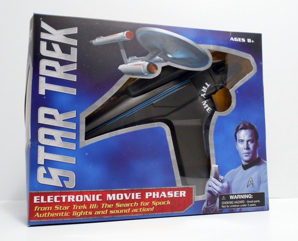
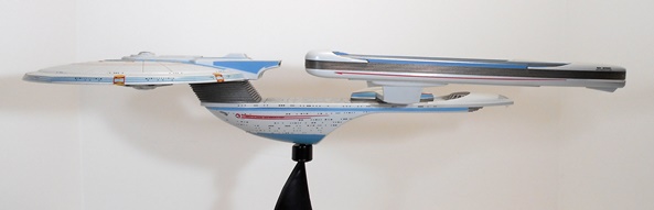
The box is right in line with releases over the past couple of years. It’s a blue box with the Classic Star Trek logo. The front and top panels has a window so you can see a good piece of the dorsal section of the ship and there’s a cut out with a “Try Me” button that repeats a single phrase and gives you a little taste of the lights. Excelsior arrives all in one piece, with no assembly required. All you have to do is pop the stand together, plug the ship onto it, and your good to go. I can still remember seeing Star Trek III in the theaters and my reaction to seeing The Excelsior. It was amazing to see a brand new Starship design and one that looked so much more futuristic than The Enterprise. The Constitution Class Refit will always be my first love when it comes to Federation ship design, but there’s something about The Excelsior that looks totally badass. The Constitution Refit is every bit the noble explorer, whereas The Excelsior resembles nothing less than a streamlined battleship. I always squee’d a little whenever this class ship made a cameo on The Next Generation and it’s fun to scrutinize the design and see how it influenced the design of the Galaxy Class Starship. Diamond has already had the Star Trek VI version of this ship (NCC-2000) out for a little while now, but I was holding out for her original appearance. Not only for the pre-commission registration number on the hull, but more importantly for the sound clips!

dstexbox2

The back of the box features a pretty big inaccuracy in that it shows the Star Trek VI version of the ship rather then the one in the box. Hell, it even lists it as the NCC version on the top, The biggest visible differences are the registry markings and the nacelles, which light up on the NCC version, but not on this one. I’d cry foul at this, but considering the ship comes in a window box, it should be pretty obvious as to what you are actually getting. There are quite a few other differences between the two ships, and since I’ll probably be picking up the NCC version eventually, you can stay tuned for the inevitable comparison feature!

dstexcel8

dstexcel2
dstexcel3

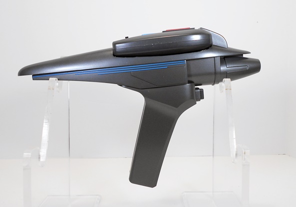
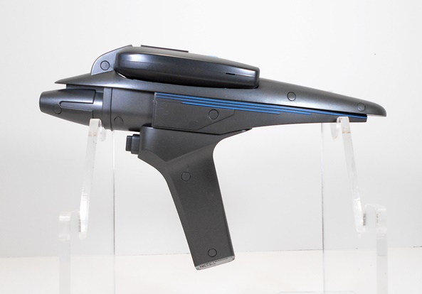
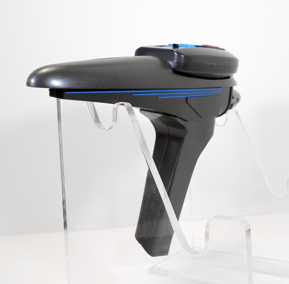
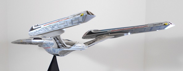
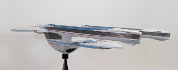
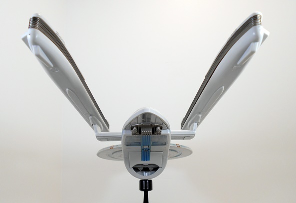
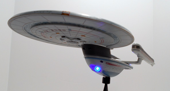
Straightaway, I’ll just say that this is one gorgeously executed ship. It only took a few moments of inspecting it to recognize that this is one of DST’s good ones, with hardly any major QC issues to speak of. It’s kind of sad when I have to start out by pointing that out. It should be a given when buying a $50 collectible model, but as I’ve already pointed out, Starship Legends is a line of highs and lows and DST’s QC is not always where it needs to be. Anyway, the sculpt here captures the unique profile of the Excelsior splendidly and at about 18″ long, this is a beast of a ship, that really tested the limits of my toy-shooting area. The warp nacelles are beautifully aligned and even the way the ship is assembled excludes the possibility of those unsightly gaps that were apparent in my WoK Enterprise. I also really dig the coloring on this piece. The official pics show the ship with a crazy blue tint and mint green accents, but in hand, the coloring is spot on perfect and the details are applied with care. Let’s start off with a closer look at the saucer…

dstexcel13

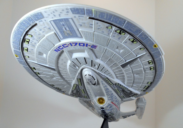
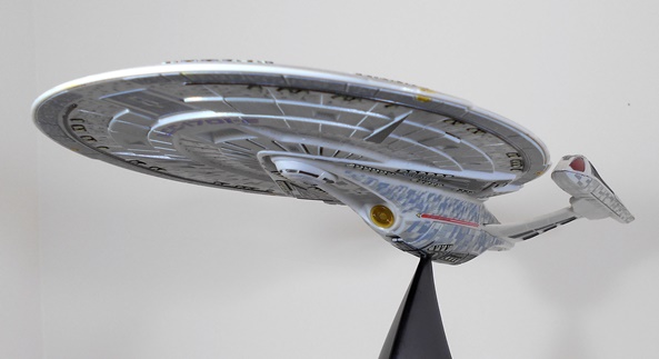
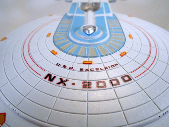
The hull doesn’t have the same hyper-detailed sculpted aztec pattern as the Enterprise, but I don’t think the screen version did either. As a result, you get some deep cut panel lines and concentric circles radiating out from the bridge and an overall cleaner look. The blue and grey patterns that form a horseshoe around the bridge look great as does the neatly printed NX-2000 and U.S.S. EXCELSIOR on the top of the saucer. The last four letters of Excelsior are a little off of alignment, but I’m really nitpicking there. The windows are mostly just painted on, but look fine.

dstexcel14

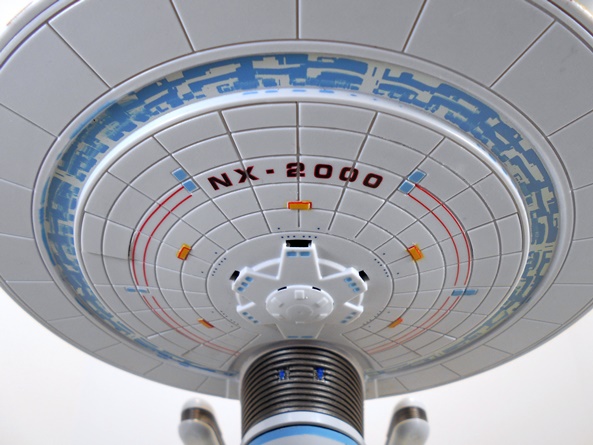
You get a similar layout on the bottom of the ship. There’s a ring running around this side of the saucer with a complex blue pattern. It’s here where the only real paint flubs can be seen. The pattern looks a little smeared on the left hand side. Yeah, I’d rather the ship be perfect, but if this is the worst there is, I’m really OK with that. Everything else looks sharp and beautiful!

dstexcel12

dstexcel15

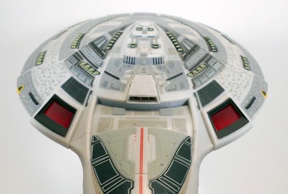
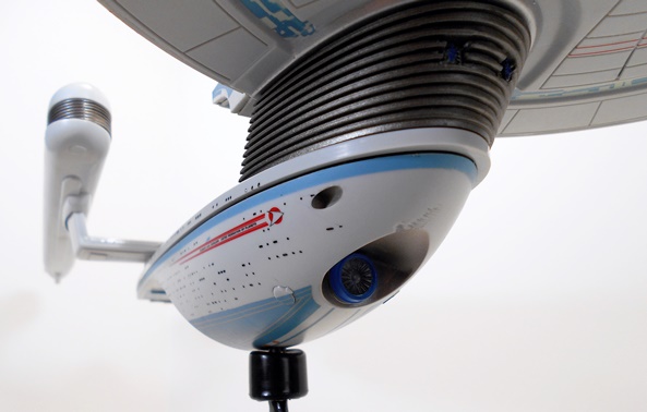
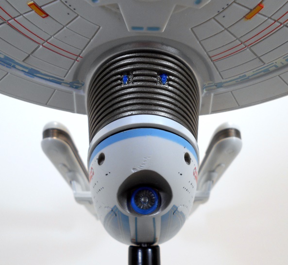
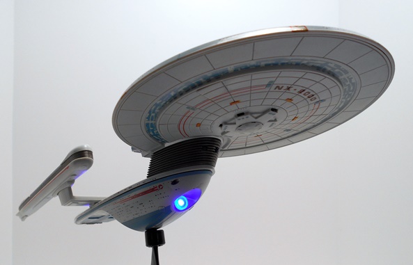
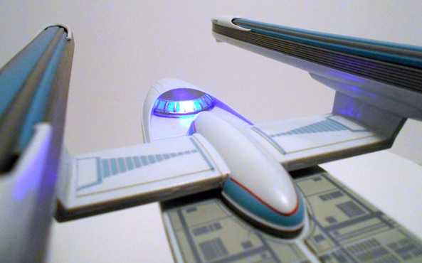
The ribbed neck features the two photon torpedo tubes on the front and the recessed deflector dish that is thankfully cast in clear plastic features just a blue ring around it. You can also see the ship’s only other QC problem and that’s a little scarring to the hull right above the deflector dish. I’m just chalking this up to battle damage, even though it was a brand new ship.

dstexcel11

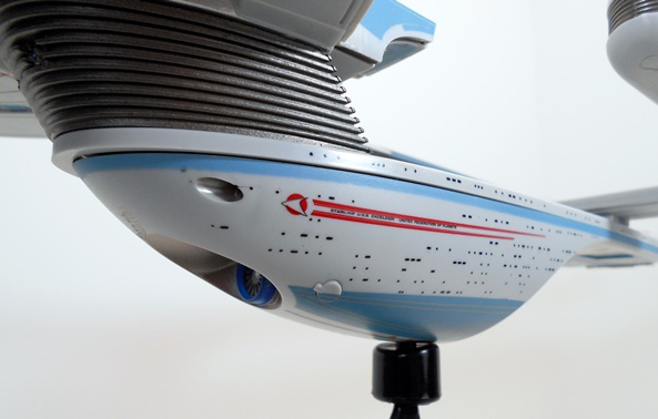
The detailing on the sides of the hull are all printed and that includes both the “racing” stripes and the windows. The blue ring around the top of the hull and the blue panels at the bottom look great. There are some notable screw caps on either side of the deflector dish, which are rather obvious, but still better than having to look at exposed screws. You also get the lower secondary torpedo tubes just in front of the Starfleet emblems and “racing stripes” just as a reminder that this thing was built to handle itself in a fight.

dstexcel10

Diamond did a beautiful job printing the patterns onto the dorsal section of the secondary hull. It all looks really crisp!

dstexcel4

dstexcel9

dstexcel7

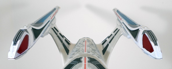
The nacelles look absolutely gorgeous and the alignment is great. I’ll also take this time to point out the debate over where the Shuttle Bay is actually located on the Excelsior. I always assumed it was the recessed cavity under the secondary hull, but the silver segmented area on the tail of the ship sure look like they could be bay doors. It wasn’t until recently that I heard the theory that the recessed cavity under the secondary hull is where the original failed Transwarp Drive might have been situated and has since been removed from subsequent Excelsior Class ships. In my research, I have found images of the Main System Display indicating the Shuttle Bay is indeed recessed under the ship, and that’s good enough for me.

dstexcel19

dstexcel18

dstexcel17

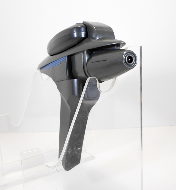
Moving on to electronics! The ship comes with batteries installed so all you have to do is switch it from trial mode to regular mode. Let’s start with the lights. Excelsior has four light points: The dome on the impulse drive lights up blue, the half-dome near the rear of the ship lights up blue, the deflector dish lights up blue, and the two impulse engines light up red. All the lights here are crazy bright LEDs that are quite visible even in a well lit studio environment. They also burn my eyes if I stare at them for more than a second or two. Impressively enough, there’s almost no light bleed through the plastic to speak of. If you want to just enjoy the light show you can hold down the bridge button for a second or two and they will all come on until you press it again. On the other hand, if you want to hear the SFX too, you can just keep pressing the bridge button to cycle through them all. That goes something like this…

Yes, a big reason as to why I wanted this version of the ship was so that I could get the voice clips of Starfleet’s biggest douchebag, Captain Styles, who seemed way too eager to take Kirk down a peg. The selection of clips is great, but there are two missing that I really wish had been included: “Kirk, you do this and you’ll never sit in the captain’s chair again.” and “If he thinks he can get away with Warp Drive, he’s really in for a surprise.” I also wouldn’t have minded a clip of Kirk referring to the ship as The Great Experiment. But what’s here is still fantastic, and the entire sequence with the engine’s failing (complete with flashing lights) makes up for anything that’s missing.

dstexcel20

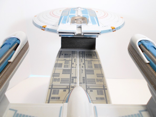
I should also point out that while the stands in this series have been worthy of much scorn, this ship’s stand is actually somewhat improved. Rather than relying on just one side of a triangle to support the model, it now features two, which adds a bit of stability and doesn’t look nearly as cheap. There’s a cylinder that plugs into the bottom of the ship, which then plugs into a ball joint and while I’ve had mixed results with this set up on previous ships, between cracking and just being loose, the system seems to work just fine here. Also, the base is sculpted to resemble the Starfleet insignia worn in the movie.

dstexcel16

It’s a shame that buying these ships has to always feel like such a gamble, but in this case it’s one that paid off. I would easily rank this release up with the best of the Starship Legends line, including the Enterprise-D and Bird of Prey. In fact, my satisfaction with this ship will probably have me gunning for another one soon, but I have yet to decide on which one. Still, with all that having been said, at fifty bucks, this is pretty expensive for what you get, especially when you consider that the QC can be wildly inconsistent. On the other hand, Star Trek toys are pretty slim pickings these days and I’m mighty proud to finally be able to put this great ship from Star Trek III on my desk.

Femme Fatales: Anne Bonny by Diamond Select

If there’s one undeniable thing about Diamond’s Femme Fatales line of statues is that it draws its source material from a deep well. So far I’ve looked at one original design, one comic based figure, and now we’re digging into the pages of history itself with the 18th Century bad girl of the seas, Irish pirate lass Anne Bonny. In my experience thus far, I’ve found this series to dabble between excellence and mediocrity, so let’s see where Anne falls along the spectrum. I should warn you, however, I enjoy me some pirates and sexy ladies, so this piece is starting off with bonus points. Warnings aside, let me also apologize. Cat hair is the bane of my collection, and copious amounts of it have snuck its way into a couple of these pictures. I didn’t see it until editing the shots. Anne’s whip and boobs seemed to be particularly prone to it. I’ll reshoot when I have time.

bonnyff1

bonnyff2

Anne comes in a window box that is identical in style to the last two Femme Fatales statues I featured. The front window shows off the statue fairly well and the top window lets some light in. The back panel has a blurb about the character and a shot of the statue itself. The credit for this piece goes to Uriel Caton for the design and the great Jean St. Jean as the sculptor. The box is totally collector friendly and the piece comes nestled between two plastic trays. Let’s get her out and set her up… ARRRRRRRR!

bonnyff3

bonnyff4

bonnyff5

Anne comes out of the package attached to her base and all ready for display. She is also followed by a pungent aroma of plastic and paint. If you think opening a NECA or McFarlane clamshell is bad, you need to experience this! It’s rather overpowering and not something I experienced when opening Lexi or Ariel. It is, however, historically accurate, as I understand 18th Century pirates didn’t bathe very often. Right off the bat, it’s worth noting that this is a large piece. She’s only about half a head taller than Lexi and the base doesn’t gain her much height, but she just looks a lot more imposing. She is, however, still scaled fairly well, so if you display the two together, Lexi just looks petite.

bonnyff6

bonnyff7

Anne strikes a classic Captain Morgan pose with one stiletto-heeled boot on a treasure chest. She’s holding either a whip or a piece of rope in her hands. It’s a very effective pose, albeit rather clichéd. The outfit, on the other hand, does not consist of any of the typical pirate duds that I’ve seen in history books. In addition to the aforementioned boots, Anne is donning the 18th Century equivalent of hot pants, a rather revealing red corset and a long brown naval greatcoat. Her hair is tied in a red bandanna. For obvious reasons, I’m a big fan of this costume’s design. Sure, it shows off a lot of skin, but it isn’t totally off the wall and just a little part of me, the part that doesn’t have a Masters Degree in History, would like to think that pirate chicks actually roamed the seas dressed like this.

bonnyff12

bonnyff13

ARRRR… THERE BE CAT HAIR IN THAT THAR PICTURE!!! The sculpt here is quite good, and that’s something I was worried about. Normally, I would have picked up a statue like this without hesitation, but there are very few photos of her at e-tailers that do her justice and I’ve never seen the statue in person at a comic shop or convention. In person, it looks great and the detail work on her outfit is particularly nice. The boots and coat show all the proper creasing and wear, you can make out the little line of sculpted fringe along her shorts, and the scrollwork on her corset are great little touches.

bonnyff10

ARRR… BY NEPTUNE’S BEARD… ENOUGH WITH THE CAT HAIR YE SCURVY DOG! The portrait is very distinctive. Anne is wearing a devilish smirk and glancing out of the corner of her eyes. The nose is surprisingly evocative of J. Scott Campbell’s work, not a bad thing as far as I’m concerned, and the little sculpted dimples are a nice touch. She has one ear exposed and fitted with a gold earring, and her hair is ratty with some of her bangs coming down out of the bandanna to cover her right eye.

bonnyff8

The paintwork here is rather subdued. Apart from a lot of flesh tone, you get the same brown on her boots, her coat, and the rope, and the same red on her shorts, bandanna and top. There is a little gold paint on her belt buckle, corset laces and necklace, as well as the white frilly cuffs on the jacket help to mix things up a little. What’s here is good, but I think there are some missed opportunities. The fringe on the front of her greatcoat could have been painted, and there’s a bangle around her left ankle that also could have used a little brushwork. It just seems like if you’re going to take the trouble to sculpt those little details you should draw attention to them with some paint. I will note that there was a very limited NY Comic Con exclusive version of Anne with a far more colorful deco and one which has the paint apps I feel are missing here.

bonnyff9

The base is just big enough to support the figure and it features a nice patch of sea washed sand with a couple of shells and a starfish, as well as the treasure chest. They put a lot of work into the chest sculpt, which is a nice surprise because it’s one of the last things that draws the eye. It’s also a little ironic that the paintwork on the shells is some of the best on the entire piece.

bonnyff11

I picked up Anne on clearance for $20. It seems like very few of these statues hold their value, as I’ve yet to pay more than $25 for any and they all start out closer to $40. I think she’s definitely worth the money. She’s a satisfyingly large piece with a great sculpt and an adequate paint job. I’ll even go so far as to say that I don’t think I would have been disappointed paying full retail for her. In a market that’s flooded with anime statues and comic book characters, it’s kind of refreshing to see something like Anne come along every once and a while, and while the Femme Fatales portion of my shelf is starting to look mighty eclectic, that’s not necessarily a bad thing.

Femme Fatales: Darkchylde by Diamond Select

Just a few weeks ago I liberated one of Diamond’s Femme Fatales statues from my local comic shop. Steampunk Lexi intrigued me enough each time I was there that I decided I should let her come home and live on my shelf. It was a good decision, as I think she is a fine statue. Good enough that I decided to order another release in the line. This time it’s Ariel Chylde, aka Darkchylde. I’ve been a casual fan of Randy Queen’s Darkchylde comic ever since I saw an art print of her at a comic convention and I decided to check out a few issues. Fast forward to today and I’ve got more than a few Darkchylde books on my shelf and even a couple of action figures. This statue seemed like a good fit. Let’s see if she stacks up to Lexi.

ffdchylde1

ffdchylde2

The package is identical to what we saw last time. It’s a simple window box and nothing at all special, but at least all the boxes in the line share a uniform deco which pleases the OCD in me. The back panel has a shot of the statue and a blurb about Ariel. The statue comes nested between two plastic trays and the wings come detached so she can fit a standard Femme Fatales box. Everything is collector friendly so you can return the statue to the box for storage or display or whatever.

ffarieal5

ffarieal6

I ordered this statue expecting her to be about the same size as Lexi from base to wing tips, but she’s actually in the same scale, which means with the wings attached she’s considerably taller. That was a nice surprise. What wasn’t such a nice surprise is that part of the statue broke off the moment it came out of the package. It was the ponytail on the doll. Granted, it’s not a crucial piece, if you don’t know it was there you wouldn’t miss it at all, but no one wants a collectible to break the moment it comes out of the box. Sorry, Ariel, we’re not off to a good start.

ffarieal7

ffarieal8

ffarieal9

The design of the statue is quite nice. Yes, I have issues with the base, but I’ll come back to that. Ariel is standing atop a raised base, in a tight dress, holding her doll in one hand and her other hand is morphing into her demon form. Her head is cocked slightly to the side, her long blonde hair is windswept to the other side, and her demon wings rise majestically from her back. I like the way the lower part of her dress is concealed between and behind her legs because, well let’s face it, she has nice legs. All in all, this design is a very typical look for Ariel, as it shows both her beautiful human side while also allowing us to glimpse her demon aspects. I don’t think I would change anything about the pose or the design here, but it’s a couple of the finer points where I’m about to take issue.

ffarieal1

My first stop is the portrait. Technically, I think the head sculpt is great. She’s definitely pretty. The way the hair is flowing looks quite good, although I’ll concede a little more texture to the hair would have helped. The paintwork on the face is immaculate, particularly the lips and eyes. I think it’s the likeness that I have to take a little issue with. Maybe she looks a little too old. Maybe the shape of the face is a little off. If I’m not a reader of the comic and I just look at this statue without knowing the character, I’d probably be perfectly fine with it. In fairness, I don’t even think Sideshow got her likeness quite right with their high end pieces, but ironically, I do think CS Moore Studios managed to nail it with their low end action figure.

ffarieal2

ffarieal3

Next up, is the base. I dig the way the base is just an extension of her dress. On the other hand, I’m not a big fan of the spiders on the base. They look too cartoony, both in sculpt and paint. Yes, I know this is a statue based off a comic, but when you compare the detail the rest of the statue with the spiders, they just don’t mesh well. Also, the one crawling up her leg is totally unconvincing. It looks like it was just stuck on there. The spiders could have been a great idea, but they needed to be executed better than this.

ffarieal4

ffarieal11

Those gripes aside, Ariel’s demon parts turned out really well. I already mentioned the realism of the claw sculpt and I really dig the way you can see a little bit of skin overlapping from where she shed it. The wings are exceptionally well done. I like the way they are swept back and not spread outward as it really compliments the pose and contours of Ariel’s shapely form. On the downside, they’re so tall, right now I’m forced to display the statue with the wings off because they won’t fit on the shelf where my similar statues are currently residing.

ffarieal12

I like this statue but I don’t love it. There’s some solid work on display here mixed with just enough hiccups to hold it back. Darkchylde is definitely not the slam dunk for me that Steampunk Lexi is. Maybe that’s because Lexi was an original design and Darkchylde is a character that I have history with. On the other hand, the qualifier here is that I picked up Ariel for $17 shipped, so it’s kind of easy to overlook the gripes I have with this piece. At the original $40-45 I probably would have been less forgiving.