Femme Fatales: Steampunk Lexi by Diamond Select

Yesterday I made the long trek to my “neighborhood” comic shop. It’s about a forty-five minute drive, so I usually make an afternoon out of it by taking a few years off my life and getting a burger and sack of fries at Five Guys before heading into the “shop-o-nerd-bliss” to see what kind of trouble I could get into. Besides picking up a Deadpool hardcover and the third TPB of Brubaker’s Winter Soldier, I also came home with this little honey. I don’t collect Diamond’s Femme Fatales line, but poor Lexi has been languishing there for a long while and discounted deeply enough that I was persuaded to put her on my shelf.

lexi1

lexi2

The package is what I’ve come to expect from PVC statues. It’s nothing special, just a window box that shows you the goods. There’s a photo of the statue on the back along with a blurb about Lexi and what inspired her creation. It’s also pretty badly shelf-worn, which is probably why they were clearancing her out. Inside the statue is cradled between two clear plastic trays. There’s no tape or anything, so she’s easy to get out and the package is totally collector friendly. Out of the package, Lexi stands about nine inches tall, putting her roughly in scale with a lot of other PVC statues on the market. She was designed by Art Asylum and sculpted by Sam Greenwell,

lexi3

lexi4

lexi5

Straightaway, I really like the styling on this piece. As much as it’s advertised as steampunk, the sculpt reminds me a lot of a retro 40’s or 50’s style. I think I’m getting most of that from the portrait and the fact that Lexi is slightly chunkier than a lot of the anorexic female statues we see. I don’t know if it’s intentional, but that’s what I come away with. She’s also pretty conservatively dressed compared to a lot of the half-naked chick statues on the market (and on my shelf). If you’ve seen any of DC Collectibles new Bombshells of the DC Universe, it gives me that same kind of vibe. The pose is excellent. Lexi is standing with one leg back and one hip thrown seductively to the side. She’s holding up a weapon in her right hand, which is cocked at the elbow and she has a smaller gun concealed behind her back. She’s looking off to the side with a sly expression and smiling knowingly.

lexi6

lexi7

lexi8

The outfit is cool and looks like something you might see on a cosplayer at a convention, and we’ll come back to the cosplay concept in a tick. She’s got high-heeled boots, thigh-high stockings, a skirt and corset, and a leather half jacket. Of course, she’s also wearing goggles up on the top of her head, because you can’t be steampunk without goggles! The detail in the outfit is quite good, although the skirt is a tad thick. The texturing and paintwork both add a nice level of credibility to the sculpt. Indeed, the paintwork on my piece is just about flawless, right down to all the tiny little silver buttons and the laces on her boots. I really dig the base, which is comprised of three giant, weathered looking gears.

lexi9

The weapons are cool, so long as you can get past the fact that her primary sidearm looks uncannily similar to a repainted nerf gun. Seriously, it’s the N-Strike Maverick! I like the design, but it seems like they could have come up with something more original. On the other hand, it brings us back to the whole cosplay vibe, which I think gives this piece a lot of unique charm. I do find the lack of a holster rather conspicuous. Where you going to put that thing when you’re trying to eat a hot dog at the concessions stand, hon?

lexi10

lexi11

In the end, I’m glad I took Lexi home with me, but it has to be considered that at $25 she was pretty far from the original retail, which I understand was closer to forty bucks. I’m not saying that she isn’t worth that from a quality standpoint. She’s certainly an exceptionally nice looking statue and doesn’t have a lot to apologize for. I keep coming back to the 40’s vibe this piece throws off and I find myself liking it even more. On the other hand, I don’t think I would have paid out that much for a non-licensed statue. I will say that now that I have some experience with this line, I am tempted to hunt down the Dawn or Darkchylde statues.

Star Trek: Captain Kirk and Khan by Diamond Select

Ever since the first reveal, I have been rather perplexed by Diamond’s new Star Trek… Figures? Statues? Collectibles? I don’t know what to call these things. They’re episode-specific dioramas that are exactly the same scale as the line of Classic Trek figures that they were putting out just a couple years back. It was a line that was subsequently shit-canned because they weren’t selling well enough. And granted, that’s a notion that is well illustrated with any stroll down the clearance section of that collectible action figure aisle at Toys R Us. Maybe Diamond is banking on more interest with a new Trek movie in theaters, but if that’s the case why not just bring out the actual figures again? Well, I’ll revisit that question more in a bit. For now, let’s look at the item in question. The initial assortment consisted of Spock and a Horta from “Devil in the Dark” but today we’re checking out Kirk and Khan from “Space Seed.”

stkak1

The package for this thing is enormous, at least it is for a card and bubble meant to hang on a peg. The bubble is massive and shows off both the Kirk and Khan figures along with the parts to the backdrop. Also visible in the bubble is Kirk’s extra set of legs and a pair of swappable hands. It’s a weird presentation that does a good job showing you all the pieces, but creates a crazy scene of disembodied human parts. The bubble is reinforced on one side with cardboard that features a nice side illustration of Kirk and a corner of the bubble has the Classic Enterprise. The idea here is to recreate the epic fight between Kirk and Khan in Engineering and give you a few different display options…

stkak2

No, you’re not looking at some tragic transporter accident. That’s all the pieces you get to customize Kirk in the display. There are two different sets of static legs, one set of hands clutching the conveniently club-shaped Engineering component, and a set of open palm hands. The Kirk torso is articulated with a rotating head, ball joints in the shoulders, hinges in the elbows, and swivels in the biceps. This begs the question… WHY NOT JUST GIVE US A FULLY ARTICULATED FIGURE? Can it really be more cost effective to include a second set of legs, when Diamond could have just repacked the Kirk figure they’ve already produced with this new head? We’re just talking about a T-crotch, knee hinges, and thigh swivels. The scale is identical… Diamond, you probably still have the figures sitting in your warehouse somewhere. I just don’t understand what they were going for here! PLEASE… SOMEONE MAKE ME UNDERSTAND!!! IT’S HALF A FIGURE ALREADY… JUST CUT OUT ONE EXTRA SET OF LEGS AND GIVE US THE OTHER HALF!!!

stkak3

Unlike Kirk, Khan is a completely static piece designed to peg into the console and be abused by Kirk. Khan has been released before by Diamond in this scale, but not in the red jumpsuit, so at least the new non-articulated sculpt here makes sense from a cost perspective. I’m very pleased with the sculpt, particularly the likeness. But in the end, this Khan is still just window dressing.

stkak4

stkak5

The Engineering section consists of a fairly large plastic base that plugs into the upright console. The wall behind the console is cardboard with two printed sides to give you two display options. The original piece was supposed to be plastic, but Diamond said it didn’t cost out in the end. I’m fine with it. It looks good and since a lot of the Classic Trek sets looked like cardboard anyway, it’s strangely appropriate. The only downside is durability and storage. I do love the console, and I’ll confess it’s the main reason I purchased this set first over the Horta one, because I thought it would be cool to have this backdrop for my proper Classic Trek figures. And indeed, Scotty looks awesome standing against it.

stkak6

stkak8

stkak9

Putting it all together, you do have several options to tweak the display, but the ensemble is designed for two specific configurations. The first has Kirk standing on the deck and pummeling Khan with the engineering rod. This is my least favorite of the options, because Kirk seems awkwardly bent and unless you tweak it just right it looks like he’s attacking Khan’s crotch with it. Kirk was a dirty fighter, but I don’t remember him beating on Khan’s balls with an implement. You can also use the open palm hands to make it look like Kirk is just slamming Khan into the console. Either of these poses make me wish Kirk’s head was ball jointed so he can look up at what he’s doing. But hey, since the hands with the rod are interchangeable with the hands on my proper Kirk figure, I can just use that figure in the display to much better effect. So again, I ask… Diamond, why didn’t you just pack the old Kirk figure in with this thing?

stkak10

stkak11

The other display option has Kirk doing a jumping kick into Khan. This configuration makes use of a clear plastic rod that pegs into the console and into one of Kirk’s sets of legs. The rod holds the figure in place extremely well and the illusion of mid-air-kick Kirk is really well done. I definitely prefer this display option as it looks a little more natural and you can tweak Kirk’s hands in a number of ways. Hell, you can even have him kicking Khan with the engineering rod raised over his hands for QUAD DAMAGE! Admittedly, “Flying Kick Kirk” makes better use of the unique Kirk that comes with the set, but I submit that Diamond could have just as easily bored a hole for the clear rod into a proper Kirk figure’s legs and still made it work.

stkak15

stkak14

stkak13

stkak12

If it sounds like I’m picking on this set, it’s just because I generally don’t understand it. That doesn’t mean I don’t like it. It’s an awesome display piece and it does a great job combining a bit of customization and playability of action figures with a statue-style environment. If we didn’t already have proper Classic Trek figures in this scale, I’d be even happier with this set, but as it is, it seems like such an odd thing to do. The photos above illustrate how well it works with the Classic Trek figures that Diamond already have made. At around $22, you certainly get a lot of stuff for your money, so it’s not a question of value, it’s just my own morbid curiosity as to how a set like this can be expected to sell better than a new round of proper action figures.

Star Trek: The Original Series Hand Phasers by Playmates and Diamond Select

I started my tribute to the new Trek film a couple weeks ago with a look at Playmates’ hand phaser from the 2009 movie series, so it seems only right to end Star Trek Week with a look back at The Original Series phaser. In terms of my own personal favorites, this original piece of Starfleet hardware is second only to the awesome design featured in the otherwise shitty fifth movie, The Final Frontier. Were they used again in Undiscovered Country in the infamous mashed potato attack scene? I think so, but I can’t remember for sure. I’m actually going to be doing a dual feature comparing the TOS phasers made available by both Playmates and Diamond Select. Phaser vs Phaser… FIGHT!

toshp11

toshp10

No package shot, because I’ve had these things for what seems like forever, but since I’m likely to get a little techno-babbly, I am including two pages from my trusty Starfleet Technical Manual as reference for the anatomy of a phaser. I first bought the Playmates one to replace an actual resin and metal prop phaser that I bought at a Trek Convention back in the late 80’s. I had to sell that one off because I was in need of monies for college, or some other stupid thing, and I had a ridiculously high standing offer on it from a friend of a friend. It killed me to sell it, but them’s the breaks. Anyway, I was never totally happy with the Playmates release, so when Diamond Select offered their version some time later, I was quick to pick it up.

toshp6

toshp3

First, let’s talk scale… both phasers are close to the proper feel for an adult hand, but the Playmates version is actually quite a bit chunkier than it should be. It’s not only the overall dimensions that are skewed, but the sculpted, “Type 1” phaser also looks a lot bigger than it should be. Now, if you just happened to be holding the Playmates version, the extra girth might not be readily apparent to you. It’s not that bad and it feels ok in the hand. But, if you compare it side by side with the properly scaled Diamond version, you can clearly see the difference.

toshp7

toshp4

In terms of sculpted detail, both phasers hit all the right points Both have nice looking translucent beam emitters with adjustable photon accelerators. Both pieces do a good job of replicating steel finish for the accelerators. The beam shield is a bit stubbier and thicker on the Playmates version, but it still looks fine. Both models feature an adjustable Dilithium Crystal Cell, although the Diamond one actually serves a purpose for the SFX, whereas the Playmates version just turns. Both have painted deflector shielding on the sides and rear. They both look good, but I prefer the Diamond a bit more, mostly because it fans out of the back in the proper fashion. Both pieces have exposed screwheads on one side, the Diamond has one on the top and one in the handle, the Playmates phaser has three in the top and one on the handle. The other big difference is the Type 1 phaser on the Diamond version is properly textured, whereas the Playmates one is left smooth.

toshp8

toshp9

Moving to the top down, it’s now worth pointing out that the Type 1 phaser in the Playmates version is sculpted on, whereas the Diamond one is actually removable. Obviously, this is a pretty huge difference. The Playmates version uses stickers for detail on the force indicator dials, and mine have long since fallen off. The Diamond version uses a printed paper sheet under the translucent piece and sculpted numbers and hash marks on the dial. Both look very nice. The Type 1 phaser on the Playmates version has somewhat unsightly speaker holes on the electron aspirator pile, and the trigger is just a sculpted piece, whereas it is a clear piece on the Diamond version. Both Type 1 phasers are missing the operational light between the force setting wheel and the force indicator dial, something that my prop did actually have.

toshp5

The electronics are about on par with both pieces. My batteries are drained on both so I’m going from memory here, but each phaser had different sounds for different settings. The Diamond version has working electronics in both the regular rig and the removable Type 1. I don’t recall having any issues with the sound on either piece.

toshp2

toshp1

I’ll freely admit it isn’t really fair to compare these two pieces. The Playmates version was more of a mass market roleplay toy, whereas the Diamond version was designed more with collectors in mind. As a result, the Diamond release clearly comes out on top across the board.  That having been said, neither version is anywhere near on par with my old prop phaser, but both have their merits. The Playmates phaser can often be had for under $20, and all it needs is a patch of velcro to make it an excellent cosplay piece that can take a beating while wandering the hotel lobby drunk out of your mind. Of course, the Diamond version can usually still be had for under $40, and it’s clearly the way to go for a better display piece or for putting together the better Starfleet ensemble. I display them both together and just use the Playmates as a slightly earlier and less sophisticated version. You know, the kind you give to Red Shirts who don’t stand a chance of surviving anyway!

Pages are reproduced from the Star Trek Stafleet Technical Manual. NY: Ballantine Books, 1975. Researched and compiled by Franz Joseph. Star Trek is a registered trademark of Paramount Pictures.

Star Trek II The Wrath of Khan: Khan Noonien Singh by Art Asylum

And we’re back with Day Two of Trek Week! The key to crafting any great screen rivalry is to create a villain worthy of the hero. In the case of Kirk, that wasn’t an easy task. But, thanks to a performance crafted by master thespian and scenery chewer, Ricardo Montalban, Khan not only held his own against Kirk on the big screen, but has become one of the quintessential villains in modern cinema. He’s so friggin formidable they made a whole movie just about his goddamn wrath. But we’re not here to talk about the movie, we’re here to talk about toys, so let’s take a look at Art Asylum’s take on Mr. Khan Noonian Singh.

kns9

It’s the exact same packaging that we saw yesterday with Admiral Kirk. The only difference is the bottom insert in the card is personalized with Khan’s name. Again, the presentation here is fantastic. I love the Starfleet insignia shaped bubble and the card art really takes me back to the 80’s movie poster stylings.

kns10

Yep, the back of the card is the same too! Lots of figures and many are now very expensive. One of these days I will have a full crew. I vow it… I will have the full crew!

wok1-vert

Anyway… moving on to the figure…

kns3

kns4

Khan’s portrait fares much better than Kirk’s. The head sculpt is a pretty solid representation of Montalban from the film, right down to his outrageous 80’s David Bowie hair. It must have been a challenge to sculpt hair like that, but I think the guys at AA did a solid effort. I also appreciate that the long hair doesn’t impede Khan’s neck articulation.

kns5

The rest of the figure is ok, but I think it stumbles in a few areas and mostly the paintwork is at fault. His ragged Ceti Alpha 5 outfit is reproduced with nice detail. He has all sorts of patchwork bits on his tunic and the Starfleet pendant he wore around his neck is sculpted into the chest. He has his one gloved hand, because it was the 80’s and cool people wore only one glove. I also dig his wrist communicator with the sculpted wire running up his arm. His boots have sculpted fur lining and are surprisingly detailed, considering I don’t remember ever getting a good look at them in the film.

The paintwork, on the other hand, makes use of too much gloss, particularly on his tunic and his bare chest. It’s just not right and it’s at odds with the matte dirty finish on the bare arms and the matte paint on the face. It also makes him look more toyish than the Starfleet figures in the line, which make an effort to distinguish matte from gloss.

kns1

kns2

Khan features the same articulation as Admiral Kirk. You get a ball joint in the neck. The arms are ball jointed at the shoulders, hinged at the elbows, and have swivels in the wrists and elbows. The hips feature a t-crotch, and the legs have hinges in the knees and ankles, and swivels in the thighs. Again, there’s no articulation in the torso at all.

kns8

Accessories! Khan comes with one extra opened glove hand to swap out his fist. You also get his Ceti Alpha eel, a bowl of baby eels, and a pair of forceps. The eel and bowl are about what you would expect. They’re ok for what they are. The forceps should have been sculpted into an extra left hand, because it’s really tough to get him to hold them in any convincing manner. Still, apart from bundling him with a Genesis torpedo, I can’t think of anything else they could have given him.

kns6

kns7

If it sounds like I’m picking on Khan, I don’t mean to. He’s actually a pretty cool figure. Khan has got a great head sculpt and an ok body, which makes him the opposite of the Kirk figure. And, hey, if you have any kind of customizing skills and some matte paint, you can probably fix most of the paint issues with this figure by getting rid of the inappropriate gloss. I picked up my Khan figure at a Toy Show from the same dealer I got Kirk and he was also $20. Not bad. If you aren’t willing to spend deeply on a bunch of WoK figures, but want some representations of the movie on your shelf, Khan and Kirk are a great way to go.

Star Trek II The Wrath of Khan: Admiral Kirk by Art Asylum

Folks, I’ve got Star Trek on the brain this week. What with the new movie opening this past weekend, I wanted to balance it out with some Classic Trek cinema, so I busted out my Wrath of Khan Blu-Ray and now I’m all ready to talk some Trek toys. So, what the hell, let’s call the rest of this week Star Trek Week! To kick things off, we’re going to Art Asylum and their line of figures based on the second and greatest Trek movie of all time. And who better to go with than the hero and the villain of the piece. I’ve had this pair for a little while now, and I decided the time was right to open them up and get them on display. Today we’re going to check out Admiral Kirk and tomorrow we’ll swing back with a looksee at his nemesis, Khaaaaaaaaaaaaan.

admk1

I really dig the packaging here. Kirk comes on a huge card with a bubble shaped like the familiar Starfleet insignia. To the left of the bubble is an illustration of The Enterprise and to the upper right corner is a nice piece of art depicting Kirk, Spock, McCoy, and Khan. The artwork almost has a vintage feel to it, which really fits the flick incredibly well. It just reminds me of early 80’s movie poster art. The bubble has an insert with the 25th Anniversary (holy shit, I’m so old!) Wrath of Khan logo and another insert with Kirk’s name on it.

admk9

The flipside of the card shows stills of the characters that are available in Series I and II. It also taunts you with the fact that four members of the bridge crew are SDCC Exclusives and so if you want them you’re screwed. Actually, you can still nab some of these figures for around $30 on Ebay from time to time, but others have crept closer to that three-digit mark. Suffice it to say if you’re looking for a full set, you better be ready to dig deep. Ok, let’s bust out Kirk and check him out…

admk2

Hot damn, I adore the Classic Trek movie uniforms: The burgundy tunic with that front flap, the shoulder strap with the rank insignia medal, the gold plated Starfleet insignia on the breast and matching belt buckle. These uniforms were clearly the pinnacle of Starfleet fashion design and I remember being so disappointed when The Next Generation premiered and dragged Starfleet kicking and screaming back to jumpsuits… although, I eventually succumbed to their old school charm. Anyway, this figure does the uniform justice in every way. The black piping is sculpted into the tunic, as is the seam running down the center of the chest. The insignia are painted onto the arm band and the sculpted Starfleet insignia on the left of the chest and on the belt buckle are both things of beauty. Overall, the paintwork is solid, and I like how they used matte black for the pants and high gloss for the boots.

admk3

You may recall a while back I looked at “Regula-1” Kirk from the same series and I was less than impressed with the head sculpt. Well, regular Kirk here uses the same head sculpt. It isn’t terrible, but there’s something definitely off about it. I think it looks like much older Shatner. His eyes seemed to get squintier the older he got, and that’s what I’m seeing here.

admk10

Kirk features decent enough articulation. You get a ball joint in the neck. The arms are ball jointed at the shoulders, hinged at the elbows, and swivel at the biceps and wrists. His hips feature a standard t-crotch, his knees and ankles are hinged, and he has swivels in the lower thighs. I’m glad they didn’t go for any torso articulation, as it would have messed up the look of the tunic. Speaking of the tunic, because the lower part of it is made of rubbery plastic, Kirk can actually sit down. I am, however, somewhat hesitant to leave him in a sitting position, since it will likely crease the plastic. It’s not like there’s a proper movie captain’s chair for him to sit in anyway. Although, the Defiant chair that came with Playmate’s 5” Sisko will work in a pinch.

admk6

admk8

Kirk comes with an extra pair of hands and the basic Starfleet gear: A phaser and a communicator. The hands are nice, but I didn’t find them really necessary. I use the ones designed to hold his equipment and don’t bother with the others. Both pieces of gear are nice tiny representations of the props in the film. I’m pretty fond of this model phaser, and this one appears to be a repaint of the accessory used for the Admiral Kirk figure from The Motion Picture. The communicators in Wrath of Khan, on the other hand, were shit. In fact, they were probably the only bad thing about that entire movie. Seriously, how did Starfleet go from using wrist communicators in TMP to these ugly behemoths? They look like some kind of scratch built transistor radios.

admk7

admk5

And that’s Admiral James T Kirk. He’s a really nice figure. The portrait of the head sculpt could have been better, but it’s not a deal breaker. He’s also one of the WoK figures that won’t cost you an arm and a leg. I got mine at a Toy Show for $20, which is about right. And, if one Kirk isn’t enough for you, you can also track down Kirk with the bloody handprint on his tunic, put there by Scotty’s dying nephew. Hey, Scotty, the dude is dying… WTF did you bring him up to the bridge for? Take that shit to Sickbay and maybe he’d have a chance to live. Oh yeah, there’s also another variant with Kirk doing the Khan scream. Happy hunting! Tomorrow, I’ll be back with the most Noonien of Singhs… Khan himself.

Star Trek Starship Legends: USS Enterprise NCC-1701 (“Wrath of Khan”) by Diamond Select

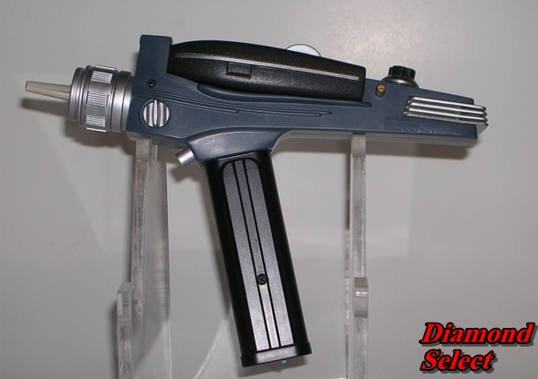
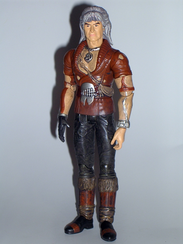
Science fiction has given us countless space faring vessels over the decades. Many have been one shot wonders, while select few have come to be considered iconic. But for my money there has never been a space ship more iconic, more graceful, or more beautifully designed than the Constitution Class Refit Enterprise. The ship made its debut in Star Trek: The Motion Picture, but it wasn’t until Star Trek II: The Wrath of Khan that we really got to see the ship in all its glory, both trekking through the stars and slugging it out ship-to-ship in a bitter fight to the death. If I were to use one word to describe this incarnation of the Enterprise, that word would be “noble.” I can’t say exactly why, but she has a glorious nobility to her that has always embodied the values of Star Trek to me. And now, I finally have the Starship Legends version of this ship in my collection. Yep… too bad it’s a piece of garbage. Now would be a good time to remind you of my colorful language disclaimer. Ok, let’s do this… Set phasers to maximum disappointment. 

DSCN0467

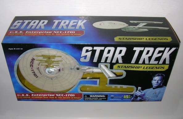
We’ve recently seen the Starship Legends packaging for the Enterprise-D and the Bird of Prey, so this Enterprises’ box should look pretty familiar, although it is a lot more compact and while the other ships came completely assembled, the WoK Enterprise requires you to attach the warp nacelles. This worried me at first, as I like the option of storing the ship in the box. Fortunately, the nacelles can be easily removed again for storage. You get that same blue starfield deco, which looks ok, but doesn’t really convey the Star Trek franchise to me and the combination of the Classic Series font and the image of Kirk in his Classic Series uniform just feels out of place for a ship based on the feature films. The box is fairly collector friendly, although the two pieces of the stand are sealed under plastic, so you will have to tear them up to get those pieces out. Still, you can do it with minimal damage and return everything to the box, which is a good thing, because this is a toy that I’m not anxious to display.

dstwok1

dstwok4

dstwok3

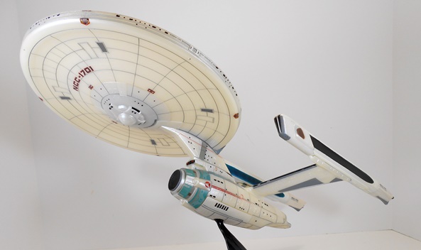
Let’s start with the few good things I have to say about this Enterprise: First, let’s talk about the sculpt. The sculpted detail on this piece is bewilderingly awesome. From the tiny panel lines to the faint Aztec pattern, Diamond obviously did their research and meticulously etched it all into the hull of this toy. Second, let’s talk about the hull’s finish. I wasn’t too sure how much I’d like the pearlescent finish on the plastic, but in person, it really brings out all that detail in the sculpt. If you manipulate the ship in your hands and shift the light around its surface, it really brings out all of those amazing and intricate little patterns. Lastly, there’s the lettering. The lettering on the ship all looks crisp and clear. From the large and obvious printing on the top of the saucer section to the minuscule “United Federation of Planets” on the sides of the saucer and the sides of the primary hull. The lettering is excellent. That’s it, folks… the rest is all downhill from here.

dstwok2

The quality of the plastic on this piece is downright terrible. It feels flimsy and cheap like a ten dollar model kit. There’s a huge gulf separating the quality of this plastic and the stuff used for Diamond’s most recent Bird of Prey. If you silhouette this ship against a light, you can practically see right through it. Seriously, I can see my fingers right through the saucer section! That’s bad enough, but when you activate the lights, they bleed through the flimsy plastic hull and make for a terrible effect. But we’ll get to the electronics in a bit. I’m not done harping on the shitty plastic yet. The top rear of one of the nacelles looks like it was repaired with some kind of gloppy glue and it looks like crap. That right there is a complete absence of quality control. If I purchased this second hand on Ebay, I would accused the seller of shenanigans. Seriously, Diamond? You’ve got to be kidding me with this shit.

dstwok13

dstwok11

The paintwork on the ship is also pretty bad. There’s bleeding and slop all over the place and the deflector dish is painted black. Yes, black. Holy fucking shit on a tribble, why in the name of all the holy mother-fucking Gamesters of Triskelion would you paint the goddamn deflector dish black? Looking at it, it’s hard to imagine it wasn’t a decision that was made to deliberately ruin the whole thing, especially since this the toy is designed to light up.

dstwok10

dstwok8

Which brings me to the electronics. I could take this opportunity to bitch that there’s no option to display the ship with just the lights on, like there was with the Enterprise-D or the Bird of Prey. But that’s ok, because the light effects are so terrible, I wouldn’t want to. They basically just come on in sequence with the sound effects. Diamond made no effort to simulate actual running lights or any of the Enterprise’s on screen lighting effects whatsoever. The back of the bridge lights up, the impulse engine lights up, the area around that shitty black painted deflector dish lights up, and the interior of the warp nacelles light up. Virtually all of the lights that you see are actually just bleeding through the cheap plastic. The ship doesn’t look that great as it is, but it looks worse with the lighting effects illuminated. That’s quite an achievement.

dstwok16

dstwok11

dstwok14

The sound is a mix of sound effects and voice clips from the movie. I suppose I could bitch about the fact that most of the quotes are taken from instances that don’t actually take place on the Enterprise, but this thing is such a mess, I’m going to give it a pass. Here’s the rundown on the audio…

  • Kirk: “Fire!” [ship phaser effects]
  • Khan: “From hell’s heart, I stab at thee!”
  • SFX: Warp
  • Kirk: “I don’t like to lose.”
  • SFX: Alert Claxon
  • Khan: “Let them eat static.”
  • SFX: Impulse
  • Khan: “Fire!” [ship phasers effects]
  • SFX: Hand phaser(!) … What. The. Fuck?
  • Khan: “Times up, Admiral.”
  • Kirk: “Lock phasers on target and await my command.”
  • SFX: Ship Phasers
  • Khan: “Time is a luxury you don’t have.”
  • SFX: Explosion
  • Kirk: “Kirk to Spock.”
  • SFX: Transporter Effect
  • Kirk: “I don’t believe in a no win scenario.”
  • Kirk: Khan scream! 

Wrath of Khan is a highly quotable film, so there’s some good material here, and I’m also a huge fan of the film’s sound effects. The transporters and the phasers sound particularly good.

dstwok12

I took a lot of issue with the stands included with The Enterprise-D. Well, the stand that comes with this ship is in some ways better and in some ways worse. Oh, don’t get me wrong, the stand itself is unbelievably cheap. The other stands featured two sides coming up from the Starfleet insignia base, making up a triangular cross-section, whereas this one only has one, making it seem like a totally deliberate way to shave a couple pennies of cost out of this thing. When I first took it out of the box I  literally thought I was missing a piece. I mean it really is insulting and shameful to have a stand this shitty for a $60 collectible. On the plus side, the ball joint will actually hold the ship upright, which I attribute mostly to this Enterprise weighing a lot less than the Enterprise-D. There is an extra battery cover, which can be swapped out so the bottom of the ship doesn’t have the hole in it for the stand. It seems like a nice bonus, but than I realize the hole for the stand is the least part of this ship’s problems.

dstwok9

I have had nothing but good experiences with Diamond Select and Art Asylum in the past, which is probably why I’m so incredibly surprised and irritated over what a terrible ship this is. It’s so far beneath the other releases in the Starship Legends line, that it feels like it’s some kind of terrible and cruel joke. It just fails on so many levels that it’s almost inconceivable that Diamond would have the nerve to pack it into a box and sell it for $60. SIXTY DOLLARS!!!! Even at a third of the price, I couldn’t have been happy with this thing. I just look at it and think, what a waste of money! Even the novelty packaging Enterprise model that holds my 2009 Star Trek Blu-Ray is better quality collectible than this unfortunate piece of garbage.

dstwok7

Computer, initiate destruct sequence… I’m going to get some Romulan Ale and drink to forget.

This Feature was Re-Shot on 4/23/15

Star Trek Starship Legends: USS Enterprise NCC-1701-D by Diamond Select

As I mentioned last Saturday, the fine folks at Diamond Select have taken pity on those of us who missed out on their Starship Legends line by reissuing the ships with some minor tweaks and refreshed packaging. I was quick to jump on board and pre-order the “Wrath of Khan” Enterprise and the “Next Gen” Enterprise-D. I’ve got a little while to wait on WoK Enterprise, but 1701-D showed up at my door this week in a giant slab of a shipping box. I’ve been jonesing after this thing for a long while now, so I couldn’t wait to get her inside and open her up. This is a big ship, there’s a lot to talk about, and there will be some bumps along the way, so sit tight and engage your inertial dampeners…

The huge window box is actually not quite as big as the Bird of Prey’s package, but it is deeper. It’s the same style of blue cloudy star field deco only this time you get a shot of Captain Jean-Luc Picard, with arms crossed, staring out approvingly at you, as if to say, “Well done on buying this ship.” That makes me happy. After all, deep down don’t we all really just want approval from Captain Picard? The Star Trek logo is in “The Original Series” font with “The Next Generation” below it. Wait… they can’t do that… can they? I’ll confess the mixing of the two generations looks weird, like it’s a knock off package or something. The front panel of the box is cut out to show the bulk of the ship, while still hiding the two pieces of shit stands in the lower right corner. There’s a “Try Me” hole in the window so little bastards can run down the batteries when they see it at their local comic shop. The back panel of the box shows a shot of the model with a couple of paragraphs on the series and the ship. It also seems to take great pleasure in chronicling the fact that the mightiest ship in the Starfleet, the Flagship, was destroyed by a small rogue Bird of Prey after Picard gave Riker the keys and Troi crashed it into a planet. Cue Picard Facepalm.

The ship is packaged fully assembled. You just have to clip the wire ties to get it off the tray, and that’s where the fun starts. I honestly didn’t expect to have anything bad to say about this thing, and yet we’re going to start off with one major annoyance. As expected, the ship comes packaged in “Try Me” mode and to get the full effect of the electronics you need to switch it over to “Play Mode.” Unfortunately, the switch is inside the battery compartment on the bottom of the Star Drive section. Some may argue that’s a good thing because the ship doesn’t have a switch exposed on it anywhere, but it didn’t bother me so much with the Bird of Prey. Anyway, this situation sent me scrambling throughout the house to find one of my tiny screwdrivers, which by now I should keep in a very prominent place, but I can never remember where I left it. After about ten minutes of swearing under my breath and rummaging through every junk drawer and catch-all I have in the house, I got my hands on it only to find that I couldn’t budge the screw. Diamond obviously used some kind of self-sealing stembolt (Right? Get it?) to secure the hatch down. I went back to searching until I turned up a pair of vice grips so I could get enough torque and break the seal on the screw. After that it was easy. I also noticed the super shit batteries they put in here, so I’m going to have to go get a couple of packs of the best AAA batteries I can find for the Enterprise and Bird of Prey so they don’t shit battery goo all over the inside of my precious ships. But wait! We’re not done yet! You also need to take off a second battery cover on the top of the Saucer Section right over the main Shuttle Bay and flip a switch under it in order to get the Saucer Separation SFX to work. Yes, the Enterprise is also powered by three additional button batteries in the Saucer. This cover is slid back by inserting a thin implement into a notch and pushing back. It’s a jarring ordeal because I had to apply just a bit more force than I was comfortable with. Keep in mind, as annoying as this all was, it’s just something to deal with during the initial unboxing and not something that’s going to really spoil the enjoyment of the model once you’ve done it. Ok, now that I’ve put everybody to sleep with exciting battery talk, let’s look at the ship.

I was expecting a lot of detail, but I’ll confess the finished sculpt still exceeds my expectations. The Enterprise-D has a lot of surface space, and every bit of it is covered with panel lines. I mean, damn, you can practically see every single plate of tritanium-duranium alloy that went into the hull’s construction. The Escape Pod hatches are sculpted, the ridges on the Shuttle Bay doors, even the little docking hatches on the sides of the Torpedo Bay launchers. If Art Asylum left any details out, I sure as hell can’t find them. There is a little more assembly seaming on this ship than was evident on the Bird of Prey. It’s mostly noticeable along the aft edges of the ship and where the back of the neck meets the front two pieces. They aren’t terrible, but worth mentioning.

The paintwork compliments the sculpted detail wonderfully. Every window is painted onto the ship’s skin from the random windows of crew quarters to the line of panels that runs across the wall of the Conference Room and even the viewports of Ten Forward. The Escape Pod hatches are painted tan and you’ve got a darker grey on the Shuttle Bay doors and the Phaser Array strips. The lettering is all crisp and hugs the hull better than what I remember seeing in the test shots. Of all the tiny details, I think the one that impresses me the most are the tiny scoring lines that run along the perimeter of all the Phaser Arrays. Holy shit that’s cool!

The Saucer Section is secured to the Star Drive Section with some of the most insanely powerful magnets I think I’ve ever seen in a toy. Separating the ship is as easy as pulling them apart. When you go to connect them up again, the magnets will aggressively grab at each other and do the rest. Connecting and reconnecting the two sections give you a sound and light show, which we’ll talk about in a little bit. Obviously reconnecting the two halves of the ship will lead to rubbing on the surface so I’ll probably avoid doing it to excess. I’ll point out here that Diamond stamped a bunch of large type copyright information inside the area where the Saucer Section connects to the neck. It’s annoying and I’m pretty sure it wasn’t there on the original release.

The Enterprise comes with two display stands and they are the biggest pieces of shit I’ve ever seen. They’re basically the same style of thin, opaque plastic pieces as the one that came with the Bird of Prey, only these feature the ball joint under the connection points and are sculpted with the Starfleet “Comm Badge” style insignia. They look cheap, but that’s not the problem I have with them. While the Bird of Prey used a fixed connection that works perfectly, these stands use ball joints and they work well until you manipulate them a couple of times and then they fail miserably. The ball joint just can’t handle the weird weight displacement of the ship and it constantly wants to drop the ship forward onto the Saucer Section. They will work fine if you want to pose the ship in an upward climb, but forget about getting it displayed parallel to the surface its standing on. You see those two side shots of the ship? Well, the stands won’t do that anymore. Hey guys, what the hell is the point of a poseable ball joint if it can only hold the ship in one position???  I’ve tried gumming it up with blue tack, which didn’t work.  I may try some nail polish next.

So two stands? Yes, The complete Enterprise displays on either stand by plugging it into the hole closest to the Deflector Dish. You can also display the Enterprise separated by plugging the smaller stand into the middle hole of the Star Drive section and using the larger stand for the Saucer Section. While I doubt I’ll ever display the ship separated, it’s very cool to have this option. The instructions show a plug that can be put into the hole of the Saucer Section to cover it up when you are displaying the ship as one piece. It’s a great idea, but sadly no such plug was included in my box.

Ok, let’s talk electronics and we’ll start with the lights. By pressing and holding the concealed button just below the main Impulse Engine on the Star Drive section, you can put all the lights into “Display Mode” and they’ll stay lit until you press it again. You get red LEDs in all three Impulse Engines and the front of both Warp Nacelles. Blue LEDs light up in the front Deflector Dish and in the strips around the Warp Nacelles. The lights are all bright and gorgeous, particularly the fronts of the Nacelles. There’s one more light, a white Bridge light on the top of the Saucer Sections dome. Alas, this one bleeds through the paint and plastic around it quite a bit. I can sort of convince myself that the light bleeding through is just the light reflecting off the hull. Yeah… sort of.

The sound effects and voice clips aren’t quite as loud and clear as the Bird of Prey’s SFX, but they’re still pretty good. The sounds and voice are activated by pressing the top dome of the Saucer Section and the lights will come on when the sound is activated. One thing I do not like at all is the way the blue Nacelle lights blink to match the speech or sound effect. It’s just like the lights on the top of a Dalek when it talks. What is the point of this, Diamond? WHY? At least all the lights don’t do it. The sounds and voice clips play in the same order and if you hold the button down it’ll run through everything in one long sequence. All of the voice clips are from Captain Picard himself. Here’s what you get…

  • “Open a hailing frequency. This is Captain Jean-Luc Picard.”
  • “Energize.” [Transporter SFX]
  • “Scan for life forms.”
  • “Shields up! Red Alert!” [Red Alert SFX]
  • [Phaser Alarm. Phasers Firing.]
  • “Make it so.”
  • [Warp Drive Engaging]
  • “Tea. Earl Grey. Hot.” [Replicator SFX]
  • “Dispersal pattern Sierra and fire!” [Torpedoes SFX]
  •  “Transferring command to the battle bridge.”
  • [Impulse Flyby]
  • “Continual fire, all phasers!” [Phaser Alarm. Phasers Firing]
  •  “Damage report!”
  • “Warp 9, Engage!” [Warp SFX]
  • “Let’s make sure history never forgets the name… Enterprise!”

I could have done without the Earl Grey quote, but I adore the way the sequence ends with Picard’s memorable battle cry from “Yesterday’s Enterprise.” The weapon sequences are so awesome that I really wish there was a way to select them specifically to avoid the following scenario: “Hey, wanna hear the Enterprise-D kick some ass?” “Sure!” “Ok, here we go.” [pushes button] “Tea. Earl Grey. Hot!” “Oh…”

Separating the Saucer section plays, “Prepare for emergency saucer sep” and engages the lights and sounds. Reconnecting plays the sound of the moorings locking down. Very cool!

If it sounds like I’m nitpicking the Enterprise more than I did the Bird of Prey, well that’s because I probably am. The Bird of Prey didn’t have as many issues. Besides, this is the goddamn Enterprise after all and I’m going to hold it to higher standards. My issues with some of the electronic SFX are fairly minor and in one case (the lights flashing in time to the voice) just a matter of personal preference. The stands, however, are just poorly executed and considering this is the second time this ship has been released, they should have been fixed. I’d much rather have a stand that gave me less display options but actually worked well. I would even have been willing to pay a little extra for a ratcheting stand. In terms of the ship itself, however, well it’s absolutely gorgeous. I love it so much that even with all the other hiccups, I’m still so very glad that I finally own it. When you consider what the old Playmates Enterprise-D goes for these days, picking up this Diamond version is a no-brainer. At $70 shipped, it’s just worth every penny, horrible stands and all! Now if only I can find a place to display it so I don’t have to put it back in the box.

And that’s going to wrap me up for this week. Tomorrow is my day of rest and I’ll actually be continuing to clean out and organize one of my bottomless toy closets. Next week is going to be a complete run of some of the stuff I find so it should be an interesting mish-mash of who knows what!

Star Trek Starship Legends: Klingon Bird of Prey by Diamond Select

Hey guys, I like me my Star Treks. You’ve probably figured that out by now. One of my great collecting regrets was selling off my fleet of Playmates’ Star Trek ships about 10 years back. They were fairly solid representations of the ships and damn if they haven’t gone up in value. Woops. Bad call on my part! Another regret I’ve had was not jumping on board with Diamond Select’s line of starships as they were originally released. Fortunately, that’s no longer a problem, because 2013 is going to see a slew of re-releases of many of the Diamond’s proud fleet of Enterpriseseses, and I’m not missing out on them this time around. But before we get to the Enterprise, we’re going to kick things off with a look at Diamond Select’s newest release, and their first crack at an alien ship: The Klingon Bird of Prey!

This now iconic ship design was first introduced in Star Trek III, it practically starred in Star Trek IV, and it subsequently appeared in every “Original Crew” movie produced since, including Generations. This particular release, however, is based on the ship’s appearance in Star Trek VI: The Undiscovered Country. What’s the difference? Christopher Plummer’s goddamn voice, that’s what.

Word is that Diamond has revamped the packaging for this year’s releases, but seeing as I don’t own any of the past releases, I have no frame of reference. There are things I like about it and things I don’t. It’s a freaking massive window box, but with a wingspan of about 19-inches, the box housing this ship has to be big! The front of the package has a kind of weird trident design cut out to show you some of the detail on the ship’s hull. The box’s deco is a blue cloudy-star motif, which doesn’t really fit Star Trek for me, and I would have much preferred the movie font over the old classic font because it just better fits the context of this ship.


There’s a decent blurb about the Bird of Prey on the back, which correctly points out that the configuration of this ship was applied to various classes from small scouts to larger warships. Oddly is proclaims that the BoP was equipped with photon torpedoes, disrupters and… phasers? It’s been a long time since my days of pouring over the stats in FASA Star Trek ship catalogs, but I’m pretty sure I never saw mention of a phaser bank equipped on a Bird of Prey, but I’m guessing that occurred sometime in the Next Gen era. Anyway, it took me a while to get all the twisty wires off the ship and free it from its tray, but I’m very happy that the ship comes in one piece and doesn’t need to be assembled. The stand does have to be fitted together, but it can easily be taken apart and the whole shebang can be returned to the box for storage.


The ship itself is gorgeous. I always used to think the Playmates version looked good enough (well, at least until I looked at it recently), but damn this thing looks phenomenal. There isn’t a square inch of this thing that doesn’t have some kind of sculpted detail. There’s pipes and vents and all kinds of windows. Hell, it’s easy to get lost in the intricate panels of the wings alone. I’ve misspent a lot of time in my youth sketching the Bird of Prey from various movie stills and FASA books and the like, so I consider myself intimately familiar with the design, and this model does it proud. Sure, close inspection reveals a few hiccups, like the hollow pieces on the back by the engines and a little bit of seaming, again on the back, but I’ve got to remind myself, this is a $60 display piece and not a studio model.


The coloring uses a mix of the base green plastic with all sorts of swirly brush strokes to convey weathering, different colored materials and panels. The red feathered coloring on the undercarriage of the wings is particularly nicely done, as is the brushed metal look of the black and silver grills of the engines. The Klingon writing and markings are all tampos rather than stickers, which goes a long way for both durability and realism. I’ve got nothing but praise for the paintwork on this piece. It looks weathered and battle hardened and awesome.


The Bird of Prey design has three basic wing configurations, and the articulated wings on Diamond’s model allows for all three. The landing mode features them raised up above the hull to allow for ground clearance; the cruising mode has them level with the ship’s hull; and finally the attack mode has them angled downward. Each wing moves independently of each other and the hinges are strong to keep them from flopping about. In fact, it takes a fair amount of effort to get them to move. I really dig the way the teeth interlock on the grills when the wings change position. That’s one delightful little detail that I never really noticed about the design.


And let’s not forget the electronics. The ship features lights, sound effects and a slew of General Chang’s hammy quotes from the movie, all accessed by a button cleverly concealed as a tower above the bridge. By holding down the button you can activate a “Display Mode” in which the powerful LED lights will remain lit. The ship has red LEDs in the rear engine and the front torpedo launcher, various yellow LEDs scattered about the ship’s windows, and a pair of green LEDs to simulate the wing-mounted disrupters. The disruptor lights are ridiculously bright!

The lights, sounds and voice clips cycle through randomly as you tap the button. Here’s the complete catalog:

  • Sound Effect: Cloaking Device Activating.
  • I can see you, Kirk. Can you see me?
  • Sound Effect: Torpedo Firing.
  • Cry havoc! And let slip the dogs of war!
  • Sound Effect: Disrupter cannons firing.
  • I am constant as the Northern Star!
  • Warrior to warrior, you do prefer it this way, don’t you?
  • To be, or not to be.

I’m very impressed at how loud and clear the voice clips are. Sure, some may argue that Commander Kruge’s voice would have been cooler, but Chang certainly was a quotable enemy and as I mentioned in yesterday’s feature, he was one of my favorite things about “The Undiscovered Country.”

Ok, so the stand is kind of cheap looking, as it’s all cast in a smoky colored semi-translucent plastic, but overall I still like it for a number of reasons. First and foremost, it is easy to attach and remove the ship, which was always my biggest complaint about the Playmates ships. This stand has a simple peg that holds the ship securely and simply pops apart when you want to pick it up and handle it. Secondly, there’s no ball joint to fail making the ship droop. Finally, I actually enjoy the fact that there isn’t any flashy paint on the base. It’s a simple sculpted Klingon emblem, which is just fine. The quality of the ship speaks for itself and it doesn’t need to be upstaged by the stand. I can easily understand some collectors taking issue with the quality of the stand, but I’m fine with Diamond putting as much money into developing the ship as possible. The stand is perfectly functional and that’s all that I need.

Needless to say, I’m suitably impressed with my first Starship Legends acquisition. I had very high expectations and the Bird of Prey certainly lived up to all of them. While I will concede that the Bird of Prey has been way overused in Star Trek over the years, I still love and admire the design. I can remember being in awe of it when it first appeared in Star Trek III, and one of my favorite Trek photos has always been a double-page spread (in Starlog maybe?) of the soon to be doomed Enterprise facing off bow to bow against Kruge’s Bird of Prey. Diamond’s release captures all the greatness of this iconic design. It’s both ugly and graceful at the same time and wonderfully constructed. I knew when I bought it that it would probably be stored in the box, but now that I have it, I’m going to have to make room to put it out. It’s just too glorious and epic not to be on display… at least until next week, when my Enterprise-D arrives.

Star Trek II The Wrath of Khan: “Regula-1” Kirk by Art Asylum

I realize that I’m not being terribly original when I say that Wrath of Khan is my favorite Star Trek movie, but it’s also one of my favorite go-to films when I want to watch a good sci-fi flick. I love the story, the script, and most of all, I absolutely adore the costumes and props. Ok, the communicators are shit, but apart from that, this movie is represents the High Renaissance of the Star Trek Universe for me. It was the meeting of the gritty old stylings with newer flashier special effects, and it was glorious. The transporter and phaser effects are breathtaking, but the Starfleet uniforms! God damn, I love these uniforms. But we’ll talk about those another time. Today we’re looking at “Regula-1 Kirk”, and he’s all about that bad-ass Landing Party jacket. I picked up this figure at the Show loose. He was baggied with all his parts, but no packaging, so instead of packaging, we’re going to take a look at the movie poster, which is something else I picked up from this Dealer.

The poster I got is a repro, and it’s still rolled up in a tube, but that’s it pictured above. By, God, but that was the right way to do the poster for Star Trek II. It was Paramount’s way of saying, “We know the first movie bored you to the point where you wanted to commit suicide in your theater seats. But check this shit out!” It’s got explosions and phaser fire and some dude we don’t know yet who looks like he may have just stabbed the hell out of Kirk. There’s mysterious desert people and I’ll be damned if that ain’t Paul Winfield screaming his ass off in a space suit. I saw the poster at the theater when I was about 11 years old and it almost blew my little mind, because I wanted to see what was going on so bad. This poster just captured everything that it meant to be Star Trek and awesome at a time where Starship bridges weren’t carpeted and Earl Gray Tea was served at book clubs and not on Starships. God, I love this movie!


Art Asylum did a lot of versions of Kirk from Wrath of Khan, and eventually I hope to look at all of them. But, as you can see, this one is called “Regula-1” Kirk as it’s based off the scenes where he beamed onto the Regula-1 Space Station only to find out that Khan had tortured and murdered the shit out of everyone. The idea of having special gear for landing party duty wasn’t often explored in the original show, but it made sense to me, and that’s where this jacket comes in. The jacket is just bad ass and Kirk being Kirk needs to wear it with the collar up to make him look a little extra bad ass. The jacket is wonderfully recreated here, with all its little patches and pockets and stitching and some very nice paint detailing. Like so many of the designs for TWOK, this thing not only looks cool, but also totally functional. Ok, except maybe for that huge pouch over the ass. How would you get anything out of that? The large Starfleet shoulder patch is present as are the rank insignia on the sleeve, the distinctive diamond pattern on the back, and the Starfleet insignia on the chest. The legs are pretty much the same as the ones used on the regular Wrath of Khan Kirk, with the red piping down the sides and high gloss black paint used for the boots.


And then there’s the head sculpt. Yeah… there’s definitely some Shatner in there, but it isn’t one of Art Asylum’s best pieces of work. One of the running themes of TWOK was about Kirk getting old, and that’s kind of ironic in retrospect, since it wasn’t so much a theme more than 10 years later when he was still chasing around the galaxy. I mention it here, because at certain angles, this Kirk head looks a bit older than Kirk from Star Trek II. Everything else here is pretty good and the painted flesh tone is thankfully free of any dirt or smudging. Kirk even has his trademark 24th Century (read early 80’s) pointed sideburns.

Alas, as good as the jacket looks; it really destroys a lot of the figure’s articulation. The head and arms are fine, as you get a ball jointed neck, ball jointed shoulders, swivels in the biceps and wrists, and hinged elbows. The leg articulation is all still there, and includes swivels in the thighs and hinged knees, but with the jacket extending down to his legs, you really can’t do anything useful with it. It’s kind of ironic, since this is supposed to be the action-packed, “I’m gonna beam down and kick your ass!” Kirk, but given the way the figure is built, I guess it’s understandable.

“Regula-1” Kirk comes with lots of extra hands. You get two replacement sets, and as is often the case with extra hands, I don’t find a lot of need for them. One is sculpted with the comm bracelet that he takes off of Chekov and screams the infamous“KHAAAAAAAAN!” line into. It’s a cool bonus. The other set seems to be slightly better at holding the gear, but not enough to make me want to swap them out. As for the other accessories, you get a phaser and a communicator. The phaser seems to be the same one that came with my Motion Picture Kirk and Spock, which is fine because the prop was more or less the same. The communicator actually opens and closes, and it feels like it’s sized down a bit, which turned out great because the communicators in the movie were ridiculously large and clunky.    
                                                                           

I love this figure as much as I always knew I would, but I also knew that once I bought one Wrath of Khan figure, I would be committed to getting the whole set, and considering that a lot of them were SDCC Exclusives, these figures tend to be more expensive than your average Diamond Select Trek figure. I was able to get MOC Khan and regular Kirk from the same dealer, without getting beat up too badly (I won’t get to those this week, but soon), but those were regular releases and not exclusives. I’ll probably just try to hunt down one of these a month until I’m done.  

Tomorrow, we’ll wrap up the week by looking at a couple more of Playmates’ Classic Trek figures: Harry Mudd and The Mugatu!

Back to the Future: 1:15 Scale Delorean by Diamond Select

It’s ridiculous how long I’ve had this thing on my want list, and how long it has taken me to actually pick it up. I’ve had it in cart at various e-tailers plenty of times, but it always seemed to get axed just before checkout in favor of something else. Part of the reason might have been that I was struggling between getting this original version, the BTTF2 version, or wait to see the BTTF3 version. I really don’t want to invest in a fleet of these things. In the end, I opted for the original and I decided to spend a little birthday money and get it before it disappears.

My first reaction when I slid this out of the packing box was, “holy shit it’s big.” And I’m not just talking about the toy in the box. There’s very little extra space used in the Delorean’s packaging. I guess I had a hard time imagining what a 1:15 scale Delorean would look like, because this thing is much bigger and beefier than I had expected.

First, a little about the packaging. I’m not sure why this one was released under the Back to the Future, Part II moniker, rather than the original movie. Especially since toy e-tailer Entertainment Earth secured the exclusive version seen in the second film, complete with Mr. Fusion and the hover conversion. Seems like that one should have been the only one released under the BTTF2 title. Either way, this toy comes in a serviceable window box with the back panel showing the toy and listing it’s features. The inside of the box is made to look like a street, complete with burning tire marks. It’s a nice presentation, and best of all the car is easy to slide out and then put back in.

I am absolutely thrilled with the quality and attention to detail on this piece. I’ve always been impressed with the sculpting that Diamond Select turns out and this car is no exception. They’ve captured the profile and proportions of the Delorean very well and all the extra time machine bits look outstanding. It’s even got the OUTATIME license plate. There’s certainly room for more detail in the engine area, but considering the relatively low price point, I think they did a fine job. Especially when you consider the amount of detail in other areas.


The attention paid to the interior is truly amazing. Most toy companies would have been happy with tossing in some seats and a steering wheel, but the Delorean’s detailed interior makes me want to crawl inside to better see it all. Luckily with the way the Delorean’s gull wing doors work, you can open both of them and get a pretty good look inside. You get detailed bucket seats with sculpted safety belts, a light up dashboard with gauges and a light up computer for setting the time destination. Naturally, the flux capacitor is there as well and yes, it lights up too!


Yes, a big part of this toy consists of the electronic FX. There’s about five or so different sequences of sound and lights that you can cycle through by pushing the button on the engine. Honestly, some of them are a bit muffled and it’s hard for me to recognize what they are supposed to be, but that’s ok, because holding down the button for about three seconds gives me the real money shot. This sequence gives you the full time travel effect with all the lights firing at once. Let’s count them! Headlights, the blue energy piping on the front and sides, the dash board and time computer, the flux capacitor and the break and rear engine lights. Nice. Even the battery compartment is cleverly concealed under the opening hood.

Overall, the quality control on mine is pretty good. There are a few minor blemishes on the bodywork, but that’s the only thing I can see.

One of the really appealing things about this Delorean is that it’s done in the 1:15 scale, so it should technically fit most 3 3/4″ action figures. And thus also leads us to the only really disappointing thing about this whole toy: It doesn’t include any 3 3/4″ action figures. Sure, I’m willing to appreciate this thing of beauty as it is, but at the same time I find it positively maddening that Diamond Select can churn out those ridiculousBack to the Future Minimates and not a Marty and Doc Brown for this set. Even if they sold them separately and at a premium, it would be so worth it. Part of my rage on this matter may just be that I absolutely hate/can’t understand the whole Mini-mates collecting mindset. Or perhaps it’s the fact that they actually thought more people would want a Mini-mate figure of Marty’s mom in her prom dress than a Doc Brown figure for this Delorean. Ok, so I’m a little bitter. [My apologies to any collectors of Mini-mates. I know they’re popular, and I don’t mean to knock them. I just don’t get it. – Ed.]


Diamond Select’s Delorean first retailed at around $45-50, but these days it can be had for more in the $40-45 range as a number of e-tailers have been clearancing it out. At either price, I think it’s a nice acquisition. There’s no doubt it’s nicely executed, the electronics are very well done, and it’s big enough to be a real impessive piece on my DVD shelf. In fact, it’s the first thing people tend to flock to when they come in my living room. They all want to pick it up and play with it.