DarkStalkers: Morrigan Aensland Statue by Capcom

[My apologies about last week’s kerfuffle, but with all I had going on at work and at home, I was not in a good place to be creating content and in retrospect, I’m glad I didn’t try. Things should be back to normal now… Enjoy! -FF] 

One of my big pet peeves is that there isn’t enough DarkStalkers merch out there. Seriously, this is the kind of thing that sometimes keeps me up at night. It may not be one of Capcom’s hottest properties these days, but I love the character designs and some of their wacky and creative attacks. And let’s face it Morrigan and Lilith should be ripe pickings for any one of a dozen manufacturers of big-busted, anime-themed hawt chick statues. I’m still hoping that Kotobuikya’s relationship with Capcom might net us some proper Darkstalkers Bishoujo pieces one of these days. Nonetheless, I stumbled across today’s statue on the InterWebs without even knowing it existed and the price was certainly right so I gave it a chance.

dsmor1

dsmor2

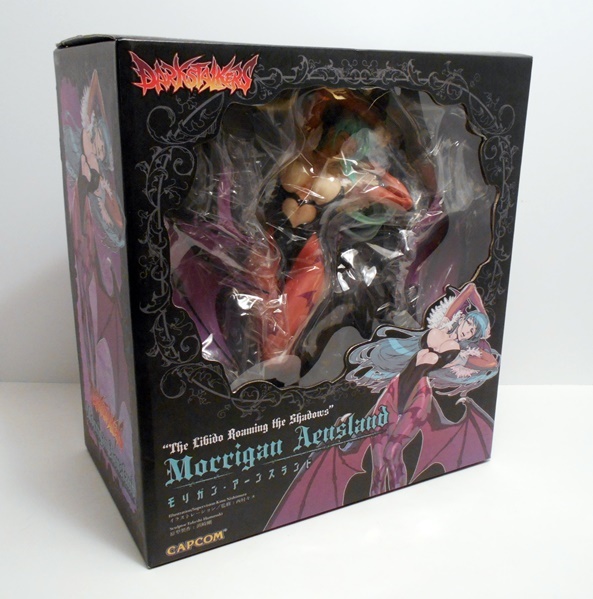
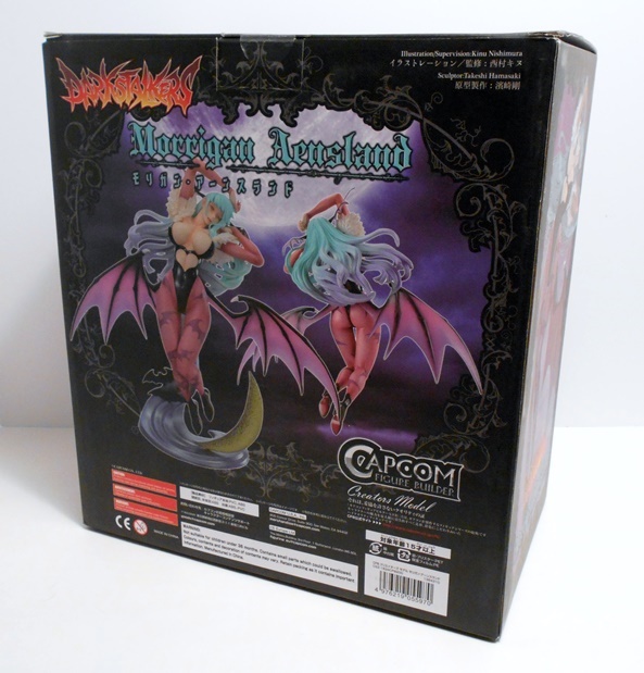
The box is quite large as this is a rather large statue, landing somewhere between 1:7 and 1:6 scale. It’s just a bit too big to really fit in with Koto’s Bishoujo’s and definitely projects its own presence on the shelf. The box art features some great illustrations and pictures of the statue itself. There’s a window on the front, but the statue is wrapped in so much plastic that you really can’t get a great look at the goods inside. Below the window is the priceless tagline that identifies Morrigan as “The Labido Roming The Shadows!” Gotta love it! I’m going to assume that this piece is actually produced by Capcom, although I find that rather surprising, especially since the bulk of the Figure Builder Creators pieces seem to focus on Monster Hunter rather then anime girls. Anyway, I’m pretty curious to see what’s inside the box, so it’s time to free this Succubus!

dsmor3

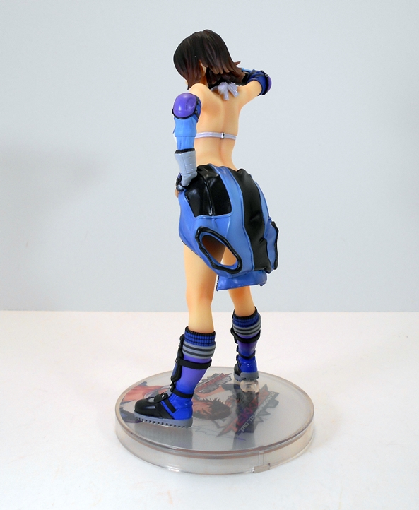
Before I get into how great this piece looks, let’s talk about the perfect storm of frustration that was the assembly process. The statue comes in four pieces: The figure itself, two wings, and the base. The wings are tabbed with individual shapes so the right will only go into the right slot and vice versa, which is all well and good, but the tabs are such a tight fit, I couldn’t get either wing in more than a tiny bit before running up against resitance. Add to that two more factors: One, the wings are super thin and feel super fragile. Two, both tab slots are just below Morrigan’s windblown hair. It’s difficult to get a hold of either of the wings’ base to safely apply pressure and even when I had a good entry point all the force I could muster was not getting those wings all the way in. I eventually resorted to boiling the tabs and that got them most of the way in. Now normally a little gap from the pieces not seating right wouldn’t bother me, especially in this case since those parts are only visible from the back and mostly obscured by her hair, but the stand is designed to cradle Morrigan’s butt (giggity!) along with two slots for the wings at a very specific angle. If the wings aren’t seated perfectly, it’s tricky to get her cheeks to stay in that cradle. The result is that the figure will tilt backwards at an angle, and since this statue already has Morrigan arching backwards and looking upward, it’s really noticeable. With a lot of work, I was able to strike a happy medium and get her cradled OK, but I really wish this whole process went easier. If you thought reading about all that was a lot of bother, just be thankful you didn’t have to endure it.

dsmor4

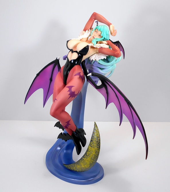
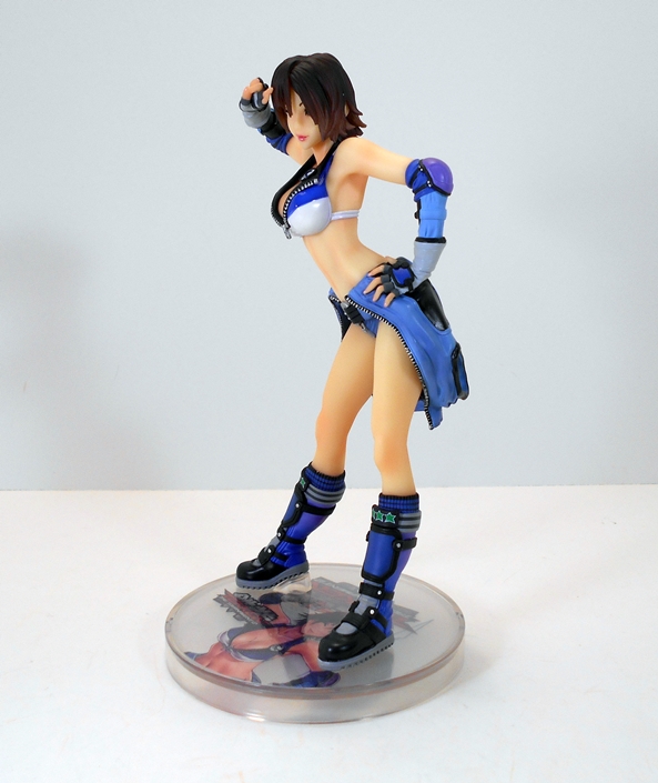
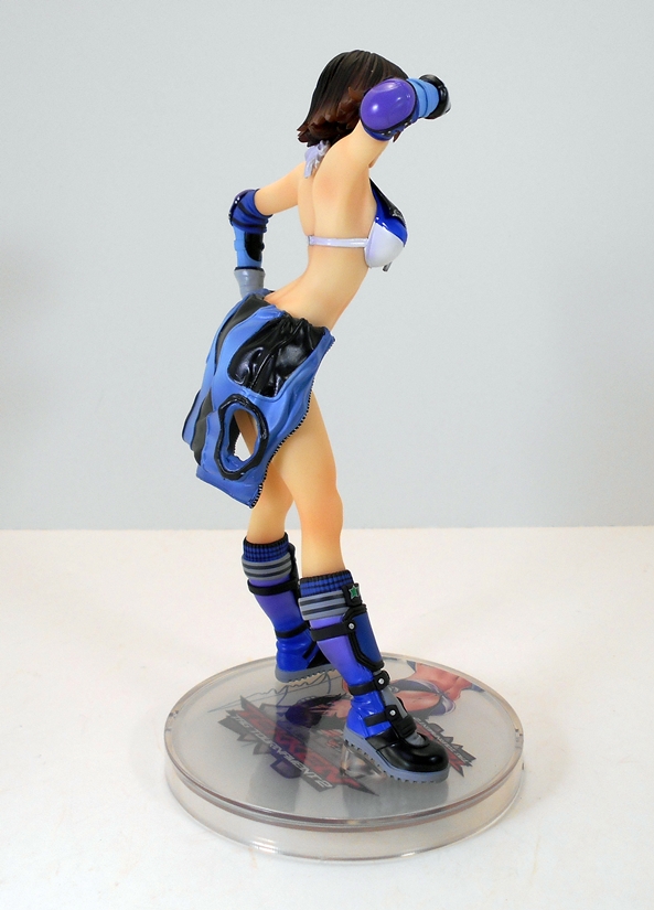
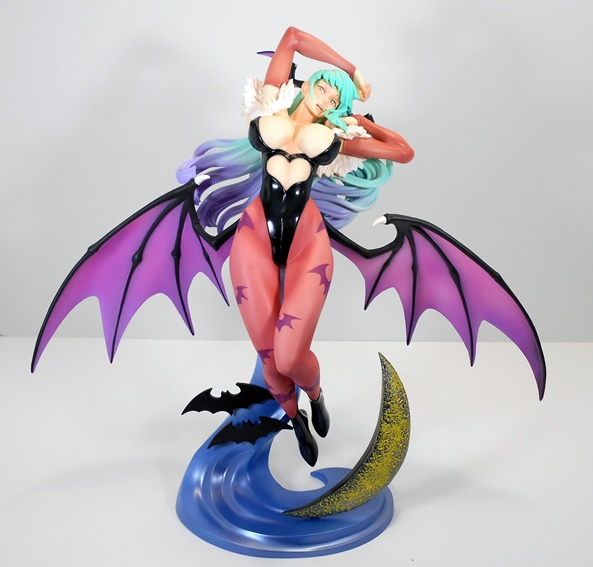
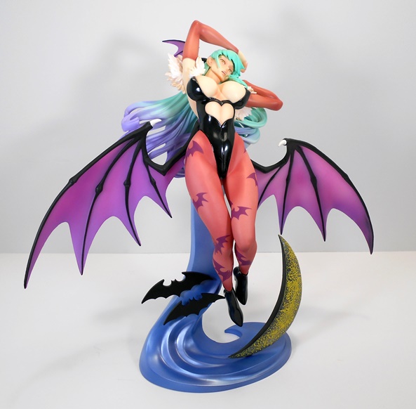
With all that worry out of the way we can finally step back an admire what a beautiful statue this is. The sculpt manages to capture all the ridiculous curves of Morrigan’s sumptuous succubus body from her rounded hips to her dramatically over-sized breasts. Such things are certainly not unusual in the world of anime-inspired statues, but this one makes any one of my Bishoujos look tame by comparison. The pose also goes a long way to accentuate what is already a pretty obviously killer body. Morrigan is in mid flight, arching her back, and pushing her chest up with her head raised upward and tilted to the side. While the pose works really well to compliment the sculpt, I’m not sure exactly what they were going for. I suppose it’s supposed to be seductive, but it almost looks like she’s swooning or even going for a little damsel in distress expression. It also kind of looks like she’s stretching, so maybe she just woke up from a long day’s nap and is ready for a night on the town. Nonetheless, as confusing as the pose may be, I still dig it a lot.

dsmor5

dsmor6


Morrigan’s outfit is achieved through both sculpting and paintwork. Starting at the bottom, she has a pair of high heeled boots, which are painted in high-gloss black. Her trademark stockings are painted on with the purple bat emblems scattered about her legs. The base color of the stockings can look more orange under some lights, but in person it’s more of a pinkish-purple. I think it would have looked better with a more definitive shade of purple, but as it is it certainly makes things more colorful. Her one piece is sculpted with a heart shaped cut out in the middle to show her mid-riff and the top is sculpted so that it can barely contain her boobs, and it’s all painted with the same high-gloss black as her boots. The outfit is rounded out with some feathered fringe around her shoulders and sleeves painted to match her stockings. The glossy black does a nice job of contrasting with the soft skin tones of her body and all in all I’m satisfied with the paintwork here.

dsmor7


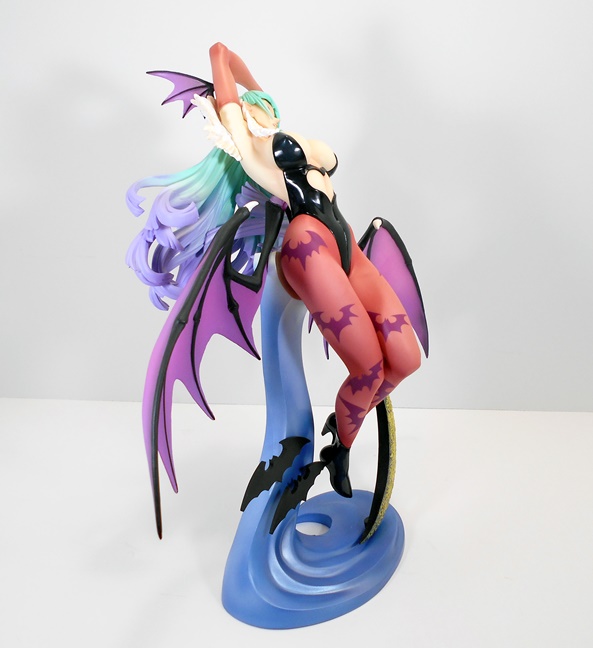
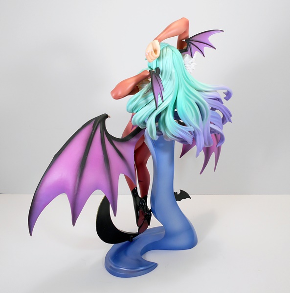
Of course, you also have her two sets of wings, two large coming out of her back and two smaller ones protruding from her head. As troublesome as it was to get the wings in, they look absolutely fantastic, even with the notable gap between wings and body. The purplish-pink paint used for the membrane carries a pleasing animated effect and the black paint used for the rest is neatly applied. Still, the wings are pretty thin in some areas and thus probably quite fragile.

dsmor9

dsmor10

dsmor11

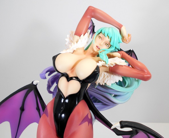
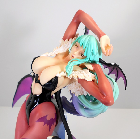
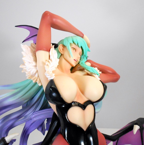
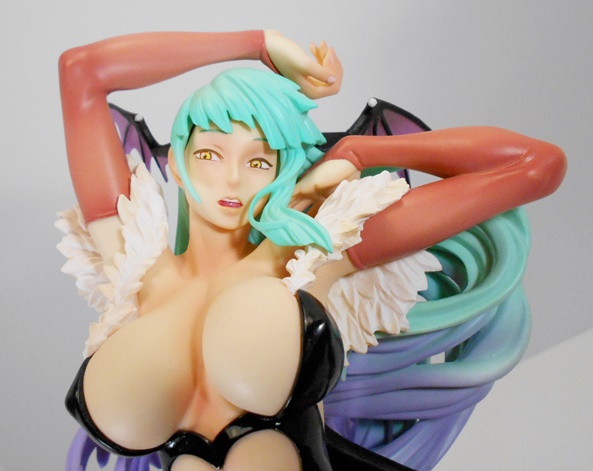
Last up, we have the portrait, which is certainly attractive, but also has a somewhat unsettling otherworldly vibe going on. I’m not sure if it was intentional or just the way the statue came out, but it certainly is interesting. I attribute a lot of it to the paintwork in the eyes, which are somewhat haunting. Her mouth is especially nicely done with her lips slightly parted and showing just a glimmer of teeth. The hair sculpt is a tad chunky in the bangs, but I think they did an overall good job of creating a crazy windblown look to it and the way it tapers from powder blue to purple at the ends looks good.

dsmor13

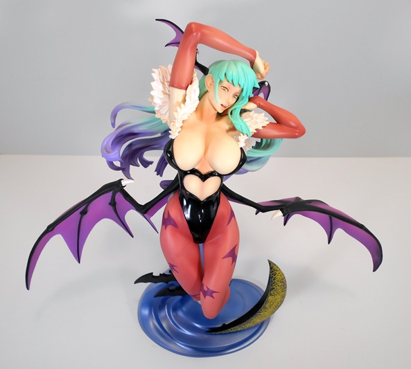
And then there’s the base, which remains my big bone of contention with this statue. Beside the fact that it isn’t engineered all that well (as outlined in my assembly rant) the somewhat primitive style is a bit at odds with the beauty of the figure. The bats are clearly just intended to be thick 2D representations and the moon is heavily textured with a less than stellar looking paint spray. The idea of the imagery is OK, but I just don’t care for how its executed all that much because the decor on iit looks almost intentionally fake like cut-outs.. Is it a dealbreaker? Nope, not at all, but in this case I think something simpler might have worked better. I will concede, however, that while the way the statue balances on the stand isn’t all that well executed, it is nice to be able to take her off and have a figure that is in no way marred by a post or socket. That leads me to wonder whether this piece might look better on a traditional Sixth-Scale figure stand. I may have to try that at some point.

dsmor8

dsmor12

Morrigan set me back $70, which is a bit much for what was essentially an impulse buy of a piece I had never seen reviewed or in person.On the other hand, for a statue of this size it feels like something of a bargain. If it were any other property, I probably wouldn’t have gone for it, but, such is the result when DarkStalkers statues or figures are such a rare breed. She may not match the quality or craftsmanship of a Kotobukiya or a MegaHouse piece, but I do think she was well worth the money. She’s big, colorful, and ultimately impressive, and as a fan of the property (and boobs) she was impossible for me to turn down, and in the end I’m mighty glad I splurged on her. I said SPLURGED on her. Get your minds out of the damn gutters, people!

S.H. Figuarts: Sailor Saturn by Bandai Tamashii Nations

I last visited with The S.H. Figuarts Sailor Moon series back in February with Sailor Jupiter and I’ve gotten a few of these figures in since then. I do have a couple of points worth noting here: First, while I’ve been going in order of appearance, I am obviously skipping over Sailor Venus because I haven’t picked her up yet. I will be eventually getting her to complete my set, but her similarities in appearance to Sailor Moon made me pass her over for the more distinctive designs of the later Sailor Scouts. Secondly, we’re into relatively unknown territory here starting with Sailor Saturn. Nearly all my exposure to Sailor Moon comes from the anime and Jupiter and Venus were more or less the last Pretty Sailor Soldiers that I am familiar with. Of course, being an obsessive plastic addict I wasn’t about to stop collecting this line and so in addition to Saturn and Venus, I still have Neptune and Uranos ahead of me. Will I be picking up Super Sailor Moon and Tuxedo Mask… probably. As for Sailor Pluto… We all know she’s coming, I just don’t understand what’s taking so long!

shfsat1

There’s the packaging and we’ve seein it multiple times, so I’m not going to dwell on it too long. It’s a wonderfully compact little window box that shows off the figure and features a deco colored to match the colors of the Sailor’s outfit, in this case mostly purple and blue. The box features lots of photos of the figure, but no artwork from the manga or anime. The lettering on the box is fairly bi-lingual but does feature quite a bit of Japanese lettering. And always remember to check your boxes for that little foil sticker of authenticity. I got stuck with a bootleg once… hopefully never again! The side panels of the box also feature images of the figure so you can line these all up on your bookshelf and still be able to grab whichever figure your looking for without having to pull them all out. That’s a big help considering most collectors will be storing the extra parts in the boxes. Inside the box, you get the standard clear plastic tray with the figure, three additional portraits, four additional pairs of hands, her Silence Glaive, and her figure stand.

shfsat2

shfsat3

Here she is, and might I say she’s pretty cute for being the wielder of the Scythe of The Goddess of Death! Saturn features the most sculpted changes to the Sailor Scout outfit over any of the other Sailor Soldiers. Her pleated skirt is the same, but her top features ruffled shoulders and the centerpiece on her bow is far more elaborate, like a diamond star burst. She also features high boots with sculpted laces running all the way up to her knees. The new costume isn’t a huge departure over the other gals, but it’s just enough to make it distinctive after seeing the same basic thing for the last four figures. The top is the same pearlescent white that we’ve been seeing all along. Her boots, skirt, and trim are all pearlescent blue, and her bows are a rich, deep purple.

shfsat4

The portraits are all pretty standard for what we’ve been seeing. Saturn isn’t known for her bubbly and outgoing personality and the extra faces reflect that. The head that comes on the figure does feature a hint of a smile. The others include shouty face, solemn face with closed eyes, and slightly perturbed face. As always the portraits are easily swapped out by removing the front hair piece and old face and pegging the new one in and reattaching the hair piece.

shfsat6

shfsat5

shfsat7

shfsat9

And it wouldn’t be a Figuarts feature without talking about a bunch of extra hands. If you read my two Figma reviews, you may recall my lamenting the fact that the Figuarts line doesn’t use a similar sprue system for storing the hands when not in use. Well, now they do! Each set of hands is pegged onto a piece of plastic, which I can only describe as like a white LEGO Minifigure head and each one of these can peg into each other so you can chain all the hands together in a modular fashion. I like it!

shfsat14

shfsat16

Of course, one of the most unique things about Sailor Saturn is her Silence Glaive. It’s a large pole arm with an elegantly curved blade. She can hold it perfectly with the special set of hands and she looks damn good wielding it. And last, but not least, the stand is the same style we’ve been seeing since this series began. You get a clear heart shaped base with the name of the Sailor on it and a hinged grabbing arm that is articulated in three places.

shfsat11

shfsat12

shfsat16

Despite moving into relatively unknown territory when it comes to the remaining Sailor Scouts, I’m still totally in love with this series and I’m looking forward to getting the line complete and set up on my shelf. Nothing could possibly reflect that more then the fact that I ponied up extra to get Neptune and Uranus, each of whom ran about ten dollars more because they were exclusives. I’ll try not to wait so long before getting back around to looking at them. Now let’s just hope we see some progress on Sailor Pluto by the time SDCC 2015 rolls around!

Figma “Legend of Zelda” Link (Skyward Sword) by Max Factory

Some time ago I got my first Figma figure and I was suitably impressed. I decided why not go for another and that leads me to today’s feature! I actually had Link pre-ordered back when he was first revealed but some budgeting cuts caused me to drop it. I always planned to get him later, but between the figure’s insane popularity and some importing issues he sold out fast and became extremely pricey on the second hand market causing me to write him off. Fast forward to now and he’s had a second release and is readily available at a fantastic price so it was only natural that I would avail myself of a second chance to add him to my collection. Better late than never!

figlink23

Link comes in a colorful window box, which is a hell of a lot more compact than the one used for my Figam Mikasa Ackerman. Of course, Link’s box doesn’t have an entire set of Omni Directional Gear in there, so that’s understandable. The box features plenty of great shots of the character showing off all his display options and the window lets you see all the goodies quite clearly. Otherwise, there’s nothing terribly exciting about the package. Most of the box is lettered in Japanese, but there’s just enough English there to point out that this is Link from Skyward Sword. I’ll confess I haven’t played that one. In fact, the last Zelda game that I played through to completion was probably on the N64. Try not to take that as blasphemy or to diminish my love of Link. He’s just about as iconic as anything else from my childhood and the look of this figure is versatile enough to work perfectly for me even as a Zelda fan that has lost his way a long, long time ago. Inside the box, you get the figure, a swap-out yelling face and extra bangs, the Master Sword and Shield, a scabbard, a sprue with four extra pairs of hands, a figure stand, a sword-swooshing effect part, and a ziploc-style bag to hold all the accessories.

figlink1

figlink2

Ocarina of Time may have been the last serious time I spent with Link and a controller, but this figure represents my favorite look for the character. Yup, Link has to be one of the few cases where I prefer what the character evolved into over the nostalgia from my past. In fact, just looking at it makes me want to finally tear the cellophane off my copy of Skyward Sword and give it a play. This is a more mature Link than what I’m used to, but it doesn’t jump the shark and become too extreme and over-the-top. Nope, this Link is just right and the figure looks absolutely amazing. The green tunic is soft plastic and layered onto the figure, with the upper arms sculpted to look like sleeves. The pliable plastic below his belt gives the legs a lot of room to move. The bottom part of his shoulder rig is part of the torso sculpt, but the strap that actually goes over his shoulder is a seperate piece. He’s got a couple of pouches attached to the back of his belt and all the joints are fairly well concealed for this type of figure. There are two peg holes in his back, one for the stand and one for his scabbard.

figlink9

Link’s head sculpt is right on the money. He’s still got a very youthful and anime-stylized look, but it toes that line of being more mature than the Link I remember from my youth. The paintwork on his eyes and mouth is immaculate and the fact that the hair is sculpted as a separate piece gives the portrait a lot of depth. There’s even a swivel cut in his cap, which was a very pleasant surprise. The alternate portrait is applied simply by pulling off the face and bangs (always creepy!) and plugging in the new pieces. The differences between the hair pieces is rather subtle to me, but the alternate face is a great feature to have for those action poses.

figlink3

figlink22

Link features a fantastic level of articulation which comes from packing rotating hinges and swivels in his arms and legs. You also get generous ball joints in his torso and neck, and even hinges in the toes of his boots.

figlink5


figlink4

HANDS! It wouldn’t be a Figma figure without tons of hands. Link comes with his pair of fists attached. You also get a pair of hands with splayed fingers, a pair of relaxed hands, a pair of of hands designed for holding the grip on the Master Sword and Shield, and a pair of hands designed to hold the Master Sword out at an angle. I love the sprue that Figma uses to hold the extra hands and I can’t believe that S.H. Figuarts hasn’t jumped on board with something similar. It’s a great system.

figlink6

figlink7

The Master Sword and scabbard are exquisitely reproduced both in sculpt and paintwork. From the subtle painted cross straps on the hilt to the blue hue of the blade and the etched Tri-Force near the hilt, this sword is a tiny little work of art only to be outdone by the ornate beauty of the scabbard. The gold paint used for the fixtures on the scabbard is sumptuous as is the glossy blue used for the sword’s hilt. The sword fits snugly into the scabbard and the pommel pulls off the end of the hilt to help get it into Link’s hand without damaging it. The scabbard features a peg so Link can wear it on his back.

figlink12

figlink21

figlink17

figlink19

Of course The Master Shield is no slouch either. It features a sculpted reinforced rim, a raised Tri-Force and some immaculate paintwork. The back of the shield features a wrist strap and a hand grip, both of which are pegged into place and can be removed to help get Link to brandish the shield or to have him wear it on his back in conjunction with the sword.

figlink13

figlink18

figlink14

figlink15

The effect part slides over the sword blade and is made of translucent blue plastic to simulate the swooshing blade. Effect parts… I can either take them or leave them. This one works pretty well and looks good, but I still doubt it’ll spend much time out of the box. And last, but not least, you get the standard Figma stand with the triple articulated arm that pegs into his back and works beautifully whether Link is just standing or jumping into action.

figlink11

figlink10

figlink20

At about $40, this figure was a deal and a half, especially since it was so prohibitively expensive when it was first released. I’m so thrilled that he was eventually made available at a good price and put into wide circulation. This is without a doubt the definitive Link I need in my collection, unless I find a suitcase of cash on the street, in which case I would probably spring for the RAH version as well. This figure looks absolutely amazing and is so hard to put down once I get started fiddling about with him. Sure, you could argue that Figma could have invested more in the accessories to make him more of an all-inclusive Link. They could have at least given him some breakable pottery! But, honestly, with the Master Sword and Shield included, and so beautifully executed, what’s here still feels like a complete package to me.

Tekken: Asuka Kazama Bishoujo Statue by Kotobukiya

A couple weeks back I featured Jaycee from Koto’s Tekken Bishoujo line and lamented the fact that I had to start grabbing the discontinued Tekken ladies up before they get too pricey on the secondary market. Asuka was one of the ones that I really wanted when she was released but I had so many other things vying for my dollars I had to put her off and she was rapidly beginning to climb out of the price range ($100+) that I am comfortable paying for these gals. I try not to resort to Ebay for my Bishoujos, especially if they’re not new, but this was a case where I had to take an opportunity and nab her when I could. Luckily she was still boxed and in excellent condition.

bishasuk1

bishasuk3

bishasuk2

And speaking of boxes, there’s Asuka’s packaging. It’s very similar to what we saw with Jaycee and Christie Monteiro before her. The box is mostly black as opposed to the white Koto uses for the comic based characters. You get some great shots of the statue as well as the beautiful artwork that inspired it. While Asuka originally hails from Tekken 5, this particular piece is based on her appearance in TekkenTag Tournament 2 and features the game’s logo on the box. The back of the box shows a teaser for the next statue, which happens to be Jaycee, the one I looked at last time. As I said, this statue came to me second hand and despite being a little shelfworn, the box is in pretty good shape. Asuka requires no assembly, nor does she come with any extra bits or bobs. You just take her out of the box, unwrap the plastic, and she’s ready for display.

bishasuk4

bishasuk5

I absolutely love the simplicity of this piece and the fact that it in no way sacrifices any of the sexy flash that I’ve come to expect from my Bishoujo statues. Asuka’s brash, arrogant, and playful style is wonderfully conveyed as she throws her hip to the side, winks and offers up a salute. Even if you knew nothing about Ms. Kazama, this pose would tell you everything about her personality. I often go back and forth over whether I prefer my Bishoujo poses to be “action shots”or just shameless mugging for the camera, but this one certainly champions the later.

bishasuk6

bishasuk7

bishasuk8

The previous Tekken statues that I featured here on FFZ showcased some pretty crazy and complex outfits, but Asuka’s couldn’t be further from that trend. Her one-piece (for lack of a better term) is zipped down to the belt and cast off behind her to reveal just her sporty bikini top, which ironically also has its own zipper, which is also zipped down to the bottom. This is a good news, bad news scenario, folks. If you’re an ass-man, Asuka ain’t gonna do much for you because of that damn jacket. If cleavage is your game, however, Asuka certainly came to play. Proportionally speaking, Asuka probably has more covering her arms and legs than anywhere else. She sports a set of boots with shin pads and fingerless gloves with elbow pads.

bishasuk9

bishasuk10

The coloring offers up some blue, gray, white, a little teal and black. I find it to be a pleasing pallet, although while there’s a nice bit of gloss to Ms. Kazama top, you don’t get that same contrast of high gloss latex and soft skin tones that characterize so many of Koto’s Bishoujo line. The skin tone’s here, on the other hand, are executed particularly well. The use of shading on her midriff, neck, and cleavage all looks fantastic.

bishasuk11

The portrait here follows suit with being rather simple and yet so good. Koto usually likes to go crazy with long windblown hair, and Asuka’s rather short coif robbed them of the opportunity here. That’s OK, though, I dig the short haircut and they still managed to get in that tapered transparent look that they love so much. With one eye closed and the other shrouded by hair, you don’t get the same clarity of peepers on this statue as most, but I’m still in love with this portrait.

bishasuk13

bishasuk14

As is par for the course, Asuka comes on a clear disk stand, which can be opened and customized with different art transparencies or just left blank. As I bought this statue second hand, mine only came with one transparency, but I doubt there was anything that I would have chosen to display her with over this wonderful piece of art. It’s nice to know that if I ever get tired of looking at the boobs on the statue, I can look at the ones on the base art. Who loves ya, kids? Kotobukiya does! [I actually didn’t notice until after I shot the pictures that the previous owner of the statue put all three transparencies into the base. If you look closely, you can see the signature overlay and the title overlay under the character art overlay. 10 Points to me for getting all three included, but minus 100 points for being too stupid to notice! -FFZ]

bishasuk12

I’m always thrilled to add a new Bishoujo statue to my collection, but this was a special case because not owning Asuka was beginning to worry me, and that brings me to the subject of cost. This is usually the part of the feature where I say what a great value the Bishoujo statues are, and in fairness, when Asuka first hit the shelves at an MSRP of around $60, she was indeed a great value. Now, you’d be hard pressed to find her selling new for under $100, although in fairness she is close to three years old now. I grabbed mine from a good home on Ebay for about $85 shipped, and I still manage to feel like I got a pretty solid deal, especially considering I spend about that same amount for DC Collectible’s cold cast porcelain Cover Girls, and I’d readily debate that Koto’s pieces are nearly always superior. Either way, I can’t put a price on peace of mind, and knowing that Asuka is finally on my shelf does indeed give me plenty of that.

Tekken: Jaycee Bishoujo Statue by Kotobukiya

I’m not proud to admit that I’ve been neglecting Kotobukiya’s Tekken series of Bishoujo statues. It hasn’t been intentional, but Koto is releasing so many of these damned things that I have to have prioritize. When I’m presented with characters from Marvel, DC, and now Street Fighter, Tekken has fallen down toward the bottom of the list. I have been trying to remedy that recently, especially with some of these statues starting to creep up in value on the secondary market. I can’t tell you how glad I am to have picked up Christie Monteiro when she first came out as now she’s commanding upward of $180 in some reselling circles. I was crazy into Tekken 3 and 4 back in the day, but I have long since stopped following the franchise with any real gusto. Of course, that hasn’t stopped me from wanting to pick up the statues and that brings us to today’s feature, Bishoujo Jaycee. I believe Julia Chang first appeared in 2012’s Tekken Tag Tournament 2, a game that is sitting on my shelf, but hasn’t spent a lot of time in my PS3. Needless to say I’m not all that familiar with the character, but she’s a Bishoujo Tekken gal and that’s good enough for me.

bishjayc1

The box is right in line with all of Koto’s Bishoujo offerings. You get a big window in the front and smaller windows on the top and side panel to let some light in. You can get a little peek at the statue inside, and in this case the extra pieces that come with Jaycee. Unlike the predominantly white boxes used for the Marvel and DC statues, Koto has opted to go with a black deco for the Tekken pieces. Finally, you get some gorgeous artwork by Shunya Yamashiti and the Tekken Tag Tournament 2 logo on the front and back. It’s a fairly westernized box with most of the text appearing in English.

bishjayc2

Jaycee comes more or less assembled and ready to go. She is attached to her base, although she is removable if you so desire. Her pony tail has to be pegged into the back of her head and I had a wee bit of difficulty getting it to peg in, but I eventually got there. Aside from the alternate masked portrait, which we’ll get to in a little bit, she has a mask, which she can hold in her right hand or be placed on the base and it’s is a very nice accessory if you choose to go with the unmasked portrait. And with all that out of the way, let’s see how she looks…

bishjayc3

bishjayc4

bishjayc5

Oh yeah, I can dig it! Jaycee has a very specific pose, which in turn is clearly intended to be viewed from a specific angle. Some may be put off by that, but there’s something to be said for having that one intended sweet spot in a statue’s composition. In this case, she’s best viewed slightly from behind with her head turned and looking over her right shoulder. If a nice tushie is your thing, you shouldn’t have a problem with the view. She has a very wide stance, standing up on her toes, left hand proudly planted on her hip, and her ponytail flowing outward in the breeze. The pose lends itself to the artwork very well, but that’s not to say it isn’t worthwhile to check her out from all the other angles, because a lot of beautiful work went into her costume.

bishjayc6

bishjayc7

bishjayc8

bishjayc9

Hailing from Arizona, Jaycee’s Southwestern flare is represented in her luchador costume. In this case, it’s more like luchador lingerie with a pinch of S&M thrown in. Her delightfully skimpy one-piece is held on by leather straps and yet it’s also laced up the back with some feathery, frilly bits around the shoulders. Her long gloves include straps around her wrists and a pair of generous elbow guards. The outfit is rounded out by a pair of thigh-high boots and holy crap it must take her forever to lace those babies up! The coloring on the costume makes for a very striking piece. You get a pearlescent silver mixed with purple and some blue piping and a little black thrown in for good measure. Most of the costume has a subtle glossy finish to it, which contrasts nicely with the soft matte tones of her skin.

bishjayc10

bishjayc12

You do indeed get two portraits with the statue, masked and unmasked. I’ll probably be going with the unmasked look most of the time, which was my focus for most of the pictures. Why? Mainly because this way you can see her face and also see the mask as she’s holding it. It’s kind of the best of both worlds. She has a pretty face with the usual soft features and her big, beautiful eyes are a gorgeous amber color. The only thing that throws me a bit is the darker red paint on her bottom lip. It looks to me like she’s sticking her tongue out, but I think it’s just supposed to be a little pouty. As usual, Koto works their magic with the hair by having it gradually turn transparent toward the edges, an effect that I always appreciate.

bishjayc15

bishjayc16

When you swap the head, you do have to swap the ponytail too, which worked a lot better for me the second time around. The exposed parts of her face are a good match for the other head and the wild design of the mask coupled with the same silver, purple, and blue does a nice job of balancing out the costume. Jaycee really does look great with her mask on and this may be a statue that I wind up actually swapping out the head every so often.

bishjayc13

bishjayc19

bishjayc20

bishjayc18

Koto has been using clear bases for their Tekken and Street Fighter statues and Jaycee is no exception. The bottom of the base can be pulled out and you can customize your statue with your choice of the included transparent inserts. You get a signature insert and two with character art, one masked and one unmasked. As long as I’m going with the unmasked head, I’ll probably go with the masked artwork just to mix things up. I’ve been warming up to using the fan art for these because I think it really dresses up the base and compliments the statue beautifully. As for the clear plastic bases, they do tend to show scratches easily, which is disappointing. When I removed my Christie Montiero to shoot with Jaycee, I noticed some scratches on the bottom of her base and that piece has done nothing but stand on my shelf and get picked up every now and again to be admired.

bishjayc11

bishjayc21

chirsjayc

And so here we have another great effort by Koto. Jaycee’s design and sculpt are fantastic and the paintwork is pretty much flawless. I believe Jaycee was the fourth release in Koto’s Tekken sub-series, but as I mentioned earlier, she’s only my second. I was lucky enough to grab Jaycee at her original retail of around fifty bucks and getting her on my shelf has given me just the push I needed to start picking up the rest of the Tekken gals before they start creeping any higher in price. I’ve targeted Asuka for my next purchase, as she’s already commanding upward of $100 in a lot of circles and based solely on the promotional images and reviews I’ve seen, I’ve just got to have her!

The Avengers: Iron Man ArtFX+ Statue by Kotobukiya

This is finally it… Kotobukiya’s ArtFX+ Avengers have finally assembled with the release of the final statue, Iron Man. I’ve been loving each and every piece in this line, but I was getting really excited to finally get the team on display together. Iron Man was available in two decos. You could go for the comic accurate black and gold Marvel NOW! version or the more traditional red and gold variant. I’m actually a fan of the black and gold look, and if this was a stand-alone piece, I probably would have gone for that one. In the end, I picked up the variant only because with Hawkeye, Black Widow, and Thor sporting so much black I wanted to add a little more color to the team display.

afxpim1

afxpim2

I don’t really have anything new to say about the package. It’s a colorful and attractive fully enclosed box that protects the goods really well and looks damn nice on the shelf. I also dig the fact that the variant is what’s actually pictured on the box. Sometimes these things will simply be denoted with a sticker. Inside are two clear plastic trays securing all the parts to build Iron Man, including the torso, head, and all four limbs. Everything fits together snugly and I had no issues assembling my figure.

afxpim3

afxpim4

afxpim5

Koto has been quite conservative with the composition of these statues going more for iconic character poses rather than originality and Iron Man is certainly no exception. He stands with his right arm stretched out about to fire off a blast from his palm repulsor. He has a moderately wide stance and his left arm is balled up into a fist. Sure, we’ve seen Stark in this pose a thousand times, but I still love it and I think it’s particularly effective for a statue meant to be displayed with the entire Avengers team.

afxpim6

afxpim7

I’m also a fan of the style of this Marvel NOW! armor. I can see a lot of influences in it and in a way it strikes me as a more angular Extremis armor with the circular chest repulsor (my favorite) as opposed to the triangle. It features all the necessary segmentation between the plates and rather than go with a bunch of panel lines, the plates themselves are smooth and featureless giving it a very pleasing comic book vibe.

afxpim8

afxpim9

Koto rarely skimps on the paint quality, so it should be no surprise that Iron Man features a gorgeous coat of metallic red paint with gold metallic trim. The paint lines are clean and precise and there’s just a few very minor blemishes that I could spot under close scrutiny. The one area where the coloring on this piece isn’t all it could be are the repulsors on the chest and hips. These appear to be stickers and aren’t terribly convincing. They look rather Hasbro-ish to me, which is a tad disappointing in a fifty dollar collectors piece. Oddly enough, this is one the rarer instances where I think they look better in pictures than in person.

afxpim10

As always, you get the simple black square base. It’s metal and designed to work with the magnets in the statues feet. You can adjust him anywhere you want on the base or even connect the bases together and have him straddle two of them. Of course, Iron Man can stand just fine on his own too.

afxpim11

With the team all assembled, I have to say I’m so very glad that I started down this road last year. While any of these statues would work just fine as stand-alone pieces, nothing beats having them displayed together and Koto designed them with that in mind. There are a few ways to go when displaying the set, but I used the lineup on the back of the boxes as a guide and I think it looks pretty damn great. And they look all the better lined up on the shelf right above my ArtFX+ Justice League!

afxpim12

afxavg

At $50, Iron Man is second only to The Hulk in price and about ten bucks more than I paid for the others. The main reason I paid so much for Iron Man was because I was worried about limitation on the variant so I pre-ordered rather than shop around for a deal. That still seems to be the going price, but that’s subject to change after he’s been out for a little bit and as of now you can still grab all of these statues at or below their original MSRP if you hunt around. Forty to forty-five bucks is definitely the sweet spot for me and these ArtFX+ statues, but I don’t mind going over now and again if I have to because they are indeed awesome display pieces. It’ll be a little while before I revisit the Marvel ArtFX+ collection, but when I do it will be with none other than Deadpool!

S.H. Figuarts: Sailor Jupiter by Bandai Tamashii Nations

Let’s see… by my reckoning it was way back in November that I last checked in with the Figuarts Sailor Moon line. I made my way up to Sailor Mars and then things just got lost in the shuffle. My pre-order for Sailor Uranos recently dropped and so I thought I’d better get cracking on getting caught up because I currently have two other Sailor Soldiers waiting to be opened. And that brings us to the next Sailor Scout to appear… Makoto. Cue transformation… JUPITER POWER MAKE-UP!!! The addition of Jupiter as the fourth Sailor Scout added another flavor to the ensemble. In addition to Sailor Moon we had brainy Mercury and the fiery Mars and to this we now add a little muscle to the mix. I like Jupiter, particularly her noble sense of justice and her willingness to dive into a scrape when the cause is right, (plus, I remind her of her old Sempai!) but I never quite bonded with her as I did Mercury or Mars. That’s not to say she’s not a great character and I was certainly looking forward to getting her figure on my shelf. I also totally dig the way she calls down the lightning with her antenna and fries her enemies with SUUUUPREME THUNDER!

shfj15

shfj16

shfj14

The package is the same compact little window box that we saw with the previous releases. It’s colorful and each box features a deco that is tailored to the Sailor Scout inside. In this case we get a lot of green. There’s a nice die-cut image of Jupiter on the front that obscures part of the window, but you still get a peek at the figure inside. The rest of the box is littered with pictures of the figure in action poses. Inside, a clear plastic tray holds the figure in the center and a secondary tray holds her extra bits off to the side. As always, the package is totally collector friendly, which helps a lot with keeping track of everything when you’re not using it.

shfj1

shfj3

Straightaway, one of the things I love the most about this figure is that it accurately reflects Jupiter’s height. A lot of toy companies would have been happy with a straight repaint of the body and hope nobody noticed, but not these guys. Jupiter stands about half a head taller than Sailor Moon and most of her added height comes from her longer torso. The rest of the costume is similar in sculpt to the other gals, complete with pleated skirt, large bows front and back, ruffled shoulders, and the sailor-style collar. The biggest difference in the outfits is found in the footwear, as Jupiter is sporting a pair of low boots laced up in the front. I really dig how they did Jupiter’s hair with the two loose strands hanging down either side of her face and an articulated pony tail.

shfj11

shfj6

The coloring and paintwork on this figure is top notch. You get the same pearlescent white on the blouse and gloves, a striking metallic green paint for the skirt, boots, and collar, and a shimmering pink for the bows. The paint on these figures has been pretty good throughout and Jupiter is right in line with the best of them. I can’t spot any splotches or flubs.

shfj7

shfj8

shfj10

I expect a lot of extra bits with my Sailor Scouts, and Jupiter isn’t one to disappoint. You get a total of five extra pairs of interchangeable hands and three extra swappable faces. Some of the hands are familiar, some are new, and they really do help to hammer home that special pose you might be looking for. The extra portraits include delighted Jupiter, slightly perturbed Jupiter, and shouty perturbed Jupiter. As always, the faces are swapped by removing the front of her hair.

shfj5

Speaking of which, Jupiter comes with an extra front hair piece that has her antenna extended. It looks great, but it’s not as rubbery as I would have expected. This means it doesn’t warp, but it also demands caution because I can see it snapping rather easily.

shfj9

And lastly, Jupiter comes with the same style stand we’ve been seeing since Sailor Moon was released. It’s a clear, heart-shaped base with an arm the pegs in to the back. The base is printed with Jupiter’s name and some stars and scroll work patterns, all in green. The arm is hinged in three places and has two little grabber arms. I’m still on the fence whether I prefer these to the peg-in-the-back style that Figmas use, but it’s still a nice, serviceable stand and it certainly comes in handy as it can be tricky to get Jupiter to stand on her tiny feet without it.

shfj12

shfj13

Jupiter ran me about $44 on Amazon, which is about average for what I’ve been paying for these figures. Even with four of these gals now on my shelf it still feels like a good value for what you’re getting. The quality is there, she’s got excellent poseability, and all the extra bits and bobs make me feel like I’m getting my money’s worth. I was wondering whether I’d get tired of this line a few figures in, since they do mostly share a lot of the same design elements, but so far that hasn’t been the case. I was just as excited opening Jupiter as I was her predecessors and I’m rather anxious to get to the next one.

DC Comics: Batgirl Bishoujo Statue by Kotobukiya

I’ve only been into statues for about four years now. It’s an aspect of my collecting that still takes a back seat to action figures, but it’s been a growing percentage of my collecting budget ever since. I didn’t pick up my first Bishoujo statue until sometime in 2011 and after I got hooked on this buxom plastic crack, I suddenly realized that there were a number of statues in the line that had come and gone and were now only available at crazy high prices on the secondary market. It’s an old story for collectors, getting into a line late and regretting those pieces that you’ll likely never own. And man, the Bishoujo line has a lot of them: Emma Frost, Rogue, Psylocke, Scarlet Witch, and Phoenix, to name a few. And also Batgirl. While I don’t recall Batgirl ever reaching the crazy prices of Rogue, she still commanded a price that was beyond what I was willing to go for. And now Kotobukiya has re-issued her and she’s finally on my shelf.

bishbg1

Batgirl comes in a window box that should be readily familiar to any collector of this line. You get a large window in front and smaller ones on the top and side to let some light in. As always, this arrangement gives you a glimpse of what you’re getting, but she’s wrapped in plastic, so you really need to bust her out of there to get a good look. The box is mostly white and includes some great full color art from Shunya Yamashita. I particularly like the image on the side panel where Batgirl’s cape is illustrated in the foreground and obscures some of the text in the background.

bishbg2

What’s bugging the hell out of me is the Coming Soon: Catwoman thing on the bottom of the back panel. Of course, Koto always has a look at an upcoming release here, but in this case what we’re seeing is most likely because of a reuse of the Batgirl box. I’m pretty sure Koto has gone on record a few times that they have no plans to re-release Catwoman, but then I never thought we’d see Batgirl again, so maybe it’s still possible. Anyway, I believe Batgirl was the 6th statue released in this line, if you don’t count variants, and I think she may been the first DC Comic character to get Koto’s Bishoujo treatment. She was also available in a black costumed variant, which followed the original blue. The statue comes out of the box fully assembled and ready to go, so let’s check her out.

bishbg3

bishbg4

bishbg5

Dear God, I love these statues! One of my favorite things about a lot of Koto pieces is their ability to convey energy and movement in a static form and that’s certainly the case with Batgirl here. Her pose is pretty simple, she’s got one foot up on a very “Gotham-Style” gargoyle, but it’s the spectacular twirl of her cape that makes the composition here stand out. It’s fanning out all around her and it just looks absolutely stunning. Standing fully erect (ahem), Batgirl stands roughly shoulder to shoulder with most of the other statues in the line, although you could argue she looks a wee bit more demure when displayed next to the likes of Huntress or Power Girl.

bishbg6

bishbg7

Newcomers to the Bishoujo line may find this Batgirl rather tame by comparison to more recent releases. The line has always been about pretty women in tight outfits, but it’s become quite the gratuitous T&A show in recent years. I’m not saying that’s a bad thing, but Batgirl certainly represents a time when the line conveyed a lot more subtlety. Don’t get me wrong, this Batgirl is still dead sexy and her costume still looks like it’s painted on, but it’s not as overtly in-your-face sexualized as say a Starfire, or Spider-Girl, or Powergirl. There’s also a lot less skin than some. Indeed, the motion that Barbara is making with her cape actually obscures her chest almost completely. Although it’s a nice counterbalance that the same motion also serves to showcase her fabulous butt.

bishbg12

bishbg15

The bulk of Batgirl’s outfit is pretty simple, at least the bodysuit part of it, so most of the sculpting here went into the motion of her cape, as well as the belt, gloves, and boots. And, of course, let’s not forget the portrait. Barbara has her head slightly lowered with her red hair escaping from her hood and flowing about her. It’s a pretty simple face sculpt, although the eyes are more defined on this piece and given a bit more depth and I like it a lot.

bishbg8

bishbg9

bishbg10

Batgirl’s costume is predominantly painted with a charcoal paint that somehow manages to be both metallic and matte at the same time. There’s a dull sheen to it that contrasts nicely with the slightly richer gold and the brilliantly blue glossy cape and cowl. And oh god, is the blue on this statue gorgeous! I think the last time I was this impressed by a shade of paint was the red used for Bishoujo Spider-Girl’s outfit. The blue here is so rich and vibrant and manages to capture that new car finish level of brilliance. As is usually the case with Koto’s pieces, the paint on this statue is absolutely flawless. The lines are sharp and there’s no slop to be found anywhere.

bishbg11

bishbg14

The base is a simple black disc with the gargoyle for Batgirl to practice her best Captain Morgan pose on. It’s a hideous little beastie with its tongue sticking out and some really detailed sculpting, especially on the backs of its wings. It’s pretty convincing as a piece of granite done in plastic and it contrasts quite nicely with the smooth sheen of Batgirl’s attire.

bishbg17

bishbg16

bishbg13

This one was a long time coming and after a long time scouring Ebay and Amazon and hoping against hope I’d find a deal, all to no avail, it’s awesome to finally have Bishoujo Batgirl on my shelf. She’s absolutely gorgeous and I’d rank her among some of this line’s best work. What’s crazy about this release is that with an MSRP of around $50 she’s hitting most retailers a good ten to fifteen dollars under what most current releases in this line are starting at. It’s still kind of early to hope that his release will open the floodgates to reissues of the other expensive early Bishoujos, but it certainly does present some possibilities. And even if this is a one-shot deal, it’s still nice to have a statue in my collection that I probably would not have otherwise gotten hold of.

Lost Exo-Realm Cubrar with Tekour (LER-02) by Fansproject, Part 2

I’m back to wrap up my look at Fansproject’s Cubrar, Not-Slag, and it’s time to get to the transforming. Going from dinosaur to robot involves some clever engineering, although there are also some subtle double-hinged plates that need to be positioned just right to make some things work. I know, that’s the case for most changeable robots, but it the margin for error feels particularly small here. For example, if you miss a minor double-fold on the plate holding the dino legs, then getting them packed into the robot legs is an impossibility. It took me a little patience the first time, but after that it was easy-peasy. Changing him back into the dinosaur mode has its own challenges, particularly getting everything to pack in and close up just right. That’s where that extra sheet of instructions came in real handy. In the end, Cubrar’s transformation feels a lot more complex and fidgety than Columpio’s, but the tolerances and clearance all feel good and not at all scary.

ler2cub1

Like Columpio, Cubrar’s robot mode walks a fine line between G1 Dinobot and original design. It’s easy to see a lot of the stuff borrowed from Slag, the most obvious being the way the dino’s bottom jaw drops down to form the center of his chest and the top of the dino head forms a hood behind the robot head, complete with horns and all. On the flip side, Fansproject put enough of their own marks on this design to make it feel fresh. Probably my favorite departure from the G1 look is the way Cubrar wears the dinosaur’s neck crest as shoulder armor. It’s a beautiful touch and pretty damn clever the way it works. Also, rather than wear his bulky dino legs on the outside of his robot legs, they pack neatly inside, similar to what Columpio’s design did with his tail. This wonderful mix of old and new results in an absolutely fantastic robot mode. The proportions on this guy are just amazing and he follows he whole G1-but-not-G1 aesthetic that I love so much about most of Hasbro’s Classics and Generations lines.

ler2cub2

Cubrar also improves on a couple of issues I had with Columpio, particularly in the way the back kibble is handled. Cubrar wears the dino’s tail on his back in a similar fashion to the way Columpio wore his dino’s neck and head. But while Columpio’s was left to flop in the breeze, Cubrar’s actually pegs in securely, making for a more solid robot mode. Of course, the downside of this is that it locks up his waist pivot. It’s a shame the hinge for the tail couldn’t have been mounted higher to avoid this. The biggest issue I had with Columpio was how loose his hip joints were, although I was able to fix them with a little nail polish. You get none of that with Cubrar. Every joint on this guy is tight and solid and he holds a pose beautifully.

ler2cub3

Cubrar’s noggin is a bit beefier than Columpio’s, partly because his face is broader and partly because his “helmet” is larger. His face has plenty of character with large blue visor and an extra helping of lips and the silver paint is immaculate. And for those of you who are fans of Lockdown from Age of Extinction (Shame on you!!!), you can transform Cubrar’s face into a gun, or in this case, I guess it’s a flame-thrower. Yeah, it’s just a byproduct of the transformation, but a fun option nonetheless.

ler2cub5

The deco in Cubrar’s robot mode closely matches what we saw in dino mode. You get the same great gray and red plastics with some metallic blue and silver detail work and more of that satiny smooth gold. The colors on this guy really pop and they match Columpio perfectly. I’m hoping this is the coloring that we’re going to get all the way through to the end of the line.

ler2cub7

ler2cub8

ler2cub4

ler2cub6

Accessories? Cubrar comes with two guns and a sword. The guns are a matched pair of short and stocky weapons, not quite pistols and not quite rifles. Individually they aren’t as cool as Columpio’s rifle with folding bayonet, but Cubrar sure looks great dual wielding them. The sword has a translucent red energon blade and is a very nice piece. Chances are I’ll wind up displaying him with the sword and one gun.

ler2cub13

ler2cub14

As with Columpio, Cubrar can store two of his weapons by pegging them into his back flaps. I think the sword looks great positioned diagonally across his back. The guns can also peg in side by side, or you can go one gun and one sword. I think this storage gimmick works a little better than Columpio’s. The stored weapons don’t look as awkward this time around.

ler2cub11

And last but not least we have Tekour’s axe mode. I thought Drepan’s weapon mode was pretty good, but I think Tekour’s outshines it. Drepan was kind of a war pick, whereaas Tekour is just a bitchin double-bladed axe. It’s a damn solid weapon mode and the pommel of the handle is sculpted with a triceratops head, because Cubrar likes to accessorize, dammit!

ler2cub10

ler2cub9

Tekour can also double as a rifle and while it’s basically just the axe held differently, I think it works really well. The stock does get in the way, as it doesn’t fit into the crook of Cubrar’s elbow, but he can hold it out in a pretty sweet firing position.

ler2cub16

ler2cub12

ler2cub15

With two Lost Exo-Realm figures on my shelf, I’m loving this line more and more and I’m getting really excited to see the team together, even though that’s going to be a long road to travel. The quality and engineering on Cubrar is up to FP’s usual impeccable standards and I’ve totally fallen in love with this aesthetic. The only hard choice will be deciding whether to display them in robot or dino modes because I really dig them both. Fansproject has been a little quiet on the Lost Exo-Realm front lately, but if things progress as they seem to be, their Not-Swoop may very well be next, but there are no pre-orders up yet, so at this point anything could happen. All I have to say is keep them coming, and I’ll keep buying them!


Lost Exo-Realm Cubrar with Tekour (LER-02) by Fansproject, Part 1

I feel bad. I’ve had Fansproject’s excellent Sigma-L on the pile waiting to be featured for months now and here I am jumping right over him to get to Cubrar. All I can say is, sorry Sigma, I’ll get to you next week. Pinky swear! It’s a great time to be a Not-Transformer collector when there’s this many great figures vying for my attention and in this case both made by the same company. Cubrar is the second in Fansproject’s Lost Exo-Realm line of giant robots that also happen to transform into giant robot dinosaurs and some might say that this one bears a passing resemblance to a Transformer known as Slag. I’ll probably be referring back to LER-01 Columpio quite frequently, so if you haven’t read that feature, you might want to start there and come back. Due to time and space constraints, I’m also going to serve this one up as a two-parter, so today I’m checking out the packaging, Cubrar’s alt-mode, and Tekour’s robot mode and tomorrow I’ll look at the rest…

lercub1

lercub2

I love the presentation here, but I’m going to qualify that love by pointing out that Fansproject did a little bit of tinkering with the packaging. The same basic style is still there. You get that same great style of artwork as seen with Columpio and lots of pictures of the toy in both modes and various poses. The front flap is secured with velcro and opens to reveal a die-cut window showing Cubrar in his dinosaur mode. So what’s different? The box is a lot smaller than Columpio’s and more squared off at the cross-section. Don’t be fooled by that into thinking that Cubrar is a smaller figure, if anything he’s bulkier than Columpio. No, Fansproject achieved the box reduction by reducing space in the tray and securing Cubrar’s sword and guns in a baggie behind the tray. It doesn’t make for as impressive a sight when you lift the flap and look inside, but it’s not something I’m terribly concerned about.

lercub3

lercub4

Fansproject also ditched the satin finish of the Columpio’s box for a more glossy look. The subtle changes in presentation, and the not so subtle change in size, does irk me a little bit. I do keep the boxes for my 3P Transformers and while these are designed to still resemble the same series, they don’t look very uniform on the bookshelf together. And while Cubrar’s box still looks great, it doesn’t have the same impact as Columpio’s did when I first held it. Still, taken on its own it sports a really classy presentation for a somewhat high end collectible figure. Inside the box you also get a simple folded instruction booklet and an extra page of errata with some tips on how to get him back in Dino Mode.

lercub5

lercub7

lercub8

Obviously, Cubrar’s dinosaur mode is a triceratops and I absolutely love it. It shares the same overall aesthetics as Columpio making for a great matched pair. The design is loaded with panel lines and he’s a tad stockier than Columpio making Cubrar resemble a walking tank. Naturally, Cubrar’s lower jaw is articulated and when you open it you reveal his flame-thrower, whih is a great call back to Slag. Cubrar features sockets on the “shoulders” of his back legs so you can plug in his guns or even his sword if you prefer. The articulation here is right in line with the first LER release, offering plenty of poseability in the legs, a segmented and articulated tail, and a ball joint in the neck. If I had one gripe, I’d say the horn on Cubrar’s nose is a little overstated, but then I guess it makes it all the more dangerous to Decepticons when he charges them.

lercub17

lercub16

The coloring here is a perfect match for Columpio and that’s a very good thing because I really dig this deco. The matte gray plastic makes up the bulk of the figure’s armor with some metallic silver paint and vac-metal style bling around his crest. The regular retail edition also features that sumptuous satiny gold paint for the head, tail, and claws, as opposed to the vac-metal style used for the Con Exclusive release. Both have their merits and it’s hard for me to say I’d prefer one over the other without having the Exclusive in hand, but I certainly have no beef with the gold paint on this retail edition. It looks great! Lastly, you get some red highlights on the legs, some red showing through from his undercarriage and the red plastic used for his horns and the tip of his tail. I could have probably done without the red cap on his tail, as I think he would have matched Columpio better without it, but it ain’t bad.

lercub9

lercub10

lercub11

Columpio came with his little weapon-master buddy, Drepan and Cubrar comes with Tekour, and I have the same mixed feelings about this little guy as I did Drepan. On the one hand, he’s a really great looking little figure and he even comes with a pair of axes to wield. The detail and quality on this guy surpasses his tiny size and with ball joints and double-hinges all around, he’s even rather fun to play with. On the downside, like Drepan, Tekour has a huge stick coming off his back. It’s awkward and unsightly and there’s no real way to hide it. When you consider how much clever design work went into this little figure, it feels rather out of place to have that one glaring oversight.

lercub12

As with Columpio, Cubrar still features a transformable platform for his weapon-master buddy, Tekour, to ride on and this platform is one of the key things that Cubrar’s dino mode does better than his predecessor. When not in use, Columpio’s seat platform didn’t lock down and it left a conspicuous hole in his back. Cubrar’s platform closes up real nice and I wouldn’t be able to tell the even serve an alternate function if I didn’t already know it.

lercub13

lercub14

lercub15

And that’s where I’m going to call it quits for today. Come on back tomorrow and we’ll look at Cubrar’s robot mode, along with his accessories, and Tekour’s weapon mode.