Figma (FigFix #001) “Kantai Collection” Shimakaze (Half Damage Version) by Max Factory

It’s an exciting (and somewhat delayed) Anime Saturday today, because not only am I checking out a new KanColle figure but also my very first Figma FigFix! FigFix is a relatively new(ish) line, which I believe started in 2014, and the best analogy I can make is that these are sort of to Figmas what Figuarts Zeros are to Figuarts. In other words, non-articulated. But keep in mind, that’s coming from someone who has yet to own a Figuart Zero, so that analogy could be flawed. Anyway, I picked up Shimakaze because she’s a real hoot in the series and right now her actual Figma is netting prices that are a bit too rich for my blood, so I thought this would be a good way to get her into my collection, at least for now.

fgxshi13

The package is very similar to that of a regular Figma and distinguished mainly by the brighter colors. You still get a window looking in on a tray with a lot of parts. If it weren’t for the FigFix on the box, I’d be hard pressed to identify this as something different, at least at first glance. Shimakaze is the very first release in this series! Let’s get it open and set her up.

fgxshi1

Shimakaze is displayed on a standard Figma stand, which is necessary because her pose has her hovering with legs bent and not able to stand. I really enjoy the fact that Figma went with the “half-damaged” version here, because it still allows room for this and the regular Figma release in any display. Speaking of which, Shimakaze is not only perfectly scaled to display with regular Figmas, but her face is also removable and compatible with the faces of the regular Shimakaze Figma, so if you have the other figure, you can change her expression. Again, I really dig the way they made the two able to interact and compliment each other.

fgxshi3

Shimakaze is clad in what’s left of her familiar uniform. Her top has mostly been obliterated leaving behind just enough for a smidgen of modesty. Her low riding skirt shows that one of the straps on her underwear has snapped, and her colorful, candy-striped stockings have holes in them. About the only thing that’s survived intact are her rudder boots and her gloves. As always with Figmas, the paint is bright and clean.

fgxshi2

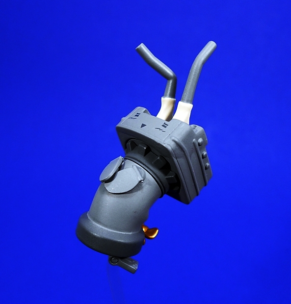
On her back, Shimakaze is armed with her five-tube torpedo launcher, which sets her apart from Fubuki, Mutsuki, and Yuudachi who all wear their torpedoes on her hips. This also makes her attack style rather distinctive and I love the way she drifts to the side and bends forward to unload these babies into the water. The launcher assembly is removable from the figure and the arm for the stand pegs right into it.

fgxshi5

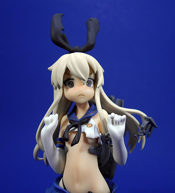
The portrait is excellent. She has a hilarious surprised expression as if she still can’t believe she got hit. her detached anchor is sculpted to part of her hair as if its been blasted off. Even her bunny ear hair ribbon is tattered. The skin tones on the figure are smooth and even and she even has a little bit of red in her cheeks showing that she’s embarrassed the enemy scored a hit on her. The neck is the only articulation on this piece, and once again, you can change out the expression if you own the regular Figma of the character, although I think the expression here is perfect.

fgxshi6

fgxshi7

Of course, you can’t have Shimakaze without her posse of Rensouhou-chan backing her up. These adorable little animated gun mounts come in three different sizes and have some articulation in their heads and guns. The smallest pegs into an arm that curves up from the main stand to allow him to hover just over her shoulder.

fgxshi8

fgxshi9

fgxshi10

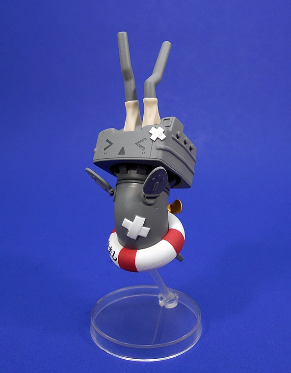
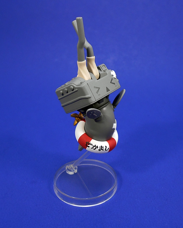
The other two have their own stands with ball jointed arms to allow you to customize your display exactly the way you like. Each of these little buggers are also depicted in damaged mode with their guns bent and the look of anguished defeat on their adorable little faces. The crossed band aids on the biggest of them is a wonderful little touch. Of course, these little buggers will make excellent accessories for the regular Shimakaze Figma as well.

fgxshi11

fgxshi12

I really had no idea what to expect when I ordered this, but in the end it really is exactly what it claims to be. It’s a Figma without the articulation. It sounds like a ridiculous concept, since Figmas are all about the pose-ability, but I’m proof positive that these serve a purpose. Shimakaze’s regular Figma tends to go for around $75-80 these days, whereas I was able to pick up the FigFix for closer to $40. I wouldn’t normally find these non-articulated versions to be acceptable replacements for the regular ones, but it does offer a nice alternative in this case. I haven’t actually featured any of the regular KanColle Figmas here yet, but I have a growing collection of them and at the very least now I can display Shimakaze with them and she’ll do fine until I can track down the regular version.


Cover Girls of the DC Universe: Poison Ivy (Ver. 1) by DC Collectibles

I’m switching it back to the statue scene this week on DC Friday and heading all the way back to the beginning of the second series of the Cover Girls line. I wasn’t all that smitten with this first version of Poison Ivy, especially when compared with what came later, but it’s one of the few early releases that I didn’t have, it’s become a bit pricey on the secondary market, and I was made an offer on this one I couldn’t refuse. Does Ivy manage to win me over? Let’s find out!

cgpoivy2

The packaging hasn’t changed much since the line was rebooted. You get the same fully enclosed box. It’s mostly white and it has some shots of the statue. Inside, the statue comes wrapped in plastic and between two styrofoam bricks. There’s no assembly required and there’s no statement of limitation on this one. It wasn’t until later releases that DCC began limiting the runs to 5,200 and hand numbering them.

cgpivy1

And this is indeed the New 52 version of Ivy and it’s a design that I never really understood or much cared for. Just what’s up with the black leotard? To me it doesn’t fit with the whole plant motif. And the leaves and vines on top of it? Are they sewn in? Does she grow them around it after she puts on the leotard? It’s just a weird design. With that having been said, I’m OK with the pose here. It’s designed to show off the curves of her body and with both arms over her head, she holds a single rose bud in her left hand.

cgpivy2

cgpivy3

cgpivy4

The costume design here is relatively simple, as it’s just a lot of matte black. There isn’t a lot of muscle definition showing through, but the shapes and curves are certainly pleasing. But with all that simple space, I would have hoped the sculptor would have paid more attention to the clusters of leaves. In some areas, they’re well defined, but in others they just look like mush. On the plus side, the green paint is applied well and there’s hardly any slop to speak of.

cgpivy6

cgpivy9

And that brings us to the portrait and this is the part of the statue that could have probably won me over, but it just doesn’t. Again, part of this has to do with my lack of enthusiasm for this version of the character. The black and green eyes are a little too demonic for me, and the black patterns on the face are as weird a choice as the black leotard. There’s something a little too sinister about this portrait. I know, she’s a villain, but here she looks like some kind of Deadite. The expression looks a little too forced as well. Again, the paint here is pretty solid, though, so my issues here are more from the design than the technical merits of the piece.

cgpivy5

cgpivy7

cgpivy8

Easily my favorite thing about this statue is the base. Currently the Cover Girls line utilizes uniform oval bases, but early on in the reboot, the statues featured personalized environment style bases and DCC did some pretty cool things with them, as showcased here. I really dig the way the vines sprout up from the ground and weave their way around her body. It’s a really cool effect for a statue in this price range and I think they pulled it off wonderfully. As for the base itself, it showcases some of the best sculpting and paint on the entire statue. It feels like there was a lot of love put into this aspect of the statue and it makes me wonder if the line would have been better off sticking with these environmental bases.

cgpivy10

cgpivy12

cgpoivy1

Admittedly, I’m not the target audience for this piece, as I’ve admitted to not being a big fan of this look for Ivy, so the fact that this statue leaves me a little cold, should be taken with a grain of salt. There’s nothing inherently wrong with it. The paint is sharp and clean on the figure and fairly exceptional on the base. The sculpting is solid work, although the leaves on the costume could have used better definition. I don’t dislike it, but I don’t love it either. And none of that is surprising, considering my rather odd motivations for buying it. I mainly wanted it to complete my trio of Batman femme fatales from the early days of the reboot, and at $65, she was an extremely good deal for a Cover Girls statue that has been out of circulation for a while.

Transformers Animated: Ratchet by Hasbro

As promised, I’m back with the second half of a Transformers Thursday double-feature. Hopefully this helps to make up for the lack of contend lately. Tonight I’m checking out Ratchet from the TF: Animated line, a Deluxe sized figure that I’ve had for a while, but never found his way into the spotlight. I’ve got no packaged shot, so I’m going to dive right in to check out his alt mode.

anirat1

anirat2

And I am not really digging it all that much, and for a number of reasons, but mostly because it’s rather f’ugly. The off-white, almost gray, plastic does nothing for me and even when coupled with the burgundy, I’m just not a fan of this deco. The paint is pretty rough too, with some sloppy lines and it’s a shade or two off from matching the colored plastic that it’s supposed to. There’s also some annoying scratches on the roof, which is yet another example of some of the poor QC that reared it’s ugly head on several of my figures from this line. Toss in a lot of ugly seaming, and those big hinges on the sides, and there’s just not a lot to love here.

anirat3

The translucent blue plastic used for the windshield, lightbar, and rear lights is nice. The Autobot emblem printed on the hood is cool. At least Hasbro slapped some yellow paint apps on the headlamps, those are all pluses. But then you get some more really sloppy paint on what I assume is supposed to be a tow winch on the front, and the painted blue windows on the side doors is another turn off for me. Ratchet’s alt mode is also pretty small, especially if you park him next to Bumblebee. Let’s see if the robot mode can save this figure…

anirat4

OK, not bad. I definitely like the way the front of the vehicle forms the chest. G1 Skids would approve! The proportions aren’t bad, and I love the he forms a backpack that can hold his tools. The only thing I’m not fond of here are the huge panels jutting up off his shoulders. A couple of simple swivels would have been nice to swing these down and make them look less cumbersome. They weren’t nearly that bad in the animated model.

anirat5

The coloring doesn’t bother me as much here either, probably because we get a lot more of that burgundy paint and plastic. Although, you can still get a good look at all that scratching on his backpack. It’s disappointing that he came right out of the package like that.

anirat8

The head sculpt is solid and a good representation of his cartoon counterpart. I like that they kept the one cracked horn. He looks appropriately grumpy too.

anirat6

Ratchet has a few accessories and play gimmicks. Firstly, he has these fold-out implements in his arms. I can’t remember whether these were weapons or tools, but I suppose they could be used for either. They’d probably come in handy for rock climbing too.

anirat10

anirat11

And you also get a bunch of tools, which clip into his backpack, and which can be clipped into his hands as well. These are a really cool idea and give the figure a lot of added personality.

anirat7

anirat9

Yeah, Animated Ratchet is a mixed bag. His alt mode is disappointing on a number of levels, but I think the robot mode is more than enough to redeem him, at least in my eyes. He’s fun and he looks great alongside the rest of the Autobots. If you haven’t checked out my other Transformers: Animated features, I have finished re-shooting all of them. Unfortunately, while I set out on this endeavor with the hopes that I would feel comfortable unloading my TF: Animated collection to make some room and generate some cash for other figures on my want list, things didn’t go as planned. Not only have I decided to keep these toys, I now feel a burning need to pick up some of the others I’m missing. So don’t be surprised if we see more of these guys popping up on Transformers Thursdays in the near future.

Transformers Animated: Bumblebee by Hasbro

It’s no secret that I’ve been hard up for content for Transformers Thursdays, but today I’ve got a little compensation to offer in the form of a Transformers: Animated double feature. This past weekend I had my Animated collection out to do some re-shoots for their old Features and I realized that neither Bumblebee nor Ratchet ever had their due. I did a little digging to find out why, and found that I started the Features for these figures, but never finished them. I’m going to look at Bumblebee this morning and then swing on back later this evening with a look at Ratchet. I’ve got no packaged shot to offer, so let’s jump right into Bumblebee’s alt mode…

anibee1

anibee2

In keeping with modern tradition of making Bumblebee a little yellow sportscar, that’s exactly what we get here. The yellow plastic looks pretty good and even the transparent windshield pieces that have parts painted yellow match the base coloring pretty well. There’s an off-center black stripe running down the top of the car, and because Bee modeled himself after Captain Fanzone’s car, he has a little police light on top. Other paint apps include the red tail lights, some very faint metallic paint on the headlamps, and a silver Autobot insignia on the driver side of the rear bumper. Naturally, there are some unsightly seams on the car, but overall, I dig this alt mode.

anibee3

Bumblebee comes with two rocket boosters that can peg into the rear sides. These attachments look like adorable, bloated atom bombs and feature some nice silver paint and translucent blue plastic.

anibee4

Bumblebee’s robot mode is still an amazing sight to see, because it manages to produce such a creatively stylized robot figure out of a working Transformer. That’s something this line has generally been terrific at, but I think that goes double for Bumblebee because his proportions in the cartoon are so unconventional. Sure, the entire chest is a fake-out. The plates that make up the top of the car wind up on the back of the figure, but c’mon… this is still great stuff!

anibee5

Despite all that car shell winding up on the Bumblebee’s back and lower legs, these pieces are neatly tucked away, so you don’t get a lot of ugly kibble. Plus, the plates on the backs of his legs serve as heel spurs. The modest backpack tabs together and acts as a storage for his bombs, which when attached make for a cool jetpack.

anibee7

I suppose, if I had to nitpick something here it would be the feet. They look disjointed where they connect to the leg, so they’re not quite as clean as they could be, but when the rest of this figure looks so damn good, I can give them an easy pass.

anibee11

The head is just fantastic. It captures all the personality of Bumblebee in the cartoon and serves up some very effective light piping for the eyes. I really liked this look for him, especially with the tiny little horns. Mine has a little scrape on his chin, but otherwise the paint is solid.

anibee6

anibee10

All this and solid articulation too? Yup. Bee features a satisfying array of both ball joints and hinges, making him a truly fun figure to play with and pose. Surprisingly, the rather large door plates on his forearms don’t really get in the way of the fun.

anibee8

Bumblebee does have one little play gimmick. He has two translucent pieces folded into his arms that can deploy and connect to form an energy weapon. I don’t remember this from the series, but it’s been ages since I’ve watched it, and I never saw the whole thing. I recently got a good deal on the whole series on DVD, so I’m going to start going through it next week.

anibee9

I was a little apprehensive about looking at these figures for the first time, so long after the fact. I find that a lot of older “modern” Transformers haven’t held up for me all that well and that’s why I’ve unloaded a lot of my Cybertron and Energon toys. Plus, it took a while for me to warm up to this style. I wasn’t fully on board until I had some of the toys in hand. I had originally taken these guys out of storage to photograph with the hopes that I could justify parting with them and generating some space and cash for other things on my want list, but that just hasn’t been the case. I still have a soft spot in my heart for this line in general, and I think Bumblebee is among Animated’s best figures.

Mythic Legions: Sir Gideon Heavensbrand by The Four Horsemen

Starting today I’m locking down Wednesdays to begin covering the big boxes of Mythic Legions figures that arrived. If you’re unfamiliar, this is a line of 6-inch fantasy figures designed and produced by The Four Horsemen Studios and funded via Kickstarter. I’m starting with Sir Gideon who was the figure I chose as my Backer Reward before I kept piling on more and more and more. I still question whether I should have gone all in, but I’m very glad that I at least bought as many figures as I did, especially after seeing how quickly the pre-orders sold out. I’ve heard more than a few backers refer to the arrival day as being like Christmas and that’s a damn good analogy. I’m going to take my time opening these and relish every moment!

DSCN8011

Before getting to the meat of the Feature, I’ll toss out some props to T4H and the way they ran this Kickstarter. Yes, it technically missed the target ship date, but not by a lot, and their communication along the way was absolutely impeccable. I don’t want to slag any other recent Kickstarters, but when it came to this one, my confidence never wavered. They really had their act together, they didn’t send out signals promoting false shipping expectations, and from start to finish it was a professional operation. Oh yeah, and the figures they produced easily met if not exceeded what they promised. Let’s start with a quick look at the packaging!

mythgid22

mythgid24

The figures come in packaging that is quite similar to past figures from T4H. You get a bubble that wraps around the edges of a card. This makes for a nice carded presentation, while still being collector friendly. You just bend back the tabs on the bottom edge and slide the card out to get at the figure. The card back is generic for all the figures, but it features some nice background art on the front and back. The back of the card also shows some head shots of other figures and has a little story about the fiction behind the line.

mythgid23

The packaging is customized for each character through an insert at the bottom of the bubble. The left side panel has a faction emblem and the right side panel has a head shot of the character along with his name and a brief bio. I’ve got to admit, I was not expecting that! The figure is secured to the tray with a simple twist tie. His sword is mounted beside him and all the other accessories are baggied behind the tray.

mythgid1

In the bags you get a dagger, a shield, two pieces of shoulder armor, a belt, and an extra head featuring a different style of helmet. The shoulders simply peg into holes in the back of the figure. The belt is probably actually a shoulder strap, but I find it a little snug, so I opted to use it as a waist belt. To put it on you pull the figure apart at the waist. Seriously, it’s all right! A big feature of these figures centers around their ability to mix and match parts. Nearly every part of articulation on the figure can be detached and while swapping parts wasn’t one of the features that motivated me to get in on this line, I can’t deny it opens up some amazing possibilities.

mythgid2

The figure itself is absolutely gorgeous. Sir Gideon features a sculpted white tabard and a suitably heroic set of gold and silver armor. The details include tons of scalloped overlapping plates, tiny rivets, and all the belts and straps that “hold” everything on. It’s such a remarkably detailed sculpt that it’s hard to believe it’s mostly part of the buck. Layered soft plastic extras like the previously mentioned shoulders, and the “skirt” serve to further add some depth and complexity to the armor without impairing the articulation. The only possible nitpick I have about the figure’s sculpt is the tab hole in his back. This is supposedly to allow for future customization pieces, but for now it’s just there. A great idea would have been to include a tab with a connector that would hold the shield. For now, we’ll have to see what T4H come up with.

mythgid4

The paint consists mostly of a sumptuous gold that gives off the right balance of brilliant luster and realistic battle gear. The trim is touched up with an equally pleasing silver. The quality of the paint is superb, with very little bleeding or slop to speak of.

mythgid5

The stock head features a form fitting helmet with a raised visor so you can get a good look at Sir Gideon’s heroic face and manly ‘stache. It’s a great portrait and certainly one befitting of the hero of this line. I’d be hard pressed to believe that Strongheart from LJN’s AD&D line didn’t help shape the look of this noble knight, and that’s an homage I can get behind. The paint on his blue eyes is straight and the mustache and eyebrows are clean and sharp. The helmet features some rather extravagant decor in the form of two mighty wings protruding from the sides and a beautiful silver eagle crest jutting up off the top. All three pieces are articulated and can even be removed if you so desire. The visor pegs into the forehead of the helmet, and there are pegs for two positions…

mythgid6

…so you can display the figure with the visor up or down. It’s a really cool option, especially since you can still see his eyes and the underlying face sculpt through the slits in the visor. Of course, if you prefer a different helmet, you can pop this one off and pop on the secondary head…

mythgid16

mythgid17

This one is a fully enclosed Crusader-style Great Helm and as you can see, the eagle standard pops off the other helmet and onto this one so that the other warriors on the battlefield recognize Sir Gideon even with a different helmet. Although, granted it would be hard to miss him in that armor! Despite spending the better part of a year drooling over the pictures and details and waiting for my figures to come in, I never once remember seeing anything about Gideon having a spare head, so this was another great surprise. It’s going to be hard to decide which helmet to display the figure with, I really do dig them both!

mythgid11

mythgid8

mythgid20

Articulation on this guy is all about ball joints and rotating hinges. You get rotating hinges in the shoulders, elbows, wrists, hips, knees, and ankles. There are also ample rockers in the ankles to steady him for those wide stances. The waist is ball jointed, as is the neck. I had no issues with painted over joints, stuck joints, loose joints or anything of the kind. Posing this figure feels fantastic and while it looks like a collectible piece, it’s a figure that begs to be played with.

mythgid19

mythgid7

mythgid9

I’ve already given a rundown on his accessories, so let’s take a quick look at each. His large curved shield features a gold face with a black griffon or dragon on the front and a silver border, making for a very attractive piece. The grip is a simple clip that pegs into the shield and clips around the figure’s wrist. I was a little apprehensive about the clip for fear that it would rub the paint off the arm, but it seems like so long as it’s clipped around the wrist joint and not the upper arm, things will be fine. The fact that the clip pegs into the shield is a pretty big deal to me, because that means it can swivel and so you can angle the shield however way you want it, no matter which way the arm is holding it.

mythgid14

mythgid3

mythgid12

The sword and dagger have matching hilts. These are stout and simple looking weapons, which I prefer over super ornate accessories. The grips are painted red and they fit perfectly in his hands. The belt has a single loop to hold the either the sword or the dagger, but not really both at once. Again, I believe the intended purpose for this piece is as a shoulder strap, but I’m just not thrilled with the way it fits across the chest.

mlgid2

mythgid18

If you’re curious about scale, at 6-inches tall these figures are compatible with a number of other lines. The most obvious would be Mattel’s Masters of the Universe Classics, one of the more high profile lines sculpted by T4H. While they are fairly different stylistically, they can certainly interact with each other comfortably and Gideon is easily able to mount any of the MOTUC beasts as well. They also scale very well with NECA’s “Heroes of the Storm” line, which should make for some pretty fun Legions-Warcraft crossovers.

mythgid10

mythgid13

mythgid15

mlgid1

mythgid21

As a Backer Reward for a $45 buy-in, Gideon is the most expensive of the initial assortment, but I think he’s still worth every penny. Subsequent figures that were added on were between $18 and $33, so if I spread his extra cost among the 18 other figures I bought, it all works out pretty well in the end. If you can’t already tell, I’m beyond satisfied with the quality of this figure and I can happily say it was well worth the wait. I’ve got a lot of these figures to go through in the weeks ahead and I’ve also got some of the figures from Wave 1.5 coming, so there will be plenty of Mythic Legions love to go around! 

Masters of the Universe Classics: PowerCon Exclusive Granamyr by Mattel

Sometimes collecting MOTUC Exclusives can be a real ball buster. In the case of this year’s PowerCon Exclusives, you didn’t have to go to the Con, you just had to be willing to pony up big money on a pre-order at one of those well known online scalpers, oops… I mean toy retailers. One of those was a re-release of the large dragon, Granamyr in his green Mini-Comic colors. The price? $140 for a repaint of a toy that was originally $85 back in 2012. Hey, don’t judge me… it’s already selling for a lot more than that on Ebay and it’s still cheaper than what the original red Granamyr is going for these days. Besides, my idea of self-control was not buying the other two PowerCon Exclusives. So hey, let’s take a look at this big-ass dragon…

pcongran1

The box looks very similar to the one used for the original release with his color being appropriately changed from red to green. I absolutely adore the artwork here. It’s very reminiscent of the stuff we used to get back in the vintage days. His tag line on the front reads, “Great Dragon Lord of Darksmoke” and it points out that as big as this box is, he does indeed come unassembled. The box is collector friendly, but it has that weird shape that Matty loves to do on these things, meaning that there’s actually multiple flaps on the side panels, the tape on each of which need to be carefully cut in order to preserve the box while opening him.

pcongran16

pcongran2

The back features a picture of the toy and a full bio. You also get a little headshot from the Mini-Comic, which inspired this new deco for the character. I was really on the fence over picking up the original release of this guy, but I had a lot of other irons in the fire and my resolve actually held out for once. When I saw how great this re-deco looked in green, I just couldn’t resist. Time to open him up!

pcongran4

pcongran3

pcongran5

Dragon parts!!! Inside the box you get two trays of parts, plus the torso wrapped in a plastic bag, and a simple, folded instruction sheet. There are a total of ten parts used to build him: Two legs, two arms, torso, neck, head, two wings, and a tail. If you’ve ever put together a Hasbro Build-A-Figure or a Mattel Collect-And-Connect, than putting this beast together should feel familiar, only on a much larger scale. I was surprised that it looks like he’s capable of being disassembled and returned to the box, which isn’t always the case with these kinds of assembly jobs. I can’t imagine any time when I won’t want this guy on display, but it’s always nice to have options to return a toy to the box, especially when it’s an exclusive release like this one.

pcongran6

Dear God, this thing is gorgeous! GORGEOUS!!! If you already have the original release, most of what I’ve got to say will be common knowledge, but this is my first experience with the figure, so please forgive me, because I’m going to have to do a lot of gushing. Granamyr measures about 14-inches tall in his seated position, and make no mistake, this is a figure that is designed to be sitting. His spindly little dragon legs can indeed be stretched out for him to stand on, making him monstrously tall, but he really looks goofy when standing. He does, however, look right at home seated with his knees drawn up on either side of his chest. Regardless, he’s still fully articulated in his arms and legs, with rotating hips and shoulders and rotating hinges in the elbows, knees, wrists, and ankles. He has additional swivels at his chest and the base of his tail, there are rotating hinges in his wings, and his neck is ball jointed.

pcongran7

pcongran8

The sculpt here is quite extravagant. The body is indeed rotocast, and that sometimes results in softer and mushier sculpts, but that’s certainly not the case here. Every part of his body is covered with sculpted scales, which feature some beautiful definition, making him look ancient. You also get crosscuts in his chest and the bottom ridges of his tail, some nice barbs coming off of his forearms, and a row of beefy spikes running down his spine. You can even make out the muscle definition in his upper legs and the tendons running from his fingers to the backs of his hands. The detail on display here feels worthy of a higher end statue, and it’s really something special to see it on an action figure, albeit a rather pricey one.

pcongran9

Like a great piece of art, the quality and composure of the paint compliments this sculpt brilliantly. That’s not to say the original red version wasn’t stunning, this one is just… different. The multiple shades of green are applied to get the most out of picking out the detail in the scales and muscles and other bits of dragon anatomy, with a lighter lime green used for his belly and some glossy gray paint for his claws.

pcongran11

And then there’s the head sculpt, which is a total knock-out. Sure it helps that they had a great design to begin with, but the quality of this sculpt just elevates it through the roof. The wrinkles, the jagged teeth, those lizard-like creases around the corners of his mouth. The cavernous nostrils and the prominent, imposing brow framing those mystical pupil-less white eyes. Everything here is just so masterfully done giving Granamyr a ton of personality and an ancient and wizened look.

pcongran12

The paintwork on the face is also stellar and arguably even better than the body. It emphasizes every little crease and crevice. The teeth are painted to match his claws, the eyes are now white, instead of the yellow used for the first release, and his helmet is finished to look like worn, cold steel. The horns on the helmet have a realistic ivory finish.

pcongran10

pcongran14

I already walked through the articulation here, and pointed out that this figure is designed with a very singular display option, however, that doesn’t mean the articulation is wasted. Not at all. You can still get some wonderfully expressive poses out of him and he’s still a lot of fun to play with.

pcongran13

pcongran15

I pre-ordered this beauty the day it went up, and I’ll be real honest and admit that when the pre-order finally dropped, I found myself hit with a pang of regret. My list of want-to-buy toys right now is pretty long and I’m already making some painful compromises to accommodate my budget. I needed a $140 dragon hitting my checkbook like I needed a hole in the head. Checking completed listings on Ebay, I had every intention of putting him on the block when he arrived and making a little extra cash on the deal too. But then I opened him and put him together and sat this majestic creature on my desk beside me. It was then I instantly knew that I had made the right decision buying him and that there was no way I could give him up. This is quite simply a work of art and I absolutely love him. What’s more, he’s such a versatile figure, and I can see using him in a whole bunch of different displays besides MOTUC, from Mythic Legions to my LJN Advanced Dungeons & Dragons figures. He’s going to be welcome among many different lines.

Marvel Legends (Absorbing Man Wave): Jack O’Lantern by Hasbro

Alrighty folks, it’s time for another Marvel Monday and today I’m pressing on through the Absorbing Man Wave, this time with the second half of Marvel’s “Villains of the Night,” Jack O’Lantern!

mljol1

As part of a shared slot, Jack comes in the exact same package as Morbius did, with his name only appearing on the back panel. This is the Marvel NOW! version of the character as he appeared in Agent Venom’s book. I suppose I should say “version of the characters” (plural) as Jack is one of those villains who has had many different identities. Hell, forget about all the other villains, Hobgoblin could have made a killing franchising out an army of Jacks.

mljol3

And what a very unique looking figure he is! That’s not always the case when it comes to Marvel Legend’s sea of re-painted bucks. And yet, Jack still makes use of a recycled body. The last (and only) time we saw this one before it was transparent and bundled with the Thunderbolts as Ghost. I would never have made that call in a million years and yet seeing it makes it seem like a no-brainer. It’s a super thin body with lanky limbs, which lend themselves to a creepy look.

mljol15

mljol4

And it’s amazing what some fresh paint and colored plastic will do! Even though I have Ghost in my collection, Jack still comes across as a newly tooled figure to me. He’s mostly black, but his chest harness and straps are painted brown and there’s some super sharp silver paint on the fixtures. His belt is a newly sculpted piece and has a secondary belt displaying his reserve pumpkin bombs.

mljol9

The head sculpt here is mighty awesome. The fully realized jack o’lantern noggin is beautifully painted and features some snazzy flame effects wrapping up around the back of the head and spilling out the eye holes too. Magnificent!

mljol5

mljol6

Articulation is mostly what I’ve come to expect from the Legends line. That includes rotating hinges in the shoulders and hips, double hinges in the elbows and knees, swivels in the biceps, wrists, hips, and waist. The ankles have hinges and lateral rockers, the torso features an ab crunch hinge, and the neck is both hinged and ball jointed. Yup, the only odd thing here is the lack of hinges in the wrists and the fact that their swivels are pretty far up the forearms. Also, I should mention that the shoulders have some crazy tight ratchets, that make it hard for me to work with them. I’m really not sure why Hasbro felt the need to do that, it isn’t an issue at all on Ghost, but it can be a little frustrating when playing with the figure.

mljol8

Accessories! In addition to the Absorbing Man leg, Jack comes with his flying broom, sickle, and a flaming pumpkin bomb. The bomb is a simple little piece sculpted in the same brilliant translucent orange plastic as the flames on his head. He can hold it pretty well in either hand.

mljol11

mljol10

The sickle is pretty big and a little ungainly. Because Jack’s hands aren’t designed for holding it, the sickle has a plastic rectangle on the grip to slip his fingers through. It works OK, so long as you’re happy with him holding it in the right hand. One side of the sickle has a cool hammered look to the sculpt, but the other side is largely unfinished.

mljol13

Lastly, you get his flying broomstick, because… COMICS! It’s partially painted and partially the exposed translucent plastic that is a running theme with this figure. There are a couple of bars to tuck his ankles onto and a grip bar, similar to what we saw on the sickle so he can hold the handle of the broom. I’ll confess, I wasn’t too keen on this piece when I saw it in the package, but I’ve found that it’s actually quite a big of fun and with a little work, he can pose quite well with it.

mljol7

mljol12

mljol14

Jack O’Lantern is a character that I didn’t even know I wanted until I had him in hand. His design is wacky, creepy, and sinister all at once and all of that is executed beautifully in this figure. Everything about him feels fresh, and since the previous use of this buck was a limited release, he should be like a totally newly tooled figure to a lot of collectors out there, and that’s something we don’t see all that often in this line. So far, The Absorbing Man Wave is batting two for two. Next Monday, I’ll see if I can throw a wrench into the works with a look at Speed Demon.

DX Girls Snap Collection (One Piece): Nami (Vol. 1 and 2) Figures by Banpresto

I’ve been covering a lot of figures from properties that I’m passionate about on Anime Saturdays, but not today. Today I’m going back to my drunken guilty pleasure, One Piece. It’s a show that I only watch when I get back from a crippling night at the pub, and when I watch it, I’m usually simultaneously hunting Nami figures online in an inebriated stupor. Multitasking! So let’s check out some Nami figures from Banpresto’s DX Girls Snap Collection

dxnamis1

If I’m going to engage in drunken online anime figure shopping, I could certainly do worse than the DX Girls Snap Collection. These roughly 7-inch tall figures are simple and inexpensive, so when the package arrives a couple days later, I don’t have to panic and worry about what damage I did to the bank account. The figures come in matching window boxes and while they’re certainly serviceable, they feel flimsy and arrived to me in rather shabby condition. I much prefer the fully enclosed box that Banpresto used for the “Sea Nymph” Nami that I got a couple months back. These boxes are collector friendly, but I sincerely doubt I’ll be keeping them. Rather than go straight to the fan service, I’ll start with Nami in her Alabasta Kingdom outfit…

dxnamis4

dxnamis5

As the “Snap Girls” name suggests, these figures are all about mugging for the camera and that’s exactly what Nami’s doing here. It’s a glamour shot with one hand on her hip and the other behind her head and her dress is blowing out beside her and she looks really great. In fact, I only have one negative thing to say, and that’s the ragged cut of her dress looks more to me like a fault in the mold than something intentional, but that might just be me. Otherwise, this is a surprisingly solid piece for such a low end figure.

dxnamis6

dxnamis7

Donning the native dress of the Alabasta Kingdom is a big change from Nami’s familiar jeans and bikini top, but I think it makes for a distinctive figure and allowed for a lot more creative license in the sculpt. Both the dress and the half-jacket that she has tied around her top are separate, permanently attached pieces, so there’s a nice feeling of depth and complexity here. The billowing of the dress adds a bit of energy to the pose and allows the figure to show off a little leg… or a lot of legs, depending on which angle your viewing her from. The detail on her arm bands and bangles is appreciated, and while the portrait is pretty simple, it’s undeniably Nami with short cropped hair.

dxnamis8

The paintwork is quite good. There’s some faint blue used on the dress to make it look like thin cloth even though the plastic used is actually quite thick. The blue paint on her waist fringe and ornamentation on her top is all neatly applied. I’ve certainly seen worse examples on far more expensive figures. The eyes are printed on, so no worries there, and they even bothered to paint her toenails. The skin tone is also even and natural looking with none of that awful waxy finish I’ve sometimes encountered in budget figures. All in all, a very nice figure. And now for the fan service…

dxnamis10

dxnamis11

Awww, yeah! If exotic Eastern dresses aren’t your cup of tea, here’s just plain old Nami walking along in a bikini and enjoying a refreshing ice cream cone. Nothing wrong with that! There’s not a lot of wardrobe to talk about here and by extension not an abundance of paint operations or unique sculpting. Nami looks as fit as ever and, the skin tone here is again quite good and I’m happy to say there’s no ugly seams to ruin it.

dxnamis12

dxnamis13

Despite the simple and skimpy outfit, the paint and sculpt still feature some nice flourishes. The tied strings for her bikini top look good as does the ornamental waist chain that rests on her hips. And uh-oh, she looks like she’s slipping out a bit in the back. I also think it’s funny that Banpresto put the copyright information across one half of her backside. I guess there was really nowhere else to put it. The paint is excellent with a very nice shade of blue for the bikini and some sharp patterns on the top. And of course her tattoo is neatly printed on her left shoulder.

dxnamis15

dxnamis14

The portrait is very similar to the Alabasta figure, but this time she’s licking her lips and the hair, while still short, is a completely different sculpt. The ice cream cone in her left hand looks good enough to eat! Also, both figures feature the same plain black disk with peg holes to hold the figure in place.

dxnamis9

dxnamis18

dxnamis2

At around sixteen bucks a pop, drunk or not, how could I go wrong? These Namis are damn great and I can wholeheartedly endorse having them even now that I’ve sobered up. Sure, I wouldn’t mind having a better example of her in my collection, but my confidence is still shaken from the dreaded Bootleg Nami incident of 2014. These are nice enough that I could have easily Featured these figures separately, but the truth is I have so many anime figures to go through that it would take me a ton of Saturdays just to get to them all. I’m still thinking about looking at my Figmas and Figuarts during the week and saving Anime Saturdays just for statues and prize figures. Now, with that having been said, next Saturday I’m going back to Kantai Collection with a look at a relatively new(ish) line from Figma… FigFix!

Rock Candy (DC Comics): Wonder Woman, Supergirl, and Modern Batgirl by Funko

What do you do when your Funko and have something like 1.5 million different Pop! Vinyl characters in circulation? You keep expanding, of course! And now Funko has introduced a new line of vinyl collectible figures called Rock Candy. Now, I’ve only dabbled in Funko’s Pop! Vinyls, but these roughly 5-inch tall, non-pose-able female figures feature a super cute style that I couldn’t resist. Currently the line is only featuring characters from DC Comics, and different versions of Barbie. Weird! Today I’m sampling half of the initial six DC Comics releases.

rcand1

The figures come in compact little window boxes that feel a lot more premium than the POP! boxes. They feature some nice gold foil lettering with each character’s name in her own particular logo on the front and again on the side panel. Oddly enough these aren’t numbered, so maybe Funko isn’t anticipating a lot of growth with this line. Like the Pop! figures, these packages are designed so that you can use them as their own display cases and still get to see most of the figure. Unfortunately, the front window on my Supergirl has heavy rubbing, so I haven’t decided whether to pitch the boxes, or maybe try to get a better Supergirl box. Of course, if you want to open them up, the boxes are totally collector friendly and you even get clear display stands with pegs designed specifically for each figure.

rcand8

Overall, I really dig the styling here. There are definitely some cutesy tropes at work, what with the big head and eyes, but I also feel like it’s something fresh and new and works well with all the characters I’m looking at today. Wonder Woman sports an adorably determined expression with hands on hips and I’m surprised at how much of her costume is fully realized through the sculpt. The belt, the chest emblem, her wrist bracers, all of these could have been simple paint apps, but aren’t. Even the coiled lasso is quite detailed! Only the stripes on her boots and stars on her super-panties are achieved with paint alone.

rcand9

rcand10

And speaking of paint, what’s here is overall very solid. The original promotional shots of these figures looked very sharp and I can remember thinking that it was going to be a line that would live or die based on the quality of the paint and considering some of the hit or miss paintwork on Pop! Vinyls, I’m surprised at what we got here. Sure, the lines could be a little more crisp in some areas (particularly the stripes on the boots), but there’s virtually no slop and the shades of blue and red and gold all look so vibrant.

rcand5

rcand6

rcand7

Supergirl boasts a confident look with fists on display and ready for action. Once again, there’s a lot of sculpted detail here that could have easily just been paint or printing, including her belt and chest shield. The paint here is also very clean and I appreciate that they even used glossy red for the boots and matte for the cape and skirt. But most of all, the colors are just so bright and luxurious.

rcand2

And that brings us to Batgirl. This is the Babs Tarr, Batgirl of Brunside, version of the character and a look that I’m very fond of. The sculpt here is pretty impressive as it includes all sorts of little touches like the laces on her boots, the pulls on her zippers, her belt and pouches, she’s even holding a batarang in her left hand. I think I like Batgirl’s expression the most out of the three, as she has a lot of personality. Even the pose, with her one knee drawn in is just adorable.

rcand3

rcand4

Unfortunately, the paint on this one is a bit disappointing when compared to the other two figures. The lines just aren’t as sharp, particularly around the yellow and black areas. I should qualify that by saying it’s still pretty acceptable for a mass produced vinyl collectible in this price range. I mean, they even made a go at painting the laces on her boots! I think this is more an example of the other two figures looking so exceptionally good, that it hurts the one that looks average.

rcand13

rcand12

rcand11

But, I don’t want to end this Feature on a sour note, because the truth is I totally dig all three of these figures and I’m definitely going to round out the DC assortment by picking up the DCEU version of Wonder Woman as well as Classic Batgirl and Harley Quinn. At $9.99 these figures are in the exact same price point as Funko’s Pop! Vinyls and I think you’re getting a lot more for your money here. They’re cute, colorful, and feel like a decent value, whereas the Pop! Vinyls to me feel like a dirty addiction that I should be ashamed of. In the end, it just feels like more work and personality went into these. While the Barbie releases aren’t my bag, I’m going to be really interested to see if Funko expands this line to include more DC figures or even other franchises. I sure hope they do.

Masters of the Universe Classics: Goat Man by Mattel

Masters Classics continues to limp along as I cling to the glory days with my little Collector’s Choice subscription. But since that figure was delayed (again!), today I’m going to open up Goat Man, a figure I picked up during one of the Early Access sales. Goat Man was one of those infuriating exclusives that was available at multiple conventions and eventually put up for sale on Matty’s site with warnings about limited quantities. I don’t recall whether he sold out quickly, but whatever the case, Matty had some more lying around and we got a second chance at him a couple of months back. This was a good thing, because he’s a really obscure character, which must have been like a dream come true for a lot of hardcore fans. For me, seeing him just made me realize that my Eternian shelves lacked a Goat Man and I just couldn’t have it.

goatm1

Despite being a Con Exclusive, there’s nothing on the package to indicate that. Flipping over the card reveals that he was the days of the line (last year) when Matty still printed bios on the back of the cards. While his tag line, “Horn-Headed Servant of Beast Man” more or less sums him up, reading the bio told me that he also got his ass kicked by Buzz-Off. Jeez. That’s quite the resume.

goatm2

Goat Man feels like he settled on his name because Ram Man was already taken. There’s nothing terribly goat-ish about him. He doesn’t have hooves for feet. He doesn’t have those creepy horizontal irises, nor does he have a scraggly little chin beard. He does feature a pretty standard MOTUC buck with the usual furry diaper and belt, some blue boots with scalloped tops, and some thigh wraps, that I don’t remember ever seeing before. The torso is covered with a vest that makes him look really puffy, and some criss-crossing black straps sculpted on.

goatm3

The paint here is mostly good. The combination of blue used for the boots and belt, and the red for the furry diaper, gloves, and vest makes for a colorful deco. There’s even a very subtle difference between the metallic red they used on the flared shoulders and the regular red used for the rest of the vest. I do find it peculiar that his skin is regular flesh tone, while his face is red. The paint on my figure has a few minor flubs, like some chipping on the black straps on the back of his vest, but overall the quality is OK.

goatm4

The head sculpt here is decent, but nothing much to write home about.  It’s actually a pretty scary portrait, with the mouth full of sharp teeth, the black and red eyes, and the curling ram… I mean goat horns. This guy looks like he would be right at home on the cover of an 80’s Heavy Metal album. Again, the fact that his face is red and the rest of the skin isn’t makes it look like he’s supposed to be wearing a mask. If that’s the case, than I have to bring his pedigree as a legitimate Goat Man into further question.

goatm5

The articulation conforms to the usual standard MOTUC buck. If there’s going to be one positive thing about this line ending is that I won’t have to run down the articulation on these any longer. Right now, I can practically do it in my sleep. The arms have rotating hinges in the shoulders, swivels in the biceps and wrists, and hinges in the elbows. The legs are ball jointed at the hips, have hinges in the knees and ankles, and swivels up near the hips. There’s a swivel in the waist, an ab crunch hinge in the torso, and a ball joint in the neck.

goatm6

goatm7

Goat Man comes with two accessories, but only one is intended for him. His is the huge, bitchin’ hammer and I absolutely love this thing. It’s a simple sculpt, with a steel finish and a sculpted, brown wrapped grip. It looks totally appropriate for him and it’s probably one of my favorite MOTUC weapons in a long while.

goatm9

The other accessory is the Staff of Avion taken from the Mini Comics. For a little while now, Matty has been trying to get extra accessories out to the fans by randomly bundling them with other figures, and this staff is yet another example of that. I can’t say that I was pining to get this into my collection, but I’ll never say no to another accessory. It’s mostly translucent green plastic with a little gold paint, and it actually looks quite striking. It’s ironic, but Stratos originally came with no accessories and now he has two Staffs of Avion (the other coming with Filmation Icer).

goatm8

goatm12

goatm10

goatm11

Goat Man doesn’t really impress me all that much, but that doesn’t mean that I don’t like him. Hell, it’s hard for me to think of too many figures in this line that I don’t like. He’s certainly a solid figure and a welcome addition to the already colorful menagerie of characters in my MOTUC collection, but I’m glad I didn’t go nuts trying to get him when I missed out on him the first time. And believe me, I almost ended up going the Ebay route on this guy. Hopefully, I’ll be able to look at the Collector’s Choice figure, Darius, within the next week or so as I just got shipping notification on him right here in front of me… TWELVE BUCKS FOR SHIPPING ONE FIGURE… Oh, YOU CAN GO STRAIGHT TO HELL, MATTY, AND I HOPE GOAT MAN IS WAITING THERE FOR YOU WITH HIS GIANT BALL-BUSTING HAMMER!!!  I do also have the PowerCon Exclusive Granamyr figure on its way, so it’ll be a race to see which one gets here first. I’m betting it’s Granamyr, because Matty’s twelve dollar shipping takes forever.