Sunday Funday: Star Trek (2009) Blu-Ray

Today’s going to be a quickie, because I’m off this weekend, it’s a beautiful day here in sunny Florida, and I’d rather be out on the patio, drinking and reading my comics. Truth be told, I went through the entire Star Trek original crew movie series on Blu-Ray this week, but I’m looking at the 2009 movie today only because Sunday Funday is supposed to be about something I did over the weekend and I watched it last night. It’s also the only one that comes with a cool novelty package that I can talk about.

stbr1

stbr2

I won’t go into a lot about the movie. Suffice it to say, I liked it a lot more than I thought I would. That’s not a loaded compliment. I really enjoy this movie, despite the fact that I was nerd-raging against the concept from the start. The casting is great, the sets and ship designs are cool, the effects are amazing, and this disc is definitely in the top three best looking Blu-Ray’s in my collection. Seriously, whenever I want to impress people with my AV setup, I’m always most likely to bust out the Blu-Ray of Star Trek or The Avengers.

stbr3

Normally, I am not a fan of novelty Blu-Ray packaging. I am borderline OCD, which probably speaks volumes as to my collecting habits. But I do enjoy my shelves to look neat and orderly with all the cases lined up just right. So when you get something like a special case into the mix, it seriously throws off the feng shui of my media shelves and that’s just not cool. I try to avoid these most of the time. I still can’t look at my shelf of Arnold Schwarzenegger movies without shooting a hateful look at that absurd circular tin containing the old Total Recall Special Edition DVD.

stbr6

stbr4

I do, however, really enjoy the Star Trek package, which is basically a little model of the Enterprise with the discs cleverly held in the saucer section. It’s such an amazingly well-crafted little piece that owning it dissuaded me from spending the money on Playmates version of the 2009 Enterprise. No, it’s not electronic, but it displays just as well on the shelf. It doesn’t look like a Blu-Ray incentive at all. It just looks like a little model of the Enterprise that I would have on my shelf.

stbr5

The idea to store the discs in the saucer section is both obvious and genius at the same time. It makes the discs easily accessible, while exploiting the design of the model itself. It’s also worth noting that this Enterprise is remarkably sturdy, made out of great quality plastic, and sits perfectly on its stand, unlike a certain expensive Diamond Select Starship I bought a short while ago.

stbr7

And that’ll wrap up Star Trek Week. I had intended to come back to some of my 90’s Playmates Trek figures, since it’s been forever since I looked at any and they are piling up. I’ll have to make an effort to squeeze them back into my weekly routine. Maybe next week.

Star Trek: The Original Series Hand Phasers by Playmates and Diamond Select

I started my tribute to the new Trek film a couple weeks ago with a look at Playmates’ hand phaser from the 2009 movie series, so it seems only right to end Star Trek Week with a look back at The Original Series phaser. In terms of my own personal favorites, this original piece of Starfleet hardware is second only to the awesome design featured in the otherwise shitty fifth movie, The Final Frontier. Were they used again in Undiscovered Country in the infamous mashed potato attack scene? I think so, but I can’t remember for sure. I’m actually going to be doing a dual feature comparing the TOS phasers made available by both Playmates and Diamond Select. Phaser vs Phaser… FIGHT!

toshp11

toshp10

No package shot, because I’ve had these things for what seems like forever, but since I’m likely to get a little techno-babbly, I am including two pages from my trusty Starfleet Technical Manual as reference for the anatomy of a phaser. I first bought the Playmates one to replace an actual resin and metal prop phaser that I bought at a Trek Convention back in the late 80’s. I had to sell that one off because I was in need of monies for college, or some other stupid thing, and I had a ridiculously high standing offer on it from a friend of a friend. It killed me to sell it, but them’s the breaks. Anyway, I was never totally happy with the Playmates release, so when Diamond Select offered their version some time later, I was quick to pick it up.

toshp6

toshp3

First, let’s talk scale… both phasers are close to the proper feel for an adult hand, but the Playmates version is actually quite a bit chunkier than it should be. It’s not only the overall dimensions that are skewed, but the sculpted, “Type 1” phaser also looks a lot bigger than it should be. Now, if you just happened to be holding the Playmates version, the extra girth might not be readily apparent to you. It’s not that bad and it feels ok in the hand. But, if you compare it side by side with the properly scaled Diamond version, you can clearly see the difference.

toshp7

toshp4

In terms of sculpted detail, both phasers hit all the right points Both have nice looking translucent beam emitters with adjustable photon accelerators. Both pieces do a good job of replicating steel finish for the accelerators. The beam shield is a bit stubbier and thicker on the Playmates version, but it still looks fine. Both models feature an adjustable Dilithium Crystal Cell, although the Diamond one actually serves a purpose for the SFX, whereas the Playmates version just turns. Both have painted deflector shielding on the sides and rear. They both look good, but I prefer the Diamond a bit more, mostly because it fans out of the back in the proper fashion. Both pieces have exposed screwheads on one side, the Diamond has one on the top and one in the handle, the Playmates phaser has three in the top and one on the handle. The other big difference is the Type 1 phaser on the Diamond version is properly textured, whereas the Playmates one is left smooth.

toshp8

toshp9

Moving to the top down, it’s now worth pointing out that the Type 1 phaser in the Playmates version is sculpted on, whereas the Diamond one is actually removable. Obviously, this is a pretty huge difference. The Playmates version uses stickers for detail on the force indicator dials, and mine have long since fallen off. The Diamond version uses a printed paper sheet under the translucent piece and sculpted numbers and hash marks on the dial. Both look very nice. The Type 1 phaser on the Playmates version has somewhat unsightly speaker holes on the electron aspirator pile, and the trigger is just a sculpted piece, whereas it is a clear piece on the Diamond version. Both Type 1 phasers are missing the operational light between the force setting wheel and the force indicator dial, something that my prop did actually have.

toshp5

The electronics are about on par with both pieces. My batteries are drained on both so I’m going from memory here, but each phaser had different sounds for different settings. The Diamond version has working electronics in both the regular rig and the removable Type 1. I don’t recall having any issues with the sound on either piece.

toshp2

toshp1

I’ll freely admit it isn’t really fair to compare these two pieces. The Playmates version was more of a mass market roleplay toy, whereas the Diamond version was designed more with collectors in mind. As a result, the Diamond release clearly comes out on top across the board.  That having been said, neither version is anywhere near on par with my old prop phaser, but both have their merits. The Playmates phaser can often be had for under $20, and all it needs is a patch of velcro to make it an excellent cosplay piece that can take a beating while wandering the hotel lobby drunk out of your mind. Of course, the Diamond version can usually still be had for under $40, and it’s clearly the way to go for a better display piece or for putting together the better Starfleet ensemble. I display them both together and just use the Playmates as a slightly earlier and less sophisticated version. You know, the kind you give to Red Shirts who don’t stand a chance of surviving anyway!

Pages are reproduced from the Star Trek Stafleet Technical Manual. NY: Ballantine Books, 1975. Researched and compiled by Franz Joseph. Star Trek is a registered trademark of Paramount Pictures.

Star Trek (2009) Command Series: Dr. McCoy by Playmates

In keeping with Star Trek Week, tonight I’ll be going to The Pub and taking my liver where no liver has gone before. That means I don’t have a lot of time, but thanks to some careful planning, I don’t need a lot of time today. We’re looking at Playmates’ Command Series Dr. McCoy and a lot of what I have to say about this figure was already said in yesterday’s Captain Pike feature. Still no in-package shot, so let’s just get right to it, so that I can go out and hit the Aldebaran whiskey.

dlm1

dlm2

McCoy was definitely a high point in the Abrams films for me. Next to Quinto, I think Karl Urban does the best job owning his original Trek character without lampooning too much. I like Pegg as Scotty, but it’s not really the same Scotty at all. He’s just too wacky for it to feel like a legitimate treatment of the character. Ironically, I would have picked up a Command Series Scotty if Playmates did one. Ideally, I would have liked to have one in each of the shirts… Command, Science, and Engineering, but poor Scotty got stiffed and there were no Red Shirts released in this assortment. Anyway…

dlm5

The head sculpt is about on par with Pike’s. It’s soft, it’s rather cartoony, but there’s definitely a bit of the actor in there. The paintwork is pretty solid. Again, for a mass market retail figure in this scale, this is passable work. Not great, but passable.

The shirt is the blue version of what we saw yesterday. It’s a little long in the sleeves, but it looks nice from the front and has an ugly seam running up the back where it fastens. The sleeve stripes and chest insignia are all sewn on. The trousers and boot-feet are identical to Pike’s.

dlm3

McCoy makes use of the exact same body as Pike, and I presume the rest of the Command Series figures. It’s not exactly screen accurate as the barrel-chested body here seems a little bit buff for Karl Urban. That’s ok, though, as I didn’t expect Playmates to churn out a new body for each figure.

dlm4

dlm6

dlm7

Accessories? The same? Not quite. Yes, you get the same phaser and communicator, but you also get a tricorder. Really, Playmates? You couldn’t have just tossed in the tricorder with Pike too? Another odd thing worth pointing out: The belt clip for the communicator is painted silver on McCoy’s belt, but it’s left black on Pike’s. Weird.

dlm8

Hey, I told ya today would be fast. McCoy’s a decent enough figure for what he is, and you can still find him on clearance at a number of e-tailers. I still say we need some high end sixth-scale Trek figures, although my first choice wouldn’t be from the Abrams reboot. Now if Hot Toys would do movie versions of the Classic Crew? Yeah, I’d be all over most of them. No, it’s never going to happen, but I can dream. And with that I’m off to The Pub. I’ll catch you all tomorrow as I wrap up Star Trek Week with a nod back to the original series.

Star Trek (2009) Command Series: Captain Christopher Pike by Playmates

Star Trek Week presses on, and it seemed only fair to look at some toys from the 2009 movie series. Of course, Hasbro’s Not-Lego Kre-O aside, there are no proper toys from Star Trek Into Darkness. Why? Because Playmates’ 2009 Trek line was such an unmitigated disaster. Ironically, if you do want some Into Darkness toys, just go to your local Toys R Us, and you can still buy the 3-year old clearance figures from the first movie right off the pegs. I have looked at some of Playmates ’09 Trek toys before, The 6-inch figure line and more recently the hand phaser, but I never got around to checking out any of the sixth-scale line. Playmates produced a select few of the characters in this twelve-inch format: Kirk, Spock, McCoy, Sulu, Spock Prime, and Captain Pike.

ccp1

ccp2

I was never planning on going all-in with this scale. Originally, I was going to buy Kirk, Spock, and McCoy and be done with it. But Playmates just up-scaled the same terrible Kirk head for the larger figure and so I went with Pike instead. And that’s fine, because I really liked Captain Pike in that movie. This figure is part of the Command Series, which is what Playmates called the twelve-inchers. Alas, the packaging for this guy is long gone. I had a photo of it somewhere on the FigureFan Zero Mainframe, but I think it got deleted when I spilled Jameson on the HDD. Suffice it to say, it came in a pretty cool window box, which was fairly collector friendly. It’s been a year or so since I’ve had this figure out of storage, so let’s take a look.

ccp3

The portrait is decent enough for a figure in this price range. It at least bears a passing resemblance to actor Bruce Greenwood. You get little touches like creases in his forehead and around the eyes. He has a fairly neutral expression, which works for me. The paintwork is very precise. I dig the little grey added to his sideburns. I don’t know that I could recognize the likeness if the figure were dressed differently, but when I know what I’m looking at, I can see the resemblance. Yes, it is rather cartoony, but when you consider the horribly misshapen “man-baby” abomination that was Playmate’s Chris Pines headsculpt, this portrait is a welcome treat.

ccp9

The figure’s outfit is also fairly well executed. The new Starfleet shirts have a complex texture of tiny Starfleet emblems running throughout. Playmates managed to capture this effect with a simple pattern. It’s not quite screen accurate, but it looks good and I applaud them for making the effort, rather than just going what would have looked more like a Classic Series shirt. I’m happy to see that the stripes on the sleeves and the Starfleet emblem on the chest are both sewn on, rather than stickered as Playmates has done in the past. The shirt is a little long in the sleeves, and it’s rather unsightly in the back where it fastens, but otherwise fits the figure well. The trousers have a sewn pattern on the knees and the boots are simple sculpted rubber and make up the figure’s entire feet.

ccp4

Pike’s is built on a very serviceable 12-inch body. The proportions are good, with the possible exception of the hands, which are a tad too big. The head is ball jointed, the arms are ball jointed at the shoulders and elbows, and the wrists swivel. The legs are ball jointed at the hips, the knees are hinged, and there’s a swivel down by the boot. The chest has a ball joint which allows for swiveling and some limited up and back movement.

ccp6

ccp5

ccp7

Pike isn’t heavy on the accessories, but you do get the necessary basics. There’s an equipment belt, a phaser, and a communicator. The belt is easily removable and has a holster for the phaser and a slot for the communicator. The phaser is a very nice sculpt and painted in metallic silver. The communicator is just a block of plastic with a sculpted disc and Starfleet emblem. I’m not really a fan of the Abramsverse communicators. You also get a very basic figure stand sculpted to look like the Starfleet insignia. Only one of the figure’s feet are pegged for it. It works, but it’s rather awkward. I would have preferred just a straight disc stand.

ccp8

So, all in all, I gotta say… Pike’s not bad. Keeping in mind that this is a pretty “low end” over-the-counter 1:6 scale figure, and keeping in mind how sub-par most of Playmates ’09 Trek toys were, they did an Ok job with this one. I’m probably being extra forgiving because you just don’t see many sixth-scale figures at mass market retail anymore, so I’m grading with a curve. It also helps that I got this guy when he was slashed down to about nine dollars, as opposed to the $29.99 he was originally stickered at. Tomorrow, we’ll look at the only other one of these guys that I picked up… Doctor McCoy!

Star Trek II The Wrath of Khan: Khan Noonien Singh by Art Asylum

And we’re back with Day Two of Trek Week! The key to crafting any great screen rivalry is to create a villain worthy of the hero. In the case of Kirk, that wasn’t an easy task. But, thanks to a performance crafted by master thespian and scenery chewer, Ricardo Montalban, Khan not only held his own against Kirk on the big screen, but has become one of the quintessential villains in modern cinema. He’s so friggin formidable they made a whole movie just about his goddamn wrath. But we’re not here to talk about the movie, we’re here to talk about toys, so let’s take a look at Art Asylum’s take on Mr. Khan Noonian Singh.

kns9

It’s the exact same packaging that we saw yesterday with Admiral Kirk. The only difference is the bottom insert in the card is personalized with Khan’s name. Again, the presentation here is fantastic. I love the Starfleet insignia shaped bubble and the card art really takes me back to the 80’s movie poster stylings.

kns10

Yep, the back of the card is the same too! Lots of figures and many are now very expensive. One of these days I will have a full crew. I vow it… I will have the full crew!

wok1-vert

Anyway… moving on to the figure…

kns3

kns4

Khan’s portrait fares much better than Kirk’s. The head sculpt is a pretty solid representation of Montalban from the film, right down to his outrageous 80’s David Bowie hair. It must have been a challenge to sculpt hair like that, but I think the guys at AA did a solid effort. I also appreciate that the long hair doesn’t impede Khan’s neck articulation.

kns5

The rest of the figure is ok, but I think it stumbles in a few areas and mostly the paintwork is at fault. His ragged Ceti Alpha 5 outfit is reproduced with nice detail. He has all sorts of patchwork bits on his tunic and the Starfleet pendant he wore around his neck is sculpted into the chest. He has his one gloved hand, because it was the 80’s and cool people wore only one glove. I also dig his wrist communicator with the sculpted wire running up his arm. His boots have sculpted fur lining and are surprisingly detailed, considering I don’t remember ever getting a good look at them in the film.

The paintwork, on the other hand, makes use of too much gloss, particularly on his tunic and his bare chest. It’s just not right and it’s at odds with the matte dirty finish on the bare arms and the matte paint on the face. It also makes him look more toyish than the Starfleet figures in the line, which make an effort to distinguish matte from gloss.

kns1

kns2

Khan features the same articulation as Admiral Kirk. You get a ball joint in the neck. The arms are ball jointed at the shoulders, hinged at the elbows, and have swivels in the wrists and elbows. The hips feature a t-crotch, and the legs have hinges in the knees and ankles, and swivels in the thighs. Again, there’s no articulation in the torso at all.

kns8

Accessories! Khan comes with one extra opened glove hand to swap out his fist. You also get his Ceti Alpha eel, a bowl of baby eels, and a pair of forceps. The eel and bowl are about what you would expect. They’re ok for what they are. The forceps should have been sculpted into an extra left hand, because it’s really tough to get him to hold them in any convincing manner. Still, apart from bundling him with a Genesis torpedo, I can’t think of anything else they could have given him.

kns6

kns7

If it sounds like I’m picking on Khan, I don’t mean to. He’s actually a pretty cool figure. Khan has got a great head sculpt and an ok body, which makes him the opposite of the Kirk figure. And, hey, if you have any kind of customizing skills and some matte paint, you can probably fix most of the paint issues with this figure by getting rid of the inappropriate gloss. I picked up my Khan figure at a Toy Show from the same dealer I got Kirk and he was also $20. Not bad. If you aren’t willing to spend deeply on a bunch of WoK figures, but want some representations of the movie on your shelf, Khan and Kirk are a great way to go.

Star Trek II The Wrath of Khan: Admiral Kirk by Art Asylum

Folks, I’ve got Star Trek on the brain this week. What with the new movie opening this past weekend, I wanted to balance it out with some Classic Trek cinema, so I busted out my Wrath of Khan Blu-Ray and now I’m all ready to talk some Trek toys. So, what the hell, let’s call the rest of this week Star Trek Week! To kick things off, we’re going to Art Asylum and their line of figures based on the second and greatest Trek movie of all time. And who better to go with than the hero and the villain of the piece. I’ve had this pair for a little while now, and I decided the time was right to open them up and get them on display. Today we’re going to check out Admiral Kirk and tomorrow we’ll swing back with a looksee at his nemesis, Khaaaaaaaaaaaaan.

admk1

I really dig the packaging here. Kirk comes on a huge card with a bubble shaped like the familiar Starfleet insignia. To the left of the bubble is an illustration of The Enterprise and to the upper right corner is a nice piece of art depicting Kirk, Spock, McCoy, and Khan. The artwork almost has a vintage feel to it, which really fits the flick incredibly well. It just reminds me of early 80’s movie poster art. The bubble has an insert with the 25th Anniversary (holy shit, I’m so old!) Wrath of Khan logo and another insert with Kirk’s name on it.

admk9

The flipside of the card shows stills of the characters that are available in Series I and II. It also taunts you with the fact that four members of the bridge crew are SDCC Exclusives and so if you want them you’re screwed. Actually, you can still nab some of these figures for around $30 on Ebay from time to time, but others have crept closer to that three-digit mark. Suffice it to say if you’re looking for a full set, you better be ready to dig deep. Ok, let’s bust out Kirk and check him out…

admk2

Hot damn, I adore the Classic Trek movie uniforms: The burgundy tunic with that front flap, the shoulder strap with the rank insignia medal, the gold plated Starfleet insignia on the breast and matching belt buckle. These uniforms were clearly the pinnacle of Starfleet fashion design and I remember being so disappointed when The Next Generation premiered and dragged Starfleet kicking and screaming back to jumpsuits… although, I eventually succumbed to their old school charm. Anyway, this figure does the uniform justice in every way. The black piping is sculpted into the tunic, as is the seam running down the center of the chest. The insignia are painted onto the arm band and the sculpted Starfleet insignia on the left of the chest and on the belt buckle are both things of beauty. Overall, the paintwork is solid, and I like how they used matte black for the pants and high gloss for the boots.

admk3

You may recall a while back I looked at “Regula-1” Kirk from the same series and I was less than impressed with the head sculpt. Well, regular Kirk here uses the same head sculpt. It isn’t terrible, but there’s something definitely off about it. I think it looks like much older Shatner. His eyes seemed to get squintier the older he got, and that’s what I’m seeing here.

admk10

Kirk features decent enough articulation. You get a ball joint in the neck. The arms are ball jointed at the shoulders, hinged at the elbows, and swivel at the biceps and wrists. His hips feature a standard t-crotch, his knees and ankles are hinged, and he has swivels in the lower thighs. I’m glad they didn’t go for any torso articulation, as it would have messed up the look of the tunic. Speaking of the tunic, because the lower part of it is made of rubbery plastic, Kirk can actually sit down. I am, however, somewhat hesitant to leave him in a sitting position, since it will likely crease the plastic. It’s not like there’s a proper movie captain’s chair for him to sit in anyway. Although, the Defiant chair that came with Playmate’s 5” Sisko will work in a pinch.

admk6

admk8

Kirk comes with an extra pair of hands and the basic Starfleet gear: A phaser and a communicator. The hands are nice, but I didn’t find them really necessary. I use the ones designed to hold his equipment and don’t bother with the others. Both pieces of gear are nice tiny representations of the props in the film. I’m pretty fond of this model phaser, and this one appears to be a repaint of the accessory used for the Admiral Kirk figure from The Motion Picture. The communicators in Wrath of Khan, on the other hand, were shit. In fact, they were probably the only bad thing about that entire movie. Seriously, how did Starfleet go from using wrist communicators in TMP to these ugly behemoths? They look like some kind of scratch built transistor radios.

admk7

admk5

And that’s Admiral James T Kirk. He’s a really nice figure. The portrait of the head sculpt could have been better, but it’s not a deal breaker. He’s also one of the WoK figures that won’t cost you an arm and a leg. I got mine at a Toy Show for $20, which is about right. And, if one Kirk isn’t enough for you, you can also track down Kirk with the bloody handprint on his tunic, put there by Scotty’s dying nephew. Hey, Scotty, the dude is dying… WTF did you bring him up to the bridge for? Take that shit to Sickbay and maybe he’d have a chance to live. Oh yeah, there’s also another variant with Kirk doing the Khan scream. Happy hunting! Tomorrow, I’ll be back with the most Noonien of Singhs… Khan himself.

Marvel Universe: Scarlet Witch by Hasbro

Holy crap, is it Monday again already? That means it’s time for some Marvel Universe. I finally gave up on finding Scarlet Witch on the pegs. Actually, I gave up on that a while ago, it was just a matter of resigning myself to spending scalper prices on her via The Interwebs. Let’s see if Wanda was worth the extra dollars… her brother Quicksilver says she is… Oh snap! Incest jokes… do they ever get old?

DSCN1238

Speaking of getting old… package shot! We see it every Monday, so let’s not dwell on it. The character art is quite excellent and Scarlet Witch fills out the bubble surprisingly well for a female type. I think it’s partly the pose, partly the cape, and partly the effects part. As usual, the “Comic Shot” offends me.

DSCN1239

The back of the package has a really odd shot of the figure that is actually missing one of the swivel cuts in the left leg. Weird. She also has a rather lengthy bio describing her powers. It could have been summed up in just five words: “Chick can f’ck with reality.” I’m stunned to see that I actually have all the figures pictured on the back. Kang, Punisher and She-Hulk… they’re all pretty excellent. MODOK is doing his thing on the bottom of the card, sucking at Hasbro’s corporate teat. I love you MODOK and I long for the day when you will appear in a Marvel major motion picture. Let’s see the “average Joe popcorn munchers” try to wrap their brains around you! Actually, once Rocket Raccoon hits the big screen, your debut will probably be somewhat anti-climactic. Ok, enough with the jibba-jabba… let’s bust this witch out.

DSCN1245

DSCN1249

DSCN1250

The portrait is easily the best thing about this figure. The head sculpt gives Wanda a pretty face and the way her tiara (or whatever you want to call that thing) is sculpted looks mighty good for a figure in this scale. One of the top corners on my figure’s tiara is bent a little. I almost thought that was part of the sculpt, but it’s not pictured that way on the back. The hair sculpt is fantastic, particularly the way it looks from behind and the way some strands overlap the tiara. I’m also happy that the added hinge in the neck post means she avoids that whole hunched shoulder look that Jean Grey suffered from. It’s obvious Hasbro put some time and effort into the head.

DSCN1246

Unfortunately, the rest of the figure is pretty average. The torso looks too plain. There’s no sculpted muscle tone or anything in her stomach, making it look really basic. I like that the tops of her thigh boots are sculpted, and the high-heeled boots are ok, but she’s got some serious cankles going on. CANKLES!!! Her feet are also kind of stubby and crushed. There’s also something off about her legs. It’s really tough to make them look natural. I like the way her hands are sculpted so you can give her a nice hocus-pocus style pose. The cape is a little longer than it needs to be, but I’m guessing that might be so you can pose her slightly levitating. You can also just pull the cape back a bit so she can stand with both feet on the ground. Unfortunately, Wanda is huge when posed next to my Secret Wars Magneto. On the other hand, the paintwork on my figure is quite good. I absolutely love the shade of red they used. It’s vibrant and shiny and it suits the character very well. The purple is also a nice shade and matches up with the red to produce a very pleasing and accurate deco.

Besides the crappy “comic shot,” Scarlet Witch comes with an energy blast effects part that fits over her hand. I’ve never been a big fan of MU’s effects part. This one will likely go into a baggie and be forgotten.

DSCN1251

DSCN1247

Wanda’s articulation includes ball joints in the neck, shoulders, elbows, hips, and ankles. She has swivels in her wrists, thighs, and again in her lower legs, just below the knees. The knees are double-hinged, and she has an additional hinge in her neck. There’s no waist swivel, but she is ball jointed in the upper torso. The big things missing are bicep swivels. I would much rather have had bicep swivels than the extra pair of swivel cuts in the lower legs.

DSCN1248

Scarlet Witch and I have a bad relationship when it comes to action figures. I’ve purchased the old Toy Biz Marvel Legends version of her twice now and each time I wound up with paintwork that looked worse than a botched custom job. I’m glad to finally have a decent figure of her, even if it is in the smaller scale. She’s not one of the best figures to come out of this wave, but she is a solid enough effort. I was ultimately able to get her for $15. Call me Mr. Unreasonable, but that’s more than I like to pay for my 3 ¾” figures. Nonetheless, living in one of the dark pockets of the country that gets zero Marvel Universe distribution, sometimes you just got to bite the bullet.

Sunday Funday with Booster Gold!

It’s Sunday Funday, where I chronicle something I did over the weekend that doesn’t have to do with toys. This weekend, I kicked back with the Booster Gold TPBs: “52 Pick Up” “Blue and Gold” and “Reality Lost.” See, I told you the last three features of the week would synch up! Yes, Booster returned with his new Ongoing book in 2007, inevitably reprinted in some collected editions a couple years later. The series picks up exactly where the events of “52” left off. While not a complete collection, the three trades offer a cohesive (well, as cohesive as you can get from time travel fiction) storyline from the first 20 issues. To the uninitiated, these volumes are a great introduction to Booster, while fleshing him out as a more sympathetic character and offering a great tribute to his undying loyalty to and friendship with Ted Kord, the second Blue Beetle. In some ways, this collection is almost as much about Kord and The Blue Beetles (plural) as it is Booster, but then the two have always been rather inseparable in my eyes.

DSCN1240

In broad strokes, a good part of the ongoing story plays out as a DC inspired tribute to Quantum Leap (maybe with a dash of Forrest Gump since Booster manages to hit a lot of important moments in the history of the DC Universe). Booster bounces through the personal histories of various superheroes and villains in an attempt to set things right. He’s on hand to keep Green Lantern Sinestro from meeting up with Hal Jordan before his time. He has a hand in making sure Barry Allen gets zapped into becoming The Flash. He teams up with Jonah Hex to prevent a herd of teleported bison (!) from falling out of the sky (!!) and crushing the Doctor that would deliver the ancestor of Superman’s adopted Earth father (!!!) all while drunk off his ass. And he dodges some rather awkward questions from Ralph Dibny about his future with his wife. Even Booster’s own timeline isn’t immune to his good-natured meddling, as he eventually teams up with himself to defeat the mysterious villains. For me, the culmination of all these time travelling adventures is the harsh lesson Booster learns while repeatedly trying to save Barbara Gordon from the infamous paralyzing attack at the hands of The Joker. The Doctor would have referred to that as a “fixed point in time!”

DSCN1244

DSCN1223

And, of course, against all warnings and advice, he uses his time-traveling power to bring back his best friend, Ted Kord, to the land of the living. And therein lies the bulk of the second volume, “Blue and Gold.” It’s so great to see the two chums standing shoulder to shoulder against evil again, even if we suspect from the beginning that such a good thing can never last. And in an instance of truly tragic irony, before the third volume is complete we see Booster unknowingly save the life of the ancestor of Max Lord himself. Time travel… it’s a fickle bitch!

DSCN1241

If the underlying theme of “Blue and Gold” is all about Ted, than a big part of the issues that make up “Reality Lost” gives Goldstar the spotlight, as more time meddling shenanigans bring Booster’s sister, Michelle, back to life and sees her teamed up with her brother. Much like “Blue and Gold” it’s bittersweet because we know this can’t end well. Still, it’s a fun ride along the way as Michelle gets to pose for Leonardo DaVinci, cosplay as Batgirl, and help steal the Batmobile with Booster dressed like Elvis. Epic hardly seems like the right word.

DSCN1233

As the bulk of my comics are in storage, picking up these trades was a nice treat. I couldn’t think of a better way to spend my Saturday evening than sitting out on the porch, enjoying a cigar and a couple belts of Jameson and getting lost in the pages. Granted, it’s only been a couple of years since I last read this run, but it’s still one of those books that I love to read even though I know what’s going to happen. The editors did a nice job cherry-picking the issues to present casual readers with a complete package, but as a Booster fan, I’d still recommend hitting all 20 issues if you can. Sure, the overall story is mostly time-travel cliches and nothing to write home about, but it’s the journey along the way that makes it so entertaining. These books feature solid art, pithy dialogue and they really do the character of Booster proud. It’s whimsical, silly, poignant, tragic, but I’ll concede that I was always more than a little disappointed that it ends with the status quo being reinstated. Still, any chance to see Booster and Ted Kord in action again is a great book for me.

Images used are the copyright of DC Comics and are reproduced here for review purposes only. If you love comic books, support the artists and writers by BUYING them, either digitally or in print. Better yet, buy them in print and support your local comic shop too!

DC Universe Classics: Booster Gold & Blue Beetle by Mattel

“A friend is a person with whom I may be sincere…

Before him I may think aloud.”

– Ralph Waldo Emerson, as quoted in Booster Gold.

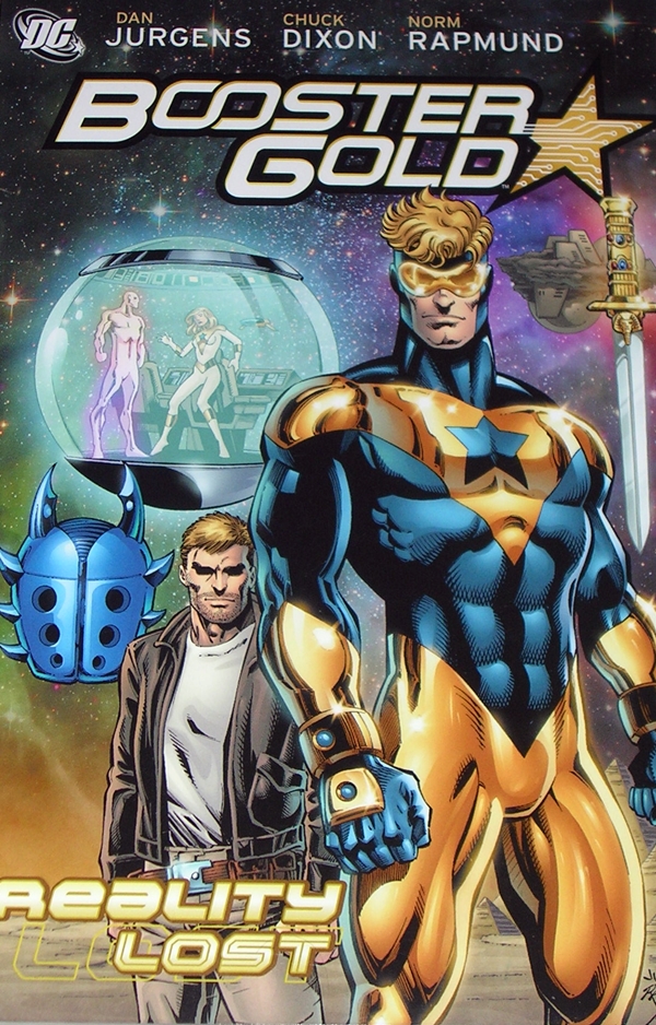
Of all the characters in the DC Universe, Booster Gold and Blue Beetle have been my favorites. Yeah, that may sound weird. People usually say Batman, Wonder Woman, or Superman or Aquaman… no, scratch that… nobody says Aquaman. That’d be ridiculous. But as pointed out in yesterday’s feature, I first took notice of this pair of BFF’s while reading one of my favorite childhood comics, Mr. Miracle, and I’ve pursued their exploits in Justice League International and the pages of other DC comics ever since.

MMBBBG

It’s no secret that I’m not a huge Batman fan, and maybe that’s because I like Ted Kord’s version of that character archetype better. Both are millionaires relying on their own brilliance and technology over superpowers. But unlike Batman, Kord wasn’t a moody dick. On the contrary, among his peers he was probably the most liked character in the DC Universe. You could argue that he ultimately died because Batman couldn’t be bothered with his findings and Ted was too nice a guy to want to burden the rest of the Justice League with his theories on Max Lord. Booster, on the other hand, yeah he was a dick. At least that’s how he was perceived by most. But he grew into a better person, and Ted saw something in him, and thus was forged this unlikely and delightful friendship. Let’s kick it off with Booster.

DSCN1212

DSCN1215

The self-centered jock from the future turned time warrior, Michael Carter, aka Booster Gold would be a polarizing character if enough people actually gave a shit about him. Those that do either love to hate him or hate to love him. He’s a fun character because he’s an anti-hero and he’s exactly what you don’t expect. He’s both pathetic and heroic, and a general pain in the ass for the Justice League, and just when you think you can sum him up in a few unfavorable words, you find that he can be frustratingly more complex than that. All I know is I love this guy.

DSCN1214

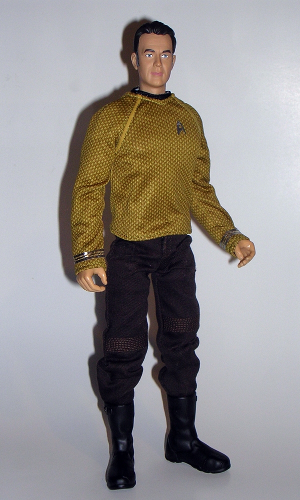
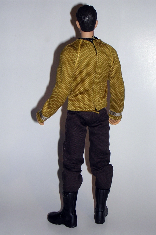
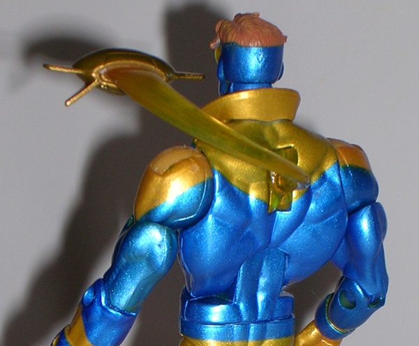
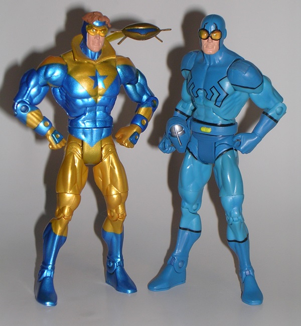
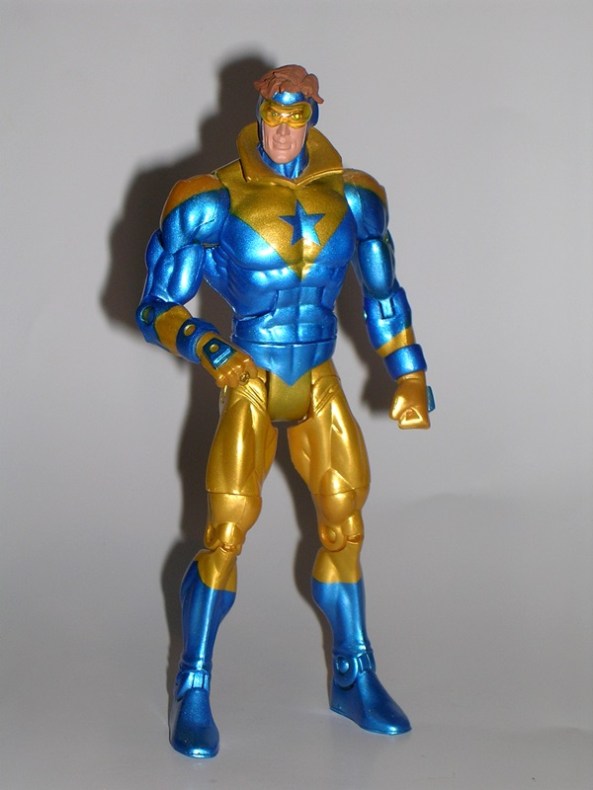
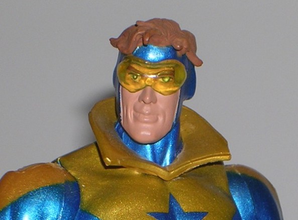
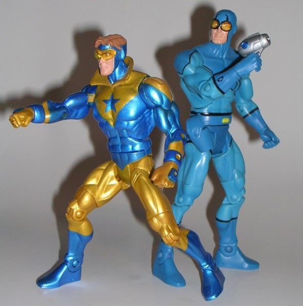
The DC Universe Classics version of Booster was available in two variants. I have the version of Booster that I prefer, but seeing as how the other one comes with a Skeets that opens up to reveal Mr. Mind, I really should pick that one up at some point. Booster’s portrait is a little hit and miss with me. Maybe a little too cartoony? I don’t know. Sometimes it bugs me, other times I’m perfectly happy with it. I do really dig the clear yellow goggles and the way his sculpted hair sticks up out of the top of his hood. The body makes use of a standard DCUC buck, but he does have his forcefield emitters sculpted into his hands, as well as his flight ring on his finger. I also really dig the sculpted high collar. Booster has a cavernous hole on his back, but we’ll get to that in a moment.

DSCN1213

Booster features one of my favorite paint jobs among all the DCUC figures. The mix of metallic gold and blue is really gorgeous and there isn’t much slop or bleeding to speak of. The only downside here is that his copyright stamps are painted black and smacked right onto his gold ass, so the lettering stands out pretty sharply.

DSCN1218

DSCN1219

Of course, you can’t have Booster without Skeets, and that’s where the big hole in his back comes into play. Skeets is sculpted along with a translucent yellow effect piece that allows him to hover over Booster’s left shoulder. I think I would have preferred the connecting piece to be completely clear and not yellow, but all in all, the effect works really well.

DSCN1208

DSCN1209

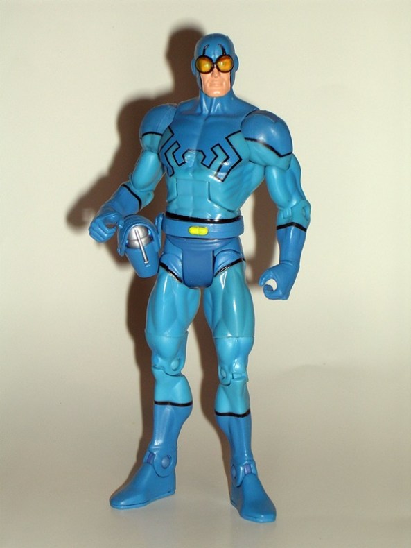
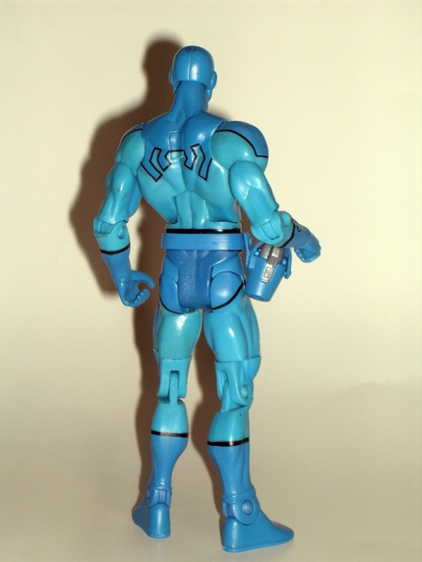
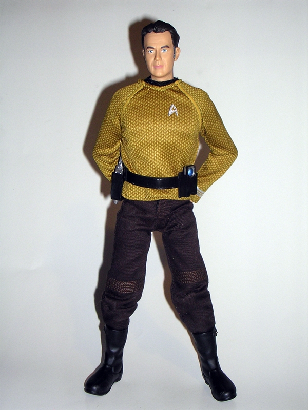
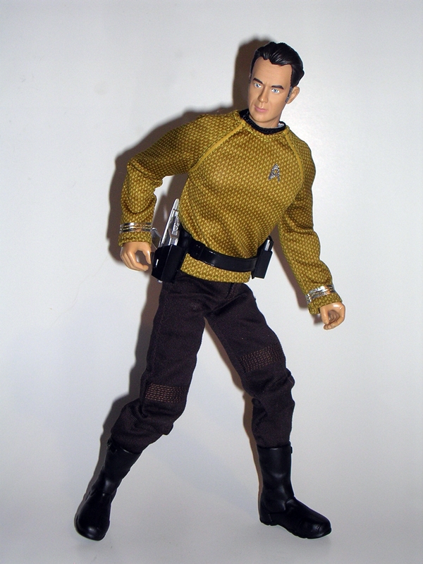
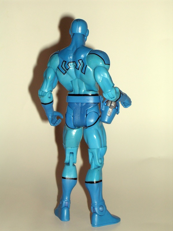
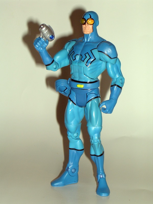
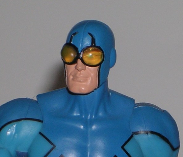
Moving on to Blue Beetle. I love this guy, and I’ll never forgive DC for allowing just about every other character that dies in the DCU to come back to life except for poor Ted Kord. Ok, so he comes back temporarily, but we’ll get to that tomorrow. Anyway, Blue Beetle is one slam-dunk of a figure. The head sculpt is fantastic and just like Booster, I love the use of the clear yellow goggles here and the powerful slightly cleft chin. Of course, setting the portrait aside, Ted was a pretty easy figure to do, since he also uses a standard DCUC buck with a painted costume. The paintwork utilizes two shades of blue and heavy black outline is crisp and fits the costume perfectly.

DSCN1216

The only new sculpting on the body involves his belt and FUNCTIONAL holster, which holds his gun. Wow, do I love Blue Beetle’s gun. It’s pure retro sci-fi love that looks like a combination of a 50’s hairdryer and power drill.

DSCN1210

DSCN1211

Both figures feature the same standard DCUC articulation, with just one exception. The arms have ball joints in the shoulders, hinges in the elbows, and swivels in the wrists and biceps. The legs have the usual DCUC style hinge, hinges in the knees and ankles, and swivels in the thighs. They each have the ab crunch hinge in the torso and ball jointed necks. What’s the exception? Booster can swivel at the waist, whereas Blue Beetle cannot.

DSCN1221

DSCN1220

And there ya go, two of my favorite DCUC figures based on two of my favorite DC characters. Besides my genuine love of these guys as individuals, it’s the magic and tragedy of their friendship that elevates them to an even higher level in my eyes. Like I said earlier, it never seemed fair that just about every other character that dies in the DC Universe gets to brush themselves off and come back, while Ted Kord remains in the ash heap. It was something that Booster could never get over, and that was really something ironic for a character that was viewed by everyone but Ted as a self-centered narcissist. Maybe it all strikes a chord in me because I’ve been there, I’ve lost a best friend before, and while time is said to heal all wounds, it’s something that never truly goes away. From Mr. Miracle and Barda to Blue Beetle and Booster, I’ll wrap this whole thing up tomorrow as I spend my weekend reading three TPBs of Booster Gold!

DC Universe Classics: Mister Miracle & Big Barda by Mattel

Today I’m kicking off a three-part set of features with a look at a pair of older DC Universe Classics figures. Follow me on this one, it’ll all be connected. I tend to get my share of strange looks when I tell people that Mr. Miracle was one of my favorite comics as a kid. He’s not exactly an A-lister in the DC roster. It was even an unlikely choice for me, as I just stumbled upon his books at the local used book shop and my dad bought me a stack of them. I also owe it to Mr. Miracle for getting me back into comics in 1989 with the return of his ongoing series (and introducing me to Booster Gold and Ted Kord, but more on that tomorrow). What sucked me in wasn’t necessarily Mr. Miracle as a superhero, but rather the whole New Gods tie in and the backstory between Scott Free, Big Barda, Darkseid and Apokolips. I thought it was epic stuff, and the book was packed with great humor as Scott and Barda tried to build a new suburban life on Earth and no one would leave them in peace.

mm01

As a result, Mr. Miracle was actually the very first DCUC figure I ever bought, and it became the slippery slope that led to my addiction to the line. He was quite the pegwarmer, and one day I encountered an entire wall of them in the action figure aisle at one of the big box stores. Leave it to me to be overjoyed by a figure that nobody else wanted. I tend to be funny that way. I couldn’t help feel bad for Scott. First he gets traded to Apokolips in one of the most poorly conceived peace deals ever and now he’s made to suffer the shame of pegwarming. The dude just can’t cut a break.

mrmir1

mrmir2

The DCUC version of Mr. Miracle gets by with a pretty standard buck and a few tweaks and bobs to the sculpt to make him unique. Oddly enough some of the best detail in the sculpt is on the soles of his boots. He’s got a crazy amount of circuit-styled detail down there where you would never see it. He’s sporting a rather seriously pissed-off head sculpt, which might not have been an optimum choice for the character. He also sports one of my favorite capes in all the DCUC line. It doesn’t drag on the ground, it has a bitchin’ over sized fastener in the front, and he’s got that great high collar that gives him a regal countenance.

mrmir12

The colors on the other hand? Well, I always thought red, yellow and green were an interesting choice of color palate. Or at least they would have been if you’re Captain Bolivia. In fairness, I think Miracle’s deco works better on the pages of the comics than in figure form, and even then it depends on who’s doing the colors. Still, he’s one distinctive looking figure. He does have some strange shadowing on his inner thighs that makes it look as if a bomb exploded between his legs!

mrmir7

mrmir5

mrmir4

I don’t usually expect accessories with my DCUC figures, but Mr. Miracle is one of the few that actually came with some cool stuff. First, you get a set of manacles for him to escape from. These slip on over his wrists and feature some amazing sculpted detail, nice silver paint, and even some additional paint apps. Very impressive!

mrmir6

mrmir3

He also came with a set of his signature Aero Discs, which peg into his feet. Again, the paint and sculpt on these are brilliant. It’s almost a shame that there’s so much detail in the bottoms of the Aero Discs, since you can’t see it when they’re plugged into the figure’s feet.

mrmir8

mrmir9

And that brings us to Big Barda. The lovely Mrs. Miracle if you will. She was available in two versions: Helmeted and sans Helmet. I have the later, but one of these days I’ll pick up the one with the helmet. In order to accept DCUC Barda into your heart, you need to lay aside a pretty glaring issue of scale. As one of Darkseid’s Furies, in the comics Barda was huge (hence the name!), much bigger than her husband, and so she falls into the trap of uniform scaled figures that DCUC often fell into. It should probably bother me more than it does, but somehow I’m able to look past it.

mrmir11

I’m pretty fond of the headsculpt on Barda. She’s attractive and looks a tad angry. The sculpt seems a little soft by today’s standards, but it’s not bad at all. I also appreciate that the hair is sculpted back a bit so as not to inhibit her head movement too much. Barda’s armor is reproduced with a very cool scale texture sculpted right onto the figure, and the top and bottom bronze plate. You could certainly argue that she should have been bulkier. The super thin arms don’t really reflect her character, but I’m guessing Mattel was faced with the dilemma of making her either too feminine or too butch.

mrmir10

Both figures feature the same DCUC style articulation. The arms are ball jointed at the shoulders, hinged at the elbows, and have swivels in the biceps and wrists. The legs have the usual universal hinge joint, hinges in the knees and ankles, and swivels in the thighs. They have ab crunches in their torsos and their necks are ball jointed. The only difference is that Barda’s armor skirt sadly renders her hip articulation rather useless.

mrmir13

mrmir14

And that’s Mr. and Mrs. Miracle. These two figures have a special place in my heart among the 150 or so DCUC style figures on my shelves. Every time I look at my DCUC display, my eyes are drawn back to this pair that started it all. Tomorrow, I’ll be back to check out another pair of older DCUC figures, who happen to be based on two of my favorite DC characters of all time, and as already mentioned, were introduced to me in the pages of Mr. Miracles own book.

*This photos for this Feature were revised on 1/21/2016