After meandering around a bit for the past few Marvel Mondays, I guess it’s time to swing back to my unfinished business with the Tri-Sentinel Wave! There’s just two more figures, and today I’m going with Dr. Moira McTaggert!
I’ve said my piece about the packaging for this wave over and over again, so let’s just say I dig it a lot and leave it at that. Moira seems to have been a polarizing character in House of X, thanks to some major (and heavily Hickmanesque) retconning. I actually had a pretty spirited discussion with one of my co-workers over it. It was admittedly weird to see such a major reassessment of a comic character that’s been around almost as long as I’ve been alive, but in the end I was pretty cool with it. It certainly wasn’t done out of hand, it was a major push forward in the X-Men story as a whole, and it’ll be interesting to see where it goes, assuming she ever decides to leave No-Place. Thanks to two sets of arms and two heads, you get a couple of display options, but let’s start with how she comes out of the box.
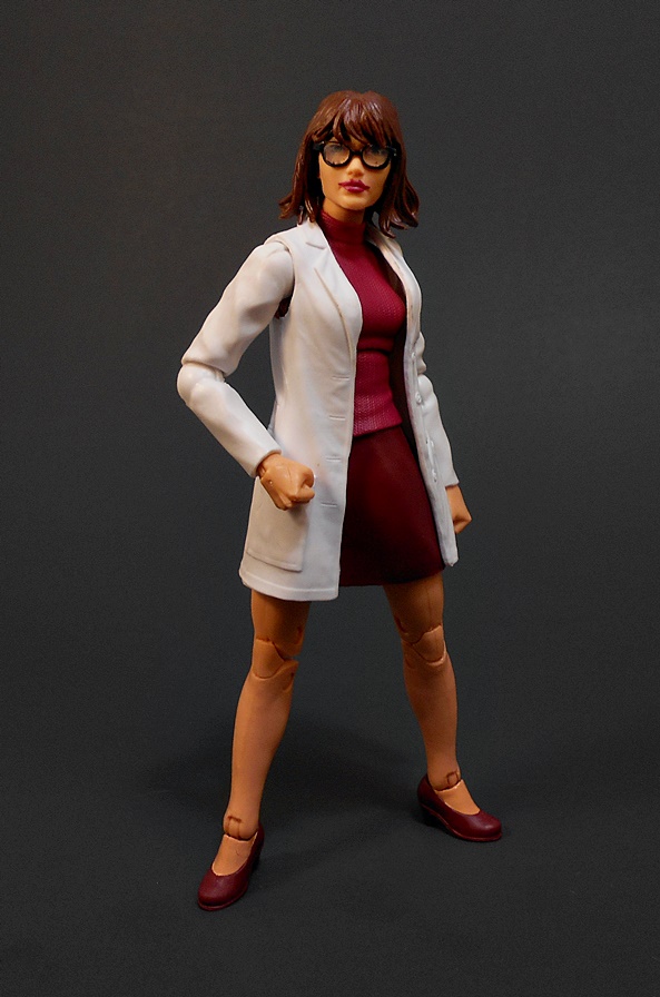
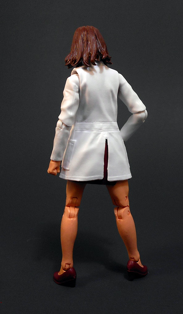
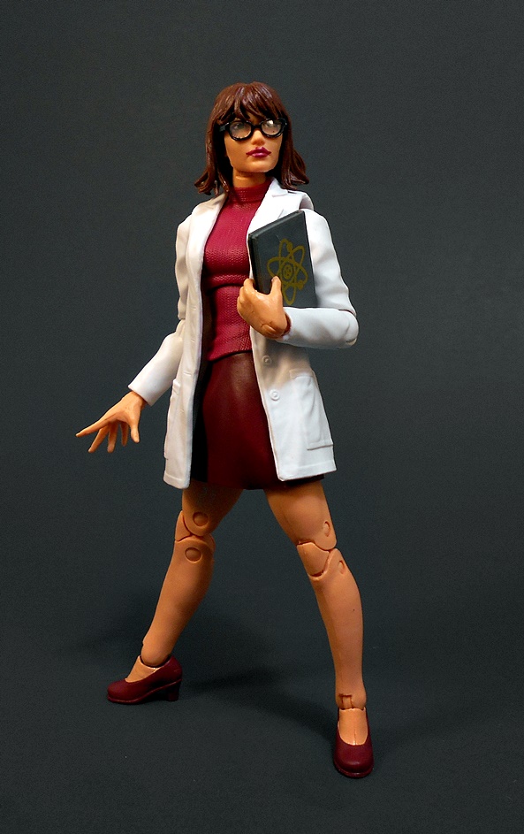
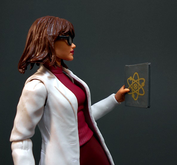
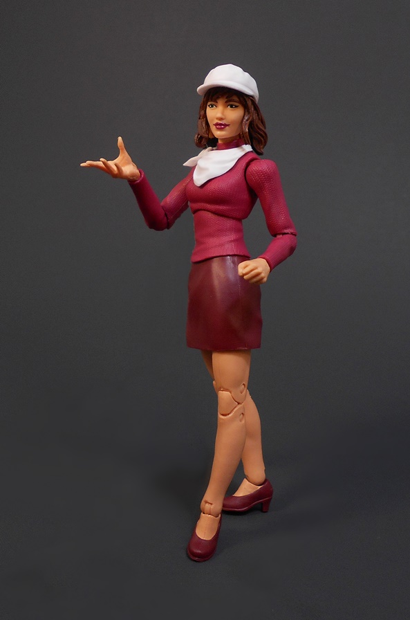
Dr. Moira, as lab-coated geneticist looks pretty good. She’s sporting a violet sweater with a maroon skirt and shoes. The coat is molded in soft plastic like a vest, with the sleeves sculpted onto the arms. It’s an old Hasbro trick and it works great, even if you can see the gaps in the shoulder holes in certain poses. Like any good nerd doing The Science, she has her coat pocket well stocked with pens. She also comes with two sets of hands. One is a pair of fists, the other features a right hand with the fingers splayed, which I believe is the usual powers-casting hand, and another to hold her accessory.
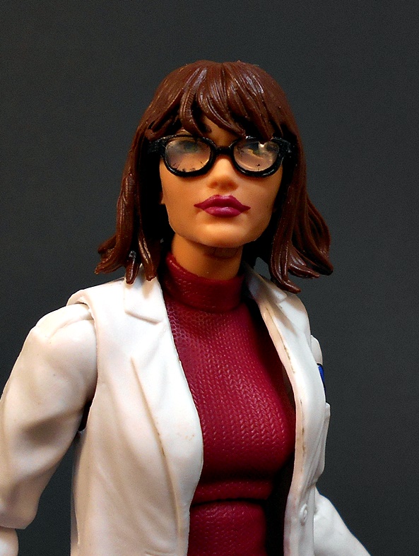
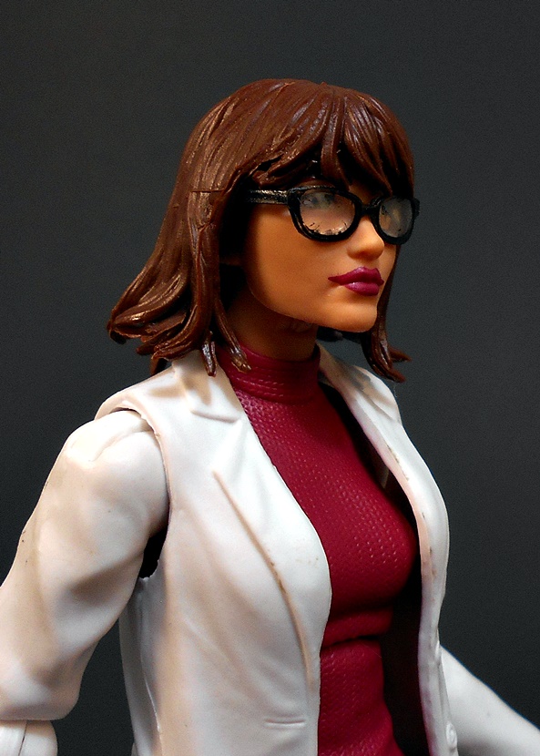
The scientist head sculpt is OK, but it’s definitely the lesser of the two. I don’t want to pick on the glasses too much, because it’s really tough to get those right in this scale. These don’t look too bad, but the paint on the frames is a little sloppy around the lenses. They also kind of look like Coke-Bottle Glasses, which makes this portrait unintentionally funny looking to me. But my biggest gripe here is that the painted lipstick does not match the mouth. Moira’s mouth was clearly sculpted with a dour, down-turned expression, while the lips are just painted straight on. It just doesn’t look good.
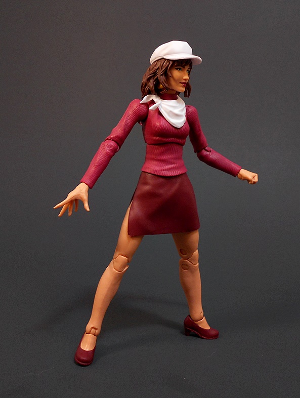
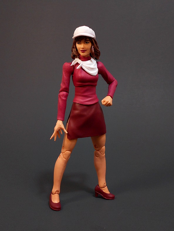
There are no surprises when it comes to articulation. Despite having swap-out arms, all the points function normally. I am happy to report that Moira’s skirt does not inhibit her articulation nearly as badly as Marvel Girl’s did. It feels like it’s made out of a softer plastic, and there’s a generous slit running up the right side. Not that I need Dr. Moira to be doing anything crazy, other than holding her Genetics Book, which is the only accessory she comes with. To change up Moira’s look, you basically pull out her arms to remove the lab coat and replace them with her sweater arms. Then you pop off the bespectacled head sculpt, put on her neckerchief, and pop on the second head. I should note that it’s really hard to pull the lab coat arms out of my figure.
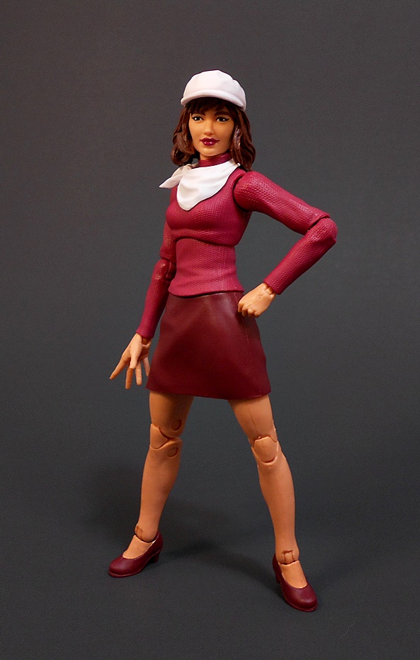
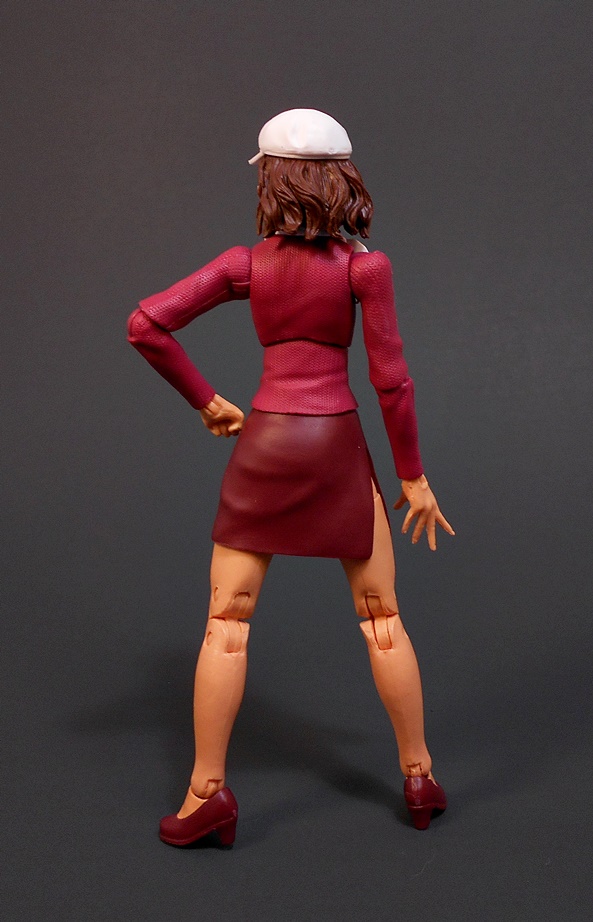
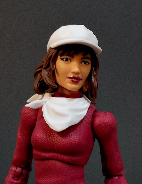
So yeah, Casual Moira ditches the lab coat in favor of the white neckerchief and fashionable hat. Overall, I do like this version of the figure better, but I think a lot of that has to do with this second head sculpt.
The glasses are gone, the lipstick still doesn’t quite match the mouth, but I still think it’s a huge improvement. It’s like in those dopey comedies when the unpopular girl is obviously just a really attractive actress wearing glasses and has her hair up, only to have her get a makeover, which just involves taking off her glasses and letting her hair down. The hat could have used a bit more detail, but it’s fine.
Moira may not be the most exciting release around, but her Marvel Legends figure is long overdue. I really dig the extra effort they put into her. I mean, it’s only fair that a woman with an untold number of lives should at least get two display options for her action figure. And you can always pick up a second for Pyro to light on fire. That brings me to just one more figure in the wave before the BAF! So, next week I’ll wrap things up with Omega Sentinel!
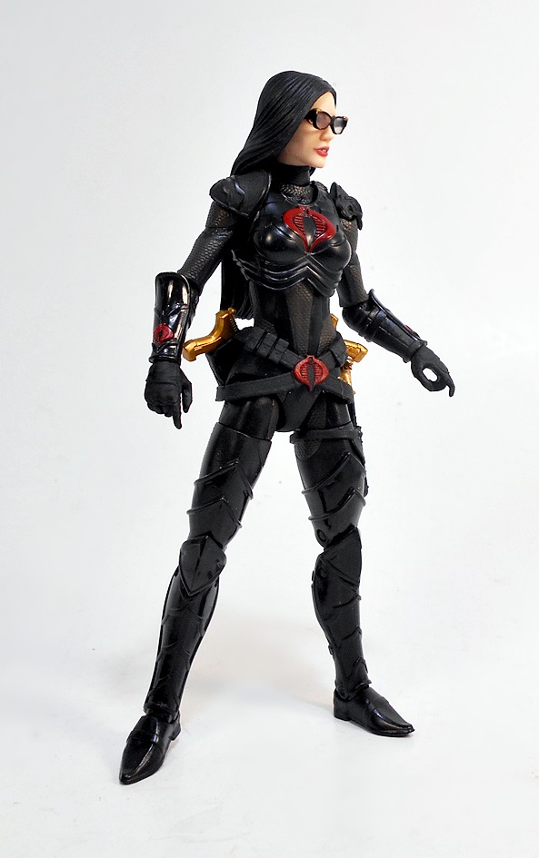
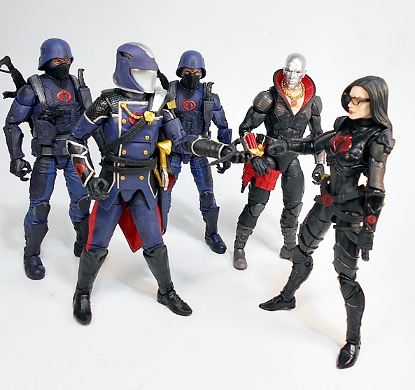
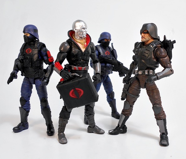
Last week, Hasbro got some more of their now infamous Target Exclusive Cobra Island figures back up for order/pre-order. At first, it seemed like another shit-show, but over the course of about 48 hours they seemed to fix things. By the end, I managed to get everything I was missing, and it dawned on me that while I scored a Baroness the first time around, I had not yet featured her here, so let’s resolve that today with a look at this magnificent set!
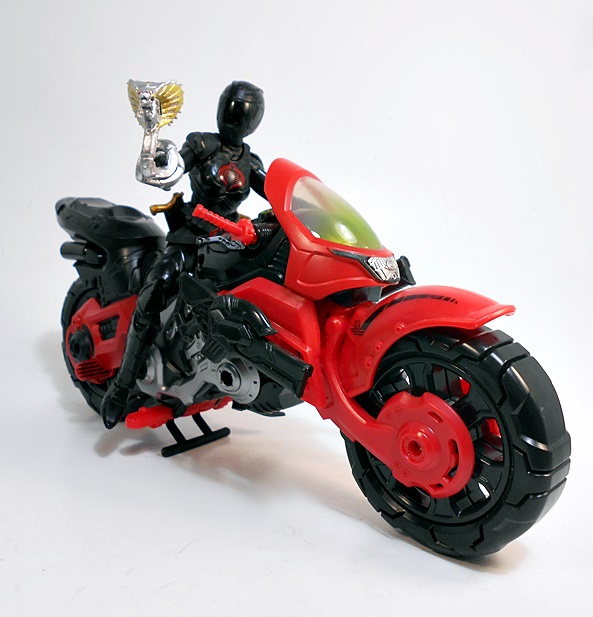
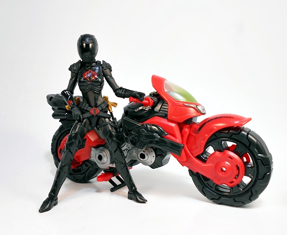
This set is similar to the Deluxe Riders that Hasbro has been putting out in the Marvel Legends line, as most of those included a motorcycle. I’ve gushed on and on about how much I love the Classified packaging, and it looks even better in this bigger format. You get some great character art, a big map on the back panel, and the window shows off the figure, the bike, and all the extra goodies. Let’s start with The Baroness!
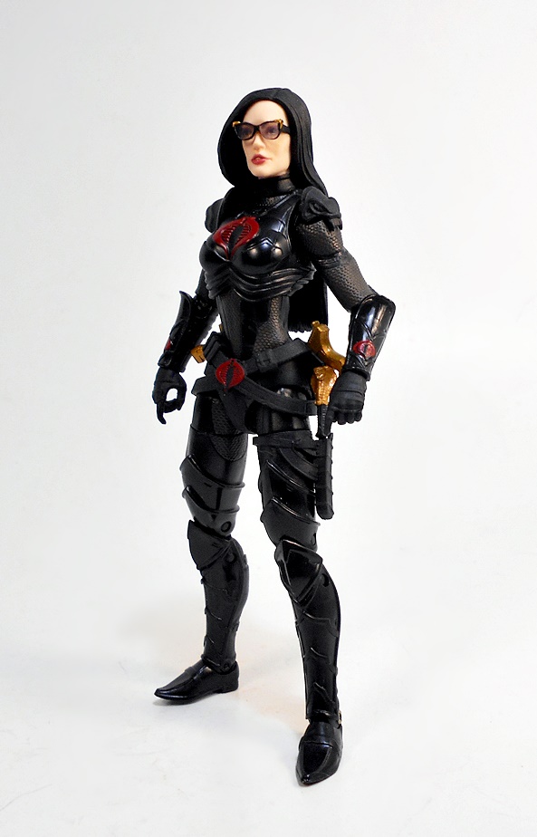
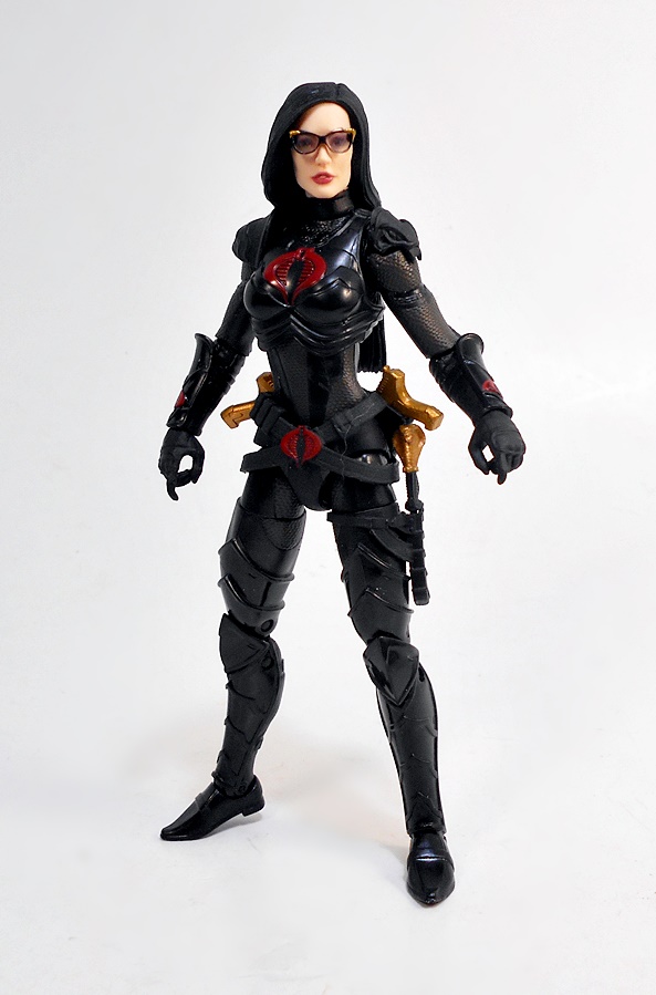
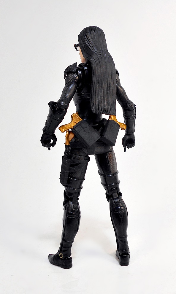
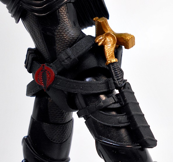
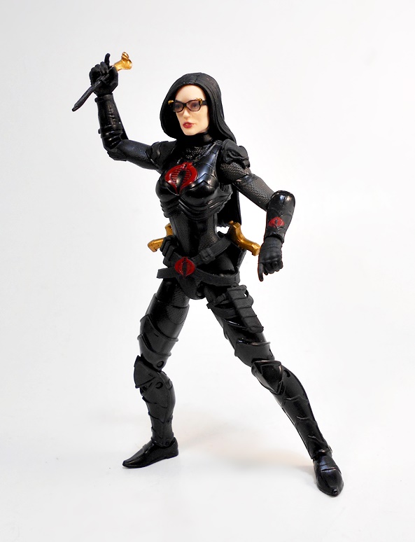
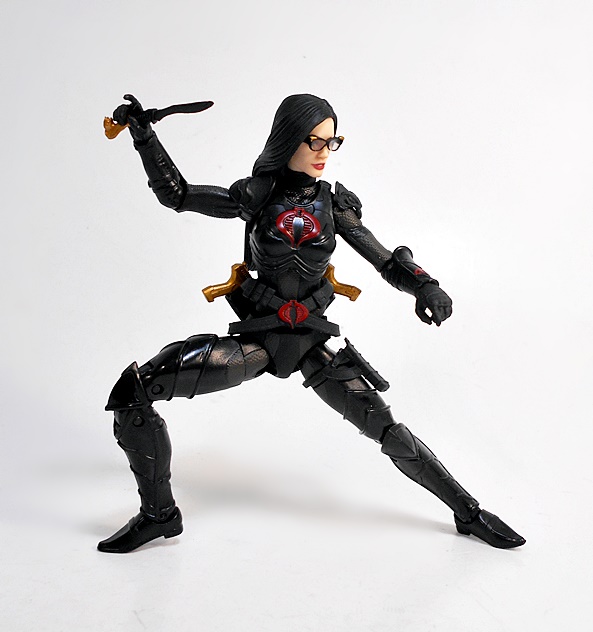
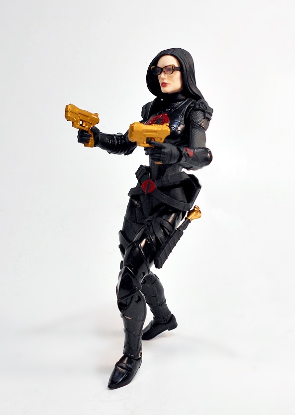
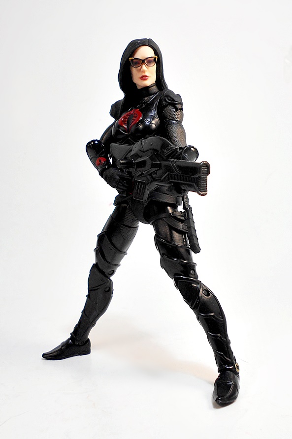
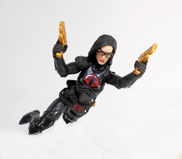
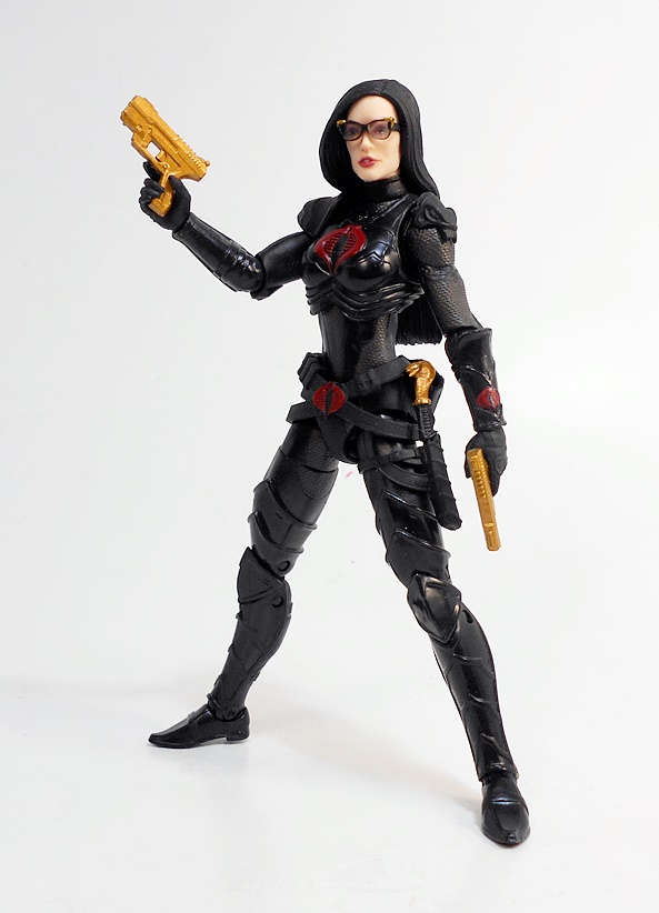
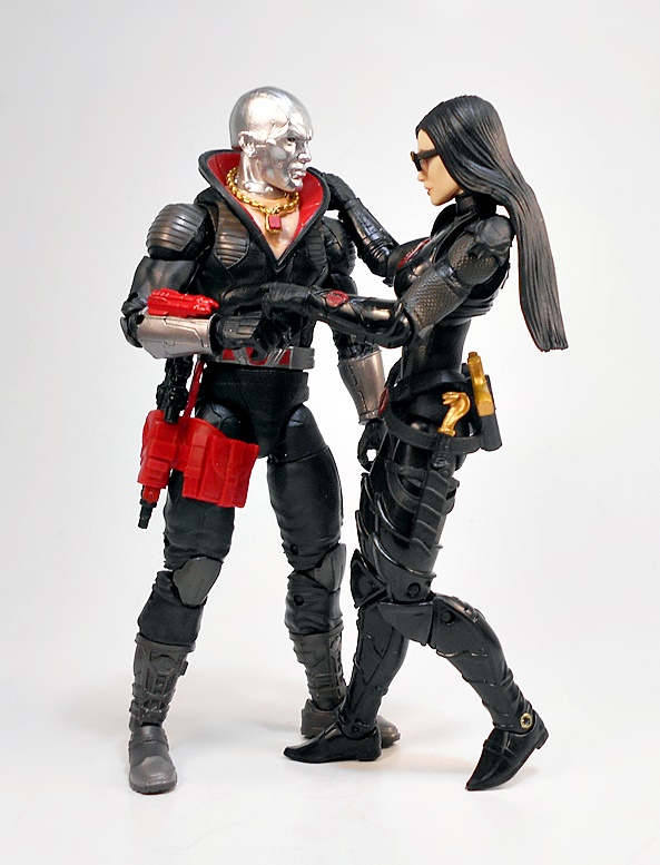
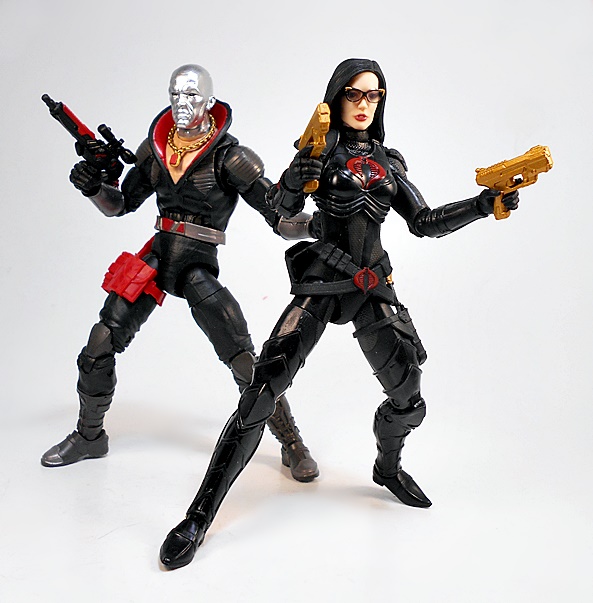
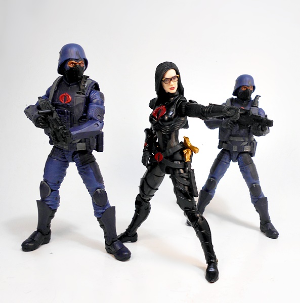
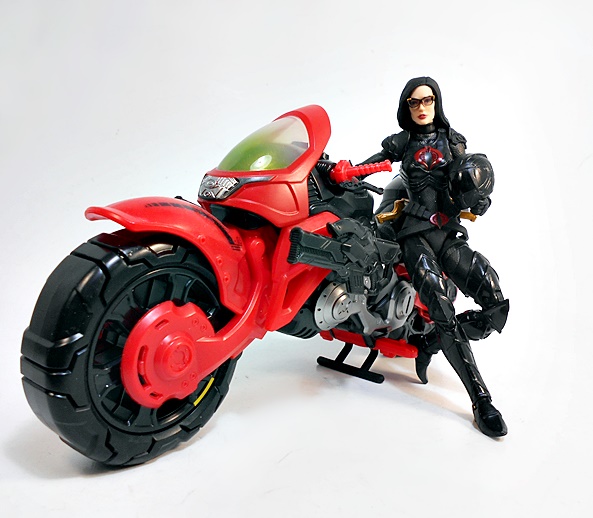
I’ve said it before, and I’ll say it again, it seems like Hasbro is taking a page from Sideshow’s book when it comes to designing their Cobra figures. Zartan and Major Bludd both had similarities to those Sixth-Scale figures, and now Baroness does to. And boy, that sure ain’t a bad thing! Like her original vintage figure, Baroness is reinforced with some sleek black armor to protect her in the never ending fight against the JOEs. Her legs are entire encased in the stuff, from her pointed-toe boots to the pointed, scalloped pieces that run up to her thighs. She has a breast plate, arm bracers, and asymmetrical shoulder pieces, with the left one being a serpent head!
In-between all that shiny armor, you can see her textured body suit with reinforced patches in all the high-friction areas. There’s some great Cobra branding on her outfit, consisting of embossed red Cobra emblems on her chest plate, her arm bracers, and her belt buckle. Baroness is sporting a crisscrossed gun belt with holsters on the back to hold her pistols out at angles. I’d like to think that this is a callback to the Sienna Miller Baroness from the Rise of Cobra film, as that Baroness also carried her guns this way. Finally, The Queen of Cobra has a sheath for her combat knife secured to her left thigh.
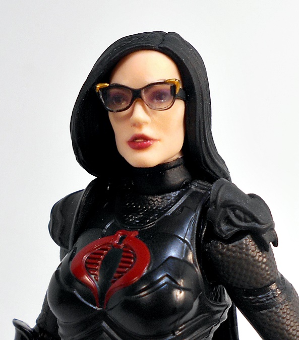
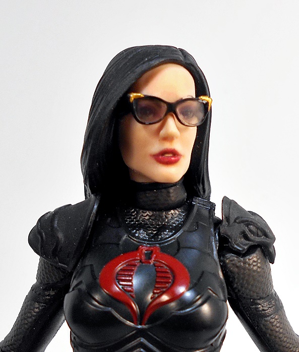
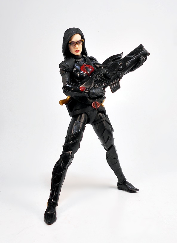
The head sculpt is quite good, although I’m not sure that I would rank this one as one of Classified’s best, but seeing as how good some of this line’s portraits are, that’s nothing to be ashamed of. The likeness certainly suits the character, and I love the little part in her lips. The printing for her facial features looks great, and I think the glasses here are quite an achievement. It’s got to be so hard to do glasses in this scale, but these turned out great. The lenses are fairly clear and I like the gold accents at the corners of the frames. I think these are supposed to be removable, but mine are stuck pretty good. Unless I score a second Baroness, I’m not about to try to force them out. The hair sculpt is pretty simple, it’s straight and cascades down her back.
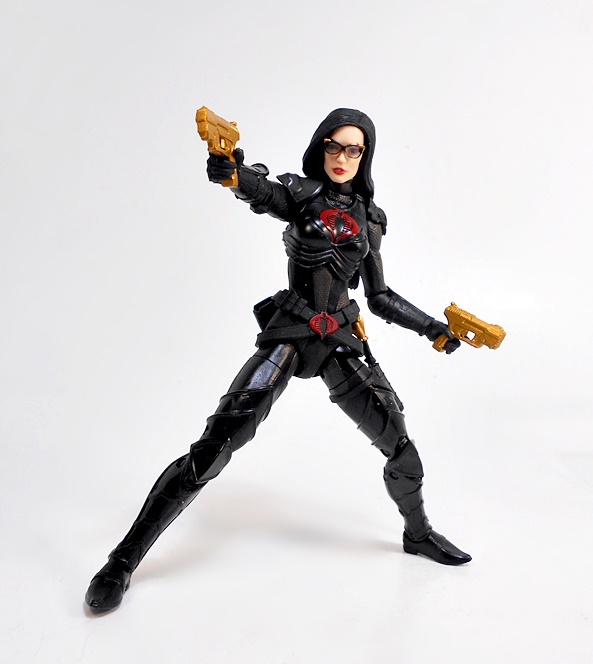
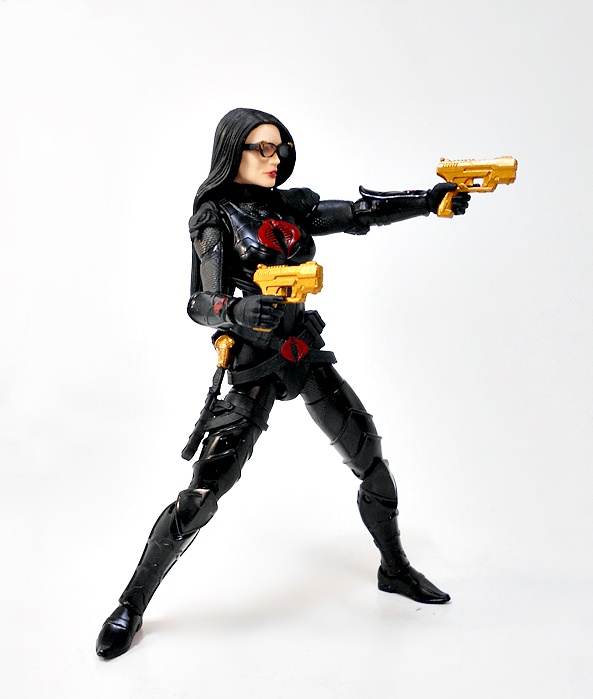
As for articulation, everything is fine here, except for the rotating hinges in the elbows, which can’t quite do a 90-degree bend. It’s hard to tell if that’s because of the sculpt or the joints aren’t cut right, but I definitely wanted a better range of motion there. Everything else here is fine, and what you would expect to see in a Hasbro 6-inch figure these days. Baroness is loads of fun to play with, and she’s fairly well balanced, despite her rather small feet.
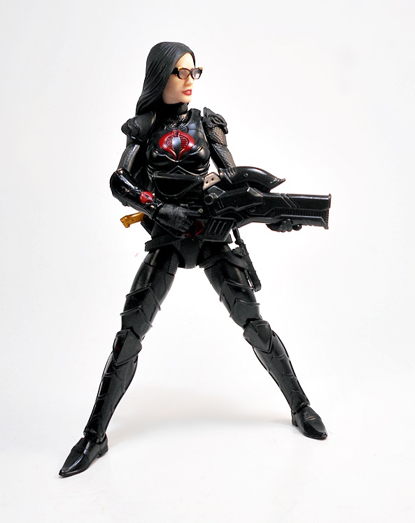
As for weapons, Baroness comes with a cool little black combat knife with a golden Cobra protruding from the pommel. It’s an exceptional bit of sculpt for such a tiny weapon. Part of me continues to wish Hasbro would paint the blades on these silver, but then having a matte black blade makes sense in a lot of combat situations where stealth is warranted. Despite having only gun-hands, Baroness can hold this little piece of cutlery surprisingly well.
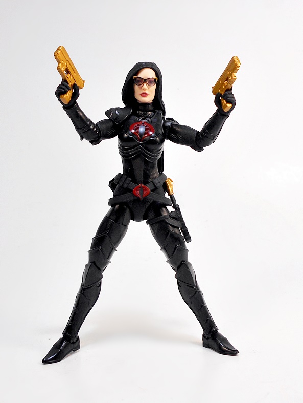
Her matched set of golden pistols are certainly distinctive! No doubt, these were a birthday present from Pimp Daddy Destro. I really dig these, as the designs aren’t too crazy and they basically just look like legit automatic pistols, albeit all blinged out. I could definitely see her fighting her way to a Rattler with these after an operation went sour.
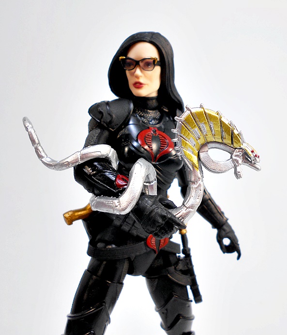
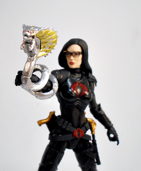
And then there’s this thing. I wouldn’t have any idea what it was if there wasn’t a picture of her on the box firing a laser out of it, so yeah… Laser Snake Gun! I honestly love this thing. Yeah, it’s balls-out weird and totally impractical, but the sculpt and paint on are just so damn good. It coils around her arm and she holds it right at the base of the Cobra’s head. I’m guessing she just squeezes it to fire. I can imagine the scene now. She pulls this thing out and Flash sees it, laughs, and shouts “What the hell are you going to do with that?” right before she uses it to burn a hole through Beachhead’s torso and he screams, “SWEET LASER JESUS!!!” Yeah, I put a lot of thought into it. OK, let’s check out the bike!
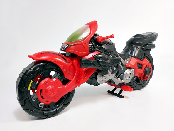
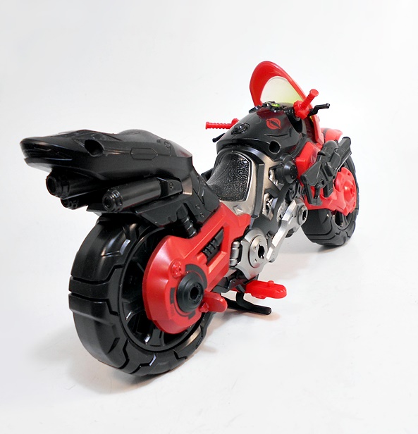
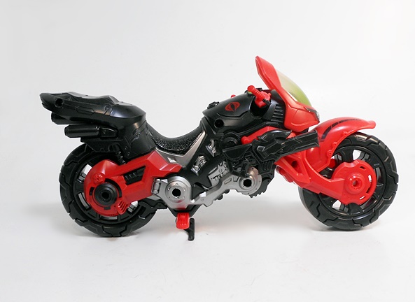
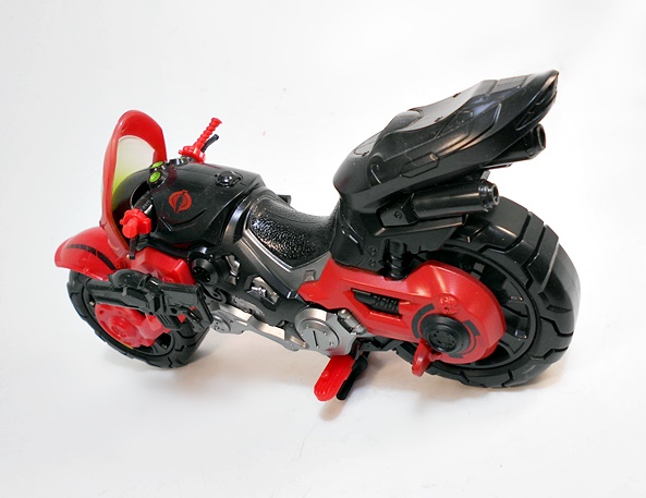
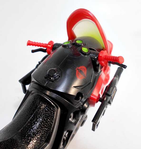
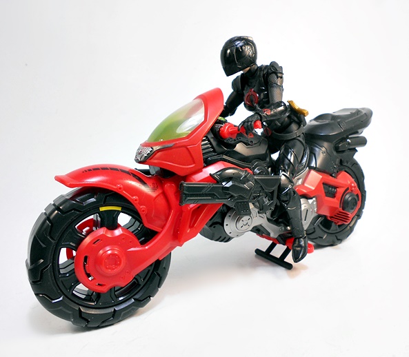
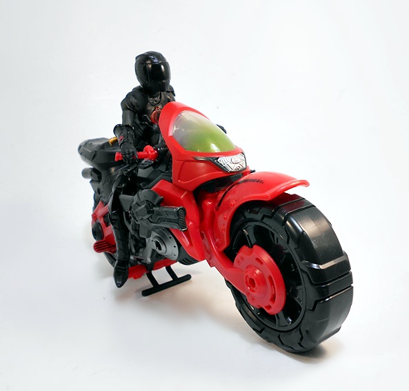
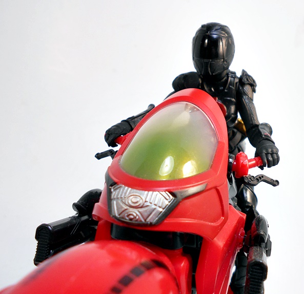
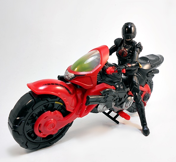
The Cobra COIL is a callback to the COBRA Coils, which were Cobra’s elite motorcycle drivers, and this thing is one sexy ride quite befitting its sexy driver. It even outclasses the Deluxe Riders Black Widow motorcycle by a long mile. The red and black bike looks sleek and mean, with it’s aggressively placed front wheel, tinted green windshield, and silver detailed engine. There’s a textured seat, Cobra emblem’s embossed near the handlebars, side mounted machine guns, and a folding kickstand to keep it upright.
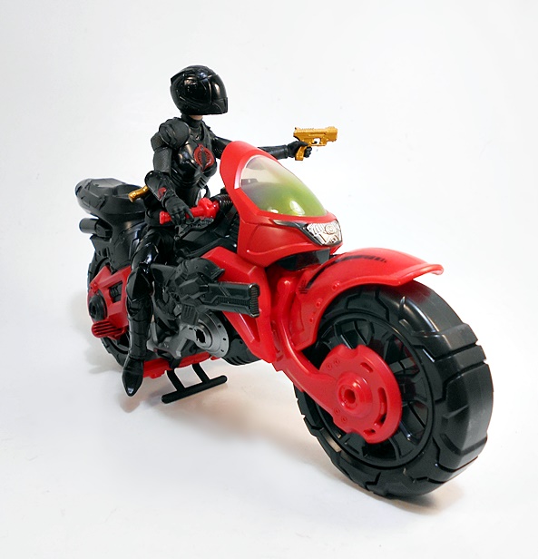
You don’t get a whole lot of detail in the instruments, just some green fluorescent paint, but the handlebars are ball jointed to allow them to more easily fit the Baroness’ grip. Oh yeah, and she also comes with a swap out motorcycle helmet head, which is such a wonderful bonus! The colors, build, and overall quality of this bike is excellent for a pack-in vehicle!
And The Baroness rides it pretty well. There are pegs on the foot pedals for Baroness’ feet, but I find it better not to bother with them.
The side-mounted weapons on the motorcycle can also be removed and used as rifles, which is pretty damn cool.
To be honest, at first I thought this was a strange mash-up, as I never really associate Baroness riding a superbike, but Hasbro really sold the idea with this set. She looks simply amazing on the COIL with her bitchin armor and her helmet on, and I would not be opposed to seeing this bike re-released in a more traditional blue and black with a male Cobra COILS update.
As amazing as this figure and bike turned out, it’s obviously been a sore spot for collectors. Maybe if the figure alone got a separate wide release without the motorcycle and helmet, it wouldn’t have been so bad. But making The Baroness a retail exclusive was a terrible idea, and scalpers just poured salt in the wound by buying them all up and asking crazy prices on Ebay. And even after the recent online re-stock, this set is selling for up to $100, which is more than double. I was lucky enough to get mine at cost the first time around, but I probably would have gone $20 over the MSRP, I had to and I’m not proud to admit that, but heck… It really is a fantastic set.
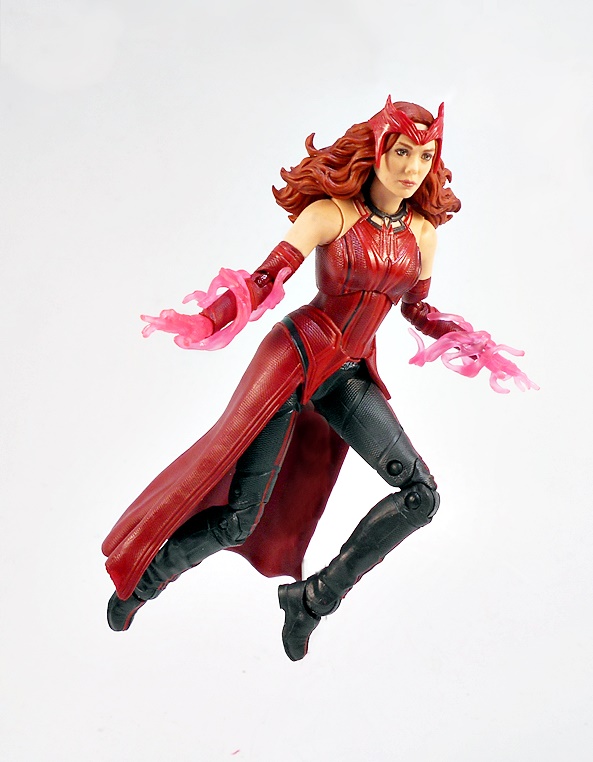
Today is another diversion from that Tri-Sentinel Wave. I hope to get back to it next week, but I today’s figure arrived and I decided to bump her up to the front of the line. I’m sad to say it, but Disney+’s MCU series experiments have lost their grip on me. I enjoyed WandaVision well enough up until it fell apart at the end, where it tossed aside a lot of cool psychological drama and mystery for a big dumb fight. I didn’t make it far into Falcon and Winter Soldier’s preachy meanderings before realizing I had better things to do, and it took me a few tries just to make it through the first episode of Loki. As a result, I was going to skip this Disney+ themed wave entirely, but since I really like MCU Wanda, I thought I’d at least grab her figure.
The packaging includes the WandaVision series logo and for the first time, Wanda can legit be called The Scarlet Witch, so that’s something! This wave does not feature a BAF figure, but rather the parts to build the wings for Sam Wilson’s Captain America costume. And yes, this is actually the second time modern Legends has done a Build-A-Wings wave and both times for the MCU. That’s crazy!
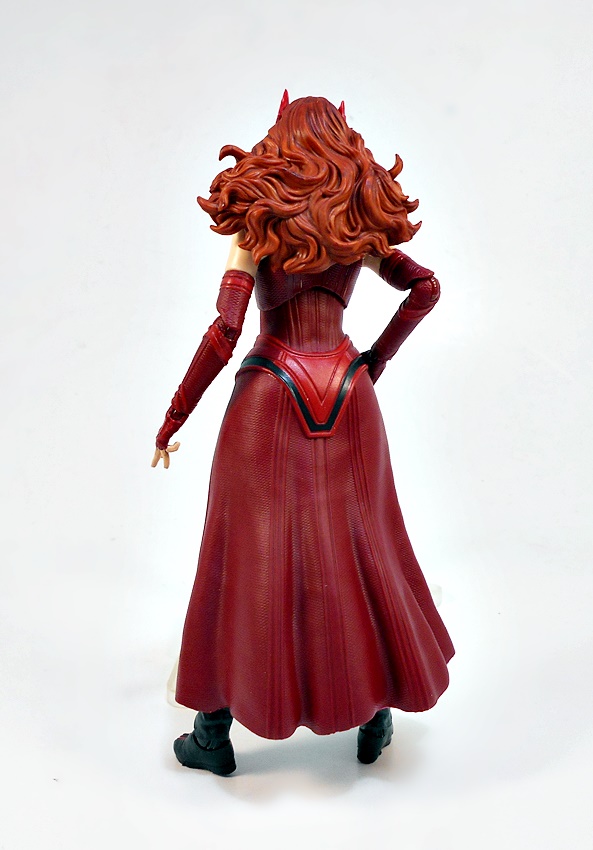
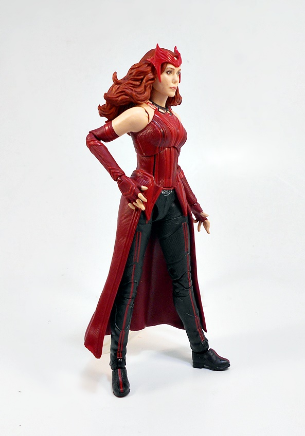
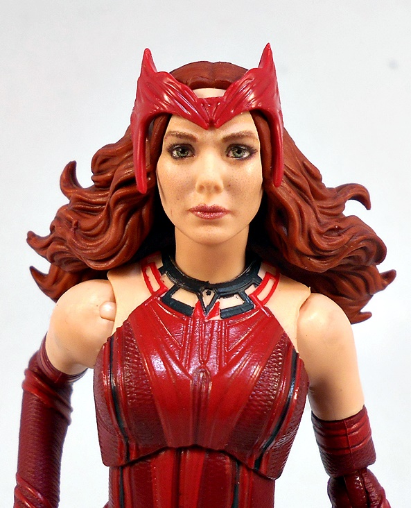
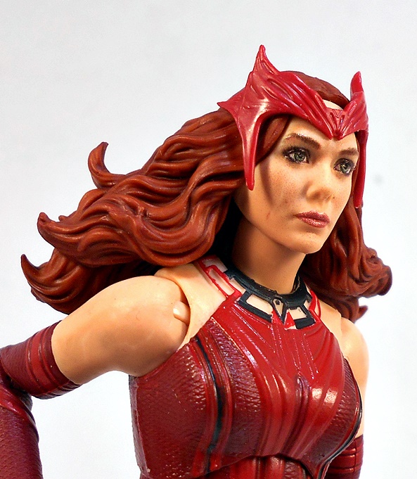
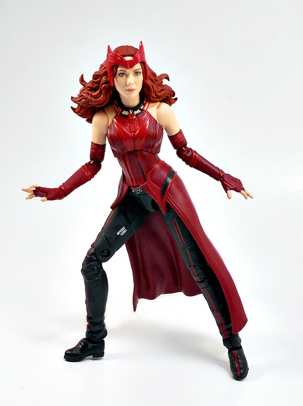
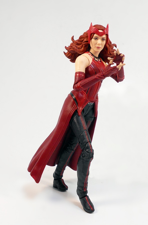
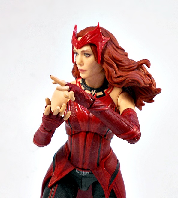
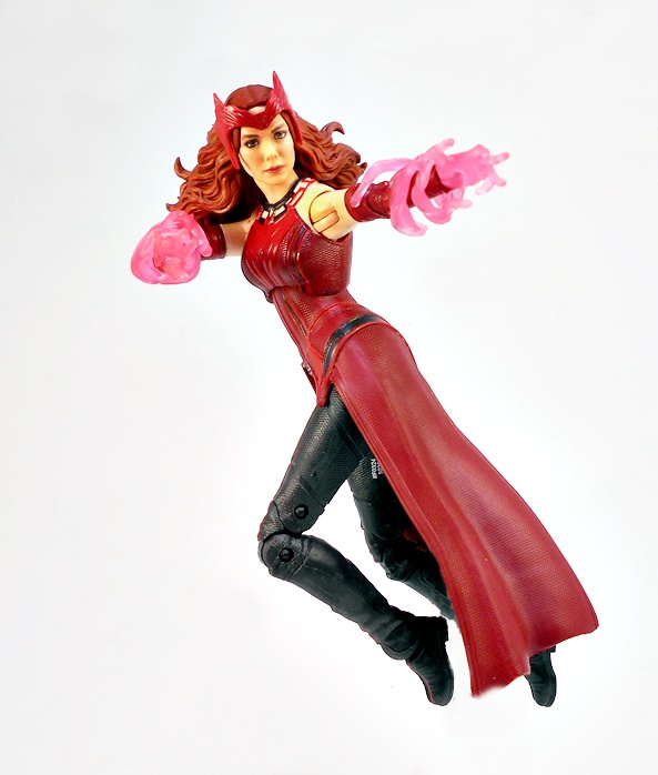
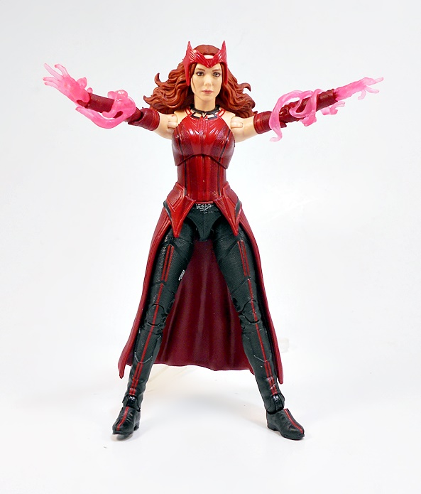
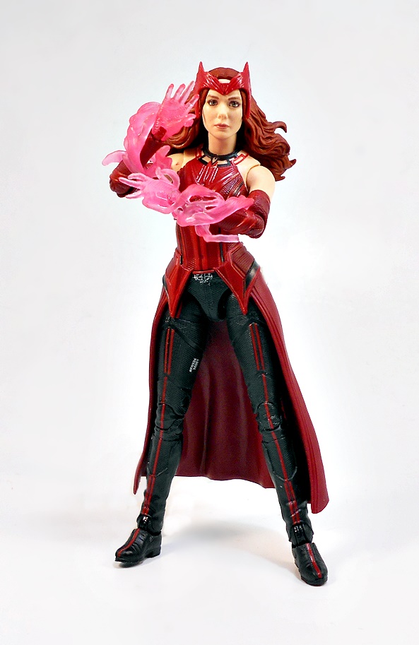
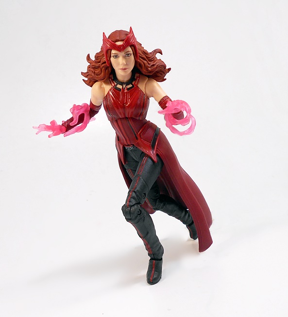
Wanda looked stunning in the solicitation photos, and I have to say she looks just as good in hand. I missed out on the Infinity War Wanda and Vision 2-pack, so this is the first MCU Scarlet Witch in my Legends collection since the Civil War release. Here Wanda is depicted in her final form (What? No sweat pants version? BOO!!!), which is very similar to her Infinity War look, only with a longer skirt and her iconic tiara in place. I like this costume design a lot and the figure executes it brilliantly. Her black trousers are dominated by her thigh high black boots, each with red stripes running up the centers. The top and skirt have a two-tone red design and some nice alternating textures to give it that extra punch for the TV screen. She has sculpted fingerless gloves and sleeves that reach up to her biceps. The bare shoulder look is nice, her top terminates in a snug collar.
I remember being pretty happy with the Civil War portrait, but it looks pretty primitive now when compared to this latest effort. I remember seeing some pictures of some MCU Figuarts recently and thinking that this portrait isn’t so far off from those expensive imports. The sculpt captures Elizabeth’s Olsen’s likeness beautifully, and the halftone printing used for her features totally seals the deal. There’s even some speckling to her skin, and the eyebrows looking uncanny in their realism. Her wild mane of hair is equally impressive, as it spills out from behind her tiara, and the tiara is sculpted from a separate piece and attached to the head to give it a nice dose of depth. And boy, it’s cool to see MCU Wanda finally get that tiara!
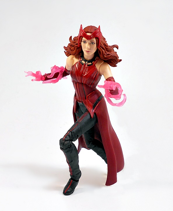
The articulation here is standard stuff for a Marvel Legends lady, which isn’t bad, but still not as good as the dudes. Rather than the double-hinged elbows and bicep swivels, Wanda gets by with just a rotating hinge in the shoulder and elbow. At least she can get a full 90-degrees out of those elbow joints. She has a ball joint under her chest, and the head is ball jointed and hinged. Her legs are ball jointed at the hips, have swivels in the thighs, double-hinges in the knees, and both hinges and lateral rockers in the ankles. Alas, Wanda is sporting some small feet with slight heels, making her a difficult figure to stand. On the other hand, I’m happy to say that the long skirt didn’t really get in the way of having fun playing with her.
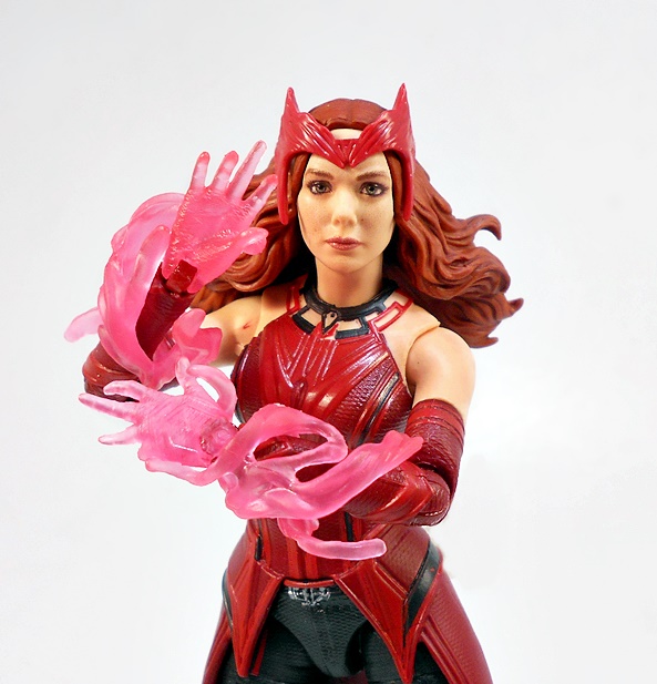
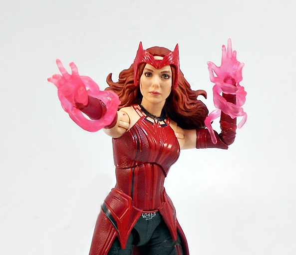
Wanda comes with two sets of hands, both are of the spell-slinging sort, with the second pair being translucent pink. She also comes with a pair of matching pink hex effect parts that snake around her forearms. These look really good when paired with the translucent hands. As some of you may know, a lot of the Legends effect parts are often lost on me, but I dig these a lot.
I can’t seam to say enough nice things about this figure! She’s beautifully crafted from head to toe, with some striking colors, a stunning portrait, value added effect parts, and she’s just all around fun. About the only thing more I could ask for would have been a second portrait with glowing hex eyes. I’m so happy with her, I’m even considering picking up the White Vision to go with her, if for no other reason, than because I don’t have an MCU Vision in my collection. Now if Hasbro would release a two-pack of Wanda and Vision in their Halloween costumes? Sold!
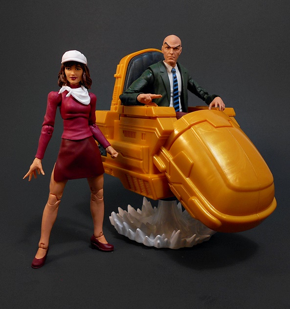
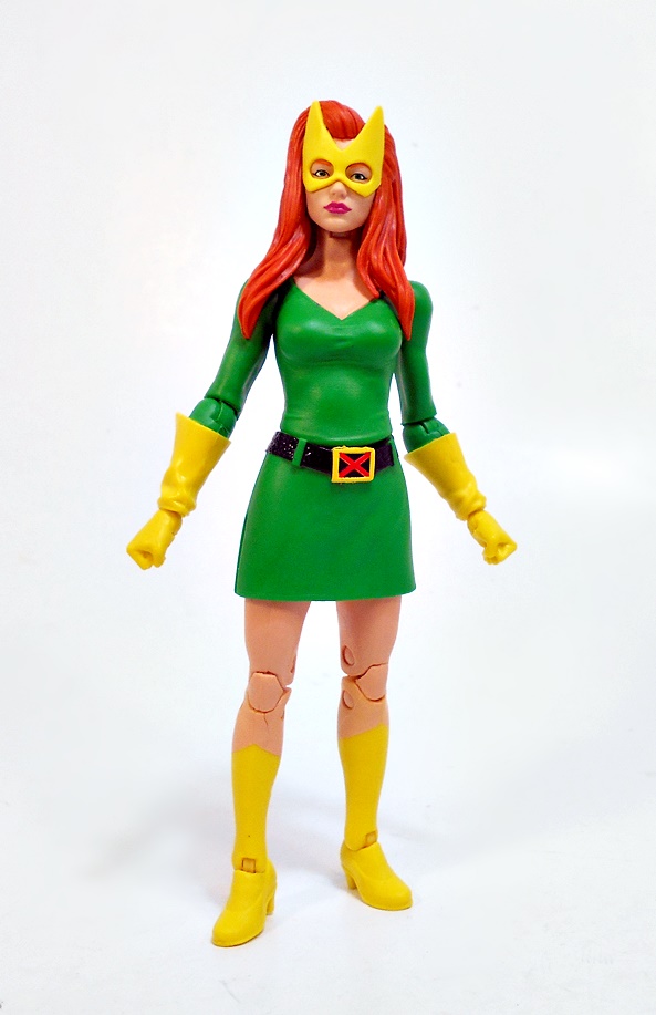
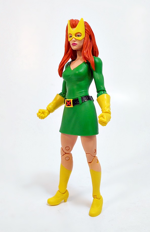
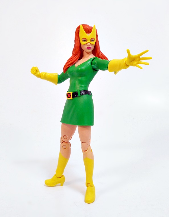
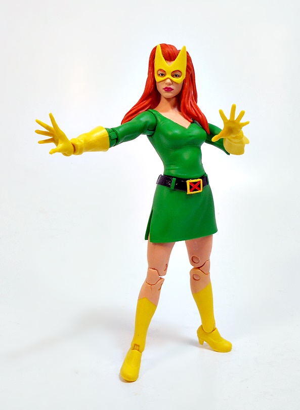
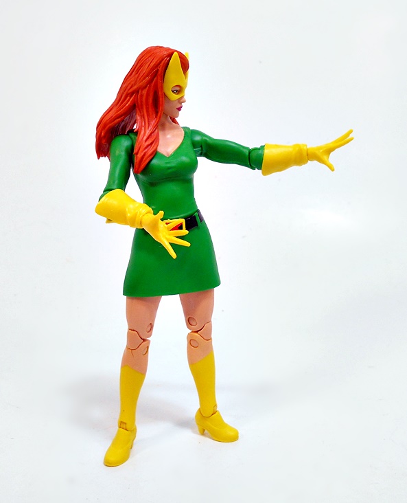
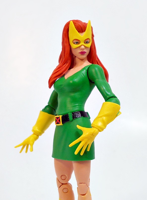
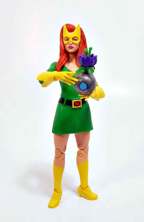
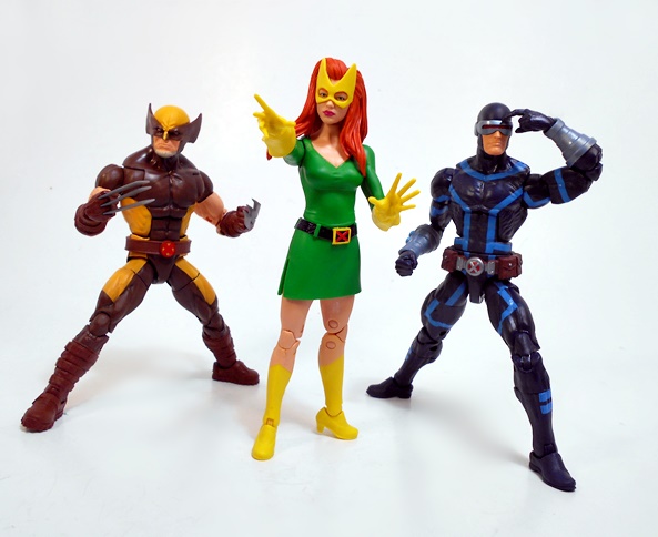
After a detour last week, I’m returning to the Tri-Sentinel Wave from Jonathan Hickman’s House of X! Today I’m opening up my fifth figure in the wave, leaving just two more to go before I can assemble my Tri-Sentinel. And while I didn’t intentionally plan it this way, all the remaining figures are ladies! So, let’s go ahead and open up Jean Grey, aka Marvel Girl!
Once again, I love the package design for this wave. The futuristic stylings of the X-Men logo, the clean black, white and red deco, and the character name printed on the front in the Krakoan language. Every once and a while I’m tempted to save the boxes for a wave and this is one of those times. But I’m not. Because, no room! Jean looks absolutely smashing amidst this presentation, and as we’ll soon see, I might have been better off leaving her in there.
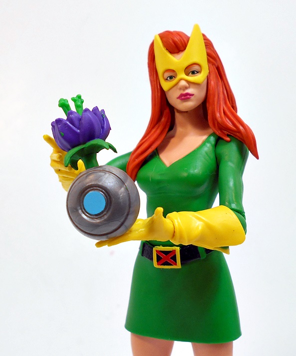
Now don’t get me wrong, this is a fantastic looking figure. House of X sees Jean return to her classic Marvel Girl outfit, and I do dig me some classic X-Men costumes! Naturally, I was excited to get this figure and I was quite pleased with what I initially saw. While the soft plastic skirt is cast separately from the torso, it’s pretty damn convincing as being all one dress. And it’s a simple one at that, especially when you consider that every damn superhero costume these days are made out of colored basketball skins! The green is perfectly matches from the skirt to the upper body, and on to the sleeves. That simplicity is only broken up by the textured black belt with green belt loops, and an old school rectangular X-branded belt buckle. The yellow boots are painted on the legs, but some sculpting for the modest heels on the feet, while the yellow gauntlets have sculpted flares to give them that cool buccaneer style! Going strictly by looks, I love the way this costume turned out and the coloring on this figure is very striking!
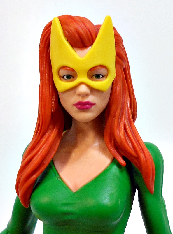
The portrait is equally solid. The yellow mask appears to be sculpted separately and attached to the head sculpt, which gives it a lot of depth. The face is pretty, and they captured her flowing red hair particularly well. OK, the hair is more orange than red, but I think it adds to the overall coloring here nicely. The hair parts at each shoulder, and it hovers a bit to not inhibit the neck movement too badly. While Hasbro has been employing halftone printing for their faces lately, this one appears to be painted, but that’s fine because the paintwork is pretty sharp. I had to get in pretty close to notice any imperfections.
What could possibly drag down such a great looking figure? Terrible articulation! Despite having a bit of a slit running up the right side, the plastic skirt renders the leg articulation above the knees pretty much useless, and that really limits what you’re going to want to do with the knee and ankle articulation, other than make small adjustments to try to keep her standing. Unless you just want her flat out kneeling, those double hinges in the knees just aren’t going to help. The legs are also a bit rubbery, and mine were slightly warped out of the package.
The normal ball joint that we get under the chest in the female figures has been moved down to her waist, which feels weird all by itself. And finally, the elbows hardly allow for even a 90-degree range of movement. Tally all of this up and you get a recipe for a figure that is absolutely no fun to play around with. I’m doing full slits on each side of the skirt to free things up a bit, but I’m not sure yet. Look, I do understand that a lot of these problems are trade offs for the costume’s aesthetics, but it doesn’t change the fact that it makes for a rather boring figure.
As far as accessories go, Marvel Girl comes with two sets of hands: One pair of fists, and one pair of the old powers-slinging hands. She also comes with a Krakoan Flower, fresh from Mars or perhaps The Savage Land. It’s an excellent choice, since these flowers played such a major role in the book. The purple bulb comes sprouting out of a gray spherical flower pot. Jean can sort of hold it in her powers hands, but because there isn’t a lot of room for leg adjustments, she frequently wants to fall forward when carrying it. So, don’t ask her to be the Flower Girl at your wedding!
Wow, this was a quick in and out as far as reviews go, but truth be told there just isn’t a lot more that I can do with poor old Marvel Girl here. She looks outstanding on the shelf, and the fact that Hickman brought back the Marvel Girl costume gave Hasbro a great excuse to give us this classic costume in a figure. I would imagine that even collectors who aren’t a fan of the House of X series would want this figure for their display. It’s just too bad that articulation had to take such a hit here and there’s only so many pictures I can take of her standing straight and waving her arms about. Sure, I’m still happy to have her, but I wish she was more fun.
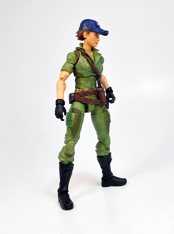
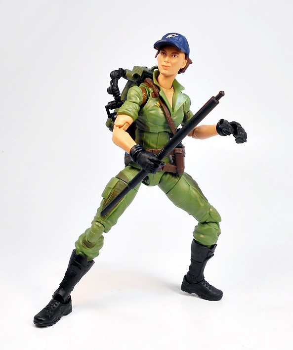
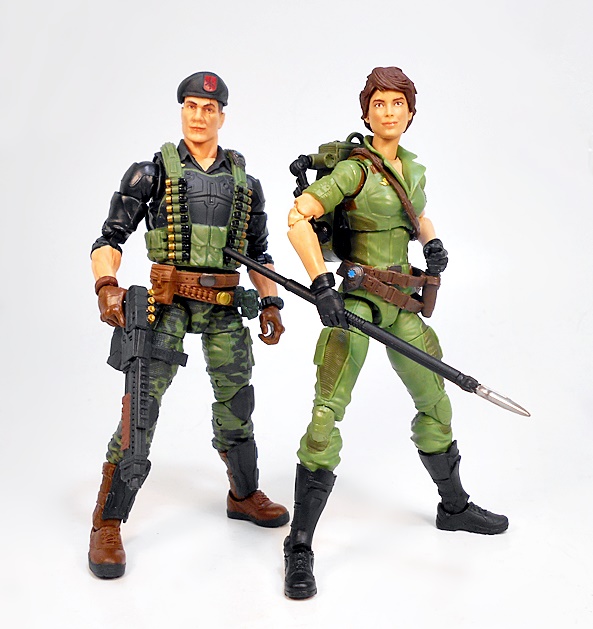
It’s Friday, and I’m in the middle of a delightful little four-day weekend, and I’m all kinds of excited to open up a brand new GI JOE figure! Yeah, it seems like FFZ is 90% Hasbro these days, but what can I tell ya? I talk about what I’m collecting, and that happens to be where a lot of the money is going these days. Today I’m cracking open the latest female addition to the JOE Team, and it is none other than Lady Jaye!
As always, the packaging here looks great, even if I constantly want to take a couple of colored sharpies and make the top bar after GI JOE red and the bottom one blue. But what can I say? GI JOE will always be the real AMERICAN hero to me. The character art on the package is excellent, but I feel like it’s a little understated here, but I don’t want to get all nit-picky. The box is collector friendly, but I got no room, so most of these packages go straight into the bin. I’ll note here that as a kid I didn’t get the original Lady Jaye figure until pretty late in the game. So when she was soaking up all of Scarlet’s screen time in the cartoon, it wasn’t until later that she would make it into my personal ranks. At that point I think I was mostly getting JOE’s to collect them rather than play with them.
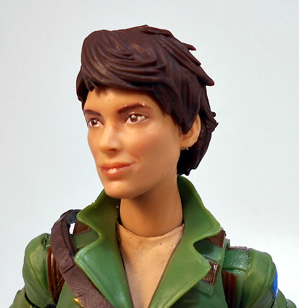
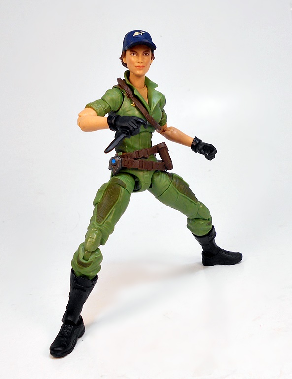
Here’s Alison out of the package, and I’m digging her quite a bit. She is without a doubt one of the most traditional looking figures in this entire line so far. And by that I mean, she doesn’t have extra armor bits tacked onto her. Her outfit is comprised of some straight up green fatigues, high black combat boots, and black gloves. She’s got a brown double belt hanging on her waist, which has a sculpted pouch and a sheath for her combat knife, as well as a brown shoulder strap. The fatigues feature some nice texturing, reinforced pads on the fronts of her thighs, a blue shoulder patch, and a golden pin on the right side of her chest. Her sleeves are rolled up, her collar is popped, and the front of her fatigues are open pretty low. She is all around excellent!
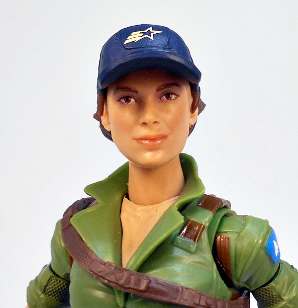
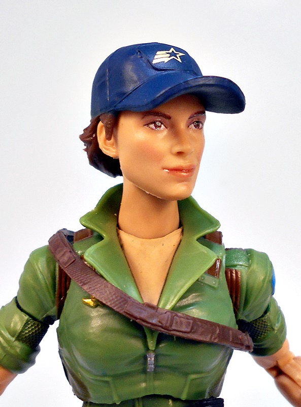
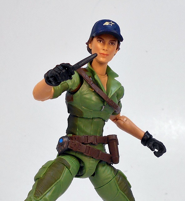
I started off with Lady Jaye wearing her ball cap, which is a solid nod back to the original figure. It’s blue and features the GI JOE star emblem with the three trailing bars behind it, along with her short cropped hair peaking out from under. The head sculpt is a slam dunk. She’s pretty with a modest and confident smile. The eyes, eyebrows, and lips are printed on, and other than a wee bit of mold flashing along the jawline and ears, I have no complaints. Now, we’ve seen a few removable hats in this line, but Lady Jaye’s does things a little differently.
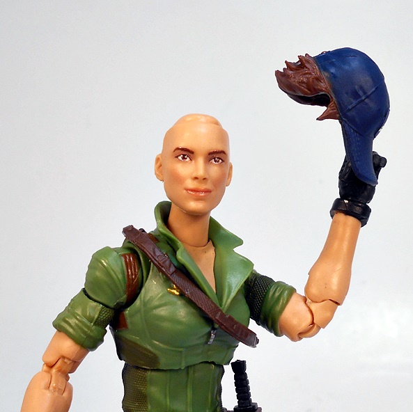
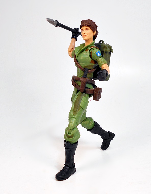
The hair is actually part of the hat, which all comes off at once, which can be a little unsettling the first time you see it. It’s a creative way to give Lady Jaye the option of going hatless without having to include an entirely separate head. Instead, you just pop off the hat piece and put on her hair piece.
Both the hat and hair stay on very well, and I think the hair sculpt is a pretty good likeness to her Sunbow design. As I said earlier, I have more experience with Lady Jaye from the cartoon than I do with the figure, so I’ll likely display her most of the time without the hat. But that’s not to say I don’t like the way it looks on her, and I try to switch it in and out throughout the rest of the photos.
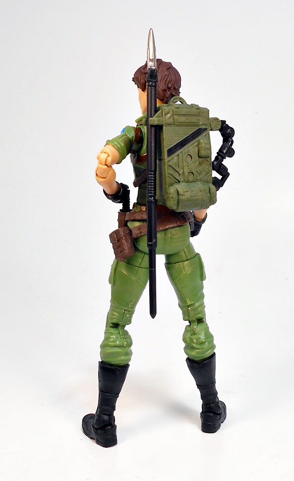
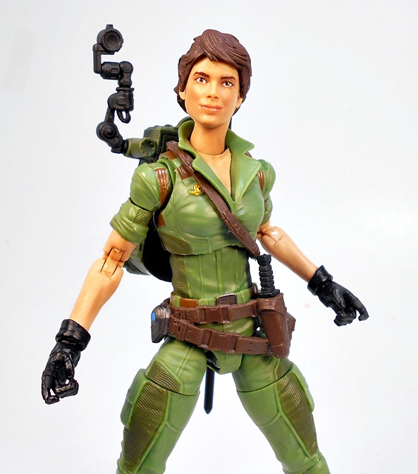
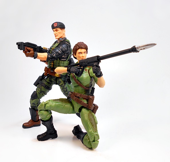
Moving on to accessories, Lady Jaye comes with a backpack that performs a few functions. For starters, it has an articulated camera on one side, which is a modern update to the camera that came with the original figure. It’s a cool idea and a creative update, but it looks a bit awkward and cumbersome to me, so I tend to leave it down at the side. Besides, you can’t have it recording when you’re shooting Cobra troopers in the knees in order to get classified information off of them. Or forcing Cobra scientists to drink their own diabolical concoctions to wash down a meal-sized serving of piping hot justice. General Hawk doesn’t want to see or know anything about any of that shit!
There’s a clip on the other side to hold one of Lady Jaye’s trademark javelins. Yup, it only holds one, but you actually get two with the figure. Would I rather have had another javelin clip on the other side instead of that camera? Eh, maybe. Either way, I’m not too upset over it. Anyway, the pack itself has some very nice sculpted detail, featuring texturing, straps, and extra pouches. There’s also a carry loop on top.
Take it off and flip it around, and you get compartments to store two javelin heads inside, and that is a very awesome little feature indeed! I have had a few issues with some of the backpacks in this line staying put, but Lady Jaye’s pegs in pretty firmly and doesn’t fall out.
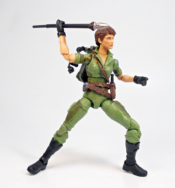
So, you get two javelins and three interchangeable tips: Two with blades, and one with a grenade. These are all pretty simple, but they work just fine. Didn’t she have some kind of magically telescoping one that she used to pole-vault over chasms in the cartoon? Well, if she did, it isn’t included here.
What you do get is a gun for launching them, and that’s pretty cool! It’s a wonderful update to the gun that came with the original figure.
And last, and very probably least, she comes with a little combat knife that fits into the sheath on her belt. It’s nothing to get excited about, but at the same time I don’t want to diminish it. Knives are great extras… especially when you’ve thrown or shot your only two javelins! The knife is all black, which makes sense to keep it from flashing during those night ops, and it also saves Hasbro the money of having to paint the blade. I may do mine up with a silver Sharpie.
While I’ve enjoyed just about all of the designs in this line to some degree, Lady Jaye is just so refreshingly loyal to her original design. Despite not having a huge connection with the original figure, I’m really thrilled to have this version in my collection. She looks great and Hasbro put some thoughtful touches into her weapons and gear. Now, I know the next obvious choice for a Femme-JOE is going to be Cover Girl, but I’m really hoping Hasbro decides to give us a Classified version of Bombstrike. She was easily one of my favorite figures from the Valor Vs Venom line, and I think she’s overdue for another update.
The 86 Transformers movie sure was a lot for a kid to unpack. Sure, I had to watch my hero Optimus Prime die, but at least he eventually came back. Megatron getting reformatted into Galvatron? Well, that shit stuck. And while Galvatron was indeed the new sexy, I really missed seeing Ol’ Megsy in the post-movie cartoon episodes. Nonetheless, as a big fan of his design, I am always down for a new Galvatron toy, especially since most of them have been pretty wanting up to this point. Fast forward to Present Day… 2021, the year where Hasbro pulls a mulligan and offers re-dos on a lot of the heavy hitters of the Titans Return and Power of the Primes lines. It’s hard to believe that was five years ago already!
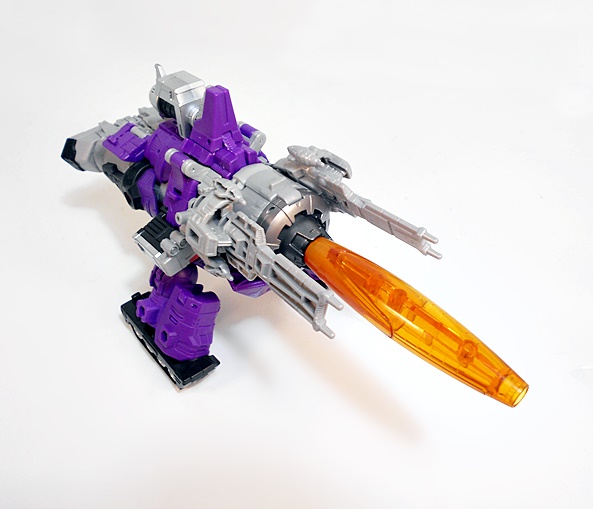
Once again, I’m confused by Hasbro’s decision to spread the 86 Movie Transformers out over two different lines. Some are Kingdom figures, others are Studio Series figures. Why? Who knows? I toss the packaging, so I can call them whatever I want. The only downside is that Galvatron doesn’t come with one of those cool cardboard backdrop stands included with the Studio Series releases. Obviously, the big question here is: Is it worth replacing my Titans Return Galvatron with this new one? Well, I’ll get to a lot of comparison stuff in this review and it’s not as simple as… oh hell… Yes. The answer is Yes. Let’s start with his alt mode.
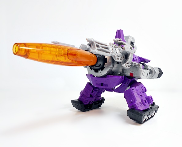
I’ve never been a huge fan of Galvatron’s alt mode. It’s a big space cannon, and while it certainly has more play appeal with other Transformers than Megatron’s 1:1 scale gun mode, it just seemed oddly abstract compared to all the other toys of the time. That having been said, this is a pretty good take on the animated version. The giant space gun sits on two stubby legs with tank treads for feet so it can roll around and gain new firing positions, something I don’t recall ever being shown on the cartoon. In fact, he would usually transform and fire off a few rounds, begging the question, why bother transforming when the cannon is right on your arm there, buddy? Oh yeah, Galvatron was crazy. Fair enough.
Unlike the Titans Return version, this mode locks together beautifully and remains a solid and stable toy. It balances pretty well too, and you can angle the gun upward to fire into the air. It’s worth noting that the two side guns that flank the main cannon are removed during transformation and as we’ll see, they can be attached to Galvatron’s robot mode, but it isn’t necessary. I do, however, really dig the way they look on the alt mode. All in all, this space cannon gets the job done. I don’t love it, but I don’t hate it, and I can’t deny that it’s an improvement. And with that, let’s have a few comparison shots.
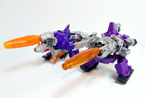
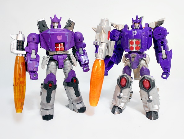
It’s worth remembering that Titans Return Galvatron was a Triple-Changer, so it’s kind of expected to have the weaker alt modes. Mostly, it just has the nose and cockpit of a jet fighter under its belly. I do find the Kingdom version to be all in all better proportioned and beefier, but in the end they’re still both ugly space cannons. Admittedly, the cylindrical body is more accurate on the newer release. The real tipping factor is how solid Kingdom toy is in this mode. I could never get Titans Return Galvatron to lock together properly in this mode, which made it a pretty frustrating toy. So yup, this is a solid update. Let’s move on to the robot mode!
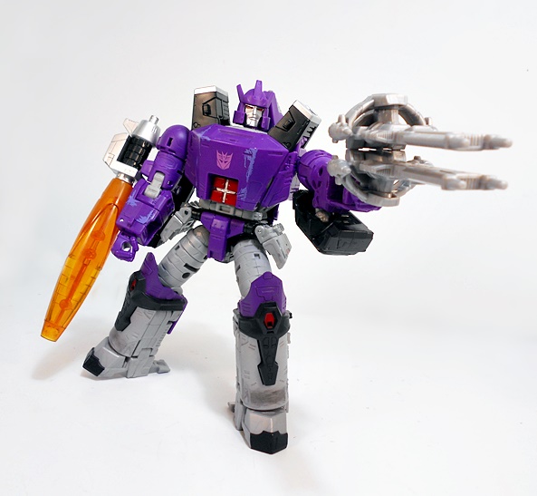
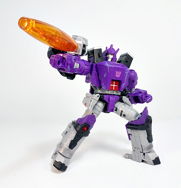
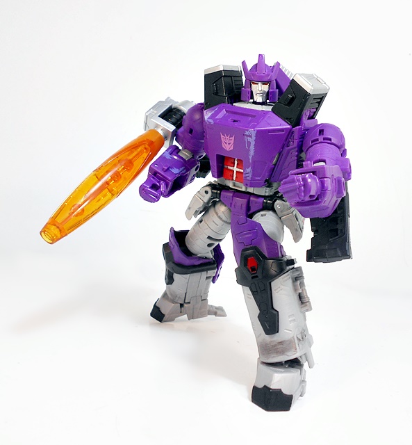
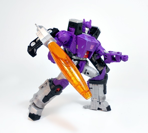
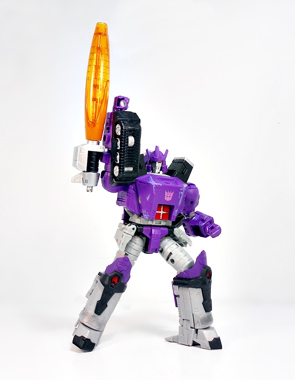
Not bad at all! Some of the early leaked photos of Galvy made him look questionable, but in hand I have to say he looks really good. I do think he’s a little stockier than he’s portrayed in the film and cartoon, but I’m not hating it. It makes him look burly and powerful. I dig his big angled chest and his familiar pylons that jut upward from his shoulders. His lower legs could have used a bit more styling, but they’re still fine. The coloring feels spot on with a combination of vivid purple, black, and gray plastics. He’s got the four red square panels embedded in his belly, and I even like the hip plates, which are fully articulated so as not to mess with his leg articulation. Hasbro brought back some weathering, but it isn’t as overt and unsightly as it could be in the Siege figures. I actually quite like it here.
From behind, Galvatron isn’t exactly pretty, but at least there are no big, gaping hollow compartments. Everything fills in quite well. I think the most unsightly thing about him here is the treads that wind up behind his upper arms. Sure, kibble’s gotta kibble! They had to go somewhere, but it’s very contrary to the clean animated look. One thing I do like is that the treads will peg into the holes on the backs of the shoulders, locking them into place. This does negate the bicep swivel, but if you want to use that you can just unpeg the tread. Still, it does help to keep these under control when posing the figure.
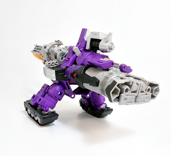
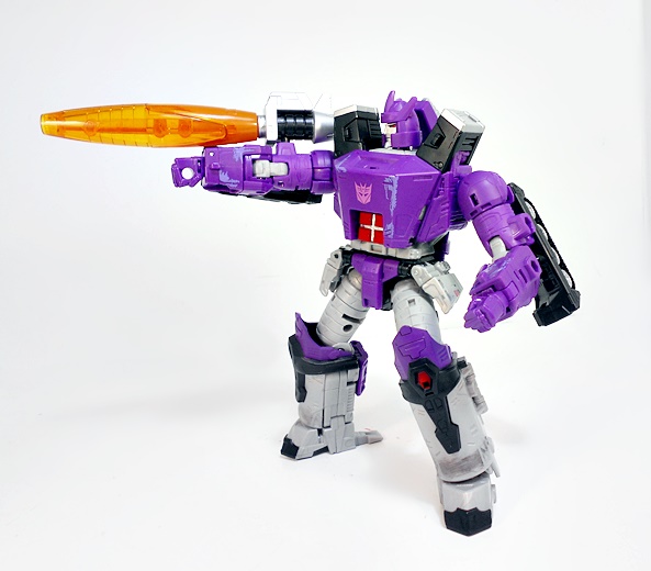
The cannon side pieces that I mentioned before are designed to attach to his back, and while they look OK from behind, I don’t like having them visible from the front, so I’m choosing to leave these off his robot mode. You can combine them and make a gun for Galvatron, but it’s not very in character for him, and it’s not like he needs to carry a gun when he has a giant cannon mounted on his arm.
Speaking of arm cannons, this one looks great! There are actually two sockets on his arm to attach it to, so if you want it on his upper arm or his lower arm, you can go either way. I prefer to have it mounted higher. And unlike the Titans Return version, the bicep swivel here allows him to position it to the side when prone and on top of the arm when firing, provided you remember to unpeg that tank tread!
And it’s hard to not make a big deal of the fact that Kingdom Galvatron’s head is an actual head, and not just a tiny head with a weird flip up frame-helmet on it. Don’t get me wrong, I loved the way Titans Return played off the Headmaster gimmick with the Deluxe figures, but the way they integrated it into the larger figures was weird, and nowhere was that more apparent than with Galvatron. Here we get nothing but a beautiful classic looking noggin. The silver paint looks great, the narrow eyes are immaculately painted with a bright shade of red, and he’s got an appropriately displeased look on his face. So much better than what we got last time!
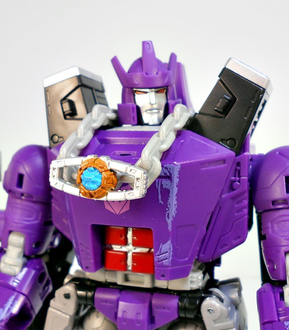
Galvatron comes with one more accessory, and that’s this Matrix on a chain that he can wear around his neck. I have no intention of ever displaying this on the figure, but I was happy to see that the Matrix comes off of the chain and it is a beautiful little piece. I think it’s the same one that comes with Studio Series Hot Rod, but I’ll have to confirm that when I get around to reviewing that figure. Either way, the sculpt and paint on this little Matrix are both excellent.
And here’s a quick comparison shot of the two Galvatrons. It’s easy to see why this figure drove me to drink when I reviewed it five years ago. As I recollect, there were some things I liked about it, but it’s hard to see what with these two standing together. Granted, that figure was possibly crippled by a Triple-Changing gimmick and a poor implementation of the Head Master, but there’s still plenty else wrong with it. I imagine that a lot of these are going to be hitting Ebay right about now. Mine will just get pitched into a tote and forgotten about.
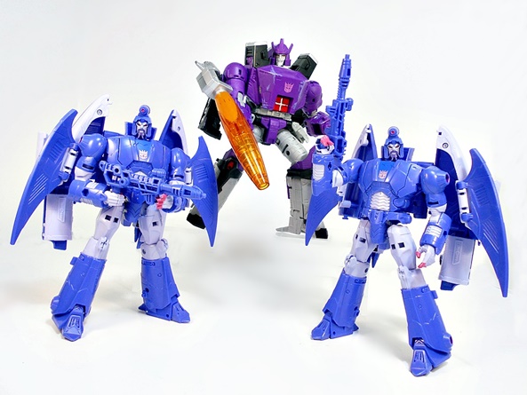
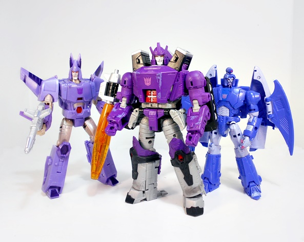
In the end, I’m very pleased with how this figure came out. He’s not perfect, and he may not even be quite the slam dunk that some of the other newly released 86 Movie figures are, but he’s close enough for me. I was happy to see them dump the Triple-Changing aspect and just deliver a great figure with one solid alt mode. Sure, it’s very possible we’ll be looking at an even better Galvatron in 2026, but for now, I’m quite content to stand this beauty on my shelf beside Cyclonus and Scourge. They look amazing together!
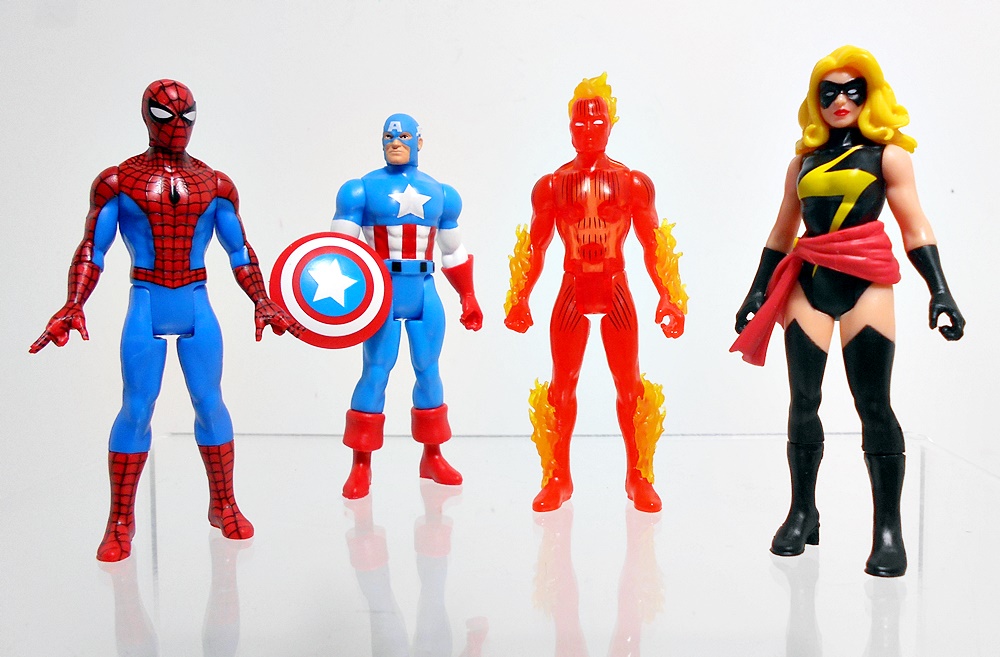
As promised last Monday, I’m taking a break from my cruise through the Legends Tri-Sentinel Wave to have a look at Hasbro’s new Retro 3 3/4-inch figures. Because The Great Lord Galactus knows I really need another Marvel line to collect, right? Well, these are similar to the ReAction figures I collect, in that I bought them to keep carded. But, I did buy a four doubles out of the six for openers, so we will at least be getting a feel for a few of them out of the package and in hand.
And yes, technically, these are Marvel Legends, it says so right on the card, which seems really weird to me. It’s doubly confusing when you consider that Hasbro is already doing a sub-line of Retro-Carded 6-inch Marvel Legends. So what the hell are these? Well, they’re retro-style 5-POA figures designed with old 80’s Kenner-style figures in mind. It’s kind of a What if Kenner did Marvel? Hasbro really did their own thing with the presentation, since they probably didn’t want to copy the look of their competitor Mattel’s Secret Wars line from the 80’s, or the chunked out proportions of Toy Biz’s 90’s line. The first wave is comprised of six figures, and there doesn’t seem to be a lot of rhyme or reason to the character selection here. As expected, these packages are not collector friendly, but at least the figures are set on trays inside the bubbles, which keeps them from rattling around in there. Also, I’ll note that these cards are made of some pretty sturdy and seemingly durable cardboard, and all the ones I bought online came unpunched, which is pretty cool. Let’s have a look at each one, starting with the two I didn’t get as openers.
Magneto represents the X-Men, and I thought him a strange choice for the first wave, but that doesn’t make him any less welcome. The card features the Uncanny X-Men logo at the top left with Magneto’s character art dominating most of the right side. Everything is just about perfect here, especially the coloring. The figure looks like a solid effort. He’s sporting his traditional red and purple costume, just as it’s depicted in the card art, and the paintwork seems pretty clean. Articulation for all of these figures conforms to the usual standard 5-POA, which includes a T-crotch, swivels in the shoulders, and a rotating head. I do find it interesting that they didn’t drive the Kenner homage all the way home by giving him a vinyl cape, but I’d certainly argue the sculpted plastic cape looks better.
I’ll show off the back of the card for Magneto and then leave it at that, since they’re all pretty much the same. You get a character card that can be clipped out and saved along with the figure. You also get a single sentence blurb about the character. I was hoping this was going to be a little more descriptive, but it’s just the same thing in multiple languages. The bottom third or so of the card is just jumbles of legalese. Man, I miss the days when toy packaging didn’t have to be littered with all this crap!
Next up is The Incredible Hulk, and this is the second of the two figures that I have yet to get an opener of, but I’m still looking. Hulk is bigger than the others, but not crazy big. He seems fairly size-appropriate, but best of all, they were able to do him without having to make a bigger card, or throw off the uniformity of the presentation. The Incredible Hulk logo features the brick pattern in the lettering, and the character art is fabulous. I also really dig the deep blue backdrop and the action lines fanning out to the borders. It’s exciting and colorful, and everything a comic book superhero action figure package should be! As for the figure, I think this is a really strong sculpt, especially the portrait. They did a nice job sculpting his muscles, and the vibrant purple paint on his pants looks snappy!
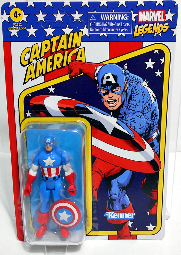
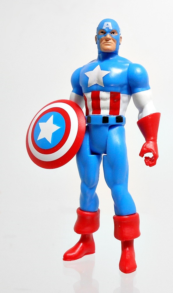
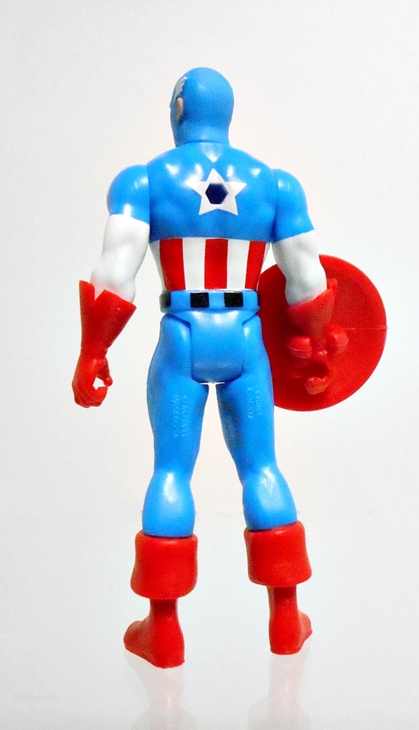
Third out of the gate is Captain America, and here’s where I start to have doubles to open! If pressed, I’d say this is probably my favorite card in the wave, or at least maybe tied for first. The character art is just fabulous, and I love that they have him throwing his shield right out of the card and into the viewers face! It’s exciting, and the star spangled deco is absolutely perfect! If I had one little gripe, it would be the color of the bubble’s backdrop. The blue matches Cap’s outfit and the figure sort of blends in a little too much. But that’s me really nit-picking.
Out of the package, Cap looks and feels great in hand. If you’ve handled any of those Funko ReAction figures, you’ll be happy to know that the quality of the plastic here is just so much better. And while Cap maintains a bit of a simple style to him, there’s still plenty of fresh sculpting to be found in the buccaneer boots, and flared gauntlets. The portrait looks great, and the paint lines are fairly sharp for a figure in this size and style. Cap happens to be the only figure in this wave that comes with an accessory, because…. well you can’t have Cap without his shield. The shield has a clip to attach it to either of his wrists and he looks good holding it. There’s a hole on his back, but no peg to attach the shield, which is a tad disappointing. Still, a great figure that will be sitting on my desk for a long time to come.
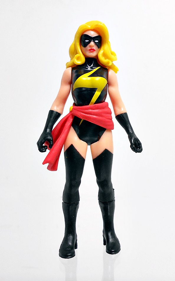
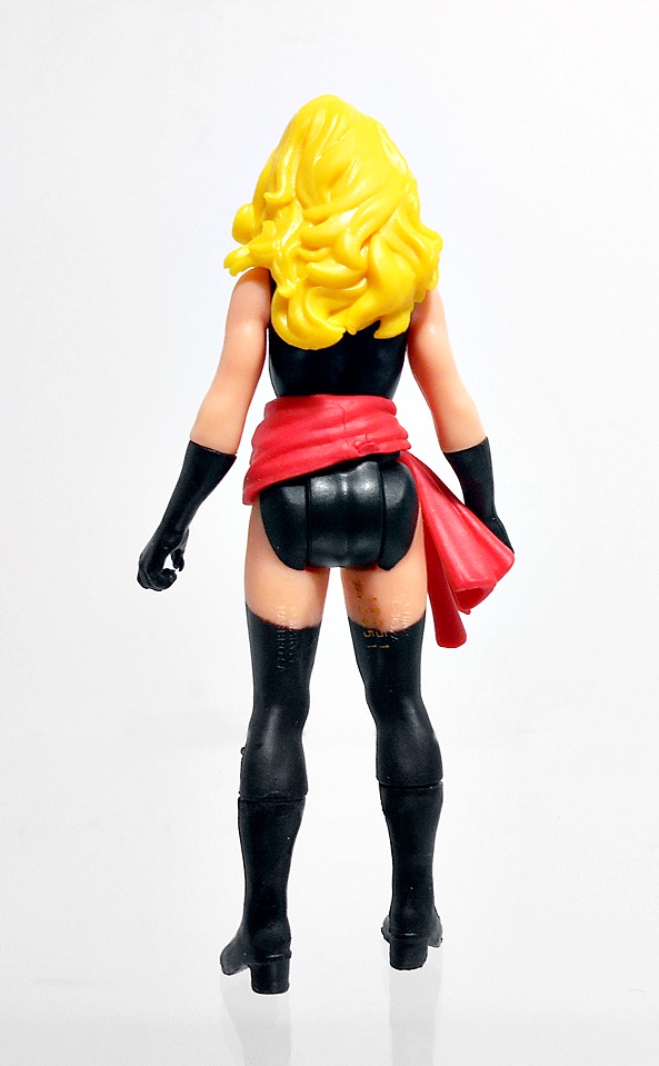
The fourth figure is a bit of an odd choice for this initial wave, and it’s Ms. Marvel herself, Carol Danvers, wearing her Warbird outfit. I really love the character art on the card, but I thought it was a little odd that they went with The Avengers logo and don’t actually refer to her as Ms. Marvel on the card. It’s kind of weird, but not a deal-breaker to me. I’ll concede that I would have preferred her red, blue, and gold outfit, but I dig this one too.
Out of the package, she’s looking fine! This figure relies a little more on paint than for her costume than the previous ones, but I think they did a fine job. The fronts of her boots are a little uneven, but the lightening bolt on her chest looks sharp! I also love that they sculpted her waist scarf as a separate piece and it’s worn by the figure, kind of like an accessory, but not really. The portrait here is really good as well, with her domino mask actually part of the sculpt.
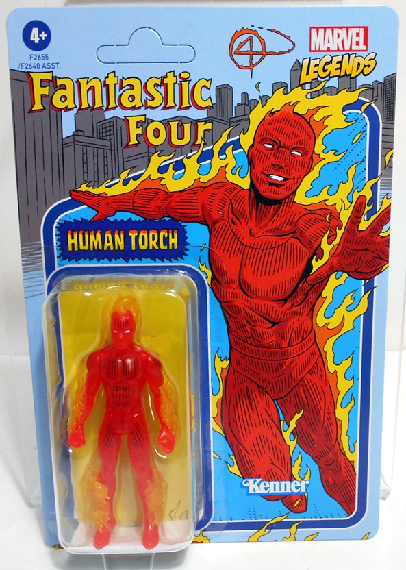
The fifth and penultimate figure in the wave is Johnny Storm from The Fantastic Four, and this one had me super excited, because I can’t wait to hang a full set of Marvel’s first family in this retro-style on my wall. The card includes The Fantastic Four logo over the NY City-Scape with The Human Torch in full flame on! They even did his flamed “4” logo in the sky behind him. Excellent!
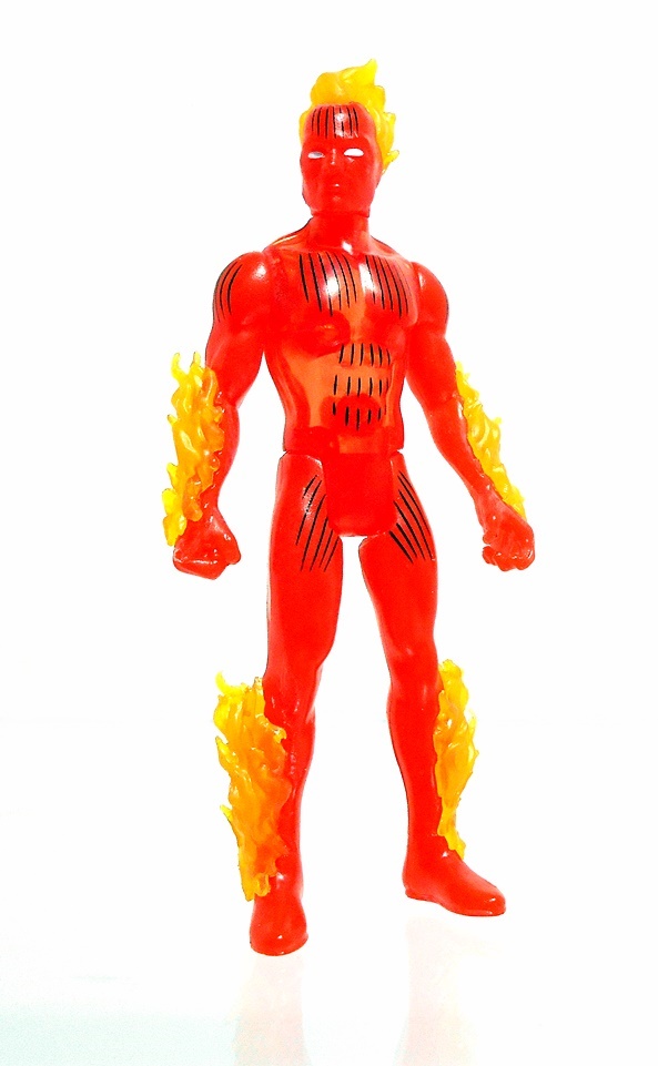
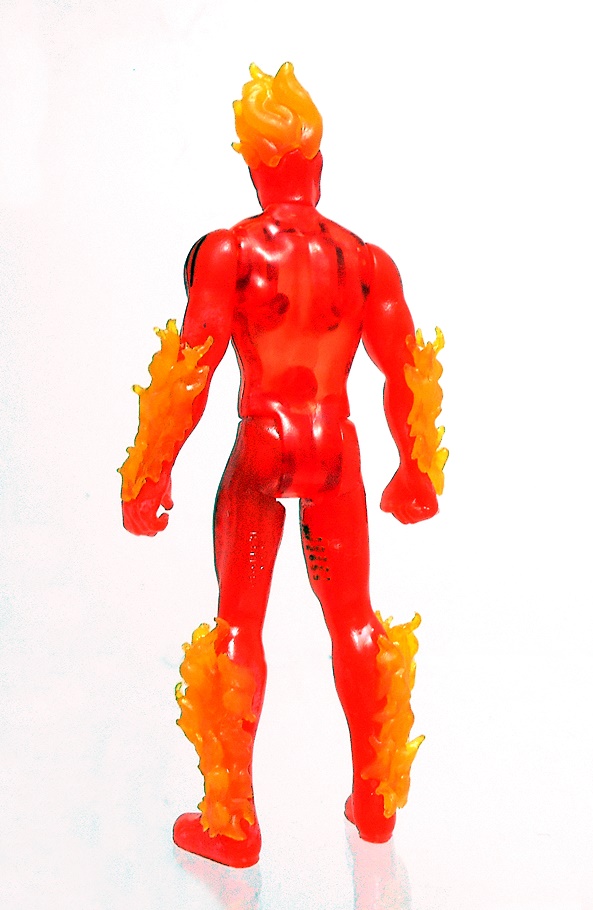
I didn’t think this would be an easy figure to do in this style, but Hasbro absolutely nailed it! Johnny is cast in translucent orange plastic with some yellow flames sculpted onto his legs, arms, and head. The effect is quite striking, especially when it’s properly lit up. Dare I say it? Hot damn, I love everything about this figure! Sue Storm is coming up in the third wave, and I do hope they finish up the Fantastic Four sooner rather than later!
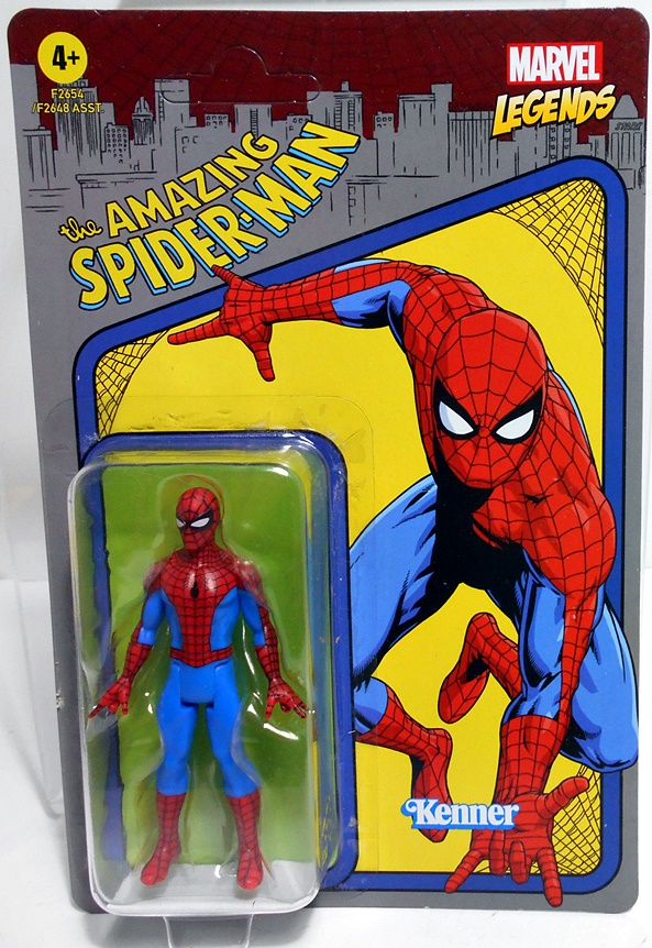
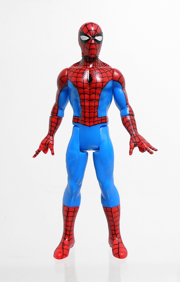
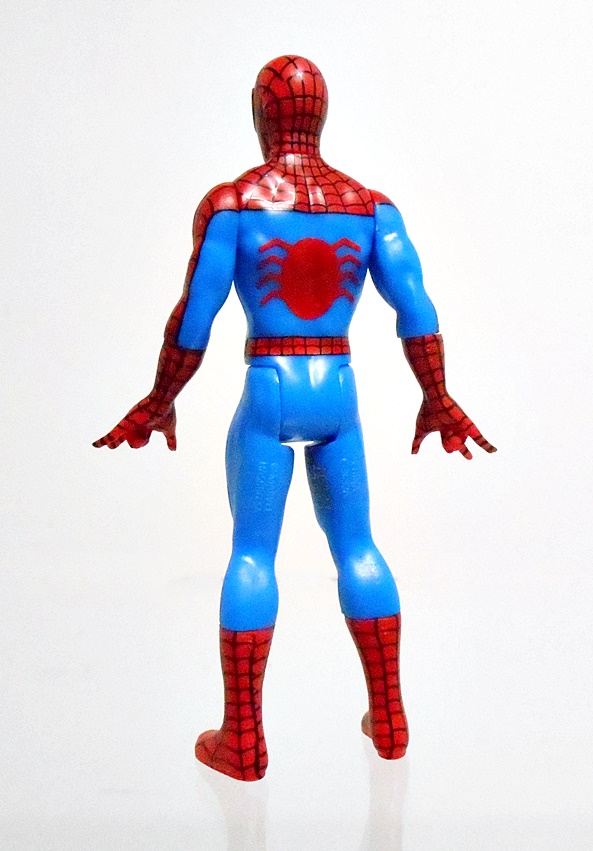
Last, but certainly not least is your friendly neighborhood Spider-Man, and if you haven’t guessed it Spidey is tied with Cap as my favorite figure in this wave. The card art features The Amazing Spider-Man logo set against the backdrop of the city with Spidey himself swinging right out of the card at you and framed by webbing.
Out of the package, this figure just pops like magic. The combination of blue and red is a feast for the eyes and the web pattern looks great. I also dig that they have his arms spread a bit and gave him two thwippy hands. Like Captain America, I just want to carry Spidey here around all day in my pocket at work, so he can have adventures on the desk when I’m bored to tears in meetings. I am really excited to see all of Spidey’s villains turn up in this series. Electro is actually part of Wave Two. Now bring on Gobby!
I’m really interested to see how this line does at retail, but I’m definitely hooked. I’m a sucker for the retro style, and there’s something to be said for these clean sculpts over the somewhat wonky results of the highly articulated Marvel Universe figures. I didn’t have time to dig out any of those to do comparisons, but it’s something I might look at doing in the future. Am I going to be buying doubles of this entire line. Nah, highly unlikely. I’ll mainly be collecting these to keep carded, pop into clamshells, and hang on the wall. But at about ten bucks a pop, I may go for doubles of the ones that I like the most! I already have a set of Wave Two, and maybe I’ll wrap up a look at these next week. Then again I’ve also got a new Marvel Hot Toys figure that I’d like to spend some time with. I guess we’ll see what I have time for!
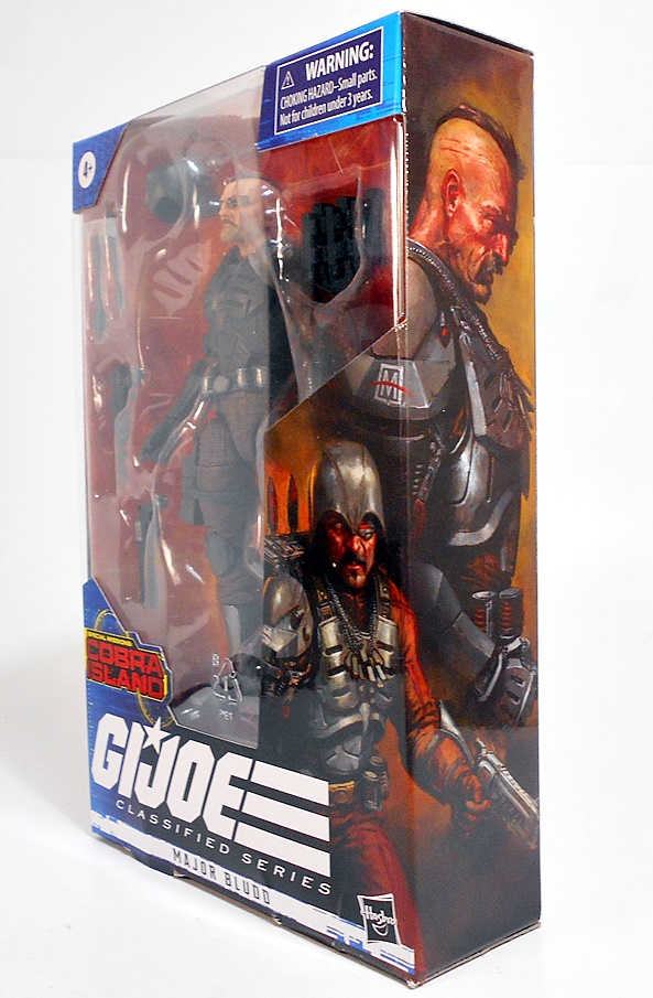
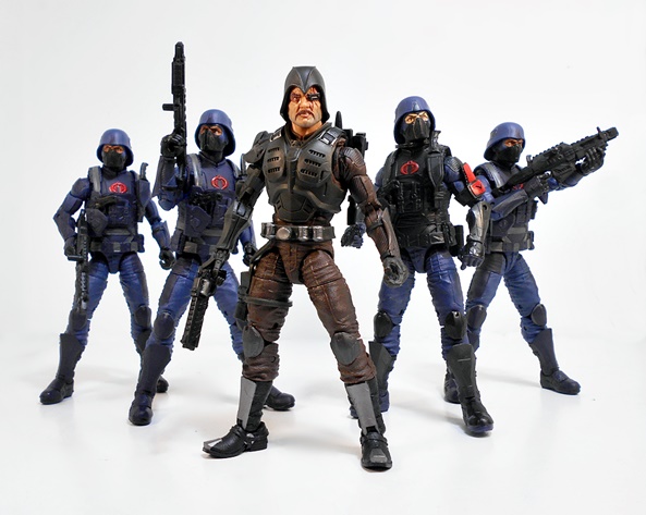
It’s Friday! And what better way to kick off the weekend than by opening a brand new GI JOE: Classified figure! As regular readers will no doubt know I am enjoying the hell out of these figures, but not so much the distribution. Today’s figure, Major Sebastian Bludd was another one of them Cobra Island Target Exclusives, and I still think it was dumb luck that I happened upon this guy when I was buying Litter for the kitty-cats! Although, I’ve seen a few pictures on Twitter showing full pegs of Bludd, so maybe things are looking up. Either way, I was stoked to get him in hand.
Here he is in the package, sporting some absolutely killer character art. I don’t save the packaging for a lot of these figures, but I may just hang on to this one. So, before we get started, here’s a quick disclaimer. If you look at the top packaged shot, you’ll see that Sebastian has a copious amount of dog tags hanging around his neck. As I was playing around with the figure, I found these to be a bit cumbersome and distracting, so I took them off and wound up leaving them off for pretty much the entire shoot. They will make a return at the end for a little discussion. I just didn’t want you to think poor old Jameson-addled Dave forgot about them. And with that said, let’s get The Major out and have a look!
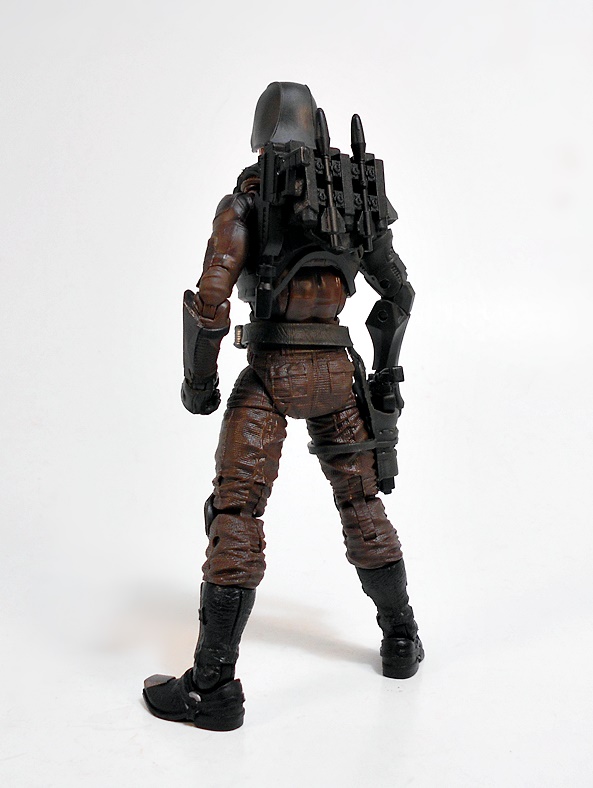
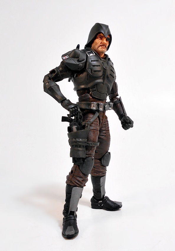
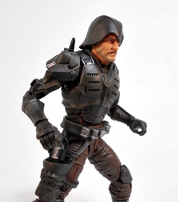
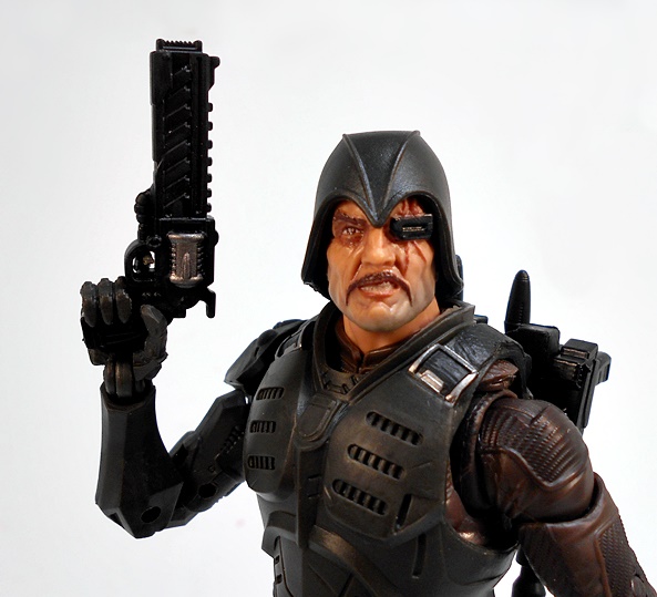
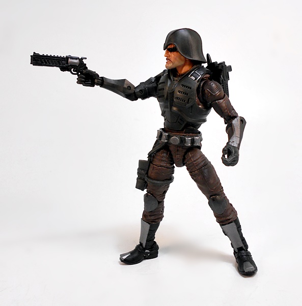
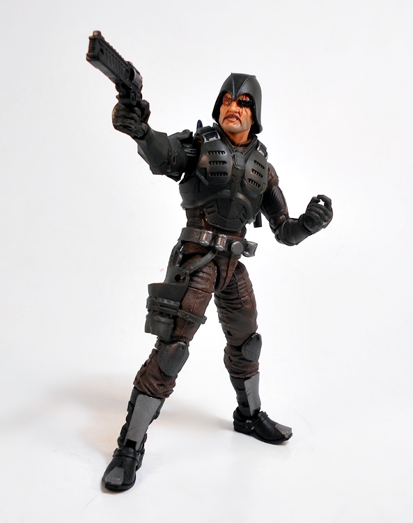
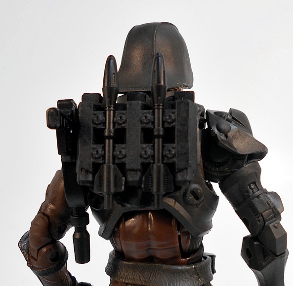
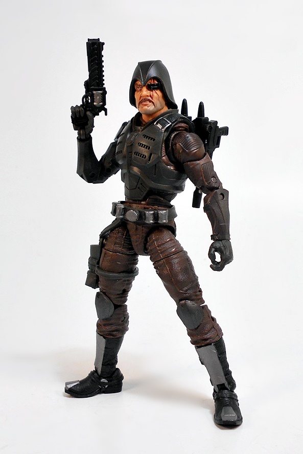
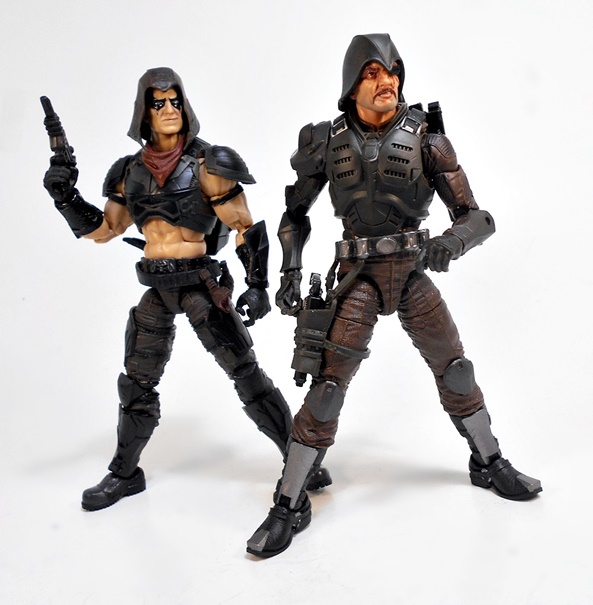
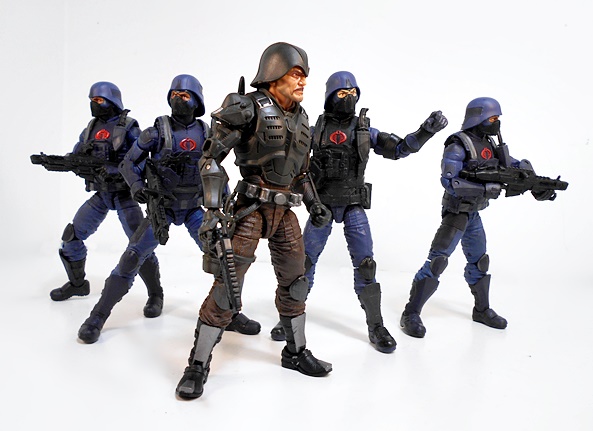
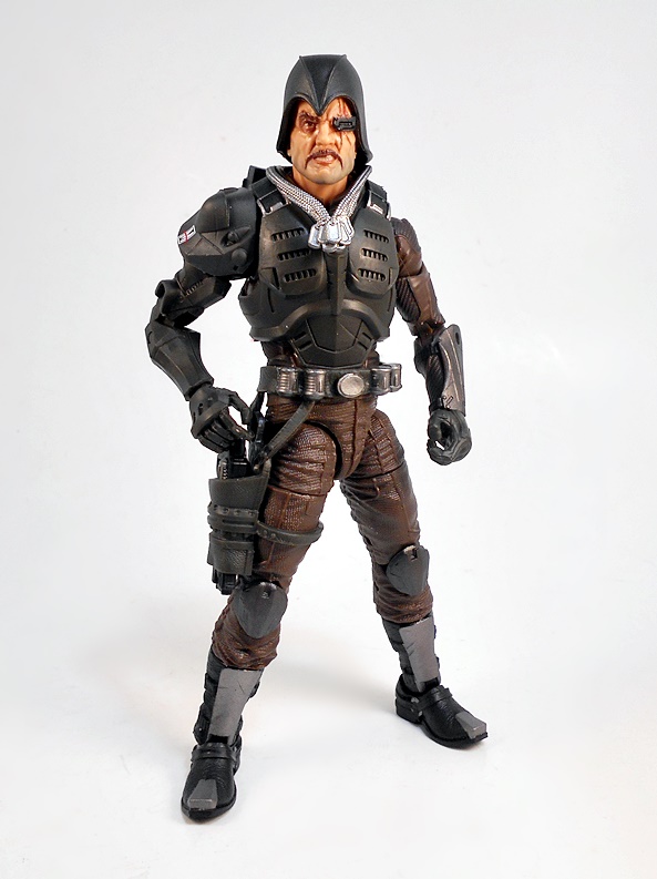
Holy shit! What a figure!!! When I reviewed Zartan, I believe I commented about how I could see more than a bit of Sideshow’s Sixth-Scale figure in there, and that happens to be the case with this one as well. I’m not sure if it’s a coincidence, but I wholeheartedly approve of the design choices here. Bludd is clad in dark brown fatigues, reinforced with an armored cuirass and kneepads. His high boots include reinforced plates on the shins and toes for administering those proper ass-kickings. He has a low slung gun belt with sculpted canisters (grenades?) and a working holster for his sidearm, secured with a thigh-strap. I particularly love the sculpting on the cuirass, which includes vents and, sculpted straps, and painted buckles.
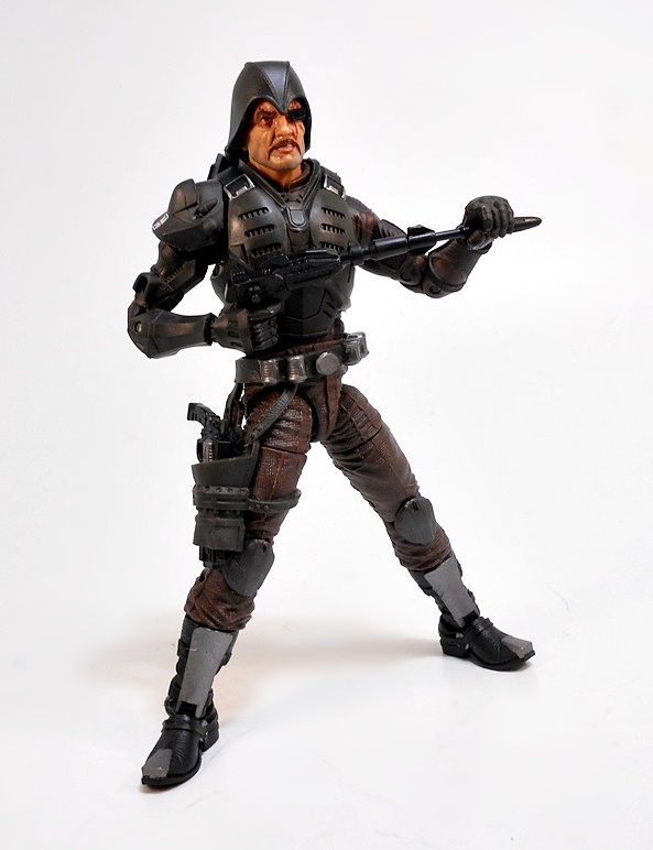
The Major is also sporting an artificial right arm, socketed in under a rather pronounced piece of shoulder armor. The sculpting on the arm is very stylized and, dare I say it? It reminds me a bit of the styling on some of the Sigma Six figures. Whatever the case, it accentuates the fact that it’s a mechanical arm, and I dig that. Every thing about Bludd’s costume screams battle-hardened mercenary. It marries elements of the original design with rugged realism. There’s no doubt he is instantly recognizable, and yet still feels like fresh and new. As far as I’m concerned, this is a textbook example of the proper way to update an iconic design.
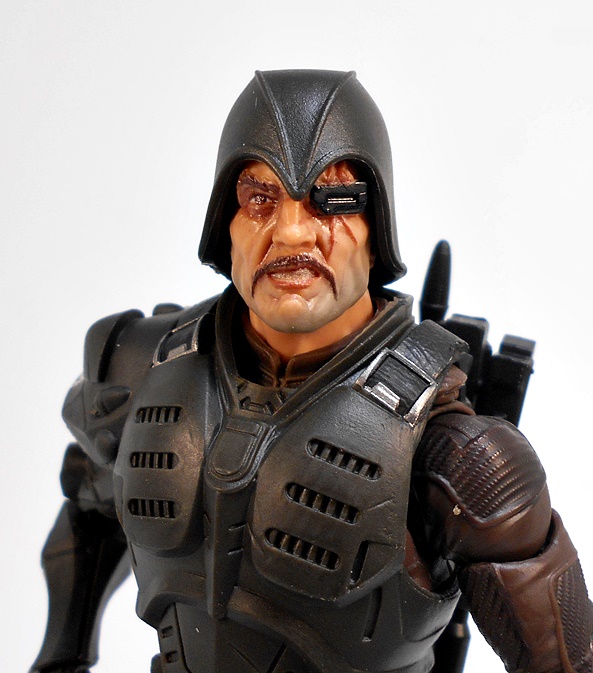
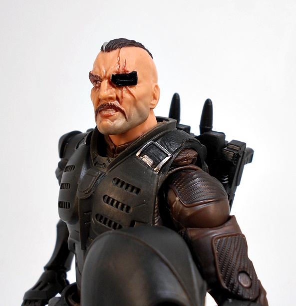
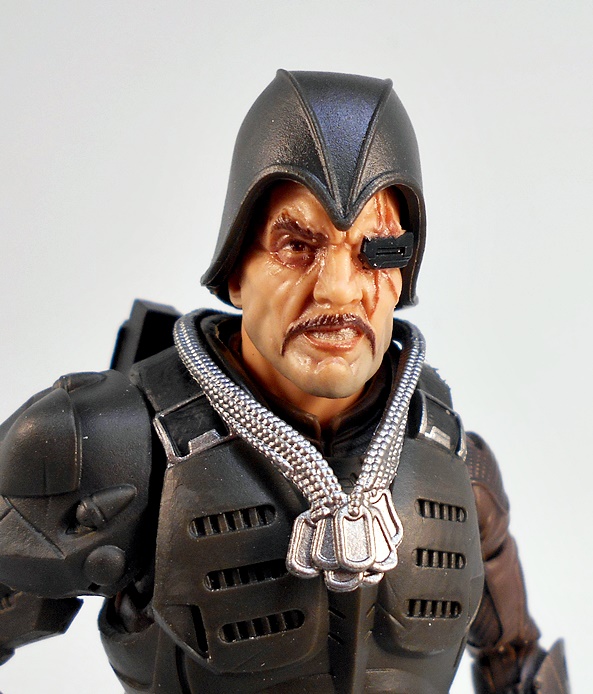
The head sculpt is an absolute work of art for this scale. Like his outfit, Bludd’s face looks rugged and battle worn. This is a guy who’s seen shit and done terrible things for a paycheck. Besides being loaded with personality, the face is cast in one of the most realistic plastic skin-tones I’ve seen in this scale. Extra paint denoting his stubble and his puckering scars complete the picture. His long, downturned mustache and snarling mouth reinforces his villainy, as does his rectangular eyepatch, which looks like it might contain some kind of tech. God damn, this is a wonderful portrait.
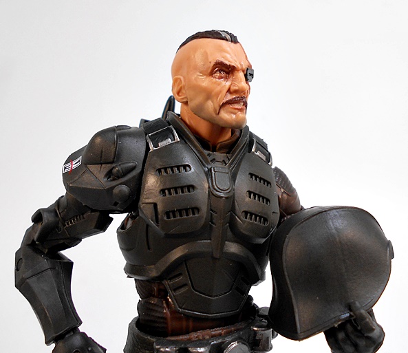
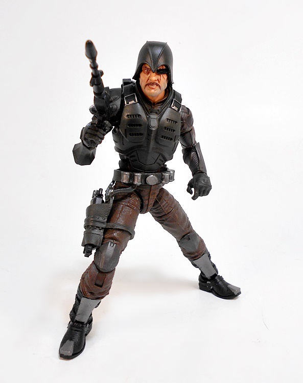
The helmet is also removable, which reveals Sebastian’s mohawk, complete with a gray streak in it. It also shows just how fearsome the scars that claimed his left eye really are, as one of them trails all the way up to his mohawk. Go ahead and compare this $20 figure’s portrait to the portraits that Mezco is doing for the One:12 figures at five times the price. I think this one wins the day. OK, let’s take a look at his gear!
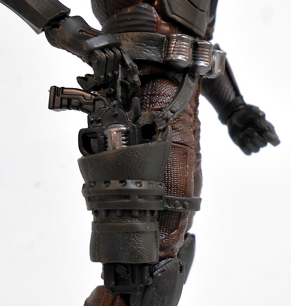
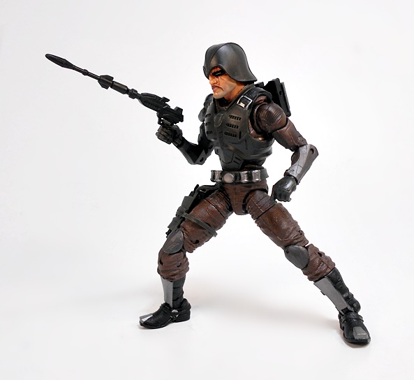
For starters, Bludd is armed with a revolver that has a rather beefy frame to say the least, and boy do I love this design! It’s like someone mated a .44 Magnum with Robocop’s Auto-9. It’s what you might call a bold statement, or perhaps an attention-getter. In addition to having a silver painted cylinder, it’s got a top rail so The Major could toss some optics on there if he’s so inclined. Some of the Classified weapons have left me a little cold, but this beauty is right up my ally!
Next up, The Major comes with his rather distinctive rocket pistol. This devastating little bit or ordinance has a socket in the barrel, so you can load it by plugging the rockets into. Bludd comes with two rockets and they are both stored on his backpack simply by clipping them into the channels. There’s also a hole in the side so you can peg the pistol into it for storage.
Now, I’ll concede that this design isn’t as compact or elegant as the one that came with the original Real American Hero figure, but I do enjoy the fact that you can load the rockets into the gun, even if it does look a tad ridiculous when it’s loaded. It’s also a lot closer to the original design than the full-on rocket launcher that Sideshow designed with their figure. I’d venture to guess that any JOE that’s snickering at it, won’t be doing so for long. Either way, I love all the different takes we’ve seen over the years on this weapon.
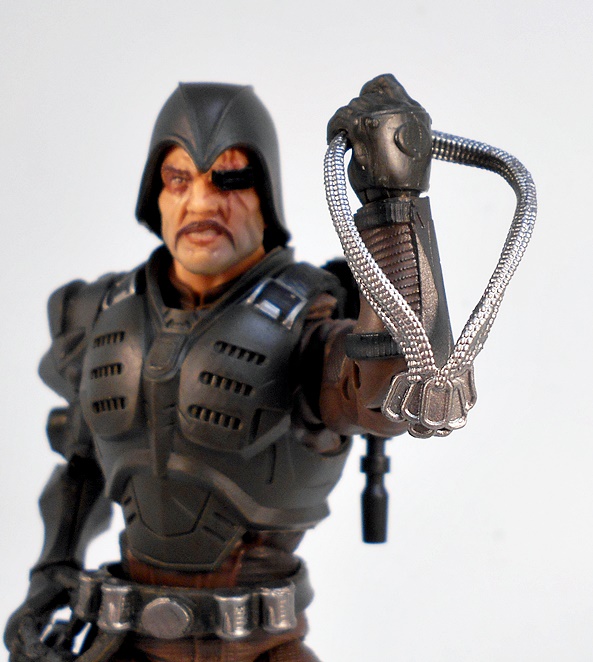
As promised, our last stop is the dog tags. I commend Hasbro for including these with the figure, as it no doubt leads to great learning moments in the toy aisle:
Mommy, why does Major Bludd have so many medals around his neck?”
“Those are Dog Tags, Jimmy. They’re his trophies! He’s taken them off the cold dead bodies of all the JOEs that he’s murdered over his long and bloody career as a mercenary!”
“Gee!!!”
Yeah! I think Hasbro did a fine job on these, considering the scale and the decision to mold them all in plastic. Yes, Sigma Six figures came with actual chain dog tags, and maybe that would have been a better way to go. Either way, I’m glad he has them, and I will be displaying the figure with him. But when I’m playing around with him, they tended to flop around and get in the way. Maybe if I find another Bludd figure, I’ll consider getting a second and gluing the tags down, but for now I’m content to leave them be.
In case you can’t tell, I am totally in love with this figure! I mean, holy shit, did Hasbro knock this one out of the park. While I’ve enjoyed pretty much all the figures in this line so far, I feel as if the Cobra designs are getting most of the real love and passion. To me, Classified figures like Major Bludd, Zartan, or even the Cobra Infantry really stand out as six-inch masterpieces. I just don’t think we’ve seen anyone on the JOE side quite approach this level of execution. Granted, I’ve grown more partial to Cobra designs over the years. Back in the Real American Hero days, I was equally enamored with both the JOEs and Cobra, but by the time I got to collecting the Sideshow Sixth-Scale figures, I found myself only buying the Cobra releases. Either way, I’m happy to see reports that this guy is turning up more at the pegs, because everyone should have a chance to get him!
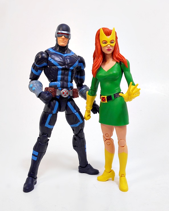
Howdy, Toyhounds! This week I’ve got Marvel Monday right back where it belongs… on a Monday. I had a fairly relaxed weekend and plenty of time to open some toys, so let’s jump right in with two more figures from the House of X-inspired assortment of Marvel Legends X-Men figures! Last time I had a look at Professor X and Magneto and I came away a little lukewarm, if I’m being honest. Let’s see how we make out with Wolverine and Cyclops!
Once again I really dig the packaging this time around. The boxes are perfectly branded to the books, complete with the futuristic X-Men logo on the front and the characters’ names in the Krakoan language beneath it. The figures themselves also look quite stunning against the backdrop of the red and white illustrated panel behind the clear tray. And if you lift your eyes to the top, you can see that when all is said and done we’ll be building a Tri-Sentinel, although Wolverine does not come with a BAF part. Let’s go ahead and start with him!
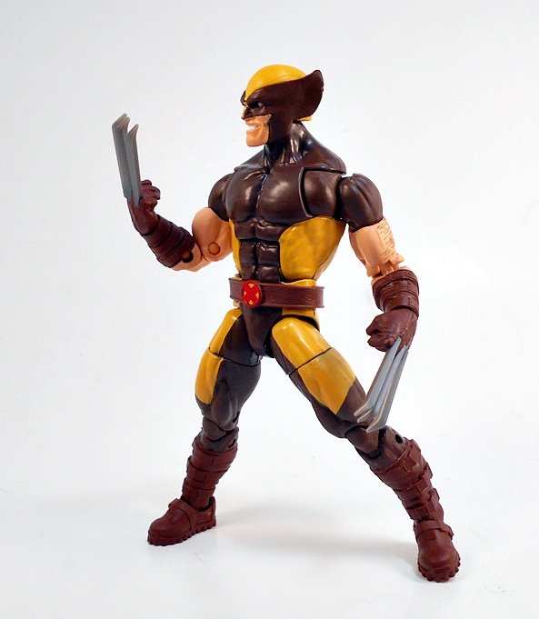
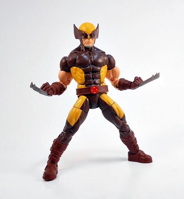
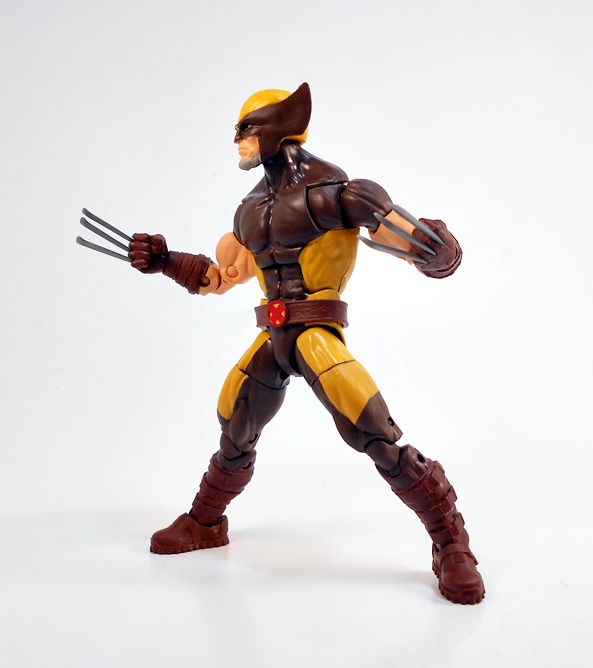
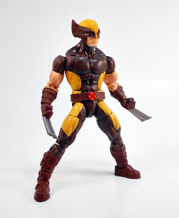
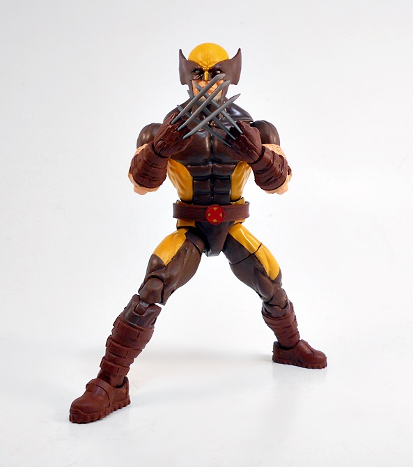
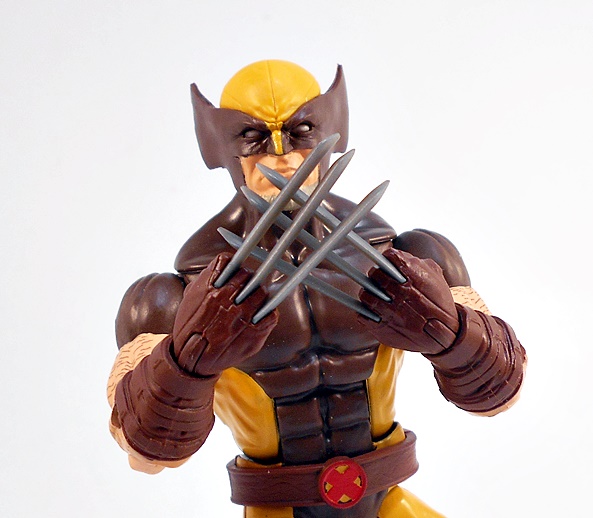
Wow, do I love this figure! The design takes the classic coloring of Wolverine’s brown suit and mixes it up with the tactical accents of his X-Force suit, and the result is something rather spectacular. Now I’m not saying I prefer brown and mustard to blue and yellow, but I still dig it a whole lot. Gone are the flared boots and in their place rugged combat boots with matching heavy gauntlets. I’m pretty sure this figure just recycles all the body sculpt from the Wendigo Wave Wolverine, which in turn borrowed a lot from the Juggernaut Wave Wolverine. Damn, I’m really terrible about keeping all these Wolverines straight! There sure have been a lot of them!
At least the belt looks new! It’s a simple brown belt with a leather-like texture and a red and yellow X-branded buckle. The belt is sculpted separately but fits the waist quite snugly and stays in place. Also worth mentioning are the beefy battle claws! We’ve seen some rather frail and anemic claws on Wolverines in the past, but these are just great. They’re nice and straight, not too bendy. Sure, you only get the one pair of popped-claw fists, but that’s all I need!
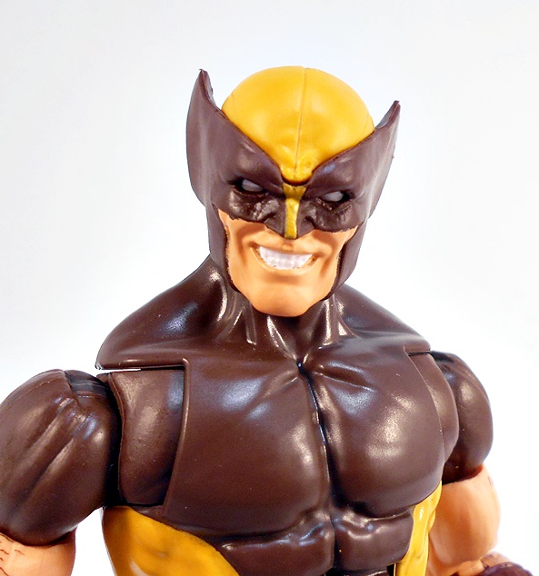
Only one set of hands, but two heads! You get a younger Wolverine portrait with Logan grinning a broad and toothy grin. I dig this portrait a lot as it looks like Wolverine is smiling as he’s imagining what he’s going to do with his adversary’s entrails, but he’s not letting anyone else in on the joke. The paint around his skin and the cowl could have been a little tighter here, but the sculpt is top notch stuff. Just look at how deep the eyes are set! Awesome!
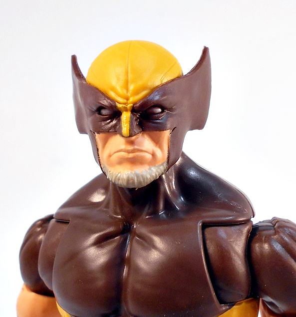
And you also get future Wolverine where he’s sporting a beard and looking a lot more grim, dour, and crotchety. Hey, Mother Mold… Come get your damn Sentinels off my lawn, bub! Everything I said about the paint and sculpt on the previous head rings true here. The paint around the cowl could have been a little sharper, but everything else is fab. They didn’t go nuts on the beard, but I think it looks good. And yeah, this is likely the head I will be using to display on the figure most of the time.
Here at FFZ we recognize that Legends Wolverine Fatigue or LWF is a real syndrome, but it’s just not one that I happen to suffer from. Wolverine always makes for a fun figure, especially since he’s always got those extra shoulder crunches. Whenever I get a new one, he usually hangs on my desk for a while before getting retired to a shelf or tote. I just love playing with them, and this figure is no different! Let’s move on to Cyclops!
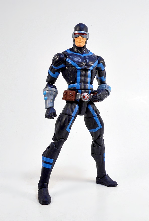
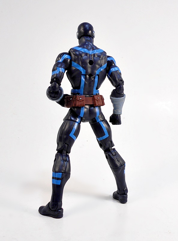
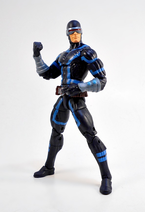
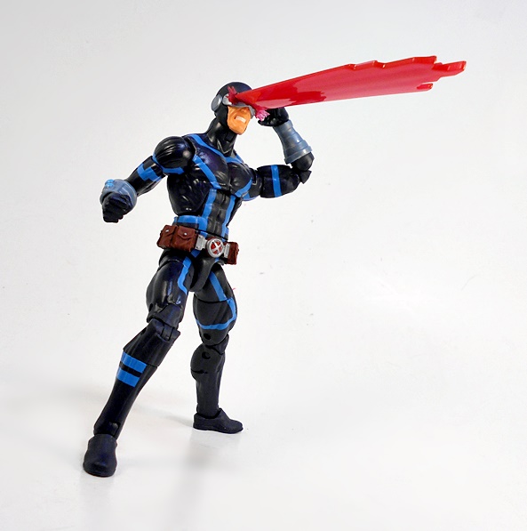
Cyclops’ costume got a rework in this book as well and while I wasn’t especially impressed by it in the comic panels, I have to say I’m really liking the way it turned out on this figure. The dark body suit has very little in the way of sculpted detail, but those bright blue stripes look really spiffy. Cyclops is also sporting a pair of silver arm bracers and an X-branded belt with some pouches. I never really think of Scott as a pouch kinda guy, but the belt looks good and I guess he has to carry around his smug self-righteousness somewhere. The tiny snaps on the brown pouches are painted silver and the buckle is red and silver. Like Wolverine, Cyclops only comes with one set of hands: A right fist and a left visor activating hand. Which brings us to…
A pretty solid head sculpt! There’s nothing crazy going on here, but the lower half of his face looks great. Unlike Wolverine, there are sharp lines between his face and the cowl, and the visor looks like it might be sculpted separately from the head.
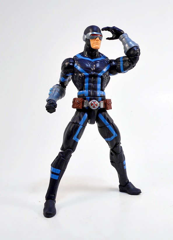
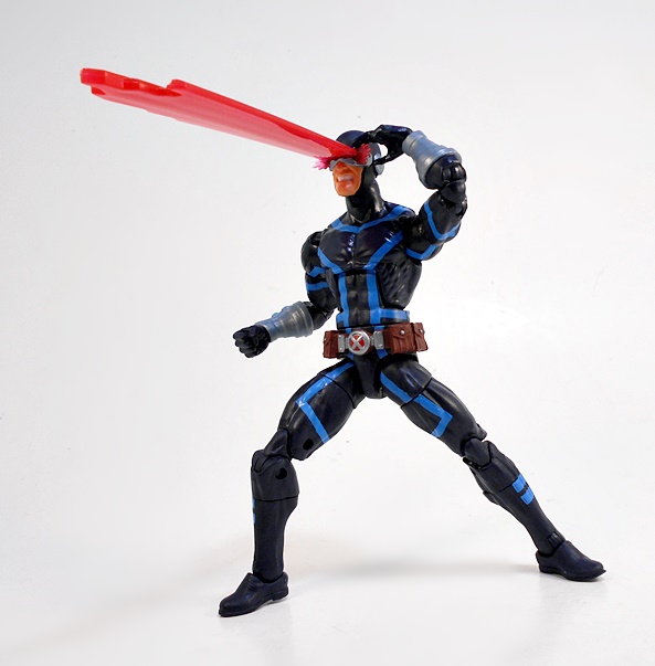
Cyclops comes with a second head with gritting teeth, some effect parts around the corners of the visor, and a slot for the really big effect beam. I dig the way this looks, and despite being pretty substantial, Scott can still stand just fine with it inserted into his head. Pretty damn cool!
I really wasn’t expecting too much out of this pair, but once I got them opened and in hand, I fell in love with them pretty fast. Neither is my favorite look for the characters, but they do make for some cool variations. And besides, it’s nice to have figures from one of the best Marvel books that I’ve read in quite a while. Yeah, that’s not exactly high praise, considering my stance on Marvel’s offerings these days, but it was meant as a compliment! As for next week’s Marvel Monday, I may be taking a slight detour of the 3 3/4-inch variety before getting back to the Legends and the rest of this wave…
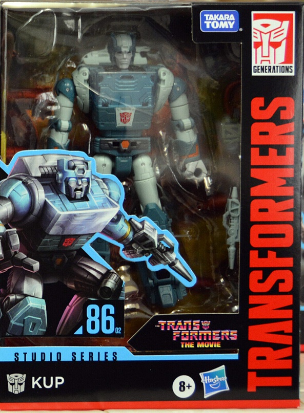
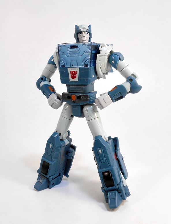
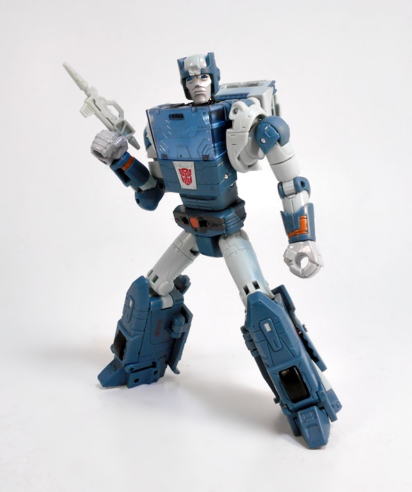
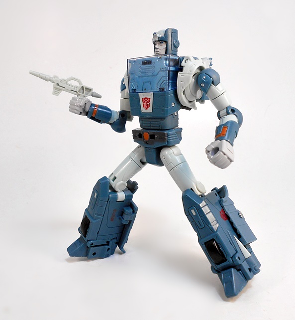
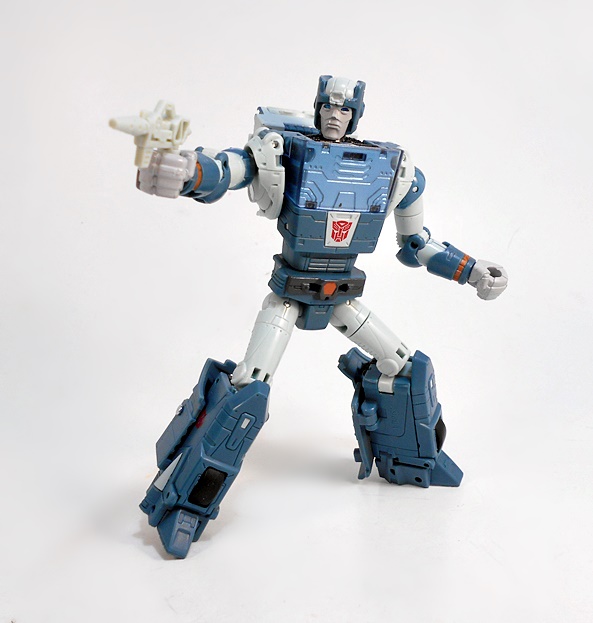
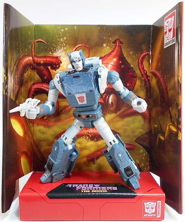
With so many great toys hitting the shelves these days, it’s really hard for me to decide on what to squeeze into my paltry three reviews (or less) a week. I really wish I had the time and energy to go back to the early days of FFZ and churn out five reviews a week, but honestly I don’t even know how I ever managed that. For now, I’m especially thrilled with Hasbro’s original Transformers movie nostalgia trip, so let’s dig into another one of the Studio Series figures with everyone’s favorite crotchety old Autobot, Kup!
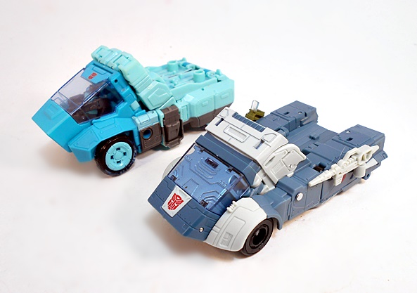
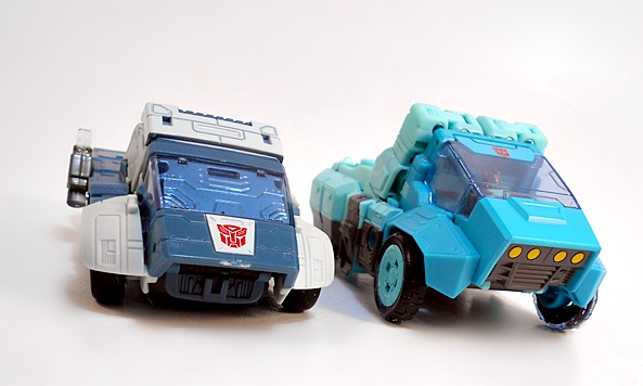
I’ve ignored the Studio Series releases for so long, because they were all based on the Bayformers, but now they’re featuring the old G1 bots and I couldn’t be happier. What makes a Studio Series figure? Hell if I know. There is a little extra effort put into the packaging in the form of a cardboard stand and backdrop, but otherwise, I guess it’s just a sub-series that allows Hasbro to mine characters that don’t fit into the whole Siege-Earthrise-Kingdom narrative. Whatever that is. In the end, I don’t care what they call them, as long as they keep them coming! We’ve had three versions of Kup in modern Transformers lines, including one as part of Generations and the more recent release in Titans Return. Let’s see how the latest one fares, and we’ll start with the alt mode!
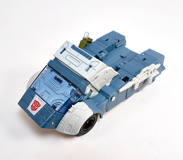
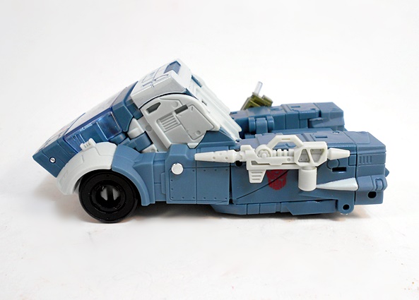
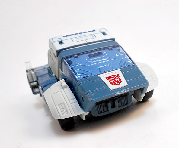
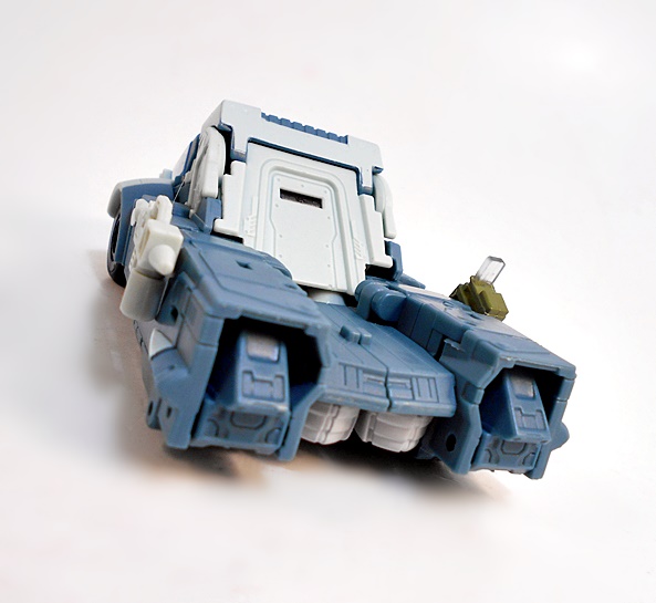
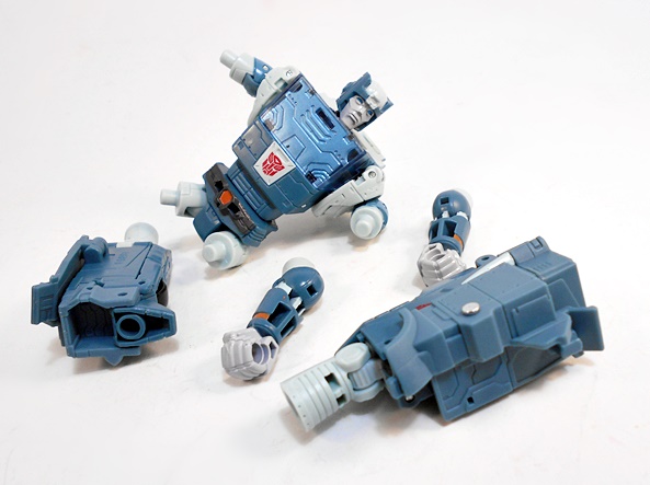
In the movie, Kup was a Cybertronian truck and this is a damn fine translation of that design to plastic form. I was never sure whether this was supposed to be a pickup-style truck with a bed for payload, or if it was supposed to hook up to a trailer of some sort, but either way I really dig what we got here. The sculpt features a decent amount of panel lines, and I especially like the canopy that doesn’t show off the interior of the cab, because it’s a Cybertronian vehicle. The design has the front wheels exposed, and the back wheels concealed underneath. Also, both of Kup’s accessories can attach to his vehicle mode giving him some extra firepower, and what looks like it could be a gas tank.
Kup’s truck mode gets by without a whole lot in the way of paint applications and instead making use of gray-blue and off-white plastic for a color scheme that closely matches what he had in the movie. You do, however, get Autobot insignia stamped on the hood and again on the sides. All in all, this is a cool and compact, rugged little space truck. It holds together fairly well, although sometimes I have problems keeping some of the seams closed up all the way. Let’s get him transformed and check out his robot mode!
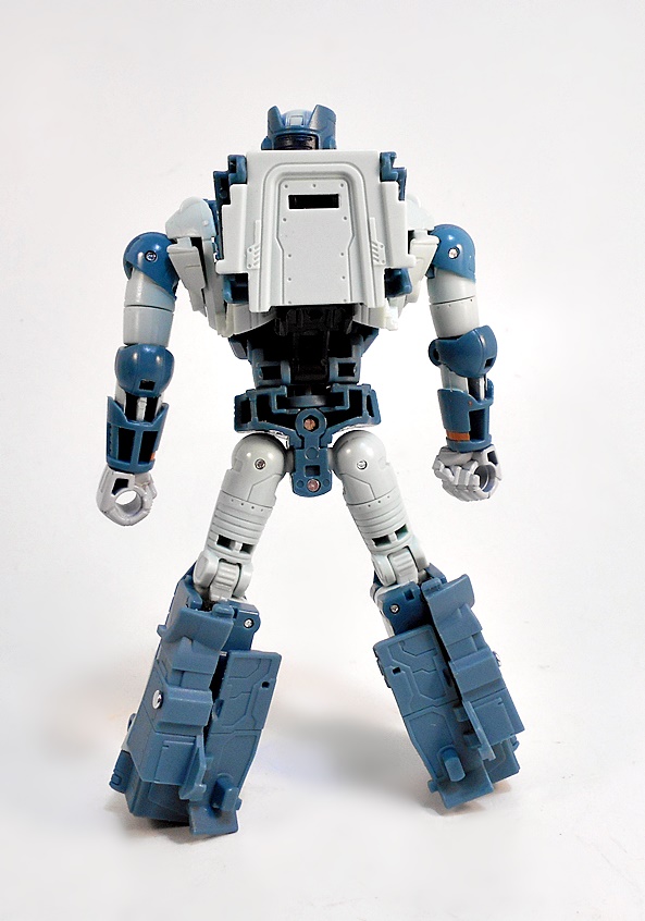
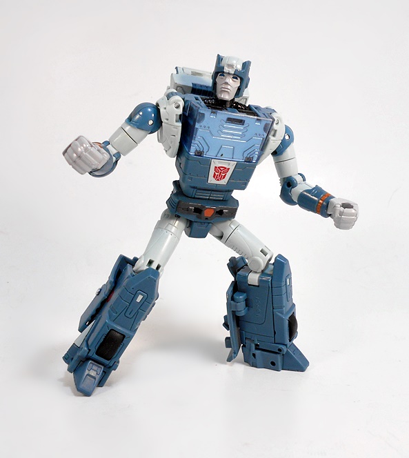
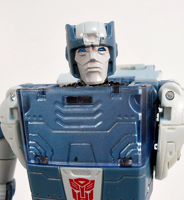
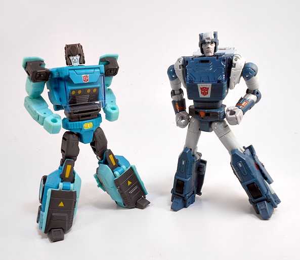
Transforming Kup is slightly more complex than I had anticipated. The first time it felt a little fiddly, but after a few times, it really isn’t that bad, and it does a few pretty clever things. The result is a great looking robot that certainly captures a lot more of the animated design than the original toy ever did. The 86 animated designs introduced a lot of curves, particularly found int he rounded arms and legs, and that’s exactly what’s on display here. The coloring carries over from the alt mode, with just a little bit of rusty orange paint accents in the forearms and his “belt buckle.” Ironically, the front wheels which were on display in his alt mode are now hidden inside his torso, while the concealed back wheels are now seen in his lower legs. When viewed from the back, he does have some ugly empty compartments in his forearms and lower torso, but all in all, nothing too bad.
I might as well mention now that he’s built to be pulled apart, probably to recreate the underwater squid attack from the movie, where he got an arm and leg ripped off and Hot Rod had to put him back together. This is a cool gimmick, I guess, but his arms tend to pull out when I’m posing him. I fear that the connections may get even more loose over time.
The head sculpt is pretty good, but I’m not sure it’s the slam dunk that we’ve been getting on the other figures. I think the facial sculpt is just a little soft and they kind of flubbed the crest on his “helmet.” But man, I’m really nit-picking, because it sure ain’t bad. It’s just that so many of the other head sculpts have been pitch perfect, I think there’s a little room for criticism here.
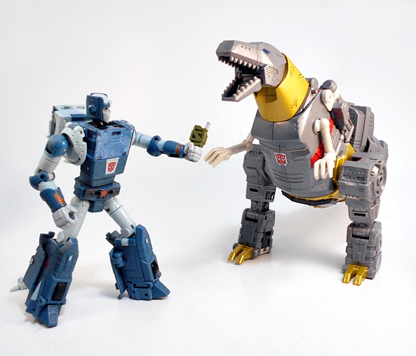
As we’ve already seen, Kup comes with a pair of accessories, which include his gun and his energon goodie dispenser. The gun is pretty non-descript but the goodie dispenser was a cool surprise. I honestly wasn’t expecting that!
And before wrapping up, here’s a quick comparison of the recent Titans Return Sergeant Kup & Flintlock with this new Studio Series model. And I’m happy to say that I can comfortably find room for both of these figures in my collection. The Titans Return version is certainly more beholding to the original toy, especially in the deco, while the Studio Series goes for an animated accurate version. And it’s still cool to me to have a Kup with the Headmaster gimmick. Ultimately, I like SS86 Kup’s robot mode a lot better, but I’m still rather fond of Sergeant Kup’s vehicle mode with the driver compartment for Flintlock.
And that’s Transformers for ya! A few of years ago I was perfectly happy with my Kup figure and now he’s being overshadowed by a new one. This is an excellent figure all around and I’ve been having a blast playing with him at my desk during my down time. The next Studio Series figure I check out will probably be Blurr, and my Hot Rod just shipped out, so I’m excited for him to arrive!