Justice League (New 52) Box Set by DC Collectibles, Part 1

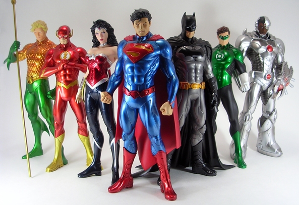
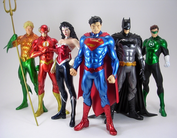
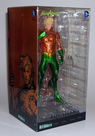
It’s DC Friday, I’m almost caught up on my DC backlog, and so it’s time to dig deep and go into the reserves. I’ve had this set sitting around for what seems like forever. It feels weird to be getting to it only now that the New 52 has been rebooted to ReBirth. Still, this set was a nice way to snatch up the entire New 52 Justice League in one shot and, if you managed to get the original “We Can Be Heroes” release of this set, you were not only getting the figures before they were released individually, but also helping the relief efforts against drought and famine in Africa. I’m going to go through this set in three parts. Now, while this was the first way to get these figures, I actually did a Feature on the later released, Trinity War box set, which included a variant version of this Superman along with straight repacks of Batman and Wonder Woman. So, today I’ll start out with a look at the package and a quick comparison of those figures to the later Trinity War releases, and then tackle the other figures, two at a time, in the following couple of weeks.

dcwcbh1

When you’re getting seven 7-inch scale figures in a single box, you know it’s going to be sizable. In this case DCC put the figures all in one epic lineup and into a long window box. The box’s deco is very simple and mostly white with a blue slash down the far right side showing some of the characters in silhouette. The set is also set apart from the original release by not having the “We Can Be Heroes” motto printed above the word “Justice.” This box is one of those cases where the packaging itself would be totally forgettable if the figures didn’t look so damn good all lined up like that. It’s a box that makes a statement and arguably displays the figures just as well as if they were lined up loose and on the shelf. Happily everything is collector friendly. You just slit the tape on the side flap and pull out the tray. There’s a clear plastic cover over the tray to keep the figures in place, but no pesky ties to worry about. I like that my set happens to have Wonder Woman looking at Superman, Superman discretely looking back at her, and all the while Batman looks off to the other side as if pretending not to notice. Anyway, this is most definitely a box that I’ll be keeping to display the figures in. I’m going to start with Superman, because he’s really the only one that’s different from the one in the Trinity War box.

dcwcbh2

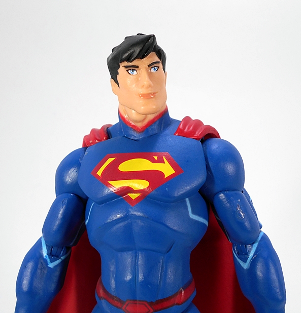
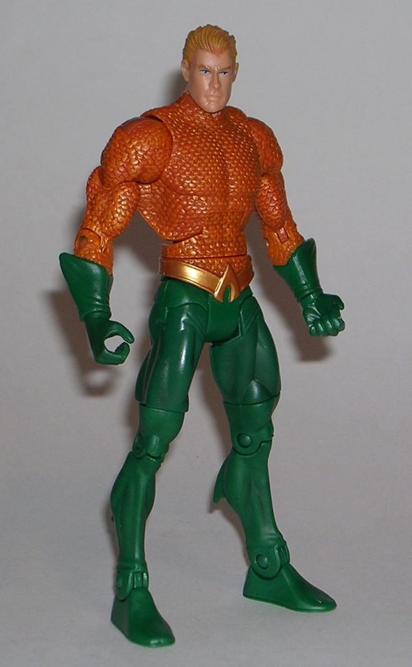
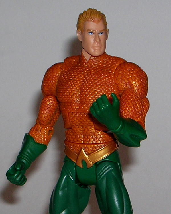
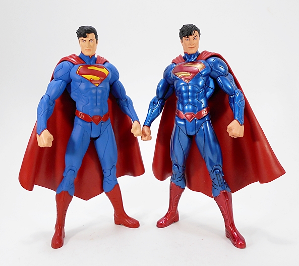
From the neck down, the sculpt here is identical to what I showed off December of last year. The only difference in the costume is that the metallic paint has been replaced with a more appropriate flat matte look. Now, I really did dig the metallic version a lot. It felt like a cool callback to Kotobukiya’s ArtFX+ Supes. Of course, the deco was more about giving collectors who already owned the figure an excuse to buy the set, then it was about anything to do with Superman’s appearance in the Trinity War story arc. Here we have a more conventional paint and just a beautiful representation of Krypton’s Last Son in his New 52 outfit. And yes, I do really love this outfit. Every detail on the outfit is part of the actual sculpt, from the panel lines and edges of the boots, right down to the belt and S-Shield. The colors, which consist of rich and vibrant blue, red, and yellow are absolutely gorgeous. I’m just totally in love with the look of this figure.

dcwcbh3

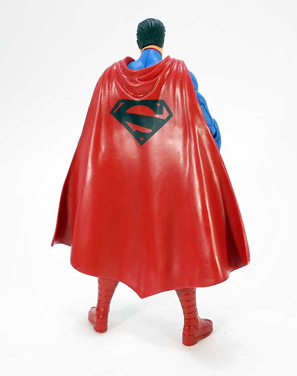
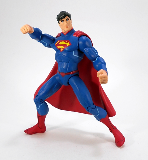
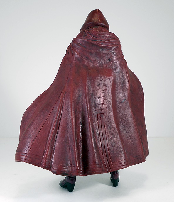
The cape cascades over Superman’s shoulders and stops right about at the tops of his boots. It’s a fairly pliable plastic and doesn’t throw the figure off balance at all. The back of the cape features a black S-Shield stamped right in the middle.

dcwcbh4

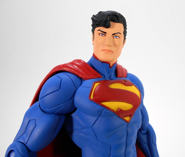
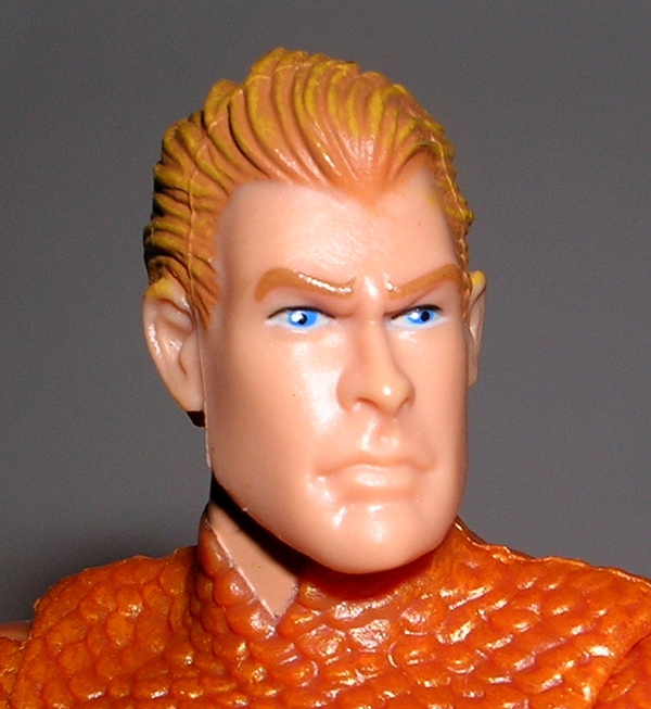
The portrait is the only difference in sculpt between this release and the Trinity War figure, which had Superman offering up a goofy smile. I was pretty happy with the Trinity War portrait, but this one just blows it out of the water. It’s definitely a more stern look, but I think it’s a great 3D likeness of Jim Lee’s art from the book. The paint is very clean and the hair is more neatly sculpted on this version.

dcwcbh6

dcwcbh5

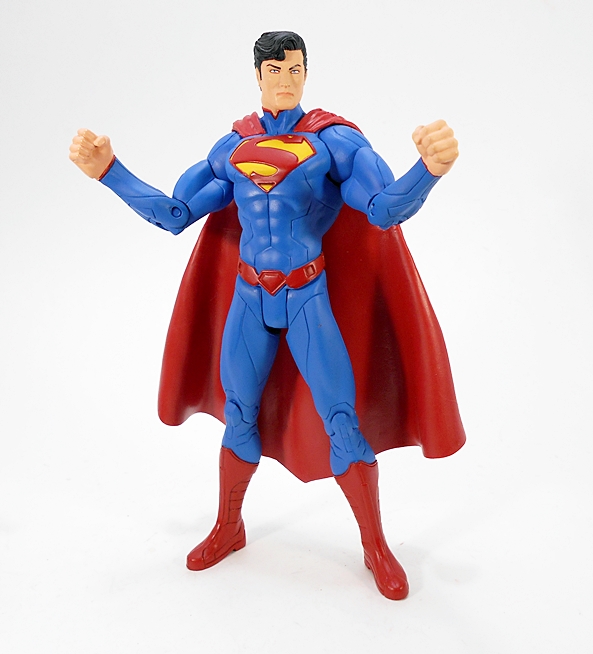
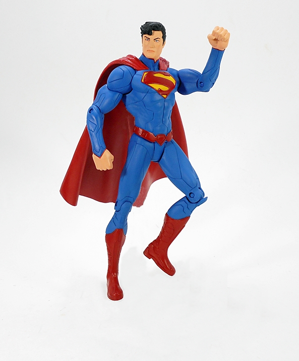
The articulation is pretty standard stuff when it comes to the earlier days of DC Collectibles’ figures. You get rotating hinges in the shoulders, swivels in the biceps, hinges in the elbows and knees, a ball joint in the head, and a simple T-crotch. You can tweak a few different poses out of him, but nothing too crazy. Moving on to Wonder Woman…

dcwcbh8

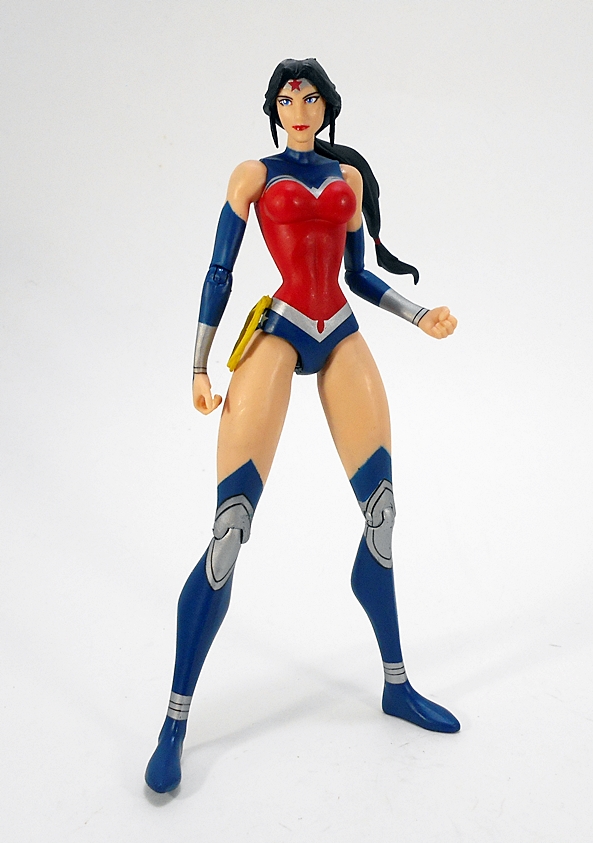
I loved this Wonder Woman figure when I got her in the other set, and I still do. This is a great look for her and the sculpt really brings out the details in the costume beautifully. Yes, for all the guff that the New 52 costumes got, and some of it was well deserved, this version of Diana’s digs is just fine with me. I still find it odd, however, that DCC never gave us the costume with the pants, but that’s a discussion for another time. Once again, every detail in the costume is part of the sculpt.

dcwcbh9

The paint here is nice and clean and pretty consistent with the later Trinity War release. The blue and red is darker than what we saw on Superman, but it has that silver and a little white to help lighten things up. Even the skin tone, which is achieved through bare flesh colored plastic, is smooth and warm. The articulation here is identical to that of Superman, so it’s not all that fantastic, but at least Diana got herself some swivel biceps. That’s not always a sure thing when it comes to the female figures.

dcwcbh18

dcwcbh10

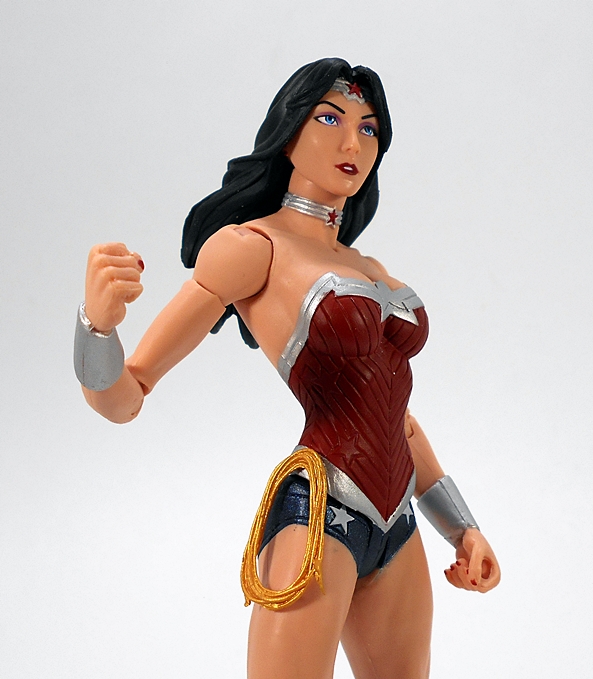
Diana comes with her golden lasso sculpted on her right hip and her left hand is sculpted to hold the sword she doesn’t come with. Now, that surprised me, as it was also vacant from the Trinity War set. Apparently the only way to get her sword was to buy the individually boxed figure or the set that paired her with Katana. Now, it’s bad enough to buy the same figure twice, but three times? That would be crazy, right? Well, I’m not saying I did, but I may be getting around to looking at that Wonder Woman/Katana two-pack at some point. Just saying.

dcwcbh11

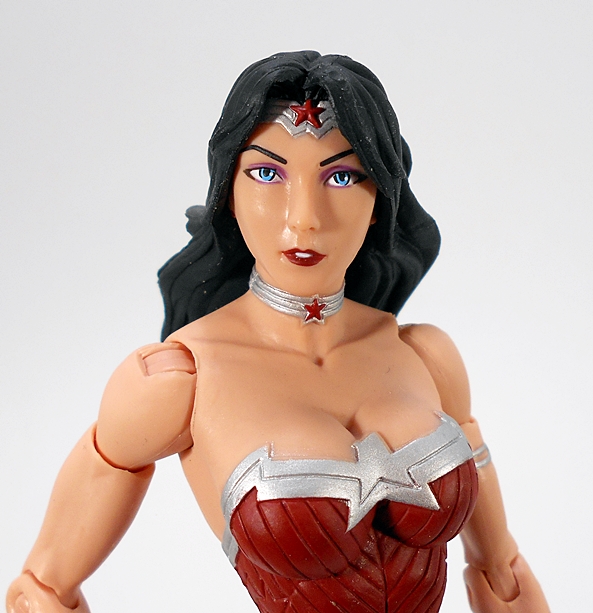
When I did my Trinity War Feature, I suggested that Wonder Woman was sporting a new head sculpt, but it turns out that isn’t the case. There are some natural variances in the paint, but they’re quite subtle and it is the very same portrait. I’d say I like this one a little more, just because the eyes are a wee bit straighter, but otherwise they’re both fine and very attractive. I really like the detail and paint on both the choker and the tiara. And oh, look! Bewbs!

dcwcbh12

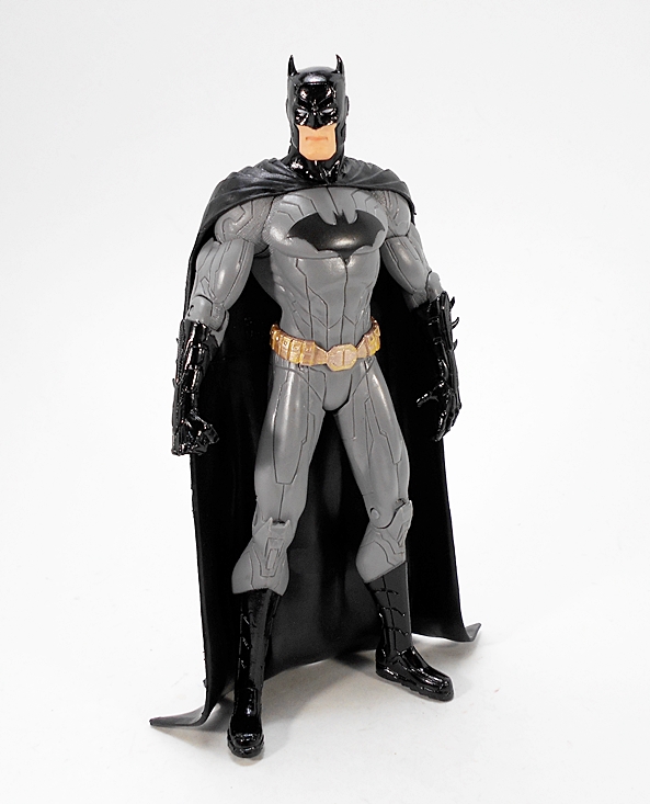
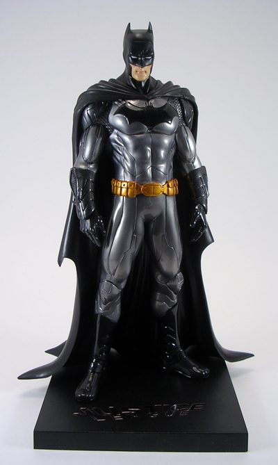
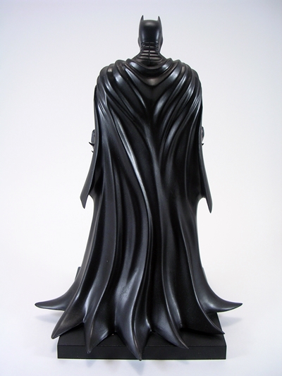
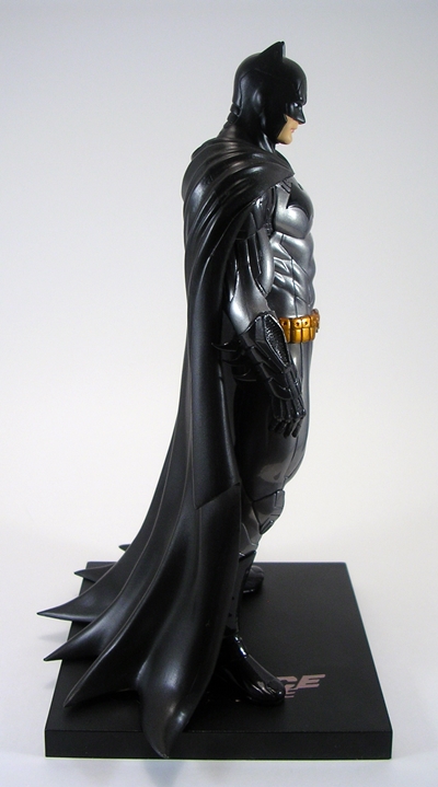
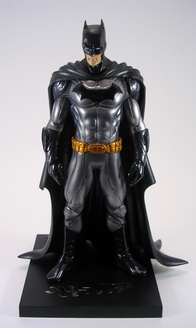
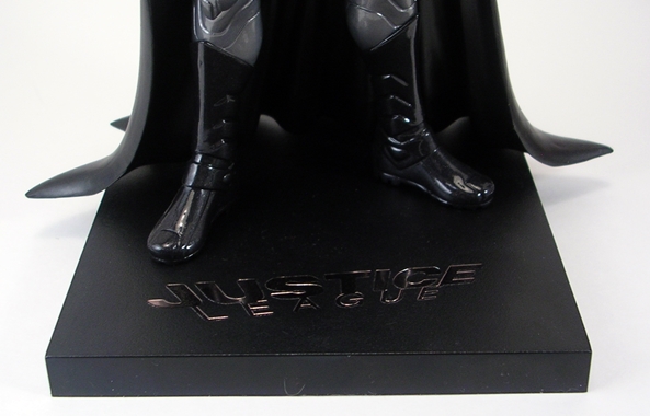
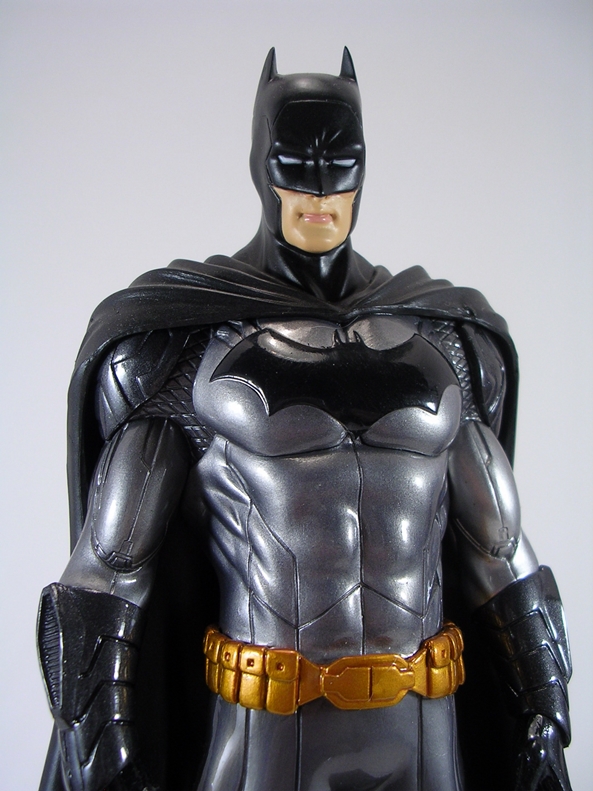
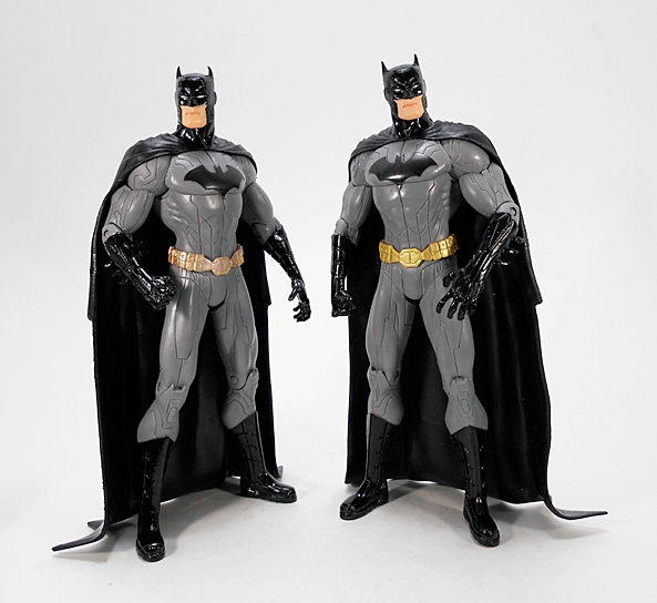
And last but not least, we have Batman. Like Wonder Woman, this figure is exactly the same as the one released in the Trinity War set and I’m going to irk a lot of people by once again saying that I really like this costume a lot. Granted, it’s not a huge departure from some of Batman’s iconic looks. You get the same sculpted detail as the other figures, right down to the panel lines and mesh material at the joints, and some very spiffy high gloss black paint for the boots, gloves, and cowl. It makes for a striking contrast against the matte gray finish of the suit. Just lovely!

dcwcbh13

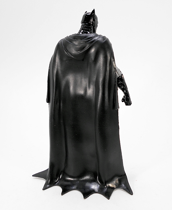
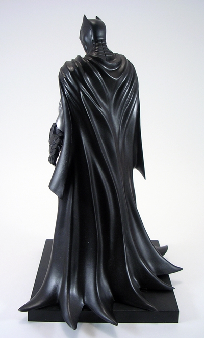
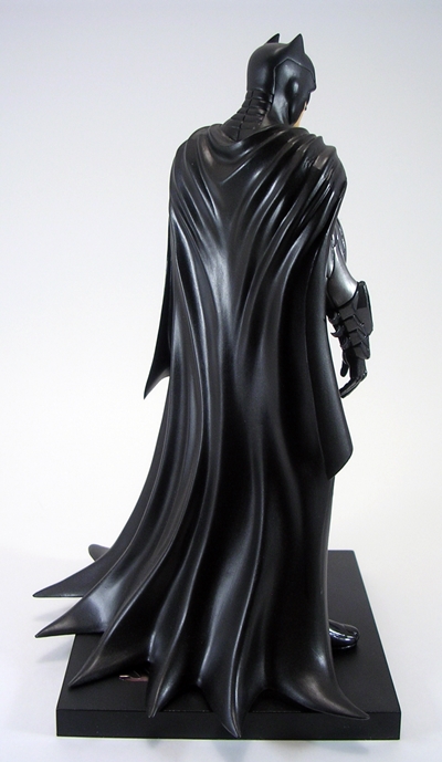
The cape falls beautifully behind the figure and the scalloped edges drag on the ground. It’s a bit heavier than Superman’s and I love the way the folds are sculpted up near the top. It looks as much like a shroud as it does a cape, and that’s certainly appropriate. The articulation here is identical to Superman and Wonder Woman, so there are options, but I really can’t get any super cool fight poses out of him.

dcwcbh14

dcwcbh15

Once again, a really solid head sculpt with a beautiful contrast between the skin tones of the face and the gloss black paint of the cowl. Batman sports a grim expression, which is quite fitting. Let’s check out some quick comparison shots of the figures with the Trinity War releases on the right and the figures from this set on the left…

dcwcbh16

dcwcbh19

dcwcbh7

dcwcbh17

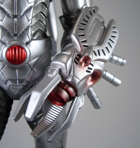
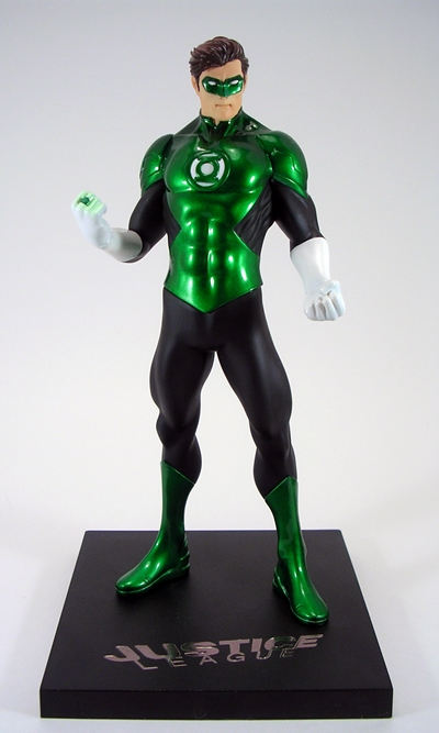
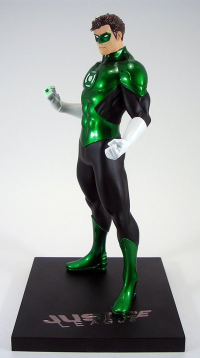
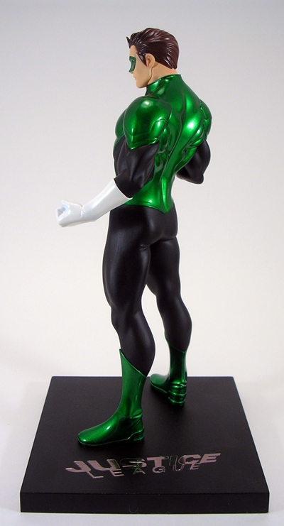
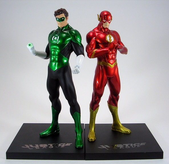
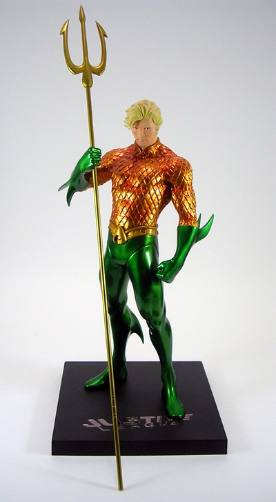
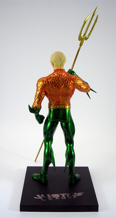
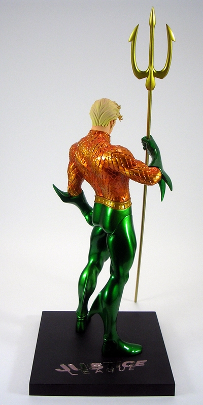
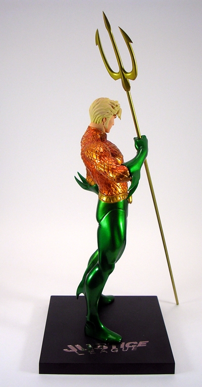
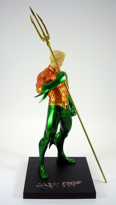
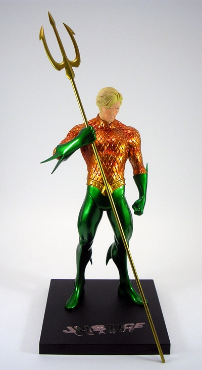
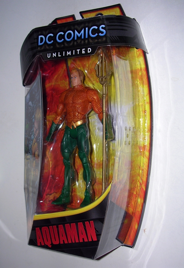
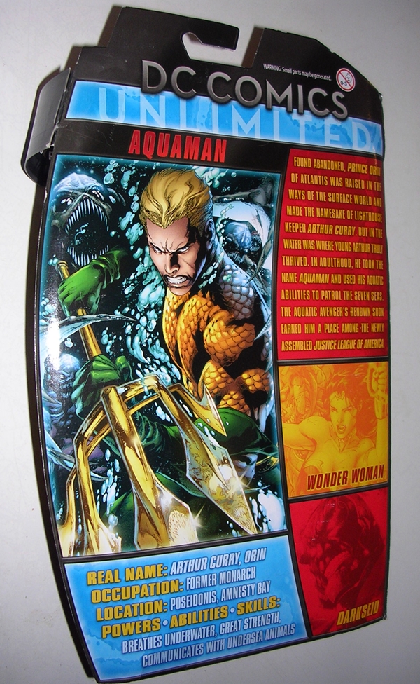
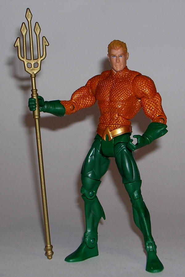
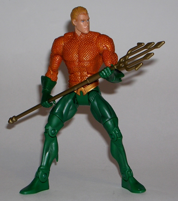
I knew when I was going in that I was going to be double dipping on some of these figures, but that was OK by me, because I didn’t have any of the other members of the Justice League in this set. And besides, the Superman is different, so it was really just two figures that were already in my collection. And while the set was originally about a hundred bucks, I found mine for a ridiculous $45. And if you hunt around, the set can still be had for very close to that price. They aren’t the most articulated figures out there, but the sculpts and paint on these three are truly fantastic. On the next DC Friday, I’ll have a look at Aquaman and Green Lantern!

Justice League War (DC Animated Movie Series): Shazam by DC Collectibles

It’s DC Friday again, and I’m almost to the point where I’m caught up on opening my backlog of DC figures. It’s possible that I might start switching up Friday content a bit in the future, but I’m hoping it won’t come to that. I’ve got the rest of August and part of September covered, and by then, I’m hoping some new stuff will start rolling in. Today, I’m looking at my last figure from the Justice League War animated film, Shazam!

dcashaz1

Here’s the obligatory shot of the packaging, or at least the best one I could salvage after my cat hit the table while I was taking it and I didn’t realize the picture was wrecked before I tore open the package. Whoops! Again, it’s clean and simple, and it shows the figure off beautifully. There are some stills from the movie printed on the card behind the figure, and some shots of other figures in the series on the back of the card. It’s not at all collector friendly, so let’s rip this sucker open and see what we’ve got!

dcashaz2

Because of the animated style, this line focuses more on paint than individual sculpts. Indeed, Shazam here is a repaint of the Superman body, and that’s a good choice that works well. The costume is mostly deep red with gold paint for the boots, belt, wrist bracers, and some gold and yellow for his chest emblem. Overall the paint is neatly applied, although there are some areas, particularly around the cape’s trim, which could have been sharper.
The cape is the only newly sculpted piece for the costume. It’s fairly light and very pliable, but it still makes him a little back heavy. The hood is sculpted down, which is the way I prefer it. I have passed on at least a couple of Shazam figures because the cape was permanently up.

dcashaz3

The head sculpt is one of the better ones in this line. Yes, that’s a loaded compliment. Superman’s sculpt was a lumpy mess, Green Lantern’s was a painted nightmare, the rest have been OK. I think they did a pretty good job capturing the animated style in this portrait and the paint is fairly clean. There are, however, a couple of stray marks on his bottom lip that unfortunately look like cold sores. Hopefully them old wizards have a cure for herpes!

dcashaz4

dcashaz5

The articulation has been a standard in all the male bucks of this line. You get rotating hinges in the shoulders and elbows, swivels in the biceps and wrists, ball joints in the hips and neck, and hinges in the knees. There’s no articulation in the torso at all. These are not highly pose-able figures, but I’d still rank them as better than most of the releases from the dark days of DC Direct’s premier lines, where nothing but t-crotches and swivel cuts were the order of the day. Still, there’s only so much you can do with him, hence the limited number of shots I used for this Feature.

dcashaz6

dcashaz7

By now, you all know that this line has been hit and miss for me. Shazam was the last one I have to open, and seeing as he’s one of the better ones, so I’m happy to ending my look at this series on a positive note. If I ever stumble across The Flash at a decent price, I’d probably grab him to complete the Justice League War set, but otherwise it’s safe to say I’m finished with these. Even though I picked up all of these for ten bucks a pop, my hindsight is telling me I should have passed on them. At a time when I’m trying to tighten up my collecting habits, the amount I spent on these figures could have paid for a Cover Girls statue I needed, or even one of Mezco’s upcoming One:12 Collective releases.


Justice League War (DC Animated Movie Series): Superman and Wonder Woman by DC Collectibles

Marvel may be ruling the world of live action movies, but DC has long been kicking ass with their animated direct to video presentations. Justice League War was one of these and boy was it great. Superb characterization, a really fun Batman vs. Superman fight, some dude called Wonder Woman a whore and got outed as a transvestite, and overall a really good feature length treatment of the first story arc from The New 52’s Justice League book. Rather than just bring us animated Jim Lee art, these films tend to skew a little more stylized and if nothing else that gives them the opportunity to market action figures of the same characters to idiots like me.

dcasww13

Now let me say straightaway, that I would have included Batman here, but for some inexplicable reason, they didn’t make a Justice League War version of Bats. Shazam? Sure! Batman, nah! That seems really shortsighted to me, but they did release him from Son of Batman, naturally I have him and I’ll get to him eventually. Anyway, the packaging here looks nice, but it’s a simple bubble on card affair and not collector friendly. You get some stills from the feature behind the figures and character art on the right panel insert. The figures are numbered, with Superman and Wonder Woman being #2 and #4, respectively. Let’s start with Superman!

dcasww1

Oh, boy. This is a stylized re-imagining of the New 52 look, and I think the work on the costume is pretty solid. Keep in mind that this line uses some buck sharing, so with the exception of the cape, all the details on Superman’s costume are achieved with paint alone. I like the rich shades of blue and red they used and for the most part the lines are fairly sharp. The intricate panel lines of the comic look have been toned down to just a few. The package suggests these might glow in the dark, but I don’t see much evidence of that. There are a few unfortunate globs of glue on my figure, one by his right cape attachment and another on his left bicep. These were priced about the same as regular DC Collectibles figures, but the quality control on Supes could have been better.

dcasww2

The cape is OK. It’s not too heavy and it doesn’t drag on the floor, so it doesn’t inhibit wider stances. There’s no S-shield printed on the back. I can’t remember if he had it in the film, but I’m guessing not. Moving on to the portrait…

dcasww3

Sweet Kryptonian Jesus!!! While everything from the neck down is passable, I don’t know what is going on with this head sculpt. It’s like someone cast older Robert Z’Dar to play Supes. Too soon? Sorry Z’Dar fans. Anyway, this portrait is just all sorts of wrong and I’m hoping that the mold got pinched in production or something, because I don’t want to call anyone out on their work. Phil Ramirez sculpted him and he’s a talented guy. I have lots of his work in both action figure and statue form, so I’m just not sure what happened here. The promo pictures were actually spot on and should have been enough to warn me off the figure, but I remember thinking, there’s no way the actual figure’s portrait is going to look like that. I have no one to blame but myself.

dcasww4

Articulation is pretty good for a DCC release. You get rotating hinges in both the shoulders and elbows, as well as swivels in the biceps. The wrists look like they have swivel cuts, but mine won’t budge and I don’t want to twist them off trying. The legs are ball jointed and the knees are hinged. And lastly, you get a ball joint in the neck. Let’s move on to Wonder Woman…

dcasww5

Diana is an entirely different story, in that she’s excellent in almost every way. Granted, you have to buy into the the stylized design, and the fact that her costume got a pretty unique overhaul for this movie, but I happen to like it a lot. Wonder Woman is the only female in the Justice League War series, but I believe they might have recycled some of the parts for the buck for Mera from the Throne of Atlantis.

dcasww6

Either way, her costume is also all achieved through a deco of red, blue, and silver paint, coupled with some flesh tones. There are a few lines that could have been sharper, there’s a stray spot of silver on her left heel, but all in all, I think the paint is good here. Her sculpted lasso is permanently attached to her hip.

dcasww7

While Superman looks like he caught a freight train full of bees with his face, Wonder Woman’s portrait, sculpted by Jack Mathews, is very well done and quite faithful to her likeness in the film. The painted features on her face are very sharp and I especially dig her ponytail.

dcasww8

The articulation here is close to Superman’s, just minus the bicep swivels.

dcasww10

dcasww11

dcasww9

Wonder Woman comes with her short sword. It’s a welcome accessory, because she used the sword a lot in the movie… even to inadvertently demand ice cream at the point of a blade.

dcasww15

dcasww14

dcasww12

I’d call my first foray into the DC Animated Movie Series to be a hit and a miss. Superman would have been fine if not for his unfortunately weird face, but I’ve got nothing but love for this Wonder Woman. In fact, she’s so good it makes me all the more sad that I don’t have a decent looking Superman to go with her. Ah, well… I also have a lot more of the Animated Movie Series to open, because most online retailers were blowing them out at $9.99 and I can’t help myself.

Justice League: “New 52” Stargirl by DC Collectibles

Once again, my DC Friday feature is spilling over into the weekend. This time, I had to dig out my Toy Closet from the backlog of receivings just to get to anything and there’s still a big pile of toy boxes impeding my entry. Anyway, better late then never and today I’m opening another DC Collectibles figure… Stargirl! I thought Stargirl was an odd choice for this line, as she hasn’t exactly lit up the “New 52” or at least not the books that I’ve been reading. Appearances in Justice League Dark and Trinity War kept her on the radar, but for me she just isn’t quite the same unless being shadowed by her robot buddy, STRIPE. Of course, none of this stopped me from picking up the figure, mainly because I have fond memories of her from the old DC continuity and she was really, really cheap.

dccsgirl1

Oh, bugger! I forgot to take the in-package shot before I tore it open like an animal. I threw one in anyway. You get the idea. Courtney comes in the fairly standard white window box with a blue swipe across the front. The side panels denote the figure inside for easy access if you save the boxes and store them lined up on a shelf. The back panel shows off the other three figures in this assortment. I’ve already looked at Zatanna and Constantine. I’ll get to Hawkman sooner or later.

dccsgirl2

dccsgirl3

Stargirl’s costume didn’t undergo a major change for The New 52. She still has the cut-off, mid-riff revealing blue top with a large star on her chest and smaller ones lining her sleeves. Blue mask? Check! Red gloves? Check! The biggest departure is that they gave her a full set of pants, in this case the same shade of blue as her top, and red boots. She also has a red utility belt with pouches. This was a pretty simple outfit to sculpt, but I think DCC did a beautiful job on her, mainly because of the gorgeous blue and red paint, sculpted seams, and crisp lines around the stars.

dccsgirl4

The portrait is pretty good too, especially considering the last Stargirl figure I bought was the one from DCUC, Wave 19 and gave Courtney a freaky Stepford Wives kind of smile. Here she’s wearing a fairly neutral expression and the paint on her eyes and lips is solid. Indeed, the only place the paint on this figure stumbles a bit is with some yellow transfer from her blonde hair onto her right shoulder. Thankfully, it’s not even noticeable if you keep her head facing front.

dccsgirl6

dccsgirl7

Articulation here is better than average for a DCC release. The arms have rotating hinges in the shoulders, swivels in both the biceps and wrists, and hinges in the elbows. The legs are ball jointed at the hips, have swivels at the tops of the boots, and hinges in the knees. The neck is ball jointed, but because of the long sculpted hair, there isn’t a lot of room for movement. Alas, there’s no articulation in the torso, but even still, she made out pretty well compared to some other DCC releases.

dccsgirl8

dccsgirl9

Courtney comes with her Cosmic Staff, which is sculpted in gold plastic and looks great in her hand. I do wish both of hands were able to grip it, but her left hand is sculpted into a fist.

dccsgirl10

I always enjoy it when a company takes a lower tier character and knocks that figure out of the park. That’s exactly what it feels like DC Collectibles did with Stargirl here. Yes, there are other characters who probably deserved this slot more, but I’m not going to argue when the figure turns out this good. Nice sculpt, gorgeous paint, and better than average articulation for the line. Toss in the fact that she only set me back ten bucks, and I’ve got nothing to complain about! And she looks damn good with my DCUC STRIPE figure too!

Justice League: “New 52” Pandora by DC Collectibles

It’s Saturday, but since I missed posting yesterday, I’ll continue to be faithful to the spirit of DC Friday as I attempt to work my way through the stacks and stacks of DC related figures and statues that have been piling up here. Today I’m checking out Pandora, the mysterious lass who haunted much of the New 52 until her mystery was finally revealed in Trinity War. Part of the Trinity of Sin, she, along with The Question and Phantom Stranger, was cursed to walk the Earth for eternity. I really liked the build up to this story, but the pay off was certainly disappointing. Don’t get me wrong, I love me the Crime Syndicate, but this was a real strange way to facilitate their return. Still, it certainly was a surprise.

dccpand1

Anywho… Pandora comes in the usual DCC window box. It’s white with the purple slash on the front and pretty bland. The top flap features the Justice League logo at the top and the window gives you a pretty good look at the figure in case you want to check her for paint quality. Everything is collector friendly and you even get an extended back with a J-hook if you want to swing it on a peg.

dccpand2

Even if I wasn’t intrigued by Pandora from the beginning, I’d like to think that I would still get a kick out of this figure because she looks fantastic. I get a major Dante vibe off of her, you know from Devil May Cry? I think it’s the design of the outfit. The sculpted detail on the costume is excellent, from the button down flap on her tunic to the laces on her high top boots and all the little wrinkles and rumples. The outfit is comprised of layers of very soft plastic, which include the lower flaps of her jacket and the outer cloak.

dccpand3

The cloak bellows out nicely, which allows for a windblown look if she’s standing at ease, but also facilitates some of those action poses. It doesn’t feel at all restrictive. There’s some great texturing in it as well as all the little sculpted stitches. When it comes to paint, Pandora’s outfit doesn’t offer a lot of colors to work with here, but the maroon is certainly faithful to the design and there’s a great black wash to help pick out all the little details.

dccpand5

dccpand4

The head sculpt is also top notch and has some crisp paint to back it up. Pandora sports pupil-less eyes, purple hair and mascara, and her jagged scars on her cheeks. The portrait is rounded out with some high gloss paint for her lips. The hood is technically removable, but the head isn’t completely sculpted in the back, so you’ll want to leave it on.

dccpand6

dccpand7

The articulation here is solid for a DCC figure. The arms have rotating hinges in the shoulders, hinges in the elbows, and swivels in the wrists. The legs feature a T-crotch in the hips, hinges in the knees, and swivels at the tops of her boots. There’s no articulation in the torso, although she does have decent neck articulation, thanks to the hood being separate from the cloak. The only thing I’m really missing here is some lateral movement in the hips. All the joints on my figure were fine right out of the package with no fears of sticking or breakage.

dccpand8

dccpand9

dccpand10

Of course, Pandora comes with her twin automatic pistols, supplied by Marcus Kincaid. She can wield them in both hands and they can also be worn in the functional holsters attached to her thighs. Beyond being decent sculpts, there’s actually some painted detail to the grips and the blue on the sides.

dccpand12

And last but not least you get Pandora’s Box, which is a particularly nice little bit of sculpt right down to it’s three little eyes. Hmm, three… I wonder what that could signify? Yeah, too bad after all that drama it just turned out to be a gateway to Earth 3. I was expecting more.

dccpand11

Who doesn’t dig a mysterious chick in a bad-ass cloak toting dual handguns? Pandora was a cool story hook and a damn cool character who had me intrigued from the get-go. And I’m very happy to say that DC Collectibles did her proud with this figure. She looks amazing, and while I would have liked her to be a tad more limber, she still ranks up there as one of my favorite figures in DCC’s New 52 line up. The fact that she can be had now for about $12? All the better!

DC Comics: Cyborg ArtFX+ Statue by Kotobukiya

Well, it took a while, but my OCD finally got the better of me and forced me to complete my collection of Justice League ArtFX+ statues. I make it no secret that I was against Cyborg as part of the Justice League back when The New 52 was launching. I wouldn’t say I’ve come to eat those words, but I will say that I have enjoyed what they did with him and I no longer feel that he diluted the greatness of the team as much as I thought he would. His ability to assimilate the power to create Boom Tubes was probably alone worthy of his addition to the roster. So why drag my feet on buying this statue? I’m just not crazy about his New 52 design and this statue seemed to accentuate a lot of what I didn’t like about it. Nonetheless, I crumbled and bought him anyway. Let’s see if it was a good idea.

kotocyb1

kotocyb2

It’s been a while, so let’s talk about the packaging. These clear plastic boxes were a neat concept, but ultimately I don’t like them. The plastic is flimsy, it scratches easily and they don’t store well. I like the idea of assembling all the art panels together behind the statues as a display option, but I don’t have that kind of display space available, so that leaves much of the appeal here lost on me. Ultimately, I save my statue boxes in case I move or I need to pack them away because they’re being rotated out of display for a while. These boxes don’t really fit the bill for that purpose and so I’ve gone and pitched them. Suffice it to say I’m happy that the Avengers statues will come in proper cardboard boxes with styrofoam trays.

kotocyb3

kotocyb5

kotocyb6

Cyborg features a very museum-style pose. He’s standing at attention with his chest out and his arms are hanging at his sides. Appropriately, Cyborg has the most complex sculpt of all the ArtFX+ Justice League statues. He looks magnificent! His cybernetic armor is replete with panel lines, overlapping plates, and beautiful contours. He’s bulkier than the other statues and while I’m overall happy with the proportions, I do think the feet are a little big when compared to most of the comic art… they look rather Mega Man-ish to me. Now, I’ve got no problem with The Blue Bomber, but I don’t necessarily need those aesthetics in my Justice League statues. I’m writing it off to the anime-style of these pieces. Don’t get me wrong, it’s nothing that ruins the statue for me, but I thought I’d mention it anyway.

kotocyb12

One of the main attractions on this piece is his sonic arm cannon, which is delightfully complex. It’s got all sorts of bits coming off of it and great texturing. The red paintwork on the lights is a little uneven, but that might be intentional to create a light effect. The contoured backpack is another really nice feature of the statue. It has a retro-vibe to it that adds plenty of character to the design.

kotocyb13

The portrait here is quite good. The face is a tad soft, but I think that works well when contrasting with the cyborg part of the head. He has a determined expression and a distinctive broad nose. Cyborg’s likeness is definitely the least anime-stylized of all these statues. The paint lines around between the skin and metal are all sharp.

kotocyb7

kotocyb8

kotocyb9

Speaking of paint, there’s not a lot paint operations on the statue, but that’s because Cyborg is mostly silver. I love the finish they used on this piece. Ironically, despite intended as metal, it seems slightly more matte than the other statues’ costumes, but it looks spectacular. The only other paint worth mentioning besides the head and the red lights on the arm cannon are the red discs on his chest, belt, and backpack.

kotocyb10

As with all of these statues, you get a black square metal stand with the “Justice League” logo on it. Cyborg has the magnets in the feet to help him stand, although I was surprised that even with such big feet he’s a little wobbly.

kotocyb11

kotojlset

In the end, I’m glad I picked up Cyborg. At about $36 he was one of the more expensive statues in this line, but that’s still a crazy low price for such a wonderfully crafted piece. I can’t say that my Justice League display felt all that incomplete without him, but he sure looks great on the shelf with the rest of the team. I’ve certainly grown to accept the character as part of the team in the comics so why not have him in my display as well? And that wraps up the Justice League ArtFX+ line. I still have a couple of the stand-alone DC Comics ArtFX+ pieces to pick up, but next time we visit these statues it will be to look at Black Widow from The Avengers!

DC Comics: Green Lantern ArtFX+ Statue by Kotobukiya

Ok, kids, we’re in the home stretch. I’ve got five Justice League statues under my belt and Hal Jordan makes six. I’ve been in a bit of a mad dash to complete this collection before Koto starts shipping the first in their Avengers ArtFX+ line and that should be any day now. [Oh shit, The ArtFX+ Hulk statue just dropped into my Pile of Loot as I am editing this!] I’m so close, but I have a feeling I’m going to fall one short what with Cyborg still looming out there and a lot of other things vying for my dollars over the next couple of weeks. Anyway, let’s jump right in and take a look at Koto’s treatment of Hal Jordan Green Lantern!

artfxgl1

artfxgl2

Once again, the window boxes that Koto developed for this line look really nice. There’s a panel of character art that links up with the character art on the other statue’s boxes so you can make a nifty backdrop. Also, two sides are transparent and if you unwrap the statue inside and put him back in, you can totally display them in these boxes and still get a pretty good look. As I’ve said all along, the only problem with this packaging is it feels rather fragile and susceptible to dings and scratches. I save all my statue boxes in case I need to move them or put them into storage, but considering I don’t have the room to display these boxes on my shelf, I’m not sure whether I’ll be bothering to hang on to them. Right now the boxes are all lined up at the tippy top of a bookcase, out of sight, and not hurting anyone, so I’m in no rush to make that decision. The statue comes nestled between two clear plastic trays with the base below it. There’s no assembly required so Hal is already for display.

afxgl3

afxgl4

afxgl5

For the most part, Koto has kept the composition of these statues pretty similar to each other and Green Lantern toes that line. He’s more or less sporting what I would call a “museum style” pose, as opposed to some crazy action scene. It’s a triumphant stance that let’s you take in the details of the individual character design, but it was also clearly designed to work well in the “group shot” scenerio for those collecting and displaying the entire line together. That’s not to say the composition is boring. With cocked elbows and clenched fists, there’s definitely an implied sense of energy at work here and I like it a lot. As one would expect, Hal’s power ring is displayed quite prominently on his raised right fist.

afxgl1

The portrait here is excellent. It certainly conveys the more youthful nature of the “New 52” Hal Jordan. While several of these statues have had a strong anime, and some would say Asian, influence in their faces, Hal is masked so it really isn’t as obvious here. The sculpted detail of his coif is also nicely done and I really dig the ever so slight cocky smirk on his lips. In terms of the costume, Green Lantern’s new digs doesn’t play up the panel lined armor effect as much as say Batman or Superman. In fact, the only place it’s present at all is in the shoulders. Nonetheless, the musculature is well defined, particularly in the back and abdomin. I also like the way the tops of the boots are sculpted to appear separate from the rest of the costume. This piece is certainly one of the simpler sculpts in this line, but that doesn’t make it any less striking.

afxgl6

afxgl7

afxgl8

afxgl9

Green Lantern deviates a bit from the other Justice League statues in that his costume showcases some matte paintwork as well as the metallic high gloss that has characterized these pieces. In the past releases the matte finish has been largely confined to the capes and skin tones, but here it’s also used for the black portions of the costume. I think the contrast works well and the metallic emerald green finish on this figure is absolutely gorgeous. Another wonderful touch is the very faint green paintwork applied to the white gauntlet around the power ring that makes it look like it’s glowing.

afxgl2


Hal includes a stand, and by now you should know the deal. It’s a simple square black metal base with “Justice League” lettered in silver on it. The metallic base works with the magnets in the statue’s feet to hold him up and it also allows you to position him anywhere without unsightly pegs. I’m really beginning to appreciate this feature, as I will likely be condensing the statues a little closer together to save some shelf space for when the Avenger’s start shipping. You can do this by using less stands and having some of the statues share. It’s worth noting that Green Lantern is a tad wobbly on his feet, but the magnets do a fine job securing him to the base.

afxgl10

afxjlgrp1

Obviously I’ve been enjoying the hell out of this line from the get-go and Green Lantern lands me the last of the heavy hitters. Yeah, Cyborg has been a pretty important character in the book and I honestly like what they’ve been doing with him, particularly his acquired ability to create Boom Tubes, but right now I don’t feel a biting sense of urgency to pick him up. Sure, I will add him to the lineup eventually, but I may wait for a dry spell or possibly when I need to toss something extra into my Pile of Loot before shipping it out. What’s that? Will I be buying any of DC’s non-Justice League members in the ArtFX+ line? Oh, I already have. Next time we revisit this line, we’ll check out Catwoman!

DC Comics: Batman ArtFX+ Statue by Kotobukiya

Since the beginning of the year, I’ve been piecing together my collection of Kotobukiya’s excellent ArtFX+ Justice League statues and with four members down I’m finally over the hump. Today we’re checking out Batman, a statue that I was particularly excited to get because I am so very fond of his “New 52” look and word on the street was that this piece really did him justice. HA! See what I did there? Ok, moving on…

afxbatm1

afxbatm2

There’s the packaging in all its great-looking but fragile glory. I still have not decided whether or not to try to keep these boxes. I doubt very much they will endure storage very well and I don’t have the shelf space to display the statues in front of their character artwork. It’s also worth noting that Batman’s box is obnoxiously large compare to the others. It’s odd because he isn’t much broader than Superman, but I suspect it has to do with the bottom of his cape. Either way, this was the box that killed any ideas I had to display them in front of their linking character art, unless of course I decide to snip out those panels, which is always a possibility. Either way, Batman comes lovingly wrapped in plastic and with no assembly required other than placing him on his stand.

afxbatm4

afxbatm5

afxbatm6

In terms of composition, Batman is the closest of all the statues to what I would consider a “museum” pose. He’s just standing there, arms at his side with his head cocked down a little bit. This piece doesn’t have that same sense of coiled energy or anticipation of action as the other statues, but that’s not a criticism, because in this case it just lets me take in that amazing suit. Many people have complained about the panel lining armor that makes up some of the “New 52” Justice League costumes, but nowhere is that armored look more appropriate than on Batman here. Besides the cut panel lines in his costume, the detail on the gauntlets and boots is particularly well crafted, as are the individual pouches on his utility belt. Even the internal webbing under his shoulder armor has been clearly sculpted.

afxbatm7

afxbatm8

afxbatm9

It’s the sculpted cape, which gives Batman the extra heft because, unlike Superman’s cape, it trails all the way to the ground and splays out on the floor. It’s a major departure from the shorter cape that Mattel employed for the “New 52” Batman figure in their DC Unlimited line, but the Koto cape tends to be more accurate with the comic art. Sure, trailing a cape around on the ground isn’t exactly conducive to action and brawling, and it’s a tad annoying the way it extends out beyond his base, but I can’t help but love the shrouded and imposing look it give the statue. Even the way the cape rests on his shoulders looks fantastic.

afxbatm10

afxbatm11

afxbatm12

While Batman is the most muted deco in this collection, it doesn’t make the statue’s coloring any less impressive and that’s mostly thanks to the metallic finish. The high gloss metal-grey mixed with the black sheen of the boots and gauntlets looks amazing, and when you toss in the metallic gold of his belt, this statue can compete with the far more colorful likes of Superman and Wonder Woman. Now contrast that with the matte black used for the cape, cowl, and skin tones and you have a piece that really pops on the shelf.

afxbatm14

And as with all the statues in this line, Batman comes with a black metallic square base with the “Justice League” logo on it. The magnets in his feet mean that you can position him anywhere on it, or even straddle two bases to customize your display to your liking. Of course, with Batman’s solid stance and cape, he stands just fine on his own.

afxbatm3

afxbatm13

If you’ve been following my features on these statues, then you know I’ve been very pleased with all of these releases, but Batman here is nothing short of breathtaking. And if you’re one of those people who can’t get behind the anime style of this line’s portraits, Batman is still worth a look because his cowl covers most of his face and the style isn’t really apparent in him at all. While I’ve been able to pick up all of the statues so far at just under $30, Batman set me back the full $40 with shipping and I’ve got no regrets, particularly since with Superman and Wonder Woman he completes my DC Trinity. The next statue coming my way is Green Lantern and then I have to decide whether or not I’m going to complete the set with Cyborg.

DC Comics: Aquaman ArtFX+ Statue by Kotobukiya

It’s been over a month since I last revisited Kotobukiya’s “New 52” Justice League statues from their ArtFX+ line. I haven’t forgotten about these! With Superman, Wonder Woman, and The Flash already under my belt, let’s pick up where I left off, this time with everybody’s favorite fish-whisperer, Aquaman. As some of you may know, I’ve never been the biggest fan of Aquaman, but I think he’s fared quite well since the whole reboot. He’s been a pretty integral character to the Justice League book and he’s been at the heart of one of my favorite JL story arcs so far. I’ve even gone so far as to pick up the first two collected volumes of his book and they’re waiting on my stack of vacation reading. That’s the first time I’ve ever bought an Aquaman comic, so that’s saying something.   

afxaman12

afxaman13

Obviously, we’ve seen this packaging before. These statues come in clear plastic boxes with character specific artwork that makes for quite a striking presentation. The panel of character art is designed to link up with the art on the other boxes in the series to provide a nice backdrop for all the statues. The statue rests between two trays, and once you unwrap the surrounding plastic, the statue can display fairly well if returned to the box if you’re someone who prefers the mint-in-box look. On the downside, the packaging is rather fragile and probably won’t fare too well in storage. The stand is positioned just below the characters feet and the only assembly required is to connect the trident head to the staff and then slip it into Aquaman’s hand. Let’s get this guy loose and see how he looks.

afxaman3

afxaman4

afxaman5

He looks fantastic! The composition here is quite similar to the one Koto used for Superman with the key difference being Aquaman’s right arm is held up to grasp his trident. While the pose is fairly passive and self-aware, the stance still manages to convey a sense of energy and excitement. The sculpted detail in the costume offers a wonderful contrast between the smooth lower half and gloves and the upper armor, which has every single scale sculpted. The leg fins are a bit understated and the twin fins in the gauntlets look rather vicious. Koto’s statues rarely disappoint on the sculpt, and Aquaman is no exception. At 1/10th scale, these statues are in a league of their own. They’re notably larger than the DCUC and DC Collectible figures and yet a bit smaller than Koto’s Bishoujo statues. I think the scale works well as it allows for a good amount of detail, while not taking up too much shelf space.

afxaman1

The portrait bears the same anime influences that have carried through the rest of this line. Aquaman’s eyes have a certain Asian countenance, which may throw some collectors. I rather think it adds to the more youthful art styling of the “New 52” League members, so it doesn’t bother me one bit. Like Superman, Aquaman is holding his head slightly down and gazing up to the side. Because of the orientation of the heads, these statues are probably best displayed on a high shelf or at least at about eye level. Otherwise, the portrait sculpt is amazing, and I’m particularly impressed with the way the hair came out.

afxaman6

afxaman7

afxaman8

One of the most striking things about this line of statues is the high gloss metallic coloring. It’s been a selling point for me all along and I think it suits Aquaman the best of all. Besides the beautiful metallic gold on the scales, the slick glossy sheen on the pants and gauntlets makes it look like he just leapt from the ocean. Beautiful!

afxaman9

afxaman10

And that brings us to the Trident, which is the only point of this statue where I have some qualms. It’s a nice and simple accessory and he looks good holding it, but I do wish it wasn’t quite so long and I would have much preferred that it was designed so that the butt of the shaft rested on the display base, rather than far to the front. With all the other statues confined to their bases, Aquaman sticks out a little awkwardly on the shelf as a result of the trident, and you can’t really pose him without it because he’s designed to be holding it.

afxaman11

Other than the trident you get the same black metal base that came with the other statues, complete with the “Justice League” logo printed on the front. The magnets in Aquaman’s feet help him to cling to the base and you can position him on it as you like.

afxaman2

At about $25, Aquaman was the last of these Justice League statues that I was able to pick up at well under retail and that was a big reason why he was my next purchase. But even at the regular retail price of around $40, these statues feel like an incredible value. As I’m sure I’ve mentioned before, I had no intention of getting into this line, but after seeing the reviews and pictures from a certain kool kollector overseas, I was immediately sold. Individually, they are gorgeous pieces and together they are building up to have the makings for an epic display. I’ve got three more to go and the one of those is already on his way to me. Next time we revisit this line, we’ll check out Batman!

DC Comics Unlimited: “New 52” Aquaman by Mattel

If you’ve been reading FFZ for a while, you probably recall me making the odd remark about my borderline OCD. It’s not like I can’t go outside without checking the lock on the door a thousand times and I don’t wash my hands until I see bone. It’s just that little inconsistencies often nag at me. I’d like to think there’s probably a little OCD in any collector, so I don’t worry about it too much. What the hell does any of this have to do with Aquaman? Nothing really. It’s just that when it comes to collecting action figures, I hate not being able to complete a team, and Aquaman was the last “New 52” Justice League figure that Mattel gave us before bailing on the DCUC style in favor of that Total Heroes garbage. At least we got five members of the Justice League, but the fact that we’ll never have a proper Green Lantern or Cyborg in DCUC “New 52” style makes me really wish I had just gone with DC Collectibles’ figures in the first place. What was I here to talk about again? Oh yeah, Aquaman. Let’s check him out…

dccuaqua2

dccuaqua1

dccuaqua3

We’re going to be seeing the DC Unlimited packaging more than a few times over the next month or so. Around Christmastime Amazon had a fire sale on these figures for around $5 each and I took the opportunity to not only finally pick up Aquaman but also get some of those Injustice figures that I was holding out on. We’ve seen this before and I still dig it quite a bit. It’s not too far removed from the old DCUC packages, but it has a fresh new design and a really nice panel of character art on the front that the DCUC packages lacked. The back panel is more similar to the old style, complete with bio and some stats, as well as more of that great character artwork.

dccuaqua5

dccuaqua6

In terms of costume design, Aquaman’s really hasn’t changed much in the jump to the “New 52.” I guess when you hang out underwater with tuna all the time, you don’t always get the new fashion memos.  For those of you who aren’t a fan of the new costumes’ panel lines Aquaman has escaped that treatment. As a result, a lot of this figure is borrowed and/or resculpted from the old DCUC Aquaman, particularly from the waist down where only his fins have been resculpted. The shirt is the same great scale texture that we’ve seen on previous DCUC releases and the sculpted belt is raised from the rest of the figure in keeping with DC’s 3D design guidelines for these characters.

dccuaqua8

The portrait on the figure is quite good, with clearly defined features, neat paintwork, and a slightly determined expression. I’d rank this head sculpt closer to the better stuff we were getting out of the DC Signature line. The more youthful nature of the new Justice League is certainly conveyed here as well. Nice job, Mattel!

dccuaqua7

Aquaman features all the articulation we’ve come to expect from the DCUC format. The arms feature ball joints at the shoulders, hinged elbows, and swivels in the biceps and wrists. The legs have the usual DCUC style hip joints, hinges in the knees and ankles, and swivels in the thighs. The neck is ball jointed, he can swivel at the waist, and he has the usual ab crunch hinge in the torso.

dccuaqua10

dccuaqua9

Naturally, you get Aquaman’s ubiquitous trident. It’s cast in a matte bronze color, and I really dig the more utilitarian barbed head on this piece. It looks a lot more useful than the overly ostentatious trident from the old DCUC figure. The figure’s hands are sculpted so he can hold it in either or both.

dccuaquagrp

There’s no doubt that Aquaman is a great addition to the DC Unlimited line, even if the DCUC “New 52” Justice League will never be truly complete without Green Lantern and Cyborg. I’ll concede that this probably isn’t the most exciting figure around because, well, he’s Aquaman and he doesn’t look that much different in the “New 52” Universe. On the other hand, I’ve really enjoyed Aquaman’s current book as well as his contribution in The Justice League. He sure played a pretty big part in the third volume TPB so it’s nice to finally have his figure on my shelf.