Marvel Legends (Mantis Wave): Star-Lord by Hasbro

It’s another double-feature Marvel Monday today, folks, as I try to climb my way out of the pile of backlogged waves of Marvel Legends that are taunting me from the corner. Today I’m dipping into the MCU figures of the wave with a look at Star-Lord this morning, and Rocket & Groot later this afternoon. Let’s shang-a-lang this…

Heeeey, you can’t fool me. We just looked at a Guardians Vol. 2 Star-Lord in the last wave… What gives, Hasbro? Yes, this is a second version of Peter Quill, this time with the longer coat and scarf. To be clear, this is Star-Lord and not in any way The Fourth Doctor! Understandably, a lot of this figure reuses parts from the last release, so this review should go pretty quickly! Let’s start off with a direct comparison to the release from the last wave with a pair of Pratts.

OK, so the underlying buck is the same, but the arms are new to make up the sleeves of the new coat and also to include a pair of sculpted finger-less gloves on the hands. This new Star-Lord looks a little taller, but I think that’s just because the coat sits a little higher on the shoulders and the head may fit a little higher on the ball joint. Since the bucks are mostly the same, the articulation here is identical. so feel free to duck back and check out the articulation rundown for the Titus Wave figure.

The new coat is very nice. While it invokes his look throughout most of the first movie, the garment was redesigned for Vol. 2 and that makes it a lot different than the one on the figure from the first film. It’s not worn and tattered, and it doesn’t have all the armor bits attached to it. The sculpt is a little on the soft side, but there are still some nice details here. I particularly like the reinforced area around the shoulders, and all the seams are present. This is definitely my preferred look for the character. I’m sure the shorter jacket would be preferable in a fight, as it’s not as cumbersome, but this look has more of a swashbuckling and adventurous flavor.

The scarf is removable and simply hangs around his neck. It looks good, but it does obscure the printing on his shirt. While we’re on the subject, the shirt features the same printing we saw on the previous figure, but the shirt itself has been repainted to be a much lighter color. Did he have two colors of the same shirt in the film? I can’t remember. To be honest, I’ve seen the film three times, and I don’t even remember him wearing the scarf. It’s tough to see with the longer coat, but he still has the thigh pegs to hold his guns. Also, in the above shot, you should be able to make out the Walkman accessory that he comes with. It can tab right into his belt, and the previous Star-Lord release has the same tab, so you can use it on either figure. It’s a pretty lame accessory, though, as there are no headphones and no paint.

The new and expressive portrait features a slight smirk. It’s solid enough, but I don’t think it’s as good as the likeness we got on the last figure. The sculpt is fine, but I think the paint might not be quite so on point this time around. I’ll admit, I’m really nit-picking. Besides, the heads are interchangeable, so you can mix and match as you like. It’s certainly worth noting that this version of Star-Lord does not include the masked head, so if you want that look, you’re going to need both figures.

Last up, we have the guns, and these are the same sculpts as last time but with some variation in paint. The silver paint from the last release has been updated to a darker gray. I’m not sure why Hasbro did this, as they’re obviously supposed to be the same guns, but it’s not something that really bothers me.

This second Star-Lord is a fine figure. I do like the longer coat look better, but if pressed, I ‘d have to say that the release from the last wave is my favorite of the two. I know some people are pissed that Hasbro double-dipped on the character between the waves, and that feeling is probably aggravated by the fact that this time around you do have to buy him if you want all the BAF parts. That having been said, I like the idea of having both with inter-changeable heads. It gives you a number of display options. In the end, I’ll probably display this one with the masked head from the previous release and cast the smirking head into the Tote of Forgotten Accessories!

KanColle: Aircraft Carrier Shokaku Kai Ni “Super Premium” Prize Figure by SEGA

After stiffing everyone on Tuesday’s content this week because of real life intrusions (sorry about that!), I thought it only fair to drop by this weekend for an Anime Saturday update. It’s a beautiful morning, I’ve got a generous mug of coffee, and I’m opening up a new Kantai Collection figure by SEGA. What could be better? How about the fact that the Blu-Ray of Kantai Collection Animation Sequence arrived at my door a little while ago and I’m going to spend a good part of this weekend binging it. Oh, yeah! But for now… let’s check out Aircraft Carrier Shokaku!

SEGA has gone back and forth between window boxes and enclosed boxes for their 9-inch scale “Super Premium” figures. Shokaku comes in a fully enclosed box and this tends to be my preference, as they’re easier to collapse and store. It also makes sense here, since there’s a fair amount of assembly required for this figure and she wouldn’t look complete through a window. The box looks good, has several photos of the figure, and virtually no English text. Inside, the figure comes wrapped in plastic, along with the base, and a bunch of pieces to attach before she’s ready for display. Just give me a few ticks, and I’ll get her all set up…

…I’m back, and ain’t she great looking! While she’s 9-inch scale, the large yumi (bow) gives this figure a lot more height. Shokaku is only my second Aircraft Carrier among the many Fleet Girls in my collection. The other is SEGA’s Akagi (I don’t really count Taito’s I-401 Carrier Sub, because that one is based off a really unusual boat). Shokaku is from the game, rather than the anime, and like all the Kancolle aircraft carriers, she functions as an archer who can fire arrows that transform into support and attack aircraft. I really enjoy these carriers because they’re costumes are based on the traditional Kyudo style and looks so unique when combined with the Fleet Girls’ usual ship parts. And because Shokaku is an armored carrier, she has a lot more of those parts than Akagi did.

The sculpting here is really top notch and very detailed. Indeed, I’d dare say that this is the most complex design of all my KanColle prize figures. The pleated skirt and billowing top contrast nicely with the cold gray steel of her chest armor and armament belt. All the little belts and straps are present and convincingly “hold” her heavy gear in place. She has armored plates coming off her knees and her rudder boots, and she has a pair of AA guns mounted on each side of her hips. The attachments to all of these guns and armor plates are sculpted to look like they can articulate, but they cannot. There are some great little touches with the paint, particularly the tiny stitches painted on the him of her skirt and the bow that’s tied around her waist.

In typical Fleet Girls fashion, Shokaku carries a very long shield on her right arm, which is designed after a carrier deck. She also uses this to recover any aircraft sorties that survive their missions. The detail on the surface is a pre-applied sticker and looks really nice. I love the archer glove on her right hand. In her left hand, she holds her yumi, which includes a piece of fishing line for string. Stringing the bow is part of the assembly, and it can be a bit tricky to get it right.

The horizontal tube slung across her back is made to resemble parts of the carrier and it doubles as a quiver for her arrows. This piece was a bit tough to attach and it’s even more difficult to see as it’s almost totally obscured by her hair. She comes with a total of six arrows, five for the quiver and one to slide into her hand. You get two styles of stickers for the feathers, I just mixed them up.

The portrait is solid, but the plastic used for her skin is a tad more waxy than I would like. Still, she has a nice, determined expression on her face and her eyes are perfectly printed. She has long gray hair that fans out behind her and with strands that fall down in front of her shoulders. She also has a long hair ribbon.

The base is a simple white hexagon, with her name printed on it. It’s a fairly big base that takes up a lot of room on the shelf, but the figure takes up even more, because of her long, angled bow.

Shokaku ran me $17 shipped from Amazon and I’m still marveling at what a great deal this was. Besides being the larger “Super Premium” format, the insane amount of detail that went into this sculpt and the quality of paint makes it feel like it could have been priced two or three times that amount. In fact, I was so thrilled with this figure, I’ve already ordered her sister ship, Zuikaku in SEGA’s “Super Premium” format as well.

DC Gallery (Justice League Unlimited): Black Canary by Diamond Select

It was way back in January that I last visited with Diamond Select’s DC Gallery line of 9-inch scale PVC statues, which is basically an off-shoot of the old Femme Fatales line. What started as a low key assortment of female indie comic characters and some original designs has since ballooned into a very prolific series of statues based on both DC and Marvel guys and gals. The DC Gallery has been focusing on the Bruce Timm style of the various DC animated series.  That last one was Zatana and she was absolutely amazing. Today, I’m opening up Black Canary based on her appearance in the Justice League Unlimited series!


I dig the packaging on these statues, which consists of collector friendly boxes with windows on the top, front, and side panels to let in plenty of light. You really can get a great look at the figure from almost every angle before you even have to break the seal. It’s great for me, because currently I’m displaying all of these in package so I can stack them. The box decos are usually themed to whichever show the character is from, and in this case we just get a very dark blue box with the JLU logo on the front and the DC Gallery logo on the top corner. Oddly enough, DST refers to this one as a “PVC Diorama” but it’s still really just a figure on a base like we’ve been getting all along. There’s no assembly required, and Dinah comes right out of her clamshell trays ready for display.

Straight away, I’ll say that I love what DST did with the pose here. Black Canary is adopting a wide stance, leaning forward with arms out and hands clenched into fists, and she’s letting rip with her awesome canary cry. This piece has a lot more energy to it then most of the other figures in this series, but it isn’t so much of a departure that she looks out of place among her fellow femme fatales. As always, the Bruce Timm animated style doesn’t require a lot of sculpted detail, so Dinah relies on a lot of smooth surfaces. You do, however, get some lovely little wrinkles in her jacket, which is blowing back behind her, plus all the paint lines feature sculpted lines as well.

The portrait is especially nice. In terms of expression and the shouting mouth, this is probably one of the most complex and difficult head sculpts DST has yet to offer in this line. Mostly we just get smiles. Nonetheless, DST pulled this one off with style. The open mouth is absolutely fantastic and I love the determined expression on her face. I also love the way her hair flows back behind her to match the jacket. What’s more the paint work on Dinah’s face is just about perfect. Actually, forget the “just about” part and let’s just say it’s perfect.

So, let’s talk paint in general, because it’s crucial on these animated style statues. While I have had a few instances with DST’s Gallery statues where the quality of the paint application has been an issue, most of the time it’s been fine, and a few time’s it’s been exceptional. It’s one of the frustrating things about having to buy these online and hoping for the best, as opposed to choosing the best one off the shelf. Well, I’m happy to say that Dinah is one of those exceptional times. Here, everything is sharp and clean. There’s no rubbing or scratches on the black or gray surfaces, and virtually no slop or uneven lines to speak of. What’s more the quality of the paint itself is superb. The yellow on her hair and the blue on her jacket are both vibrant, the gray on her stockings and the skin tone are both smooth and consistent.

The base places Black Canary on a strip of road with the asphalt all ripped up in front of her. It looks pretty good, with a decent surface texture and the highway dividing lines painted in yellow. The area where it’s broken up looks a bit mushy and more like clay than asphalt, but I’ll write that off to the animated style. It looks fine and it makes for a nice little scene, but it’s nothing we haven’t seen before, and not really worth the added moniker of “PVC Diorama.” 

After the great experience I had with Zatana, I thought she was going to be a mighty tough act to follow, but Black Canary here makes the grade. The composition is excellent, the sculpt is on point, and the paint is superb. And here’s where I’m happy to remind myself that this is essentially a budget line. Black Canary retails for around $45, but I was able to pick her up on Amazon for ten bucks less and at either price, I think she makes for a great value. Right now, I’d probably put her tied for second among my Femme Fatales DC ladies. Zatana still holds the top spot, with Dinah battling it out between Talia and Poison Ivy for second place.

Transformers Titans Return: Freezeout and Topspin by Hasbro

It’s been a long while since I’ve had the opportunity to gas on about how much I love the G1 Jumpstarters toys. So many of my friends hated them, but I could never understand why. They had, what I always considered to be, Cybertronian alt modes, they’re robot modes actually looked like designs right out of the Sunbow cartoon, and they transformed instantly, making them loads of fun to play with. And oh boy, did I play with mine. They were in every battle. Particularly Topspin, just because I liked his alt mode a little more. What’s that? They were bricks? Yeah, so were a lot of G1 Transformers. That never stopped me from having fun with them.

Needless to say, I’ve been looking forward to this review ever since I saw Hasbro’s first promo shot signaling Topspin’s return to the toy aisle via the Titans Return line! It actually surprised me that it took this long to get us an updated Topspin, especially since the character was so high profile in the much beloved Wreckers comics. Indeed, the character even got the third-party treatment quite a few years back from Mech Ideas. Could Hasbro possibly churn out a better figure at about half the price? Let’s find out… but I’ll save the comparison for the end.

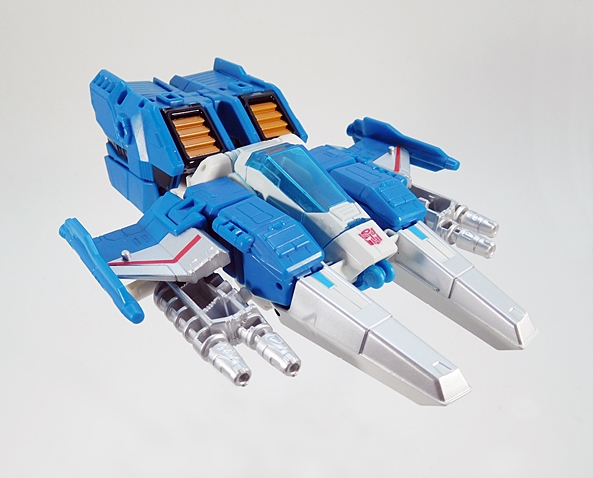
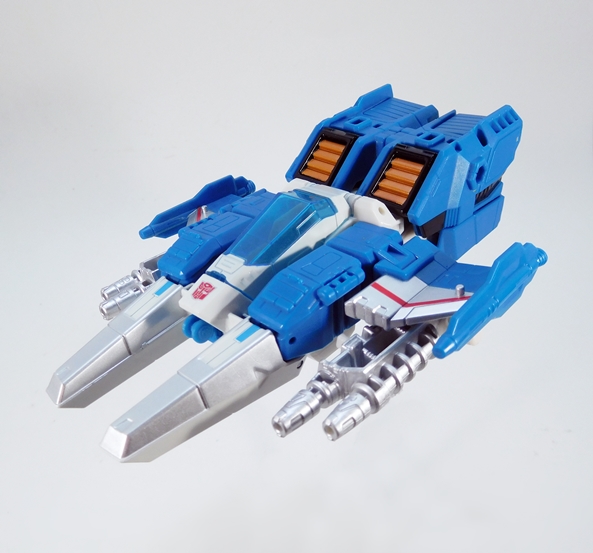
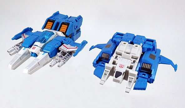
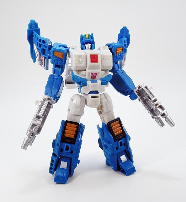
So, Topspin’s alt mode is a Cybertronian jet, which definitely pays homage to the original toy, but brings some new stuff to the table as well. Now, I always thought that the two pylons coming off the front were both cockpits, kind of like Slugslinger. Whether or not that was ever intended, this new version gives Topspin a proper single cockpit right in the middle of the jet, making those two pylons just twin nosecones of some sort. I’m strangely OK with that. Everything else is more or less right on target. The stubby wings are pushed up from the back a bit, and they have a nice little angle to them. I’m also pleased to say that this update hides the robot arms a lot better than G1 Topspin. The hunched back features a pair of intakes behind the cockpit, and Topspin wears his folding landing gear in full view, right between the nosecones. I really dig this alt mode a lot, and I can really picture him dogfighting with Triggerhappy over the metallic landscapes of Cybertron.

Oh, and will you just look at the thrusters on this guy! These are some proper Space 1999 Eagle kind of rocket boosters. Fantastic!

The coloring is very much on point. You get the very familiar blue and off-white plastics for the body. The cockpit canopy is cast in translucent blue plastic with some paint that matches the body very well. The intakes are gold framed in black and there’s some of absolutely gorgeous silver paint on the pylons and guns. The wings also have some silver with red striping to mimic the stickers on the original toy. There are a few different configurations for the guns. My favorite is the stock, under the wing, configuration. My only gripe here is that the hollow portions are exposed from the top. I wish those were filled in. Ah, well!

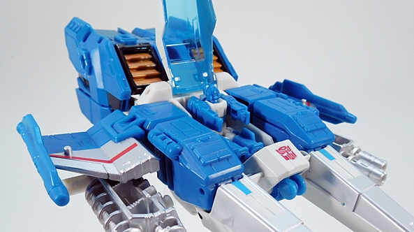
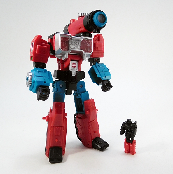
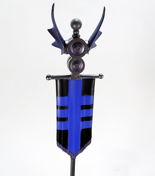
Topspin’s little Titan Master is Freezeout and as far as these little guy’s go, he’s about as typical and nondescript as you can get. He shares the same blue and white plastic as Topspin, features no paint hits at all, and has a big screw in his chest. And, of course, he can sit inside Topspin’s cockpit and pilot his bigger half. You also get some tiny foot pegs on the wings, in case you want to load Topspin up with more little bots. Unlike the original toy, Topspin obviously doesn’t just flip into his robot mode. Nevertheless, the transformation is still pretty simple and features a few clever little moves.

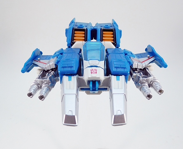
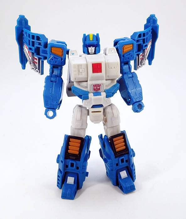
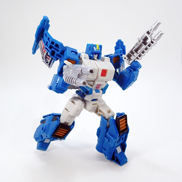
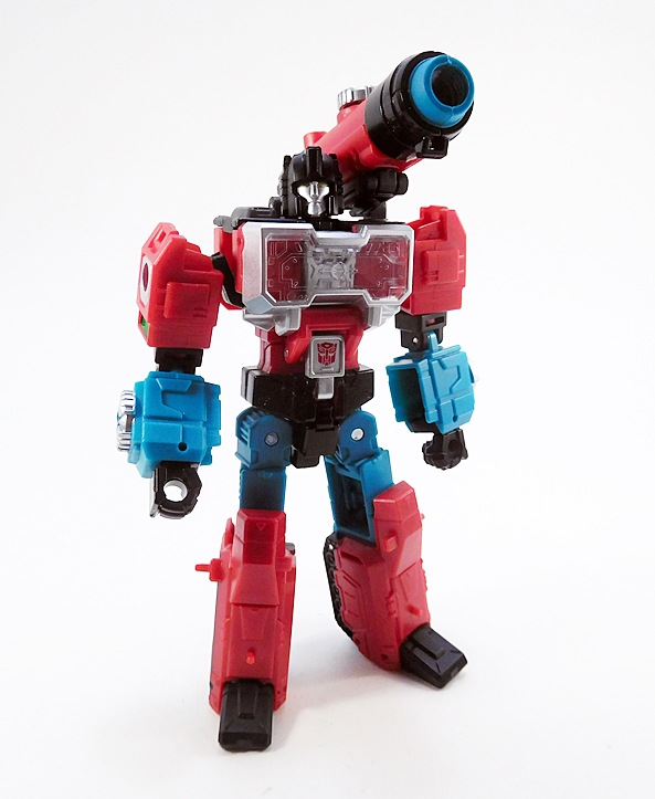
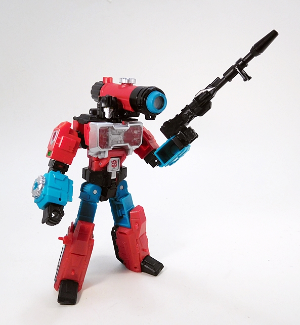
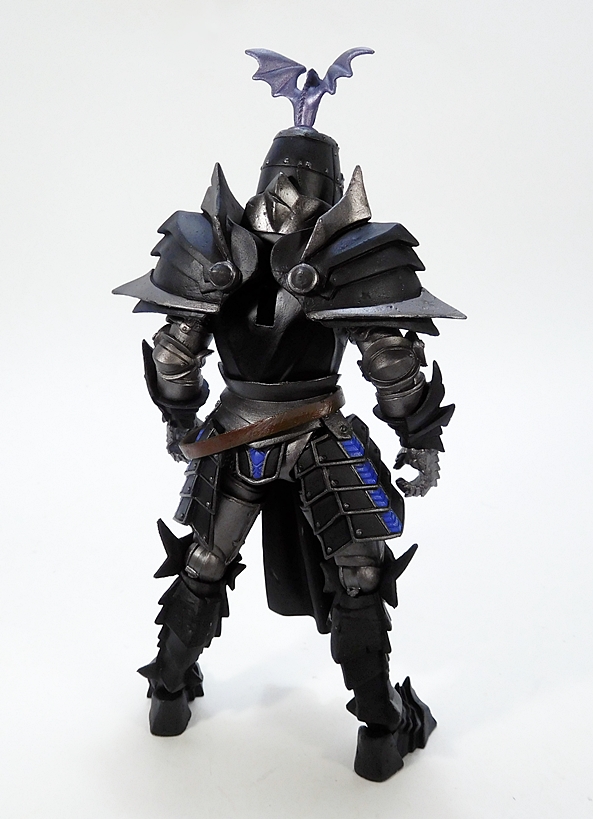
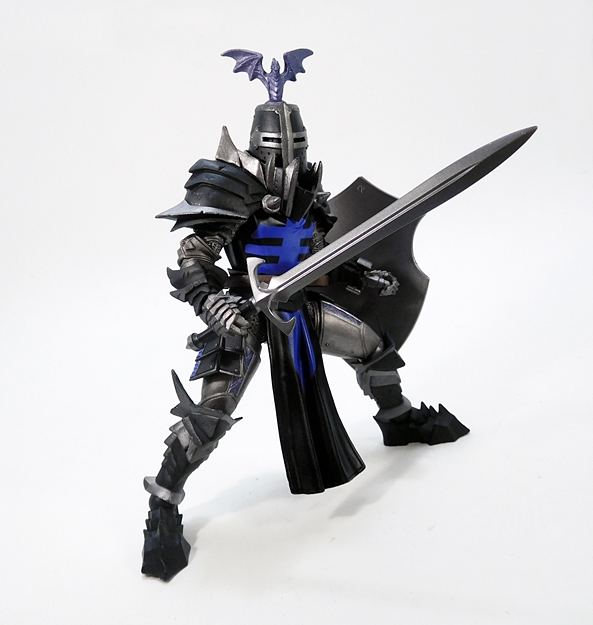
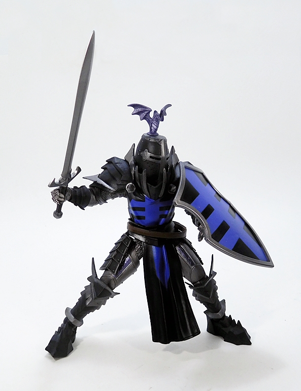
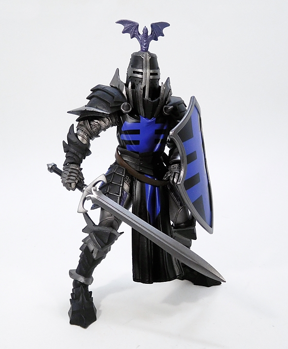
And the result ain’t too shabby! Topspin gains a less squat and overall better proportioned upgrade and fits in beautifully with his fellow Titans Return Deluxes. He even keeps the original’s same silhouette by wearing his wings on his shoulders. There are some really solid callbacks to the original toy here as well, particularly in the panel lining on his chest, the lower position of the Autobot emblem, and even the blue hinges down near his robo-groin. I especially love how they took the intake sticker designs from the original toy’s knees and turned them into the fully realized intakes that you see in his jet mode. Likewise, you get painted panels on his shoulders and striping on his wing shoulders to match the G1 stickers. If I could change one thing, I probably would have had the spot on his right chest painted in to look like the catch on the original toy. Then again, I could probably do that with a Sharpie myself.

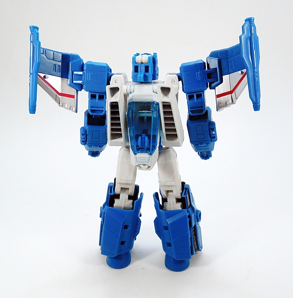
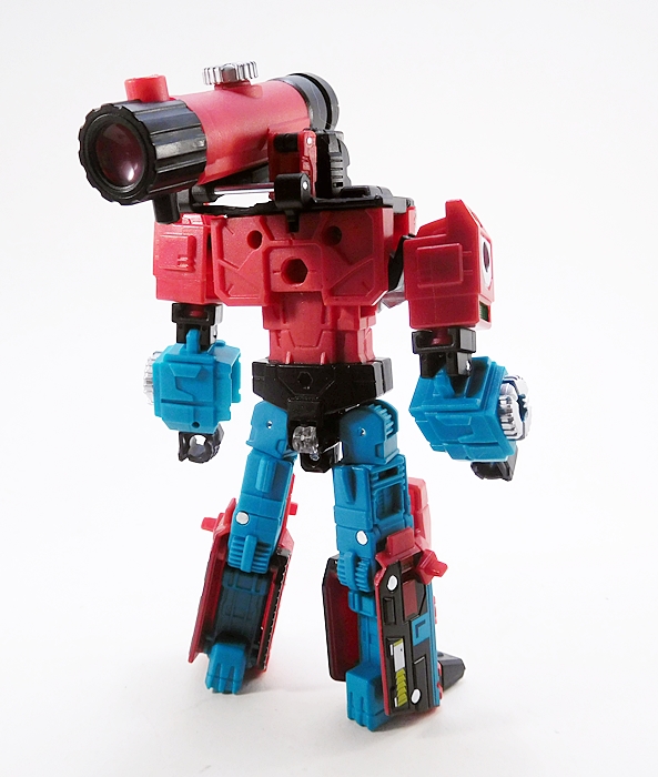
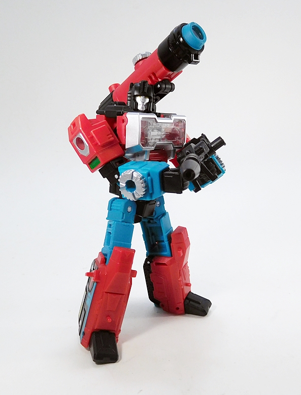
From the back, things are pretty interesting. The twin nosecones and cockpit canopy fold in to form his back in a sort of criss-crossing diagonal configuration. These pieces don’t really lock into place, but they hold there really well. As a result, Topspin looks really nicely filled out from the back. It would have been nice if the hinges in the wings allowed them to fold all the way back. Yes, that would spoil a big part of the G1 design homage, but sometimes they can be a bit cumbersome jutting out like that.

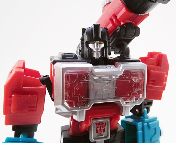
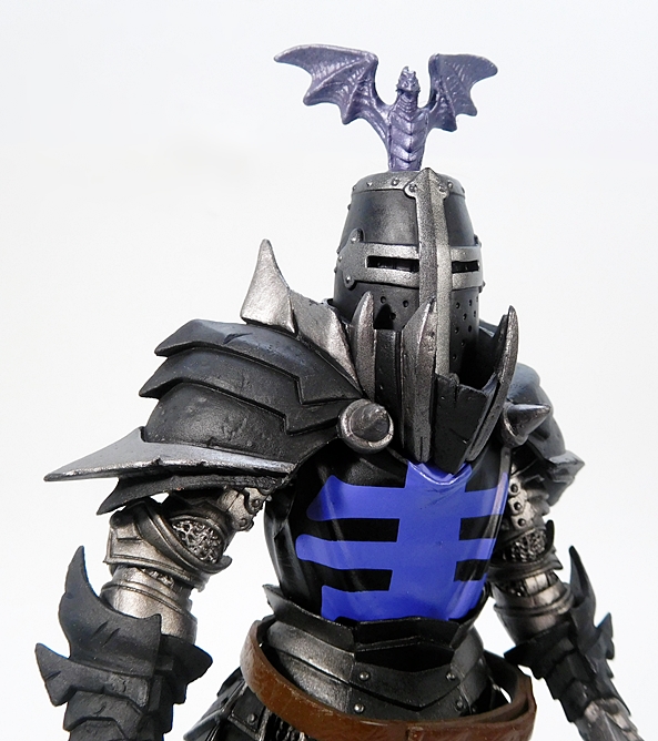
Freezeout forms a very respectable head that follows through on the homage nicely. The “helmet” really evokes the old style and the gold stripe sticker on the original toy is recreated here both in sculpted detail and paint. The silver used for the face is beautiful and there’s a different shade of blue used for the visor. Topspin sports a pretty stern expression, confirming what I already know: You don’t mess with a Wrecker!

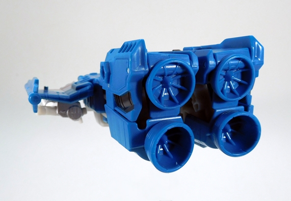
I also want to throw out there how much I love Transformers with thruster cones in their feet. two of Topspin’s four engines wind up in his heels.

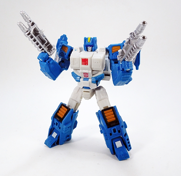
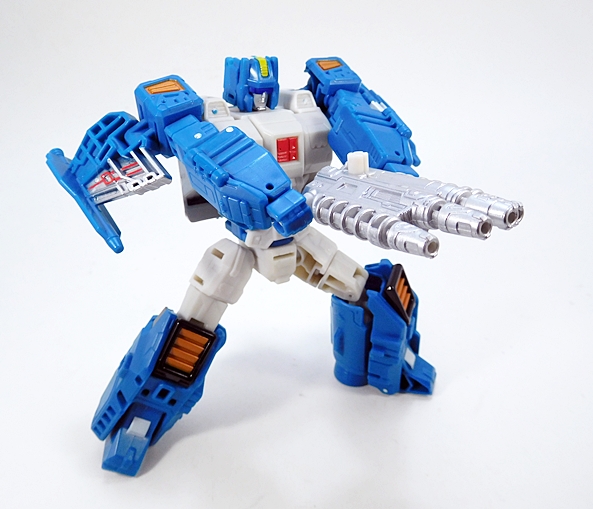
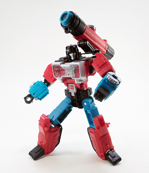
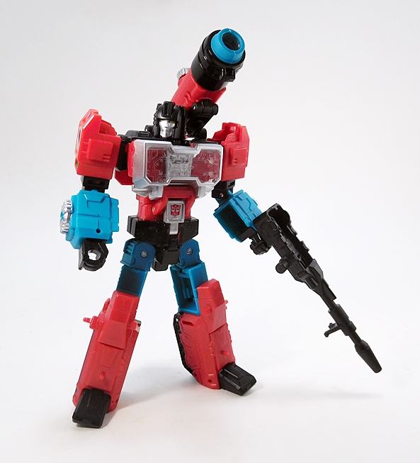
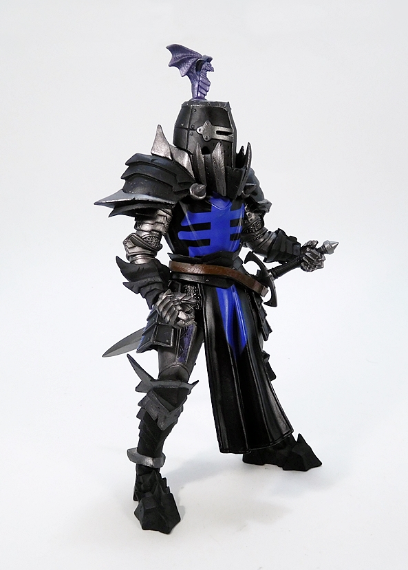
And then you have these guns… I love these guns!  The over-and-under barrels look great, and I dig the sculpted coils on the lower barrels. The silver paint also looks superb on these. Seriously, this silver paint that we’ve been seeing for the last couple of years is the best thing that’s happened to Hasbro in a long time. I hope they never stop using it. As cool as these twin guns are, sometimes you really need to make a statement… and that’s when you combine them for…

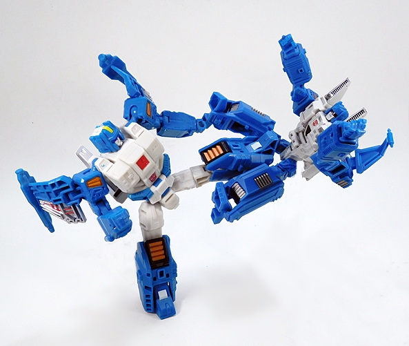
QUAD DAMAGE!! Holy shit, look at this thing! It’s both ridiculous and breathtaking at the same time. It’s a weapon fit for a Wrecker. I shall call it The Streetsweeper! Wreck’n Rule!

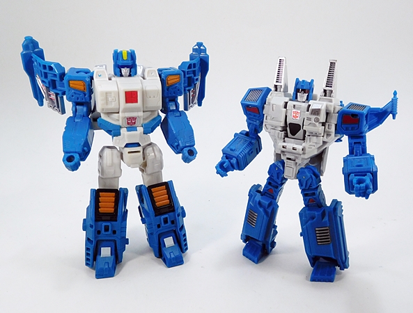
So, before wrapping up me spooging all over what is a truly fantastic figure, it’s time to pull out the Mech Ideas version of Topspin (called Apex) for a quick comparison. To put things in perspective, Apex was released back in 2013 along with Not-Twin Twist by one of the smaller third-party convertobot makers. They were packaged separately, but I bought them as a set for $70 and reviewed them very favorably back then. As far as 3P Transformers go, $35 a figure is pretty cheap, even when you consider that these guys were closer to the modern Legends Class than Deluxes. Let’s check out the alt modes…

Yeah, this fellow’s alt mode hasn’t aged very well. I like to think that Apex is supposed to be a much larger craft with that little triangular window housing a sizable bridge. It’s definitely a different take on the original vehicle design, but it feels really bland to me now and way too squat. You could add a little more to it by plugging Apex’s guns into the top, but it doesn’t change it up that much. I think Topspin’s alt mode blows this one out of the water. The design is more interesting to me and it makes far better use of paint apps. Transformation on Apex is also more fidgety and complex. Let’s move on to bot modes…

Pretty much the same thing here too. Besides being considerably smaller, Apex looks a lot rougher in comparison to Hasbro’s official figure. Some may prefer the busier and more complex sculpting of the chest, but I think it looks more unfinished. I also think the Seeker-style shoulder intakes work against the character homage. The shoulder wings on Apex don’t really lock in at all and his joints were fairly loose out of the package and haven’t gotten any tighter. What does all this mean? Nothing really. Except maybe that Hasbro has been taking notes and getting more creative with their designs and engineering. At the very least, I find it interesting that they are able to produce a Deluxe figure that is (in my opinion) every way superior to a figure that sold for twice as much and had no safety regulations working against it. Apex still has some merits. I don’t want to pile on the hate, but in the end…

YOU LOSE, APEX!!!

And here’s the part where I remind myself that Titans Return Deluxe figures can do no wrong in my book. That statement continues to ring true, as Topspin is a real treat. He’s not only the first true modern update of one of my favorite oddball Transformers as a kid, but he’s an absolutely stellar update on every level. I cannot wait until I can pair him up with his fellow Jumpstarter, Twin Twist. Hopefully it won’t be long. Next Thursday, I’ll keep on moving through this wave with a look at one of the repaints!

Marvel Legends (Mantis Wave): Adam Warlock by Hasbro

As promised, I’m back this evening with a Marvel Monday double feature. Yeah, I’ve got to start doubling up on some of these Marvel Legends reviews if I ever have a hope of getting caught up. One a week just ain’t cutting it no more. Earlier today, I looked at Ex Nihilo and tonight I’m checking out the other half of the “Cosmic Protectors,” Adam Warlock!

Let’s face it, you can’t bounce around Cosmic Marvel for long without bumping into this guy. Hell, it only took two Guardians of the Galaxy films for the MCU to tease his coming. Actually, only one if you still want to count the easter egg in The Collector’s lair. It was all the way back in 2012 that we last saw him grace Hasbro’s Marvel action figure lines, where he was bundled with The Mad Titan Thanos in one of the 3 3/4-inch Marvel Universe comic packs. That was a pretty great figure, but needless to say it’s long past due that we got Warlock in the 6-inch Legends line.

Warlock sports his modern costume, which is beautifully executed here. Sure, I still miss the iconic trappings of his classic cape and staff, but there’s something to be said about this snazzy new look as well. The outfit is executed predominantly through paint, as you get a black buck with deep crimson accents. The quality and application here is excellent and he doesn’t suffer from a lot of that bleeding you often see when they paint over black plastic.

Indeed, the red paint lines are surprisingly crisp and I really dig some of the features of the motif here. You get the crimson lightning bolts coming off from around his shoulders onto either side of his chest and back. These contrast nicely with the reversed color palate black bolts running up the crimson on his legs and on his gauntlets. I also love the crimson palms and fingertips on his gloves. For me, nothing will replace the classic look, but this one suits the modern Marvel aesthetic perfectly and it makes me curious as to what the MCU version will look like. The painted costume is rounded out by the sculpted belt and sash, which are a separate piece. The belt is painted with a rich gold and has sculpted patterns and the sash is red with a black bolt pattern running down the center.

The solid body work is partnered with a fantastic head sculpt. Warlock sports a neutral, almost serene expression. There’s some particularly solid detail work in the facial features. The skin tone has an appropriate touch of orange to it. The eyes are a little weird. They work pretty well under casual inspection, but the closer I get, the more I think they could have been cleaner. Still, all in all I’m very happy with what we got.

As a real treat, Hasbro included a second head, to change the figure into Warlock’s evil future incarnation, Magus. Hot damn, this is an amazing piece of work. The expression is masterfully done and the painted features are superb. Even the hair sculpt is great. Yes, I do believe this head may warrant buying another Warlock figure to display it on.

The articulation is pretty standard. The arms have rotating hinges in the shoulders and wrists, swivels in the biceps and double hinges in the elbows. I should also point out that those shoulder joints feature ratchets in the rotation. The torso features an ab crunch hinge and a swivel in the waist. The legs are ball jointed at the hips, have swivels in the thighs and lower legs, and double hinges in the knees. The ankles are hinged and feature lateral rockers. And finally the neck is both hinged and ball jointed.

Warlock’s other accessories include two effect parts, which I believe I last saw packed in with Havok from the Juggernaut Wave. These are cast in a cool metallic blue and fit around his wrists. The color is actually pretty close to Havok’s but these have more of an opaque finish. They’re somewhat similar to the hex effects we’ve seen a billion times now, but I haven’t become completely fatigued by them yet and they still make for some pretty cool display options.

Adam Warlock is another solid release in these Guardians-themed assortments. Once again, I want to applaud Marvel for taking the opportunity and use these MCU-inspired waves to dig deep on comic characters. It would be so easy to sell retailers on an assortment of characters hot off the screen of Marvel/Disney’s latest billion dollar blockbuster. Instead, they’re tossing in plenty of treats for the comic fans. Not that Adam Warlock is an obscure character by any means, but getting him out there in his modern look and pairing him up with Ex-Nihilo really shows that Hasbro is willing to take some risks with this line. And it seems to be working, as there appears to be no end in sight!

Marvel Legends (Mantis Wave): Ex Nihilo by Hasbro

After a brief detour, I’m steering the good ship, Marvel Monday, back to Marvel Legends. These things are piling up around me like crazy and I’m beginning to think running a whole week of Legends is going to be necessary if I’m ever getting caught up. Maybe I’ll do that for the next wave, for now I think I’m going to double up on the shared slots, which means I’ll have a second review going up this evening. In the meantime, I decided to go for the second Guardians Vol.2 wave and I’m kicking it off with Ex Nihilo, straight from The Garden on Mars!

Of course, Marvel split this assortment into two waves so that they could include some comic-based figures along with the MCU Guardians. Call me crazy, but I was quite pleased to see Ex Nihilo revealed in this wave, as I am a big fan of Hickman’s run leading up to the Avengers: Infinity story arc in general and Ex Nihilo and Abyss were some interesting additions to the Marvel roster. Indeed, if anything about the news of this release disappointed me it was that there wasn’t an Abyss figure included in the wave as well. Hell, a Ex Nihilo, Abyss and Aleph three-pack would have been sweet. Anywho… Ex Nihilo shares a slot with Adam Warlock as the “Cosmic Protectors,” which is a pretty unlikely title for him at his introduction, as he was kind of a prick in the beginning, but he came around in the end.

No doubt, Ex Nihilo is a distinctive looking fellow, so much so that it’s hard to believe that he could be considered one of the budget figures of the wave. And yet, he makes use of a standard buck with just a new head sculpt. I’m sure I’ve seen those hands before, although I’ll concede that the bare feet are probably new. The only paint on the body is the Omega-like emblem printed on his chest.

The gold colored plastic looks pretty good, but not quite as good as the original promotional pictures. The final figure isn’t quite as vibrant and there’s some of that annoying swirly pattern evident here and there. So, yeah… it didn’t turn out quite as nice as the teasers, but he’s not bad at all. Under the right lighting the gold is very pleasing on the eye.

The head sculpt depicts Ex Nihilo with a toothy grimace. I think this was actually a good expression to go with, since the figure is pushing him not as a mysterious threat dropping Origin Bombs on the Earth, but as someone who eventually allied with The Avengers against The Builders. Either way, I think the sculpt is excellent, the teeth are exceptionally well painted, as are the green eyes. I really dig the subtle black outline around the eyes. Seeing as how the figure required only the minimum of painted detail, it’s nice to see they did it right!

The articulation is pretty standard. The arms have rotating hinges in the shoulders and wrists, swivels in the biceps and double hinges in the elbows. The torso features an ab crunch hinge and a swivel in the waist. The legs are ball jointed at the hips, have swivels in the thighs and lower legs, and double hinges in the knees. The ankles are hinged and have generous lateral rockers. And finally the neck is both hinged and ball jointed. The joints on this guy feel great and he is a lot of fun to play around with.

I would imagine that Ex Nihilo has a number of Legends collectors scratching their heads. He’s from a story that’s not old enough to be classic, and not recent enough to be all that relevant. To my knowledge he’s never really been affiliated with The Guardians of the Galaxy either, although he is part of Cosmic Marvel. Nonetheless, he comes from a solid run of The Avengers, and I’ve wanted some figures from this run ever since it debuted. The fact that we’re only getting Ex Nihilo now gives me hope that we could still see some other figures from this book. In addition to Abyss, I’d love to get a Starbrand, and while Captain Universe is part of a wave hitting the shelves now, I’d really like the Tamara Devoux version as well. Either way, I’d say this wave is off to a solid start. And as mentioned earlier, I’ll be back later tonight to check out the other half of the “Cosmic Protectors:” Adam Warlock!

DC Comics: Harley Quinn (New 52) Bishoujo Statue by Kotobukiya

As promised, DC Friday is back after a couple weeks hiatus and today I’m digging in with a new(ish) Bishoujo statue from Kotobukiya. I actually passed on the last Harley Bishoujo and it’s bugged me for a while now that she isn’t represented on my ever expanding Bishoujo shelves, so I simply couldn’t let this one pass me by too.

If you’ve seen the packaging for any of the Marvel or DC Bishoujos then you should know what to expect. It’s a mostly white box with window panels on the top front and side. You also get some of the lovely art by Shunya Yamashita, which inspired the statue. The back of the box teases the Wonder Girl statue, which reminds me that I really need to pick her up, because she’s already out.

This statue is billed as the New 52 version, which really whored Harley up big time. It took her from mischievous looking jester to pole-dancer. It’s hard for me to tell if the shock value here has worn off for everybody else, but I’m so used to seeing her in this outfit now it hardly phases me. I’ve gone on record many times that I’m fine with this look, but I understand that it triggers a lot of fans who prefer her classic jester look. Anyway, the pose here features Harley with one hip thrust to the side, her hand resting on it, while the other cradles her trademark hammer, which in turn rests on her shoulder. It’s sassy, playful, mischievous and there’s a little bit of energy added with her pigtails and cape fluttering in the imaginary breeze.

The coloring on this piece consists of some beautiful red and blue, which looks all the more vibrant against the pale tone of Harley’s skin. There’s a lovely contrast between the matte finish on her stockings and cape with the glossy sheen on her corset and nearly non-existent shorts. This is a statue that really pops on the shelf, even when displayed among lots of other Bishoujos.

There is some excellent sculpted detail in the costume as well. Her knee socks have a knitted texture and the lacing on her corset is fully realized. I particularly love the detail in the belt. It features a squared silver buckle, cartridges stored in individual loops, and blue and red holsters for her twin sidearms.

And here’s a close up of what she’s packing. The guns are sculpted well enough that you’d swear they could be removed. Oh yeah… butt shot.

And that brings us to a great portrait, which includes sharply printed eyes and perfectly painted lips. She has a hint of a smirk. The ruffled collar fits her jester motif quite well, although I find the cape to be a bit of a strange inclusion.

The base is a disc with a checkered diamond pattern in red and blue to match her outfit. It’s simple, colorful, and suits the statue quite well.

One cool sidenote is that if you want an alternate display option, the hammer can also be positioned so that she appears to be leaning on it. Simply un-peg it from her arm and carefully place the end of the handle in her hand. I don’t think this was intentional, but I really do like the way it looks and it might be a welcome option for collectors with tight real estate on their shelves.

I’ve had this one on my want list for quite a while, but what finally got me to pull the trigger was when it went on sale for $35. There aren’t a lot of Bishoujo’s you can get at that price these days, so it was all the incentive I needed. I think the Bishoujo treatment works well for the character and everything from the pose to the sculpting and coloring hit all the right marks to make this one another excellent release.

Transformers Titans Return: Convex and Perceptor by Hasbro

I’ve been on a third-party convertobot streak for the last four Transformers Thursdays, but I thought I would turn my attention back to the official stuff for a while. I’m also dog tired from a pretty brutal week at work, so hopefully I can make it through this review before I run out of steam. Just pardon me if I’m a little more brief than usual. Anyway, today I’m digging into the most recent wave of Titans Return Deluxe Class  figures and I thought I’d start things off with Perceptor.

I always liked Perceptor. He had a pretty unique personality in the Sunbow cartoon and was basically an Autobot nerd back when it wasn’t all that cool to be a nerd. Plus, his G1 toy was fantastic and featured a particularly good robot mode. I’d say it’s long past time he’s had a new figure, since it’s been six years since we got the last Perceptor as part of the Reveal The Shield line. There was a lot I liked about that figure, and a lot of things that came up short. It was a good try, but it eschewed Perceptor’s microscope mode for an SUV and that never sat right to me.

Well, clearly some of the thinking has changed at Hasbro because this new version is indeed a microscope and a pretty cool little one at that. I kind of get Hasbro thinking that kids would rather play with a truck than a microscope, but the Microman toys were such an integral part of Transformers history that it seems a shame to ignore them. Besides, how terrible is it to have a kid playing with a microscope? Back in my day, there were all sorts of toys that were designed to get kids curious about “the science!” Anyway, as if you needed any more indication of who this microscope is supposed to be, the the red, teal, black and silver deco is unmistakably Perceptor. The only thing missing is the big Autobot emblem on the front of his tube, and I can probably remedy that with one of the repro sticker sheets that I have lying around. I just can’t tell you how happy this little microscope makes me.

The scope itself is hinged so that it can look straight down on the tray or angle outward to examine something in front of him. What’s even cooler is that the knob on the microscope actually causes the tube to extend and retract. The tray is also specially designed to hold a Titan Master figure. I really dig that Hasbro tied Perceptor’s microscope mode into something specific to this line, like examining the little head robots. I love this mode so much, I’m not even going to acknowledge that there’s an “unofficial” tank mode, but there is as evidenced by the sculpted tank treads.

While he may be small, you don’t actually need a microscope to get a good look at Convex, Perceptor’s little Titan Master buddy. He’s cool enough, but he suffers from Hasbro’s continued reluctance to hit these little guys with some paint. As such, Convex is just red and black plastic. But while he isn’t anything special, I have to say I wholeheartedly approve of his name, Convex, which is such a great name for a head robot paired with Perceptor.

Perceptor’s transformation is super easy, but who’s complaining when the results looks this good! He features a very clean and well-proportioned robot mode, which hits all the right points of the G1 character. He wears his silver faux dials on his forearms, his translucent tray becomes a chest shield, and his microscope lens becomes an enormous shoulder cannon. In terms of pure homage, this figure is a winner.

He’s also pretty clean from the back and no hollow leg syndrome. Well, not completely hollow… just recessed. There are some lovely paint apps on the sides of his lower legs to replicate the stickers on the original toy. He also features a peg in the middle of his back, where he can store his rifle. I should also note that the right shoulder on my figure isn’t at all droopy, I was just a dope and neglected to straighten it out all that well for these photos. Any other day, I would have re-shot those, but I just don’t have it in me today. If nothing else, my carelessness demonstrates that you can pull the arms out a bit to get an even better range of motion. Yeah… that’s why I did it!

The Titans Return line has produced some great head sculpts, and Convex is no different. I really dig the depth to his “helmet” and the way it extends out on the sides of his face. The silver paint is beautiful, both on the face and all over the rest of the figure, and the yellow eyes are sharp and bright. The cannon does sit pretty close to Perceptor’s head, but it’s mounted on a hinged arm, so you can angle it upward to get it out of the way, or if you want you can actually stow it away on his back.

Perceptor comes with a sniper rifle, complete with a little molded biped stand. I seem to recall this being a thing with him in the IDW comics. I like the gun well enough, but I would have preferred something more akin to his G1 weapon. It has some pegs on the side so it can plug into any of the Titans Return vehicle modes and it also has the ubiquitous seating area for a Titan Master to operate it.

I’m beginning to believe that the Titans Return line can do no wrong by me, at least not in the Deluxes. These figures have all been great and Perceptor keeps that trend chugging along happily. He’s also all the more special for actually having a proper Microman alt mode. And with Hasbro now willing to give us boom boxes and microscopes, is it too much to hope that a trio of bots merging into a camera could be too far behind? Probably, but at least now I can have a solid foundation on which to build some hope. In any event, Perceptor sets this wave off to a very strong start and I can’t wait to see what’s in store for me next week when I open up Topspin!

Mythic Legions (Covenant of Shadows): Baron Volligar by The Four Horsemen

We still have a loooong while to wait until the “Advent of Decay” figures from the last Mythic Legions Kickstarter ship, but it looks like T4H are gearing up to offer some more figures for pre-order later this month. To celebrate, I decided to open up another one of the handful of “Covenant of Shadows” figures that I’m sitting on to hold me over until next April. So, come on… let’s check out Baron Volligar!

It’s the same old packaging I’ve shown here dozens of times: Attractive, serviceable, and ultimately collector friendly. As always, you get a little bio blurb on the side panel of the bubble insert. I didn’t care about these at all in the beginning, maybe because the figures were still so new to me, but I’ve come to really appreciate exploring the lore and backstory of this action figure line. The bio here describes Baron Volligar as ancient vampyric royalty, and basically tells us that he is a pretty bad hombre, even as far as vampires go.

And oh, boy does he look the part! Volligar sports a suit of armor, which is a hybrid of Sir Godfrey’s and many of the pieces common to the Orcs’ armor. Mating Templar and Orc designs may sound like an unlikely marriage, but fear not, T4H really know what they’re doing and the results are pretty spectacular. Digging deeper, we can see that Volligar features the knightly tabard torso, hip armor, and upper legs and arms of Sir Godfrey, all of which is given a rather sinister twist thanks to the lower legs, grieves, shoulder armor, and collar of the Orcs. It almost looks like Volligar might have had a respectable suit of hero armor and gradually tweaked it after succumbing to the vampire curse. Of course, none of that is spelled out here, but rather just my own little musings.

As always, the shoulders are removable, and actually come packaged separate from the figure. I definitely prefer him with them on, but taking the armor pieces off does improve the range of motion in the shoulders quite a bit. The jagged and primitive look of these pieces mates beautifully with the similarly designed boots and grieves. There are some wonderful little nicks and pitting sculpted in as well to make them look well worn.

We last saw this helmet on Sir Godfrey, although it’s popped up a few times before him as well. It’s a very classically styled Great Helm with reinforced strips forming a cruciform pattern. Yeah, I find that a little odd for a vampire, but I’m willing to let that go. The helm features sculpted bolts and breather holes, and the deep set eye slits reveal only mystery. The helm is further customized by the rather imposing dragon crest at the top. I really dig the way the helmet sits deep in the center of the collar. It just further adds to the darker nature of a helmet that has so far only been used on the good guys.

And speaking of darker, the deco on this figure is superb. Besides knowing all the right ways to mix and match their system of parts, T4H are also adept at putting together some truly amazing color combinations. OK, so this one in particular is kind of a no-brainer and for me it really evokes a lovely Decepticon deco that I love so much. Yup, it’s all about the black and purple on that tabard. It almost looks like a primitive ribcage or ideogram for the undead. Lovely! The armor itself features both matte black and a rich, charcoal gray with a brushed metal finish. You also get some metallic purple applications on some of the ornate panels on the armor, which look quite striking under the light.

For armaments, The Baron relies on his trusty sword and shield. The sword is the two-handed variety that we’ve seen many times before. This design always reminds me of Glamdring from Lord of the Rings, probably because I saw an illustration of Gandalf carrying a similar looking sword. It’s a nice mix of classic and fantasy and I really dig the shape of the crossguard and that skull-crushing pommel. It has a sculpted black grip and the blade and other fixtures are painted with a charcoal gray to match those parts of Volligar’s armor.  The shield is also the same standard sculpt with his black and purple coat of arms painted on the face. Wait? You mean that’s it? These guys usually come loaded for bear. He just has a sword and shield? Yeah, Volligar is a little light on the weapons, when compared to other Mythic Legions figures, but that’s probably because he comes with…

…this enormous battle standard. T4H did a bunch of these representing the different factions of Mythic Legions. I think they were all available in one pack, but every time pre-orders go up, I’ve been budgeting to get as many figures as possible, so this is actually the first time I’m getting one of these standards into my collection. It’s a very cool piece with a pole so long it comes in three separate pieces. The flag itself is painted with Volligar’s coat of arms and there’s a pretty rad set of wings angling off of the top. Unfortunately, it’s way too tall for me to display him holding it on the shelf, but I may yet find a way to display it somewhere.

And so, to the surprise of absolutely no one, here’s another Mythic Legions figure that I can’t stop gushing over. What can I tell ya? I adore this line and I don’t see that changing any time soon. It’s probably worth pointing out that when I pre-ordered Volligar, I didn’t bother to read his bio and I thought he was just an awesome evil knight. The fact that he’s a vampire pleases me greatly, because the decision to chop the vampire, Carpathias from my original Kickstarter Backer Rewards remains a sore spot for me. At least now I finally have a vampire to tide me over until “Advent of Decay” arrives.

Guardians of the Galaxy: Drax the Destroyer 1:6 Scale Figure by Hot Toys

Collecting Hot Toys is not a hobby for the impatient and this is not news to me. Figures can go up for pre-order eight months to a year before they’re expected to ship, and even then you can almost always expect delays. This can be frustrating when you’re buying figures that are tied to movies. It’s doubly so when you’re trying to complete a team from a movie. My first HT figures from the original Guardians of the Galaxy (Star-Lord and Gamora) arrived more than two years ago. Rocket and Groot showed up a few months later. And ever since, I’ve been waiting for the arrival of Drax the Destroyer. Well, the Guardians sequel has come and gone and finally this cardboard shipper turned up on my doorstep, almost a year since I pre-ordered him.

Granted, Drax’s road to release has a more troubled history than most, and I can’t say as I know any of the details. I’ve heard rumors that point to Hot Toys having issues with the likeness approval and for a while it looked like we might never get a Drax at all. Fortunately, all parties were eventually satisfied enough to ink a deal and the figure was produced, allowing us to finally complete our original MCU Guardians team.

Despite the long delay between figures, the presentation here is identical to the rest of the HT Guardians. I love the package art design on this series and they all look great when lined up on the shelf. Unfortunately, HT has really been skimping on some of their packages lately, and that trend hit the Guardians series big time. What we have here is basically a pretty flimsy window box with an illustrated sleeve around it. Granted, I just use the packaging to store the extra accessories, but it upsets me when Hot Toys takes away premium packaging while continuing to raise prices. It’s extra annoying when the figure in question is rather light on the accessories, but I’m getting ahead of myself. The tray inside the box is exactly what we’ve been getting all along. The figure is surrounded by his extra hands and weapons, and there’s a figure stand nested between his legs.

For the most part, Drax almost looks like he jumped right off the screen… almost. There’s something about the upper body that just doesn’t click with me. I’ve spent some time comparing him to screen caps (something I almost never have to bother doing with Hot Toys figures) and while some look pretty close, others look far off. In the end, I’m still undecided on the torso. From head on it looks fine, but if turned to profile it looks too thin. Either way, I’m certain that the arms needed to be beefier.

On the other hand, I think they did an amazing job on his raised “tattoos” Normally, there isn’t a whole lot of opportunity for detail on a shirt-less figure, but they really did a nice job here. Coupled with this raised detail, the speckled skin looks pretty close to the body paint used by Bautista in the film. Realistic skin tones has never been a problem for Hot Toys, even when it’s an alien color. Of course, the bare arms mean exposed joints, and that’s always a downer on these figures. The rotating hinges in the elbows really make this feel more like a run-of-the-mill action figure. Hot Toys did a beautiful job with the seamless elbows on their Hulk figure, but it probably wasn’t an option here because of the sculpted tatts. On the plus side, there’s virtually no restriction on Drax’s articulation, which makes him a lot more fun to play around with than most Hot Toys.

The portrait is excellent. If they really did invest all that extra lead time in the likeness, I think it paid off in spades. Once again the skin tone is spot on and the sculpted tatts look great. His eyes feature that eerie spark of life that I’m used to seeing in my Hot Toys figures. Alas, I think this is a character that really needed an extra portrait showing some emotion. If this were a Guardians Vol.2 version, I’d say a laughing portrait, but in this case, rage would have done nicely. Still, for someone like me, who tends to pose these figures in fairly subdued stances, this neutral portrait works fine in context with the rest of the team.

Drax’s outfit is pretty simple, as it amounts to just a pair of trousers and some boots, but HT packed a lot of detail into them. The trousers include all the detailed belts and straps and fixtures that really look fantastic. The boots are also very intricately designed right down to the sculpted treads on the soles. You also get a second pair of red trousers, which I was not expecting. I’m not sure that I’ll ever bother to change them out, but I love that they were included as a bonus.

Besides the change of pants, Drax comes up really light on the accessories. You do get the usual assortment of hands, in this case there are three pairs (fists, relaxed, knife-holding) and one specialized right hand. His knives look amazing. The hilts are beautifully sculpted and the blades feature some red inscriptions. These have a nice weight to them and the silver finish is quite striking. The boots have molded sheathes for his knives, but these are a real tight fit. Plus, for reasons I cannot explain, the blades are designed to detach from the grips, so when trying to remove the knives from his sheathes the handles often just pop off.

Drax also comes with the bazooka he had on the Kree Warship, The Dark Astor. They did a particularly nice job with the rusted finish on the tube, and even the areas that are black have a little wear and tear painted on, as well as a blue lens over the scope. Overall, this is a pretty nice sculpt, but it has no moving parts and it feels really light. The specialized right hand that I mentioned earlier is designed to hold this weapon and it does that quite well. Unfortunately, there isn’t enough range of motion in the elbow to get the shoulder rest onto his shoulder. He can still hold it very convincingly and even line up his eye with the scope.

The final stop on any of my Hot Toys reviews is always the stand. In this case it’s the exact same design we saw with the rest of the Guardians team with an illustrated base that looks like the deck plating of a space ship. My OCD give thanks to the Supreme Intelligence that they did change this up, because I like my bases to match.

So, here’s the thing: Drax is an excellent figure… by anyone else’s standards. But, I collect Hot Toys to be blown away and Drax here doesn’t quiiiiite make it to that “blow me away” level. I still can’t say I’m disappointed in him. I needed to complete my MCU Guardians and I’m very happy that I no longer have a Drax-shaped hole on my shelf. And to be fair, he looks fantastic with the rest of the team. I just feel that there are several opportunities for improvement here. If he were a one-off standalone figure, I might come down a lot harder on him in the end. I will, however, unequivocally declare that at $220, the value just isn’t here. Sure, Hot Toys releases at or under $200 are getting almost non-existent these days, but here’s one that should have been.

On an administrative note, I am now officially FOUR waves behind in Marvel Legends. I have the Warlock and Mantis waves stacked in the corner, I’m piecing together the Sandman wave, and the Spider-Man: Homecoming wave is hitting stores now. I don’t know what I’ll be jumping into next Marvel Monday, but I’ve got to start coming up with a plan to get all caught up!