Indie Comic Figure Weekend!

So, I took a little ride this week to FigureFan’s remote storage enclave and took home a couple of dusty totes. One of these totes was the result of me picking through the basement of a comic shop that was closing down near my old hometown back in New Jersey. The other tote… well, there were some cool surprises in there, but I’ll save that for another time.

A lot of this stuff hasn’t seen the light of day in quite a few years, but I had a pretty good recollection of the kind of figures that I culled out of that place. I picked up most of these for $2 a pop, and the guy liquidating the place was offering me even better deals if I bought five or more of each. We’re talking the kind of figures that only the 90’s indie comic book culture could produce. The kind of figures that you could find hanging and collecting dust in the back reaches of any little comic shop. It was an unending parade of scantily clad chicks with big boobs, thongs, leather gear, swords, and sometimes the occasional demon parts. Figures based on art designs that seemed to be inspired by Meat Loaf album covers.  And all produced over and over again in every possible color variant you can imagine.

I was originally planning to do a whole week of this stuff, because God knows there are enough figures in this tote to sustain it, and then some. But with my acquisitions pile continuing to grow, I thought I’d confine this detour to just a weekend and come back to more later on. So, I randomly picked out something from each of the three major offenders companies putting these things out. Rendition? Check! Skybolt?Check! Moore Collectibles? Check!

Stay tuned… I’ll be back later to kick this thing off with a look at everybody’s favorite Princess of Hell… Sinthia.

Um, who???

Teenage Mutant Ninja Turtles: Michelangelo (Nickelodeon) by Playmates

Ok-dokey, folks, it’s the last day of my look at the new Nick TV styled Turtles, and I’ve saved the runt of the litter for last. It’s Michelangelo!!!

I was about to say this is the last time we’ll see this packaging, but who am I kidding? I’ll be picking up more of these figures in the future. Suffice it to say, the packaging is awesome and brimming with personality. The bubble insert declares Micky as the “Jokester & Hard-Hitting Nunchuck Hero.” Indeed he is. The back of the card has a nice File Card that you can clip out and save with a terribly goofy shot of Mickey as he appears in the new Nick show. Once again, the bottom of the card has pictures of the rest of the figures that are currently available in the line.

The first thing I noticed when getting Micky out of the package is he’s actually notably shorter than the other figure, which just continues the cool trend of Playmates making each figure so unique. The back of his belt has two loops to store his nunchucks, but we’ll get to more on that in a minute. He has the same basic style of arms and legs, complete with the nicely detailed hand and foot wraps and the cool leathery texture to the skin. His shell has some distinctive scrapes and nicks, although he looks to be slightly less battle scarred than some of the others. I like Mikey’s head sculpt a lot. Beyond the fact that Playmates didn’t go all goofy on us like his screen counterpart, he still has a lighthearted, toothy smirk and just looks very much appropriate to the character as I remember him.

As with the other Turtles, Mikey’s coloring comes more from the plastic than paint apps. The paintwork that is here is very good. I’m not a big fan of the coloring Playmates used on his skin. It’s kind of a puke, pea-soup green and it looks slightly jarring when posed with the other turtles.

Mikey comes with his nunchucks, and here’s where my first big complaint about any of these figures comes into play. The chucks are each molded in one piece of plastic, one with them close together and the other with them a little bit apart. If you flex the molded chain on either in the slightest, you get nasty stress marks that look like they’re going to break apart any second. Unfortunately, to store them right, you need to squeeze them together and tuck them into the loops on the belt. The alternative is to just stick one end of each into each loop. It works, but it looks terrible. I wish Playmates had taken a page from Bandai’s book and given us an extra set of closed chucks on the sprue tree. Yes, Mikey comes with a nice assortment of gear in his Ninja Arsenal, just like the other figures.

And that wraps up my look at the Nickelodeon turtles. Hopefully I’ve properly conveyed just how awesome these figures are. In fact, they’re so well done, I think I actually dig them a bit more than the Classics, and that’s saying quite a bit. If nothing else, this line (as well as the Classics figures) proves that even a company with a track record as spotty as Playmates can go above and beyond and it’s particularly gratifying to see them do it with one of their oldest and greatest licenses. While it’s always tricky to compare different figure lines, I think you’d be hard pressed to find a better made set of figures hanging on the pegs at this price point. What’s even cooler is that Playmates is trying to give the whole vehicle and playset thing a go, and I hope it works for them. I’ll definitely be picking up more of these figures, and some of the vehicles. I’m still on the fence over the mammoth sewer playset. I want to support their decision to release it by buying the thing, but I seriously have absolutely nowhere to put something that big, and it doesn’t look like something that would go back into the box all that easily. We’ll see…

Teenage Mutant Ninja Turtles: Raphael (Nickelodeon) by Playmates

It’s Day Three of our look at the new Nick TV series turtles, and that brings us to Raphael. This may be my favorite of these turtles so far. Let’s take a look…

I still love the packages here. Once again, a lot of love and forethought went into their design with a little retro styling and some of that new-fangled hip Nickelodeon wackiness. The front bubble features an insert proclaiming Raphael as “Hot-Head and Sharp Sai Expert” and doesn’t that just say it all? The back panel has the usual clip-out File Card. Woof! I still don’t like the portraits of the Turtles’ TV counterparts. You also get a bunch of photos of other figures in this line.

As with Leo and Don, Raph features both unique sculpting and some clever reuse of parts. The legs are more or less the same throughout, while the arms seem to be mixed and matched throughout the set. I’m still digging on all the little details on the limbs, like the crisscross pattern in the hand and foot wraps, and the leathery texture sculpted right into the turtle skin. The torso features an all new array of scrapes and nicks on the shell, including one pretty cool looking chip right out of his breastplate. The belt is new and features two slots in the back to store Raph’s pair of sai. The head sculpt is brimming with awesome. Raph is definitely the most pissed looking of all the Turtles, showing off all his teeth and furling his brow. I’m also particularly fond of the sculpt on his eye mask and the way it’s whipping off to the side. The sculpting on his teeth is also very impressive. It’s downright amazing how much effort Playmates put into sculpting the details on these guys.

The coloring here is just as good as on Leo and Don. Again, most of the coloring is in the plastic, with some secondary paint applied. Raph has the dark brown foot wraps and light cream colored hand wraps. His skin is molded in dark green plastic and the paintwork on his eyes, teeth, and mask are all really well executed.

By now, we know the drill for articulation. The neck and shoulders are ball jointed. The arms have hinges at the elbows and there are swivels at both the elbows and the wrists. For the legs, you get hinges and swivels in the hips and knees.

Raph comes with his pair of trusty sai, which can be stowed in the slots in the back of his belt, and they look really cool when stored on his back. He also has the sprue tree containing the rest of his Ninja Arsenal. All of his weapons are cast in grey.

I think Raph is my favorite so far mainly because of his head sculpt and his deep green skin color. I also really like that chip taken out of his breast plate. It really gives him a lot of character. His weapons are also very cool, fit well in his hands, and look great when stored on his back. So far, there’s really been no downside to any of these figures, but Raph’s personality just shines through exceptionally well. And that leaves us just one more Turtle… tomorrow we’ll take a look at Michelangelo.

Teenage Mutant Ninja Turtles: Donatello (Nickelodeon) by Playmates

Turtle time continues today with a look at Donatello from Playmates’ new Nickelodeon series. Today’s feature should go a lot quicker than yesterday’s, since we’ve already hit most of the basic points and can focus on the differences. Let’s dive right in…

The packaging is basically the same, but there’s plenty to distinguish Don’s card from Leo’s. Besides the individualized insert that identifies Don as the “Inventor and Weaponeer” of the turtle team, the back of the card has the File Card that can be clipped out and saved, just like the good old days. God, look at that terrible portrait of Don from the new series. May I take this opportunity to once again state I’m giving this show a pass? It’s amazing how much better the figure looks. Once again, Playmates, you clearly put a lot of love and attention to this packaging and it shows.

At first glance the body may look like a reuse from Leo’s, but the similarities are only in the broad strokes and these are in fact two mostly unique sculpts. Check out the dents, dings, and scrapes on Don’s shell, knee and elbow guards and you’ll see they’re all different. The wrist and foot wraps are the same basic sculpts, but the finger and foot wraps are differently colored. Don’s belt and shoulder strap are also different, plus Don has a little loop in the back of his belt, which can be used to store his bowstaff. You do still get that same great leathery texture to the skin. Naturally, the head is brand new, giving Don a slightly more stoic and less toothy mouth. Once again, the coloring on the figure is excellent, using a lot of colored plastic over paint, and you’ll notice that Don features a different skin color. All in all, he looks great.

Donatello’s accessories include his trademark bowstaff and a sprue tree containing his “Ninja Arsenal” which can be clipped out. The bowstaff and the sprue are all cast in brown plastic, which works just fine for me, because they aren’t in neon orange or purple or other colors Playmates has traditionally and incomprehensibly used for accessories in the past. The bowstaff is simple enough, but still sculpted well and Don can hold it in either or both hands.

About the only thing that is identical between Don and Leo is the articulation. You get a ball joint in the neck, arms that feature ball joints in the shoulders, hinges at the elbows, and swivels in the elbows and wrists. The legs feature hinge and swivel hips and knees. Once again, the articulation is certainly serviceable for a figure of this size and build.

Don turned out every bit as good as Leo. He’s distinctive right down to the tiny little details, and feels just as high quality and lovingly constructed. I’m going to go with liking the Leo figure a bit more, just because I dig Leo’s swords and scabbards more than Don’s simple bowstaff, but there’s no doubt that Playmates is now two for two on this new line of Turtles. Tomorrow we’ll look at Raphael and see if they can go three for three. And here’s a hint… yes, they can!

Teenage Mutant Ninja Turtles: Leonardo (Nickelodeon) by Playmates

Uh oh, I sense a theme week coming on! Yep, a couple weeks back, I netted me a set of Playmates’ smaller, more kid friendly versions of the Turtles based on the new Nickelodeon show. I’ve seen clips from the show, but I honestly don’t even know if it’s even started airing yet. The clips look like it will make for a great series for kids, but it’s not for me. I’ll stick to watching the originals through my nostalgia and alcohol tinted glasses, while extinguishing all change in my mind. (“Damn kids, with their Ben 10’s and their Bakugans!”) I was overall pretty thrilled with the larger, more expensive, collector line, so let’s see if lightning can strike twice for Playmates in their attempt to deliver some quality Turtle toys for the kiddies…

Leo comes in a standard carded package and I really dig the way it looks. It’s simple enough, but it’s bright and cartoony and it really captures a lot of the spirit of the original TMNT packaging. It’s kind of retro, but without trying too hard. The sizeable bubble shows off the figure and accessories (oh, I’m sorry… “Ninja Arsenal!”) quite well, and there’s a printed insert to customize the packaging and declare Leo as the “Leader & King of the Katana Swords!” But wait… the figure is actually on a unique card as well, because when you turn it over, there’s an actual File Card for Leonardo that you can clip out and save just like the good old days! I actually saved the whole card. The back of the card also shows off other figures available in the line. This packaging may not be collector friendly, but it is really fun and really well designed. Playmates put a lot of love into it, and it certainly makes me excited to buy the figure.
So, the new show features a pretty heavy redesign on the Turtles. Frankly, I think it’s fantastic and the bulk of the fan feedback I’ve seen across the Interwebs tells me I’m not alone. They are a lot more stylized, which is all the rage in animation these days, but the figures actually look tons better than what I’ve seen of their new TV counterparts. Much like with the DC New 52 figures, which I looked at last week, your mileage with these figures will depend on how you take to the new look of the characters.


Once I got Leo out of the package I was immediately impressed by the feel of the plastic and the heft of the figure. Ok, it’s not so much that he’s heavy, but he just feels like such a solid and well-crafted toy. The next thing to impress was the complexity of the sculpting. For a kid’s line, Playmates went nuts with the sculpted detail on this guy. You can see tiny dents and scratches in his shell and his knee and elbow guards, and even all the little hash marks In the wraps around his hands and feet. His skin is even sculpted with a leathery texture. All this little detail makes this guy look more like a small high end collectible than a kid’s action figure. The head sculpt is also excellent, and while he’s showing all his teeth, Leo looks a lot happier than his larger, angrier Classics version. You also get a pair of functional sculpted scabbards on his back. Unlike the Classics Leo, the scabbards are parallel instead of crisscrossed. They’re also removable, as they simply peg into the back of his shell.
The coloring on the figure is just about perfect. Leo relies more on colored plastic than actual paint, and that’s not at all a bad thing. The paint apps that are here are all precise and clean, particularly on the head. I’m also in full support of the choice to go without pupils in the eyes. I just think it looks great.


Leo comes with his trademark pair of katana swords that fit snugly into the double scabbards on his back. His hands are sculpted to hold them perfectly. He also comes with a bevy of other weapons all attached to a sprue tree, similar to the pack-ins that came with the vintage figures. The weapons are all cast in grey plastic, which is cool, because Playmates has a habit of casting accessories in ridiculous neon colors. I haven’t clipped any of my extra weapons out yet, and I may not. Don’t get me wrong, I love the idea of Playmates packing all this extra stuff with the figure, but for display purposes, Leo’s katanas are good enough for me.


While the figure isn’t exactly super articulated, you do get a good range of movement. The head is ball jointed, the arms are ball jointed at the shoulders, hinged at the elbows, and swivel at the elbows and wrists. The legs have hinges and swivels in the thighs and the knees. The lack of ankle articulation is really the only obvious omission, and with the design of the larger feet, it would have been tough and probably unsightly to work that joint into the mix. Indeed, some of the figure’s overall sculpting does inhibit the range of motion in some of these joints, but overall, I think we still get a nice compromise of style and poseability.

In case you haven’t guessed by now, I really adore this figure. With a great sculpt, great quality build, solid articulation, and a heaping helping of accessories, Leo hits all the right points. And at $7.99 at my local Wally World, it’s hard to think of a figure that delivers this much at such a great price. I’ll be looking at the other three Turtles over the next three days. They are all individual sculpts, but now that we’ve got a good idea what to expect, I should be able to be more brief with the rest of our Heroes in a Halfshell.

Marvel Universe: Captain Marvel & Ms. Marvel by Hasbro

[Ok, one last update for what has become a Marvel/DC Week. I’ve still got a lot of this stuff to get to, but I’m going to take tomorrow off and then come back on Monday with a promise to give the Marvel/DC stuff a rest for next week. –FF]

It’s what we like to call a “two-fer” today. Why? Well, just because. I’ve had this pair sitting in my new pile for a while, even though neither of them are new releases. A long while ago, I checked out the modern version of Ms. Marvel, but this classic version has become all the more relevant since the second season of Earth’s Mightiest Heroes. Let’s give them both a quick looksy…

Marvel Universe packaging and nothing new here. Both figures feature some pretty solid character art on the card and both look great in their bubbles. They obviously come from different waves as the SHIELD emblem is different. Ms Marvel includes the Top Secret SHIELD files envelope and collector card that I used to love getting with these figures. Captain Marvel doesn’t have the envelope or card, but he does come with the more practical figure stand.

Captain Marvel is as simple an MU figure as you can get. His body relies almost entirely on a painted buck for detail. Thankfully the paintwork on this figure is excellent. The blue and gold on red plastic looks great and there’s virtually no slop or bleeding to speak of. The gilded starburst emblem on his chest stands out very nicely. The head sculpt is definitely one of Hasbro’s better efforts, and all in all this guy looks like a shrunken down version of Hasbro’s Marvel Legends Captain Marvel from their initial stab at that 6” line. And yes, that’s a very good thing.

Captain Marvel is based on one of the older bucks of the line, and that means the articulation isn’t what we’ve been seeing in some of the newer figures that have come since. You get ball joints in the head, shoulders, and hips. The arms feature hinged elbows and swivels in the thighs and wrists. The legs feature double-hinged knees, along with hinges and swivels in the ankles. The torso has a ball joint that serves as a swivel and ab crunch.

And that brings us to Classic Ms. Marvel. She was a variant in her wave, sharing the slot with the Modern Ms. Marvel. Both figures use the exact same body, with the only sculpting differences being the head and the inclusion of a red scarf, around Modern’s waist and around Classic’s neck. The new head sculpt features her shorter hair and older style mask. I have no problems with the sculpting work here, it looks great, but the flesh tone plastic looks waxy.

The paintwork on Ms. Marvel is a mixed bag. On the one hand, it’s applied very well and escapes all of the horrible slop and bleeding that plagues my Modern Ms. Marvel figure. The red plastic looks good and the yellow starburst pattern feels more appropriate then going with the gold paint used on Captain Marvel. So what’s the problem? Hasbro went with blue paint highlights on the black parts of her costume. It doesn’t look so bad to the casual eye, but if you inspect the figure under any kind of really good light, it looks downright awful.

Speaking of downright awful, Ms. Marvel suffers from some really dated articulation. You get ball joints in the neck, shoulders, and thighs. The arms feature hinged elbows and swivels in the wrists. The legs have double-hinged knees and hinges and swivels in the ankles. The torso has the same ball joint as Captain Marvel. At the very least, this figure is screaming for swivels in the biceps, but the lack of the same in the thighs is really frustrating too.

In the end, I’d say these figures are fairly solid, but far from great. Captain Marvel strikes me as the better of the two. Yes, he’s lacking some points of articulation, but the head sculpt is spot on and the paintwork is good. Ms. Marvel really screams for better articulation, and the blue highlights in the black parts of her costume remind me of some of that terrible first run of Comic Packs that Hasbro did for Star Wars. Still, I do like her better than my Modern Ms. Marvel, but considering that figure’s issues, it isn’t exactly high praise.

Marvel Universe: Guardians of the Galaxy by Hasbro

It is a great time to be a Marvel comic book fan, when even characters that were once considered second or third tier are not only getting their own figures, but also huge budget movies. While I’m not sure the movie-going audience is as ready for Rocket Raccoon and company as they are for The Avengers, it’ll be an interesting experiment to see just how much hardcore nerd culture the general populace will stomach for their entertainment. Either way, this set must be somewhat popular with collectors, since it took me forever to finally find one on the shelf. When I did a week or so back, I promptly snatched it up.

gotgmu13

gotgmu14

Hasbro has done a number of these multi-packs for the Marvel Universe. I’ve looked at both versions of the Fantastic Four set, and the packaging here is the same general idea. The set includes Starlord, Drax the Destroyer, Groot as a sapling, and Rocket Raccoon. The figures come in a nice window box that features awesome character art and shows off the goods quite well. The package is also totally collector friendly, which is cool because my MU shelves are getting so cramped that I have been storing all my multi-pack figures in their boxes.

gotgmu5

gotgmu6

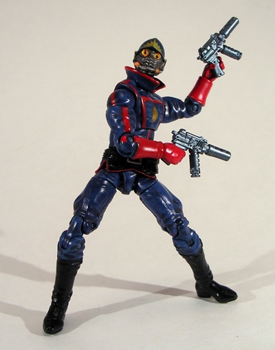
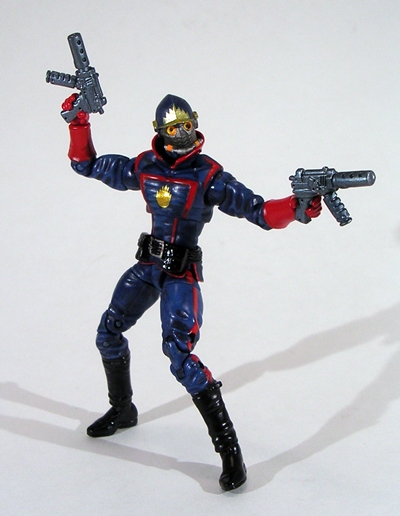
Let’s go ahead and start with Starlord. He’s a really cool figure and quite impressive considering that he’s almost a complete reuse of the AIM Soldier body, which was also repurposed for Ghost Rider. The only new sculpting here is the belt, which is sculpted to include the bottom part of his tunic, a new collar, and naturally a new head. I’m pretty pleased with the head sculpt that packs an awful lot of detail and a rather complex design into such a small scale figure. The combination of military style helmet and mask fits the character perfectly and looks cool doing it. His hands are sculpted to hold each of his detailed… machine pistols? Well, that’s what they look like to me. I can’t place them… maybe they’re just reused, but they don’t look bad in the figure’s hands.

gotgmu7

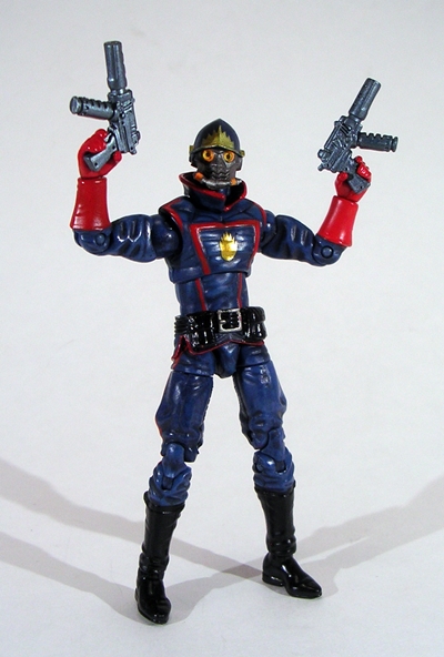
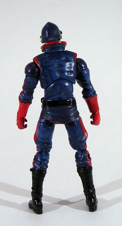
But I think it’s the paintwork that really makes this figure stand out. The bulk of the uniform is blue, with a slight wash that I could have done without, but the red piping looks snazzy as all hell and the glossy black used for the belt and boots, coupled with the gold for his chest emblem and helmet ornamentation really wraps the whole thing up.

gotgmu9

gotgmu8

The reuse of this particular body means that Starlord sports some solid articulation. You get ball joints in the neck, shoulders and hips. The arms feature hinges in the elbows and swivels in the biceps and wrists. The legs feature double hinges in the knees, swivels in the thighs, and hinges and swivels in the ankles. The torso swivels at the waist and features a ball joint for an ab crunch.

gotgmu1

gotgmu2

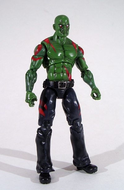
Next up is Drax the Destroyer, whom we last saw in the larger Marvel Legends format. Again, Drax recycles a body, this time the one used for Absorbing Man and modern Luke Cage. It’s a shirtless buck with trousers and it fits the character perfectly. There’s a newly sculpted belt hung around the waist, which includes two slots in the back so he can sheathe his two combat knives. That was a brilliant and unexpected touch! The grim head sculpt is perfect. I love the scowl, particularly the nose. Drax’s paintwork is about what you would expect. He has dark blue trousers and green skin, with a modest wash to it. All of his red tats are present, although they don’t quite come off as vibrant as they do on the Legends figure. Still, not bad for a guy in this scale.

gotgmu3

gotgmu4

Drax’s articulation is a tad more limited than Starlord’s. Here you get ball joints in the neck, shoulders, and hips. The arms feature swivels in the biceps and wrists, and hinged elbows. The legs feature double hinges in the knees and hinges and swivels in the ankles. The torso has the ball jointed ab crunch. What’s missing? The waist swivel and the thigh swivels.

gotgmu11

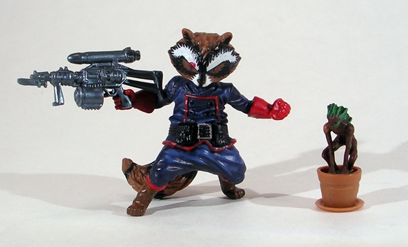
The critters of the set include Rocket Raccoon and Groot. Groot comes in his tiny sprig form, crouching in a tiny terra cotta planter. He’s an absolutely marvelous sculpt for such a tiny guy, but try not to sneeze when you’re holding him or you’ll lose him. Honestly, I’m not too upset that this little guy is all we got. With a GotG movie on the way, I’m sure we’ll see a proper Groot figure, either as part of MU or part of a separate movie line. My opinion on Rocket Raccoon is a little divided. On the one hand, it really is a hell of a nice sculpt with some excellent paintwork. Well, apart from the stray red mark on his eyebrow. I noticed that in the store, but it was the only set they had, so I had to go with it. On the other hand, I was at least expecting some basic articulation like swivels in the shoulders and hips. As it is he’s a totally static piece designed to hold his removable gun out in a “come get some” kind of taunting stance. I do really like his gun, complete with what looks like a missile on the top and a tiny little raccoon-sized bayonet.

gotgmu10

gotgmu12

The going retail for this set is about $20, which is the same as the Fantastic Four and other MU multi-packs. It does seem a little bit steeper here, since you are only getting two full figures, instead of three, and both of which feature some heavy parts re-use. That having been said, I’m not going to argue with parts reuse when it’s done this well. Besides, this is certainly a niche set even by Marvel Universe standards and frankly I’m amazed to see something like it land on Big Box toy shelves, when by all logic it should be relegated to comic book and specialty shops. Oh, but then there’s that big movie release pending, so who knows, in a year or so we could see all kinds of Guardians of the Galaxy toys flooding the shelves. Wouldn’t that be something?

DC Universe All Stars: Superboy Prime by Mattel

So, I’ve been having a little fun with DC Universe All Stars and about how despite all the hype on Mattel’s part about DCUC being completely rebranded as a new retail line, nothing has really changed in terms of the brand. We’ve got the same basic figure styles, same basic packaging. So let’s at least give it to Mattel that what they really meant was that DCUC was being rebranded as a concept, and was going to be spearheading the action figures based on the New 52 reboot. That’s why the first wave has included figures like New 52 Superman and Batman and now… uh… Superboy Prime? Ok. So scratch that idea too. Isn’t Superboy Prime one of the main players partly responsible for the whole thing the New 52 reboot was intending to get away from? Sigh… let’s press on…

Yes, it’s the new rebranded packaging that looks the same as the old packaging. At least having “Classics” left on the package makes sense now since this figure is from the old continuity. For all my poking fun at the lack of package changes, I’m still happy for it. It’s comforting to continue to see this familiar old style keep turning up, despite the line being officially dead and reinvented into something new. The back panel has the little blurb about Superboy Prime and pictures of the other three figures in this wave. This will be the third of the four that I’ve looked at here, and I’m probably going to pass on Red Robin.

Out of the package, we have Superboy Prime wearing his Anti-Monitor inspired armor and it is the armor that I dislike most about this figure. Take a look at the photo of the figure on the back of the package. It looks just like the early promotional images for the figure we’ve been seeing all along, right? Now take a look at the figure itself and you can see some major differences in the armor. The shoulder armor in the images has separate hoses that look really nice. The final figure has hoses sculpted onto the shoulder pieces and are painted like shit. There’s a ton of slop between the gold and the blue making it look like someone had it with a brush and some Testor’s model paint. I can’t tell you how disappointed this change made me. At least the hoses are real on the arms and legs, and the chest shield being part of the shoulder armor is kind of cool.

The figure under the armor is pretty decent. The head sculpt features Supes’ traditional cowlick and the prominent ears give him a youthful, almost dorky appearance. I also like the tattered sculpt used for the cape. Naturally, both hands are sculpted into fists for some “reality punching action.”

I’ve already pointed out how crappy the paint on the shoulder armor is. The paint on the rest of the figure is actually pretty decent, although there isn’t much else to speak of. The body is cast in a nice shade of blue plastic with the boots and super-undies painted matte red. I like the use of glittery blue paint on the arm and leg armor. There is a little scratching on the front of the gold belt, and the blue highlights in his hair are a bit weird.

Articulation? You know the drill. There are ball joints in the neck and shoulders. The arms have hinged elbows and swivels in the biceps and wrists. The legs have universal joints in the hips, hinged knees and ankles, and swivels in the thighs. The torso swivels at the waist and has an ab crunch hinge. The armor inhibits the articulation at the shoulders quite a bit. Thankfully the hoses on the arms and legs are soft and loose enough to not impede the rest of the figure’s articulation.

Who knows what Mattel was attempting with the whole “DCUC is dead and will be rebranded into something new” malarkey? (Yes, I used the word malarkey, dammit! Deal with it!) They could have been trying to fool retailers into carrying the figures again, but then I haven’t seen any of the new All Stars in any of the Big Box toy aisles. They could have been using it as a scare tactic to try to push the Signature Collection as a subscription line to cut out middlemen and up the profits. Or they could have just had different plans that somehow went tits up. I distinctly recall the initial teasers for All Stars having all New 52 versions of the characters, rather than this mix of old and new. Honestly I would have preferred that arrangement, especially in light of how Superboy Prime turned out. He’s not the worst figure I’ve ever picked up, but he’s a blatant bait and switch between the early proto and the final figure, and had I seen him on the pegs, instead of buying him blind online, I would have taken a pass. At least I didn’t wind up paying a premium for him.

DC Universe All Stars: “New 52” Superman

Time to check out the second New 52 treatment in Mattel’s DC Universe Classics line… oops, I mean All Stars. Make no mistake, this isn’t DCUC, that line was cancelled. This is something brand new. You can tell just by looking at the package…

Yep, there’s nothing at all familiar here. We just saw this packaging a few days ago with New 52 Batman, so I’m not going to spend a lot of time on it. It still looks great to me. The back panel of the card has a blurb about Superman, just in case you don’t know who the hell he is, right? The bottom of the card shows the other three figures that make up this wave. Let’s rip it open and get Supes out…

Once again, your mileage with this figure will depend a lot on how you feel about the New 52 costumes. Batman’s wasn’t all that much different than what we’re used to, but Superman here breaks from tradition a bit more. It’s still a blue outfit, red cape, and giant “S” shield on his chest, but as they say, the devil is in the details, and a number of the iconic details have changed up a bit. The most obvious is the omission of the red “underwear” which seems to bother fans the most. The belt has gone from yellow to red, there are panel lines in the costume, giving it a slight armored look, and he’s now sporting a high collar. But in the end the design is what it is, and we’re here to see how well the figure pulls it off…

Pretty damn well, I think. First off, the size difference doesn’t seem as apparent on this figure as it did with Batman. Yes, New 52 Supes seems a little slighter when standing next to my DCUC Supes, but they’re roughly the same height and they can certainly hang on my shelf together. The second thing that grabs my eye the most is the new head sculpt. It really does a great job matching the new, more youthful guise of the New 52’s comic book counterpart. I like it a lot. Next up is the glorious sculpted chest shield. Yes, just as with Batman, DC pointed out in one of the early issues of Justice League that the emblem on Superman’s chest should be raised in any 3D recreations and Mattel answered the call. The difference between a sculpted emblem and one that is just painted on makes a huge difference to me. As with Batman, the panel lines on Supes’ costume are downplayed a bit. I think I would have liked to see them more pronounced.

I’ve always been a fan of Superman’s colors scheme and this figure’s coloring really pleases the eye. The blue plastic used for the body suit is vibrant and spot on and meshes beautifully with the red plastic used for the cape. The paintwork on the chest shield is immaculate and the use of glossy red paint for the boots is certainly welcome. There’s no slop or bleeding to speak of and everything looks snazzy and fresh.

The only things here that I’m not all too keen on are the belt, the wrist cuffs, and the emblem on the cape. The cape emblem is just tampoed on in drab black ink and doesn’t really match the colorful snap of the rest of the figure. The belt is oddly un-centered. I’m not sure if this is a stylistic point that I missed from the comic artwork or not. Either way, it’s not a huge deal. As for the cuffs, well that’s just a sticking point I have with the design, not the figure.

How about articulation? Well, I realize this All Stars line is brand new *cough* so you might not know what to expect. Surprisingly, the articulation is identical to the old DCUC line. Imagine that! You get a ball jointed head; the arms feature ball jointed shoulders, hinged elbows, and swivels in the biceps and wrists. The legs have that same universal movement from the old DCUC line, hinged knees and ankles, and swivels in the thighs. The torso swivels at the waist and features the ubiquitous ab crunch hinge. Nope, no surprises here!

In the end, I really like this figure a lot. It’s definitely fresh and new and it hits all the points of the redesign quite well. The sculpting is all around solid and the coloring is gorgeous. I’m not prepared to toss my original DCUC Superman figure into a tote and give this one his space on the shelf, but I respect the changes, probably more than most vocal fans, and the figure really does it all… dare I say it? Justice!

Marvel Legends: Yellowjacket by Hasbro

I’ll be frank: The wait for the next wave of Marvel Legends is killing me. To remedy that, I’ve been trawling some of my old haunts and picking up some of the older Marvel Legends figures that I wanted back into my collection. Yeah, selling these things off was not one of my better moves. As a result, I’ll be looking at a lot of these in the coming months leading up to the release of the next Wave. Today we’re checking out one of my favorite Marvel characters, the deliciously flawed and deeply complex Hank Pym as his Yellowjacket persona.

Hasbro’s earlier package design for the Marvel Legends wasn’t that bad, but it isn’t as delightfully obnoxious as the current style. Nonetheless, the principal is the same with the character art on the upper left corner and various comic panel shots running down the right of the bubble. Yellowjacket was part of the series of figures needed to build The Blob. By the time Hasbro took the line over from Toy Biz, I was cherry picking the figures so I never did get to build The Blob, and in fairness it wasn’t really a BAF that would have made me buy figures I didn’t want.

Out of the package and we have Yellowjacket in all his glory. The majority of the figure is a simple painted buck, although the torso has his trademark shoulder pieces sculpted in and they look pretty darn good. I’m very pleased with the head sculpt here, particularly the antenna and the yellowed out eyes as opposed to Pym’s eyes peeking through the mask. Don’t ask me why, I just like this look better.

The paint on my figure is pretty solid, and I really like the shade of yellow plastic used here, far better than the gold-yellow used on the Marvel Universe figure. The paint on his belt looks a bit like a sloppy afterthought, but the emblem on his chest is pretty crisp. From sculpt to paint deco, this version really captures the character for me.

As a Hasbro figure, Yellowjacket doesn’t have the insane amount of articulation as the Toy Biz line, but there’s still a very good effort here. He has a ball jointed neck. His arms feature shoulder hinges built into the torso, in addition to ball jointed shoulders. He has double hinges in the elbows, hinged wrists, and swivels in both the biceps and the forearms. His legs feature ball joints at the hips, double hinges at the knees, hinges at the ankles and the middle of the feet, and swivels in the hips and lower legs. He also has rocker joints in the ankles for those wide stances.  His torso swivels at the waist and has an ab crunch hinge. No, not too shabby.

Usually when I think back to Hasbro’s first attempt at Marvel Legends I don’t have fond memories of the experience. But I guess it’s easy to forget that for every shitty movie Jean Grey you got a solid figure like Yellowjacket. Ok, maybe the ratio wasn’t exactly one-to-one, but I’m interested to see how many of these earlier Hasbro efforts impress or disappoint me, as it’s been quite a few years since I’ve owned any. Either way, Yellowjacket really hits all the right points. What’s more, he looks perfect standing alongside the newer figures and contemplating why no one called him to be in the Avengers movie.