DC Multiverse (Dark Knight Trilogy): Batman and Scarecrow by McFarlane

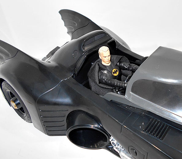
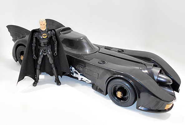
My DC Multiverse collection has been growing exponentially and there’s so many figures to choose from when it comes to deciding who’s turn is next here. But, there are a couple of waves that I’m particularly excited about getting to, so they’ll get the bump to the front. Today I’m kicking off what I hope will be just a two-part look at the four figure Build-A-Bane Wave based on The Dark Knight Trilogy, and I’ll probably throw an extra Gold Label figure in at the end. Let’s start with Batman and Scarecrow.

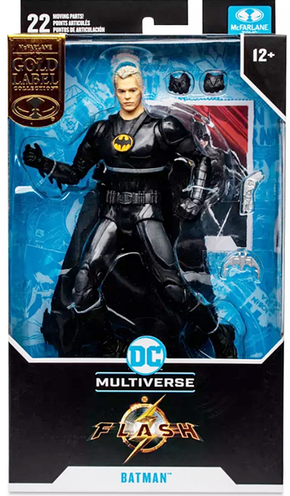
I’ve got nothing new to say about the packaging. It’s mostly collector friendly and it shows off the figures well. You also get the usual black disk stands and collector cards included. Batman comes with Bane’s legs and Dr. Crane comes with his arms, and boy is it refreshing to only have to pick up four figures in a wave to complete a figure, RIGHT HASBRO? I have to toss out my ubiquitous disclaimer that I’m not the biggest fan of this trilogy or Nolan’s films in general. They’re fine, I guess. The first and third tend to put me to sleep, while I like the middle one the most. With that having been said, I think the movies did a fine job imagining some of these characters. Certainly enough for me to want the figures. Let’s start with Batman…

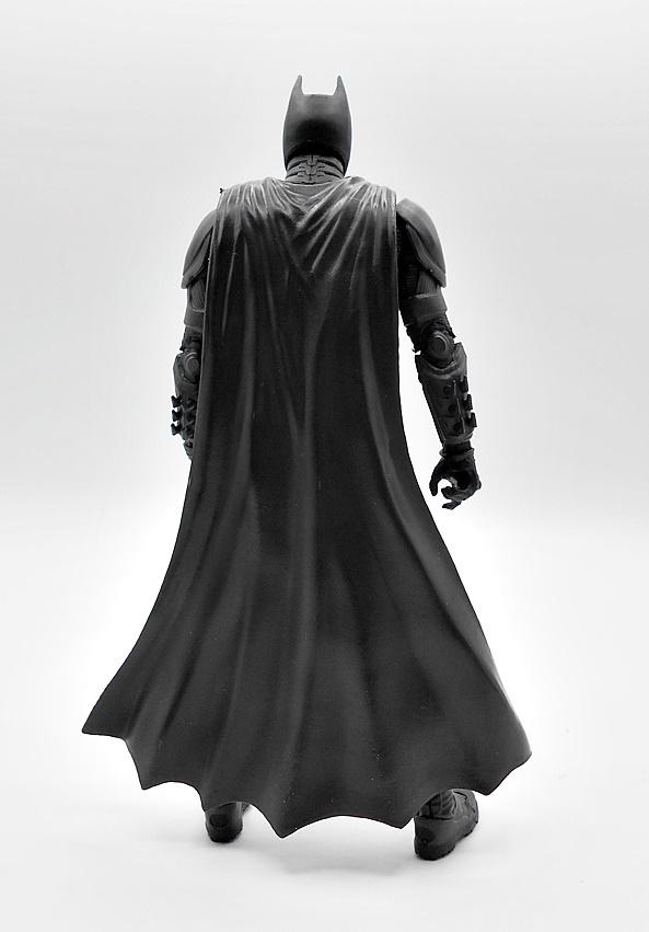
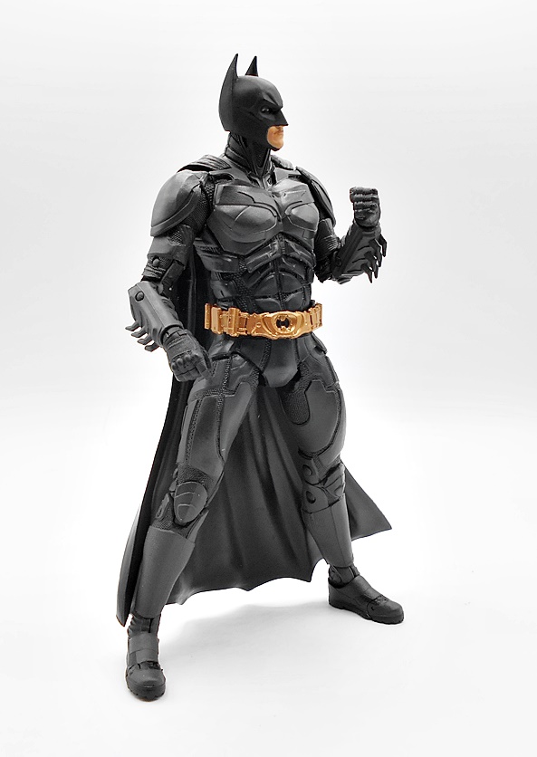
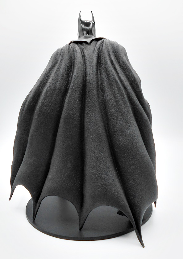
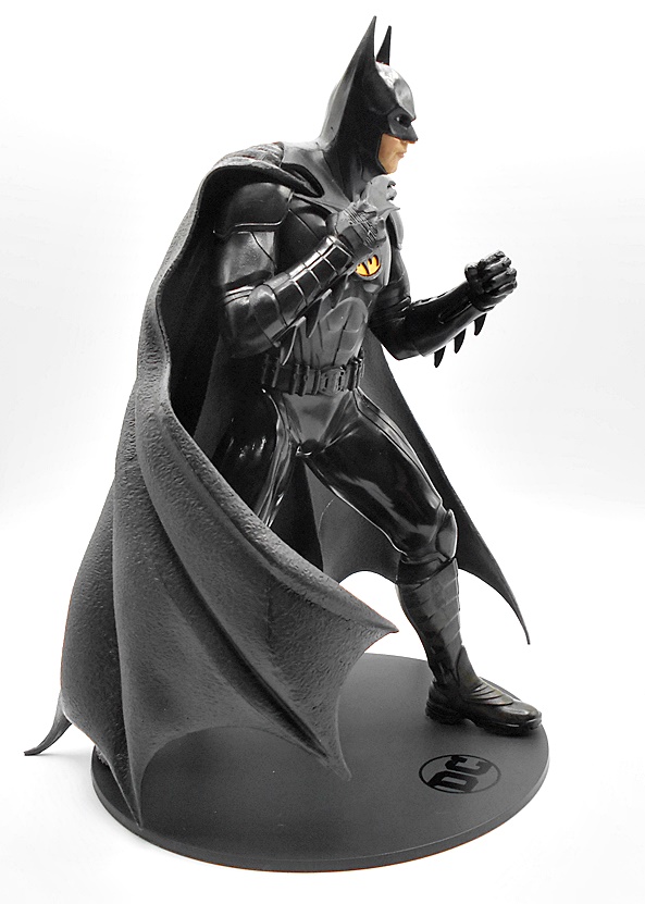
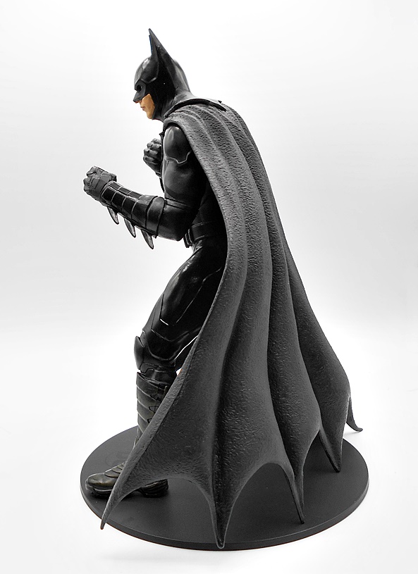
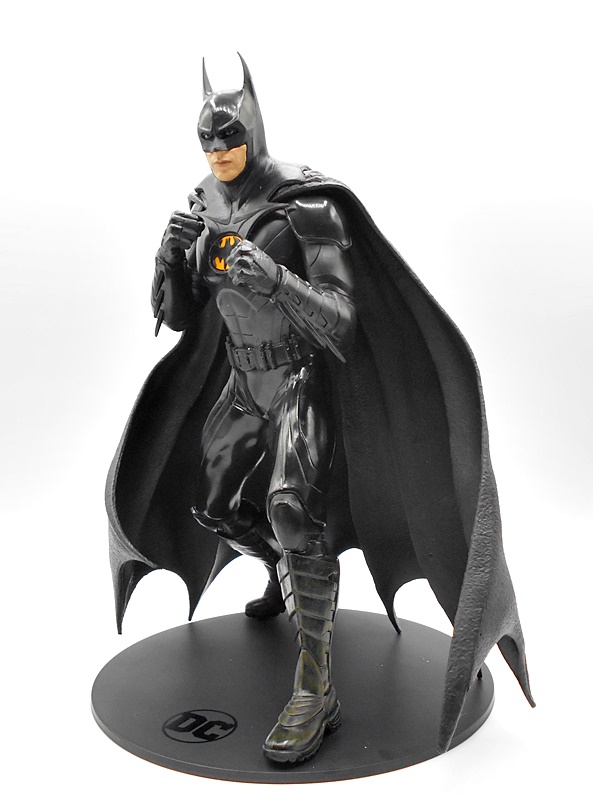
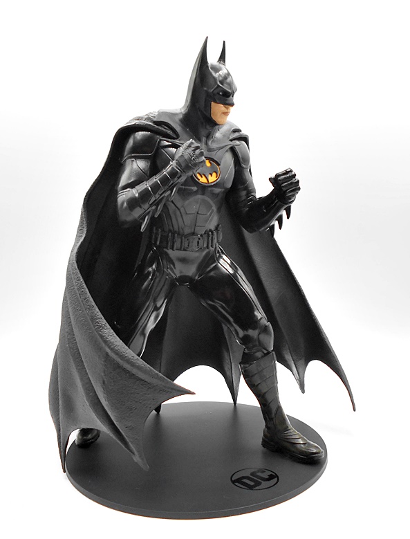
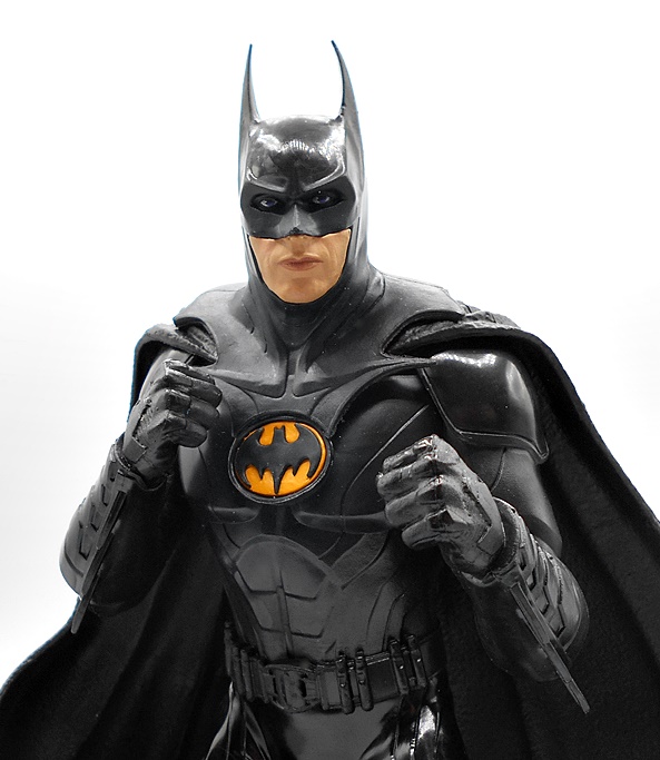
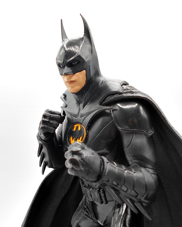
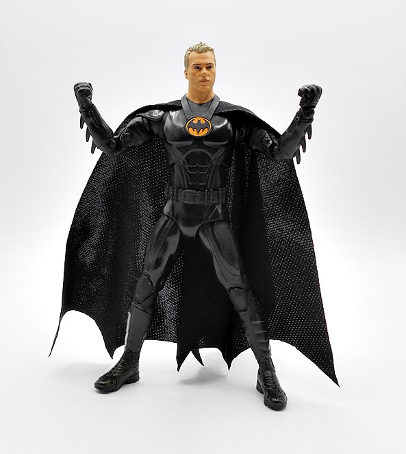
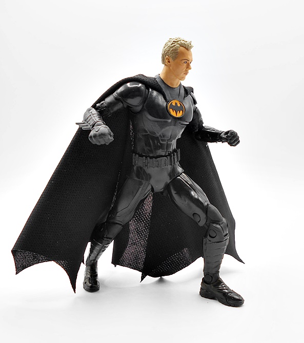
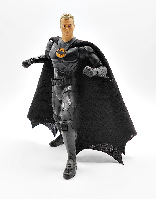
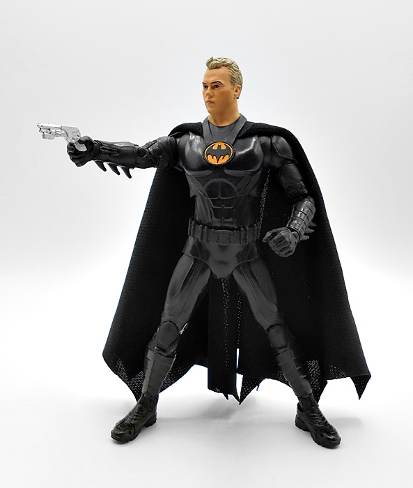
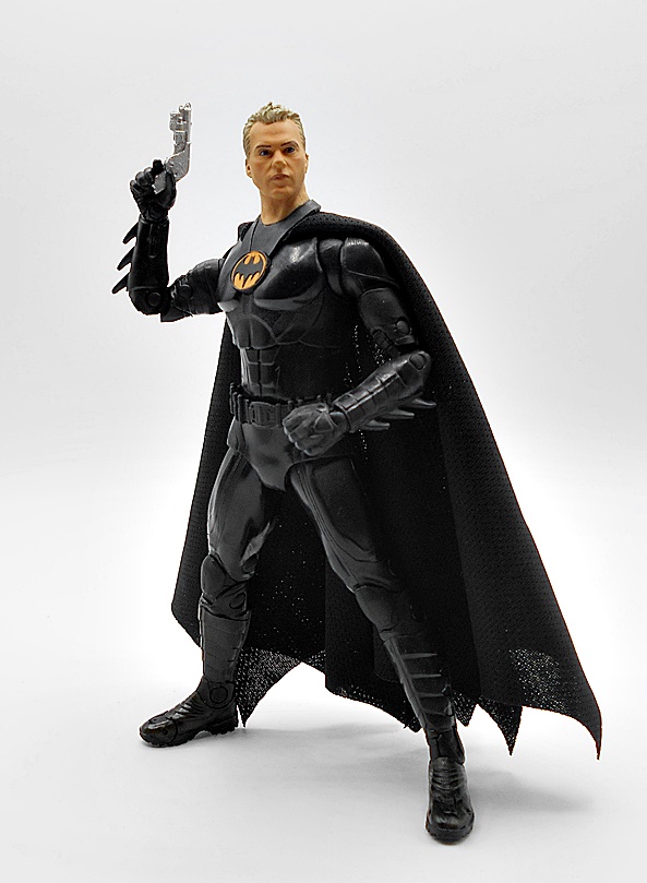
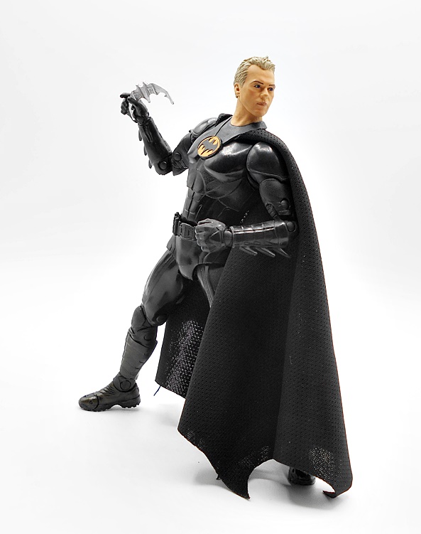
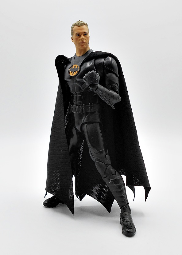
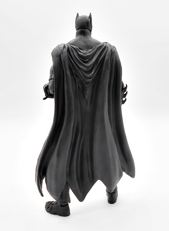
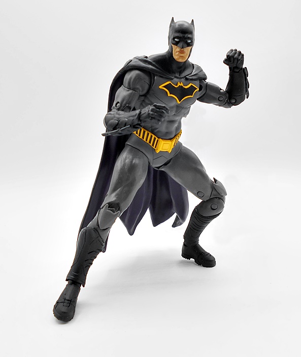
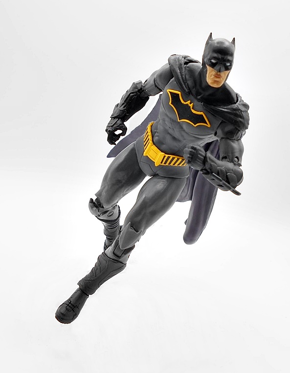
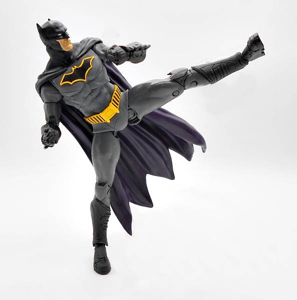
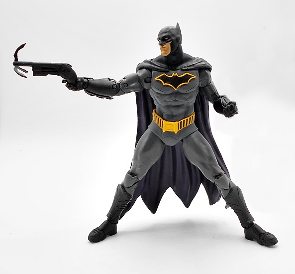
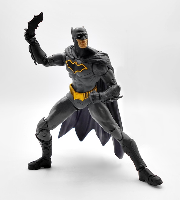
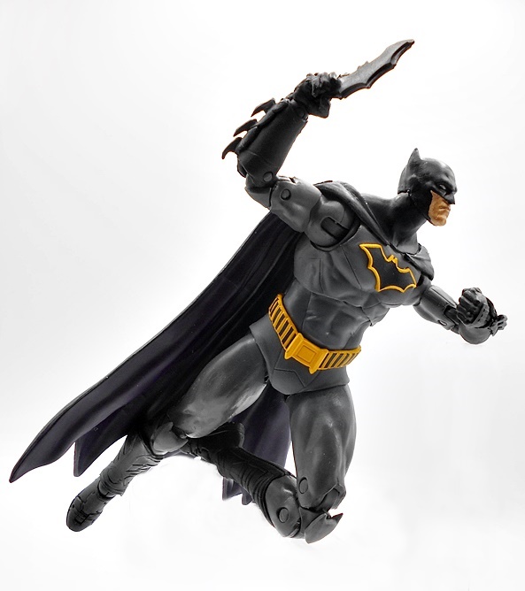
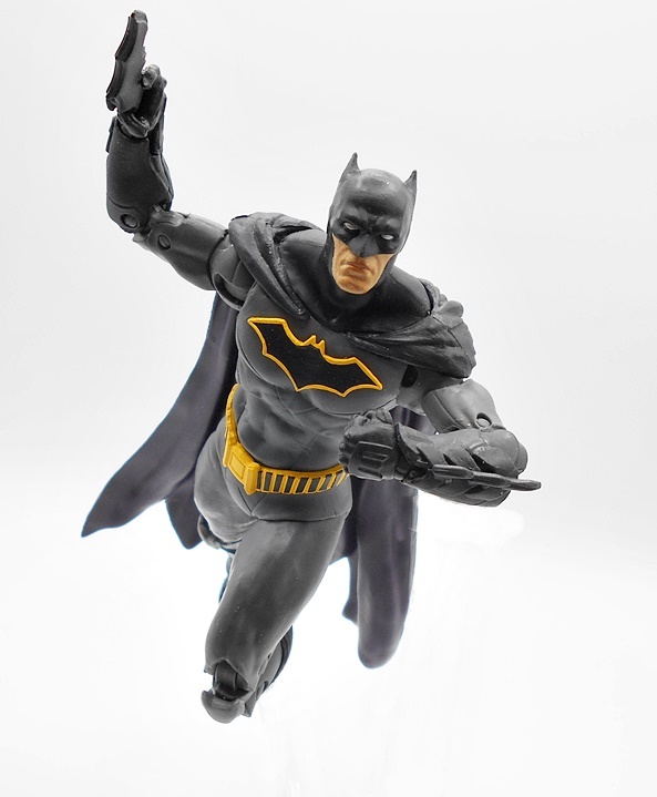
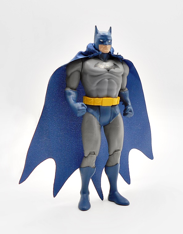
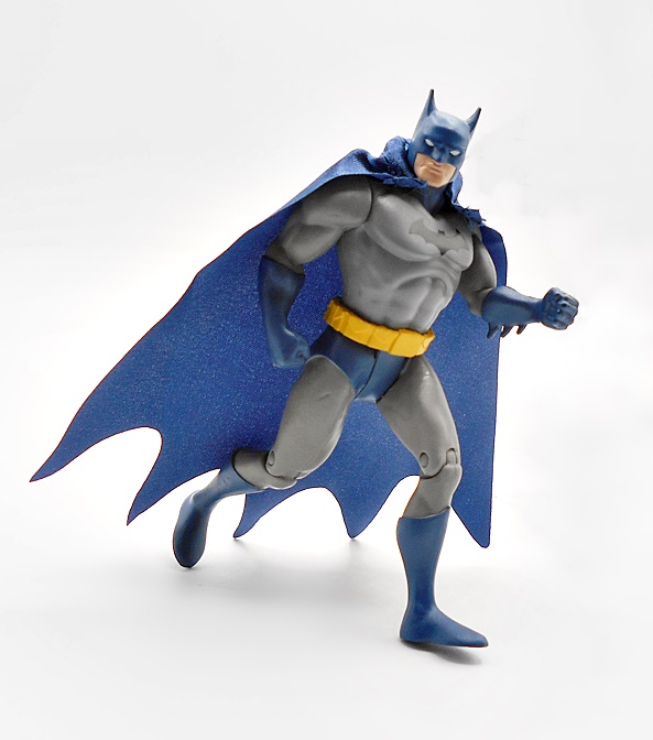
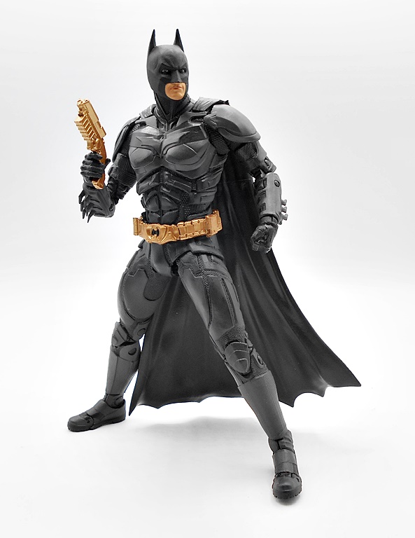
To me this suit was 90% perfection, assuming you count the cowl as 10%. Yes, I like the Keaton suit better, but if you’re going for realism over comic in your Batsuit, than this is how you do it. The suit has a wonderfully tactical look to it and this figure pulls it off quite nicely. The sculpted gaps between the armored plates show the textured undersuit and the chiseled muscles in the abs are superb. The bat emblem is a little too subtle for me, but I get that was an artistic choice. The vastly diminished profile of the cape works well with this look too, as it hugs the body and only fans out at the end. The gold belt is just the chef’s kiss of the whole ensemble. I’m not well versed in the movies to pick out any inconsistencies or differences between the films, but for my money, this is a great looking Batman figure.

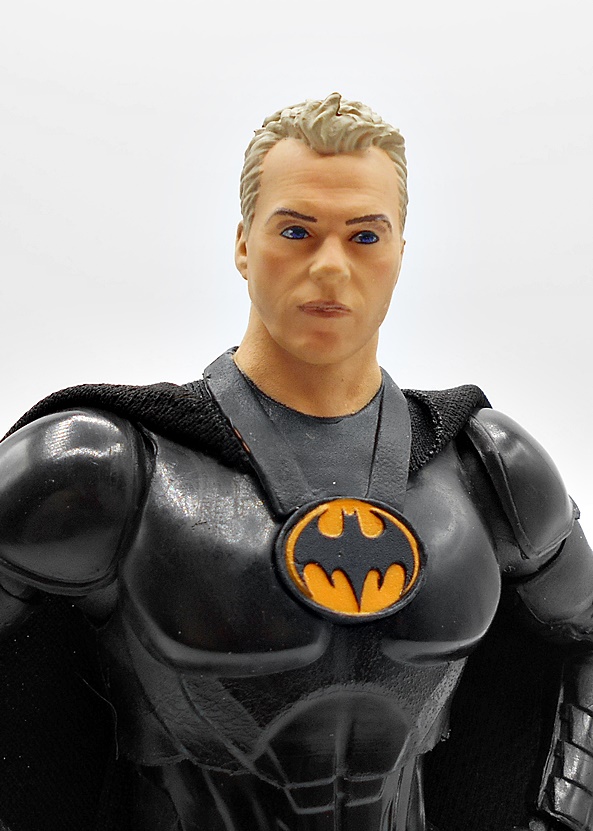
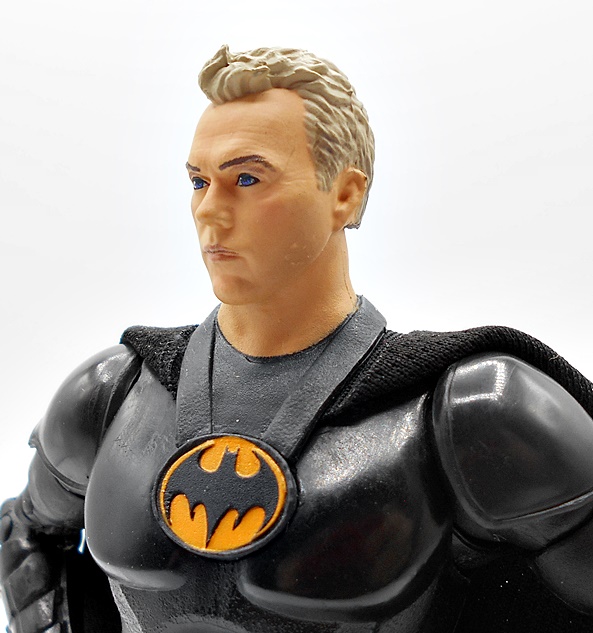
If there’s anywhere this figure stumbles a bit it’s the head, and I’m having a hard time deciding whether it’s actually the figure or just the design of this cowl which I have never liked. The overly round shape is just goofy to me and it’s amplified by the round cut out for the face. I think McFarlane did OK with what they had to work with here, but it remains the one thing I don’t like about this suit.

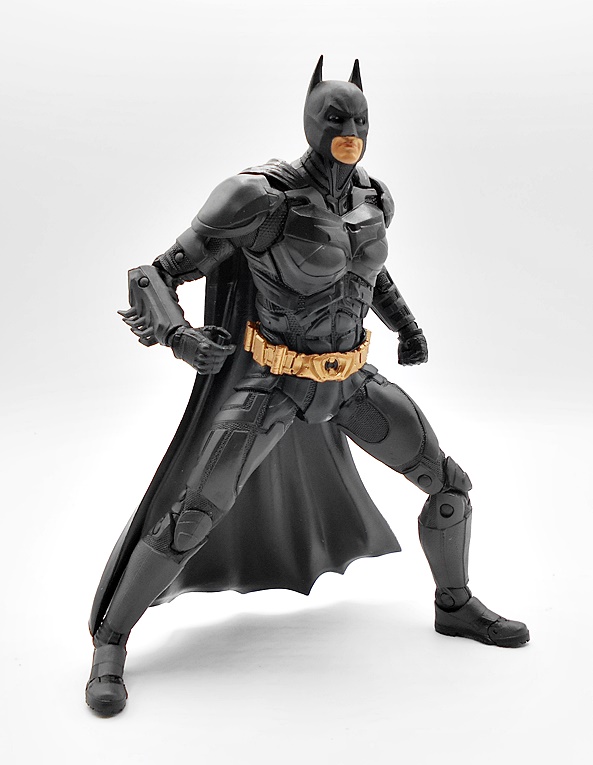
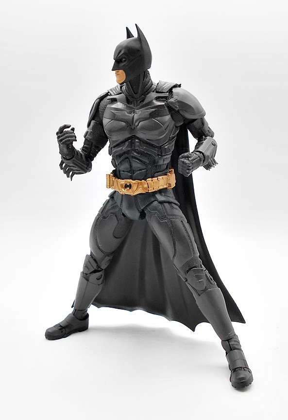
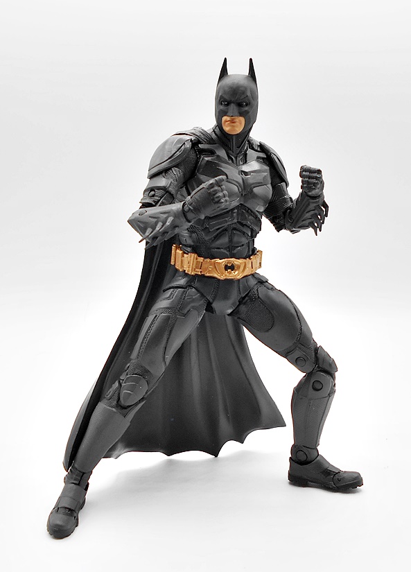
Articulation is everything you’d expect from the DC Multiverse line. I think I’ve covered enough of these figures where I’m not going to run through it every time. I will say that the range of motion here is all quite nice. The shoulder armor is the only place where there’s some inhibition, and even those are designed to flex as much as possible. I have to imagine that what we get is pretty comparable to what movement in an armored suit like this would be like. Batman only comes with the one set of hands, with the left hand balled into a fist and the right hand designed to hold accessories.

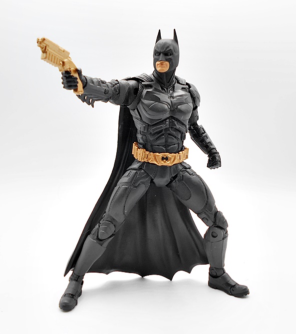
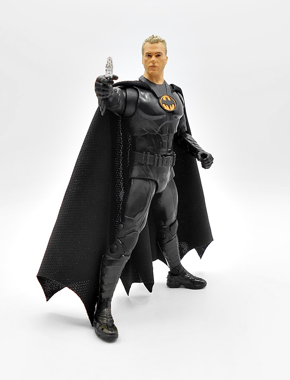
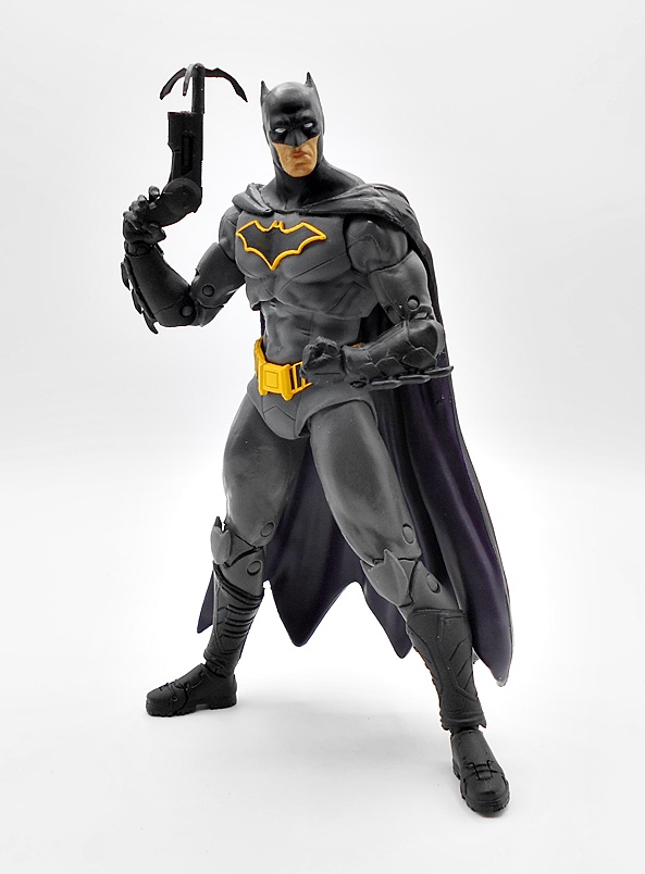
And those accessories come in two varieties. the first is his grapple gun, which is a really nice sculpt and cast in gold plastic to match the belt.

Next up we get three gold batarangs. Why three? Don’t know. I guess it’ll come in hand when I inevitably lose one or two. These are simple accessories, but they are made out of nice stiff plastic, which is nice. I probably would have preferred we only get one and they use the rest of the plastic to make a hand better suited to holding them, or just another fist, but now I’m nitpicking. How about some Scarecrow?

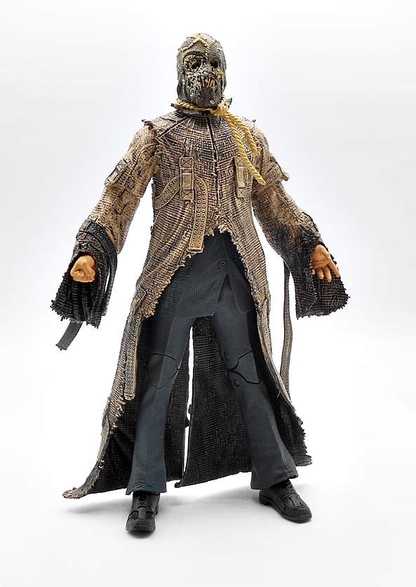
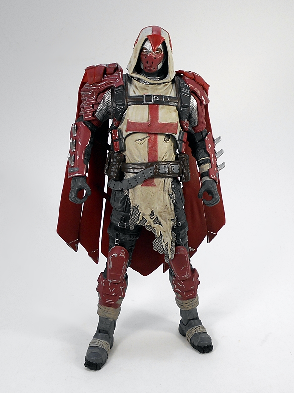
Scarecrow was pretty cool in The Dark Knight Rises, but if it weren’t for the C&B parts, I probably would have passed on this one. And now that I have him I’m kind of glad I didn’t, because McFarlane did an impressive job on this guy, especially with all the layering. Under the straightjacket trench coat you have a fully sculpted suit, but really it’s the detail on the straightjacket sculpt that just blows me away. The texturing on the threads is so intricate, along with all the straps and loops and the ragged edges look great. I also dig the way all the loops in the straps look like suckers on a tentacle. I especially love the way the arm straps just lash out from his arms. You also get a really nice black wash over the tan plastic, making it look extra shabby and dirty.

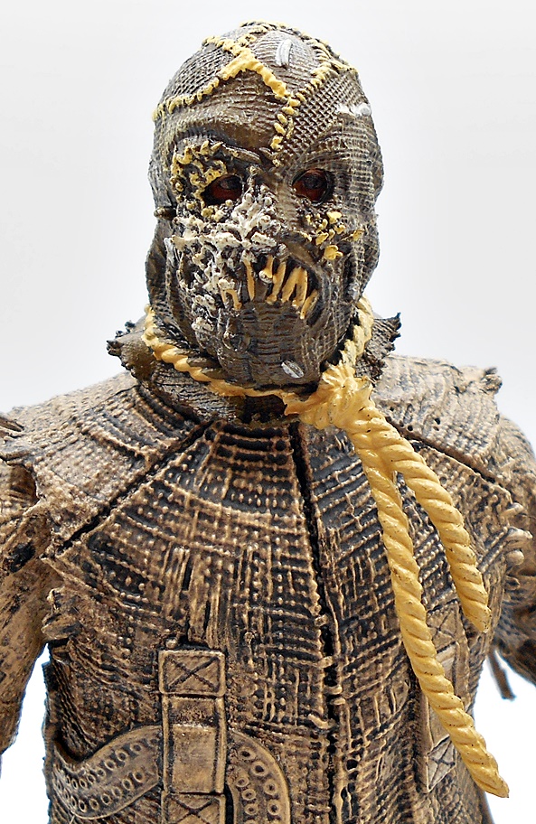
The head sculpt is great too, as it looks like there’s a whole head sculpt under there, even if it is probably just the eyes. Instead of just doing the whole head as one piece, this makes the eyes look really deep set and extra creepy and adds tons of credibility to the hood being an actual hood. And man, is that hood disgusting. I think the white stuff is supposed to be the maggots from one of the fear gas scenes, but either way it’s just so delightfully gross!

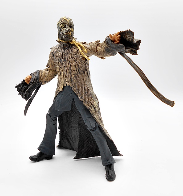
There are no accessories here, but you do get two pairs of hands with Scarecrow, and I honestly can’t understand why they bothered. I would have rather those hands went to Batman. The right fist and the left reaching hand are really all I will ever bother with.

Both of these figures turned out really nice. I think I have one of Mattel’s old TDK Trilogy figures around here somewhere and I can surely retire that one in favor of this release. Still not a fan of the cowl, but even still I think it’s a great Batman figure. Without the C&B part, I would have written off Scarecrow as one of those $12 clearance picks ups that I come across with this line, but it turns out he’s pretty damn cool. Next week, I’ll wrap up this wave with The Joker, Harvey Dent, and the C&B Bane… oh, and one extra Gold Label figure that I mentioned earlier.

DC Multiverse (The Flash): Batman Statue by McFarlane

It’s been a long week at work, but I’m off for a couple of days and ready to start hitting the hooch. So today I’m doing a bit of a quickie. I haven’t picked up any of McFarlane’s DC Multiverse Statues, because I don’t have a whole lot of room to display more statues at this point, but being as smitten as I am with the Batman design from the Flash film, I decided to go ahead and pick this one up, so it’ll be a new experience for me.

The statue is still released under the DC Multiverse banner and even the packaging is identical to the window boxes used for the regular action figures, just bigger. It’s mostly collector friendly, but you will need to tear the base off the back tray and unlike the figures, you really do need it here. There’s also a character trading card just like the ones that come with the figures.

Batman comes out of the box ready for display. You just have to peg his feet into the large round base and he’s good to go. He measures about 10-inches tall and he’s in a bit of a crouched fighting stance, but still a bit shy of being a proper sixth-scale figure. He’s a hefty hunk of plastic and I’ve got to say this guy has a really nice shelf presence about him. With fists balled up, he’s ready to get nuts! This base has a big diameter, and even then it’s still pretty economical when it comes to taking up space with Batman’s left toe at the edge of the front and his right toe at the edge of the back. The cape is made of a very soft plastic and has some excellent texturing throughout. The left side hangs freely while the right corner licks up a bit in front of the leg he has drawn back.

Obviously, there’s not a lot of color here, but you do get some different paint finishes on the black ranging from high gloss to satin to matte. There’s also a muddy paint wash on his boots, which helps to mix things up a bit. The sculpt includes the natural muscle contours of his legs contrasted with the sculpted abs and pectorals of the chest armor. The utility belt has some nice detail work and I’m a big fan of the serrated looking fins on the gauntlets.

The portrait is pretty nice, albeit not a dead-ringer for Keaton. I like the exposed area around the eye holes in the mask are painted black and there’s some sharp edges between the cowl and his skin suggesting the face is sculpted separately. There’s a subtle curve to the ears and these seem to be stiff enough to not be susceptible to warping.

The only real color on the costume is the orange field around the bat symbol. It still feels a little weird for that to be orange and not yellow. Granted, I didn’t see the film, so I can’t comment on whether it’s film accurate or not, but it still looks good.

I think this statue originally retailed for around $40, but I grabbed it on sale at $30. If I were to compare it to something else on the market, I would probably go with Diamond Select’s Gallery series. This one is scaled a bit larger than those, but I’d say the quality is about the same, as is the level of detail in the sculpt and the paint finish. And that’s intended as high praise, because I honestly think that DST’s Gallery offerings are the best value to be had in the comic book statue market right now. I don’t know that I would rate this piece as a Must-Have, especially since I have both versions of the figure, but I’m glad I didn’t pass it up, because it looks really great on the shelf.

The Flash: Batmobile and Batman Unmasked by McFarlane

I can think of few toy reveals that rippled outward with such a shockwave of excitement than McFarlane’s take on the Batmobile from the upcoming Flash film. It speaks volumes of how iconic that design has become in the three decades since it appeared in the ’89 Batman film, and makes me wonder why Mattel didn’t cash in on some of that love back when they had the DC license. And while I have no interest in seeing The Flash movie, I guess I have to at least be thankful that it resulted in this ’89 Batman resurgence and some cool toys. Today I’m checking out both the Batmobile and the Target Exclusive unmasked version of Michael Keaton as Batman. Let’s start with the Batmobile! This thing is a little too big for my regular photo staging area, so I had to improvise!

This sweet ride comes in a fully enclosed box that’s drab and boring. It’s a pretty good sized box, but that’s to be expected as this is a 7-inch scale car with very little assembly required. In fact, all you have to do is free it from it’s plastic bag and plug in the rear fins to get it ready to patrol the streets of Gotham. If you pop open the canopy, you’ll find a collector card hidden in there, similar to what we see included with all of McFarlane’s DC Multiverse figures.

Oh yeah… that’s the stuff! This design is still as dead sexy as ever, and McFarlane did a nice job recreating all those sleek curves. But make no mistake, this toy is a textbook example of give and take, so let’s get some of that stuff out of the way first. McFarlane had to play with the size here a bit to get it at the price point they wanted. As a result the car is a tad smaller than it should be, but I don’t find it that noticeable. It certainly doesn’t feel as downscaled as McFarlane’s 66 Batmobile. Along with the scale, the car also lacks the heft you might expect. The plastic is nice and sturdy, and the toy actually feels quite rugged in hand, but in the end it is mostly just a plastic shell. Indeed, as we’ll see the only play feature you get is the opening canopy and the rolling tires. I’m guessing pop up machine guns would qualify as forbidden by Warner Bros weird No Guns policy. Sure, I would have happily paid a bit more to get some extra gimmicks, but I’m also fine with them being left out. Finally, the profile of the canopy is definitely higher than the actual car, but it’s another thing that doesn’t really bother me all that much.

With all that having been said, I think this toy looks fantastic. The car has a beautiful glossy sheen to it that makes it look like it just rolled off the assembly line. Alfred really is an expert at buffing and waxing! You get some beautiful sculpted detail in that bullet shaped turbine in the front, and while I recall that being black in the film, I think the gunmetal gray here looks good. There are sculpted panels where the machine guns would pop up are present, as well as some additional panel lining on the sides. Yes, under bright lights the canopy is gray, but the variance between the gray and black is a lot more subtle in room lighting. When I first took it out of the box I barely noticed it, but under studio lights it can’t be missed. It’s not optimal, but it sure isn’t a deal-breaker for me either.

The rear of the car has a central turbine in gunmetal gray with two pairs of silver exhaust pipes and two sets of red taillights. The organic curves of the fins look great, as does the sculpted vents positioned between them. The tires are made of rubber and have gold bat symbols on the wheels, and you get some silver pipes and detail on the side cutouts, as well as circular vents angled away from the rear wheels.

To open the canopy, there’s a button just in front of it on the hood. It releases the catch and allows you to slide the canopy forward to reveal the driver cabin. There’s only one seat and while it isn’t accurate, it works fine for this toy. I’m extremely happy with the level of detail in here. You get a fully sculpted seat, which even has some sculpted stitching on the cushions. The banks of instruments and gauges are all picked out with silver paint and it all looks really sharp. The steering wheel is positioned dead center, but does not turn. Let’s switch over to have a look at Unmasked Batman and then we’ll get him in the Batmobile!

I’m using McFarlane’s in package solicitation shot here because mine got pulverized in shipping. It’s the same style packaging we’ve been seeing in the DC Multiverse line only branded for The Flash film and with the foil Gold Label corner. You get a stand and a collector card too. I almost wasn’t going to buy this figure, but he was billed to ship before the regular masked version. And I’m pretty glad I did, because my masked version probably won’t arrive until next week and I wouldn’t have had anyone to put in the Batmobile!

I won’t get too long winded here, because I’ll probably do a comparison when the masked version comes in. The suit is a lot different than I expected and I would have preferred something mare akin to the ’89 film. Here it looks more like sculpted armor and less rubbery, which sure ain’t bad, but just different. The sculpted muscles are a tad more pronounced and angular in some areas, particularly in the abs, I really love the detail on the forearm bracers, you get some panel lines in the upper legs, and the boots look great. Yeah, I’m bummed that the belt is now black instead of yellow, and a little surprised that the bat symbol is more orange than yellow here. Still, I think the suit looks great and I especially dig the glossy finish.

The cape is cloth, and while it looks a bit thin under the studio lights, it looks fine with the figure in hand and under normal lighting. Obviously, they went with softgoods here to make him work with the Batmobile, but I really wish they would choose softgoods over plastic more often. It just makes the figure so much more fun to play around with. Speaking of which, Batman hits all the usual points of articulation that are standard for the DC Multiverse line. The only thing I can really complain about are the continued lack of thigh swivels.

And then there’s the portrait. Well, from certain angles I can see Keaton in there, but not enough to make the likeness anywhere near a slam dunk. I actually think the flat paint is what’s letting down the likeness more than the sculpt. Considering you had to buy a whole different figure to get the unmasked head, I think this probably should have turned out better.

Batman comes with two sets of hands: One pair of fists and one pair of accessory holding hands. The included accessories are his grapple gun and a batarang, both of which are silver. Both are nice sculpts, but it’s a little odd that they aren’t black. Maybe they’re silver in the film? Someone will have to let me know, because I’m not going to see it.

Getting Batman into his ride is pretty easy, thanks to that cloth cape. He sits a little close to the steering wheel, but if you have more patience then me, you can probably get his hands on the wheel. I’ll make more of an effort when the masked Batman comes in.

Overall, I like this figure a lot, but I’m sure I’ll like the masked version even more. Chances are, I’ll wind up leaving this one in the Batmobile and displaying the masked version beside it. Then again, I do have McFarlane’s giant Batwing coming in at the end of this week, so I guess one of them may wind up sitting in the cockpit while the other stands beside the Batmobile. As for the Batmobile… If you’re looking for a perfect rendering of the 89 Batmobile that will hold a figure, well this isn’t it. But then, I don’t think such a toy exists. The old Kenner Batmissile Batmobile released in 1992 is your best alternative option, but it’s scaled for smaller figures, has some silly play gimmicks, and has it’s own share of inaccuracies in the design. It’s also selling for three or four times what this one is if you can find one complete and in good condition. Considering that McFarlane’s put this out at $60 seems like quite an amazing feat, and considering how quickly it sold out everywhere, I’ll go out on a limb and call it a success. I pre-ordered this at three online retailers just to be sure I got one. Only one of those retailers delivered the goods and that was Target. Another retailer outright cancelled, and my Amazon pre-order is in limbo and will likely be cancelled too. There’s certainly some room for improvement in this toy, but I love it and I’m glad I was able to get one!

DC Multiverse (Rebirth): Batman and Superman by McFarlane

A little while back, I popped my cherry on McFarlane’s DC Multiverse line with a look at the Blue Beetle and Booster Gold two-pack, and now I’m going to start unloading on reviews for this line, because I bought a whole hell of a lot of them on various sales. Of course, this line is very Batman-heavy and otherwise pretty scattershot when it comes to the comic period and costumes, which can be infuriating when trying to build a team, but otherwise fun if you’re just looking at individual figures. And, coming into a line late in the game also has it’s ups and downs as well. Some figures have gone on deep discount, while others have gone up in value on the secondary market. Right now I’m still in the looking for good deals phase, but eventually I’ll probably hunt down some specific releases. With all that having been said, let’s have a look at Batman and Superman in their Rebirth costumes!

The packaging here is consistent with what we’ve been seeing in the line. I really dig how the bright blue interiors contrast with the black boxes. I’ve never really enjoyed how grimdark modern DC has become in the mainstream, so I think these packages stride the line nicely. Each figure comes with a collector card and a stand. Batman comes with the regular disk stand, while Superman actually comes with a clear flight stand. I bring these up now, because for the time being, I will not be removing the cards or stands from the boxes, as it damages the trays. Eventually, I will get short on space and have to pitch all these boxes, but for now I’m keeping the figures in them. Let’s start with Batman!

Cards on the table, I really loved the New 52 Batman costume, so I was a little apprehensive when Rebirth came along. Turned out that I really liked this one too. Maybe not loved, but it’s not bad at all. The dark gray suit looks great against the black of the boots, gauntlets, cape and cowl. The big change here is the brighter yellow belt and yellow outline around the chest symbol, both add a nice little pop. The suit has a few panel lines, but it doesn’t overdo it, and that sort of detail is mostly reserved for the boots and gauntlets. The serrated blades on the gauntlets are awesome, and I absolutely love how the bat symbol is sculpted and not just printed on. I’m not a huge fan of the bat-head knee guards, but they’re not too distracting. The cape is sculpted so that it stays fairly tight with the body and not fanning out too much. I do tend to prefer this to the dynamic, windblown effect, which I think is best saved for statues and not action figures. All in all, this is a great looking suit and McFarlane executed it beautifully for the figure.

The head sculpt, on the other hand, is nothing to get excited about. The lower half of the face is a pretty soft sculpt. So much so that my shitty camera took half a dozen shots to finally get somewhat focused on it. I do dig the cowl, as it gives me a bit of 89 Batman vibes, and the whited out eyes look fine. There’s nothing really bad here, but I just don’t find it exceptional.

The articulation is exactly what we saw with Beetle and Booster. Eventually, I’ll get to the same point as I did with Marvel Legends and just stop surveying the points of articulation on these. When it doesn’t change from figure to figure, it gets old to recount it all every time. But these bodies are still new to me, so let’s give it a rundown. The arms have rotating hinges in the shoulders, swivels in the biceps, double-hinged elbows, and ball hinges in the wrists. I really have no complaints about the arms at all, and I love how tight the elbows will go! The legs have rotating hinges in the hips, which offer a pretty nice range of motion going forward, back, and to the sides… but so very little swivel, it’s practically non existent.. The knees are double-hinged, the ankles have both hinges and lateral rockers, and the feet are hinged for the toes. The one gripe I’ll keep coming back to in the legs is the lack of a thigh swivel. The neck is ball jointed with some nice range of motion, especially for Batman’s constricting cowls. Finally, you get ball joints under the chest and at the waist, which do a fairly decent job. This is a fun figure to pose and play with, even though the cape can make him a bit back heavy.

Batman comes with two accessories: His grapple gun and a batarang. His right hand is sculpted to hold either one, while the left is balled up in a fist. The grapple gun is pretty big and satisfying, with the grapple hook sculpted in place. Getting a string to swing the figure on would have been cool, but this looks good in his hand. There’s no obvious trigger, which I assume is part of Warner Brothers weird obsession with not allowing any guns or anything even remotely trigger-y. Quite frankly, I’m surprised McFarlane got away with this accessory at all.

The batarang is simple enough, but a pretty nice sculpt. It can be a little tough for him to hold it, but squeezing it between the fingers seems to work fairly well. If you’ve been around here a while, you may know that I’m not a huge Batman fanatic, and I’m not going to buying the majority of the ones released in DC Multiverse. But, I do indeed love this figure, and considering the insane number of Batman figures in this line, I’m glad I started out with this one. Let’s move on to Superman…

Unlike Batman, I’m always down for a new Superman figure, so I was really excited to get this one opened and check him out. Happily, he does not disappoint. Rebirth Superman’s costume didn’t stray too far from his New 52 look, and while I like it a lot, I still think it was a step down. I mainly miss the red boots here, as you now only get some red striping at the tops of blue boots. The cut lines in the suit have been toned down a bit, which is fine. I still like the red belt with the floating diamond buckle. And like Batman, I absolutely love that the chest shield is sculpted and not just printed on the figure. The coloring here is extremely nice, with the blue and red playing off each other brilliantly, and the glossy sheen on the chest shield is gorgeous. I do wish the striping under the knees were a little more vibrant, and I really would have preferred if the ball joints in the wrists were flesh colored and not blue. The cape is mostly tamed behind him, although there’s a little bit of flutter to his left side.

The head sculpt here is much sharper than Batman’s, but in fairness they had a lot more to work with. Overall, I like the portrait, but looking straight on there’s definitely an extra helping of jawline. I like the furled brow and intense gaze, which makes him look just a bit perturbed at the whatever injustice he is perceiving. I don’t like my Superman to be too angry, so this works for me. The cleft chin and the cowling are also wonderful little touches.

The articulation here is identical to Batman, so I won’t run through it all again. I will say how much I appreciate the upward range of motion in Superman’s head, which is perfect for flying poses. It’s ridiculous how many flight capable super hero action figures get this wrong. There are no accessories with Superman, unless you count the flight stand, which I suppose is a really nice bonus. And since he has nothing to hold, his hands are both sculpted as fists, which once again works great for those flight poses, or just punching villains.

I have to say, I’m having an absolute blast dipping my toe into McFarlane’s DC Multiverse. Rebirth Batman and Superman are both excellent figures, and I’ll wager they will reside on my desk within arm’s reach for a while before getting put up on the shelf. They are tons of fun to play around with and I couldn’t be happier with the way they turned out. I was able to pick this pair up for just $16 each, which is a helluva deal, and I’ve already got a few more Rebirth era figures to check out! Boy, does it feel great to be buying DC figures again!

DC Super Powers: Superman, Green Lantern, Batman, Darkseid and Batwing by McFarlane

New takes on retro action figures is a huge thing these days. I think a lot of the credit (or blame) on the resurgence of vintage and 5POA figures can go to Funko and Super7’s ReAction lines, but since then a lot of companies have jumped on board. And while McFarlane is already producing a dizzying array of regular DC figures in their Multiverse line, they’ve found the time to reintroduce the world to Kenner’s old DC Super Powers Collection. These aren’t exact reproductions of those figures, instead some are new versions of the characters done in the old style. And unfortunately, these are all Walmart Exclusives, so I was pretty surprised to find any of them at all, let alone the whole wave. Let’s start with the figures and then I’ll have a look at one of the vehicles!

The first wave consisted of three figures: Superman, Batman, and Darkseid, but since I managed to find Jon Stewart Green Lantern from the second wave, I’m throwing him in here as well. The second wave also included The Flash and Batman Who Laughs, and I’ll only be picking up the Flash out of those two. Obviously, the packaging is going for pure nostalgia with some pretty close approximations of the old Kenner card backs. They look great, but they are definitely not collector friendly. And I was tempted not to open these at all, but my willpower is shite, and I tore into all of them. The wave one figures were on clearance, so I may pick up a second Batman and Supes to keep carded, if there are still any left. We’ll start with The Man of Steel!

Superman is the only one of the bunch that’s pretty close to the original Kenner figure, at least in terms of costume design. He’s got his bright blue suit with red boots and undies, yellow belt, and S-shield. I dig the proportions on this figure, and the sculpted muscles look really nice. The coloring is also outstanding with bright yellow, vibrant blue, and crisp red, he looks like he flew right off the pages of a DC funnybook. The head sculpt is a tad soft in the facial features, but they really captured his trademark cowlick, and I like the bright blue eyes.

The cape is like a cross between paper and cloth. It’s stiff, but looks good, and has a wire running through the collar, which is the only way it attaches to the figure. It hangs on well, and my only gripe here is that the cape was secured to the bubble with a wire, which left a tiny hole in the cape. This won’t be an issue for mint-on-card collectors, but it bugs the hell out of me. As with all the figures in this line, Superman has seven points of articulation. The head turns, the shoulders rotate, the T-crotch allows the legs to move forward at the hips, and the knees are hinged. The figures do not retain the Kenner action gimmick that made them punch when you squeezed their legs.

Unlike Supes, Batman is a completely different version than the original Kenner figure. I think this design is based on the Hush comic, which admittedly isn’t a huge departure. Instead of having the yellow and black bat symbol on his chest, he just has the black. It’s disappointing to me, but not a deal breaker. Otherwise, the figure looks fine with a mix of new sculpting and recycled parts. The cape works the same as Superman’s and yes it still has a tiny hole in it from the wire. Batman is by no means a bad figure, but he’s definitely my least favorite of the four.

Darkseid is also pretty different from the original Kenner figure, with this being the New 52 version, which is nice nod for me because I happen to like this look a lot. Darkseid is the biggest and most complex figure here with a lot of great sculpting for a figure in this scale. The armor bits give him a lot of heft, and I love the detail to his belt. You even get a little sculpted fissures in the skin on his arms and his face. Even the coloring here is fun and vibrant with the bright blue and yellow contrasting nicely with the dark skin. Darkseid has one hand sculpted into a fist and the other able to grab other figures. I love this guy!

Last, but not least is Jon Stewart, who did not get a release in the original Super Powers, as Kenner only produced Hal Jordan as Green Lantern. And oh boy, is this figure outstanding! The costume is pretty simple with a mostly black bodysuit and green boots, bracers, and shoulders, with the lantern emblem on his chest in green and white. The head sculpt is an absolute homerun here! The facial sculpt is so good that it doesn’t feel like it belongs in the same line as Batman and Superman. Jon’s right hand is sculpted in a fist and has his power ring clearly represented, while his left hand is designed to hold his lantern accessory. Wow, what a great figure!

There’s a part of me that would have liked to see McFarlane do the Kenner versions of these figures, but then New 52 Darkseid and Jon Stewart Green Lantern are so great, I’ll happily stick with what we got. Despite being cherry-picked from across the DC Multiverse, these figures still manage to capture the charm and fun of the original Kenner efforts. What’s more, they certainly don’t feel like quick and dirty nostalgia cash grabs, but rather damn fine figures for their scale and style. Even more so at less than $10 a pop. But we’re not done yet… let’s move on to the Batwing!

Kenner Super Powers gave us the Batmobile and the Batcopter, but this Batwing is an original design for this line, borrowing heavily from the 1989 Batman film and retro-fitting it perfectly for the vintage Kenner style. The jet comes in a fully enclosed box that mimics the vintage vehicles for more of that sweet, sweet nostalgia. You get artwork on the front and some shots of the Batwing on the other panels.

The Batwing comes out of the box fully assembled, but with the wings folded up. I’m not sure if this is supposed to be a play feature, or just a method of getting a big toy into a small box. Either way, I dig it, as it’s similar to how some vintage aircraft would fold up the wings for storage on carriers. I’d like to think that this is how the Batwing travels up an elevator to be deployed out of a concealed hanger on the top of the Batcave.

With the wings folded down, we can get a better look at the jet, and it’s a damn cool little vehicle. Again, the similarities to the 89 Batman jet can’t be overstated. This one is a little smaller and cast mostly in blue plastic with black bat wings jutting up from each side of the translucent orange cockpit. There’s a little bit of panel lining, and two gray machine guns, at least that’s what I’m calling them, and finally a very classic black and yellow bat symbol, which doubles as a button to spring open the canopy. The back has a gray thruster cone, and there’s a trigger on the undercarriage to activate the capture claw hidden on the front. I really love the design of this little toy, especially how anachronistic it is. The way it takes a newer design and makes it feel totally at home in this retro line is just genius.

Batman is a bit of a snug fit in the cockpit, but it works! I prefer to remove his cape, just so it doesn’t get all bunched up in there. The cockpit is detailed with some very colorful pre-applied stickers for the consoles, and a bat-shaped yoke for steering.

The capture claw feels right at home as a Super Powers action gimmick, while also employing a feature seen on the 89 Batwing. I can practically see a kid in a vintage commercial swooping in for the grab while shouting, “YOU’RE FINISHED, DARKSEID!” Every bit of this toy just oozes 80’s Kenner charm!

Now, I will confess to some Batwing sticker shock, as for some reason I was convinced that these vehicles were $20, but in fact they were $29.99 at my Walmart. I’m not going to say it’s totally outrageous, but it is a lot for what is a pretty small and simple vehicle. But, obviously it wasn’t too much, because I came home with it. Still, I wish it had been on clearance like the figures! Nonetheless, I have no regrets. This line is just tons of fun and looks great on display in a little corner of my Comic Room. I’m not sure how deep I’m going to go with collecting it, but I am hunting Flash and Wonder Woman now, and I will probably break down and pick up the Superman vehicle as well. It would be great to see Kalibak and Steppenwolf, as those were some of my favorites in the Kenner line, but even if we do get them, who knows what versions they will be. And that’s really just my one nitpick here is that I would have enjoyed more of a cohesive selection of character versions.

DC Comics Multiverse (Doomsday Wave): Dark Knight Returns Batman and Robin by Mattel

So, if you haven’t guessed by now, I’ve been using Mattel’s ho-hum Multiverse line as filler for DC Fridays as I await some better stuff to come in. I should have something next week for sure. In the meantime, I’ve picked up a couple waves of these figures for stupid cheap and I’ve been trudging through the Doomsday Wave. Today I’m doubling up with a look at both Batman and Robin from Frank Miller’s The Dark Knight Returns. I was actually looking forward to these figures and hoping they would be the breakouts of the wave. Turns out those were lofty and unfulfilled hopes. Let’s have a look…

The figures come in window boxes and are collector friendly. They’re not ugly, they’re not great, they just are. Sometimes I’m sad about tossing packaging, but in this case, I don’t really care. There’s some nice character art on the side panels, and you get a little blurb about each character too. Let’s start with Batman…

So, my first thought here is that the figure looks drab and unfinished and I proscribe that to the lack of paint. I suppose you could argue that they’re going for a comic look here and the art in this particular book sure isn’t cheery. In fairness, they did attempt to add a little color diversity here and there. You get the dark gray of the armor pieces, with the lighter gray and blue of the underlying suit peeking out. Then you get the blue of the cape and cowl, and the bright yellow of the utility belt. And yet still, there’s something about the coloring on this figure that looks cheap.

The sculpt itself is passable. I like that the chest armor is soft plastic wrapped around the buck. It adds to the bulk of the figure and also gives it a unique matte finish to contrast with the rest of the plastic. There are some little cinches and rumples sculpted in too. You get some panel lines in the armor rings, some nice ribbing and texturing on the fists, including reinforced plates on the knuckles, and best of all, you get those crazy spikes on the soles of his boots. Again, I think a lot of the reason this figure falls flat for me is the lack of paint. I’ll also point out that mine came out of the package with the right shoulder cape attachment warped so it looks like it’s pulled up.

The head sculpt isn’t terrible. It fits the style of the art. There’s some nice depth between the face and the cowl. But the paint on my figure is all chipped around the upper lip, exposing the gray plastic under it like some kind of unfortunate case of necro-herpes. For a figure with an MSRP of about $20, that level of quality control just isn’t here.

Articulation here is quite limited. That’s been a gripe of mine for the first two figures in this wave and it looks like that isn’t going to change. Once again, the problem isn’t with the points, but with the range of motion in those points. The elbows in particular have are laughably limited. In the case of this figure, I’m maybe willing to be a bit more forgiving, because he is wearing bulky armor, but it still means that this figure isn’t much fun to play with. Also, there’s a waist swivel in there, but mine is locked tight with the torso slightly turned to the right.

Batman comes with his EMP gun and it’s a pretty sorry excuse for an accessory. Maybe this would have been OK for a 3 3/4-inch scale weapon, but come on, Mattel. This is just embarrassing. I’ve had enough of this guy… let’s move on to Robin.


We’re still focused on TDKR here, so this is of course, Carrie Kelly. I like the scaling here, especially when you display her next to Batman, because she’s appropriately tiny. From the neck down, the sculpt isn’t half bad. Mattel actually did a decent job with the classic Robin outfit. It’s not overly encumbered with detail, but it definitely gets the job done and adheres to the art style reasonably well. I even like the coloring here. The bright red, yellow, and green really make this figure pop splendidly. Well, look at that, I had some nice things to say!

For a while I was a little torn on the head sculpt. At certain angles it doesn’t look too bad, but in the end I have to come down against it. The glasses look way too large and blocky and having them just painted over green doesn’t work for me. At this point, I realize it’s asking way too much to have clear green plastic and sculpted eyes behind them (although even Funko’s Pop! Vinyl managed to do it), but it doesn’t change the fact that what we got here looks kind of awkward. And speaking of awkward, the bottom part of the face and lips does not look like anything like a child to me.

Like Batman, the articulation here sucks. Again, on paper this figure should have all it needs to work, but none of those points offer any real range of motion, except the shoulders. The hips are confined by the tunic, the elbows can barely make 90-degrees, and the ankle hinges are all but useless. I pick these figures up, fiddle with them for a few moments, get frustrated, and put them back down again.

Robin comes with her slingshot accessory, which is a good thought, but executed pretty hamhandedly. The rubber band looks like a chewed stretched piece of caramel. She can hold the slingshot in her right hand or it can get tucked into the loop on her belt, where it looks like an oversized albatross.

Goddammit, Mattel! After one disappointment (Supergirl) and one meh (Superman Doomed), I’ve was hoping to finally hit a couple of Multiverse figures that I actually liked and instead I got these. They look and feel cheap, they have horrible articulation, and Mattel should be ashamed of themselves for asking $20 a pop for these. Keep in mind, I paid eight bucks for each of these and I’m still not satisfied. These are giant leaps backwards from the days of DC Universe Classics, a line that Mattel killed many years back so that they could, what… work on developing this garbage? OK, I still have two more figures in this wave to review before I can put together Doomsday, but I feel like I’m really bumming out DC Fridays with this crap, so next week I’m going determined to cleanse the pallet with something decent.

Arkham Origins: Dr. Harleen Quinzel, The Electrocutioner, and Lady Shiva by DC Collectibles

It’s been over a week since I last had a day off from work. I’m exhausted and keeping up with FFZ’s content this week has been a real drain on me. Nonetheless, with just one day left, I wanted to finish off the week so I could collapse and rest for the weekend. Let’s see, what did I have scheduled for this DC Friday? Oh, shit… a box set of three figures? Oooook, let’s get to it…  As some of you may know, I’ve been picking up the figures based on the Arkham video games, even though I’ve only played the first two so far. I really like the designs for a lot of these characters and in some cases these allow me to get characters into my collection that aren’t otherwise available. This Arkham Origins set caught my eye at a game store a little while back and the price was right, so it went home with me.

The figures come in a pretty standard window box with the back showing off all the other figures available in this series. This set is actually my first from the Arkham Origins game, but definitely won’t be my last. The crazy thing about this series is that the figures tend to run all over the place in terms of cost. This set was pretty cheap, while some of the individually packaged figures have become crazy expensive. Let’s start with Harley… whoops, I mean Harleen!

I’m not sure why, but DC Direct, and now DC Collectibles, have had some issues in the past with females in civvies. They tend to look more clunky than they should, but I’m happy to say that’s not the case with Dr. Quinzel here. She sports a black skirt, red blouse, and white lab coat and there’s some really nice detail here, including the sprig of holly on her lapel, her security badge, and even the diamond pattern belt buckle that hints at the costume design for her future alter-ego. Indeed, I really dig how even the colors here are just a rearrangement of Harley Quinn’s classic look. Granted, the knee joints are a bit clunky, but otherwise this is a great looking figure. And speaking of joints, the articulation here is fair. Most of the useful points are in her arms, with rotating hinges at the shoulders, hinges in her elbows, and swivels in her biceps and wrists. The legs have swivels hidden up under the skirt, the aforementioned hinges in the knees, and she has a t-crotch, which is inhibited quite a bit by the skirt. Finally, she has a ball joint in the neck.

Even the portrait is pretty damn stellar.  Keep in mind, DCC’s paint tends to fall apart when you get in real close with the camera, but to the naked eye, this is a phenomenal head sculpt with some really great paintwork to back it up. The eyes are unfortunately uneven, but it’s really hard to tell that without a zoomed lens, and these have got to be some of the best eyeglasses sculpted in this scale that I’ve ever seen. Also, check out how the collar on her blouse pops up instead of just being sculpted as part of the buck. That’s a great touch!

Harleen comes with one accessory and that’s her clipboard. She can hold it in either hand, but it’s really intended for her right. It would have been cool if they could have printed a sheet of paper on it with The Joker’s file or something, but as it is it’s just empty.

I’ve wanted a figure of Harleen for a while now, and this one really scratches that itch. It’s a great sculpt and while she may not be the most exciting figure when it comes to articulation and accessories, she looks great on display. Next up… The Electrocutioner!

Even though he’s based off the video game, The Electrocutioner is everything I could hope for in a DCEU version of the character. The bulky electro suit is packed with details, from rumples to stitching, to all the little bits of wire that presumably make shoot electric bolts of death. In the tradition of modern comic book movies, it takes a very comic-booky design and ramps it up with a dose of realism. I particularly love the battery packs strapped along each of his sides. The heavy armored chest plate, boots, and knee pads give him an even more formidable look. And while he’s mostly a dark figure, he has some bright yellow and blue on his cables that makes him stand out. He also has some red striping added, which forms a “V” on his chest, reminiscent of some of his comic appearances. All in all, I think this is a damn cool design.

The head sculpt is also excellent and features a gruesome area of scarring on the left side of his face, where the flesh has practically been stripped down to the muscle. The red paint in the left eye is a particularly nice touch.

Like Harleen, the articulation here is fairly good, but has a few unfortunate restrictions. The arms have rotating hinges in the shoulders, double hinges in the elbows, and the wrists can swivel. That’s all great, but the hips are a simple t-crotch, which is disappointing. The knees are, however, double hinged, and he has swivel cuts at the tops of his boots. There’s no articulation in his chest, but his neck is on a ball joint. Overall, I don’t mind the curtailed articulation here all that much, because Electrocutioner is a freaking tank and doesn’t really need it.

The Electrocutioner is completed with a pair of extra hands with open grips. I don’t feel that these were really necessary and I doubt I would have missed them if they were omitted, but it’s always nice to have options. The yellow cables simply unplug from the fists to allow you to change them out. I don’t really have a whole lot of history with Electrocutioner from my romps through reading DC Comics, but he’s a cool character and this is a great looking figure.  And that brings us to the final figure… Lady Shiva!

I was really impressed with the look of this figure before I even got her out of the box. The finery on her top is not only a great design, but DCC did a wonderful job translating it to this figure. Everything is sculpted from the gold fasteners to the sash tied around her waist and the gold fixtures at the ends and the paint really pops against the rest of the black costume. In reality, it’s probably not the most versatile attire for martial arts, but we’re talking comics and video games here, so I’m happy to sacrifice plausibility for a fantastic looking costume like this one.

Again, we have an excellent portrait with some nice depth to the face coming from the way it’s framed by the hair. I also dig the jade colored paint they used for her eyes. The articulation here is almost identical to what we saw on Harleen. The swivels in the legs are at the boots instead of up in the thighs, and Shiva has a better range of motion in the hips because she isn’t inhibited by the skirt. With that having been said, articulation that I found acceptable in the previous two figures feels really limited here. Shiva should be able to all kinds of crazy moves and poses, and you really can’t do much of that with this figure.

Lady Shiva comes with her sword and scabbard. There is unfortunately nowhere to attach the scabbard to the figure, which makes it fairly superfluous. Otherwise, the sword is a nice enough piece and her right hand is sculpted to hold it perfectly.

My guess is that this set was around $50-60 originally, but I got it on clearance for around $30 and that’s not a bad deal at all. In truth, I bought it mostly for Harleen and was just pleasantly surprised by the other two. All three of these figures look fantastic in terms of both sculpting and paintwork and really show that DCC at their best. The articulation is certainly lacking a bit, although the nature of Harleen and Buchinsky makes it more forgivable. In the case of Shiva, it hurts a little more. All this figure needed was some ball jointed hips to make her truly shine.

I had originally planned on doing an Anime Saturday post tomorrow, but I’m going to bow out in favor of some recoup time. Appropriately, I’ll be spending this DC Friday night seeing Wonder Woman and I’ll spend the rest of the weekend doing as little as possible! 


Arkham Knight: Catwoman by DC Collectibles

Yup, I’m still on an Arkham Knight figure kick and one day, I hope to get around to playing the game too! Honestly, even if I wasn’t starting to collect this line, I’d still probably have picked up Catwoman here, because I tend to pick up whatever Catwoman figures I can find. What can I say? I like cats and I like women. Meow!

arkcat1

The packaging is the same as we saw last time with the Azrael figure. It’s an attractive and collector friendly window box with that stylish angled edge that features the figure’s name. I like the grittier box art too. The presentation here is just all around fantastic and if I weren’t so damn pressed for space, I’d keep the box. Sadly, that’s not an option.

arkcat2

arkcat3

Free from her box, Catwoman is looking mighty fine. This isn’t a huge departure from Catwoman’s modern look in the comics, but it’s a quite a bit of a change from the Greg Capullo Catwoman I looked at a little while back. You get a much more realistic catsuit, and by that I mean it’s got all sorts of texturing and extra details. High friction areas are covered with a textured web-like honeycomb pattern while others are reinforced with just smooth padding. There’s a subtle mix of matte and gloss black to further distinguish the details. There’s also some crazy detail on the front laces of her high heeled boots. Those things must take forever to put on!

arkcat9

arkcat7

While technically an accessory, I’ll mention her coiled whip here. It tabs into a slot on her right hip so you can display her wearing it when she’s not using it. It’s a great addition to the figure and I’ve to to say, I wish the Capullo Catwoman did something similar.

arkcat4

arkcat5

The head sculpt is quite nice. Again, I can’t really vouch for the likeness to the in-game model since I’ve yet to play the game, but I like what we got here. The cowl has a sort of worn leather look to it and her red tinted goggles are sculpted permanently in the up position. I dig the way her hair falls over her left eye. The paint work on her green eyes and red lips is very sharp, and while Catwoman is often depicted wearing a choker, here she’s wearing a full-on kitty collar! Naturally, her front zipper is way down low to show off the kittens.

arkcat8

arkcat13

arkcat12

Articulation is not something I expect in spades from DCC’s regular lines, but Catwoman here doesn’t make out too bad at all. The arms feature rotating hinges in the shoulders, elbows, and wrists. The legs have rotating hinges at the hips. swivels in the thighs, double hinges in the knees, and hinges and lateral rockers in the ankles. There’s a ball joint just under the chest and another at the neck. She’s by no means super-articulated, especially for a nimble minx like Catwoman, but I’m still impressed at how much she can do for a non-Icons DCC figure. If her hips had just a little more range of motion toward the front, she’d be really something.

arkcat14

arkcat11

As far as accessories go, I already mentioned the coiled whip. She also comes with an uncoiled whip and a total of three pairs of hands: Fists, whip-holding hands, and scratching claws. And let me tell you, the claws on this kitty are serious business. They freaking hurt like hell the first couple times I swapped hands on the figure. I think some paint rubbed off on the inside pegs, because after a few times, swapping hands wasn’t so difficult or painful.

arkcat17

arkcat15

arkcat18

arkcat19

The action whip is a lot of fun to play with. It’s a stretchy rubber and she can hold it really well.

arkcat16

arkcat24

arkcat22

arkcat23

arkcat21

I picked up this Catwoman off of Amazon when they were running some pretty great deals on the Arkham Knight figures. I think she wound up being around $13 and hell, I’ll buy figures like this at that price all day long. Indeed, I would have been perfectly happy shelling out the $20-22 she usually sells for, because she really is that good. Yeah, I’m biased because I dig Catwoman so much, but this may very well be my favorite figure of the character in my collection.

Arkham Knight: Azrael by DC Collectibles

It was a crazy, busy week for me, folks, and not a lot of time for toys. Luckily I had a few hours yesterday morning to sit down and open up a new figure for DC Friday, take some snaps and write him up. And what’s this? More figures from a game I haven’t played yet. Hooray! That’s OK, though. I’m familiar enough with Azrael, I dig his character, love his back story, but most of all, I absolutely adore what they did with his design for Arkham Knight. Even if it takes a while for me to get deep enough into my “To Play” stack of games to reach Arkham Knight, I had one look at this figure and knew that I needed it!

dccaz1

Azrael comes in a window box, featuring that distinctive angled side with the character name, which DCC has been using for a while now. The artwork features the game’s logo on the front and eschews the usual clean, white look of DCC’s boxes for something dark and foreboding. It’s totally collector friendly and shows off the figure beautifully. You even get a nice piece of tissue paper to protect the cape.

dccaz2

Oh, where do I begin? I guess with the Suit of Sorrows re-design that just looks so damn good. Medieval history is one of my passions, and I love reading about The Templars so it should come as no surprise that I love the look of this guy. Obviously The Order of St. Dumas bogarted the design from The Order of Solomon and the idea of seeing this white surcoat with the red cross in a modern urban setting just sings to me.

dccaz12

The detail in the outfit is exceptional. I love the dirty, ragged, and ancient look of the coat with the chainmail exposed underneath it. You also get a bevy of straps, buckles, and pouches all of which seem to be the key ingredient in making a costume look edgy and modern. I really dig the spiked armor on his forearms, complete with sculpted straps to secure them to his arms. What’s more, every little detail on this figure is painted from the tiniest buckles to the weathering on the armor pieces.

dccaz5

dccaz3

From the back, you can see Azrael’s cape, which is basically a row of strips with reinforced points at the ends. There are additional sculpted strips running across and bolted into place to hold the rather unconventional design together. The entire ensemble is cast in fairly heavy plastic, but it’s still pliable and definitely suits the figure.

dccaz4

The portrait is partially concealed under a sculpted hood, which floats freely so as not to inhibit the head articulation too badly. The underlying head features a sculpted mask that gives me a hockey mask vibe and adds to the delightfully anachronistic flavor of this entire costume.

dccaz6

On paper, the articulation here is excellent, in practice it runs up against the sculpt a bit. You get rotating hinges in the shoulders, elbows, wrists, and hips. The knees are double hinged, and the ankles feature both hinges and lateral rockers. There’s a ball joint just under the chest, and another in the neck. There’s a good range of motion in the legs, but the arms aren’t going to go much above the shoulders. Generally speaking, Azrael wants to be hunched over most of the time, so getting him to look straight ahead can be challenging. With all that having been said, his joints are all solid and he’s still plenty of fun to play with.

dccaz11

dccaz8

Azrael comes with one accessory, and as you might expect it is indeed The Sword of Sin. This is a beefy and vicious looking sword with sword-breaker notches stacked near the hilt and a chunky grip.

dccaz13

dccaz9

dccaz7

Even if I never get around to playing Arkham Knight, I’m still enjoying these figures a lot. I find the designs are so much better than what we’re seeing come out of the DC Cinematic Universe and I’m absolutely in love with what they did with Azrael here. Even if I didn’t follow or collect comic book figures (a scenario impossible for me to even imagine!) I’d still love to have this guy on my shelf as a stand alone piece. DC Collectibles took a fantastic design, poured on the love through some excellent sculpting and paintwork, and delivered an outstanding figure.

Arkham Knight: Batgirl and Oracle by DC Collectibles

It’s a familiar story to most collectors. A figure comes out, you procrastinate picking it up, and next thing you know it’s going for all the monies and you missed your shot. One of those instances for me was the Oracle figure that DC Direct released in their Birds of Prey set over ten years ago. Well, when I got wind that DC Collectibles was taking a shot at the character from the Arkham video game series, I wasn’t hesitating this time and pre-ordered this set the moment it was solicited. For a while I forgot it was coming, but here it is!

batorac25

So far, I’ve only played the first two Arkham games and Knight is still confined to my sad pile of games waiting to be played. Nonetheless, I like the aesthetics in the series and I’ve been starting to collect some of DCC’s Arkham figures, so you’ll likely start seeing some of these featured here from time to time. This set comes in a sizable window box, which gives you a great look at both Barbara Gordon figures and all the accessories. It’s a little roomier than it needs to be, but it also feels like something special. It’s also collector friendly, which is great because I tend to keep these multi-figure sets from DCC in the box, as they display really nicely. Let’s start off with Batgirl…

batorac1

The Arkham Knight version isn’t a huge departure from the New 52 look. The black body suit is still very tactical in appearance with sculpted panel lines and ribbed sections under the arms and between the thighs. Here, her boots, gauntlets, belt, and bat symbol are all painted with a snappy gold instead of the traditional yellow, making for a very sharp looking suit. She retains the scalloped boot tops from the New 52 look, but her belt is far more intricate and ornate. It almost looks like it’s sculpted to look like a ring of laurel leaves. You also get some tiny painted snaps and fasteners near her shoulders. I like the look of this suit a lot and DCC did a fine job executing it here.

batorac3

The cape is soft and pliable, with a scalloped bottom edge. It features a painted gold finish on the interior and a thin gold border running around the outside. It’s just the right length and weight so that it doesn’t throw off the balance of the figure too badly. Even in some precarious action poses, she does not tend to topple backwards. That’s a good thing, because she doesn’t have peg holes in her feet to accommodate a traditional DC Collectibles figure stand.

batorac5

batorac2

Where this figure stumbles a bit (just a bit) is in the portrait. It’s certainly not bad, but I fell like there’s something a little off about it. The plastic used for the skin is soft, and the face is pretty, but the green eyes are a little dead and the face is a little too full and rounded. On it’s own, I would probably be OK with it, but she’s going to be sharing a display case with the New 52 Batgirl that DCC put out just a few years back, and the inevitable comparisons are just not that favorable. On the other hand, the sculpt work on the cowl and hair are both fantastic. Maybe I’m just being picky, because this was a somewhat pricey set.

batorac11

batorac4

batorac6

The articulation here is slightly better than what I’ve come to expect from the modern DCC figures. You get rotating hinges in the shoulders, elbows, and wrists. The legs are ball jointed at the hips, have double hinged knees, swivels in the thighs, and hinges in the ankles. There’s a ball joint just under the chest and another in the neck. The addition of thigh swivels is a very welcome treat. To help with those action poses, Batgirl includes no less than three pairs of hands. The fists are attached with the other options being open hands and gripping hands. I love that the open hands have the interior gripping parts of the gloves painted black.

batorac8

batorac7

batorac9

Batgirl comes with a batarang. It’s a static piece with no hinge in the middle like we’ve seen on some of DCC’s other batarang accessories. This is also pretty big accessory, so big I wonder where she would possibly keep it. It sure as hell isn’t going anywhere in that utility belt! Still, I dig that it’s substantial, she can hold it very well, and it’s a very nice sculpt along with some silver paint on the edges.  Let’s move on to Oracle…

batorac14

batorac12

batorac13

Oracle comes out of the box seated in her wheelchair, which is a completely separate piece, but obviously integral to displaying the figure. DCC did an impressive job with the chair’s sculpt and paint. The parts that are supposed to be metal have a metallic gray finish with orange trim. The cushions are off white with a matching orange paint. All four wheels are designed to roll. There are no pegs or tabs to secure the figure in the chair, she just sits right in it.

batorac17

The sculpt and paint on this figure are both excellent. She’s wearing yellow shorts and a lavender and yellow jacket with a grey and pink striped shirt peaking through the top. The outfit is rounded out with some finger-less gloves, yellow sneakers, and white socks. The detail in the clothing goes above and beyond for DCC. For a company that’s used to doing either spandex costumes or panel-lined armor, they really went all out with the little details on Oracle’s civvies, right down to the little buttons pinned to her jacket. The paint is pretty clean too, with one glaring exception: Mine has a glob of yellow paint on her left shoulder. It’s not a big deal for me, but had I been able to buy her at a store, I could have picked out a better one.

batorac16

The portrait here is solid work. It’s not easy to do glasses in this scale and make them look good, but DCC pulled it off here with aplomb. That having been said, the I would have appreciated it if the two portraits matched a little closer. Apart from the red hair, the likenesses on these two figures don’t do a lot to suggest that they’re the same person.

batorac15

All of Oracle’s articulation is in her upper body. There are rotating hinges in the shoulders, elbows, and wrists; She also has ball joints below her chest and in her neck. My only nitpick with Oracle is that I wish she sat a little straighter on the wheelchair. The way she’s pre-posed has her perpetually leaning forward, which actually would work fine if there was a computer desk to put her in front of. I am able to get her seated back further and looking fine, even if her feet aren’t quite touching the foot rests.

batorac18

batorac20

batorac21

Oracle comes with a few nifty accessories, the biggest of which is her backpack. This piece is designed to hang off the back of the chair and it fits quite nicely. It has a trendy pink camo deco along with a peace sign painted on the back. There are a number of sculpted books and whatnot peeking out of the open pouches and there’s a pouch for her water bottle. The bottle is even removable. I am a little surprised that they didn’t include a laptop with her.

batorac19

Oracle also comes with a pair of stylish headphones, which are not designed to fit onto her head, but rather just hang off the back of the chair.

batorac24

batorac22

batorac23

I like this set a lot and both figures are quite solid. Best of all, Oracle’s design is versatile enough so that I don’t mind her standing in with my comic based figures. Speaking of which, it’s a shame that DC Collectibles hasn’t done a modern comic version of Black Canary because posing Batgirl in her place alongside Oracle and Huntress makes for a nice picture, but granted doesn’t make any sense, leaving me one Bird of Prey short. These figures set me back fifty bucks, which sounds about right when you figure about $20-22 a figure and then factor in the wheelchair as a very large accessory. It’s always possible this set will drop in price eventually, as many of DCC’s Arkham video game figures do, but this was a case where I wasn’t willing to take that risk and with the figures in hand, I’m glad I didn’t.