Marvel Gallery: Medusa by Diamond Select

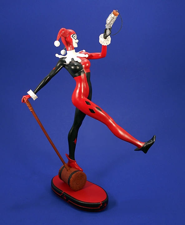
What started as a humble line of indie comic statues, called Femme Fatales, has grown into quite the Marvel and DC branded juggernaut. Indeed, Diamond Select has been churning out these Marvel and DC Gallery statues at a remarkably brisk rate while expanding to include the dudes as well. At the same time, they seem to have a handle on balancing the compromise between budget and quality. I’ve amassed quite a few of the DC Animated Series and I’ve had few complaints. And if that wasn’t enough good news, DST is clearly willing to start taking risks with some character choices. And that brings us to one of the most recent Marvel Gallery releases: Medusa, matriarch of the Inhumans!

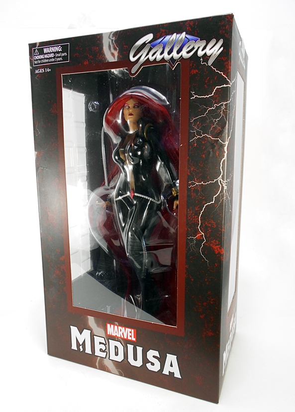
Now, granted, Medusa is far from an unknown in the Marvel Universe, but this line has mostly been about A-Listers, so including her is a welcome and unexpected treat. The statue comes in the same style window box we’ve been seeing ever since the first Femme Fatale statue hit the comic shops, although the decos are now branded to match the characters inside. You get windows on the front, side and top panels to let in plenty of light. Medusa’s box also has the added bonus of being crazy heavy. For what are roughly nine-inch scale PVC statues, these don’t tend to have a lot of heft to them, but as we’ll soon see, Medusa’s hair adds a lot of weight to this piece. The statue comes secured between two clear plastic trays, the box is totally collector friendly, and there’s no assembly required.

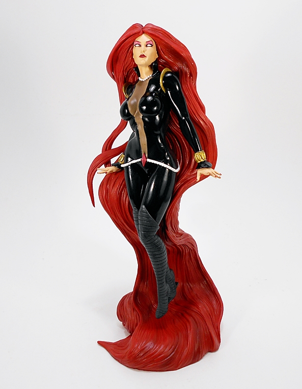
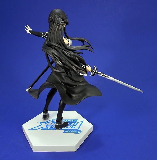
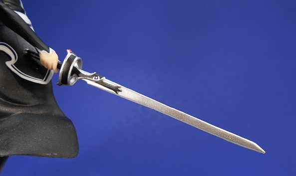
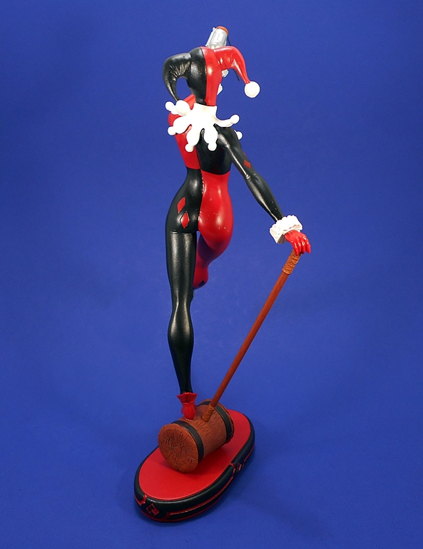
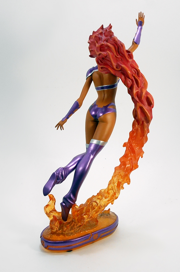
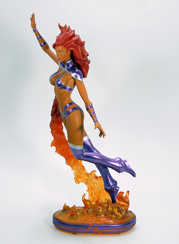
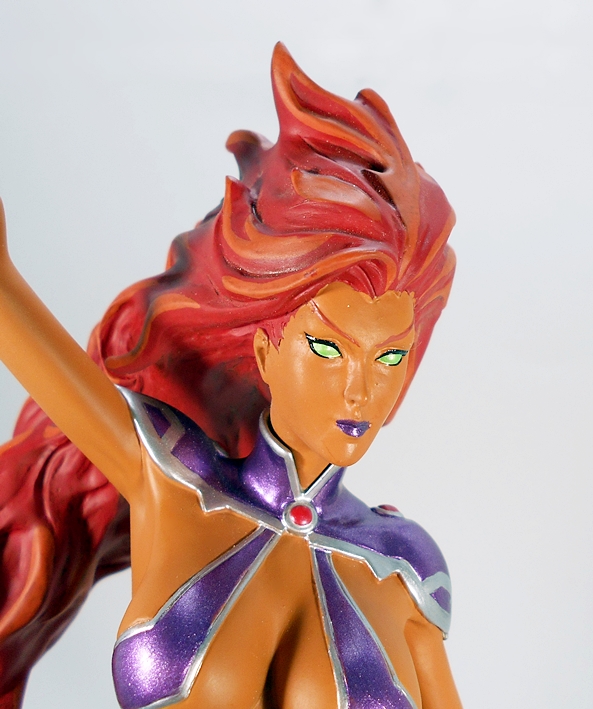
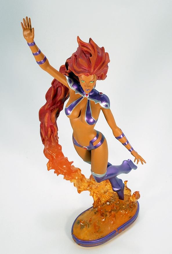
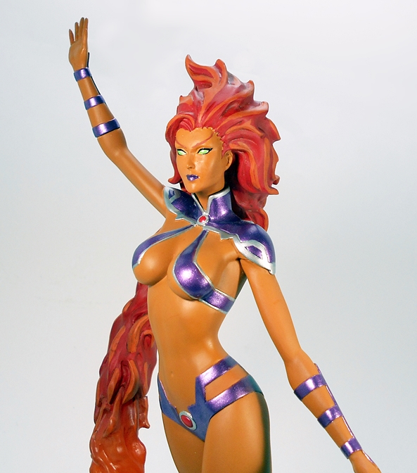
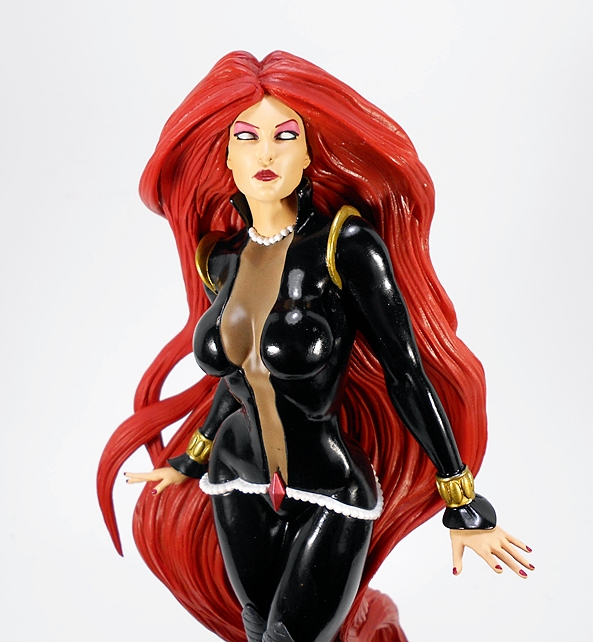
Out of her box, the Inhuman goddess is a remarkably striking piece.  She dons her black costume, which features a high gloss finish and a very low cut front that runs all the way down to her belt. The skin revealed by her exposed front is tinted black to suggest she’s got some kind of body stocking to protect her Inhuman goodies. She has a pair of matte black, ribbed boots, which come up past her knees and feature some rather interesting heel designs. The costume also features hold arched fixtures on her shoulders, gold wrist bracelets, a red jewel just below her naval, and a pearl belt and necklace. I just love what they did with this costume, and the little contrasts from matte to gloss and bits of gold, white, and red offer some nice diversity to what could have been a bit of a boring outfit. It also helps that the quality of paint and its application on this piece are top notch, right down to the red nail polish on her finger tips.

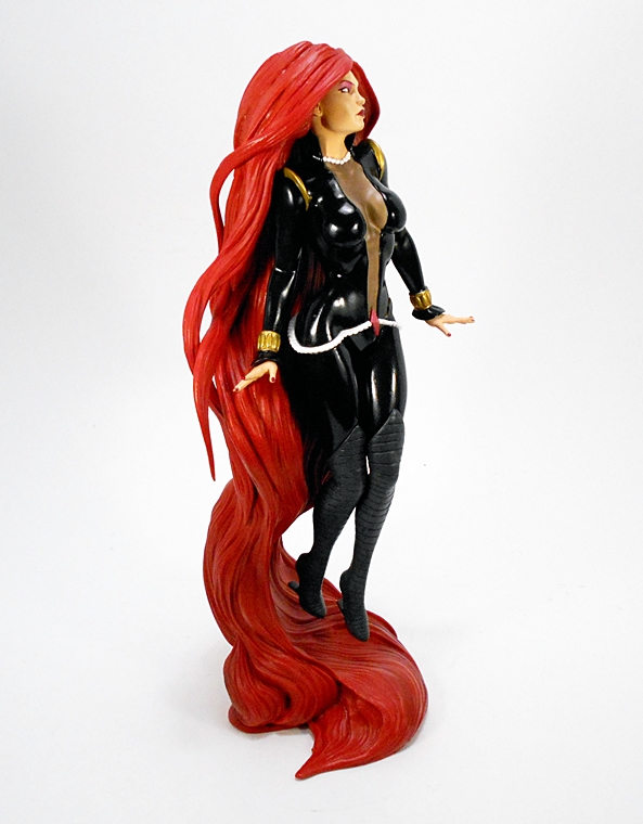
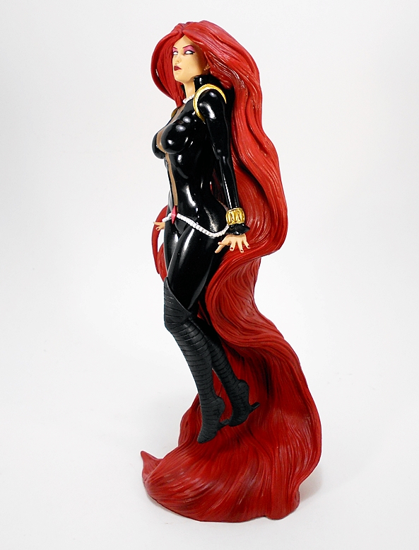
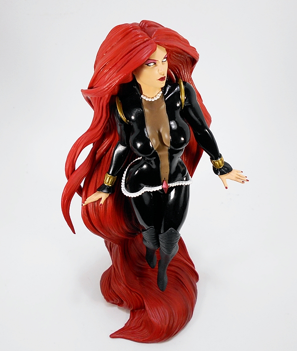
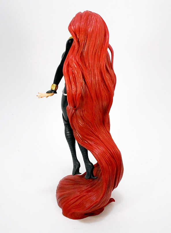
Of course, I can’t go far in this review without talking about her legendary copious coif. Medusa’s red hair cascades down her back and pools up below her feet to form a very creative base. The hair features sculpted texture and some subtle variations in color. I really dig how they designed this piece and the way the hair suspends her with her feet in mid air. There’s so much to love with this statue!

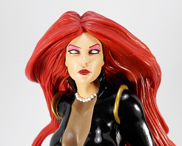
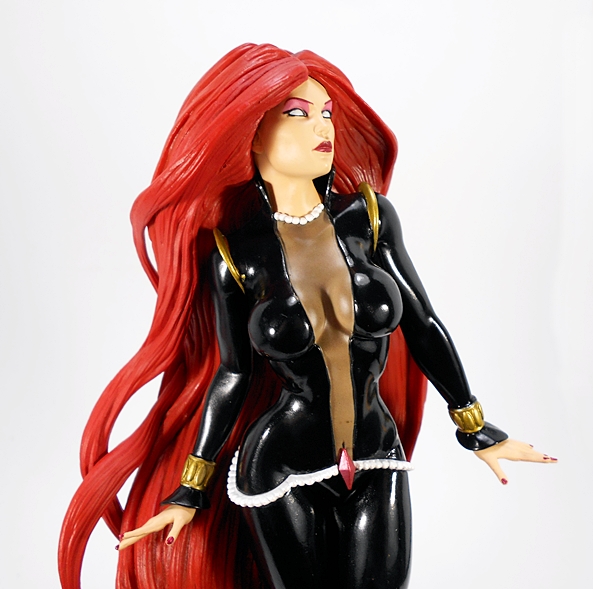
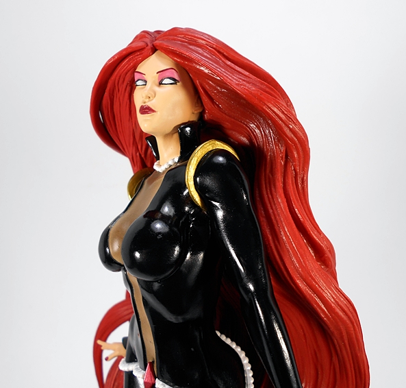
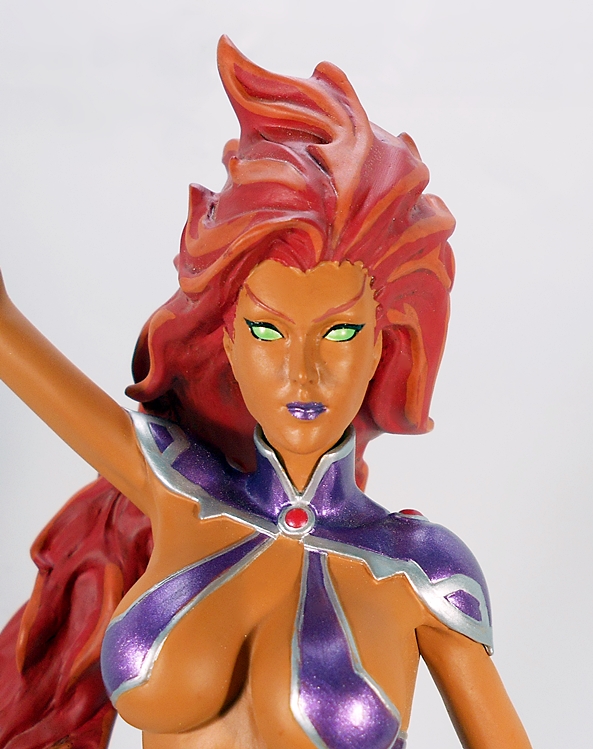
And I’m happy to report that the portrait is every bit as good as everything from the neck down. She’s got a beautiful portrait and the paint used for her lips, pupil-less eyes, and vibrant eye shadow is crisp and perfect.

Normally I wait for a deal when picking up these statues, because they tend to get deeply discounted by retailers after they’ve been on the market for a couple of weeks. In this case, however, I really wanted to show my support for Diamond’s willingness to go with some less obvious character selection. To that end, I pre-ordered both Medusa and Jewel (aka Jessica Jones) at full price, which amounted to about $45 each. I’ll get around to reviewing Jewel eventually, but as far as Medusa goes, I couldn’t be happier with this purchase. Everything about this statue makes it feel like something far more premium than a budget statue and I could confidently place her among some of my $100 DC Cover Girls or Marvel Premier pieces and she could easily hold her own in terms of paint and overall quality.

Dengeki Bunko Fighting Climax Ignition: Asuna (Game Color Version) by SEGA

Yes, as if there weren’t already enough Asuna figures on the market from Sword Art Online, her appearance in SEGA’s All Stars-Inspired 2D fighting game, Dengeki Bunko Fighting Climax has given the purveyors of plastic another excuse for more releases. The game is pretty damn good, and in a move that still amazes me to no end, the home version got a US release on the Sony PS3 a couple of years back. Japanese versions are also available on the PS Vita and the PS4. If anime and fighting games are your thing, you owe it to yourself to track it down.

In the game, Asuna wears her familiar Blood Knights outfit, both in the traditional colors and in a black and white version to represent the typical recolors we see in fighting games. While I may eventually double dip on the regular look, I thought it was a lot more fun to go with her unconventional and totally unique black outfit and hair color. The box is your typical prize figure fare. It’s completely enclosed with some nice shots of the figure. The copy is mostly in Japanese, but there is a little English here and there. Inside, the figure comes on a clear plastic tray with a little bit of simple assembly required.

After putting on her scabbard, popping her sword into her hand, and plugging her into the base, Asuna is all read for display and looking great. The pose is elegant and powerful, with her hips jutting forward, her left hand stretched out defiantly, and her trusty sword, Lambent Light, poised in her right hand and ready for action. The energy of the composition is furthered by the unseen wind that ruffles her coat and excites her hair. Fantastic!

The coloring takes the white and red deco of the Blood Knight’s costume and exchanges the white for black and the red for white. It’s an interesting deco, especially when coupled with the silver of her chest and ankle armor. I like it a lot, especially the look of the white crosses on her stockings, and the border lining of her tunic. The paint quality here isn’t bad, but it isn’t the best either. With the naked eye, it looks fine, get in closer, and some areas, particularly the white borders of her bicep cuffs and straps, tend to look a little blurry. It’s not something that I would really hold against the figure, considering the price point, and you really have to get in close and scrutinize it to notice.

The portrait is excellent. I love the printing on Asuna’s wide eyes, and her mouth is open as if she is shouting a spell or a battle cry. In the game color version, even her normally red hair does not escape the pallet swap, as it’s been turned to black. It works well on this figure, but I tend to be partial to red heads.

The base is a simple white hexagon with the logo of the game printed in blue outline.

This figure works well on a number of levels. If you can’t get enough Asuna, and you want something different for your collection, then this is certainly a worthy purchase. It’s worth noting that Asuna scales quite well with my two Taito Asuna figures. On the other hand, if you just happen to be a fan of the fighting game, it’s probably a small miracle that the game produced any merchandising, let alone figures like these. I was able to grab her off of Amazon from a US seller for $22 shipped and I think that’s a pretty solid deal for what you’re getting.

KanColle: Destroyer Akizuki “Super Premium” Prize Figure by SEGA

Who’s ready for another Anime Saturday celebration of the amazing and wondrous world of Kantai Collection? I know I am! Today, I’ve got a new Fleet Girl cruising into port and it is none other than the Akizuki Class Destroyer. This lovely lady with a lovely name (“Autumn Moon”) is a bit bigger and badder than most of the Destroyers I’ve looked at before. Much like Fubuki, Mutsuki, and Yuudachi, Akizuki also has two sister ships, Teruzuki and Hatsuzuki, one of which will be showing up here on a Saturday in the near future.

SEGA tends to mix it up when it comes to the packaging for their Super Premium (SPM) figures. The original trio of Destroyers came in window boxes, whereas Battleship Nagato and Akizuki here come in fully enclosed boxes. I actually prefer these, because they’re easier to store and easier to keep from getting damaged. You get some nice gradient coloring with a hexagonal pattern and several shots of the figure inside. There’s virtually no English on the box at all, so here’s a situation where you really need to know who you’re looking at. Setting her up requires a little more assembly than usual, but she goes together nice and easy. It’s worth noting here that Akizuki is from the game, rather than the anime, but we won’t hold that against her. And, to quote her from the game, “Akizuki’s night battle, shall I show it to you?” Um… Yes, please!

And Wow… I’m in love! Akizuki is definitely a heavier Destroyer than I’m used to seeing as she has the dual gun emplacements that make her appear more similar to KanColle’s Battleships and Heavy Cruisers. I absolutely adore everything about this figure, but let’s just start with her outfit, which consists of a mostly white (with a little gray) sailor-style blouse and pleated skirt, short gloves, and a bright yellow neckerchief. What really makes her costume distinctive, however, is her armored corset and neck guard, designed after the ship’s forward bow. The coloring on her costume is nice and clean, and the bright white and yellow contrasts beautifully with the gray of her armor and armaments. She is a damn snappy looking figure.

The portrait is also fantastic. I love the depth given to her hair sculpt, and the mechanical look to her eyes. She has an Anti-AA Fire Detector Assembly perched on her head and a headband with “61st Destroyer Division” printed in Japanese. As I’m sure you know by now, I have quite a few of these Fleet Girls inhabiting my shelves, and I have to say this is one of my favorite head sculpts. The detail is just fabulous.

Moving on to her armaments, Akizuki features a 61cm Oxygen-Powered Quadruple Torpedo Launcher slung across her back, which if you haven’t seen the anime, make for a spectacularly cool looking attack maneuver when the girls launch these babies. Another really cool and unique aspect of Akizuki’s gear are the four replacement 10cm gun barrels that she has strapped to her right thigh, because those Type 98 guns were notorious for needing frequent replacing. I also really dig her rudder boots. They’re higher and more graceful looking than most of the other girls’ boots and actually resemble a pair of high heels. The crimson coloring also looks great with the matte gray.

Of course, the real star of this gun show are the Type 98 10cm Twin High-angle Gun mounts, harnessed to her hips. Not only do I love that these are fully articulated, but I really dig the split-prow design of her rig, which features some really nice attention to detail in the sculpt. And much like Shimakaze has her little animated gun buddies, called Rensouhou, Akizuki has her own gun-toting familiars, which are delightfully referred to as Chou-10cm-hou! These little fellas can be removed from her rig and allowed to wander about on their own. OMG, I’m dying!!

The base here is a white ovoid platform with her name emblazoned on it. She attaches to it by only one foot and leans forward while pointing to the target of her impending barrage. I love the balance of this piece, which really adds a sense of both style and excitement to the composition.

Akizuki scales quite well with SEGA’s other SPM figures, which means she’s a bit bigger than the Destroyers like Fubuki, but her armaments are still dwarfed by that of Secretary Ship Nagato’s.

Akizuki was about $25 shipped from a US Seller on Amazon, and holy hell is that a great deal! All of the SEGA SPM figures in my collection have been totally on point when it comes to quality, but aside from Nagato, which admittedly ran me three times the cost of this figure, Akizuki is without a doubt the showpiece of my SEGA fleet. Everything about this figure comes together so beautifully. She’s got a fantastic sculpt, solid paintwork, and the ability to remove both Chou-10cm-hou-chan figures is a wonderful little bonus. SEGA really outdid themselves here!

Cover Girls of the DC Universe: Harley Quinn (Ver.2) by DC Collectibles

I’m committed to getting completely caught up with DC’s Cover Girls before the next statue ships in a month or so, and to that end I’m finally getting around to this, the second version of Harley Quinn to be released in the current incarnation of the line. The first Harley consisted of her full-on New 52 look, whereas this one returns the character to her more classic look. It’s also worth noting that a third version of Cover Girls Harley has been announced, but I’m pretty sure that one will kick off the third Cover Girls series, which will be under the stewardship of a new artist.

The statue comes in a really big box. Next to Bleez, this is probably the biggest box they’ve had to use for this line. What’s funny, though, is that it weighs so little that I was actually worried that there might not be anything in it. Thankfully, that wasn’t the case and what’s really going on here is that Harley’s a pretty slender gal, but her rather unique pose required the bigger box. Combine those two elements, and you get the deceptive size to weight ratio. With that having been said, the box is bright and snappy with a white, black and red deco. It notes on the bottom that this is a numbered second edition, as the original run did sell out and DC Collectibles put her back into production. As a result, the limitation here is 5,000 as opposed to the usual 5,200. Apart from the disclaimer on the box, that change in limitation is the key to identifying the second edition of the statue.

Harley comes balancing with her left foot on her giant hammer and her right leg stretched out in front of her. Her right hand clutches the handle of the hammer and her left hand sports her over-sized pop-gun. There’s a lot to love about this pose. It’s distinctive and totally Harley. She’s playful and whimsical, and she’s probably going to murder someone with that hammer. On the other hand, the composition here makes for a statue that for me really only has one “sweet spot,” which is basically the angle of the first picture.  The problem with this is that it means her right leg is also protruding forward. My Cover Girls display shelves are getting a little congested, and to put it bluntly, when it comes to taking up space on the shelf, Harley does not play well with others. I’m also a little worried I’m going to knock that leg when passing by and all Joker’s horses and all Joker’s men won’t be able to put Harley back together again.

Looking beyond the composition, I have to say that I love what they did with the sculpt. The costume is appropriately simple, but even the little things like the diamonds on her legs are sculpted and not just painted on. She’s also got little wrinkles around her ankles, the flare of her little boots, and the fringe around her wrists and neck all look fantastic. I’m very happy that they went with a subtle gloss for the costume. The Harley from the first incarnation of Cover Girls always looked way too glossy for me. The paint on the costume is super clean too, the lines are pretty sharp, and the red  is nice and even, and compliments the black and white beautifully. There are, however, a few QC issues on my statue, and to show you, I’m going to have to go in for a butt shot. Sorry, can’t be helped.

So first off, let me get it out of the way. Daaaaaayum, that’s a fine tokus! But what we’re really looking at here is that scattering of what appear to be paint bubbles on her right ass cheek. These are pretty unsightly, but at least they’re in a place where they won’t be normally be seen when she’s on display. Instead, I’m only apt to notice them when I pick her up and scrutinize that fine clown caboose. And how often is that going to be, eh? OK, probably a lot.

The portrait is pretty solid. There are a few very minor blemishes on her face, but you have to get in pretty close to see them. Also, it kind of looks like what you might expect to see on grease paint. What’s crazy is that teeny tiny bit of flesh color that they put around the seam between her collar and her hood. I also like the subtle rumple in her tassels. Unfortunately, the posing here does get in the way a little of really taking in her facial features. With her hand holding the gun up in front of her, you have to come in at an angle.

The base uses the standard oval structure that we’ve seen since the earliest releases in this line. I like how they get around that by having her stand on the hammer. It’s like they wanted to do something special, but still conform to the standard that the line has been using. They really went all out on the wood detail for the mallet, which makes for a nice contrast to the smooth and mostly featureless costume she’s wearing. The red and black deco looks great on the base and the paint here is nice and clean. As always, the statue is hand numbered on the bottom, with mine being 1532 of 5,000.

So, I actually passed on this statue when it was first offered. While I have most of this series of Cover Girls, there have been a select few that I skipped. Most notable was the first version of Wonder Woman, which did nothing for me and had a reputation for some unfortunate QC issues. I would have probably stuck with my inclination to skip Harley here, had I not found this second edition for the irresistible price of $45. How could I go wrong? Yeah, I know what you’re saying… you could get one with ass bubbles, and you did! I’m pretty sure that was just a coincidence as my statue was still sealed and I’ve still seen Ms. Quinn here floating around in the forties through other sellers. She’s a nice piece of work, but not one of my favorite releases in the line. I think a lot of that may come down to just having Classic Harley fatigue. Which would also explain why I still prefer the first release version to this one, as it’s something different.

SEGA Hard Girls: SEGA Saturn by SEGA

Just in case the three times “SEGA” appears in the title didn’t give it away, today’s feature involves SEGA and the amazing gift that is SEGA Hard Girls. Based on the premise of SEGA’s video game consoles remade in the form of goddesses and having to graduate from school, SeHa Girls spans everything from light novels to anime to (appropriately enough) video games. It’s like a ridiculous miracle handed down from heaven for a SEGA Fanboy like me. And of course, there are figures too! You didn’t ask for it. You probably didn’t want it. But, on this Anime Saturday morning, I’m checking out the lovely lady that is SEGA Saturn personified! Hey, at least it isn’t something from KanColle or SAO for a change!

Saturn comes in a very standard prize figure package, magnificently branded for the Saturn console. Sure, it’s the usual fully enclosed box with perforations on the sides to make handles, but I just adore the presentation here. From the proud SEGA logo in the corner to the “SEGA SATURN” logo running down the side.  There’s some great artwork and shots of the figure, and just enough English to let you know what it is you’re looking at. Inside, Saturn comes locked between two plastic trays. I should confess, the Saturn is probably my least favorite of SEGA’s consoles, but I still have a soft spot for it in my heart, as I do all of SEGA’s hardware. I built some great memories off of that machine. Anyway, there’s a bit of assembly required on this figure, including plugging in her arms and getting her set up on the base, but you can get her ready for display in no time at all.

The 32-bit Goddess dons a black dress with a belt designed to look like the buttons on the front of the console. On top of that, she has a white sleeveless jacket with pink piping and detached sleeves that match. The pins along the right breast of the jacket are designed to simulate the buttons on the Japanese Saturn controller. Her high-heeled boots sport the Saturn S and also have blue console buttons at the tops, and her ensemble is rounded out with a wide collar that floats around her neck, also sporting the Saturn S logo.

Saturn wields twin staffs, with glorious 3D Saturn logos suspended in their heads. Both of the staffs levitate mysteriously in the palms of her open hands, proving that SEGA is both wondrous and magical. The floating staffs, combined with her pose, make her look like some kind of angelic 32-bit Messiah.

The portrait is simple but cute. Saturn features her black hair secured by pink rings into two impressively large pigtails. She’s got large, perfectly printed eyes, one blue and one greenish blue, and an adorable little smirk. The quality of plastic and paint on this piece is overall solid, but trails a bit behind some of my other SEGA prize figures. Not bad, especially if we’re grading on a curve because of price, just not exceptional either.

Saturn’s base is… a Saturn console! And a gray Japanese version, at that! The details, like the buttons and logo, are all painted on, and you get two translucent blue squares with the Saturn logos that peg in beside each of her feet. It was a little hard to get her pegs seated properly due to a particularly tight fit, but she eventually went in there. I don’t know that I’d risk disassembling her too many times.

Fun, simple, cute… these are all ways I would describe this figure. I’ve had my eye on the SeHa Girls figures for a while and I went with Saturn here first because I was able to get a really good deal on (sixteen bucks shipped!) her from a US Seller. I wasn’t 100% committed on picking up the others, but now that I have this one in hand, I think I’m sold adding Dreamcast and Mega Drive to my collection. Alas, I’ll likely have to go with a Japanese seller on those, so it could be a little while before I revisit this line on Anime Saturday.

KanColle: 41cm Twin Gun Mount for Nagato “Super Premium” Figure by SEGA

Welcome to another relaxing Anime Saturday Morning! Back in February, I took a look at SEGA’s Battleship Nagato “Super Premium” Prize Figure. I loved the figure, but lamented the fact that the seller screwed me out of her Gun Mount. Well, after some hunting I was able to find a Japanese seller with reasonable shipping and after a little wait, I finally have Nagato all kitted out. So, consider today the second part of that feature, and if you happened to miss it the first time, I recommend checking out the figure review before reading this review for what is essentially an add-on piece.

To clear up any confusion, most of the KanColle prize figures put out by Taito and SEGA are not fully outfitted with their weapons, and I certainly don’t mind that. It makes the armed ones all the sweeter. But, SEGA’s SPM Battleship Nagato was one of the rare occasions where they gave collectors the option to buy her armaments separately and that’s what we’re checking out today. The kit comes in a fully enclosed box very similar to Nagato’s. Even with the slight amount of English copy on the box, they still do a good job of indicating what’s in the box. It’s also worth mentioning that this kit is designed so that you can display it on its own, without the figure, or perhaps beside Nagato. I’m not sure why anybody would want to do that, but I’ll start there anyway.

There’s a fair amount of assembly required here, but the rig goes together very smoothly and when you’re all done you have a pretty cool display piece that rests on its own stand. I like the fact that the stand doesn’t feel like an afterthought. Even though, I will likely never use this stand again, it’s clear that SEGA put some work into it, sculpting it in a smoked, semi-transparent plastic and giving it a gantry style look. There’s also a name plate (in Japanese of course!) and the entire gun mount tabs right into the stand for easy removal.

The guns are overall pretty clean, with only a slight degree of weathering here and there. There’s also some useful articulation, with each of the eight gun barrels are independently hinged and the all four turrets able to swivel. And that brings us to the moment of truth…

Awww, YEAH! The rig tabs right into Nagato’s back and holds in place very well. It also looks amazing on her. Sure, I can get this same look with my Nagato Figma (a figure I still need to review here one day), but this version is so much bigger and awe inspiring. The guns perfectly compliment her pose as she looks like she’s about to unload with all her weapons. There’s even a spot on Nagato’s stand if you want to transfer the little name plate.

This add on kit ran me $30 shipped, which was a pretty good deal considering I had to get it shipped from Japan. When you combine it with the cost of the figure, that brings the whole piece to about $70. It’s a lot to pay for a prize figure, but then this is no ordinary prize figure. She’s fully scaled and so far beyond what I tend to think of when I think of prize figures. SEGA absolutely outdid themselves with this one and she is most definitely the showpiece of my Kancolle collection. The only shame here is that SEGA didn’t do fellow Battleship, Mutsu in the same scale and style.

Cover Girls of the DC Universe: Starfire by DC Collectibles

The current incarnation of Cover Girls of the DC Universe is running out of time. There are only three more statues due to release before it reboots in favor of a new artist. Conversely, there are only three previously released Cover Girls that I need in order to get all caught up, and I’m opening one of those today. I hope you like Tamaranean T&A, because it’s time to check out the lovely Princess Koriand’r!

I’ve showcased enough of these statues by now that I have precious little left to say about the packaging. Starfire comes in a fully enclosed box and sandwiched between two styrofoam trays. It’s not the snazziest presentation out there, but it’s collector friendly, and I’ve yet to receive one of these pieces damaged, so obviously the packing is doing its job. Starfire requires no assembly. She’s already attached to her base and ready to go.

And WOW! Starfire hovers in mid-flight supported by the toe of her right boot, which dips into the fiery trail left behind by her hair. There are so many things I love about the composition of this piece. The graceful flow of her body, tapering off to her outstretched right hand is absolute poetry and the way her hair arcs alongside her is stunning. It’s not only a great comic statue, but a wonderful study of the female form. The balance (both literal and figurative) of the statue is also fantastic, as Starfire looks like she’s defying gravity. Cover Girls is so often about museum-style posing, but every now and then DCC lets loose and delivers a release like this one. It’s definitely one of the most kinetic statues in the line, and yet she still feels right at home when displayed among her fellow Cover Girls.

The costume is lifted directly from her appearances in Red Hood and the Outlaws, although purple and skimpy has almost always been the order of the day for Koriand’r, so this New 52 look isn’t a huge departure from her more classic appearances. Granted, she covered up a bit more once she got her own book by Amanda Connor, but that’s another statue for another day. It’s perhaps worth noting that there isn’t a lot of sculpted muscle definition here. I only tend to notice it around her abs area where it’s totally smooth. Not a problem for me, but I thought it was an interesting choice on the part of the sculptor and I feel it gives her a slightly more animated appearance.

From the neck down, the paint on this piece is quite good, both in terms of quality and application. The metallic purple used for her costume is right on the money and is nicely complimented by the silver borders. Her distinctive orange skin is just the right shade as well as being smooth, warm, and even. There are a few areas on mine where the paint lines don’t quite conform to the sculpted lines, but I really had to scrutinize her carefully to notice them. Needless to say whatever tiny flubs are here, don’t bother me at all.

And as long as we’re doing paint checks… nothing wrong back here!

I like the portrait a lot, but I think there are just a few areas for improvement here. Normally, I wouldn’t bother mentioning them, but since all I’m doing is gushing over this piece, I’ll play devil’s advocate for a bit. The first is just my personal preference that I would have liked to see a little smirk or smile on her face. As it is, it’s a very neutral expression, and that’s fine. There’s so much great stuff going on here, that I’m not immediately drawn to her expression anyway. Secondly concerns the paint application, which is a tad off on the hairline and the lips, both of which are only really an issue if I get in super close and start to scrutinize it. Still, it’s not bad and I’ve seen far worse paint applications on far more expensive “premium” statues.

The base manages to maintain the uniform oval generic theme of this line, while still going above and beyond. For most of the Cover Girls, the bases are just something for the figures to stand on, but here, it’s an integral part of the presentation, as her hair flows down and transitions into the fire effect. It’s beautifully done and genuinely hard to tell where the cold-cast porcelain ends and the translucent plastic begins. The effect is quite similar to what we saw with Bleez’s fire base and Mera’s water base. It’s an effect that could easily make or break the statue, but here it succeeds brilliantly. As always, the limitation is hand numbered on the bottom of the base. Mine is 2,223 of 5,200.

Starfire’s MSRP is right in line with the other Cover Girls at around $100. It’s certainly a fair price for what you’re getting, but I try to do a little bargain hunting when it comes to this line, and was able to pick her up for just under $70. Between the elaborate marrying of hair and base, the vibrant combination of colors, and just the overall beauty of her form, I think this is one piece that really sticks out, even in a display case full of Cover Girls releases. It’s also a piece that makes for a great stand-alone representation of Koriand’r for someone who isn’t collecting the line. And considering that Kotobukiya’s Bishoujo Starfire is now selling for well over $100, this one is a damn good value too.

Sword Art Online: Asuna Loading Figure by Taito

It’s Anime Saturday again! I’ve come here to open anime figures and drink coffee, and I’m all out of coffee. Nah, not really. I just put on a fresh pot. And just to remind you that these Saturdays aren’t always about adding to my beloved KanColle collection, I thought I’d check out something new from Sword Art Online. I’ve looked at plenty of Asuna figures, including both Figmas and prize figures, but this one is another cool little piece from Taito and it features her dialing into the game and downloading her outfit.

The packaging holds no surprises, as we’ve seen this sort of thing before. It’s a fully enclosed box with perforations on the sides for handles. It’s colorful, it’s collector friendly, and the figure inside comes wrapped in plastic. Unwrap her, plug her foot into her base and she’s all set to go!

Here we see Asuna, accessing the interface for the game and I presume she’s loading her avatar’s Knights of Blood outfit from the top down, because the lower part of her jacket is clear, as if its in the process of downloading, and she’s barefoot, so I presume her boots are next to materialize. This is a clever idea for a variant and I think the way they did it turned out splendidly. From the skirt up, her outfit is fully realized, and I’ve made it no secret that this is my favorite look for Asuna.

The paint on this piece is very well done, particularly all the red trim on the white costume, with just a little bit of yellow. It’s a beautiful deco. If I had one minor complaint it would be that some of the plastic on her coat looks a little waxier than usual, but it’s nothing that I’m really all that upset about and it probably isn’t even worth my mentioning it.

I like the portrait, although I’m not one hundred percent sure what they were going for here. She looks surprised. Maybe Kirito walked in on her changing? Whatever the case, it’s cute and it’s definitely Asuna. As always, her eyes are beautifully printed, and I really dig the dynamic flow of her hair.

The game interface is pretty cool too. It’s basically just a slab of translucent plastic with a little paintwork to suggest she’s accessing her character screen. Considering that this is a budget prize figure, I think they pulled off the effect quite well.

The base is as simple as you can get. It’s just a clear plastic disc with a raised incline to plug her left foot into. Part of me wishes that Taito would just stick with one kind of base for each series of figures. As it is we get all different shapes and sizes, some clear and some opaque, some with logos, some without. Oh well, it’s too late for that now.

Let’s face it, every figure company under the sun has had their crack at Asuna. I could probably fill a shelf just on the releases of her in her Blood Knight outfit alone. So it’s nice to know that some companies are trying for some that are unusual, like her Aincrad Fencer outfit and this Loading version. The figure is excellent, and at this point I expect nothing less from Taito’s work. And at a ridiculously low price $16 shipped, I couldn’t be happier with her on my shelf.

DC Comics: Lex Luthor ArtFX+ Statue by Kotobukiya

I started this week with a Kotobukiya Marvel statue, so I might as well end it with a Kotobukiya DC statue. Yes, despite telling myself that I was done with Koto’s amazing line of 1:10 Scale DC ArtFX+ statues, it seems I got pulled back in. I originally got into this line to pick up the Justice League and get out. Later, I wound up grabbing Catwoman and Batgirl, but I still never intended to be “all in” with these. That having been said, when I came across a sale on some of the ones I didn’t have, I found my resolve weakening. And so after almost three years since I opened my last one of these beauties, Lex Luthor is joining the display!

A lot of people seem to be smitten with this packaging, but I’m not a big fan. It looks great, but it’s delicate so it doesn’t store well, and it’s really susceptible to scratches and rubbing. I prefer the colorful and sturdier enclosed boxes that Koto used for their Marvel ArtFX+ series. Those boxes were keepers, these just get pitched. They seldom survived the trip to me in good condition anyhow. As with the rest of this line, Lex is based off his New 52 appearance. Sure, there were a few things about The New 52 that didn’t work for me, and only a handful of books kept me engaged until the end, but Justice League was a solid book, and I absolutely loved what they did with Luthor during this run.

Similarly, I absolutely love what Koto did with this statue. While they have mixed things up with some recent DC ArtFX+ releases, the poses generally favor museum-style composition over action. Here Lex stands with both hands balled into fists in a pose that just oozes power. If I were to nitpick one thing here, it’s that I wish they had orientated him so that his head was turning to his right and not his left, but only because I think he would display better with the ArtFX+ Superman that way. Then again, when I do put them together the right way, it looks like Supes is staring at Lex suspiciously, as if to say, “So you want to join the Justice League, eh? Pfft… over my dead body.” To which I say, “Pssst, Superman, I hate to break it to you, but you don’t survive The New 52. Oh, and Lex becomes a kind of Apokolips God-being.” Either way, as a stand alone piece, I think the pose here is flawless.

This line has been big on using beautiful high gloss paint and that certainly is the case here as well and it makes for an absolutely striking figure. In fact, the only matte finish on this statue comes from Lex’s bald head. The armor itself is painted in an exquisite combination of metallic purple and green and the sculpted lines and contours of the armor is exactly what I would like to see from a modern DCEU version of Lex’s Power Armor. And yes I said, “like to see” not “expect to see.” I mean, Christ the DCEU can’t even get Flash’s suit right… that shit is a lost cause. Not to mention, just look at who their Lex Luthor is. Sorry. The DCEU triggers me every damn time. I’m going to take a deep breath, count to three and press on…

The portrait is a little on the soft side, for example there isn’t a lot of detail in his gritting teeth, but I chalk that up to a stylistic choice for this line. The rage-filled expression isn’t so much the “I want to join the Justice League. I can make a difference” Lex as it is the “I’m going to annihilate the shit out of The Crime Syndicate” Lex. Either way, I love it.

As usual, the statue comes with a black metal square base that attracts the magnets in the feet to help him stay upright. It’s not really necessary as he stands just fine on his own, but I still dig that they toss that feature in for some added stability.

I seem to recall the original retail on these statues to be around $50-55, but the actual market prices run the gamut from the low thirties to the high fifties. Granted, there are a few exceptions, like Catwoman or Supergirl which often reaches the low $70’s. The magic number for Lex was $30 and for that I simply could not resist. From a quality perspective, they’re certainly worth it up to the higher end of that spectrum. This is Kotobukiya we’re talking about, a company that is always dedicated to delivering quality and craftsmanship. Originally, I wanted to stick with just the Justice League, because that group of seven makes for a perfect display on my shelf. Each and every one of those statues was designed to work as stand alone pieces, but also display as a set. But with Catwoman, Batgirl, and now Lex off in the background, I may have opened myself up to collecting this line again. Even now, I find myself eyeing up Lex’s New 52 bodyguard, Captain Cold.

Marvel Comics: Spider-Gwen Bishoujo Statue by Kotobukiya

I know, riiiiight? It’s been forever and a day since I last looked at one of Kotobukiya’s Bishoujo statues and I have no excuses other than I’ve been prioritizing Marvel Legends so as not to fall too far behind. But it’s crazy to think that I haven’t visited with this line since the Summer of last year, and the last Marvel Bishoujo I showcased here was Ms. Van Dyne all the way back in October of 2015. Holy hell, that’s way too long. So today I’m opening up a brand new Marvel gal for this collection and it is indeed, Gwen Stacey, aka Spider-Gwen!

kotogwen1

The box is pretty typical for the comic book based Bishoujos. It’s mostly white with some great artwork from Shunya Yamashita. You get plenty of windows to let the light in and the statue comes between two clear plastic trays. Spider-Gwen is one of the very few Marvel books that I’m current with (at least in collected trade format), and I enjoy it a fair bit. But if I’m honest, Marvel’s comics have been going through some really weird phases these days and I find it pushing me to spend more time reading DC’s ReBirth. But that’s an entirely different discussion for a different time and place. Gwen’s set up only requires you to peg her left foot into the base. She comes with her unmasked portrait, but I’m actually going to start with her masked.

kotogwen2

kotogwen3

And here she is, and she is fantastic! There’s a lot to love here, but straightaway, it’s the balance of this statue that really impresses me. With just her left heel touching the base, Gwen pulls off a fantastic gravity-defying pose, as she pulls back her right hand to throw a punch and her left hand reaches out to thwip out another web. Not only does the composition of this piece just exude energy, but it also allows you to get a great look at the figure from every angle. Koto has done some amazing poses for their Marvel and DC ladies over the years, but this is without a doubt one of my favorites and it suits the character perfectly.

kotogwen6

kotogwen5

Gwen is somewhat unique among the Bishoujos in that she requires very little detailed sculpting and features a nearly entirely matte painted finish. Now, I don’t want to undercut the fantastic job they did with all her curves and contours, but apart from her lovely shape, the only real detail here from the neck down can be found on the cut web patterns on her arms and underarms, cut lines just below her knees, and on her shoes. You also get cut lines to reinforce the paint lines. Keep in mind, none of this is a criticism at all, quite the contrary, it’s totally appropriate for the character design and also serves to make Spider-Gwen a refreshingly simple figure.

kotogwen4

The other distinctive thing here that I mentioned was the completely matte finish, except for her shoes. Koto does indeed love their high gloss paints and in truth it does seem to go so well with so many of the super hero costumes. In this case, they were right to avoid it. The white here looks so bright and clean and the black is smooth and consistent. The plastic Koto uses for these takes white and black so well, which has sometimes been a problem with lines like Diamond’s Marvel and DC Galleries, which often show rubbing. The red webbing and blue shoes serve to break up the black and white costume beautifully. If I were to nitpick just a bit, the red in the webbing inserts doesn’t quite line up with the cut lines, but it’s not something that bothers me.

kotogwen10

One thing that does, however, bother me is how I’m going to choose which head to display her with. The hooded and masked head is superb. It goes on all as one piece and there are tabs on the hood to make it connect with the body. The sculpted and painted web patterns inside the hood look great and the mauve spray that defines her eyes is spot on. It’s amazing how quickly this costume has become iconic for me and that’s a strong argument to go with this this option. On the other hand…

kotogwen12

kotogwen11

The unmasked portrait really conveys what the Bishoujo line is all about. This option is achieved with two pieces. The lowered hood tabs in first and then the head after that, and the combo is splendid. Gwen is one of those characters that fits right in with the Bishoujo style without a lot of tweaking at all. Her eyes and hair are perfect and that sly little smile is one of the best expressions Koto has done for this line. In the end, I’m probably going to go unmasked. The last time this decision was such a dilemma was with Koto’s Batwoman.

kotogwen8

The base is a raised disc with an incline, very similar to the kind used for Wonder Woman v2. This one is painted with a black and white city skyline and a mauve sky to match her costume deco. It really matches the art styling of the comic very well.

kotogwen7

kotogwen13

kotogwen16

Spider-Gwen is quite simply Bishoujo perfection. What’s more, even if you aren’t a fan of Koto’s Bishoujo line (WHAT’S WRONG WITH YOU??), and you’re just looking for a really nice Spider-Gwen statue, you could display this statue with the masked portrait and no one would be any the wiser. And I should toss in here how great it is, after such a long absence, to be opening one of Koto’s lovely Bishoujo statues again. It goes without saying that it’s particularly nice to come back to such a very strong entry in the series. It’s true there have been a couple of Marvel gals that I skipped. I wasn’t really keen on their She-Hulk and I haven’t gotten around to picking up Lady Deadpool yet. Fortunately, there are a lot of Bishoujo ladies hitting the shelves either right now or very soon, so it’s safe to say I’ll have some more Bishoujos featured here again in the coming months, particularly Squirrel Girl, Harley Quinn v2, Wonder Girl, Lady Thor, Lady Loki, and Street Fighter’s Ibuki. So sit tight, Bishoujo fans. Things are going to start heating up again real soon.