Marvel Legends (Giant Man Wave): Captain America and Iron Man (Mark 46) by Hasbro

Last week saw the Blu-Ray release of Captain America: Civil War, a film that I thoroughly enjoyed in the theater and have now enjoyed even more in the comfort of my own home. Over and over again! Coincidentally, I’m also doubling back to start my look at the Civil War inspired wave of Marvel Legends. Considering I’m so backlogged on these figures, I’m going to be doubling up on a few of these so that I can get through the wave a little quicker than usual. It seemed only natural to kick it off with Cap and Iron Man.

capim1

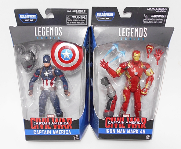
And here they are in the packaging. Not much new and noteworthy to talk about, other than the movie branding and some nice blue panels on the sides with character art. If I’m being honest, I bought this pair solely for the BAF parts and I doubt I’m alone in that. Let’s look at Cap first to find out part of the reason why…

capim2

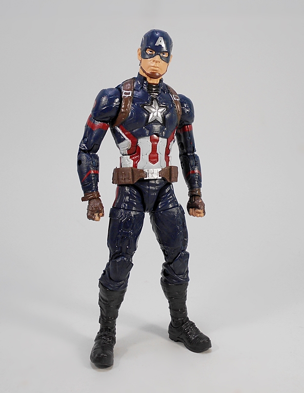
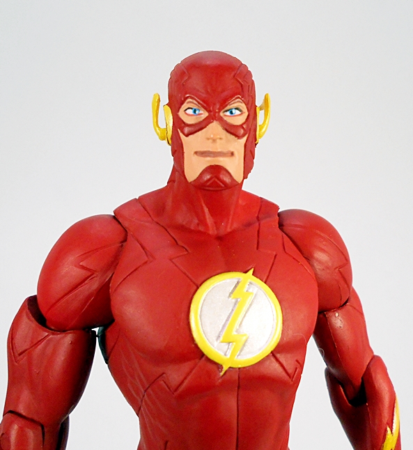
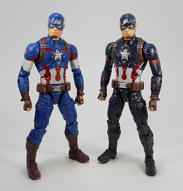
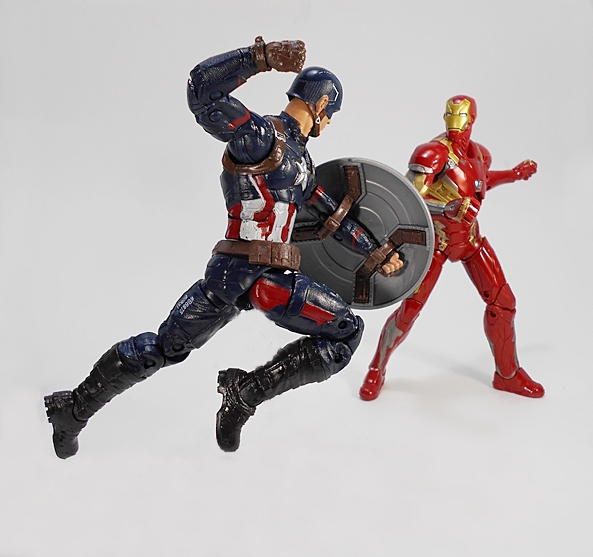
Yes, this is Age of Ultron Cap from last year’s Thanos Wave with a fresh coat of paint, and the new deco doesn’t really thrill me. The blue is a lot darker and the white bands from the biceps have been replaced with more dark blue and a less notable red stripe. Most of the other minor differences are just areas where red accents have been either added or taken away.

capim3

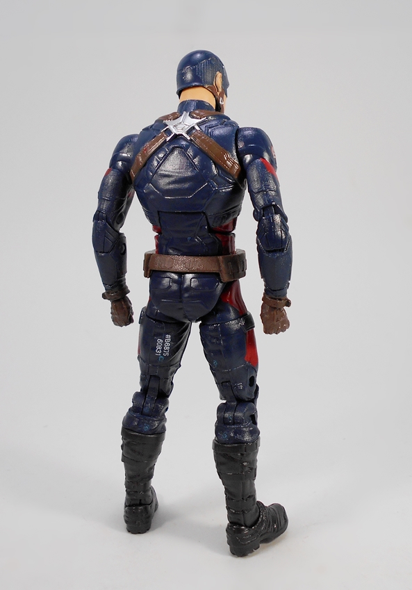
Speaking of other things that have been taken away, last year’s release included two extra hands and an unmasked head. Here? Nope, nada, bupkis! The only accessory Cap comes with is his shield.

capim5

capim6

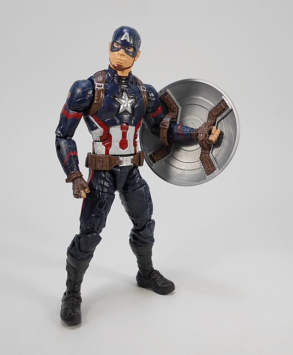
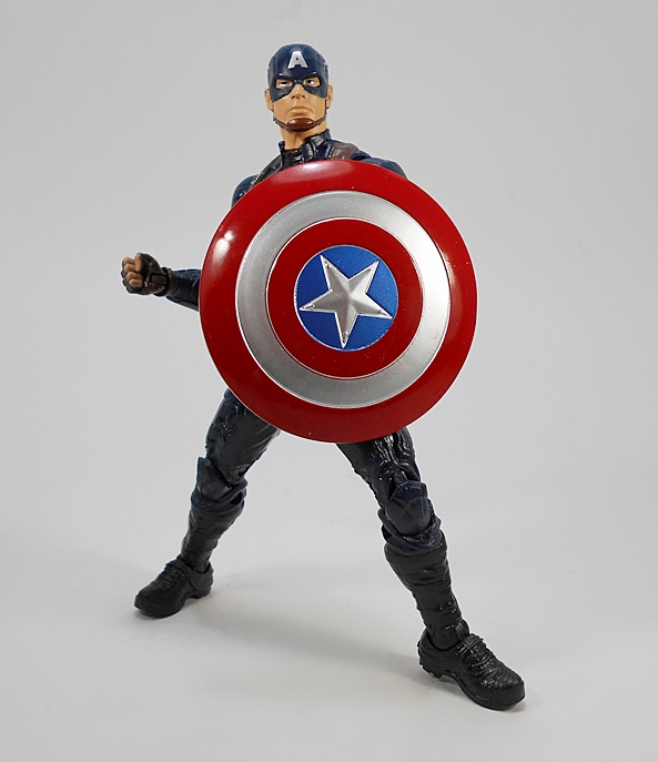
It’s the same shield we saw last time, which means it’s got the more realistic straps and detailed sculpt inside. Unfortunately, there’s no way to attach it to his back, unless you use a big wad of blue tack. The bottom line is that unless you’re after a darker, grittier look for Cap, or you want yet another of Cap’s shields rattling around in your accessory tote, the Giant Man head is the only reason to even consider this purchase. Not a bad figure, by any means, but it would have been an easy pass for me. Congratulations Build-A-Figure gimmick. You won this round!

capim8

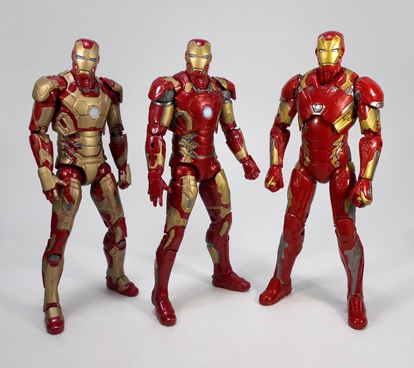
Iron Man’s Mark 46 armor fares a bit better, as I believe this is a brand new sculpt, but I have so many god damn Iron Man figures in my Legends collection, my eyes start to glaze over when I try to remember them all. It’s at least notably different from the Age of Ultron Mark 43, which was mostly a repaint of the Iron Man 3 Mark 42. Oh, god. I need to lie down. F.R.I.D.A.Y. get me an ice pack.

capim9

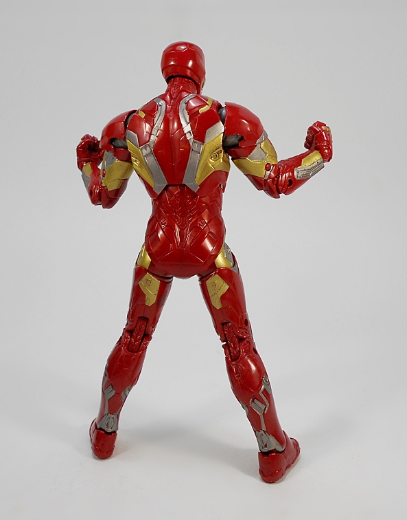
I actually dig the look of this design a lot. The overall figure is a lot cleaner than the last two with a little less panel line clutter and the gold is toned down even more than the Mk 43. The more buff look of the chest is pretty cool and the partially shrouded Arc Reactor at least shakes things up a bit. The paint here is also pretty sharp and clean and the red plastic is shiny and vibrant. Alas, the Mk 46 takes a hit when it comes to articulation. All the points are there, but the shoulders inhibit the range of motion in the arms and the hips don’t have a lot of motion either. He’s a solid figure, but there are only so many poses you can get out of him and that’s frustrating.

capim10

capim11

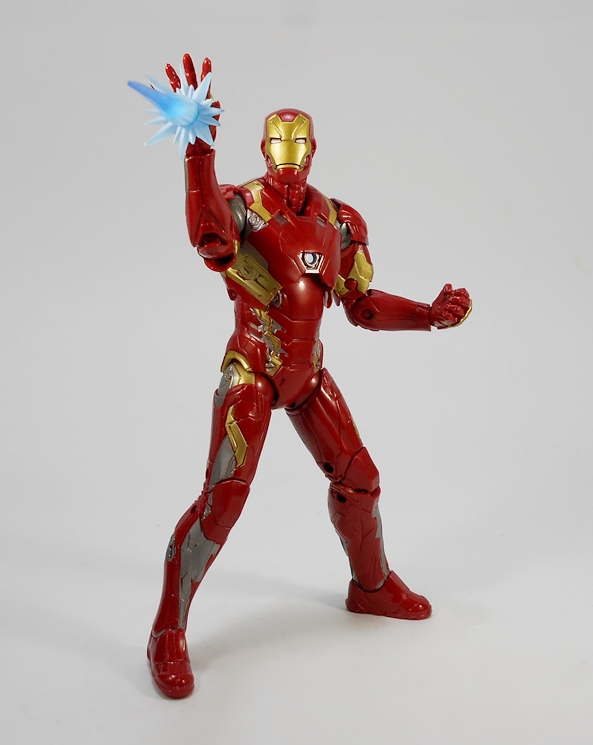
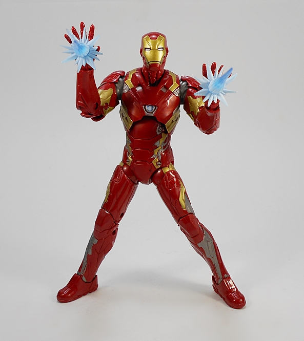
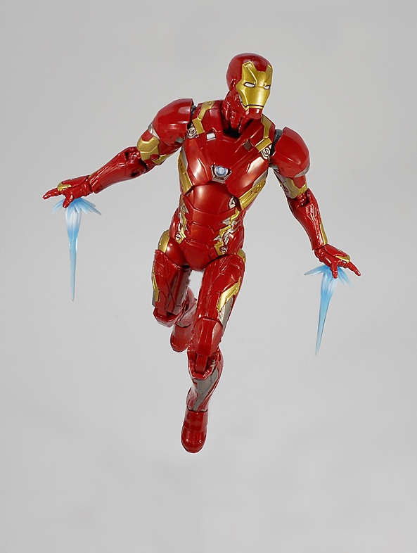
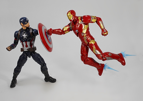
Cap may have been cheated out of accessories, but Tony wasn’t. The Mk 46 not only comes with an extra pair of hands (one pair of fists and one pair of repulsor blasting hands), but also a couple of effect parts designed to peg into his palm repulsors. Yeah, they’re blue and that’s odd, but they’re still pretty cool and that’s coming from someone who isn’t generally impressed by effect parts. But even here, there are issues with the articulation. The wrists are limited by the arm sculpt, so getting his hand straight up into the firing position while the arm is held straight out is impossible. You’ve got to bend those elbows!

capim12

capim14

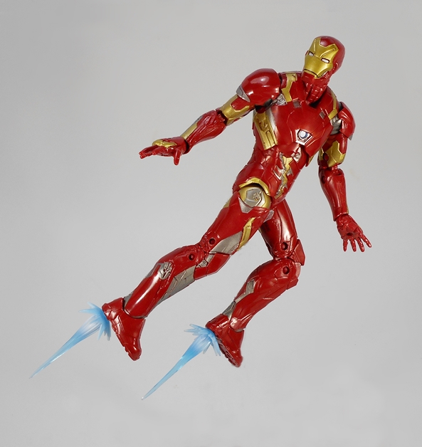
You can also put them in the peg holes in his feet. It doesn’t quite position the blasts where they’re supposed to go, but it still works just fine.

capim18

capim16

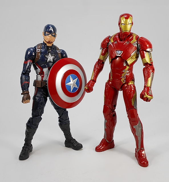
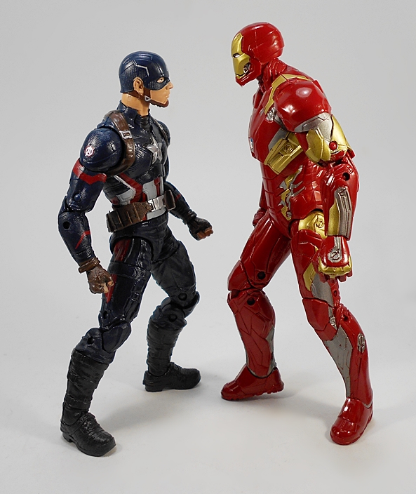
One last thing worth mentioning is the scale here and how it feels off between them. Obviously kids are going to want these figures so they can make them fight each other. And by kids, I my 43-year old ass. But put them toe to toe with each other and Cap doesn’t just come up short, he looks downright puny. I get it, Tony is a guy wearing a suit of armor, so he should be bigger than you average guy. But this is Steve Rogers and he’s not your average guy. Then again, scale always has been an issue with this line and this Cap is definitely rather demure.

capim4

capim7

capim15

capim19

It seems like a while since I came away from a Marvel Legends review and not been on a toy-loving high, but today’s installment of Marvel Monday turned out a little disappointing. Neither of these releases are bad figures, but neither excite me all that much either. Tony Stark obviously comes away as the fresh and new release, but even there I’m starting to feel the effects of iron fatigue. But hey… two BAF parts down!

KanColle: Battleship Yamato (Day Off Figure) by Taito

Greetings Anime Fans and Toy Hounds and welcome to another Anime Saturday! I’m back to Kantai Collection this week and checking out another prize figure from Taito, the secret weapon of the Fleet Girls, the mighty battleship Yamato. Just don’t call her Hotel Yamato. Seriously, don’t. She doesn’t like that.

doffyam1

We’ve seen plenty of Taito’s prize figure packaging on these lazy Saturdays and this one is more of the same. The figure comes in an enclosed box with perforations on the side to make some handles. You get some nice artwork showing off the figure and just enough English on the package to let you know what’s inside. Everything is collector friendly and the figure comes baggied and in need of just a little simple assembly. As always these figures land right about in the 9-inch scale, give or take a bit.

doffyam2

Yamato is one of my favorite designs of all the Fleet Girls. She’s just so regal and lovely. The set up here is pretty simple. The figure’s feet tab into the base as does a holder for the umbrella. This is another one of Taito’s “Day Off” figures, which show the girls during their down time, which is especially appropriate for Yamato because she spent so much of her time on the series at the Truk Lagoon base waiting to be put into action.

doffyam3

doffyam9

The outfit here is more sophisticated than the regular Fleet Girls’ uniforms. She has a white top with a burgundy skirt. The collar features a gold chrysanthemum crest, the seal of Imperial Japan, and she has a gold neckerchief as well. Her skirt features cut outs at her hips to frame the anchors hanging there. On her legs she has one thigh high stocking, with the other ending just below the knee, and rudder boots on her feet.

doffyam4

Yamato is holding aloft a plate of food in her right hand and clasping a menu in her left. These could be references to the hospitality that she extended toward the Fleet Girls when they arrived at Truk Lagoon. They could also reflect that even after the simplest of maneuvers, Yamato required huge amounts of food to sustain her energy because she was such a powerful battleship. Even a simple training exercise with Fubuki required a vast meal afterwards.

doffyam8

The portrait is excellent. Yamato’s face is dwarfed by the copious amount of hair that sweeps out behind her and also flows off of her shoulders. Her eyes are perfectly printed and her mouth is open with delight, because… FOOD! She features her radar apparatus on head and her ponytail is bound with a ring of pink chrysanthemums. The skin tones on the figure are warm and even. I’ve been pretty impressed with Taito’s work on these figures in the past and Yamato is no exception. The character design offers a lot of opportunities to show off with the sculpt and the paint is especially well done. I love the bright gold used for the neckerchief and collar crest, and there’s a little more on the tiny tassels that hang down from her radar array.

doffyam7

The base is just as large as it needs to be and features a sculpted brick floor pattern. Yamato’s trademark umbrella is set atop a structure made to look like the battleship’s mast.

doffyam6

doffyam10

And so, Taito has done it again, delivering another superb addition to my ever expanding collection of Fleet Girls. I’ve found that Amazon has been a great source for these figures and Yamato here set me back a whopping $18 shipped from within the US. There aren’t a lot of aspects of figure collecting that make me feel like I’m getting a great value these days, but I’ll buy figures like this for under twenty bucks all day long! That probably explains why my KanColle shelves are starting to get so congested.

Justice League (New 52) Box Set by DC Collectibles, Part 3: The Flash and Cyborg

It’s DC Friday again and time to wrap up my look at the DC Collectibles’ New 52 Justice League set with The Flash and Cyborg! If you missed out on the last two installments, you can check out the packaging along with Superman, Wonder Woman, and Batman here and Green Lantern and Aquaman here. Let’s start with Barry Allen…

flshbrg1

While The Flash is in no way a terrible figure, I’m sorry to say that I find him to be the weakest of the set. I guess someone had to come out on the bottom, but in this case the few issues I have with him are pretty specific. But first, I’ll say that I like this sculpt a lot. With the New 52 behind us, I can take this opportunity to say that I’ve been perfectly fine with all the Justice League costumes and that goes for Flash as well. Granted, it’s not a huge departure from previous looks. The main difference is the addition of the panel lines and these are all part of the sculpt, as are the lightning bolts on his waist and arms, and his chest insignia. I particularly like the sculpted lines in the boots.

flshbrg2

The coloring on this figure is overall quite good. The plastic used for the bulk of his suit is rich and vibrant and it contrasts nicely with the bright glossy yellow used on the boots and lightning bolts.

flshbrg3

flshbrg4

The portrait is where I think this figure starts to falter. The mouth is just weird. I do like the sculpted detail in the hood and chin cup. God, everyone seems to have hated that chin cup. It wasn’t such a big deal to me. The wings on the hood are made of pretty hard plastic, so they won’t warp, but that also means they feel really fragile. It probably wouldn’t take much to snap them off. The paint around the mask and face is fairly straight and clean. I wish I could say the same for the emblem on his chest. It’s easily the weakest paint work in the entire set.

flshbrg5

The articulation here is the same as we saw on the previous figures. That includes rotating hinges in the shoulders, swivels in the biceps, hinges in the elbows and knees, a T-crotch for the hips, and a ball joint in the neck. It’s nothing outrageous, but I can still get Barry into a decent running pose. I will note that the right bicep swivel on my figure has a little pull to it leaving a gap between the joints. Bummer. Let’s move on to Cyborg!

flshbrg6

Cyborg is an appropriately large figure. He’s not only bulky, but stands almost a head taller than the rest of The League. The figure features a clean and somewhat simple sculpt with some deep cut panel lines as well as some segmented sections between the joints and on the sides of his torso. I really prefer this over-sized look for the character as opposed to the leaner and more human proportioned renditions.

flshbrg7

The paint here is well done, but I’m surprised they didn’t go for a metallic finish. I mean, they did it for Green Lantern and Aquaman’s scalemail shirt, it seems like they could have ponied up for it here as well. Then again, it might have been an artistic choice and I’ll concede that the more satiny finish doesn’t look bad, by any means. From the neck down this is mostly a monochrome look with just the bright red domes in the chest, back, and hips to make the deco pop.

flshbrg8

flshbrg9

They did a really solid job with the portrait here. The high collar looks great and I like the exposed segmented part of the neck. You also get some more detailed panel lines in the cybernetic half of his face. The paintwork here is fairly good. The hairline could have been sharper, but it’s not too bad either.

flshbrg10

Cyborg is the one figure that adds a bit of articulation over the rest and that’s additional swivels in his forearms. It’s odd that he should get extra points, as I consider him to be the least agile of the bunch. On the other hand, even with those extra swivels, there’s not a whole lot you can do with him when it comes to posing.

flshbrg11

flshbrg12

It was fun for me to give this set a once over now that the New 52 is behind us and even with a few disappointing things about The Flash, I’d say this is a fine collection of figures, so long as you aren’t in the market for anything super pose-able. Personally, I plan on keeping this set displayed in a box up on top of one of my display cases where it looks fantastic. Either way, I think it’s a fitting end tribute to the action figures from this era of DC Comics, and while a few New 52 appearances are bound to still turn up in DC Icons and maybe some statues, it’s probably safe to say that by next year it’ll be phased out for either ReBirth designs or more classic looks. While I drifted in and out of lots of different books across the New 52, The Justice League was one of the books where I never missed an issue. It wasn’t always great, but I think it was almost always good. Although, I’d still rank Wonder Woman as my favorite New 52 title. With that having been said, next week I’ll be checking out another one of the Cover Girls statue, which will land us right back in this era.

Transformers Titans Return: Stylor & Chomedome by Hasbro

Here I go, busting into the second wave of Titans Return Deluxes and I decided to go with Chromedome first. This is an interesting wave for me as I happen to own the Fansproject unofficial versions of each of the figures in this assortment and I’m excited to see how Hasbro’s versions turned out. Still, I’m going to try avoid comparisons, because it’s only fair to evaluate these new bots on their own and not how they stand up to far more expensive third party figures.

twcdome1

I’m still not a huge fan of this card art and layout, but I sure was glad to see it on the pegs when I stopped in the local Wally World for some groceries. These Deluxes have been really tough to find in my area and forget about any of the larger boxed figures. I had to go online to get the first Deluxe wave, so stumbling across all of wave two in one shot at an actual brick-and-mortar store that is not known for having anything good ever was quite the pleasant surprise. Chromedome is packaged in his robot mode, but as always, we’re going to start with his alt mode.

twcdome6

In auto mode, Chromedome does a beautiful job recreating, and slightly tweaking, the look of the original G1 toy. I was never sure what they were going for with this design, but I’ve always experienced a weird retro-future-muscle vibe from it. Nonetheless, I liked the creativity in alt modes that spewed out of the waning years of G1 and this design still reflects that. This new version is a little better proportioned and lacks those awkward arm-pylons on the sides as well as making the hood near the windshield a little less bulky and awkward. The mold consists of some panel lines, but nothing too crazy. Overall, I think fans of the character will be pleased.

twcdome7

The toy retains that same distinctive brown, tan, and red deco that no one in their right mind would ever think to put on a car, and yet obviously somebody did. Most of the deco here is achieved through colored plastic, although the paint on the roof and side panels is a very nice high gloss shade of red and the headlamps are painted blue. You also get some silver and red tampos on the hood, which replicate the original toy’s stickers, and a bold Autobot emblem. The cockpit is hinged so that it can either open by swinging straight up or you can sort of lift it and hinge it backwards to give it a more stylish way of opening.

twcdome12

twcdome8

And speaking of stylish, meet Stylor, Chromedome’s little Headmaster buddy. His robot mode is pretty standard stuff with articulation in the shoulders, hips, knees, and neck. His deco matches that of his larger robot chum. Unfortunately, Hasbro didn’t spring for any paint apps on this one, which was one of the most impressive things to me about the first wave of figures. I liked the tiny painted faces. Also, the red plastic looks kind of cheap. Aesthetics aside, Stylor does sit comfortably in the driver compartment of the vehicle.

twcdome11

twcdome10

twcdome9

There are two weapons which can plug into the sides of the car mode in a few combinations. One is a standard gun, while the other becomes a sort of sidecar gun for one of the tiny bots to ride in. You can also plug the regular gun into it and there are tabs on the roof where it can plug in as well.

twcdome14

Transforming Chromedome feels really familiar and that’s because the figure borrows heavily from the Combiner Wars Stunticon engineering, particularly Dead End. The half-elbow hinges in the arms, the way the legs unpack, and the chest plate that folds down to cover a non-existent combiner link. In that sense, this figure feels like a throwback to a line that just ended, but does that make for a bad robot mode? Not exactly.

twcdome15

twcdome16

I actually like this robot mode quite a bit, but then I was overall rather fond of the CW Stunticons. Chomedome is a very solid update to the original figure. The hood packs away neatly on his back and the the canopy parts fold up on the backs of his legs. Chromey suffers from some hollow forearms, but the legs aren’t have panels to fill them out better than most of the wave one figures. I’m also happy to say the robot mode features some very nice red and silver paintwork, which feels like a big step up from the lack of coloring on some of the figures from the last assortment.

twcdome3

Stylor makes for a great looking portrait. Yeah, the red back kind of makes it feel like the face and “helmet” is tacked onto the head, but it works well enough for me. I like the coloring, particularly the blue visor and orange face plate, but my figure has a bit of mold flashing that needs to be cleaned up.

twcdome2

twcdome17

twcdome4

Of course, the guns can be wielded in robot mode and even combined if you want something bigger and kind of goofy looking.

twcdome13

twcdome5

twcdomegp

Chromedome is a solid figure and I’m happy to have him, but after seeing the Stunticon style engineering so many times throughout the Combiner Wars run, it feels a little cheap and sleazy to get a retread of it again in Titans Return. Yes, I do respect and admire Hasbro’s ability to design molds that can be re-purposed, and while it definitely works here as Chromedome, it doesn’t feel terribly clever. Considering how popular this character has become from the near-perfect comic run of More Than Meets The Eye, I think this is a figure where the mileage may vary greatly and some collectors aren’t going to be nearly as forgiving as me.

Mythic Legions: Urzokk by The Four Horsemen

Holy crap, it’s Wednesday again and time to check out another figure from The Four Horsemen’s magical, mystical, and certainly mythical line of kickstarted 6-inch scale fantasy figures. Phew, that was a mouthful. What do you say? Time for another Orc? Yeah, let’s do another Orc…

mlurzz1

After looking at well over a dozen figures, I’ve said all there is to say about the packaging in this line, so let’s take a quick look at the bio. Urzokk is what you would call an Orc success story. He buckled down and gave it his all, killing lots and lots of humans. Eventually he rose through the ranks of the army to not only hold a command position among his fellow Orcs, but he also became a trusted colleague of the evil Gorgo Aetherblade. See, kids? If you truly apply yourself and there are no limits!

mlurzz3

Urzokk comes fully armored, and boy do I love this armor. It’s grimy and functional, and just the sort of thing I imagine that an Orc General would wear. This is also another brilliant reuse of a lot of parts we saw before in a brand new combination that makes it work as an entirely fresh figure. The torso, upper arms, and upper legs are pulled from the line’s standard knightly armored figures. These pieces are mated with the cruder, bulkier, and more angular Orc armor for the lower arms and legs. The paint here is absolutely phenomenal. The same armor pieces that looked so majestic and noble on the Hero Knights now looks old, worn, and caked in mud. This magnificent new body is capped off with the leather scale style groin piece.

mlurzz4

mlurzz5

Of course, if you want to bulk Urzokk up, he comes with a pair of the heavy and angular Orc shoulders, which peg into the back of the figure. There is also one piece on this guy that we haven’t seen before and that’s the rather sinister looking neck guard. Both the shoulders and neck guard feature some wonderful nicks and wear in the sculpt and that same amazingly weathered paint job really drives the worn and used look of the armor beautifully.

mlurzz18

The standard head is a fantastic sculpt. I’ve been a little underwhelmed with some of the human faces in this line, but the Orcs have been superb. This portrait is just packed with grim personality from the tusks protruding out of his bottom jaw to the pointed ears and the veins sculpted in on the sides of his head. The piercing yellow eyes are creepy and I love the deep shade of green they use for the Orc skin. Urzokk also features some white war paint to set him apart from the rank and file soldiers. If that’s not enough, the figure also includes a spare head without the war paint, which is a great bonus if you want to swap it with any of the other Orcs to make a new style of foot soldier, or just stick it on the end of one of the hero’s spears.

mlurzz6

mlurzz19

mlurzz17

While the extra head is a nice surprise, the other accessories are all things we’ve seen before. The sword is the longer two-handed version with the stylish crossguard and slight swell toward the end of the blade. I love this sculpt, but I do wish they had weathered Urzokk’s a bit. It looks a little too clean for this guy, especially in contrast with his armor. I really liked the patina of rust they put on Urkku’s sword and something like that would have been welcome here. Of course, you also get the standard brown belt so that the figure can wear the sword on his waist or across his back.

mlurzz7

Urzokk comes with the same style of shield we’ve been seeing all along. There’s a wrist clip that pegs into the back and it holds quite well. This shield has a unique painted crest, in this case a black skull emblem against a crimson field. While the sword was clean, this shield has some nice distressed paint effects to make it look battle worn.

mlurzz9

mlurzz15

mlurzz14

Finally, it’s our old favorite, the axe, this time with a bronze painted shaft and the usual ability to change it from a single to double bladed weapon. Like the sword, I think the axe is a little too clean for this figure, but it’s still a great piece.

mlurzz16

mlurzz12

mlurzz2

mlurzz20

Urzokk was one of those figures that didn’t make my original cut, when budgeting the add on’s for my Kickstarter Backer Rewards. Luckily they later extended the pre-order period and I was able to find some money and add him and a few other figures. He is no doubt a fantastic looking figure and while I’m sure I say this almost every time, this one is very high up on my list of favorites. The new combination of armor pieces works wonderfully and the weathered paint effects are flawlessly executed. And that leaves just three more figures to check out before I’m all caught up. I’ve got a Dwarf, a Knight, and one more Orc left and I think I’ll take them in that order. T4H are expecting new figures to be shipping out in about a month, so I may even have some more to look at by the time I wrap this up.

Masters of the Universe Classics: Crita by Mattel

The news has been out for a while now that Matty Collector’s days are numbered. The site as we know it will close up shop at the end of the year and the rest of their stock is now up for grabs. Sadly, it’s mostly the late-game figures that don’t garner a lot of interest. That reminds me, I do need to get me a new Flogg, since the crotch on mine inexplicably exploded while it was sitting bagged in a tote. And in all this turmoil, I completely forgot that I still have a Masters Classics figure from last month waiting to be opened. I better open this one up now, because September is going to be a big month with quite a few figures rolling in.

smcrit1

Her name is Crita and she dances on the sand… no, wait… that’s Rio from Duran Duran. Let’s try that again. Her name is Crita and she hails from the New Adventures cartoon series. I have no idea who she is, other than one of the evil Space Mutants, and since there are no bios on the backs of the packages anymore, I’m no more the wiser. But not knowing a particular character has never stopped me from enjoying any figure in this line before. I just have to do some research. Thanks to the magic of The Yootoobs, I’m off to watch an episode of the cartoon that she appeared in called “Escape from Gaolotia.” BRB!

…And NOPE! I couldn’t get through it, but I saw enough to know that Crita and Skeletor might have had a little sumthin-sumthin going on and she talks like she smokes 30 packs of Marlboros a day.

smcrit2

And here she is in all her glory. I don’t get what they were going for with her design. Most of the Space Mutants each had their own crazy thing going on, but I can’t figure out what that is supposed to be with Crita. She’s a lavender skinned lady in a purple dress, purple boots, and a blue half cape kind of thing that is permanently attached to her arm bracers. At the risk of dropping two 80’s music references in one MOTUC review, this looks like Space Stevie Nicks. Holy shit, now I can’t unsee it. Some of the finer details of her ensemble include a gold belt, a gold amulet around her neck, a sculpted ring on her right hand, and what appears to be a bone necklace. Seriously, what’s going on with this chick?

smcrit3

Have I mentioned this cape thing? Yeah, I did, but it begs further study. Never sacrifice agility for fashion, especially if you’re in a career that demands you fight people for a living. I would have been a whole lot more forgiving of this thing if you could un-peg it from the arms, but you can’t. It’s like some kind of bizarre fashion bondage accessory designed to inhibit her arm movement. Apparently Space Stevie Nicks is a little kinky!

smcrit4

Crita may be a product of the 90’s, but she’s got hair straight out of the 80’s. Forget Space Stevie Nicks, she looks like she should be a backup vocalist for Jem and the Holograms. Or maybe The Misfits, since she’s a bad girl. My point is she’s got a whole lot of hair. The portrait is pretty standard stuff for this line. She’s pretty, but nobody ever sat her down and told her that too much eye makeup makes her look like a whore. The gold tiara is a nice touch.

By now we all know the standard articulation for the MOTUC female bucks, but I’ve only got so many of these figures left, so let’s run it down for old time’s sake. The arms feature rotating hinges in the shoulders, swivels in the biceps and wrists, and hinges in the elbows. Of course, the range of motion is limited, so if you want one arm out the other arm needs to be close to her side, and even then, you don’t get a lot of range of motion here. The legs feature ball joints and swivels in the hips, and hinges in the knees and ankles. Here too, Crita suffers some limitation, this time because of her skirt. Finally, you get a swivel in the waist and a ball joint in the neck.

smcrit6

Crita comes with three accessories. First, you have her gold wand with a rose-colored opaque stone embedded in it. I didn’t watch enough of the episode to figure out what her powers are, but I presume she’s some kind of spell-slinger. Either that or she just hits people with this wand. Actually, it does have a more conventional use…

smcrit7

smcrit9

It transforms into a whip. No, it doesn’t really transform, this is a second accessory presenting the wand in whip form. I kind of like it. It’s different. I mean, rocker chicks from space with magic whips? I can dig that.

smcrit11

smcrit12

And lastly, she comes with what I believe is a fear gas gun. I hate this thing. It looks like somebody 3D-printed it. Seriously, not a single lick of paint on an accessory this big is inexcusable when you consider the price of these figures and getting her to hold it in any convincing manner is all but impossible. Also, I kind of hate that it’s not a keytar.

smcrit10

smcrit13

smcrit14

And that’s Crita, folks. Contrary to how it may sound, I don’t really dislike this figure at all. I kind of hate that I paid about $35 for her when you factor in shipping, but whatever. The rest of this Collectors Choice Sub has been rock solid, and if Crita’s the worst of the bunch, that’s still not too bad. I know quite a few folks were complaining about the QC on this one, like maybe it’s getting worse as the line gets closer to the end, but I don’t have any issues with mine, other than a stray spot of paint or two. Really, in the end my main gripe here is that her outfit is restricting, and she’s just not a lot of fun to play with. But in the end, it’s just nice to have a chick on hand to spruce up my Space Mutant shelf.

Marvel Gallery: Spider-Gwen (SDCC Exclusive) by Diamond Select

What’s this? Marvel Monday without Marvel Legends? Yeah, since I’m between waves of Legends, I’m taking the opportunity to look at something different before engaging on a month-and-a-half long expedition into the Civil War Giant Man Wave. Marvel Gallery is DST’s extension of the Femme Fatales line of PVC statues and while all of the Marvel editions so far have been ladies, they will be including some dudes in both this line and their DC Animated series, hence the change in name. Today I’m checking out the SDCC Exclusive Edition of Spider-Gwen, which features an unmasked head.

ffsgwen11

I really like the packaging for these statues. The boxes are fairly small and feature windows on the front, sides, and top to allow you to get a good look at the piece before you buy it. That is assuming, you’re lucky enough to have a comic shop in your area that sells them! And despite all the windows, the boxes are still quite sturdy. The Femme Fatale boxes have mostly been rather dark and bland, but these Marvel ones are bright and colorful. I especially like the printed insert. Everything is collector friendly, although Gwen here requires one bit of assembly. With over a dozen of these statues in my collection, this is the first time I’ve come across that, but all you have to do is attach her left arm, which is quick and easy to do.

ffsgwen12

There is an SDCC Exclusive logo printed on the front of the box as well as “Unmasked Edition” lettered under the main window. Previous exclusives in this line have only been denoted by a piece of tape on the flap. You still get that here, with the limitation number printed on it. Mine is 2,847 of 3,000. Here’s where I point out that putting a number limitation on the tape that secures the flap of the box is the dumbest thing I’ve ever heard of, even if there is a flap on the bottom to go in through. Also, not putting a limitation on the statue itself sucks. Just saying, DST. If you’re going to limit your runs of these at least have someone write it on the bottom of the statue with a Sharpie.

ffsgwen1

ffsgwen5

ffsgwen3

Once you get Ms. Stacey’s arm plugged in she’s all set to go and looking pretty damn nice. The pose features Gwen sticking to a wall via her right hand and the soles of her feet with her left arm stretched out and her hand getting ready to thwip out a web. I like this pose a lot and the paint and sculpted detail on the wall itself is very well done. You get a lot of texturing in the bricks and a goblin-style gargoyle head that looks to be glaring specifically at Gwen. A little bit of ivy here and there adds to the character of the setting. It’s nice to see DST learned their lesson. A little while back, they solicited a Star Trek statue of Seven of Nine in the Femme Fatales series with a sculpted plastic wall behind her and in the final release that was changed to cardboard. Even now, if you go to order that statue through most e-tailers, they’ll show the deceptive picture of the plastic backdrop.

ffsgwen2

ffsgwen4

Gwen’s costume is recreated here mostly with paint, but all the paint lines are part of the sculpt as well, which is always nice to see. Some of the paint lines could have been sharper, but the black and white areas are clean. I was worried about the consistency of the white on this piece, but with the exception of a few visible brush strokes, the white is bright and vibrant. The black has a scuff mark here and there, but nothing major. The red web patterned areas under her arms and inside her hood look great, and her ballet-style slippers are painted blue. The designer even made sure that the left arm connects where there was a seam in the costume, so as to match it to the other arm.

ffsgwen8

That brings us to the portrait, which is the only difference between this exclusive and the regular retail release. Here we get Gwen unmasked and I have to say they did a nice job on the sculpt and the paint. As much as I enjoy the Captain Marvel statue they did a few months back, there was something a little off about Carol’s face. Here, I think they nailed Gwen Stacey quite nicely. The skin tone is clean and the paint for the green eyes and red lipstick is precise. Even her familiar hair style and headband are recreated wonderfully here. I do wish they had sculpted the exclusive with the hood down, but I still like what we got.

ffsgwen7

The base consists of a plain black disk, which supports the wall. With all the weight of the figure on the wall, I am a little concerned that over the course of time the statue may begin to lean forward a bit. Then again, I could be worrying about nothing. I may rig up a hook on the back of my shelf or wall where I display her to take up some of that weight just to be sure.

ffsgwen6

Spider-Gwen seems to be the new go-to girl when it comes to marketing and as a fan of the comic and character, I’m glad to see it. I’m really happy with the way this piece turned out and I’m glad I went for this exclusive version. Gwen set me back about $45 shipped, which isn’t that much more than these statues usually cost. In fact, it can still be snapped up at a number of online retailers for around that price. Whether or not I’m going to double dip and pick up the regular masked release remains to be seen. I’ve actually already got Spider-Gwen from DST’s Marvel Premier Collection on pre-order, so I may just stick with one version of this release.

ThunderCats Classics: Wilykit and Wilykat (SDCC Exclusive) by Mattel

Yes, folks, I’m sort of cheating on this fine Anime Saturday morning. Obviously this day is set aside for figures based on proper anime, but today I’m bending the rules so I can finally look at this set based on the Thundercats cartoon, which at least counts as animation, and a tenuous hook on which to hang today’s Feature. I was so excited for this set when it was first revealed. I cursed it for being a convention exclusive, but I vowed I would pay whatever price was needed. In the end, I was able to get it off of the soon to be defunct Matty Collector site with little difficulty and since then it’s been sitting in the corner silently mocking me. I should be cherishing this Feature, but I’m more in a mind of just wanting to get it over with…

kitkat1

Of course, the reason for my onset of Thundercats induced depression is because the line may already be dead. With Matty Collector going under at the end of the year and transferring their licenses to indie toy company, Super7, it seems unlikely (albeit not impossible) that Thundercats Classics will survive the switch. That means that after two false starts from Bandai, the dream of getting a full set of Thundercats figures based on the classic cartoon may still be only just that… a dream. With that rousing introduction out of the way, I’m going to try as hard as I can to not let any of the behind-the-scenes politics to cloud my opinions on these Thunder Kittens.

kitkat2

kitkat19

The packaging for this set sure is nice. I don’t know whether it was ever really an SDCC exclusive, few things are these days, but the presentation sure points to it being something special. The set comes in an illustrated black shipper box with the Eye of Thundera logo and the figures’ names below it.
Inside, you get a fantastic looking window box that shows off the figures and their accessories beautifully. The back and side panels feature some rather pretty character art, and the whole thing unfolds into an illustrated display stage with The Cat’s Lair in the background. Getting the figures and all the accessories out can be a pain, thanks to those terrible plastic ties that all these companies seem to be using now. Also, you’ll want to be super careful opening up the stage, which serves as a storage for the hoverboard display stands. Ultimately, Matty went all out for the presentation here and I absolutely respect and appreciate that.

kitkat3

And here are WilyKit and WilyKat out of the package. The figures themselves are special for being really the first time we’re getting proper figures of the Thunder Kittens. I believe LJN originally released them as static PVC figurines. They later got better releases, but still felt a little wanting. Even the 2011 reboot figures were rather insubstantial in the 3 3/4-inch scale and not released at all into Bandai’s 6-inch scale. The sculpts on these kittens are pretty solid. They do a nice job capturing both the character portraits as well as the classic costumes. Kat features his two-tone brown belted tunic and buccaneer boots. Kit features her ragged-cut dress and spats. Both figures have places on their belts where you can peg in the coiled versions of their weapons. Overall, there’s a very nice balance here between detail and adhering to the simple animated look.

kitkat4

The articulation here is identical on both figures, and it’s safe to say these are the best articulated versions of the kittens we’ve yet to see. You get rotating hinges in the shoulders, elbows, hips, and knees. The ankles are hinged, the waists and wrists have swivels, and the necks are ball jointed. Hinges in the wrists would have been nice and the tunic and dress do inhibit the hip movement a bit, but otherwise I really have no complaints when it comes to the pose-ability here.

kitkat5

Unfortunately, the paint quality runs hot and cold. Most of the paint on these are fine, but there are some flubs that have no business being on a pair of $60 figures in this scale. Oddly enough these mostly appear on my Kat, while Kit has escaped largely unscathed. The biggest offender is on my Wilykat’s face, where there’s a large glob of paint on his left cheek just beside his nose. There’s also a lot of paint chipping on his right arm just below his wrist bracer. Some of the lines could also be sharper.

kitkat6

Each of the kittens come with some extra hands. These are all pretty standard with the exception of the one sculpted with an effects part for Kat’s smoke bombs. The sculpt and paint on this piece are fantastic, but if memory serves, the purpose was to throw these and have them burst into a smokescreen, so why would they already be smoking in his hand? Am I missing something?

kitkat8

kitkat7

You also get deployed versions of each kittens weapon. Kat comes with his whip and Kit comes with her pink lasso. It’s worth pointing out that on the back of the box, it mentions Wilykit having a hypnotic flute as one of her weapons. It’s not included with the figure, but then unless I’m mis-remembering the flute was something they introduced in the 2011 reboot. Granted, it’s been a while since I’ve watched my original Thundercats DVDs, so I could be entirely off base on that one. Either way, it probably shouldn’t have been mentioned on the box.

kitkat9

kitkat14

The hoverboards are nice pieces, but the paint on these could have been better. Again, the issue seems to mostly affect Kat’s board and not Kit’s. Kat’s board just looks dirty on the top surface with all sorts of scratches and stray paint marks, and the edging lines aren’t really that sharp. Someone at the factory really had it out for WilyKat that day. If this set were a regular release that I had picked up through a regular retailer, I would have demanded an exchange for another one.

kitkat11

kitkat10

The clear stands secure pretty well to the bottoms of the boards and they hold them beautifully thanks to a pretty strong ball joint. Each stand features a sculpted Eye of Thundera. The figures attach to the boards via standard foot pegs and they look great riding them.

kitkat17

Finally, we have the stage, which folds out from the packaging. Even better, it can be folded back together so the figure can be returned to the packaging without any issues. I absolutely love when companies do this sort of thing and in this case it goes a long way to help justify the price point here. The artwork is beautiful and the figures look fantastic displayed on it. It’ll look fantastic at the back of a shelf with the kittens on the stage and whatever other figures we manage to get posed standing in front of it.

kitkat16

Also, if you’re wondering, the kittens scale pretty well with Bandai’s first pair of Thundercats Classics, Lion-O and Tygra.

kitkat13

kitkat18

If I set aside all the ill will I’m feeling toward Matty and their Thundercats Classics right now, this set really only suffers from some piss-poor paint QC, and I’m willing to concede that issue might be isolated to my particular set. If the paint on my Wilykit figure and board wasn’t such an issue, I’d be free to gush on about how much I adore these figures, the accessories, and the overall presentation. Even if we never do wind up with a complete set of Classics out of this line, it’s nice to finally have decent figures of the Thunder Kittens and knowing that I’ll at least have some of the core team to display them with. Indeed, I’m smitten enough with this set that I’m seriously considering rolling the dice on better paint and picking up a second one. And just because there aren’t enough Uncle Buck references in Thundercats action figure reviews…

uncle-buck-quarter-1

“Hey Wilykat… Here’s a quarter. Go downtown and have a rat gnaw that thing off your face.”

Justice League (New 52) Box Set by DC Collectibles, Part 2: Aquaman and Green Lantern

It’s been another killer of a week for me at work, folks, but the show must go on here at FFZ. Fortunately the figures I have on tap for today won’t require a lot of time from me, so I can crawl back into bed with a bottle of Jameson and some comic books. On the last DC Friday, I started checking out DC Collectibles’ New 52 Justice League set with Superman, Wonder Woman, and Batman. Today, I’m pressing on with a look at Aquaman and Hal Jordan. If you want a refresher on the packaging, have a look back at Part 1, otherwise, let’s start with Aquaman…

aqlant2

It may be the New 52 look, but Aquaman’s costume still retained much of its classic and timeless design. The figure features the scale armor tunic with some gorgeous metallic golden-copper paint, a stylishly sculpted belt, green gauntlets, and the green leggings with sculpted fins on the backs of his calves. As far as the costume itself goes, there’s nothing really groundbreaking here, but when it comes to this costume, I always love the contrast between the dark matte hunter green and the glittery top and this figure showcases that perfectly.

aqlant4

There are a couple of nice touches that make this figure rather distinctive. First, he has a pretty cool necklace hanging around his neck. Secondly, his trident is attached to his belt with a gold chain. The trident itself is nothing special, just a simple sculpt cast in gold plastic, but the chain is a cool addition, that is unless you want to display the figure without the trident, because it’s clearly not meant to be taken off.

aqlant6

aqlant3

The portrait here is fantastic, somewhat unconventional, and easily one of the best looks for the character I’ve seen in action figure form. I just love the scruffy beard and sideburns over his usual clean shaven look. He has a fairly pissed off expression. the paint used for the skin tone is excellent, and I really love what they did with his hair. Moving on to Hal…

aqlant7

aqlant8

Green Lantern features one of the simpler sculpts in this set. He does feature some cut panel lines in the shoulders as well as his chest emblem being sculpted. Other then that you mainly just get some nice muscle definition. The costume features a mix of matte black, metallic green, and some lovely pearlescent white for the gloves and face of the chest emblem. The metallic green paint on this guy is quite the eye catcher and it reminds me a lot of the finish Kotobukiya used on their excellent ArtFX+ Hal Jordan only not quite as brilliant.

aqlant10

They did a particularly nice job with his ring. It’s both well defined and neatly painted.

aqlant9

The head sculpt here doesn’t impress me as much as Aquaman’s, but it is very good. It features a rather stern expression, the mask is part of the sculpt, and the paint is all on point. I like the stray wisps of hair over his forehead and more of that lovely green paint on the mask.

aqlant5

aqlant11

The articulation is identical for both of these figures. You get rotating hinges in the shoulders, swivels in the biceps, hinges in the elbows and knees, ball joints in the necks, and t-crotches for the hips. These aren’t super pose-able by any means, but I can still have a little fun with them.

aqlant12

So, overall there aren’t a lot of surprises with this pair, but what’s here is exceptionally well done. The sculpts are solid, the portraits are excellent, and while they aren’t going to feature the play value of DC Icons or even Mattel’s 6-inch DC lines, they look fantastic up on my shelf, especially when displayed with the rest of the Justice League. I believe these are pretty much the same as the individually boxed releases, but I have yet to see those in person, so there may be some variations at work. On the next DC Friday, I’ll wrap up this set with a look at The Flash and Cyborg!

Transformers Titans Return: Grax & Skullsmasher by Hasbro

It’s another Transformers Thursday here at FFZ and today I’m checking out the final figure in the first wave of Deluxe Class Titans Return figures, Skullsmasher and his little head-forming buddy, Grax. Yes, somewhere along the way Hasbro must have lost the Skullcruncher trademark, but it’s close enough. Let’s see if I can make it through the whole Feature without calling him Skullcruncher by force of habit! As for Grax, well, apparently they managed to hang on to the name of the original G1 Skullcruncher’s Nebulon, because it remains unchanged.

trsksmsh1

Here’s a quick look at the package before I tear it open and have to deal with those goddamn plastic wires. I got nothing new to say about the package itself, other than it keeps the figure minty fresh until it gets to me and I guess that’s really all I’m looking for here. Skullsmasher is packaged in his robot mode, but crikey, we’re gonna check out his croc mode first!

trsksmsh2

trsksmsh3

So, allow me to go on record, probably not for the first time, by saying how much I love whenever G1 did animal alt modes. They always had that appropriately cybernetic look to them like a machine approximation of an animal form, rather than the creepy and off-putting real animal forms of the Beast Wars era. In a lot of ways Skullsmasher here captures that beloved aesthetic, much like the G1 figure he’s based on. The croc mode is very angular, it’s covered in panel lines, and it features some great spikes and ridges all over. The deco relies almost entirely on colored plastic, from the pleasingly rich and slightly metallic green to the cheaper looking and almost neon red, and the the odd gray pieces. There are some painted panels on the sides and a Decepticon emblem on top of his head. It’s an uncharacteristically garish deco, but one that should satisfy the G1 purists. Overall it works just fine for me.

trsksmsh5

I really dig Skullsmasher’s croc head. The diamond shaped eyes are reminsicent of Dinobot eyes and I really dig the way some of his teeth mate with the opposite jaws when the mouth is closed. Open up the mouth and you get treated to a full display of teeth and a segmented tongue.

trsksmsh4

When Skullsmasher is just sitting there in croc mode, I think he’s great, but picking him up and playing around with him reveals a lot of problems. The plastic here feels super cheap to me. Like knock-off cheap. Especially the red stuff. The way the tail pegs onto the body is a tenuous connection. If I try to pose it to the left or right, it usually pulls out. The two halves of the croc’s hind quarters don’t like to stay tabbed together at the top either. The rest of the figure features some decent articulation. The hind legs are attached to the body with ball joints. The front legs swivel where they meet the body and again just below the hinged elbows. Unfortunately, if I swivel the lower part of the leg enough, it’ll pull right off. Finally, the head is ball jointed, and of course the jaws are hinged.

trsksmsh6

Grax is a pretty cool little dude with a black and green deco and some nice paint on his tiny face. These guys all have the same articulation, which includes hips, knees, shoulders, and head. He’s an expressive little guy and of course he has that ubiquitous exposed screw right in the middle of his chest.

trsksmsh7

Despite not being a conventional vehicle, Skullsmasher has a compartment inside him for Grax to ride in. The door is made of a weird rubbery plastic and blends into the croc’s back pretty well.

trsksmsh8

trsksmsh9

The instructions don’t really outline any other modes, but if you pull off his tail and flip it upside down it forms a little gunner station with a seat. This can be pegged back into the croc’s ass if you want to make Grax a… wait for it… tail gunner! There are also some tiny foot pegs on Scullsmasher’s front legs for the little guys to ride on rather awkwardly.

trsksmsh10

Transforming Skullsmasher holds few surprises and his robot mode even less… unless you count his legs constantly popping off at the hips a surprise. In keeping with the three figures that preceded him in this wave, he looks pretty damn good. He’s nicely proportioned and very reminiscent of the original G1 version. You even get the hatch on his chest that flipped down on the original figure to show the stats when you plugged in the Headmaster. I do like the way the croc legs on his lower legs serve as heel spurs to stabilize him. The deco doesn’t change much from the croc mode. You just get a little more gray showing and some paint details on his chest. The lack of Decepticon emblem on his chest, however, irks me to no end. I might have to go into my stash of stickers to give him one.

trsksmsh13

From the back, Skullsmasher includes the expected croc head kibble backpack, which really isn’t too bad. On the downside, the tail is just sort of an extra piece. You can actually peg it into his back, but than the bulk of the kibble becomes ridiculous.

trsksmsh15

trsksmsh14

He can hold it as a shield or sword or bludgeon, or whatever you want to call it to pretend it isn’t just a left over tail. Also, if you leave the gun in it, it can serve as an awkwardly large gun tail thing. None of these options are really ideal for me, so I just plan on putting it behind him when I display him. Thankfully, the gun comes out and can be used as a stand alone weapon.

trsksmsh12

Grax forms a fantastic head and holds his form quite well. Once again, you can plug any of the heads into him. Head swapping isn’t a gimmick I’m fond of and my other little head guys are buried in the other room so pardon me if I don’t actually show it this time.

trsksmsh16

trsksmsh17

Now, when I first started playing with him, I thought I was going to be able to make it out of this review without having to comment on my figure being all loosey-goosey like so many others seem to be. In truth everything on mine is actually pretty solid, except for those ball joints in the hips. They’re not completely useless, he can hold himself up, but if you give him too wide a stance, he’s likely to crumble. Also, the red plastic on this guy still feels rather cheap.

trsksmsh18

trsksmsh19

There’s no denying it. Skullsmasher is the only disappointing figure in this wave for me. I think it comes across in how brief this Feature is compared to the others. I didn’t have nearly as much fun shooting him as the other offerings of this wave. But, he’s not a terrible figure by any means. It’s just that when compared to the three shining examples that came before him, he’s just weakened from too many nagging little issues. I’m certainly not sorry I bought him, but I am glad I didn’t lose my patience and pay a premium for him, because he wouldn’t have been worth it. And even after ending this assortment on a slightly sour note, I’ll still say that this is one solid wave of figures and I’m really excited to get my hands on some more. Thanks to a nice score at the local Wally World, which typically has the most poorly stocked toy aisles I’ve ever seen, I was able to grab the entire second wave yesterday. So come on back next Thursday as I start digging into those with a look at Chromedome.