DC Icons: (#11) Aquaman by DC Collectibles

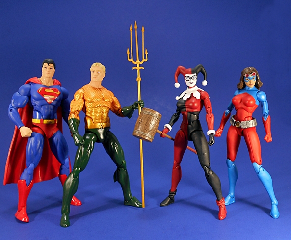
Apologies that today’s DC Friday Feature is going up so late. It’s been a bitch of a week and I’m glad to put it behind me. But after a detour last week, I didn’t want to delay wrapping up Wave 3 of DC Icons any longer. Yes, today’s figure is Aquaman, and while he tends to take a lot of guff from a lot of people, I’ve always had a soft spot for the guy. I was happy to see him getting a slot in the DC Icons line, as the series continues to alternate between classic versions of cornerstone characters and more fleeting appearances of back-benchers. And so some may shake their head when a wave goes from Harley Quinn and Superman to Atomica and back to Aquaman, but scoff if you will, this is what Universe building is all about.

dciaqua13

We’ve seen this packaging many times over by now. It’s clean, attractive, and collector friendly. Aquaman’s box is branded with orange coloring, indicates that he is the 11th figure in the line, and the side panel notes that this figure is taken from the pages of “The Legend of Aquaman,” a limited run origins story that was published in the late 80’s. I actually remember reading that one way back when, it was probably one of the last comic series I read before the 90’s hit and I started drifting away from comic books for a time. I revisited it after getting this figure, but unlike my re-reading of “Man of Steel,” it completely failed to capture my interest.

dciaqua3

dciaqua4

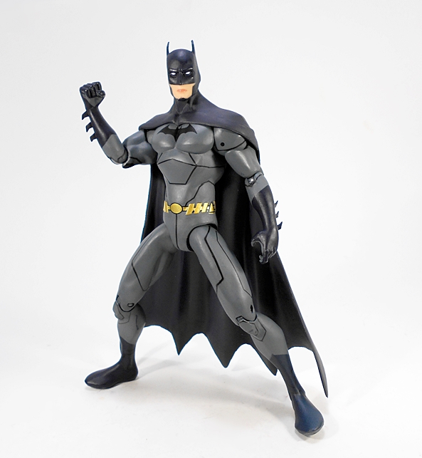
Nonetheless, the book features a very classic look for Aquaman and a great basis for this figure. But is there really a lot to say about this guy? With a few exceptions, his costume has changed the least out of anyone over the years and whether I’m looking at the original DC Universe Classics version or the New 52 Justice League version from DC Collectibles, there’s not a lot new here to talk about. You get the gorgeous gold fish-scale patterned top and dark green gauntlets and legs. From the back you can see the sculpted fins on the back of his lower legs. This is a fine treatment of the character, but I don’t think it’s really anything we haven’t seen before plenty of times.

dciaqua14

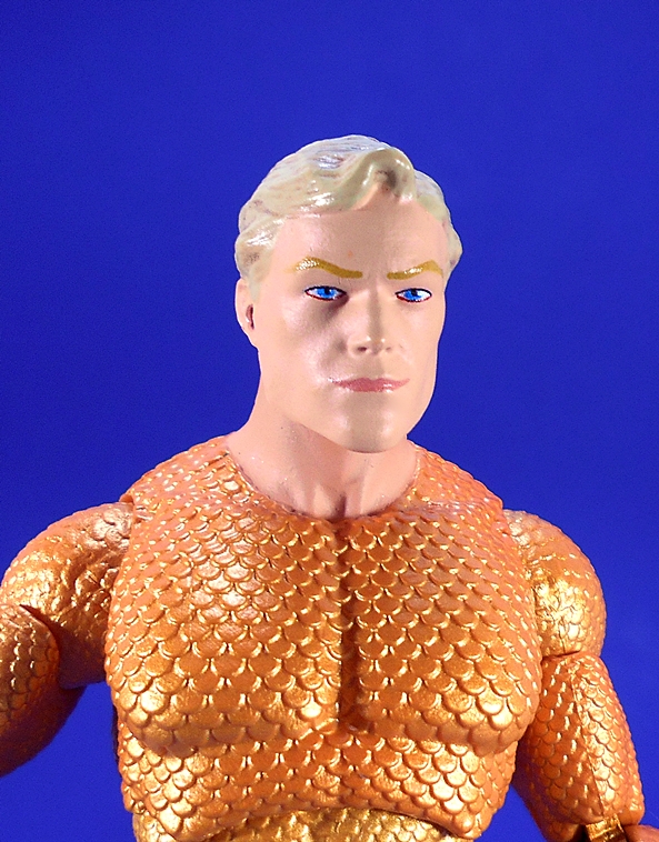
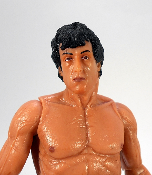
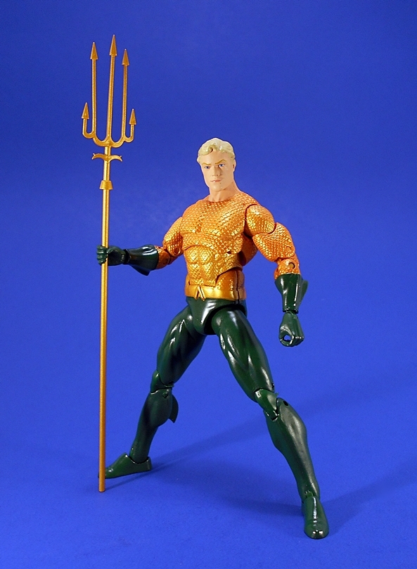
You get two portraits with the figure. The regular head is one of the better ones I’ve seen in the DC Icons line. At the risk of overusing the word here, it just looks very classic Aquaman. The paint is very clean and the figure features a strong jawline.

dciaqua7

dciaqua8

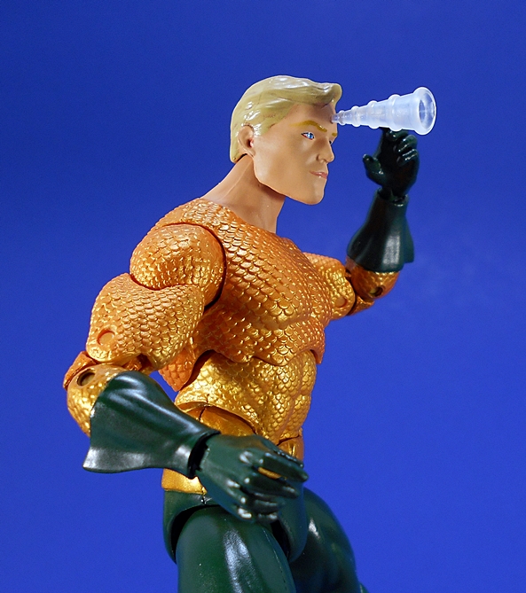
The alternate head features a hole in the forehead to insert his telepathy effect part. I like the look of this piece and I’m glad DCC included it, as it’s one of the few things that makes this figure truly stand out as something genuinely new and different. The head sculpt is virtually the same, and I’m not sure why they bothered to make the effect piece removable. It’s not like anyone is going to use the head without the cone telepathy cone pegged into it. Maybe it was just cheaper to do it that way.

dciaqua5

dciaqua6

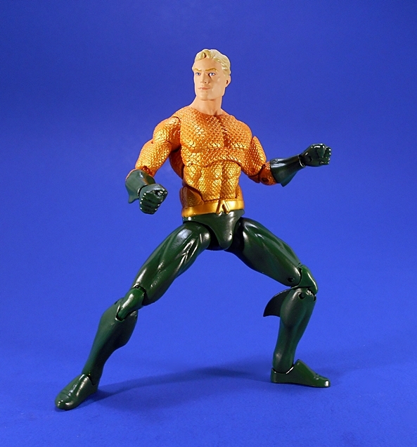
If you’ve been collecting this line, or reading my Features on it, the articulation here should present no surprises. You get rotating hinges in the shoulders, double hinges in the elbows and knees, hinges and lateral rockers in the ankles, ball joints in the hips, an ab-crunch hinge just above the waist, a ball joint under the chest and again in the neck, and swivels in the biceps. It’s all pretty good stuff, but the lack of a waist swivel in this figure really irks me, as does the lack of thigh swivels. The wrists are on hinged pegs, allowing for swappable hands. Aquaman comes with a total of three pairs, including fists, relaxed hands, and trident-holding hands.

dciaqua11

dciaqua12

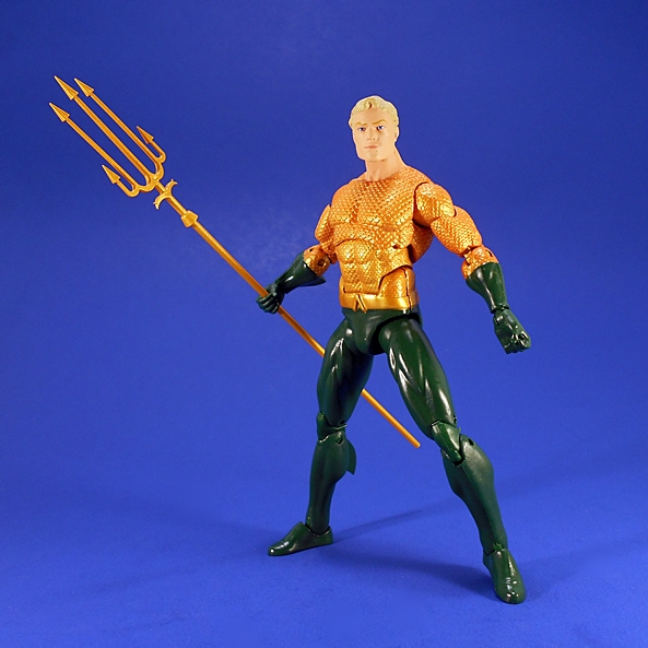
And conveniently, you also get a trident for those-trident holding hands to hold! I have my share of Aquaman figures and I can safely say this is the best trident that’s come with any of them. The prongs are super thin and fragile, but I think that’s what makes it look so good. The head will pop off the shaft to help slide it through his closed grips.

dciaqua10

dciaqua15

If you’re in the market for a very classic and solid Aquaman figure, you can’t go wrong here, and thanks to the timelessness of this look, he works fine as a modern version of the character too. I should also note how cool it is that Icons has so far been pulling the core Justice League characters from appearances published in the 80’s and that gives me a very classic and cohesive looking team so far. And this Feature also gets me current on DC Icons, but I’ll be anxiously awaiting Wave 4 to ship with Firestorm, John Stewart, and The Joker. Unfortunately, it looks like they’ve been delayed well into 4th Quarter.

Transformers Unite Warriors: Combaticons (UW-07) Box Set by Takara, Part 3: Swindle and Brawl

Folks, it’s been a loooong and thankless week at work. I’m exhausted, and I almost didn’t have it in me today, but the show must go on, and so here we are with another Transformers Thursday Feature. I also just spent a shit ton of money on new sneakers for my car and no small sum at the bar around the corner while I was waiting for the work to be done. I am quite tired, fed up, and most definitely inebriated. I picked up the car and literally screamed at the new tires, “I HATE YOU, YOU’RE MONEY I COULD HAVE SPENT ON TOYS!” Anywho…. today, I’m continuing my leisurely (now going on three weeks!) stroll through Takara’s big imported box of Combaticon goodness. So far, I’ve checked out Onslaught, Blast Off, and Vortex. Today I’m finishing up the individual bots with a look at the Deluxe figures that will form my Bruticus’ legs: Swindle and Brawl. What’s that? You can make them into arms too? UNACCEPTABLE!!! Once again, I’m looking at the alt modes first, so let’s jump right in and start with one of my favorite Decepticons of all time… Swindle!

swinbrawl1

swinbrawl2

Oh, Swindle, what have they done to you? G1 Swindle was originally a yellow and purple military jeep and now he’s ahhhhh… well, I guess a modern yellow and purple military sort of jeep looking thingy? With no place to sit? Yeah, there’s a little half sculpted blob in there that’s supposed to be a steering wheel, but I have to be honest here, this alt mode is a goddamn ugly mess. Some of you may remember me looking at Warbotron’s version of Swindle a while back and being content with them making him into a Humvee. Granted, that was an $80 Third-Party Voyager scaled figure, but I still think a Humvee might have worked better here. How could it have been worse?

swinbrawl3

In fairness, there’s a decent amount of sculpted detail here. You get shock absorbers inside the wheel well, pouches along the sides, and some vents and panel lines. Swindle gets by with minimal paint apps in this mode. His roll bars are painted silver, as are the wheels, and the conspicuous robot hands inside what would be the cabin. You also get some rather striking purple paint showing on the hood and the tailgate.

swinbrawl5

swinbrawl4

Swindle comes with a gun that can be mounted on his rear section, either left or right. You can also mount his combiner hand/foot on his roof to make a formidable double barreled cannon. Normally, I’m not a fan of using these pieces with the alt modes, but it worked alright for Vortex, and I think it works fine here. I mean, Swindle’s alt mode is already f’ugly enough, might as well stick a big foot cannon on top of it, right? Look, it sounds like I hate this thing, I don’t. It’s a passable Deluxe alt mode. It does what it needs to do. But as a devotee to my main man, Swindle, this alt mode could have and should have been better. Let’s see if Brawl’s alt mode fares any better…

swinbrawl6

swinbrawl7

Yes it does! It’s Brawl. He’s a brown tank. It doesn’t take rocket science to make this alt mode work. You get sculpted treads, some decent detailing, which includes hatches, vents, and, bolts, panel lining. Other than some black, a little silver, and Decepticon insignia on the sides, there’s nothing in the way of paint apps. The turret does not turn, but the gun can be raised a bit. It’s frightfully simple, but it works for me. It is clearly Brawl.

swinbrawl8

swinbrawl9

Brawl doesn’t come with a gun, but you can stick his foot/hand part on top of him for added firepower. I can’t say as I’m a big fan, but it’s not terrible. Also, so long as we’re looking at him from the front, his combiner port sort of looks like a third middle tread. Just saying. If this were a contest between the two alt modes, Brawl is the clear winner for me. He looks a lot more like what he’s supposed to be than Swindle does. He’s a tank, not some modern abstract realization of a tank. Maybe Swindle’s Jeep mode has a little more play value, but that’s about it. So, how about them robot modes? Well, let’s turn our attention back to Swindle…

swinbrawl10

swinbrawl12

Now we’re talking! The only think keeping this from being the Swindle I know and love is the lack of arm cannon, and you can always plug one of Onslaught’s guns into his shoulder to try to make it work. Otherwise, this figure hits all the right points. He’s got a pretty clean robot mode with loads of sculpted detail showing in his legs and arms. The upper chest is made up of his actual alt mode front, while a faked out Jeep front is situated in his pelvic region to drive home that G1 homage. And speaking of G1 homages, just look at that head sculpt! It’s love. G1 love. I love it.

swinbrawl11

From the back, we can see the hood and roll bars of the alt mode peg in firmly to his back. The whole assembly sticks out a bit behind his head, but it’s not terrible as far as kibble goes. If it really bothers you, you can drop it down to form a butt flap, but I’d rather not. I also really like the wheel placement on this figure. Two wind up in his armpits, without being cumbersome to the articulation, while the other two wind up on his ankles. The deco here is perfect. You get all that lovely yellow-tan Swindle-y plastic with a little more purple and silver paint showing. Was it worth getting a ho-hum alt mode for this kind of robot delight? Yessir, it is. But I’d still argue they could have done this with a cleaner and more accurate Humvee alt mode.

swinbrawl13

swinbrawl14

Swindle comes with a very sweet gun with three barrels. This is the first time I’ve seen this gun in the CW/UW line and I absolutely love it. Let’s move on to Brawl…

swinbrawl15

OK, so I sense a flipping pattern going on here. Swindle had an iffy alt mode and a rock solid robot mode. Brawl had a decent alt mode, and this as his robot mode. I’ve been playing with it off and on for an hour now and I still can’t make up my mind. Like Swindle, he’s a pretty solid representation of the G1 alt mode. You’ve got the treads facing front on his upper arms, you’ve got the turret on his back with the cannon sticking straight up. You even have those circular hatches sculpted into his lower legs like the Sunbow model showed.

swinbrawl16

On the other hand, those puny little forearms! Oh, how I wish they could have fixed those. If only they could have cut the arm hinge a little higher. And then there’s that mid section. It’s sort of just a big hinge above his pelvis. It doesn’t really ever lock in securely enough for my satisfaction, especially when I pick him up from the chest and his lower half flops down a bit. It’s not something that really bothers me until I start playing around with him and then it just doesn’t feel right. But… all these quibbles, and I’m still nowhere near to saying I dislike this figure.

swinbrawl17

The deco here is mostly what you get from his tank mode. There’s a lot of brown and black with a little more silver exposed. The deco is drab and dreary and looks perfectly suited for Brawl… until I get to the head. A fantastic head sculpt, but that neon orange paint is a bit much. I wish they could have toned that down a bit. Here’s an instance where I prefer the Hasbro paint to this one. With all that having been said, when I stand Brawl on the shelf beside Swindle, he looks just fine.

swinbrawl18

swinbrawl21

Brawl doesn’t have a gun, although you can angle that turret cannon over his head into a firing position. You can also attach his hand/foot part to either arm to give him a weapon. It looks about as good as one might expect it to look.

swinbrawl20

swinbrawl19

Both of these figures get a passing grade from me. Where Swindle stumbles in his alt mode, he soars in his robot mode and becomes my official Generations-Classics-Whatever version of the character. And Brawl sports as solid an alt mode as I would expect, but experiences some design hiccups in his robot mode. It feels like these could have used another trip across the designing board, one for alt mode and one for robot mode, but then if you count the limb modes, these are essentially Deluxe Class Triple Changers, so sacrifices are going to be made. In the end, these compliment the rest of the team nicely and I’m rather excited to get them cobbled together into Bruticus. And I’ll do just that next week in Part Four!

Mythic Legions: Sir Owain by The Four Horsemen

It’s Wednesday and time for another look into The Four Horsemen’s Kickstartered line of amazing 6-inch scale fantasy figures. I began my look at the Mythic Legions line two months ago with the brave knight, Sir Gideon, and after nearly ten figures, today I’m returning to the knights of the line and checking out Sir Owain!

mlowain1

Here is a quick, obligatory look at the figure in his packaging. You get a generic card with a little of the line’s fiction on the back. The bubble insert has “Mythic Legions” printed across the front and a little bio of the character on the right panel. The card is designed to slide out of the plastic bubble front, so everything is collector friendly!

mlowain2

mlowain3

Oh yes, Sir Owain is as classic a knight as you can get. This guy really takes me back to those wonderful Marx Knights that I used to play with at my Uncle’s house way back when. We’re almost ten figures in and by now we’re going to start seeing a lot more familiar parts, but this is as close to a straight repaint as I’ve shown thus far. From the neck down, Sir Owain is just a recolor of Gorgo Aetherblade. The sinister black and red deco has been replaced with a simple yet gorgeous silver and gold color scheme, keeping just a little bit of black. The resulting transformation from evil bastard to noble and heroic knight is impressive. Seriously, the quality of paint on this figure is just breathtaking.

mlowain6

As always, the shoulder armor arrives off the figure in the package. Owain looks totally complete without these pieces, but pegging them into the shoulders gives him some lovely bulk. As with the rest of the body, these shoulder pieces are also repaints from Gorgo. You also get the ubiquitous brown belt, which can be worn around the waist or as a shoulder strap.

mlowain5

mlowain4

While the bulk of this figure is recycled, this is the first time we’re seeing this head sculpt. Known as a Burgonet and popular in the 16th Century, this helmet really captures that classical romantic feel of the chivalrous knight as depicted in the Renaissance Period. The silver, black, and gold deco matches the rest of the armor and he does have a large burgundy plume spilling out the top from behind the crest.

mlowain12

Just in case this is your first of my Mythic Legion Features, I’ll give a quick run down on the articulation for the line. You get rotating hinges in the shoulders, elbows, wrists, hips, knees, and ankles, as well as lateral rockers in the ankles to steady him for those wide stances. The waist is ball jointed, as is the neck. The neck guard is soft plastic and is designed to shift if need be to accommodate movement in the neck. Truth be told, Sir Owain is probably a little more limber than a dude in full plate armor should be, but that’s what helps make him such a fun action figure. Also remember, these figures are designed to be modular, so if there’s a joint, then chances are that joint can be separated and another part swapped in for easy customization.

mlowain9

mlowain7

mlowain8

Like Sir Owain’s body, we’ve seen his weapons before. First off, he comes with a sword and shield. All the shields we’ve seen in the line so far have been the same basic accessory, but with a unique coat of arms painted on the front. In the case of Sir Owain you get a large bird with a sword in the center set against a black backdrop. The shield clips onto the figure’s wrist and the clip is pegged into the shield. The sword is the same one that came with Sir Gideon. It’s a single handed weapon with a newly painted deco for the hilt.

mlowain13

mlowain14

He also comes with the silver spear that we’ve seen several times.

mlowain11

mlowain16

You will no doubt have noticed that most of this Feature is pointing out how much of this figure is based on reused parts and accessories. Keep in mind, that is in no way intended as criticism. The fact is that T4H developed this line based on a selection ofparts that could be interchanged into different combinations to create new figures. And in this case, they show that even the right repaint can turn the same body into a figure that still feels fresh when standing next to the original. The repaint here is so well done and each figure owns it so well, that Owain doesn’t at all feel like a rehash of Gorgo to me. With all that having been said, anyone looking for just a beautiful 6-inch scale classical knight would be well served hunting this guy down. He’s a gorgeous figure even as a stand alone piece.

Rocky III: (Series 1) Rocky Balboa (1st Fight) and Clubber Lang (2nd Fight) by NECA

You have to hand it to NECA, they know how to harvest that 80’s nostalgia and use it to exploit us action figure collectors. Sure, they usually do it with sci-fi films like Alien, RoboCop, Terminator, or Gremlins, but landmark 80’s films are not bound to any single genre and the Rocky franchise is proof positive of that. For my money, they are Stallone’s finest body of work (although, I’m very partial to Copland as well). Rocky is quite simply the role he was born to play and it saddens me to think that eventually Hollywood will get to rebooting it starring someone else. Nonetheless, these films will always have a place in my heart, and that’s coming from someone who probably wasn’t these films target demographic. Needless to say, when NECA stepped up to produce figures for the 40th Anniversary of the franchise, you bet your ass, I was up for it. The first series consists of two versions of both Rocky and Clubber Lang from Rocky III and today I’m looking at one of each.

rockone1

While not quite equaling the decadent packaging of the Ultimate Series, the presentation here is not at all shabby. The figures come in window boxes with some handsome gold foil work on the front portraits and on the spines. The side panels identify the character and the series, so you can line these up on a shelf and always know who you’re reaching for. This is simple, elegant, and collector friendly packaging at its best. Let’s start with Rocky!

rockone2

This is Rocky as he appeared in the first fight with Clubber Lang, where he got his ass kicked. I can still remember the first time I saw that fight in the movie. I was young and I recall feeling scared shitless for him because Clubber was so intimidating. Rocky sports his yellow/gold trunks, gloves, and high tops and dammit, there is some really fine detail going on here. The gloves and shorts look like the real thing thanks to a beautiful coat of paint and some sculpted stitching and wrinkles. From his name on his shorts to the elastic waistband, this is great stuff. The same goes for his footwear, which feature the same amazing gold paint and “ROCKY” printed across the backs of the high tops.

rockone3

Naturally, a good portion of this figure is showing skin and NECA did a fabulous job sculpting the intricate musculature. For a company that has practically built an empire off of Xenomorphs and Predators, it’s genuinely satisfying to see them turn their attention to something as simple as human anatomy and show off how well they can do it. Now, to know me is to know how much I usually hate when companies use this type of waxy plastic for flesh, but here it works for me. The glossy sheen just communicates sweat and stress and adrenaline and fear. I love it.

rockone8

rockone9

The portrait here is solid enough, although I’ll confess it leans a bit into caricature territory. Or maybe it’s just the way Stallone naturally looks. Yes, part of it is the waxy plastic, which doesn’t allow for some of the nuances of paint to bring it out. The paint could have been a little cleaner on the eyes, but it also gives him that certain “just took a blow to the head” kind of look. That all having been said, I think it’s fine. It’s most definitely Stallone.

rockone10

rockone11

The articulation is everything I could want for a Heavyweight Champion of the World. You get rotating hinges in the shoulders, elbows, wrists, and knees. The hips appear to be ball jointed, but it’s hard to tell because the legs actually connect inside the shorts. The ankles have rotating hinges as well as lateral rockers and there’s even a hinge midway through each foot. Finally, you get ball joints in the chest and in the neck. Moving on to Clubber…

rockone4

rockone5

As far as 80’s film antagonists go, Clubber Lang is surprisingly high up on my list. That’s a testament to the script writers and Mr. T’s performance. I really hated this guy. He was an animal and he showed absolutely no respect to The Italian Stallion. Everything I said about the Rocky Balboa figure can be applied to this one. The colors may not be as flashy, but the black and white shorts and white and black footwear look great. He has “CLUBBER” printed across his waistband and his initials printed down on the left leg of his shorts. I really love his gloves. The red paint here is so vibrant and like Rocky’s they have “TUF WEAR” printed on them.

rockone6

rockone7

I think the key difference here is while I found Rocky’s portrait to lean a little toward being a caricature, there’s absolutely no equivocating on this one. It is an incredible likeness to the great Mr. T. The expression is spot on and pretty damn terrifying. This is quite simply top notch work on NECA’s part.

rockone12

rockone13

The articulation on Clubber is identical to Rocky, although it’s worth mentioning that they are most definitely separate bucks. Clubber is appropriately larger and beefier.

rockone14

rockone15

rockone16

rockone19

Hot damn, do I love these guys! When I purchased these, I was pretty deliberate about the ones I bought because I hadn’t planned on getting the whole Series. Getting two of each character just seemed like double dipping. Now that I have them in hand, I’m certain that I’ll be getting the other versions as well. These look so amazing in hand and on my shelf and I’m really looking forward to the upcoming figures, particularly Apollo Creed and Ivan Drago. Now, I just need to get me a 6-inch scale boxing ring. TO THE EBAYS!!!

Marvel Legends (Juggernaut Wave): Cable by Hasbro

It’s Week Two of my jaunt through the new X-Men Wave of Marvel Legends and for this Marvel Monday, I’ve decided to rip open Cable. Now, what we have here is one of those Good News, Bad News, Good News scenarios. The Good News? He’s Cable! And at last in the Legends scale! The Bad News? It’s not really the version of Cable I would have preferred. The Good News? He’s still an excellent figure! But, I’m getting ahead of myself. Let’s start with a quick look at the packaging…

xmcab1

I commented last time about how much I dig these boxes with the matching yellow accents and boy do I! Along with the snazzy coloring, the character art on the side panels really make them pop and they look amazing collected together as a set. If I weren’t so hard pressed for space as it is, I would probably display this set packaged and on the wall, but alas my walls and closets and shelves are busting at the seams, so I’m going to have to be content admiring the boxes in these pictures after I toss them all. But before I sadly toss the packaging, let me get the stuff inside out first!

xmcab7

So, yeah, this isn’t really my Cable. This Cable does not scream “bodyslide by two” hijinx with Deadpool to me. This Cable hails from a mini-series from about four years ago. It’s an odd choice to be sure, but knowing Hasbro’s need to recycle parts in this line, they may have been going for a look that they could work with. And while I haven’t looked at the Civil War Wave yet, I’m seeing a bit of the Nuke figure in this one. Ideal? No! Am I OK with it? Yuppers! Because Cable here, no matter the version, is a damn nice figure. One of my favorite things about him is the bulky armor, which features some lovely texturing and scattered bullet holes. Also the segmented metal arm is just gorgeous!

xmcab8

This is also a suitably bulky buck. Even without the barrel chested armor, he’s got a nice presence to him. There’s plenty of detail in the pants and boots. He’s packing dual thigh pouches, a slew of belt pouches. POUCHES! He’s clearly trying to make Deadpool jealous. The shin and knee armor is colored to match his chest armor and also features some dings and bullet holes. The deco on him is nothing outrageously special, but the quality of the paint is superb. That silver paint just can’t be beat. I also love the tat on his right shoulder.

xmcab10

xmcab9

And the portrait!!! Hasbro wasn’t fooling around when they sculpted this noggin. This is clearly a character that offered plenty of opportunities for them to shine and they stepped up to the challenge. The stern jaw, broad nose, and grim expression says it all. The paint apps on the scarring and his one organic eye are sharp and clean, and the exposed cybernetic portion of the head is absolutely killer. Again, some great silver paint and amazing detail work in the segmented lining. What’s particularly cool is the detail on the neck goes all the way down into the armor. I have nothing but admiration for the work here.

xmcab11

xmcab14

xmcab3

Cable’s articulation is a little better than I would have expected from such a substantial buck. I was particularly pleased to see the double hinges in the elbows. The arms also feature rotating hinges in the shoulders and wrists, and swivels in the biceps. The legs are ball jointed at the hips, double hinged at the knees, and have swivels in the thighs. The ankles are hinged and feature lateral rockers. The torso has a swivel at the waist and a very generous ball joint buried under the chest armor. The neck has both a hinge and ball joint. The jointing on this figure feels great and he’s been pretty hard for me to put down.

xmcab12

xmcab13

xmcab17

Weapons! It wouldn’t be Cable without an arsenal and this figure comes with two sizable, futuristic guns. The smaller of the two appears to be a new sculpt. If it isn’t, I can’t place where we’ve seen it before.  The larger gun is, appropriately enough, the same gun that came with Hope Summers all the way back in the initial wave of the Legends relaunch. This one, however, has the added bonus of an ammo belt that plugs into the bottom of the stock.

xmcab5

xmcab18

xmcab19

In case you can’t tell, I absolutely adore this figure. And that sentiment shouldn’t be taken lightly, as I’m even surprised at myself how the disappointment of this not being Cable’s more conventional look hasn’t overwhelmed me here. The truth is, this is such an amazing looking figure and so much fun to play with, that I’m easily able to overlook what could have been and just really admire the beautiful work that went into what we got. And for the time being, at least I still have an excellent 3 3/4-inch version of proper Cable from the Marvel Universe line a few years back. So far, this Wave is batting two for two. As much as I’m tempted to go with Deadpool next, I think I’ll check out one of the X-Ladies on next week’s Marvel Monday.

Figma “Arpeggio of the Blue Steel” Iona by Max Factory

By now, y’all know how much I love me my Kantai Collection and the exploits of the Fleet Girls. Well, then it should come as no surprise, that I’m also extremely fond of Arpeggio of the Blue Steel. It too has WWII style ships, a naval war against alien fleets, and some adorable girls at the helm. In reality the two series are really quite different, but they’re both near and dear to my heart. Figma didn’t go too deep with AotBS, but they did produce a figure of Iona, the Mental Model of the renegade Fleet of Fog submarine I-401. Not to be confused with the I-401 from KanColle that I looked at last week. See? Similar, but different.

absiona12

Iona is #263 in the ongoing Figma line. She comes in one of the smaller and more compact window boxes with a blue and black deco. The window gives you a glimpse of the figure and all the goodies inside. As always, it’s collector friendly and even has one of those branded Figma ziploc bags to help you store all those parts if you don’t want to keep the box. I’ve been really pressed for time this week, so today’s Feature will be relatively quick, but Iona is a fairly simple figure, so I think I can do her justice in a short amount of time…

ionabs6

Here she is out of the box and looking pretty sweet. If you’re familiar with the anime, than the obvious thing to point out here is that this is not her better known, dark blue outfit. I actually like this look a lot, but I think it was an odd choice to go with for what will likely be her one and only Figma. Her outfit and hair consist of a matching powder blue, white, and lavender, all of which conspires to give her a very pale and almost ghostly appearance. That having been said, the detail here is quite nice, particularly on the laced boots and the straps that hang off her top and down across her hips.

ionabs7

Of course, you get a standard Figma stand with the articulated arm. From the back, you can see that her long hair is articulated to allow the arm access to the peg hole in her back. If you look closely, you should be able to make out the Fleet Insignia printed just above her butt.

ionabs3

ionabs5

ionabs4

It wouldn’t be a Figma figure if it didn’t come with a whole bunch of hands. In this case, there are four pairs, including: Fists, relaxed hands, splayed finger hands, and accessory holding hands. You also get a pointing right hand, and another right hand that is permanently attached to a little tea cup. One thing to watch out for are her teeny-tiny wrist cuffs, which will fall off when you swap out the hands. Iona also comes with three different swap out faces, which include a surprised expression, a neutral expression, and one with a slight smile. Switching these is as easy as always, you just pull off the front hair piece, pull off the face, tab in the new face, and replace the hair. All of the expressions are pretty damn adorable, and her large green eyes are immaculately printed on each portrait.

ionabs1

ionabs2

As if all that wasn’t enough, Iona also comes with an alternate lower half, which has her sitting down. This piece requires you to pop the boots off of her legs and attach them to these legs, then pull the figure apart at the waist and attach the upper half of the figure to this piece via a ball jointed peg. Here’s where I like to use the teacup and saucer that she comes with to have her taking some time off from running the I-401 and enjoy a nice cup of tea. Fair warning, the “tea” in the cup isn’t fixed in place and will fall out if you turn the cup over. If that happens, good luck finding it again!

absiona3

ionabs9

Iona comes with one other accessory and that’s a little pink starfish. She was rather obsessed with the squishy little animals in the series and those accessory holding hands work pretty well with it.

ionabs11

ionabs10

And last, but not least, Iona comes with a complex system of parts to replicate her holographic interface with the I-401. In the series, this consisted of three bands of data displays, which encircled her. Here it’s recreated with three translucent plastic strips that are attached to a special arm on the back of the figure stand. It works… sort of. I give Max Factory major credit for trying, but in the end, I had mixed results with this set up. It’s also extremely frustrating to work with and I could never get the data rings positioned just the way I wanted. A cool idea, nonetheless.

ionabs12

ionabs8

Iona is a very nice figure and I’m glad that the Figma line threw some support behind this anime, because I really do enjoy it a lot. At only 12 episodes, It’s a short run, but I’ve probably been through it three or four times. If you want more, there’s also a Manga and a couple of films. Obviously, I would have liked to see more of the Mental Models recreated in figure form, or even some of the crew of the I-401, but if they were only going to do one figure, Iona was the logical choice. She doesn’t come with as much stuff as a lot of my other recent Figma purchases, but at around $35 the price certainly reflects that. If I had one gripe, it would be the choice of costume, but I’m already eyeing some other figures of her, to get that more traditional look.

Son of Batman (DC Animated Movie Series): Batman by DC Collectibles

I know, a lot of you were probably expecting me to wrap up Wave 3 of DC Icons today on DC Friday. Pfft… like I’m going to buy Aquaman! Kidding! Kidding! Of course, I picked up Aquaman and he’s a fantastic figure. Truth be told, I’ve had a busy week and I didn’t have enough time to do Aquaman justice, so I opted to take a little detour and check out another one of the DC Animated Movie Series by DC Collectibles. These are pretty simple figures and don’t take nearly as long for me to look at. So let’s have a look at Batman from the Son of Batman movie! Hopefully his arm won’t fall off like Green Lantern’s did.

sonvabat1

It’s confession time! I haven’t seen Son of Batman yet, but I hear it’s pretty good. I actually bought this figure as a stand in for a Justice League War Batman that was never produced. Regardless, the figure comes carded in the same style as the JLW figures only with Son of Batman on the front insert and stills from the movie on the card behind the figure. The back of the card shows other figures in the line: Robin, Nightwing, and Deathstroke. If you’ll give me a moment, I’ll say a quick prayer to the QC Gods and get Bats out of his package.

sonvabat2

Alright! I’m happy to report that Batman made it out of the package without any breakage and looking pretty sharp. I was expecting a recycled buck from the JLW Hal Jordan or Barry Allen, but Batman looks mostly new. The overall shape and style of the body is similar, but Batman lacks the detailed muscles in the abs, making this look more like light armor. Most of the costume is achieved through paint apps. It’s a very dark charcoal gray with black painted panel lines, boots, gloves, and bat symbol on the chest. The gold belt is a mix of sculpt and paint and looks pretty good.In fact, all the paint on this figure is quite solid.

sonvabat3

The cape is particularly well done. I love the way it covers the shoulders rather tightly, it fans out just the right amount, and the scalloped edges end just a bit above the ground, so it’s not dragging. Nice!

sonvabat4

The head sculpts have been hit or miss in this line. We’ve had the sloppy Hal Jordan, the deformed Superman, and a pretty solid Wonder Woman and Cyborg. I’m happy to report that Batman can be counted with the better ones. Not only is the cowl excellent, but the exposed part of the face is clean and sharp and actually looks great.

sonvabat6

sonvabat7

The articulation on these figures is the same throughout all the male bucks. It’s OK, but not great. It’s loads better than what we used to get from DC Direct, but not quite up to snuff with the other modern DC Collectibles lines. You get rotating hinges in the shoulders and elbows, hinges in the knees, ball joints in the hips, and a ball joint in the neck. A couple of my figure’s joints were a little tight out of the package, but I was able to coax everything into moving without breaking.

sonvabat5

sonvabat8

That’s it! I said today was going to be quick and it was. I’d rate Batman among the best of these figures so far, or at least of the ones I’ve already opened. The stylized sculpt suits him beautifully, the paint is sharp and neat, the portrait is solid, and I’ve really got nothing at all to complain about. Well… at $20, the original price is a bit high for what you’re getting here, but I’ve been picking these up for ten bucks a pop, and I’m certainly satisfied here.So far, the best I can say is that I’d be happy to just own this one and Wonder Woman as stylized stand alone figures, but it’s not a line I’d recommend at anything other than deep discounts.

Transformers Unite Warriors: Combaticons (UW-07) Box Set by Takara, Part 2: Vortex and Blast Off

It’s Transformers Thursday again and I am continuing on with my look at Takara’s Unite Warriors Combaticons box set. Last time we looked at the packaging and Onslaught, today I’m starting in on the limbs, or more specifically, the Deluxe Class bots that will make up Bruticus’ arms. Let’s kick it off with the alt modes, and I’ll start with Vortex…

vortoff3

Originally released as Alpha Bravo for the Aerialbots and then Blades for the Protectobots, it should come as no surprise that this mold is being recycled yet again for Vortex. That’s not a bad thing, as I like this mold a lot and all of my original hostility toward it was fueled by the fact that he was a helicopter standing in for a jet on my Aerialbot team. I’ll even go so far as to say Vortex is probably the best use for this mold to date, seeing as how it comes armed to the teeth with a pair of rocket clusters. Structurally, the only real difference between Vortex and Blades is the new four-bladed rotor, which looks great in the chopper mode, but I’ll have some unkind things to say about it when we look at his robot mode.

vortoff4

The new color scheme is pretty nice. The primarily dark gray and black deco certainly gives him a sinister Decepticon look and I really dig the faction symbols near the doors to the cockpit. The lighter blue striping on the nose and rockets is an interesting choice. I wasn’t so sure about it at first, but it’s growing on me.

vortoff2

Vortex is one of the few instances in the Combiner Wars/Unite Warriors line where I find value in attaching one of the combiner parts to an alt mode. In this case, plugging the hand/foot with the twin chain guns into the bottom not only gives him a platform to rest on, but adds some major firepower without looking too stupid. Moving on to Blast Off…

vortoff5

If you haven’t figured it out by now, Hasbro likes to substitute impostors into our Combiner Teams and release the real ones later, or just leave it up to Takara. With the Aerialbots, Protectobots, and Stunticons, they did this by introducing an all new character. With the Combaticons, they just made Blast Off a repainted jet from the Aerialbots. And while a combat jet makes more sense in the team than a space shuttle, it was still unacceptable to me because I’m an unforgiving middle aged fan who does not want my childhood re-written. Sometimes, folks, you should be careful what you wish for…

vortoff6

vortoff7

Enter Takara’s Blast Off, a brand new mold and a proper space shuttle, yes, but not an alt mode that’s going to win any awards. This thing is actually pretty ugly with obvious arms running down the sides, a tail fin that doesn’t always stay pegged together, and a patchwork deco that isn’t helping the mold any. Am I being too hard on him? Probably. Truth be told, I’m happier having this toy, with all its flaws, in my Combaticons, than I would be having a repainted Aerialbot. I actually think a more reasonable deco could have helped this shuttle mode out a lot. In the end, I’m going to give it a pass, but just barely. Let’s move on to the robot modes, and we’ll jump back to Vortex…

vortoff12

As with his vehicle mode, Vortex’s bot mode is just a repaint of Blades with a new head, at least from the front. The coloring doesn’t change much from the chopper mode, although you do get a little more blue exposed in the upper legs and chest. And while the coloring overall looks pretty good here the paint on my figure has a few flubs on the right arm. The paint just doesn’t look as premium as I’m used to seeing in a Takara release. That having been said, this is still a huge improvement over the crazy coloring on Hasbro’s version. Besides the coloring, I still dig this mold a lot. You have the option of pivoting the tail boom left or right behind his head, but I prefer leaving it straight to preserve symmetry. The new head is absolutely fantastic. A solid tribute to the G1 version of the character.

vortoff13

From behind, things get a little shaky, thanks to the new set of rotors. With blades, you could fold up the two blades and tuck them neatly between the stabilizers on the tail boom and for the most part they stayed out of the way. Here you have two additional blades to deal with. The official transformation just leaves the bottom two blades flopping off to the sides. I’ve found that if I squeeze them in a little further, I can get the bottom blades to stay in position roughly in line with the top two blades. It’s possible, however, that this is causing some stress to the plastic, as they aren’t meant to be placed in that position, but it helps solve what is otherwise a detriment to the figure.

vortoff9

vortoff11

vortoff10

vortoff8

Vortex comes with a repaint of the same rifle as Blades, and it remains among my favorite weapons in this line. Of course, he also has a full bank of rockets mounted on each arm. When it comes to attack power, Vortex has got it covered. In the end, Vortex still feels like a relatively fresh figure to me, but a lot of that probably has to do with me skipping Alpha Bravo. The color scheme works well, the new head sculpt is perfect, and so long as I can get the rotors situated on his back just right, he’s aces in my book. So how about Blast Off’s bot mode?

vortoff14

Well, I’m surprised to say that despite the iffy shuttle mode, Blast Off’s bot mode is pretty damn great. I really dig the way the nosecone of the shuttle packs up so neatly into his chest. Yeah, it juts out a bit, but it still works for me. Likewise, the wings all pack up nicely on his lower legs and the thrusters as feet are a nice nod back to the Sunbow version. As far as the coloring goes, it’s easy to see they sacrificed any sense of coherence in the alt mode for a pretty spiffy deco in robot mode. I guess I’m OK with that. And like Vortex, Blast Off’s head sculpt is simply superb.

vortoff15

It’s interesting to check out Blast Off from the back and see how his backside looks pretty similar to the fronts of a lot of the CW/UW Deluxe limbs. Indeed, if for some reason you don’t like the chest, you can just spin the lower half around, re-position the arms and legs and have a more familiar looking bot that wears the nose cone assembly as a backpack. Me? I’m fine with the official mode.

vortoff16

vortoff17

Blast Off comes with a little black pistol, which isn’t as impressive as Vortex’s rifle, but it suits him just fine. And since he has thrusters in his fists, I like to think that those would serve him well as additional weapons. As much as I dig Vortex, Blast Off takes the prize as my favorite of this pair, at least in robot mode.

vortoff18

vortoff19

And there you have it, a couple of solid Deluxe Class figures who I am very content to call modern updates to their G1 Combaticon namesakes. If the snazzy paint job on Onslaught hadn’t already convinced me that Takara was the way to go here, this pair has even more so. Getting a proper shuttle mode for Blast Off is a treat, even if the shuttle mode ain’t all that great, because his robot mode more than makes up for it. I think he’s one of the more interesting Deluxes to come out of this line. And as for Vortex, even if the paint here doesn’t feel as premium as I would have expected out of Takara, the alternative deco on the Hasbro version is an absolute tragedy. So far I’m digging this set a lot. Next Thursday, I’ll be back to talk about Swindle and Brawl!

Mythic Legions: Asterionn by The Four Horsemen

Oh, how I look forward to Wednesdays now, when I can sit back and bask in the glory of yet another Mythic Legions figure from T4H. Today I’m checking out one of the more unique figures in the line. His name is Asterionn, and he’s a god damned Minotaur! And he’s one of the good guys!

mlaster16

I’ll continue to show packaged shots of these figures even though by now y’all should have a good idea of what to expect. It’s a simple and collector friendly bubble and card with an insert showing the name of the series on the front and a blurb about the character on the right panel. Slide out the card and you can get at the goods. It’s worth mentioning here that Asterionn is the one and only figure in this line that had some paint rubbing on the inside of the bubble from his nose. It’s not even noticeable on the figure, but the smudge is clearly visible on the bubble. That protruding snout just doesn’t have anywhere to go in the package, so it just ends up rubbing on the inside.

mlaster1

As usual, the figure comes packaged without the shoulder armor attached and in this case it gives us a nice look at the unique sculpting in the area where the fur from his bovine head gives way to man flesh. This part is cleverly done as the entire area from the chest medallion up to the neck is a separate piece fitted on top of the standard bare chested buck. That buck, as well as the upper legs and upper arms, are the same parts used for Urkku and Vitus. The parts reuse means that Alterionn features the same excellent standard of articulation as the previous figures in the line, which basically means you get rotating hinges all around and each of those hinges is a point where the corresponding part can be pulled off and swapped out with one off of another figure.

mlaster2

mlaster3

We saw the waist, hip, and groin armor back when I looked at the Dwarves, Thord and Bothar. Yes, the armor pieces used on the Dwarves work perfectly on this hulking dude. Proportionally, it shouldn’t work but it does. How cool is that? The shoulder armor consists of the same molds we first saw on Sir Gideon and both the gauntlets and grieves are repaints of the same pieces worn by Urkku. Asterionn does feature a new set of hooves for feet. And yes, you get the standard brown belt, which can be used on the waist or as a shoulder strap. The paint on Asterionn is just as fantastic as what we’ve been seeing all along. The armor pieces feature a very nice worn copper look with silver painted rivets and metallic blue scales over the groin, each with a neatly painted copper rivet. The same blue is used for the stone in the center of his chest medallion as well as some striking accents on the shoulders.

mlaster5

mlaster4

The portrait here is brand new and it is absolutely killer. The powerful bull head features some excellent sculpted hair and the glossy paint used for the eyes give him a delightful spark of life. The horns can be rotated or even pulled out and used in one of the other figures’ helmets. But I wouldn’t want to deprive this guy of his horns. I really like the deep chocolate brown paint they used on his head and the way it fades gradually into the skin tone.

mlaster6

mlaster7

mlaster8

Asterionn comes equipped with the standard shield that we’ve been seeing a lot of. In this case the surface features a blue stag head against a gold background. You also get the sword that we’ve previously seen included with Gorgo, Urkku, adn Bothar. This time it has a gold painted hilt, which matches the gold rim on the shield.

mlaster10

mlaster9

mlaster14

And finally, you get the axe that we’ve already seen a couple of times and which can be displayed with either a single or double blade. This one is decked out with gold, silver, and blue paint to match his armor. There’s also a cool weathering effect on the blade.

mlaster12

mlaster13

mlaster15

I’m really trying not to fall into the trap where every time I look at a new Mythic Legions figure, I proclaim it to be my new favorite, but that’s been more or less the case. I really do love everything about this guy. Having a Minotaur in the line is a perfect fit and while I confess that I haven’t been investing a lot in the fiction for the line just yet, I do like that they made him a good guy. Asterionn is a gorgeous figure and yet another fine example of how well T4H planned out the parts sharing in this line. There’s another Minotaur coming with the Wave 1.75 figures, but I decided to stick with this one. He’s more special to me if he’s the only one of his kind, and quite frankly I think they nailed this figure so well, I didn’t see a reason to add another.

Masters of the Universe Classics: Despara by Mattel

In case you haven’t heard, there’s been big doings over at Matty’s Castle. Matty Collector is officially closing down at the end of this year and the Adult Collector lines are being handed over to Super7. Right now it seems like Masters Classics will certainly continue under the new stewardship in some form, while the future of lines like ThunderCats, which haven’t even started shipping yet, are a bit more questionable. Either way, as we ponder the future of these lines, it seems only appropriate to be looking at one of my most anticipated figures from the Collectors’ Choice Sub. Let’s check out Despara!

motucdesp1

Will Super7 carry over this style of packaging? I hope so! These packages have become so iconic to me over the last handful of years. No more bios on the back, but we do get Despara’s tag line on the front, “Powerful Force Captain of the Evil Horde” and a Horde sticker on the bubble. An explosion on the side panel declares this figure is part of the Collectors’ Choice Subscription. I think there are still two more figures coming in this Sub and I still have one other waiting on deck to review. As I understand it, Despara is the name used by Adora in the DC Comic, when she was a Force Captain for The Horde. I’ve never read it, but I do remember her being affiliated with The Horde in the beginning of the She-Ra Filmation cartoon, although I seem to recall that she was just called Force Captain Adora and that she wore her regular clothes. I think I like the DC version better, because…

motucdesp2

Well, damn… just check her out! I don’t know about you, but being told that Force Captain Adora is coming to lay down some Horde law wouldn’t instill fear in me. Nor would I be trembling when some wholesome looking blonde shows up in a tunic and skirt. Now, you tell me Despara is coming to set fire to the village and this bitch turns up? I’m gonna get out my Bank of Etheria checkbook to pay my taxes right quick. This design is just so bad ass. Yeah, it’s basically just She-Hordak, but oh man, do I love it! You get that same sinister black and gray deco on her outfit and a little bit of red. Why no Horde emblem? I’m sure there must be a reason, no?

motucdesp3

The stepped shoulder armor is part of the cape, which just lays on her shoulders. If you pop the head you can lose the cape to give her a little more agility for battle. The cape also features a pair of loops for her twin swords, which I’ll get to in a bit. The paint on this figure isn’t quite as tight as what I’m used to seeing on most of my MOTUC figures. It’s by no means terrible, but some of the lines could be a little sharper. Also, it’s just my personal preference, but I wish the outside of the cape was black. But who am I to nitpick the Horde Queen’s color choices?

motucdesp4

The masked head is patterned after Hordak’s and it is every bit as ugly as it should be. Actually, it’s a wee bit uglier. The teeth look kind of sloppy in both sculpt and paint. Same goes for the cowl that frames the face. The truth is, we’ve seen better in this line. Just compare this portrait to any of the Hordaks and I think it comes up a little short. Again, not terrible, but I think Matty could have done better.

motucdesp16

As we saw in the packaged shot, Despara comes with an unmasked head. It’s basically Adora with a buzz cut and some war paint under her eyes. The portrait looks a little too friendly, but I guess that’s why she has the mask. The paint here is fairly solid. I like the gloss they used on her lips and the bright white for her teeth. There is some unfortunate and annoying mold flashing around the edges of her chin and her ears. I love that we got this extra portrait, but will I be displaying it on the figure a lot? Probably not.

motucdesp11

Articulation features the standard for MOTUC female bucks. That includes rotating hinges in the shoulders, swivels in the biceps and wrists, and hinged elbows. The legs are ball jointed at the hips, have hinges in the knees, swivels at the boots, and the ankles feature both hinges and lateral rockers. There’s a swivel in the waist, no ab-crunch, and a ball joint in the neck.

motucdesp7

motucdesp5

In addition to the extra head, Despara comes with her own Horde staff, which features an array of silver painted blades and a red tip. I like this thing. It’s a pretty cool mix of ceremonial piece and weapon.

motucdesp12

motucdesp9

motucdesp10

Despara also comes with her twin swords and here’s where we run into some problems. The swords themselves are fine. They have silver painted blades and the hilts are black and red to accessorize with her outfit. They look great! No, the problem here is that her hands are clearly not made to hold them very well. The grip is just a little too big and the swords wind up falling out of her mitts. I can squeeze the grips to close them and that works for about a minute or so before they go back to normal and drop her swords. Now is a good time to go digging through the trash and find those clear plastic rubber bands they used to hold them in her hands while she was in the package!

motucdesp15

motucdesp14

motucdesp17

motucdesp18

If it sounds like I nitpicked Despara more than I do most Masters Classics figures, you have to understand that I was really looking forward to this one. And what I got is in no way a bad figure. There are, however, a few things about her that didn’t live up to my expectations and I feel some of that has to do with her coming at the end of Matty’s run. I could be totally off base on this conclusion, but the little nitpicks about this figure point to her being rushed. Just stand her next to the original Hordak and the difference in care and craftsmanship feel like night and day. I think the paint could have been a little tighter, the head sculpt a little better, and those sword-dropping hands really are a nuisance. Disappointed is way too strong a word for how I feel. I dig this figure a lot, but I can’t help but believe that had she been released a year or so ago, she would have turned out a little better for it.