Vitruvian HACKS (Series 2): Knight of Accord by Boss Fight Studios

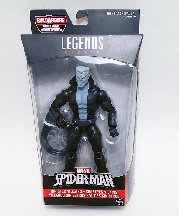
The folks at Boss Fight Studios have followed up their Greek Mythology based Series 1 of Vitruvian HACKS with a Medieval-Fantasy based second series. I’ve reviewed quite a few figures from the original series (with still more to look at eventually… I’ll get to them!) and I’ve been very pleased with all of them. There was never any doubt that I would be diving into Series 2, even though my fantasy figure heart has been forever stolen away by The Four Horsemen’s Mythic Legions. Hey, there’s always room for more, right? And as it turns out, each of these lines of figures have their own charms. I’ve picked up the first wave of four figures, as well as one of the two exclusives, so let’s start out with the heroic Knight of Accord! There’s a lot to talk about, so hang on tight!

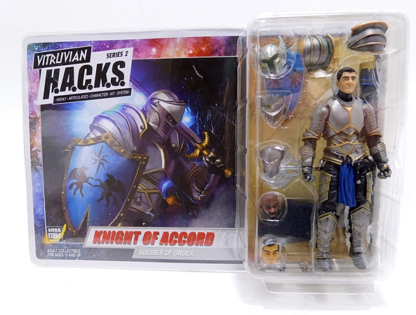
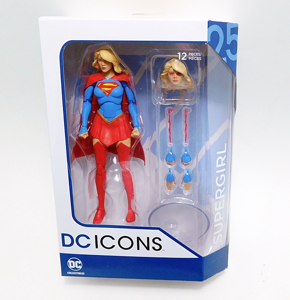
I’m delighted to see that they haven’t changed the package design. The figure comes on a landscape-style card with plastic covering the front, which will display beautifully right alongside all my Series 1 figures. It’s also totally collector friendly, as all you have to do is bend the edges of the plastic up and slide out the card to get to the figure. And don’t let the small bubble fool you, there are two nested trays and a ton of stuff packed in there with this 4-inch figure.

The back of the card has a little blurb about the Knights of Accord. Note that this isn’t a specific character and we’ll soon see he can be many different characters. The cardback also shows off the other figures in Series 1 as well as the Series 2 figures, which should be coming soon.

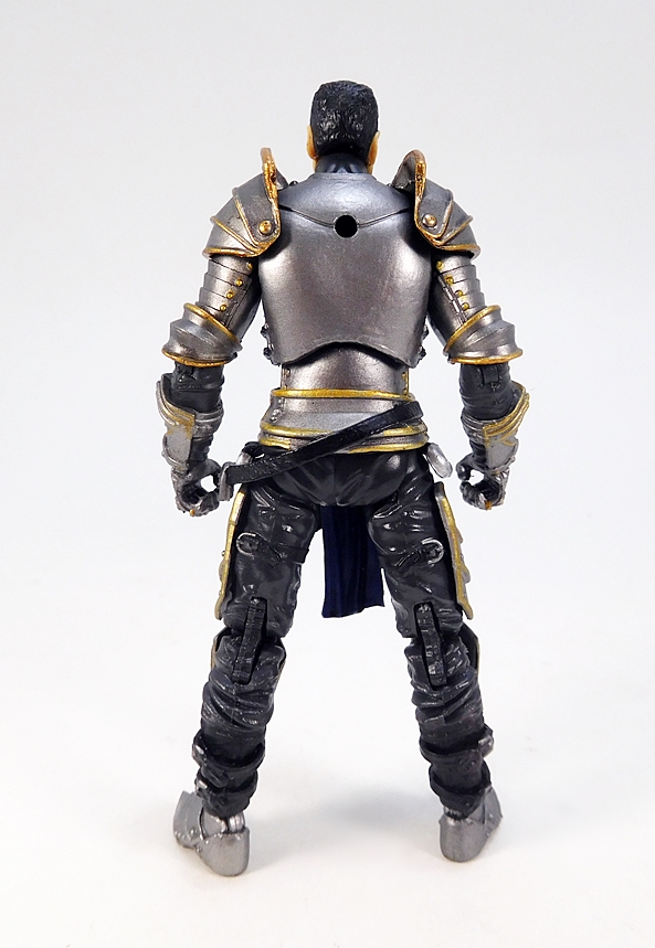
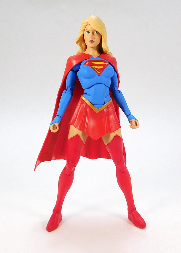
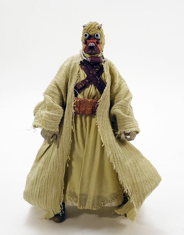
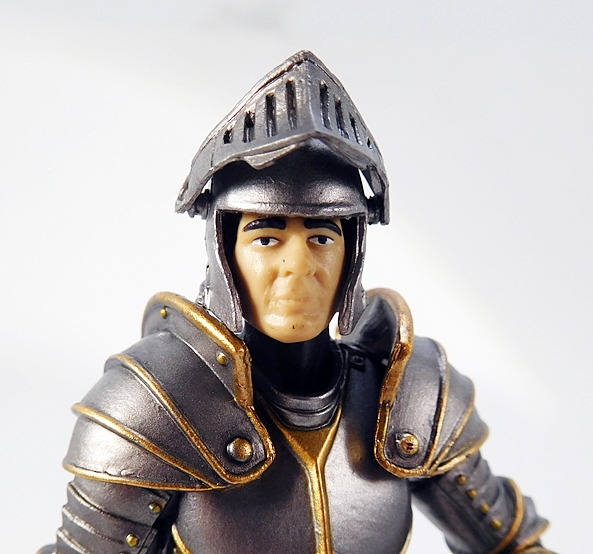
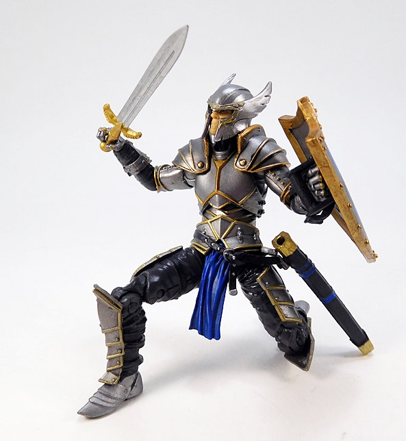
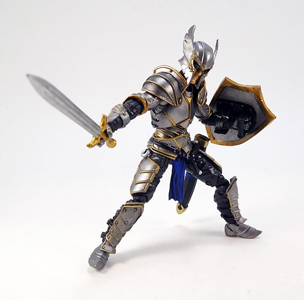
The Knight uses a brand new buck, which is a mix of sculpted armor and clothing. Some of the armor is still removable, like the thigh plates and the grieves. The shoulder pieces also come detached from the figure and have to be pegged into the shoulders. This figure is a pretty big departure from Series 1, which used completely nude bucks with all the armor separate, but given the new time period, it’s certainly understandable that they went this route. The attention to detail is pretty spectacular when you consider the scale. Segmented plates and tiny rivets are all part of the sculpt, as are the straps that are meant to hold on the plates. And those rivets, as well as the reinforced edges of the armor, are painted bronze. I don’t think there’s ever been a better example of an armored knight in this scale. The name of the game here is customization, and the idea is that you can get a bunch of these figures and tweak them all to make up a squad of different characters. To further that end, BFS has included three different heads with the Knight.

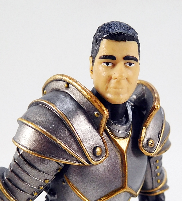
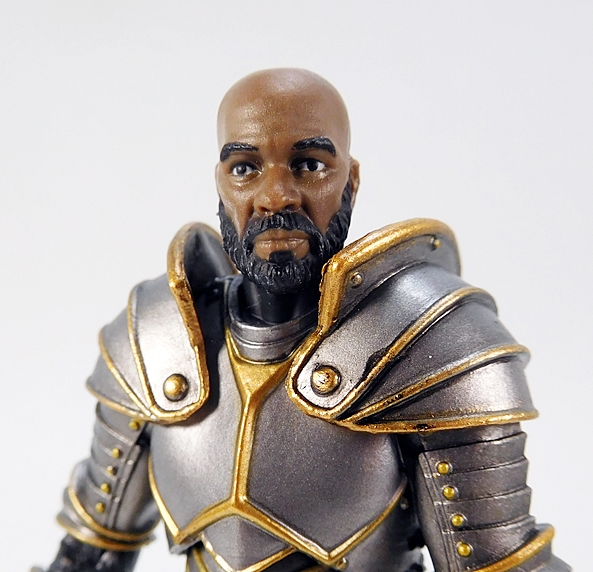
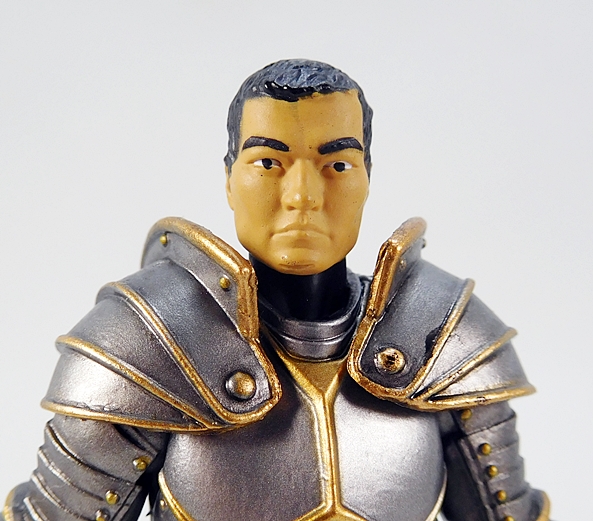
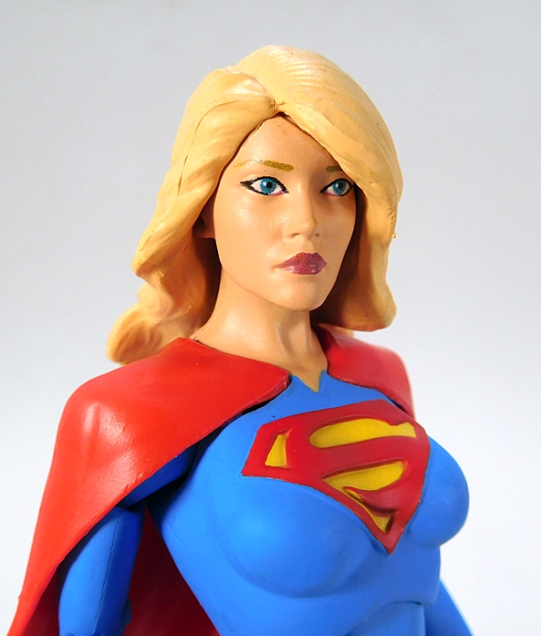
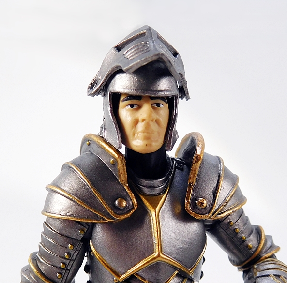
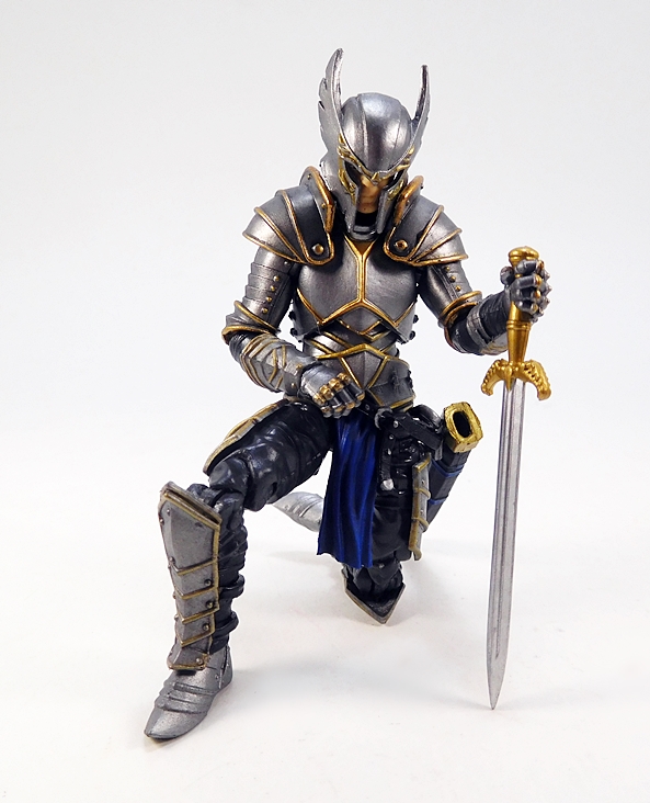
Each of the heads come on their own bar-bell ball joint and these noggins are a bit of a mixed bag. OK, none of them are terrible, but overall I’m more partial to the head sculpts we got with Series 1. That stock head, for example, sure got an extra helping of eyebrows! Who is this, Sir Eugene Levy? The second head is my favorite. I think it’s the best overall sculpt and the beard makes him look distinguished. The final head is OK, but looks a little lumpy. Keep in mind, as with most 4-inch figures, they don’t hold up all that well to close scrutiny via the camera lens. Truth be told, they all look fine to me when viewed with my naked peepers. Well, except for that first head… his eyebrows are still huge! Are three heads not enough to customize your Knights? Well, let’s talk helmets…

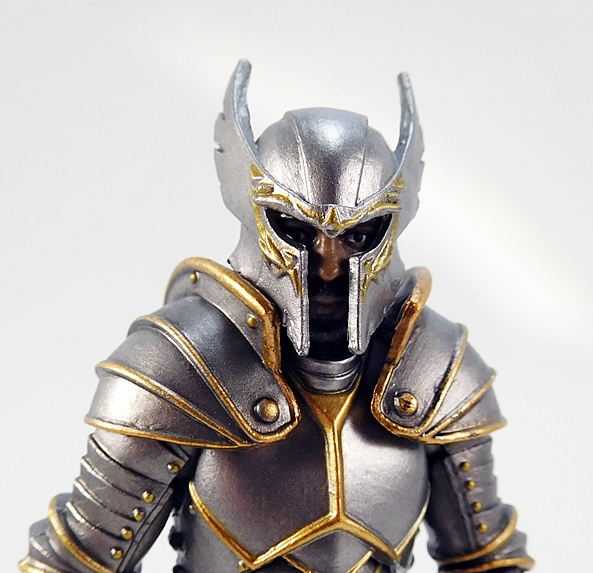
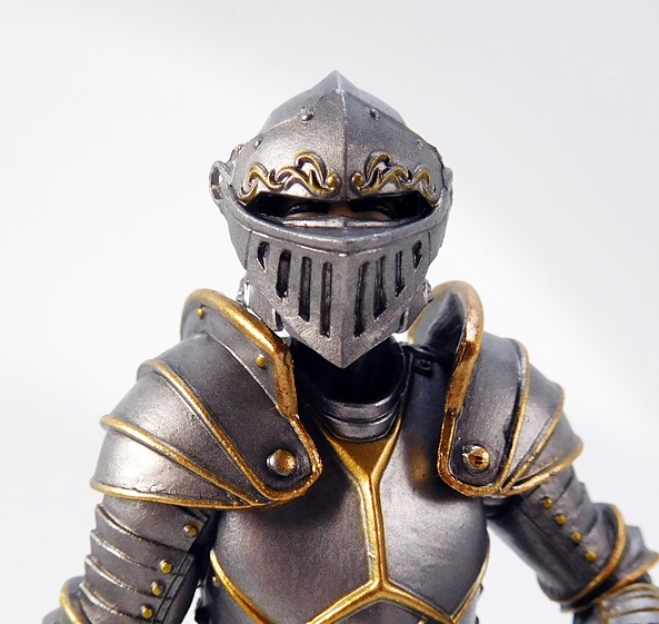
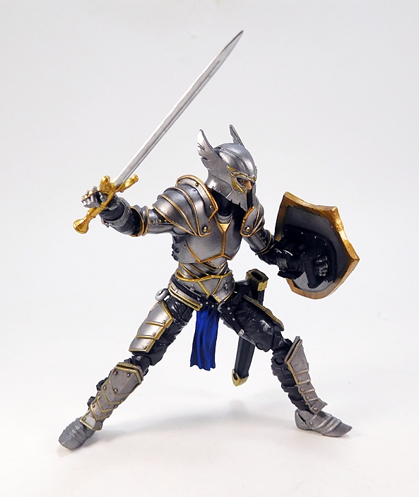
First off, you get this stand-alone helmet, which looks great and fits the heads perfectly. I really have to give BFS credit in that both Series 1 and Series 2 have had some of the most impressive helmets I’ve ever seen in this scale. I love the sweeping curves of the horned crest and the extra sculpted detail around the visor, which is also painted gold to match the paint accents of the armor. The helmet fits so well that the eyes actually line up with the visor holes. So cool!

You also get an open-faced helmet with pegs on the side and it’s designed to work with three different visors. The problem is the visors don’t peg into the helmet very well at all. I’m afraid to force them at the risk of tearing the hole in the visor itself. Two of them do, however, clip on fairly well with just friction holding them in place and can even still be opened and closed without them falling off. It’s not the way these were intended to be used, but it’s the only way that I can really get them to work. The one up top is my favorite.

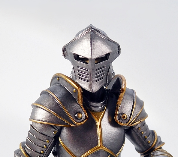
But this one is pretty cool too! What about the third? It doesn’t work. I’d have to actually peg it onto the helmet to make it stay put and as I said, I’m not willing to risk it. But even with three heads, two visored helmets, and the other helmet, you’ve got plenty of options to mix and match and create a little army of Knights.

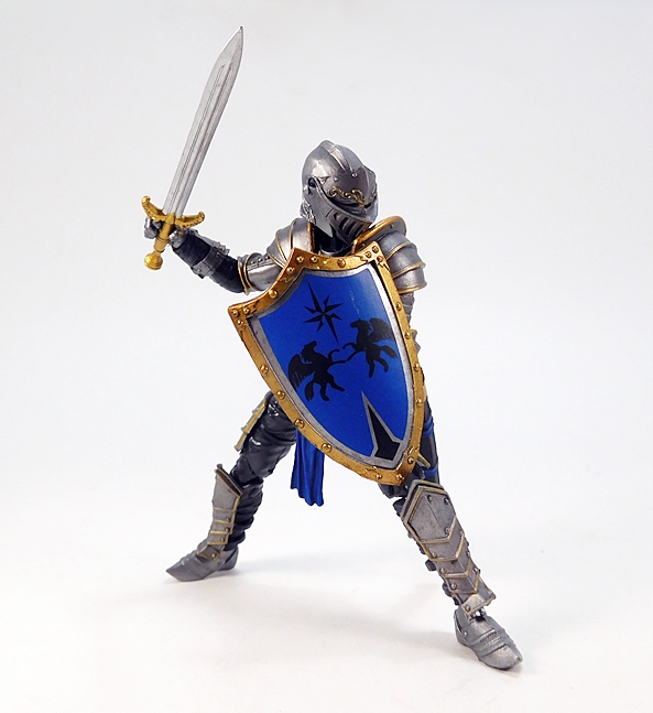
The articulation is virtually identical to the Series 1 humanoids, so let’s run through it real quick. The arms have rotating hinges in the shoulders and elbows, with hinged pegs for the wrists. The legs are ball jointed at the hips, double hinged at the knees, and hinged at the ankles. There’s a ball joint in the torso between the waist and chest, and as mentioned the neck is a double ball joint. The absence of things like lateral rockers in the ankles and swivels in the thighs do hold this Knight back a bit. Also, the legs feel a tad mushy, which was an issue I had with some of my Series 1 figures. So, not perfect, but still pretty damn solid, and I’d say that overall he’s probably more poseable than he should be wearing all that plate armor.

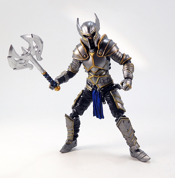
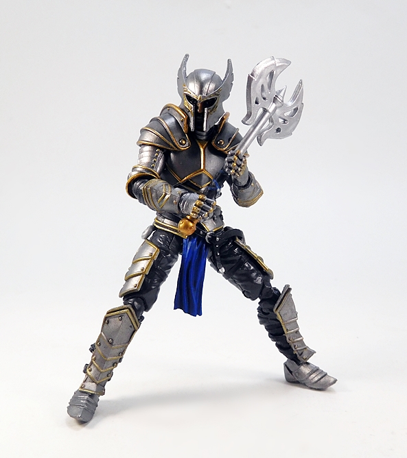
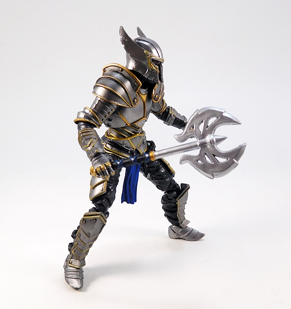
As for weapons, you get a couple of choices here as well. For starters, The Knight comes with this pretty cool double-headed battleaxe. It’s a very ornate weapon and includes a highly stylized head with cut-outs in the blades. The grip is sculpted and painted with black, gold, and blue. It’s designed to be wielded with one or both hands, and the articulation does allow for either.

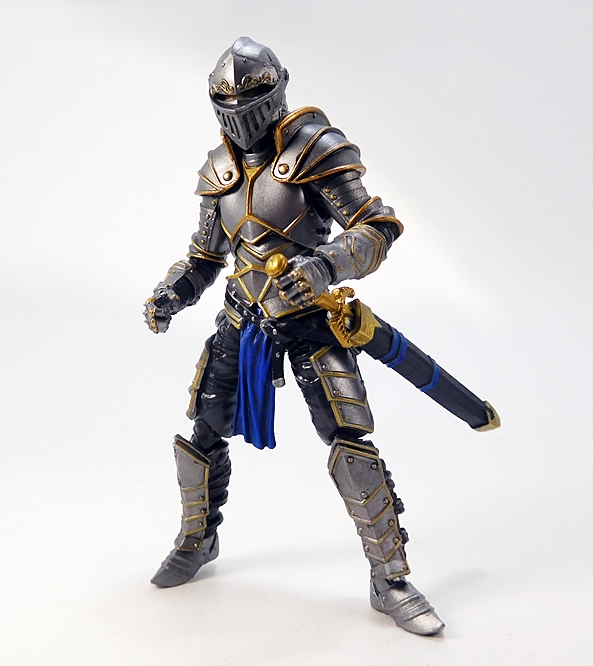
Next up, he comes with a broadsword and scabbard. The scabbard can peg into the hole on the strap coming off the left side of his belt. It’s a bit of work to get it in there, but unlike the visors, I was able to make this work. There is also a ring on each side of his breastplate, which can hold the scabbard. Functional holsters for guns usually impress me in 4-inch figures, so as you can imagine, I’m practically losing my mind over a functional sword scabbard. Not that we didn’t see them in Series 1 also. The scabbard is painted black with some blue straps and a gold throat and tip.

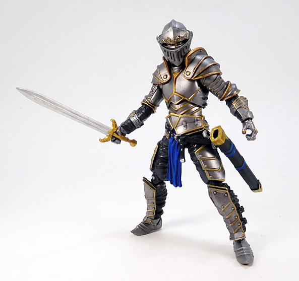
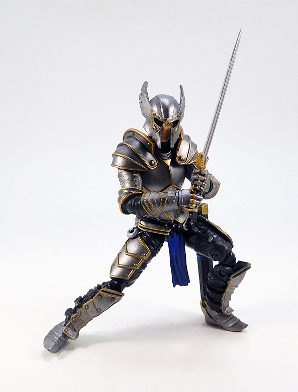
The sword features a golden hilt with an up-swept crossguard and a stout blade. No bendy plastic here. This thing will go right in your eyeball and keep itself straight while doing it! Like the axe, the sword’s grip is designed to be wielded in either or both hands. It is, however, a bit of a tight fit in the scabbard. It’ll go all the way in, but then getting out requires a bit of force.

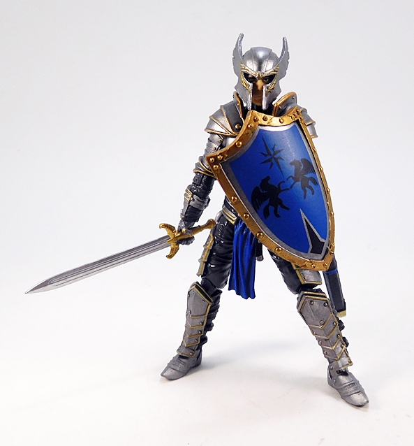
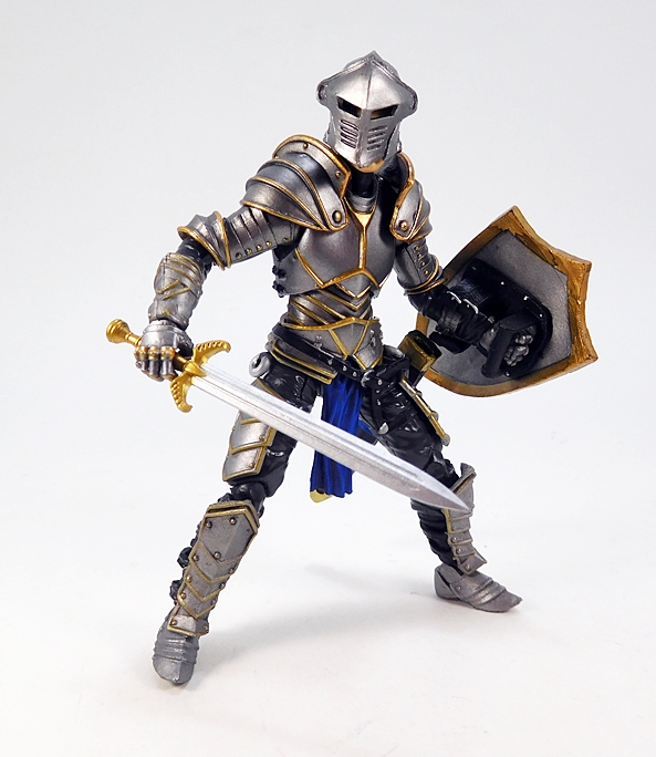
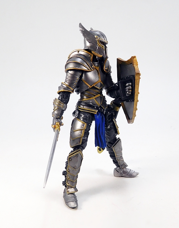
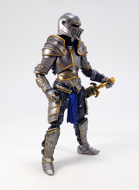
The final accessory in the Knight’s inventory is his shield. I believe this is an example of what scholars call a “heater” shield. It’s a pretty classical design with a heavy border framing its heraldic crest. There are sculpted rivets around the border and the grip features a soft sleeve that hugs the figure’s forearm and a grip. It’s kind of tough getting the grip into his hand, but even without putting the grip in there, he can still hold it convincingly. The sleeve will do most of the work.

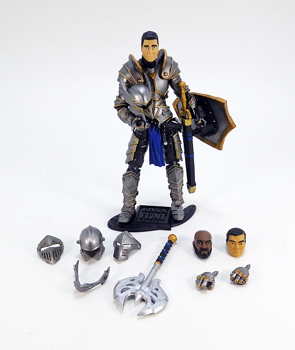
There are a few extra goodies that I haven’t mentioned yet. The Knight comes with a second pair of hands, in this case the hinges are designed to move the hand forward and backward, rather than up and down. It’s the same thing BFS did with their Series 1 figures, and while the distinction might seem subtle, it’s nice for when you want to have your figure pointing his sword forward. And you also get the standard Boss Fight Studios action figure stand. The figure’s feet peg into one or both of the pegs. It’s exactly the same as the stands that came with Series 1.

If anyone was wondering whether Vitruvian HACKS Series 1 was a case of lightning in a bottle, I would urge them to play around with this figure. And as amazing as this individual figure is, I’m most intrigued by the mix-and-match design. The original HACKS series was designed with customizers in mind, but I felt that accessing it required actual customizing skills, which I sadly do not possess in spades. This time around, it feels like it’s been made far more accessible right out of the package by just swapping out heads and helmet styles. It would have been cool if the sash on the belt could have been swapped out for a different color, but then again I think they’ve done plenty.

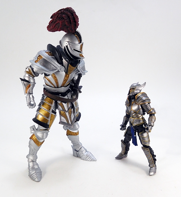
The Series 2 figures are selling for $25 a pop on the Boss Fight Studios webstore and yeah, that’s a good chunk of change for a 4-inch figure, unless you’re used to buying GI JOEs from that club. It’s also about five bucks more than most of the Series 1 figures were. I’ll concede the price here feels high, especially when compared to roughly $30 average for a Mythic Legions figure, but at the same time, it’s easy for me to see where the money went. This is an exceptional figure with all new tooling and sculpting and plenty of extras thrown in. And the fact that I’m not only all in so far with these, but I’ll also likely buy at least one more Accord Knight, should prove that I’m very happy with my purchase.

Marvel Legends (Vulture Wings Wave): Tombstone by Hasbro

I didn’t think I was going to make it back for a Marvel Monday Double Feature tonight, but I ultimately decided that I could polish off the second half of the “Sinister Villains” without needing too much time. Besides, if I’m going to get through this wave and into the Gladiator Hulk Wave before Thor: Ragnarok hits theaters, I’ve got to get busy on these reviews. So, let’s take a gander at Lonnie Lincoln, aka Tombstone!

The package is identical to what we saw this morning with The Beetle. This time there isn’t quite as much packed into the tray, just the figure and the Vulture Wing part. Also, to get in the mood, I have a Pepperoni Tombstone Pizza in the oven that’s going to be ready in like ten minutes, so let’s get right to it.

There were two directions Hasbro could have gone with this figure: Broad shouldered and business suit, or bulked out and well… whatever the hell this is he’s wearing. It is a pretty iconic look for him so either way would have worked for me, but I’m thinking this look required a little less effort in the sculpt. Indeed, while this is a pretty distinctive looking figure, it is a fairly basic one as well, and he doesn’t have the snazzy paint job that Beetle has to make that simple buck really stand out.

The bulk of the outfit is just matte black with a couple of loose cuffs around his ankles and wrists, also matte black. Everything is just black. Jesus, it feels like I’m talking about Hotblack Desiato’s stuntship (And if you don’t get that reference, Don’t Panic… just Google it). At least the belt breaks things up a little bit with a dark gray, a belt buckle, and some sculpted studs. I think it would have been cool if Hasbro went with the traditional soft-plastic vest with sculpted arm-sleeves look, but instead we just get some lines forming the open jacket and the ashen skin of his bare chest. Even the high collar looks like it might just be attached to the buck. I’ll admit that it looks a little cheap to me.

Ah, but once we get up past the neck, this is where the figure really shines. Hasbro has turned out some truly spectacular headsculpts in the modern Legends line, and Tombstone here is yet another example of that. Lonnie really is an interesting character, and this portrait captures him perfectly right down to his sharpened teeth. It really elevates this figure from an average budget-minded release in the wave to something special.

The articulation here is standard modern Legends fare, but let’s run through it anyway. The arms have rotating hinges in the shoulders and wrists, swivels in the biceps, and double hinged shoulders. The legs are ball jointed at the hips, have double hinges in the knees, and swivels in the thighs and the lower legs. The ankles are hinged and have lateral rockers. He has a swivel in the waist, an ab crunch hinge under the chest, and his neck is both hinged and ball jointed. He does have that issue annoying issue where his arms won’t hang close to his sides, but I’m willing to turn a blind eye to that. And so is Daredevil. In fact, two of them!

Before wrapping up, I just wanted to say how much I wish they had given Tombstone an extra pair of accessory holding hands. Yeah, I know he doesn’t come with anything for him to hold, but it would have been nice to be able to have him be able to grab Spider-Man. Even one fist and one graspy hand would have been cool. The fists are a little limiting, although fine for if you want him always ready to spar and throw punches.

I wouldn’t say Tombstone is a great figure, but maybe I’d say he’s a great treatment of the character? Does that make any sense? He’s perfectly serviceable as he is. A solid figure through and through, but he definitely feels like the figure designed to make the rest of the wave cost out and that definitely holds him back a bit. But hey, if that’s what Hasbro has to do to get characters like this one swinging on the pegs in 2017, I’m fine with the compromise.

Marvel Legends (Vulture Wings Wave): Beetle by Hasbro

Holy hell, someone at Hasbro sure loves The Beetle. We’ve already had the Janice Lincoln version in The Absorbing Man Wave and the Ultimate Beetle from Earth-1610, as part of The Ultimate Green Goblin Wave, and now we’re getting Abner Jenkins, the original article! That’s right, all you True Believers who were upset that Hasbro was dicking around with them other Beetles can now rest easy. Your day has finally come. Me? Well, I really dig the other two figures, and I always knew they’d get to Abner soon enough.

Beetle shares the same slot in this assortment with Tombstone as one of the “Sinister Villains” and there sure is a lot of stuff in this box! He comes with his wings and shell pieces detached, as well as one of the VTOL pieces needed to build the MCU Vulture’s wings.  Putting on Beetle’s own wings and shell is as easy as plugging them into his back and he’s all ready to go.

The coloring! So pretty! I rarely start out talking about the paint job on a figure, so when I do, you know I’m really pleased with the result. Here’s one example where the paint and colors carry the day and take this figure from potentially average to absolutely gorgeous. I’m in love with this metallic green and purple combo. The shimmery green plastic reminds me of the factory paint on my first Ford Mustang. I think it was called “Hunter Green,” but whatever the case, I think this is beautiful. Couple that with the eye-melting sex that is the metallic purple on the boots, pelvis, and gauntlets and it’s easy to overlook how little sculpted detail is on this figure.

Beyond the coloring, my favorite thing here is the beetle shell on his back. The pieces swivel to open and close, so you can display him with his wing’s retracted and the shell closed or open it and peg in the wings for when he’s ready to take to the skies. Marvelous!

Do the wings look familiar? They’re the same translucent purple flappers that we got with the Janice Lincoln Beetle. The main wings are mounted on rotating hinges and the smaller ones are pegged into the larger ones so they will swivel. All four have sculpted veins running throughout them and they really look great with the purple and green deco of the suit.

The head sculpt is simple, but really captures that classic comic look. The purple paint matches the rest perfectly and the giant gold eyes really pop.

The articulation makes this bug loads of fun to play with. The arms feature rotating hinges in the shoulders and wrists, along with swivels in the biceps, and double hinges in the shoulders. The legs are ball jointed up in the hips, have double hinged knees, and swivels in the thighs and the lower legs. The ankles are hinged and have lateral rockers. He has a swivel in the waist, an ab crunch hinge under the chest, and his neck is both hinged and ball jointed.

Hasbro has done well by The Beetle, now in his many forms, and these have been among my favorite additions to Spidey’s rogue gallery. Personally, I think he was well worth the wait, not only because he turned out beautifully, but also because we got two other great figures running up to this release. I first opened him up back on Friday and he’s been on my desk all weekend for me to fiddle about with while watching Netflix or working on projects. I have to imagine that even if I had no interest in Spider-Man or Marvel Legends (OK, I can’t really imagine that, but bear with me), I’d love to have this figure in my collection. Will I be back tonight with a Double Feature? No guarantees, but I’m going to do my best!

DC Icons: (#25) Supergirl by DC Collectibles

We knew it was coming, but that doesn’t make it any easier. DC Collectibles has officially discontinued the single-boxed releases for their DC Icons line and as things stand Number 25, Supergirl, appears to be the final release, with Nightwing preceding her and a Robin and Superboy two-pack included in the assortment. I’ve reviewed a lot of these figures here, but certainly not all of them. I’m still pondering over whether or not to go after the handful that I missed. But for now, let’s just enjoy checking out this last figure.

The packaging hasn’t changed. Supergirl comes in a clean window box with an angled corner that bears her name. If you’ve collected any of the DC Designer Series, you’ll also know what to expect here. Her name and number are also on the side panel as well as the comic she’s drawn from, in this case ReBirth Renaissance. The window shows off the figure beautifully as well as the bevy of extra bits, which are laid out beside the figure. Everything here is collector friendly, and while I would have loved to be able to keep these boxes, my available space doesn’t allow it.

Here she is, freed of her packaging and looking amazing. Icons has been a great line from the beginning, so when I say I was impressed by Kara here as soon as I got her in hand, well that’s saying something. I think this is one of those perfect combinations of great choice of outfit, great portrait, and some spot-on coloring. So where to begin? Well, for starters, the costume design lends itself to this sculpt really well. The thigh-high boots are sculpted at the top edges, as is the belt and skirt. The S-Shield is fully realized in the sculpt and I love the look of the way the cape hugs her shoulders. Note, I said the look, and I’ll come back to that in a bit. The sculpt on this costume is just the right mix of poetic simplicity and just enough detail to know that no shortcuts were taken.

The cape falls naturally down Supergirl’s back with just a hint of breeze blowing it to the side. The yellow S-Shield is stamped on the back, and I will point out that there’s a bit of chipping to it on my figure. But that’s about the only place I can criticize the paint or coloring here. DC Collectibles used the exact perfect shades of red and blue for her costume. From the neck down, this is a figure that absolutely pops on the shelf.

And things aren’t too shabby from the neck up either. I really dig the way they sculpted her portrait and the use of a printed face instead of paint makes for a nice change. If you get in really close, you can start to see the halftone effect begin to break down, but when viewed in hand with the naked eye, it looks perfect. I like the styling on her hair, but I do think it could have used a little refinement. As it is it looks a tad more like putty and less like hair. Maybe deeper cuts in the sculpt to give it the feel of actual hair would have helped. But don’t get me wrong, Kara’s coif does not even come close to diminishing this figure for me.

The articulation here is standard for the Icons line, which means it’s good and comes oh so close to being great. The arms feature rotating hinges in the shoulders and wrists, double hinges in the elbows, and swivels in the biceps. The legs are ball jointed at the hips and have double hinges in the knees. The ankles have hinges and lateral rockers. There’s a hinge in the torso down near the waist, a ball joint under the chest, and the neck is ball jointed. Alas, the hair keeps her from being able to look up while flying and the absence of thigh swivels will forever bug me. I will say that they did a really nice job on the skirt. It’s very soft and pliable and allows for a decent range of motions in the hips. And remember that shoulder-hugging cape? Yeah, it does restrict shoulder articulation a bit, although not nearly as much as I would have expected.

Supergirl also comes with three pairs of hands, all of which are very easy to swap in and out. You get fists, accessory holding hands, albeit with nothing for her to hold, and hands with her fingers together as if she’s about to karate chop someone. But why karate chop your foes, when you can just fry them with heat vision!

Yes, Kara comes with a second head and two effect parts that plug into her eyes to recreate her heat vision. I think this looks pretty rad from a distance, although if you get in really close it looks goddamn creepy. Also, if you display this head without the effect parts plugged in, her eyes look like two bloody, vacant holes.

Supergirl includes one final accessory and that’s a rather unique flight stand. It’s actually just a clear cylinder with a slanted top and a peg for her right foot. The illusion is supposed to be not so much one of flight, but more like hovering. I’ve had mixed results with it, but I do think it’s a pretty neat experiment and I may very well wind up using it to display her. In fact, I wish they had included something like this with Superman as well.

If DC Collectibles wanted to punish everyone for not buying into this line enough, this figure was a great choice for the final single release. It makes the point that this line was pretty fantastic and that in a perfect world it would have kept going. I know at least one fellow collector who was confident enough in the success of Icons that he started selling off his DC Universe Classics figures. I’m glad I didn’t go that route, although I would have been very happy had Icons become as prolific as Mattel’s and took its rightful place as the new resident universe building line. As things stand, I will forever be disgruntled that we are likely to never get the Booster Gold/Blue Beetle 2-pack. I can, however, promise you that this will not be the last time you see DC Icons grace my pages of toy bloggery.

Voltron: Legendary Red Lion by Playmates

I had planned to look at both the Red and Green Lions last Thursday, but I was only able to get Green in time, so this week, I’m going to take a look at Red. It actually worked out fine, because I’m a little pressed for time today and needed to do a quickie… and after reviewing four of these kitties, this should indeed be quick!

We’ve seen this packaging three times so far, and Red’s isn’t any different. The card and bubble are not collector friendly, but it does offer a good look at what you’re getting. The inserts are personalized to fit the lion and the package shows you where Red goes when he combines with the others to form Voltron!

Of all the lions, Red and Green are the most similar to each other, both in size and overall aesthetic. The legs share the same molds and the differences in the bodies are very minor. I realize similarities are to be expected for the sake of Voltron’s symmetry, but I think the designs for Blue and Yellow (Voltron’s legs) were better distinguished. That’s not to say I’m disappointed. This sculpt is sleek and curvy and absolutely beautiful and the the heads are each unique.

Playmates picked a fantastic shade of red plastic, which looks great along with the black, gray, and silver paint. You also get a little bit of yellow at the base of the tail and some light blue paint apps on the hind legs. None of my lions have had poor paintwork, but I think Red here is probably the tightest. There aren’t any nicks in the white around the mouth and the slop is kept to a bare minimum. Given that these are most definitely toys and not collectibles, I’m quite happy with how they turned out.

And yes, the little pilot sled accessory is still included and can be stored in the hatch under the belly. I wish they were able to keep the paint apps on these that are shown on the package and promotional materials. Or that I had the skills to paint them up myself. As it stands, I don’t have a lot of use for these other than the way they really convey how enormous these lions are supposed to be.

The articulation is identical to the Green Lion, which means you get hinges in the hips, knees, and ankles of each leg, all of which contain ratchets. The head can rotate side to side but cannot look up or down. The jaws are spring loaded and the elbow joint for the arm mode gives him the ability to bend left or right in the middle, which is useful for posing.

As with the other lions, Red comes with a back-mounted weapon. In this case it’s called a Magma Beam Launcher. It’s fairly similar to Green’s weapon and as big and goofy as it is, I really don’t mind it too much. I do think it’s unfortunate that they couldn’t cast the missile in a red translucent plastic instead of the blue they used for Blue’s Ice Beam.

Red also includes the other half of the Blazing Sword. which features a translucent blue blase. Like Green, he can hold it in his jaws, but I don’t think it looks as good with him carrying it as the Green lion does wielding his half.

Playmates has produced yet another fun lion to add to the team. Right now, I’d say that Red is contending with Blue to be my favorite, but they’re all quite good. He even escapes the one minor gripe I have with these and that’s the paint on the others could have been a bit better. With that having been said, I’m happy to have most of this Pride of Lions assembled. Next up will be Keith’s Black Lion and after that I’ll be able to check out Voltron. And fear not, convertorobo fans, next week, I hope to be turning my attention back to Transformers proper at least for a week or two before coming back to Voltron!

Star Wars Black: Tusken Raider by Hasbro

I’m finally counting down to a complete set of the Black Series versions of the “Original Twelve” Kenner figures, with only three left to review. These have been ridiculously tough for me to get at reasonable prices as they were each originally released on the 40th Anniversary Vintage Style cardbacks and I’m still plenty sore at Hasbro for going this route. The only 40th Figures I ever saw in my neck of the woods were the repacks of Obi-Wan, Tattooine Luke, and Princess Leia, which clogged the pegs everywhere. Fortunately, I’ve since been able to hunt down the Jawa and Death Squad Commander without getting too badly beaten up on the price.

And thankfully today’s figure, The Tusken Raider, was re-issued in the traditional boxed package so he’s finally easier to come by at his regular retail price. Oh, I still haven’t been able to find him locally, but I was able to grab him online. I’ve got some great memories of this figure from the Kenner line and he’s remained a favorite, which is surprising because that goddamn ambush scene jump-scare scared the living shit out of me when I was a kid. I was like 7 years old when my parents took me to see Star Wars and that one scene is the only thing I remember from that day. The only reason I was able to get my shit back together was because I didn’t want to be the reason the family had to leave and miss the rest of the movie.

And holy crap, does this guy look amazing! Ain’t no vinyl cape here! This is easily some of the best use of softgoods Hasbro has done in this line. And yes, I realize that’s not much of a compliment, but nonetheless I really like it. I don’t know what this stuff is, but it looks like they actually dug up mummies and used the gnarled and nasty mummy bandages to make the Tusken Raider’s cloak. If so, I got to say, that’s some dedication and I approve! It fits the figure pretty well over his plastic sculpted robes, all of which are textured quite nicely. Now, I just have to keep myself from pulling on any of those random threads.

Additional detail to the outfit includes the brace of ammo pouches that run across his waist and the crisscrossed bandoleer straps across his chest. The paintwork on the pouches feature a nice watch to make them look like warn brown leather and both the pouches and the straps have individually painted fixtures to make them look like bronze or brass. The head sculpt is excellent too. From the protruding eye cylinders and head spikes, to the roller around his neck, and that creepy orifice he calls a mouth. The paint is overall solid too, except for a little brown slop on his silver nose thing.

The articulation is pretty typical for a robed Black Series figure, which means all the points are there, but the range of motion could have been better. You basically get rotating hinges in the shoulders, elbows, and wrists. The legs have ball jointed hips, double hinged knees, and swivels in the thighs. The ankles have both hinges and lateral rockers. There’s a ball joint in the waist and both a ball joint and hinge in the neck. My biggest issue is that even with the slits up both sides of the soft plastic robes, posing his legs can get frustrating. If you have the Obi-Wan figure, than you know what I’m talking about. It makes me really wish they had gone with softgoods below the belt. The other problem is that the lower hinges in the knees have limited range of movement because of the way the lower leg is sculpted. It’s a bit of a bummer. but comes nowhere near ruining the figure for me.

The Tusken Raider comes with three different mace heads for his gaffi stick, which was a really nice surprise. I haven’t read any reviews of this guy prior to opening him, so I wasn’t expecting that. These pieces just peg and unpeg from the base of the stick and they all look great. I was already hoping to find a couple more of these guys and now that magic number will likely be three so I can have one with each style of stick.

He also comes with his musket, which is beautifully detailed. It has a rather 19th Century Moroccan flavor to it and features a scope, a reinforced stock, and various paint hits to the bits and bobs. Now, his right hand is sculpted with a trigger finger, but because of the limitations in the elbow joint, it’s really tough to get him to draw his weapon up to his cheek like he’s firing it, but I was able to get it close enough.

I’m more than a little surprised to say that the Tusken Raider now ranks among my favorite figures in the Black Series. Some minor articulation gripes aside, this figure feels closer to that impressive first wave than most of what I’ve picked up since. He features a fantastic use of softgoods, a solid sculpt, and it feels like they really made an effort with the paint. Toss in all those extra gaffi stick parts, and you can count me very pleased with the way this fellow came out. Had they gone with softgoods for the lower skirt, I think he would have been damn near perfect.

Zenescope’s Liesel Van Helsing Sixth-Scale Figure by Phicen Ltd.

If you follow me on Twitter than you probably know that I’m a big fan of Zenescope Comics. I started reading their flagship title, Grimm Fairy Tales, a while ago as a guilty pleasure and slowly got sucked into the wider universe of characters and other books until I had an entire shelf devoted to their floppies, trades, and a few limited edition hardcovers. Plus, since Marvel has forsaken me with their bullshit, I’ve been leaning on Zenescope a lot more lately as a new outlet for my comic book dollars. Sadly, there’s been precious little in the way of Zenescope merchandising, with the shining exception being a small assortment of Sixth-Scale figures from Phicen and Executive Replicas. I’ve already looked at Mercy Dante and Robyn Hood, Today I’m going back to their very first release: Liesel Van Helsing!

The packaging is still quite similar to the two followups: Robyn and Mercy. And the presentation here is first rate. You get a wraparound sleeve with the Grimm Universe logo and the figure’s name on the front as well as some wonderful character art on the back and side panel. The other side panel has the figure’s name so you can line these up on a shelf and still tell who is who. The high-quality box is black and textured with a magnetic front flap and a foam tray that contains the figure and accessories. The packaging rarely ever makes or breaks a collectible for me, but when you’re paying a lot it’s nice to get a premium presentation. This is definitely a lot more effort than Hot Toys has put into the packages for their recent releases, and I appreciate that, especially from such a small company.

And here she is all ready for action. Van Helsing features the ever amazing, and a little bit creepy, Phicen realistic super-flexible body. I’ve lost track of which particular model body this is, as they’re constantly making changes and improvements, but suffice it to say, you get a stainless steel skeleton wrapped in a shapely silicone muscle and skin, which feels squishy to the touch and only shows seams at the neck and wrists even if you were to strip them down. Oh yes… and enormous boobs. Because Phicen. And Zenescope. There isn’t a whole lot of set up required to get Liesel ready for display, but she does come with her trench coat off and getting it on is a MAJOR pain in the ass. Besides having to deal with the friction of getting the realistic silicone rubbing against the sleeves, you also have to pop her hands off and getting the hands off of the steel ball joints is frustrating. Once this jacket went on, there was no way I was taking it off again. The same goes for the accessory holding hands, so I’ll mention now that she does come with an extra pair of relaxed hands and a pair of fists, even though you won’t see them used in this review. Now… let’s take a quick trip around her outfit.

As a girl displaced in time, Liesel’s wardrobe has had several looks throughout her various appearances, but Phicen went for her most traditional and iconic 19th Century monster hunter garb. And might I say, they did a fabulous job with her costume. The troublesome trench coat is great once it’s in place and features a belt on the back so it can be cinched tighter and there’s a wire in the bottom so it can retain a flowing look for those action poses. It’s a cool blending of modern and vintage, with the big buccaneer sleeves to give it that hint of period attire.

The red and black corset is made out of a similar leather-like material with four individual belts running across her tummy and two pointed half cups tasked with the momentous job of keeping her goodies in place. These can be a little frustrating because there is about a two millimeters difference between them doing their job and Liesel suffering a nip-slip. I had to do quite a few re shoots to keep this review at a PG rating. Moving further down, she sports a very scant pair of tight shorts some real fishnet stockings. The stockings are done very well, although you do still get some bunched up seams, which are probably impossible to avoid at this scale.

The high boots feature buckles running across the fronts and real laces running up to the top. I am going to presume that these are boot-feet, but I’m not about to unlace them to find out.

The head sculpt is fair but not exceptional. It’s a far cry from what we got for Mercy and Robyn. Those were sculpted specifically for those figures and definitely looked the part. This one appears to be one of Phicen’s generic heads, as I can see a lot of resemblance to some of their other boxed figure releases. Still, Liesel can look a little different from book to book depending on who’s drawing her, so I don’t think using this head was a total flub. Plus, this was their first release in this line, so I’m prepared to cut them a little slack. Besides, I think she has really pretty eyes. At least the long black hair is very much on point, and when you include the choker necklace and her trademark hat, it’s easy for me to tell who this is supposed to be, even if I were just seeing her from the neck up.

The hat is spot on to what she’s often wearing in the comics and is comprised of both leather-like material and felt. It holds its shape perfectly and it also includes Liesel’s rather distinctive glasses. These can be removed from the hat and worn over her eyes, but it’s not like she does that a lot in the comics, so I’m happy to keep them where they are.

Most of Liesel’s equipment can be worn on her person and she does possess some nifty monster-slaying tools, albeit none of the truly outlandish stuff she invents in the comics. For starters, she wears a brace of stakes on her right hip. She comes with five wooden stakes and five silver ones. I went with the wooden ones for my display because I liked the look of them a little better and I am a traditionalist. A better prepared monster hunter would probably mix them up for when you have to switch between dispatching vampires and werewolves on the fly.

There isn’t a proper scabbard for her sword, but it can be easily thrust through the belt on her left hip and it looks good there. The sword features a short thrusting blade and a rather ornate hilt with a curved knucklebow and sculpted pommel. It fits perfectly in the intended left hand and the fingers are flexible enough so that it’s easy to bend them and get the sword in place. As is sometimes the case with Phicen’s accessories, the sword does feel a little flimsy in hand and the blade is a little bendy, but overall I think it looks great.

The strap on Liesel’s lower right thigh includes a holster for her shotgun and there’s an ammo pouch as well. And yes, she comes with two teeny-tiny extra shells to put in there if you want. The breech on the shotgun can be opened and there are two more teeny-tiny shells sculpted inside. The sculpt and finish on the shotgun is beautiful. It features checkered brown grips and a gunmetal blued finish with a stainless steel finish on the barrels. Her accessory holding right hand fits it perfectly.

Next up is her crossbow, which is painted to resemble wood with some lovely steampunk-looking fixtures and a scope. It’s also fitted with a string, which can be drawn back and hooked on the catch so you can load one of the five silver bolts into it. Liesel also comes with a quiver for the extra arrows and a hook to store the crossbow, but it’s designed to work with her when she’s not wearing her trench coat, and since I’m always going to display her with it on, it’s not a lot of use to me and it tends to stay in the box.

The final extra is a figure stand, which normally would be a no-brainer, but Robyn Hood didn’t come with one, so it’s not always a given when it comes to Phicen’s Sixth-Scale figures. Indeed, even my recent purchase from ThreeZero didn’t come with a stand, so I guess packed in stands aren’t as common as they used to be. Anyway, Van Helsing’s stand is identical to the one that came with Mercy. It has a base with a post that can hold the figure, but the post isn’t very helpful. The base, however, has thick pegs, which connect with holes in the figure’s boots just like a standard 3 3/4-inch figure. It’s an odd system to see in these larger scale figures, and the base isn’t anything special, but it works pretty well.

Liesel set me back about $150, which feels like a pretty good value in the current Sixth-Scale market, especially since the subject matter here is for a pretty limited audience. As much as I love the character, I can’t imagine her books sell more than 4,000 copies, so to get an action figure of this scope and quality based on her is a real treat. Not to mention that she comes with a lot of stuff, her outfit is carefully detailed, and the Phicen body provides endless fun for posing. I was also lucky to not have to pay a lot over her retail, since I started collecting this line late in the game and had to track her down. I eventually found her in the last but most obvious of places, Zenescope’s website, and I’m convinced I may have gotten the last one because she was removed from the site a day after I successfully placed the order!

On the downside, I’m not sure that the relationship between Phicen and Zenescope has much of a future. They showed off a Goblin Queen figure from Grimm Fairy Tales at one of the big Comic Cons a couple of years back, but it appears to have been quietly cancelled. They do have a figure due to ship any week now based off The Goddess of Death, Keres, from No Tomorrow and Grimm Tales of Terror, but they took a lot of liberties with the design of that figure to the point where it just looks like it’s loosely based on the character design. I don’t know that I’m going to pull the trigger on it. I’d like to support the line, but at this point I don’t buying that figure will save it. It’s a shame, because a release of Sela Mathers, Brittany Waters, or Belinda would have been fairly easy to do and my collection feels rather incomplete without at least having Sela on my shelf.

Marvel Legends (Vulture Wings Wave): Cosmic Spider-Man by Hasbro

As promised, I’m back with an extra-helping of Marvel Legends goodness on this Marvel Monday. Earlier today I looked at Spider-Man and tonight I’m looking at… Spider-Man! There are actually no less than three figures in this wave simply called “Spider-Man,” but of course they are all unique figures. This one is a comic-themed release and can be regular Peter Parker hosting the Uni-Power, or Cosmic Peter Parker from Earth-13, or simply Captain Universe, depending on which head you want to display him with. Ahhh, but I’m getting a-head of myself (HA!). Sorry. Let’s look at the damn figure…

Holy shit, look at that box! The packaging on mine got really chewed up, possibly literally. As if there are dogs roaming the warehouses in Amazon making snacks of the merchandise. But I care not. He was super cheap and I just toss the packages anyway. I do get a kick out of the fact that Cosmic Spidey is looking down like he’s ashamed of the state of his packaging. Well, let’s get him out of there and we’ll start out with the stock head.

If you’re more of a casual Marvel fan, this figure might be giving you a little case of Deja Vous because the color palate is very similar to the Vance Astro figure we got back in the Titus Wave. Indeed, the lovely metallic blue paint appears to be the same, although the white here is comprised of a striking pearlescent white plastic. Overall I think the effect here is much better and absolutely gorgeous even if it does play havoc with my camera’s color balance. The connected circle patterns are neatly painted and he has some white speckling that looks great. He may be just a basic buck, with virtually no unique sculpting from the neck down, but the coloring here elevates that buck to something truly special.

Indeed, Hasbro probably could have gotten away with just repainting the Vance Astro head for this one, but they didn’t. Now, I’ll be honest, I have very little memory of this appearance, other than Spider-Man was fighting some Super Sentinel and there was a follow up What If? ish about him actually keeping the Uni-Power and retiring as Spider-Man. I’m also not a huge fan of the look here, as it’s basically the Captain Universe cowl with Spider-Man’s mask appearing through the mouth hole. Meh, it’s OK, the paintwork is excellent, but I can tell you right now this is the head that will get the least display time. And by least, I really mean none.

Next up, we have the Earth-13 Peter Parker head from Spider-Verse and oh boy did I love this scene. Uni-Powered Pete basically tells the Spider Totems to scatter and heroically proclaims, “I’ll handle this!” only to get his ass kicked by Solus, Patriarch of The Inheritors. It was a sobering experience for the Spider Crew who were quickly learning that nobody was going to be able to save them. Anyway, this is a great looking sculpt and it would definitely be the one I’d go with for my default display if it weren’t for…

Regular masked Captain Universe! Actually, I’m calling this one Ray Coffin and I can’t even tell you how stoked I am to have this figure. Captain Universe is a cool idea and all, but the fact that he originates from the Micronauts Universe raises his coolness factor in my book by a thousand fold. Now I can say I have a modern Micronauts figure on my shelf, and not those shitty ones Hasbro did for the SDCC Exclusive set. Needless to say, this is the noggin that I’ll be displaying 99% of the time.

Hasbro could have easily just popped the stock head on this guy and made Captain Universe the cheap-o figure of this Wave, but I think it’s really cool that they dropped the two extra heads into the box as well. If this figure drops in price on Amazon like some of the pegwarmers out there, I can easily see myself picking up one more so I can at least get one extra for my Spider-Verse shelf. And with Spider-Man Noir and Spider-Punk both revealed, that shelf is getting more and more crowded!

Marvel Legends (Vulture Wings Wave): Spider-Man (Hoodie Suit) by Hasbro

It’s Marvel Monday again and time to embark on a brand new wave of Marvel Legends! I’m so backlogged, that I had a lot to choose from, but I went with the Spider-Man: Homcoming inspired assortment because the flick is due out on Blu-Ray in a few weeks, and I’m really looking forward to seeing it again. Now if things go well and I can double up a few weeks, I’ll be able to cruise right into the Thor: Ragnarok wave right as that one hits theaters! And speaking of doubling up, I’ll be doing that today, so let’s jump right in and check out Spidey!

In the title I called him “Hoodie Suit” Spidey. “Homebrew Suit” Spidey works too. One of my favorite things about Homecoming was how they did the switcheroo on the suits. In the Raimi film he started with the crappy homemade suit and by the time he was ready for the climactic final battle with Goblin, he was in the polished new one. Here he started in the spiffy Stark Tech suit, but went back to his crappy homemade suit for the final battle in order to make a point that clothes do not make the (Spider)man. It was sort of the same point that Tony learned in Iron Man 3. Anyway, I thought that was just all kinds of neat and one of the reasons why I love the movie as much as I do.

And I really loved this costume in the movie. It was a fun palate swap homage to the Scarlet Spider costume with a few tweaks. As for this figure? Um… I like it, but I don’t quite love it. Part of the problem here is that it feels really flat. There’s some nice texturing in the socks and some decent sculpted wrinkles in the suit, but otherwise, the lack of detail makes it feel more like a comic based figure and not an MCU figure. Maybe that’s the point and I’m just missing it. Also, I don’t recall his wrist bracers being all silver. I thought they were red with silver cartridges. And speaking of coloring, my biggest issue here is that the red looks too dark. It wasn’t so much a deep crimson as it was a bright candy-apple red.

I do dig that Hasbro included two different hoods, so you can display him with it up or down. If you have the Spider-Gwen figure than you know how this works. But the head itself could have used a few more tweaks to the goggles to make them match the on screen appearance a little better. And what, no drawstrings on the hood? A little more facial definition sculpted into the mask would have been cool too. Again, it’s just kind of bland. Am I being too picky? Maybe. Either way, I definitely prefer him with the hood down, so I went with that look for most of the pictures I took.

The articulation here is solid enough. Granted, he doesn’t have the butterfly shoulders like we often see in our Legends Webheads, but everything else is as expected. The arms have rotating hinges in the shoulders and wrists, with double hinges in the elbows and swivels in the biceps. The legs are ball jointed at the hips, with double hinged knees, and swivels in the thighs. The ankles have lateral rockers and hinges. There’s a swivel in the waist, an ab crunch in the torso, and the neck is both ball jointed and hinged.

Homebrew Suit Spidey also comes with two pairs of hands: Fists and thwippy hands!

I don’t usually discuss the BAF parts until the end of the wave when I’m ready to build it, but I’ll make an exception here because Hasbro is trying something truly new and exciting in this Wave. It’s not a Build-A-Figure, but instead the parts will build something to enhance a figure in the Wave. In this case, it’s the MCU Vulture’s wings. Now to give credit, Mattel first tried something different in their Multiverse line by doing a Collect & Connect roleplay Batman Grapnel Gun, which isn’t quite the same thing, but does show the same kind of thinking outside the box. I was surprised to hear a fair amount of criticism from some fans over this idea, but I think it’s brilliant and I hope Hasbro does more with it in the future.


I know I harped on him a lot, but this is by no means a bad figure. He just kind of feels a little underwhelming to me. Again, maybe that’s the point, because it’s an underwhelming homemade suit. I’d probably be more forgiving if the colors were a little more accurate and a little extra paint on his bracers, but I’m certainly not sorry I picked him up. Of course, if I wanted to put my money where my mouth is, Hot Toys is doing a figure with this outfit, but I don’t like it enough to blow $220 on it. The Stark Tech Suit? Yeah, I’m probably going to go for that one! In the meantime, web-swing back later this evening and I’ll have a look at another version of Spider-Man in this wave!

DC Designer Series: Wonder Woman (Frank Cho) Sixth-Scale Statue by DC Collectibles

DC Collectibles has been throwing some serious love to everyone’s favorite Amazon Princess with not one, but two Designer Series statues released within about a month of each other. In September we got the magnificent revamp of the Adam Hughes Cover Girls Statue, and now we’ve got a new release based on a stunning piece of art by Frank Cho.

If you’ve picked up any of DC Collectible’s statues than you have a pretty good idea about what to expect from the packaging. This piece comes in a fully enclosed box, mostly white, featuring plenty of shots of the statue. Diana comes encased in two halves of a styrofoam brick and requires very little assembly. Just peg her foot into the base via the metal rods and peg her sword into her hand and she’s all ready to go. The statue is limited to a production run of 5,000 numbered pieces and there’s a piece of tape on the flap with the individual number.

Great Hera! Just one look at the solicitation shots for this statue had me mashing the pre-order button. Yes, it helps that I adore Frank Cho’s work in general, but there was something specific to this piece that called out to me. Measuring in at about 12-inches tall, the pose has Diana standing poised to engage in battle. She has one foot on the base with sword and shield in hand and a determined gaze as her hair blows in the wind. There’s so much I love about this figure I hardly know where to begin. I think one of the things that struck me early on was how powerful she looks and that’s something very faithful to Cho’s art and credit also has to go to sculptor Jonathan Matthews. This Amazonian Princess has some muscle on her, particularly in those thighs and I just love the muscle definition sculpted into her back. I’ll also note how much I appreciate that the shield is being held in a manner so as not to diminish the figure itself by obscuring it from view. Even if you’re viewing her from dead on, it’s still off to the side just enough.

And then there’s the costume, which exhibits some magnificent sculpting and paintwork. The gold eagle and WW Belt look as if they are actually layered over the red corset, despite all being sculpted from one piece. The corset and bracers include sharp cut lines and the skirt is textured to look like leather with sculpted stars and border edges. The boots include sculpted creases where her ankle flexes as well as shin and knee armor with nicks and scrapes from battle. The deep crimson, lustrous gold leaf, and deep blue paints are masterfully applied with virtually no slop or missteps to be seen. And all of the colors contrast beautifully with her warm, soft skin tones.

The portrait is a classical beauty and her blue eyes are hauntingly bright. I love the attention given to her clavicle. The paint on the face is nice and clean, and the skin tone looks incredibly lifelike. The only place where the paint on this statue fumbles a bit is the star on her tiara. It’s not something I notice when admiring the statue on the shelf, but when I get in closer with the camera, I can see it needed to be a little sharper. They did a particularly nice job with the wind-blown hair.

Diana’s gear includes her sword, shield, and golden lasso.  The bottom part of the hilt is sculpted as part of her hand, while the blade and crossguard are one separate piece that pegs in through the top of the hand and holds together quite securely. The golden hilt features a sculpted, ribbed grip and a simple pommel and crossguard. The double-edged blade has a deep fuller running through the center and tapers rather quickly to a sharp point.

The shield is a striking piece of work on its own right. The face in adorned with a bird sculpted to look like hammered bronze, and a segmented border that looks like it might be meant to simulate a rope pattern. There are some stray scrapes in the surface to show the shield has seen some action. The reverse of the shield featured sculpted straps sculpted and painted to look like calfskin and are detailed down to the faux rivets that hold them into place. It’s also painted in bronze finish, which distinguishes it nicely from the gold paint on her costume. I’ve always loved her depicted as an actual warrior and while she’s strong and skilled enough to best most foes with her bare hands, she just looks so much more bad ass with her sword and shield in hand.

The golden lasso is attached to her right hip. The vibrant lasso is made of a strong rigid wire-like material and fashioned to resemble braided rope. It’s secured to her belt with a sculpted “leather” buttoned loop.

The base is pretty standard stuff. In fact, it’s identical to the one DCC used for the Adam Hughes Designer Statue. It’s a thick black disk with the familiar WW logo sculpted into it and painted in gold leaf. I really dig the way she’s only got the one foot on the base and the other on the ground beside it. It not only accommodates her action stance by allowing that one knee bend, but the fact that she’s only half on the base gives the whole composition that extra little dynamic kick to it. The limitation is noted on the bottom of the base. In this case, mine is #1,024 of 5,000.

After having the Adam Hughes Wonder Woman for only a few weeks, I never thought my head could be turned by another statue treatment of the character so quickly. That’s not to knock the Hughes Wonder Woman, because it’s a fantastic piece. Indeed, the two of these statues compliment each other perfectly. The Hughes statue has a smoother and less complex costume, emphasizing the more classic blue starfield panties, whereas this one features Diana as the grittier warrior princess. Despite being in the same Designer Series line, this statue was a smidgen pricier than the Hughes statue, but only by about ten bucks. Either way, she was well worth it.