Doctor Who: The 12th Doctor Sixth-Scale Figure by Big Chief

It was three years ago that I Featured Big Chief’s Eleventh Doctor Sixth-Scale figure here on FFZ. It was a somewhat expensive gamble on an untested company, but ultimately it paid off. While the tailoring on the outfit wasn’t quite up to Hot Toys’ level, the likeness was excellent and I wound up with a solid figure at a good, but admittedly deep-discounted, price. Jump into the TARDIS and travel three years into the future, or now as we like to call it, and I find history repeating itself. This time, I was able to pick up The Twelfth Doctor at a decent price and everything I said about Eleven pretty much applies here.

bc12th2

There can be no denying that Big Chief has the presentation down pat. You’re paying for a high end collectible, and everything about this package sells it. At first glance, the package appears to be a simple blue shoe box style affair illustrated with the gears from the 8th/9th Season openers, the Doctor Who logo in the center, and “Twelfth Doctor” down in the bottom right hand corner.

bc12th3

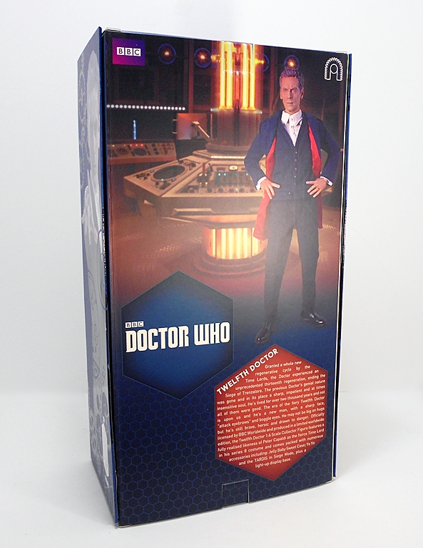
The back of the box shows off the figure against the backdrop of the TARDIS console room and you get a blurb introducing The 12th Doctor and how he got his new set of regenerations. On closer inspection it turns out that the front and side panels are actually a tri-fold wrap-around that’s held on by magnets. When you remove it…

bc12th4

You reveal a window showing off the figure and a heavy cardboard stock backdrop of the TARDIS interior to display the figure in front of. I absolutely love this idea! The layout of the interior of the box should be familiar to anyone collecting Sixth-Scale figures these days. You get two trays. The top has the figure resting in a molded plastic cradle with his accessories and extra hands around him. The lower tray consists of the figure stand and, in my case, an empty space where the miniaturized TARDIS from “Flatline” would be. There’s some confusion over this accessory. It wasn’t advertised as part of the initial promo pitch, it’s definitely been bundled in some of the Con Exclusive releases of this figure, but apparently not all of them. It’s odd, because as the box proclaims, this is a Limited Edition figure and at only 1,000 of the regular release produced, it seems like they could have included that accessory in with all of them. Well, let’s get out The Good Doctor and see what he’s all about…

bc12th5

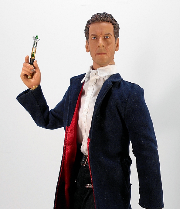
First up, let’s talk wardrobe. Throughout the 8th and 9th Series, Twelve has been all over the place with his costumes. He’s gone from finery that would have made The Third Doctor jealous to slumming it with a hoodie that even Nine probably wouldn’t have worn. Happily, Big Chief decided to go with the outfit that Peter Capaldi wore in the first official images of him as The Doctor. It features his gorgeous navy blue coat with red liner, a navy sweater, a white button down shirt, black trousers, and shiny black boots. Straightaway, something here felt off, and I quickly identified it as the sweater. He wore it initially, but not enough that I associate him with it. It’s definitely the weakest part of this outfit and it’s hard to get it to sit right on the figure, especially when articulating the arms a lot. Also, it made the jacket feel way too snug and restrictive in the upper body and shoulders. That sweater has to go!

bc12th6

Much better! The button down shirt here is a huge improvement over the one on the 11th Doctor figure. It’s made of lighter material and not nearly as puffy, but the collar still has a habit of popping up and I’m considering pinning it down, as I think it will make a huge difference. The shirt features nice stitching, tiny buttons, and even french cut sleeves. The belt makes the waist look a bit too small, but then Capaldi is a pretty thin guy, and the jacket conceals most of that issue.

bc12th7

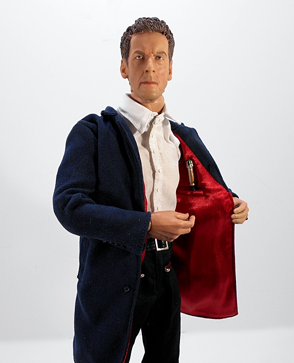
The stitching on the jacket is splendidly done and includes the buttons on the sleeves. The inner lining is also gorgeous. You even get a breast pocket for you know what! There’s a magnet placed inside the jacket if you want to display him with it closed.

bc12th9

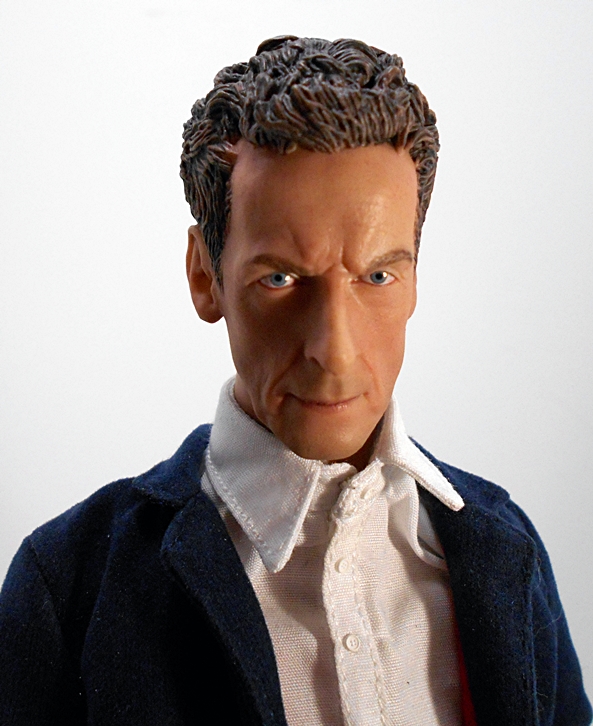
The Capaldi portrait here is quite good. After several different Doctors, I’ve found Big Chief to be a little hit and miss with their likenesses. I’d rank the Matt Smith sculpt and this one as their best. The Tennant, Eccleston, and Tom Baker likenesses are close, but a little off. And I’m at odds with their William Hartnell likeness. In this case, I think the actual sculpt is spot on and they’ve made a valiant effort at painting that eerie spark of life into the eyes. The skin tone is good, but it’s the paint that keeps this from rising to the ranks of the top tier Sixth-Scale competitors. Still, not bad at all.

bc12th10

As for the body itself, it feels very similar to the Matt Smith body. The joints are looser than Hot Toys and more on par with Sideshow, however they are capable of holding any pose I put him in and supporting the weight of the figure. The generic stand I’m using is entirely for balance issues. Happily, the outfit is not at all restrictive, making The Doctor a lot more fun to play around with than most of the other Sixth-Scale figures in my collection. Of course, you also get a bunch of hands, which include: Relaxed hands, fists, accessory holding hands, and the right hand to mimic that wonderful pose in that instantly iconic initial press photo, which introduced Capaldi to us as The Twelfth Doctor. The hands use a peg system practically identical to Hot Toys and Sideshow and they are very easy to swap in and out. You get plenty of extra pegs too, but I can’t see ever breaking one of these.

bc12th11

bc12th12

bc12th13

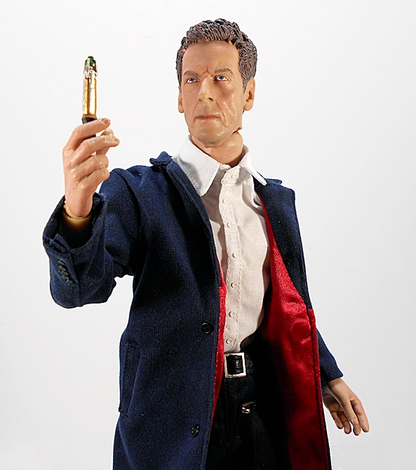
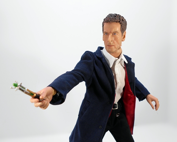
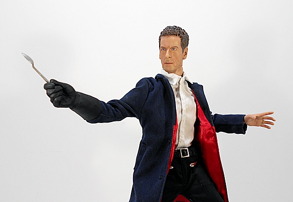
Big Chief has been great about including a lot of nifty accessories with these figures. And as before, none of these are mind blowing, but they are good selections and lots of fun. First and foremost are a pair of Sonic Screwdrivers, one with the tip open and one closed. These are essentially the same pieces that came with The Eleventh Doctor. As already shown, there’s a pocket in the jacket to slip it into and the hand designed to hold it works perfectly.

bc12th14

Next up, is The Doctor’s yo-yo, which he uses as a super high-tech instrument for measuring gravity.

bc12th16

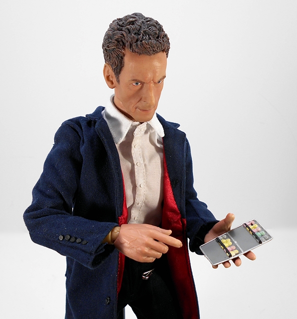
Jelly Baby, anyone? Yes, you get the posh little cigarette case that The Doctor used to store his favorite sweets in “Mummy on the Orient Express.” It’s a static piece, sculpted in the open position with individually painted Jelly Babies inside. I love that they included it as an accessory, especially since it was used as basically a one-off gag and never seen again.

bc12th17

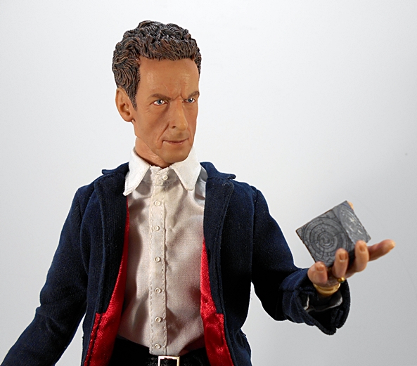
The Psychic Paper! Easily my favorite addition to The Doctor’s arsenal since the show returned in 2005. Yes, this is essentially the same accessory included with The 11th Doctor figure.

bc12th20

bc12th21

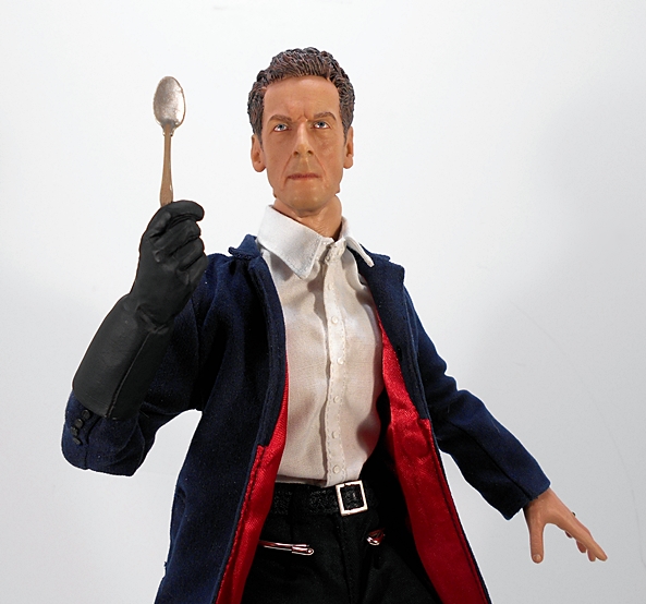
Moving on, we have a gloved hand and spoon! This pair of extras were inspired by that episode that I adore and everyone loves to hate on, “Robots of Sherwood.” The premise was ridiculous, the resolution was dumb, but it was such a fun ride and Capaldi’s sheer annoyance with Robin Hood was absolutely fantastic. Also, that whole dungeon scene ranks up pretty high on my list of favorite Doctor Who moments. I love that they included these, because again they are pretty much one-offs.

bc12th18

And, finally… it’s The TARDIS in Siege Mode from “Flatline.” This is a really nicely sculpted accessory, but also one that I can’t get terribly excited about because, a) The Doctor was inside The TARDIS at the time, so having it as an accessory to interact with the figure is a little odd. b) It looks way too much like a miniaturized version of The Pandorica.

bc12stand

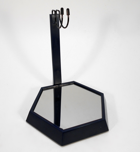
Before wrapping up, we have to talk about the stand. Oh, God, the stand! It’s so hard to imagine that Big Chief put so much work into something like this and screwed up the basic premise of its functionality. You all may remember that I was less than pleased with the stand that came with The Eleventh Doctor, but that piece is like an engineering marvel when it comes to this one. The base is a mirror and there’s a light up feature that illuminates some Gallifreyan writing, which is a really neat effect, but one that I couldn’t really capture in a picture. Unfortunately, the post that’s designed to support the figure does not attach securely to the base, so when you put the figure on it, the post immediately pushes away and falls off. This is a relatively easy fix, by gluing the post to the base, but then it’s never going back in the box again. I have yet to decide whether I’m going to do that. For now, I’m making use of the inexpensive and generic figure stand that you’ve seen throughout these pictures.

bc12th19

bc12th22

DSCN9523

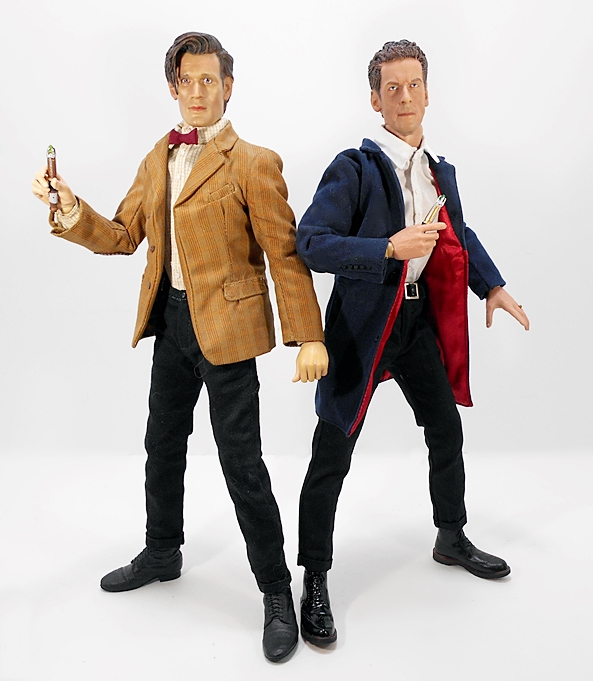
I love this figure and it makes for a wonderful display next to my Big Chief Eleven. But in the end, so much of collecting comes down to money and Big Chief has been asking a lot for these figures. Twelve debuted at $239, which is even higher than many of Hot Toys’ standard releases these days. Of course, Big Chief’s figures are a lot more limited, and as popular as Doctor Who has become, it’s safe to say these figures are more niche than the box office juggernauts of Marvel and Star Wars. But even with that being the case, my satisfaction with their Eleventh Doctor figure coupled with my unending reservoir of adoration for Peter Capaldi as Twelve couldn’t get me to pull the trigger at $239. As good as these are, they’re not comparable to the insane level of craftsmanship that goes into a figure at the Hot Toys price point. That’s nothing to be ashamed of, Big Chief, as few figures can compare, but if you’re going to market a product at the same price, you really should be offering the same level of excellence. These are on the right track, but they aren’t there yet. Ultimately, I found Twelve for $150 shipped, and that was the number that made me take the plunge and I feel it was worth it. I’m still in a holding pattern on some of the others, but if any of those hit that magic number, then Big Chief’s Sixth-Scale Doctor Who may return!

Marvel Legends (Juggernaut Wave): Phoenix by Hasbro

It’s Marvel Monday again, and thanks to a little doubling up last week, I’m up to my sixth figure in Marvel Legends‘ oh-so-solid wave of X-Men. Today I’m turning my attention back to the X-Ladies with a look at Jean Grey as Phoenix!

mlphx13

While a number of the characters in this wave are making their modern Marvel Legends debuts, there are a few retreads. Jean Grey is one of those… sort of. She last appeared about three years back as part of the Rocket Raccoon BAF Wave and sporting her Jim Lee look. This time we’re getting the Phoenix version and I’m pretty happy about that. The Toybiz version of Phoenix was among the last handful of figures from my old Marvel Legends collection to get sold off quite a few years back leading to almost instant regret. Needless to say, I’m excited to get a modern Legends update. I’ve said my piece about this wonderful packaging, so let’s rip it open and check her out…

mlphx11

mlphx10

And here she is in that lovely gold and green costume that just pulls on all of my nostalgia strings at once, while also making me feel a little funny in my nether regions. Damn, this is a great looking figure! The costume is achieved with some gold swirly plastic and green and black paint. Also, it looks like Jean has been raiding Carol Danvers’ closet, because she’s wearing the Ms. Marvel sash around her waist. It’s OK. Nothing wrong with that. The paint lines are all pretty clean, especially around the Phoenix emblem on her chest. I’ve just got zero complaints about this lady. And what is it about the X-gene that gives the X-Ladies such wonderful bums? Damn, Jean, you don’t need no telepathy, because you’re blowing my mind with that caboose! Know what I’m saying?

mlphx9

mlphx2

The portrait here is mighty solid.  Hasbro continues to be doing a nice job on their 6-inch female sculpts… at least in the Marvel Legends line. Hasbro, you might want to loan out some of these guys to that Star Wars line you do. The paint here is sharp and clean and she has a copious amount of hair. Yeah, all that hair does hinder the neck articulation a bit, but not completely.

mlphx6

mlphx12

mlphx1

Speaking of articulation, Jean’s got it in spades. You get rotating hinges in the shoulders, elbows, and wrists. The legs are ball jointed at the hips, have double hinges in the knees, and swivels in the thighs. The ankles have hinges and lateral rockers, and the torso features a ball joint under the chest and both a ball joint and hinge in the neck. The only thing that’s a little problematic is getting her balanced on her tiny feet.

mlphx3

mlphx8

mlphx7

I don’t think I was quite prepared for how much I was going to love this figure. Like so much of this wave, Jean is just classic X-Men goodness synthesized into bright, shiny plastic. And apart from being just a really solid release, it feels so good to get Phoenix back into the collection again. I’ve always had a thing for this costume and until now I regretted unloading the Toybiz one. Now I just regret unloading that bitchin’ translucent phoenix flame effect piece with her. And with another one down, I’m left with just two more figures to open. Who will it be next week? Merc with a Mouth or Sassy Southern Belle? Honestly, I’m not even sure myself!

S.H. Figuarts: Sailor Pluto by Bandai Tamashii Nations

What? A rare Anime Saturday with no Kantai Collection? I know, right? Well, don’t worry my personal KanColle love fest will return, if not next week then soon. In the meantime… it’s hard to believe that it’s been exactly a year this week since I last looked at the S.H. Figuarts Sailor Moon line. And yet, that’s about how long it took me to finally get one of the last Sailor Scouts I needed. Sailor Pluto has finally landed, weighing in as the eighth figure in my collection and I’m rather excited to revisit this great line and check her out! “Pluto Planet Power… MAKE UP!!!”

shfplut1

It’s been a while, but the package hasn’t changed. The figure comes in the same compact and colorful, little window box with plenty of pictures of the figure and the accessories. The side panels also identify the figure, so if you’re like me and have a lot of these boxes lined up on the shelf, it’s easy to grab the one you want. There’s also a fairly decent amount of English copy on the box, making it friendly to us Western collectors. Finally, everything is collector friendly, which is great, because even when I have the figures on display, I use the boxes to keep all the extra bits and bobs organized.

shfplut2

It’s safe to say that I’m not nearly as familiar with Pluto as I am the earlier releases. My exposure to Sailor Moon comes strictly from the anime and Pluto was a late arrival. Nonetheless, I dig her a lot. Obviously the costume is quite similar to the other Scouts, and Sailor Moon’s in particular. The boots are almost identical in sculpt, only without the crescent moons on below the knees. Other slight differences include Pluto’s top being sleeveless and her collar not having the same clear sailor motif. The black and white of her costume is quite striking and rather distinctive when compared to the more vibrant colors of her sister Scouts. The brown bows are a bit of an odd choice, but they work, and I love her long green hair. The deco is rounded out by the bright red stones on her chest, tiara, and earrings. Paint has never been a big issue on any of these figures for me, but that having been said, Pluto’s paint is among the best in my collection. With the exception of a little bleed around the top of the skirt, I’m hard pressed to find anything to nitpick here.

shfplut4

I don’t tend to run down the articulation on these figures, because Figuarts are generally all very similar. Suffice it to say you get loads of rotating hinges, and most of the joints are designed to pull out, rather than break. Articulation is generally excellent, although the skirts on the Sailor Scouts do tend to inhibit some of the hip movement. Also, the shoulders on my Pluto feel a little stiffer and more restrictive than my previous Scouts. Neither issue is a big deal though, and these figures are always so hard to put down, once I start messing around with them.

shfplut10

shfplut3

Of course, you get the usual collection of hands and a total of four portraits. The faces include a shouty face, a concentrating with closed eyes face, and a slight smile and a neutral face, both of which are so similar, I’ve got to really look to tell them apart. The hands come pegged onto the usual hand totem pole for easy organization, and there are a lot of them! You get relaxed hands, closed hands, splayed hands, fists, hands designed to grip her Garnet Staff, what I like to call hocus-pocus hands, and a right hand pegged to hold the Garnet Stone without the staff.

shfplut5

shfplut9

The Garnet Staff, which she uses to guard the Space-Time Door, is just a lovely piece of work with the key-like teeth sculpted on the sides. It features some beautiful metallic paint and as I’ve already shown the head piece comes off so she can hold it separately. The bottom third of the staff also disconnects to make it easier to slide it into her grippy hands. One of these hands was open and one had the fingers connected. I opted to slit the connection on those fingers to make it easier to fit it into that particular hand.

shfplut14

shfplut13

Of course, Sailor Pluto comes with the same style of crystal heart-shaped stand as all of the previous releases, and that leads me to my only complaint about this figure. Her copious amount of hair doesn’t make it easy to get the stand connected to her waist. In the past, like with Sailor Mars, Bandai has compensated by allowing the hair to part in the middle and get the stand through. In this case, the hair is one solid piece, and only articulated at the top. You can swing it all the way to the right or left, or you can pull it away from her back, but then you’re getting into a situation where the neck is articulating downward too. The above two shots illustrate that it is possible, but in all the cases where I was going for a fairly static and relaxed pose, I was content to just lean her up against the stand, rather than use it properly.

shfplut11

shfplut7

shfplut6

shfplut15

It’s been two years now since I started collecting this line and I can’t tell you how happy I am to be re-visiting it. These figures have been a delight since the beginning, and I probably enjoy this line a lot more than any middle aged male has any right to. In fact, since playing around with Pluto, I’ve already gone back and picked up one of the very few I’m missing, Sailor Venus, and I’m once again eyeing Tuxedo Mask. It’s also been a while since I’ve dipped my toe back into the anime series, but playing around with Pluto has me hankering to go back again for a re-watch, or maybe even give Crystal another go.

By figurefanzero

Justice League War (DC Animated Movie Series): Shazam by DC Collectibles

It’s DC Friday again, and I’m almost to the point where I’m caught up on opening my backlog of DC figures. It’s possible that I might start switching up Friday content a bit in the future, but I’m hoping it won’t come to that. I’ve got the rest of August and part of September covered, and by then, I’m hoping some new stuff will start rolling in. Today, I’m looking at my last figure from the Justice League War animated film, Shazam!

dcashaz1

Here’s the obligatory shot of the packaging, or at least the best one I could salvage after my cat hit the table while I was taking it and I didn’t realize the picture was wrecked before I tore open the package. Whoops! Again, it’s clean and simple, and it shows the figure off beautifully. There are some stills from the movie printed on the card behind the figure, and some shots of other figures in the series on the back of the card. It’s not at all collector friendly, so let’s rip this sucker open and see what we’ve got!

dcashaz2

Because of the animated style, this line focuses more on paint than individual sculpts. Indeed, Shazam here is a repaint of the Superman body, and that’s a good choice that works well. The costume is mostly deep red with gold paint for the boots, belt, wrist bracers, and some gold and yellow for his chest emblem. Overall the paint is neatly applied, although there are some areas, particularly around the cape’s trim, which could have been sharper.
The cape is the only newly sculpted piece for the costume. It’s fairly light and very pliable, but it still makes him a little back heavy. The hood is sculpted down, which is the way I prefer it. I have passed on at least a couple of Shazam figures because the cape was permanently up.

dcashaz3

The head sculpt is one of the better ones in this line. Yes, that’s a loaded compliment. Superman’s sculpt was a lumpy mess, Green Lantern’s was a painted nightmare, the rest have been OK. I think they did a pretty good job capturing the animated style in this portrait and the paint is fairly clean. There are, however, a couple of stray marks on his bottom lip that unfortunately look like cold sores. Hopefully them old wizards have a cure for herpes!

dcashaz4

dcashaz5

The articulation has been a standard in all the male bucks of this line. You get rotating hinges in the shoulders and elbows, swivels in the biceps and wrists, ball joints in the hips and neck, and hinges in the knees. There’s no articulation in the torso at all. These are not highly pose-able figures, but I’d still rank them as better than most of the releases from the dark days of DC Direct’s premier lines, where nothing but t-crotches and swivel cuts were the order of the day. Still, there’s only so much you can do with him, hence the limited number of shots I used for this Feature.

dcashaz6

dcashaz7

By now, you all know that this line has been hit and miss for me. Shazam was the last one I have to open, and seeing as he’s one of the better ones, so I’m happy to ending my look at this series on a positive note. If I ever stumble across The Flash at a decent price, I’d probably grab him to complete the Justice League War set, but otherwise it’s safe to say I’m finished with these. Even though I picked up all of these for ten bucks a pop, my hindsight is telling me I should have passed on them. At a time when I’m trying to tighten up my collecting habits, the amount I spent on these figures could have paid for a Cover Girls statue I needed, or even one of Mezco’s upcoming One:12 Collective releases.


Transformers Titans Return: Hyperfire & Blurr by Hasbro

It’s hard to believe Combiner Wars has come and gone already, eh? No, actually it’s not. While I enjoyed the line quite a bit, seeing those same molds over and over was beginning to wear out its welcome. Thankfully, we have a brand new line coming in, and like Combiner Wars, I’m happy to say that it is slavishly beholden to Generation 1. I hope you like Headmasters, because that is indeed the main gimmick of Titans Return. I know, these figures are old news to a lot of people, but they’re still hard to find in my area and I’m quite excited to be looking at my first one. So I’ll warn you ahead of time I’m going to talk about this figure a lot.

ttrblur1

Alas, the packaging hasn’t changed all that much. It’s still mostly black with Transformers running vertically up the side. This overall design grew on me a little over the last year or so, but I was hoping for a change up. It still bears the Generations insignia in the upper right hand corner and the cards still feature character specific art at the top. Unfortunately, the art here is not really grabbing me. I appreciate that it’s emphasizing the Headmaster gimmick, but it just looks goofy to me. Also, the fact that I have to title these Features with the Headmaster’s name first like the actual figure is an afterthought is going to irk me every time. In the end, I’ve never even been tempted to keep carded Transformers packaging, so it’s not a big deal to me. Into the rubbish bin with you, foul packaging! OK, let’s start with the alt mode…

ttrblur2

ttrblur3

Hey, did I mention it’s Blurr? I love Blurr! Always have. He was one of my favorite characters from the movie and post-movie season of the Sunbow series. This is about as close to G1 Blurr as we’ve had in forever and it’s making me very happy. The vehicle is a beautiful homage to the G1 toy right down to the engine/exhaust/fin thing on the back and the gap behind the cockpit. It holds together tightly, rolls along fine, and the robot mode’s gun mounts under the nose of the car. As far as alt modes go, this one is simple, you can kind of see what’s going to happen with the transformation, and all that is just fine with me. I adore this.

ttrblur4

The coloring is solid as well. The bulk of the car is cast in an ever so slightly metallic blue plastic. You get some gray, as well as a little minty blue all of which conspire to replicate those instantly recognizable colors from the G1 toy. The brilliant silver paint used for the gun is easily the stand out attraction here. An Autobot emblem on the hood and a translucent blue tinted cockpit helps seal the deal.

ttrblur5

Blurr’s little chum is Hyperfire, which is a name that sounds more suited to a Targetmaster than even the name of G1 Blurr’s Targetmaster, Haywire. As a kid buying toys, I was already growing out of Transformers by the time the Headmasters hit. I enjoy the gimmick now, but I think I would have been confused by it back then. I didn’t want to worry about how that whole symbiosis worked and who’s personality was who’s. I just wanted robots that changed into stuff and fired lasers at each other. Anyway, my rambling should tell you that I don’t have a whole lot to say about this little guy. He’s cool for what he is: A very tiny robot that turns into a head and can also ride in Blurr’s alt mode. His legs are fused together, but they can bend together at the hips and knees. His shoulders are jointed, and since his little head is also the connection to the robot, it is also articulated. Hasbro made a valiant effort at painting this tiny guy, but that doesn’t change the fact that he’s got a giant screw right in the middle of his chest.

ttrblur6

ttrblur7

Hyperfire can indeed sit comfortably in Blurr’s car mode and the cockpit closes perfectly. I would dare say that my favorite thing about the Headmaster gimmick is having these little guys to interact with the vehicles. Speaking of which, those pegs beside the cockpit are there so you can attach more Headmaster riders via the peg holes in their tiny feet. Oh yes, Blurr also has a second alt mode, and to show it off, I’m bringing in one of the individually packed Headmasters, Nightbeat.

ttrblur10

ttrblur9

You basically take the hood section, flip it upside down and peg it into the side to form an outrigger with a cannon. This is not the most clever of designs, but I have to say, I love this concept probably more than it deserves. Something about this just reminds me of the old Micronauts toys, where you could pull pieces off of them and remake them into different things. Blurr’s sidecar doesn’t quite measure up to that level of complexity, but I really appreciate what they did here in terms of added play value. Well, enough of the alt modes… can Blurr’s robot mode live up the same level of ungodly G1 goodness?

ttrblur11

Yes it can. There isn’t a whole lot to transforming Blurr, but damn do I dig the results. Like the alt mode, this robot mode just pulls at all the right nostalgia strings for me. This figure is as Blurr a Blurr as we’ve had in the modern era and I am in love with him. A lot of early reports have scared me about how loose the joints on these figures feel, but I’m fortunate that my Blurr has no such issues. He’s perfectly proportioned and there is an impressive amount of sculpted detail on him. But as complex as some of the detail is the overall feel of this figure is positively elegant in his simplicity.

ttrblur14

Unfortunately that simplicity follows through on his coloring, where it is less of a selling point. There’s precious little paint on this figure and in robot mode he shows a lot less variety than in his car mode. What’s here is good. I really like the way they painted the look of the original toy’s stickers above the feet. You also get a little of the lighter blue trim around the cockpit, but the bulk of that coloring winds up on his back and the backs of his forearms. Other than that, it’s just a whole lot of that metallic blue plastic. His deco (or lack there of) is not unattractive to me, but arguably on the bland side. It’s also worth noting that there is an obvious place on his lower chest intended for an Autobot insignia, but Hasbro didn’t bother printing it in there. That bugs me more than anything else, and I’ll likely wind up digging through my sheets of repro stickers to find one to put there.

ttrblur17

ttrblur15

Blurr has a hood-shield similar to his G1 counterpart. I was never a fan of that design and I’m delighted to say that the piece on this figure can store on his back to fill out the torso a little more. The result is no obvious car-part shield and no extra part lying around. The silver gun can be held in either hand and goes a long way to spruce up the otherwise sameness of the coloring here.

ttrblur19

ttrblur12

Like all Headmasters, Hyperfire just rolls up into a ball to form the head and it works just fine. The head sculpt is great. It’s undeniably the Blurr that I grew up with and the head stays together even when I manipulate it on the neck. For people who aren’t into the whole Headmaster thing, I don’t think the look of the head will be an issue, other than having to attach it after transformation.

ttrblur18

And yes, all Headmasters will work on this guy. I pulled out Nightbeat once again to illustrate. The idea of swapping heads is a big one in Titans Return, but not one that really interests me a lot. Heaving a Headmaster for Nightbeat doesn’t make me want to put it on Blurr, it makes me want to have a proper body for Nightbeat. And if there were such a body and the head was called Nightbeat, than why isn’t Blurr’s head called Blurr? See… this is exactly the sort of shit that would have fried my child brain if I had these way back when. Granted, I seem to recall that in the original concept, the Nebulons were bonded to specific robots, so this perverse practice of head-swapping wasn’t possible. Nonetheless, I bet this is fun for the kids and I’ll admit to already own eight of the individually packaged Headmasters, four Autobots and four Decepticons. I will eventually do a very quick Feature on them when I run out of the regular figures to talk about.

ttrblur16

ttrblur20

ttrblur23

ttrblur21

ttrblur22

You need only look at how long I droned on about a simple Deluxe Class figure, to know that I really love this toy. In fact, apart from the lack of paint apps in robot mode, I’d say he’s very nearly perfect to me and he’ll definitely be replacing that Blurr that was recycled from Drift a few years back. This is my new Classics/Generations Blurr and I find that he even scales fairly well with Classics Rodimus and most of the gang from the Generations line as well. He was a great choice for me to usher in this new line and I can already tell that I’m going to be into Titan Returns in a very deep way.

Mythic Legions: Vorgus Vermillius (The Blood Armor) by The Four Horsemen

It’s been one of those days, folks. Meetings ran long at work and here I am getting home late with content left undone. What can you do? It’s those long meetings that pay for toys! I was tempted to take the day off of bloggery, but it’s Mythic Legions Wednesday and I can’t let the day go un-celebrated, so I decided to look at a figure today that wouldn’t require a whole lot of time…

mlverm1

Behold… Vorgus Vermillius and the ubiquitous in-package shot. Nope, there’s nothing new to say about the package. I will, however, do something I haven’t really done with these figures before and give a shout out to this guy’s bio, because it’s just so damn awesome. To make a long story short, the brutal vampyric Knight Lord Edgard got himself some kick ass enchanted armor, but it turned out to be a trap that slowly consumed the life force of its wearer. In that regard, this isn’t necessarily a figure of Lord Edgard, but rather The Vorgus Vermillius, or Blood Armor, that roams the land looking for new victims to wear it so it can be fueled by their goddamn souls. Holy crap, that’s metal! Let’s check him out…

mlverm2

mlverm3

Does he look familiar? The reason this figure won’t take a lot of time is because he’s the closest I’ve come so far to looking at a straight repaint in this line. The Blood Armor is Gorgo Aetherblade, only with horns instead of antlers, and a diffent cape. The figure comes packaged with the shoulders off and the cape comes in a plastic baggie. The repaint is done mostly in one color and it is a very deep and rich red. So deep and rich that it looks brown under certain light. You do get some black wash as well, which adds a certain look of antiquity to the figure. I mentioned last time, when I looked at the Knight Legion Builders, how amazing these sculpts look even with simple paint jobs, and that’s the case here as well. I can still make out all of those beautifully sculpted details in his full suit of armor. As always the figure is modular in design and articulation is constant across the board in this line, so I’ll just refer you back to the Feature on Gorgo if you need to get up to speed. Now, stare into the grim face of death…

mlverm5

mlverm4

Damn, he’s gorgeous! Normally, the shoulders are completely optional, but I can’t imagine displaying this guy without them. They add a lot of menace to his stature, and they’re also instrumental in attaching his black cape. The cape has holes cut in it that you pass the peg through to secure it and as with Gorgo’s red cape, this one really adds to the figure. Every Dread Lord needs a flowing black cape! And yes, you also get the now familiar brown belt, which can be worn on the waist or as a shoulder strap to carry his sword.

mlverm7

mlverm8

Sword, you say? Yes, The Blood Armor comes with the usual array of killing instruments, all of which are repaints of weapons we’ve seen before. The sword is the same one we saw packed in with Gorgo, and several other figures since. It features a vaguely leaf-shaped blade, a two handed grip, and a stylish crossguard that really evokes the style of Tolkien weaponry for me. The blade is painted silver and the hilt is painted to match the armor itself.

mlverm10

mlverm9

mlverm11

You also get a repaint of the same axe that was bundled with Gorgo. It’s painted in the same colors to match the sword and as we’ve seen before, it can be converted from a single-blade to a far more formidable looking double-bladed weapon.

mlverm12

mlverm13

And finally, The Blood Armor comes with a spear. This spear has been recycled time and time again, but that’s not really a sticking point with me. Heh. Heh Heh. Ahem…

mlverm6

mlverm14

Whatever you do, do not mistake my brevity today as any slight on this figure. The Vorgus Vermillius is another absolutely outstanding figure in the Mythic Legions line and one with a damn cool backstory too! Indeed, when I was picking out which figures to get while remaining in my budget, I expressly tried to avoid any that were close to straight repaints. And yet, this guy still wound up on my list. It was quite simply the amazing paint job on the already fantastic sculpt that sold me, and I’ve had no regrets since I have had him in hand. And let me tell you, there is no better reward after a long, hard day at work than to pour a tall Jameson and sit down to admire and write about a magnificent figure like this one.

Contra: Bill Rizer and Lance Bean by NECA

If you came of age in the 8-bit video game era than you already know what run-and-gun platforming perfection looks like. If you didn’t, than here’s a visual aid…

necacont21

That’s right, motherf’cking Contra on the Nintendo Entertainment System! It rocked hard than and it still does. It remains one of my go to games and I still play it frequently because the music is fantastic, the action is frantic, and it brings me back to simpler times when all you had to worry about was a jump button, a fire button, and not getting hit. Of course, that was easier said than done. I was already 16 when this cartridge blazed its way onto the NES. By then, I had a solid eight years of video gaming under my belt and I still had never played anything quite like it. It was tough as nails and the alternating perspective was a nifty trick for its time. This game was undoubtedly the shit, but we’re here to talk about toys, not video games, so let’s check this out…

necacont1

You’re looking at the packaging for Private Bill Rizer and Lance Bean in glorious action figure form, lovingly crafted by the fine folks at NECA toys. And let’s not forget Konami, who apparently licensed it out and then fought them every step of the way. They were so uncooperative and difficult to work with that NECA claims to have sworn off dealing with them ever again. Yup. Did you see those early shots of the 8-bit version of Castlevania’s Simon Belmont? Well, forget it. It’s gone. Thank Konami for that. But I don’t want to dwell on the bad stuff. This is a day to be celebrated, because it genuinely looked like this pair of figures would never see the light of day… and yet here they are!

necacont2

The packaging is very reminiscent of NECA’s other video game figures as well as their Ultimate line. You get a big beautiful box that in this case looks like an over-sized box for a Nintendo cartridge. You get the beautiful retro artwork on the front and an opening front flap that shows you the player select screen on the reverse and a window displaying the figures inside. The back has a little blurb about Contra and shots of the figures set up to look like screenshots from the video game. The figures come on one tray and there’s a second tray under it with a whole bunch of extra goodies. Naturally, everything is collector friendly, so you don’t have to ruin this fine presentation to get at the toys inside.

necacont4

And here they are. If you aren’t up on the characters, That’s Bill Rizer on the left with the blonde hair and red outfit and Lance Bean on the the right in blue. Don’t feel bad if you didn’t know. I’ve been playing this game for decades and even I had to look it up. From the neck down, these are the same sculpt, with the exception of Bill having gloves and Lance going without. I’m guessing NECA borrowed some or all of these from either the Rambo or possibly the Predator Dutch figures. Sadly, I don’t have either in my collection to verify. They come shirtless and advertising their 80’s action hero manliness and wearing combat fatigues and boots. The head sculpts are bursting with personality. Bill looks a little confused, like he’s trying to remember the Konami Code, whereas Lance looks like the most pissed off guy I’ve ever seen in my life. Superb!

necacont5

The coloring on these guys consist of some great digital 8-bit camo on the pants and some white wash on the skin to further drive home the video game look. The red and blue used for the pants, boots, and headbands are both vibrant and beautiful. Each figure also includes an ammo bandoleer strap across their chests. The articulation here is pretty standard for NECA’s modern figures. You get rotating hinges in the shoulders, elbows, wrists, hips, and knees. You get both hinges and lateral rockers in the ankles. The torsos have ball joints in the waists and below the chest, and the necks are also ball jointed. In short, these figures are loads of fun to play with!

necacont6

necacont7

The figures include belts with holsters for automatic pistols and sheathes for combat knives. I wasn’t expecting either of these accessories, so they come as very welcome treats. You get some very nice painted detail on the pistols and the knives have bright silver blades and handles painted to match each player’s color palate. The hands hold the guns beautifully, but they clearly aren’t designed to hold the knives. I was still able to make them work.

necacont8

necacont9

necacont13

necacont12

Of course, the pistols and knives are just fallback weapons. These babies are the real hardware! Each figure comes with the same base gun, but with attachments to set them apart. Bill’s gun comes with a removable muzzle and stock. The stock also extends and collapses. Lance’s comes with a double-barrel muzzle attachment. Both guns have fold down stands, possibly meant to be similar to bi-pod rests. The customization on the guns is something else I hadn’t expected to see in this set and it’s a great surprise, which adds some play and display value. And speaking of which, how about that other tray of extra parts?

necacont3

The tray consists of a whole bunch of effect parts, as well as the previously mentioned stock for Bill’s gun, and what I like to call the Power Up Football. There are some great pieces in here, and one piece that doesn’t quite pan out as well as I had hoped.

necacont19

necacont20

The Power Up is pretty simple. It’s a great likeness to the floating Power Up in the game and it can be displayed “levitating” on the clear stand. Unfortunately, the base for this stand is shared by another piece in this set, so you can’t really display everything at once. But I’ll come back to that in a bit to explain how that isn’t a problem for me.

necacont14

necacont15

The first of the effect sets consists of these simple shot pieces for Bill’s gun. These peg into each other like a chain, so you can have one shot, two or three, however you want to display it. I think the effect here is pretty damn cool.

necacont16

You also get a three-way spread shot piece for Lance’s gun. The explosive effect plugs into the barrel and again, this is a great looking effect. If you want to go full spread shot, that’s an option, albeit sadly not an ideal one.

necacont17

Yes, this huge piece simulates the extension of the spread shot effect and I think it looks awesome here. Unfortunately, I had to use a lot of trickery to make it work. The piece was very warped when I took it out of the tray, mainly because the plastic is so very thin. It’s designed to plug into the same base that the Power Up uses, but when I plugged it in, it just leaned to the side. It’s possible it could be straightened with some heat, but considering how tenuous the plastic is, I wasn’t about to try it. In the end, I had to cobble together a bunch of pieces from a Bandai stand kit to get it to stand straight so I could take the highly doctored picture above. I’d be interested to see if the issue is common to all sets or just mine. It was a nice idea, I’m glad they tried it, but in the end, it just doesn’t work out all that well. So, sharing that base with the Power Up won’t be a problem after all.

necacont11

necacont10

necacont18

But believe me when I say that I in no way want to end this Feature on a downer, because these is an unbelievably cool set of figures and I can’t even express how happy I am that NECA was able to make it work and get them into the hands of us collectors. I picked this set up off of NECA’s Ebay store for about $55 shipped and I couldn’t be happier. There were times when I practically chewed my fingernails down to nubs reading some of NECA’s tweets about whether or not these were actually ever going to happen. It’s sad that NECA and Konami had to part ways over this release, but if you’ve followed gaming news lately, than you already know the folks in control of Konami have lost their god damn minds. Still, this set opens up so many other possibilities. Damn, I’d love to see Double Dragon get this exact same treatment!

Marvel Legends (Juggernaut Wave): Havok and Iceman by Hasbro

It’s Week Four of my Monday romps through the recent X-Men Wave of Marvel Legends and today I’m knocking out two figures in one Feature. No disrespect to either of these characters or figures, but I’m seriously backlogged on opening my Legends toys and with eight figures plus the Build-A-Figure this wave is a tall drink of water. I’m not complaining, Hasbro, keep them coming! In the end, I think I can do justice to both Havok and Iceman in one shot, because while they are both excellent, they are relatively simple figures.

hmhav1

Once again, the packaging for this wave feels special to me. The bold X-Men logo on the front and the X-symbol on the top panel advertise a wave that given the current state of the comics, shouldn’t exist. The yellow and black deco is striking and you get some beautiful character art on the side panels. Normally, I don’t mind tossing out my Marvel Legends packages, but in this case, I wish I had the space to keep them. Havok and Iceman are two more examples of the great character selection in this wave. Both received the Universe 3.75-inch treatment, but it’s long past time they landed in the modern Legends 6-inch line. Let’s start with Havok…

hmhav2

hmhav3

Havok features his modern look, or at least it’s one of the most recent costumes that I recognize. Granted, I know this look best from the pages of Cable & X-Force and that’s got to be nearly five years old already, so I guess modern is a relative term. Dark and simple is the style on display here and while I dig it, I do prefer the look with the lit lines feeding into his chest. Nearly the entire costume is conveyed through minimal paint on a black buck. In fact, from the neck down the only original sculpting here are the cuffs of his silver gauntlets. You get some more silver striping on his boots, and partially around his waist. The costume is wrapped up with the blue emblem on his chest. This version of Havok was an easy figure for Hasbro to do, no doubt, but it still looks solid.

hmhav4

The head sculpt is quite good. Alex sports a stern and determined look, like maybe he’s sick of Scott’s shit again. The paint lines between the flesh and the black mask are sharp, and the silver bands on his head are crisp.

hmhav55

A rundown of the articulation here shows pretty standard stuff for the modern Legends line. The arms feature rotating hinges in the shoulders and wrists, double hinges in the elbows, swivels in the biceps. The legs are ball jointed at the hips, double hinged at the knees, have swivels in the thighs and lower legs, and the ankles feature both hinges and lateral rockers. The torso has a swivel in the waist, an ab crunch hinge, and the neck is both ball jointed and hinged. He’s lots of fun to play with, but damn, those ratchets in his shoulders are tight!

hmhav6

hmhav7

Havok comes with a pair of effect parts to simulate his ability to shoot plasma blasts. They’re similar to the hocus-pocus effects we got with Scarlet Witch and Dr. Strange, but new sculpts with a subtle conical shame. I think they look damn good, and coming from someone who usually just tosses effect parts into the dreaded and bottomless Tote of Forgotten Accessories, that’s saying a lot! Moving on to Iceman…

icem1

icem2

Where Alex Summers got by with minimal sculpting and minimal paint, Bobby Drake gets it done with a surprising amount of new sculpting and virtually no paint at all! Hasbro wisely went the translucent route with this figure, something that they haven’t done in Legends since the Ghost figure in The SDCC Thunderbolds Exclusive set. I love translucent figures! Do I love photographing them? Oh, God no! When I do they always look like piss. In this case, the plastic is a little blued and a little chalky and it looks absolutely fantastic… in person. Honest, you’ll have to trust me on this one. The buck here is recycled from one of the recent Spider-Man releases, but you get new hands, forearms, and lower legs with some jagged ice effects, as well bare feet, which appear to be new pieces. There’s also a removable chunk of ice that plugs into his back.

icem3

A bitchin’ new head sculpt with white painted eyes rounds out this beautiful figure quite nicely. He’s also got a great little smirk.

icem5

icem6

The articulation here is almost identical to what we got with Havok. Iceman loses the extra swivels in the lower legs, but gains the lateral shoulder crunches. It’s a worthy tradeoff!

hmhav8

hmhav9

Havok and Iceman are great additions to a wave that is so good it’s downright… uncanny? It’s true that Hasbro didn’t break the bank on Havok. He’s a simple painted buck with a new head and that’s really all he needed to be. Iceman, on the other hand… well, I wasn’t expecting as much unique sculpting to go into him and the results are quite spectacular. With only three figures left to go, I’m beginning to believe this wave can do no wrong. Next Monday, I’ll be checking out another of the X-Ladies!

KanColle: Abyssal Fleet Battleship Princess Senkan Seiki By Taito

I had honestly planned to mix things up for today’s Anime Saturday and do something different, but then I got this Battleship Princess from Taito and couldn’t wait to open her up. Still, it’s sort of different, because in the unending parade of KanColle figures that I’ve featured here, I’ve only looked at one other Abyssal figure, and that was the Airfield Princess by Furyu way back in May.

kcseiki1

Enclosed boxes are still the order of the day for Taito’s prize figures. Gone, however, are the cheery colors of the Fleet Girls’ boxes as here we have a more sinister black and red deco that better suits the evil Abyssal Fleet. There’s a little more English on the package than we usually get, a nice big Kantai Collection logo on the front panel, and plenty of pictures of the figure inside. This box is also notably bigger than most of the other releases in this line and it weighs a lot more than usual. I’m excited to open her up and see what we’ve got!

kcseiki5

Holy hell! Despite how elaborate this piece may look, it requires very little assembly. You get a piece of hose that plugs into the back of Seiki’s neck, next you tab the feet and the other end of the hose into the base. I found that it was impossible to get her right foot to tab in all the way. I may need to shave the tab a bit, but even as it is, she stands fine. It’s also worth noting that Seiki herself is scaled a bit smaller than most of Taito’s Fleet Girls, but that’s understandable given the amount of plastic used for the base. And speaking of the base… I’m going to break my usual formula and start by discussing base first and including some shots of it without the figure.

kcseiki2

Obviously, I’m used to seeing plain plastic discs for the bases on these figures, but here we have a sculpted water environment cast in a beautiful translucent blue plastic. The monstrous left hand of the Battleship Water Demon reaches up from the waves while the tip of one of its two heads breaks water surface to the back left, along with one of its triple gun mounts to the back right.

kcseiki3

kcseiki4

The sculpt on the Water Demon parts is all solid. The hand looks incredible, while the battleship parts are a little more basic and convey the look of rough hammered iron. Apart from the vibrant blue water the design doesn’t offer a lot of colors to work with here, but Taito still did some nice stuff with the paint. The coloring on the head gradually becomes more toward the giant monolithic teeth and the ends of the gun barrels are red, as if running hot from being fired. The effect of these pieces mixed with the translucent water is just fantastic. Moving on to the figure itself…

kcseiki6

kcseiki12

Seiki stands atop the Water Demon’s hand with her long black hair fanning out around her. In design, she’s slightly less creepy than the Airfield Princess, but only slightly. There is some nice sculpted detail on her black dress, her low plunging neckline shows off her lady battleship parts, and you get her little demon horns protruding from above her chest and her forehead. I really like the sense of scale between the Water Demon’s hand and Seiki, which may be why she appears to be a little smaller than Taito’s other Fleet Girls.

kcseiki8

kcseiki7

kcseiki11

The only coloring here is black and gray with some red accents for her eyes, horns, and some highlights in her hair. You do get a little mix of gloss and matte black, though. The paint is a little more heavy handed than I’m used to seeing on Taito’s work. In fact, this is one of the first times I think the pant quality was vastly superior on the sample used for the box shots. Still, what we got is not bad at all.

kcseiki13

kcseiki14

I’m totally blown away by this piece! This is a prize figure and to get something so elaborate in this format impresses the hell out of me. Granted, she cost me more than any of my other KanColle prize figures, but at under $30, she still feels like a great deal, and despite a little variance in scale, she displays quite nicely besides my Furyu Airfield Princess.

Batman (Classic TV Series): Batman, Robin & Batgirl Box Set by Mattel

For today’s DC Friday, I’m pulling out a line that I thought I was done with. As most of you probably remember, the 1966 Batman TV Series was in licensing limbo for a long time. No DVDs, no toys, no nothing. Well a couple of years back some lawyers reminded everyone involved that money is a good thing and managed to break that log jam. The result was an avalanche of toys and merchandise. Mattel scored the 6-inch scale action figure license and produced a couple of series of figures and while they were far from exceptional, they were fairly decent by Mattel standards.“Holy backhanded compliment, Matty, are you going to let him get away with that?” SHUT THE HELL UP, ROBIN, ADULTS ARE TALKING!!! I liked the figures well enough, but let’s face it, they would have been in better hands with just about anyone else. Where was I? Oh yeah… let’s look at this…

matbatg1

Yvonne Craig was one of the last hold outs in terms of likeness rights, Mattel finally got them, but the timing was awkward and unfortunate as the line was already breathing its final breaths. The package even makes a funny little jab at that fact with Robin’s quote: “Holy return from oblivion, Batman!” Mattel managed to get the figure out anyway, but in a typical Mattel dick move, they released her in this three-figure boxed set, making sure that pretty much everyone buying her was going to be re-buying the Batman and Robin figures too. This is actually my third time out with the same Batman figure, because Mattel made us buy him again in order to get Robin. Sheesh! In the end, this set arrived on store shelves around the same time the earlier figures were deep discounted on the clearance racks. I’m pretty sure this set was a Toys R Us Exclusive (that’s where I got mine), but there’s nothing denoting that on the package.

matbatg2

The packaging here is actually quite nice, although based on early promo pictures, I assumed the box opened up to look like this, but nope, it’s just a weirdly shaped three-window box. Presentation was always this line’s strongest suit , and I think that’s reflected here. The colorful artwork is great and the box shows off each of the figures beautifully. The back panel even shows Batgirl’s motorcycle. which would have been a pretty cool vehicle for Mattel to make if this line had lived longer. While the individual carded figures were not at all collector friendly, this set is, so between the Batmobile and these figures, I still have the look of the package represented on my shelf. Anyway, if you haven’t guessed by now I’m really here to check out the Batgirl figure.  I’m not going to spend a lot of time with Batman and Robin, because I’ve already featured them here several years back. But let’s take a quick look at them anyway…

matbatg3

matbatg4

Batman is the same as the carded release, which just means he doesn’t have the wire running through his cape. So, I suppose if you only bought the Batman & Robin 2-pack, this figure is new to you. Robin also comes sans cape wire, which means he’s also sort of a new figure and he’s nice to have as he fits in the Batmobile better than wire-cape Robin. The paint on this pair is OK, but the quality seems to have dropped a smidge from the earlier runs. My Robin has a stray mark of green paint on his upper right leg and my Batman has a stray blue mark on his chest. Overall, though, not bad.

matbatg5

The articulation on these figures is pretty good for what are essentially Mattel’s Movie Masters line. The arms feature rotating hinges in the shoulders, swivels in the biceps and wrists, and hinges in the elbows. The legs feature those lateral hinges, which should be familiar to people from the DC Universe Classics days. There are swivels in the thighs and hinges in both the knees and ankles. There’s an ab crunch in chest and the necks are ball jointed. The right thigh swivel on my Batman is fused. It’s probably an easy fix with a little heat, but seeing as I now own three of these, I don’t think I’ll bother. A lot of people loved to shit all over these figures, but I really do enjoy them a lot. If these were available when I was a kid, it would have blown my little mind. Moving on to Batgirl…

matbatg6

I watched the intro of every episode of Batman with baited breath to see if Batgirl was going to drive by in the animated intro sequence. They did that whenever she was going to appear and while I’m not sure I knew why back then, I always wanted her to appear. She made me feel funny in every good way possible. Mmmm… Batgirl. What? Oh, the figure… right. This was a great costume. It was campy and colorful and it really showed off Barbara’s Bat Assets. The costume itself is recreated quite nicely here, but something about Batgirl’s figure is lost in her figure. She just ends up looking a little too boxy in the hips and a little too lanky in the limbs. The same was the case with this line’s Catwoman. Still, all in all, I think the good outweighs the bad here.

matbatg7

The cape is cool, so long as you’re OK with it always being spread out. The stitching is surprisingly well done for a figure in this scale and the fabric matches the purple paint on the cowl fairly closely. It’s definitely going for a singular look, but it displays nice on the shelf, so long as you don’t stand anyone behind her.

matbatg8

The head sculpt is fine, although it really begs the question why Mattel needed the rights to Yvonne Craig’s likeness to make this figure. Sure, it looks like her, but I attribute that mostly to the cowl and mask and hair. The eyes are painted sharp and straight and the extra flare of mascara really sells it, but it’s hard to believe they had to pay out to the actress just for the eyes and the lower half of the face sculpt. If this were a Hot Toys figure or even a NECA release, I could understand it. You’d get more of an attempt at accuracy in the sculpt. This feels more like what we might have had in a vintage action figure likeness.

matbatg9

matbatg10

The articulation here is pretty close to what we saw in The Dynamic Duo. You get identical articulation in the neck, arms, and legs. The only difference here is that the ab crunch on Batman and Robin is replaced with a ball joint under the chest. At least I think it’s a ball joint. Truth be told it only allows for a swivel on my figure. Despite her tiny feet and high heeled boots, she can stand surprisingly well. As for getting her to high kick? Well, as the fine print on the packages often say, that required some additional support.

matbatg12

matbatg13

One of the fun little gimmicks of this line was the inclusion of stands for all the figures, each of which featured one of the comic style fight expletives. In this case, Batman gets “BAM!” Batgirl gets “SOCK!” and Robin gets “WHAMM!!” Each has a foot peg to secure the figure and there’s a slot in the back to stick in the collector card, which doubles as a backdrop. I’ve opted not to remove my cards from the box, but the fronts have animated shots of the characters, and I presume the backs have stills from the TV series. At least that’s how the carded figures did it.

matbatg14

matbatg11

As I mentioned earlier, I really do like these figures and think it’s a shame they get dumped on as much as they do. I would have certainly been all in for another wave of villains. I think one of the big problems is that despite the “Adult Collector” moniker on the package, these feel more like toys to me than collectibles. But that’s fine, because in that sense they’re fulfilling a wish that I had as a kid. There’s no doubt a company like NECA could have done these better, hell they proved that with their one off Adam West Batman release, but I’m all for enjoying these for what they are, rather than lamenting over what they could have been. One legitimate gripe I do have about these was the price. These figures retailed for $20 a pop and these are definitely not twenty dollar figures. Not in any dimension. Fifteen? Yeah, I guess. And here’s where having to buy this whole set to get Batgirl won back a little favor with me. I got mine for $30 on clearance, which means if I factor Batgirl in at $20, I only paid five bucks a piece for the Dynamic Duo.