The Muppets (Wave 1) by Diamond Select, Part III: Fozzie and Scooter

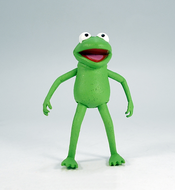
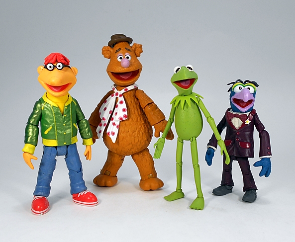
Alrighty, folks, here we are at the final stop in this Midweek Mini Muppet Marathon. You might even say, “we’re moving right along!” Time to open up the last figures of the first wave: Fozzie and Scooter!

mupfoz13

mupfoz14

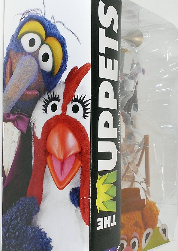
Here’s a quick look at the package. This time around we get two fully realized figures in one pack. I’ve said all I have to say, so let me just sympathize with how hard character selection for this wave must have been. With basically just four main characters, I think they did pretty well, although I’m still surprised that Ms Piggy didn’t make the cut. I was even more surprised that she didn’t make the cut for wave two. Again, here’s hoping this line has some staying power! Let’s start off with Fozzie…

mupfoz2

mupfoz1

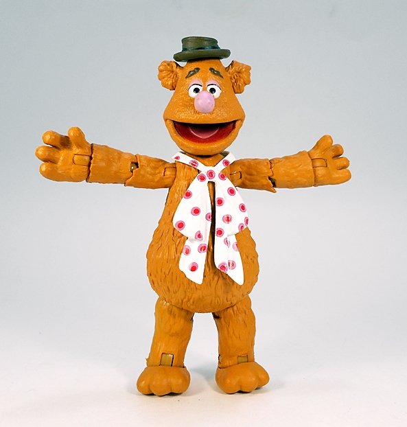
Ahhhhhhahhhh. Waka Waka! I love Fozzie Bear, he was easily my most anticipated figure in this wave, and I’m happy to say he turned out fantastic. Approaching 4-inches tall, he’s easily the biggest figure of the wave, not only in height, but also in girth. Since his costume consists entirely of his poka-dotted neckerchief (a separate piece) his bare bear body is supplied with some nice sculpted fur and a brownish-orange coat of paint. The head sculpt is as spot on as you can get. This is without a doubt the Fozzie Bear that I know and love. Apart from some scratches on his nose, the paint on the face is solid. Articulation consists of rotating hinges all around: The shoulders, elbows, wrists, hips, and ankles. He’s capped off with a ball jointed neck. The sculpt does restrict some range of motion and the way his hips are designed, he can’t really sit down. But why would he? He’s a stand-up comedian. Eh? Waka Waka!

mupfoz5

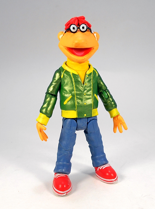
Scooter weighs in a little closer to Kermit in height, putting him around 3 1/2-inches. He’s one of the most complex designs in this wave, both because of his costume and the nature of his peepers. His eyes are appropriately part of his glasses, but there’s very little holding his glasses on. In fact, thanks to the warning from Scott’s review on the Action Figure Blues podcast, I was careful to keep the transparent rubberband that holds them on. It’s a temporary (and not ideal) thing for now, as I might get the courage to dab a little glue on them.

mupfoz6

mupfoz7

Considering this is the most intricate paint job on any figures in this wave, I’d say it’s fair but not exceptional. There’s some slop to the striping on his sneakers and some of the yellow piping on the jacket could be sharper. Again, these closeup shots don’t do these figures any favors and all in all he looks good in hand. I do really dig the metallic green they used for his jacket and The Muppet Show logo on the back looks great. Scooter’s articulation again consists of rotating hinges in the shoulders, elbows, wrists, knees, ankles, and neck. The hips have rotate and have lateral hinges.

mupfoz3

mupfoz4

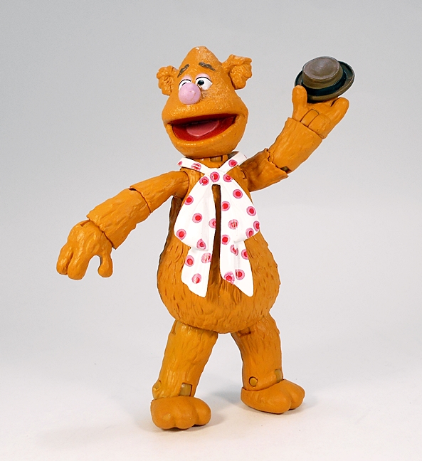
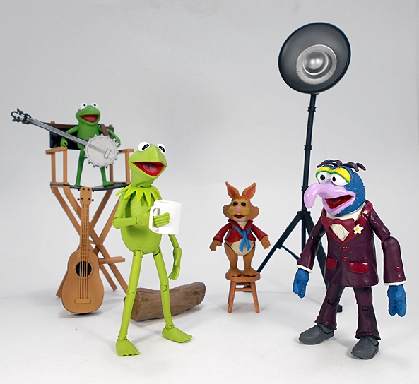
With both Fozzie and Scooter taking up most of the plastic real estate in this package, it’s understandable that the accessories are a lot smaller, but what we get here is still plenty good and fairly character specific. Fozzie comes with his hat, which is only an accessory because it’s removable. No clever magnets here like with the Palisades figures, and while it does sit on his head fairly well, I used a blob of blue tack to keep it there. You also get a rubber chicken and his Groucho Marx glasses, both of which are perfect accessories for him, but no telephone pole for the infamous Telephone Pole Bit.

mupfoz8

mupfoz9

mupfoz10

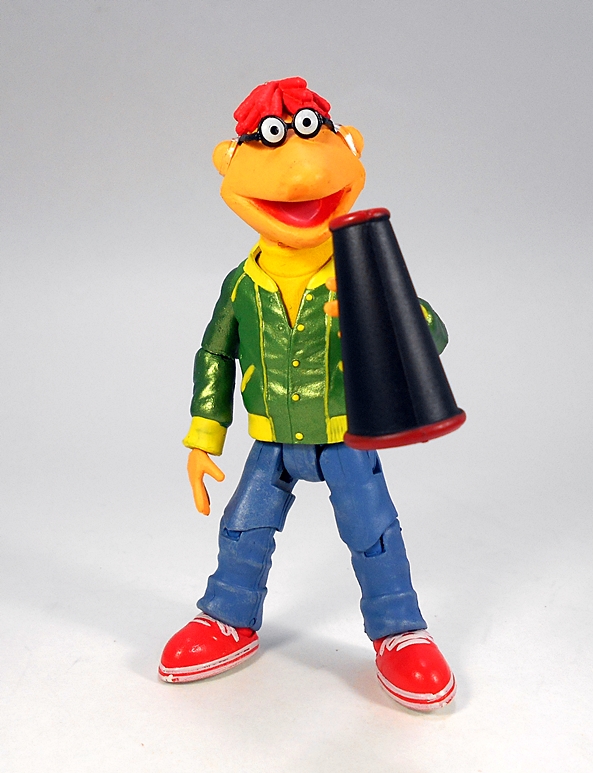
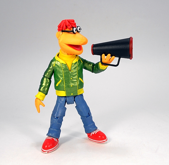
Scooter’s accessories are a little less personal. He comes with a clap board and a bullhorn. Considering Scooter was more of a stage hand most of the time, I’m not sure that these Director’s tools fit him, but I’ll go with it. Besides, they’re more of those great universe building accessories that will be nice to have as the pot grows bigger with subsequent waves.

mupfoz11

mupfoz12

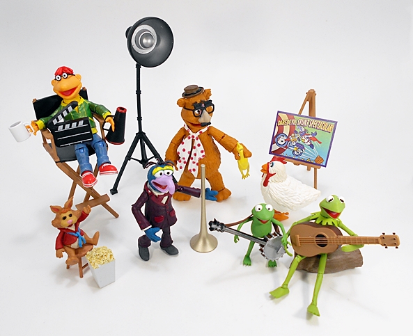
If I had to pick a favorite pack in this first wave, I’d probably go with this one. Besides my love of Fozzie and general fondness for Scooter, the mix of two figures and a handful of decent accessories feels right. But when you put all three releases together, then everything feels right, so I’m not going to quibble over what came in which pack. DST seems to be working well with the challenges that the different shapes and sizes of these characters offer and the accessories are diverse and fun. If I had one thing I’d like to see improved in future waves it would be a little more polish on the paint. I think this series is off to a strong start and the next wave, due out sometime this Summer, looks like it’ll be fantastic. Animal with his drums? Beaker and Professor Bunsen Honeydew? And Waldorf and Statler? Oh, yes, please. Give me some of that!

The Muppets (Wave 1) by Diamond Select, Part II: Kermit with Robin and Bean Bunny

In case you missed yesterday, I’m smack in the middle of a Muppets Trifecta as I look through the first wave of Diamond Select’s new Muppets figures. I went really long yesterday, which often happens when I introduced myself to a brand new line, so let’s jump right in and check out Kermit and friends!

mupkerm1

mupkerm2

I had a lot to say about the packaging yesterday, so let’s just take a quick look and move on. It looks great and it gives you a clear look at the figures and accessories inside. The large character portrait on the side panel is nice to be able to identify who is in the package if you have them all lined up on a shelf. But, great presentation aside, it’s not at all collector friendly and takes up way too much room for my taste. It’s also really wasteful. When I was all done opening this set it was crazy how big the pile of cardboard and plastic was in relation to the actual toys that came in it. But enough said about that, let’s start off with Kermit…

mupkerm3

At about 3 1/2-inches tall, Kermit is just a smidgen taller than Gonzo. And like Gonzo, DST did a really nice job with this sculpt. Granted, there isn’t as much to work with here. There’s no outfit, no elaborate coloring. Just a green frog and as we all know, it ain’t easy being green. The head sculpt is spot on, with the mouth open to show the painted tongue and throat inside. The best detail for me here are the little creases that appear at the sides of his mouth that showed on the real life Muppet when he opened his mouth. There’s a little bit of slop around the eyes where the white meets the body. It stands out a bit on close up photos, but it’s not too bad when viewed with the figure in hand.

mupkerm4

I was really curious to see how they were going to make him work with his spindly arms and legs while still maintaining articulation and not being ridiculously fragile. As it turns out, they did a really nice job. Kermit sports rotating hinges in the shoulders, elbows, wrists, hips, knees, and ankles. He also has a rotating hinge in the neck, which allows him to look up and down, where Gonzo really couldn’t. I was honestly terrified when I first got the figure out and started to work his joints. They are certainly fragile and the left hip joint on mine wouldn’t move until I gave it some prolonged gentile coaxing. I think the most amazing thing about this figure is that while the joints are tiny and some feel loose in hand, he can still stand surprisingly well on his own. Seriously, just look up there at the balance on this guy. Half the time, I didn’t even have to put any effort into it at all.

mupkerm6

Robin, Kermit’s nephew, measures in at only 2-inches tall. He’s a very simple figure with the only articulation being the swivels in his elbows and hips. He’s a lot tougher to stand than Kermit is, but he will stand. I’m not sure, but I might have preferred him sculpted in a seated position. That was the way he was almost always seen on the show and I think he would have made a more stable display piece that way. Still, all in all, he’s not bad.

mupkerm5

mupkerm15

mupkerm7

And that brings us to Bean Bunny. I had absolutely no idea who he was until I did a little research to discover the character premiered in 1986 and was a little after my time. I won’t hold that against him as he is a cool little guy, even if his black, soulless eyes give me the creeps. At about 2-inches tall, this is a really impressive little sculpt and features quite a lot of paintwork for such a tiny piece. He also sports an impressive about of articulation, especially considering I expected him to be a static piece like Camilla. With ball joints in the shoulders, swivels at the hips, and a head that turns, he made out a lot better than Robin. With Kermit and his two chums, this pack really feels like a better action figure value than Gonzo and Camilla… let’s see how it stacks up with the accessories…

mupkerm12

mupkerm8

My guess is that DST had their doubts about Kermit’s uncanny ability to stand because a lot of what you get in this pack are things for Kermit to sit on. The largest one is the director’s chair and it’s a great piece to give him a little height if you want to display him alongside any 5 or 6-inch scale special guest star figures. Additionally, you get a little stool and a log for Kermit to plant his green ass on, especially when he feels like plucking away at a string instrument.

mupkerm9

mupkerm10

And hey, speaking of instruments… you just happen to get a couple: A banjo and a guitar. These are great for any time he wants to bust out Rainbow Connection. These are fairly simple sculpts and fairly simply painted, but welcome additions nonetheless and I could see these getting passed around my Muppets figures quite a bit.

mupkerm14

mupkerm13

While there were some things about the Gonzo set that left me a little cold, Kermit brings it all back home for me. This is a great set with some thoughtful accessories and combining it with Gonzo and his stuff begins to hint at how much potential this line is going to have as it continues to grow. And while I still can’t quite figure out what sort of black magic DST used to get Kermit to articulate and stand so wonderfully, I’m glad they were able to do it. He’s a fantastic little figure that gives me nothing but high hopes for The Muppets future.

Tomorrow, I’ll wrap up this Trilogy with a look at Fozzie Bear and Scooter!

The Muppets (Wave 1) by Diamond Select, Part I: Grover and Camilla

“It’s The Muppet Show, with our very special guest…” Growing up hearing those words meant about 25 minutes of sheer bliss was about to be unleashed on our household. I was about seven years old when The Muppet Show was in full stride, right around 1979 and let me tell you, it was event programming in my house. It truly was great family television, because there was something for everyone. My brother and I watched it for the Muppets craziness and my parents watched it for the guest stars and musical numbers. My father would even pop popcorn. It was a magic time and produced many wonderful family memories. And while I would have killed for some actual Muppet puppets as a kid, the only Muppet toys I ever had were those little figures from Fischer-Price with the big white sticks coming out of their backs. As if to pour salt into the wound, Palisades introduced their epic line just a year or two before I got back into toy collecting and I missed out on that. When Diamond Select announced their new line, I was pretty excited and instantly sold. I’m going to be looking at all of Wave 1 over the next three days and just to warn you, today will get a little long-winded. Let’s start with Gonzo and Camilla…

mupgonz1

Diamond Select has been doing figures for a long time, but apart from one of their Classic Star Trek sets with Kirk and Khan, I’ve never actually bought any. Yeah, that even surprised me. I’ve come close to picking up some of their Marvel Select figures and some Universal Monsters, but never got around to pulling the trigger. As such, this packaging is a new experience to me. It certainly is impressively HUGE for what are in this case some pretty small figures. The figures and accessories come spread out in a tray under a giant bubble, allowing you to see everything you’re getting. Also… Disney? I honestly had no idea that Disney owned The Muppets now, but I guess I should have because they own everything. A folded illustrated cardboard spine offers some great pictures of Gonzo and Camilla, so you could line these up on a shelf and know exactly who is in which package. Of course, none of this amazing presentation makes much sense when you have to destroy it to get to the figures. Nothing here is collector friendly, and all of the packages seemed to be pretty rough just from being on the shelf at the store. All this plastic and cardboard seems rather wasteful for something that I’m betting most people are just going to throw out. And considering all the accessories, keeping these mint-in-package makes even less sense to me than doing it with their Marvel figures. But hey, to each their own.

mupgonz2

As I already mentioned, these are pretty small figures, with Gonzo measuring about 3 1/2-inches tall. If I were buying these without any foreknowledge, I probably would have been surprised when I got them. Diamond Select’s figures are usually sizable and the $21 price tag can cause sticker shock if not for all the extras in the package. Yes, I consider Camilla more of an extra than an actual figure, but more on her in a bit. Now, with all that having been said, I think the scale works for a couple of reasons. One, it does allow for more accessories, especially some of the big stuff coming in the second assortment, like Animal’s drums and Statler and Waldorf’s balcony. And who knows? Is a playset or two too much to hope for? Secondly, it will allow for bigger characters, like Sweetums, without having to break the bank. Finally, and this applies more to DST than us the consumer, it would make no sense for DST to adhere to the Palisades scale because then collectors would just be cherry-picking what Palisades didn’t get around to doing, instead of starting over. With all that out of the way, let’s turn our attention to little Gonzo.

mupgonz3

mupgonz4

The sculpt here is pretty spot on, with Gonzo sporting his trademark tuxedo, complete with bow tie and flower on the lapel. Gonzo adopts many different outfits, but this is the one I would call his standard look. I couldn’t have asked for more out of the portrait, at least not in this scale. His mouth is partially open. which I suspect will be the consistent look for all the Muppets throughout this line. The eyes are on point and while the wispy hairs that protrude from the real Muppet’s head are a lot heavier handed here in plastic, they still convey the look just fine for my tastes. What’s also cool is that Gonzo’s tiny body manages to employ a good deal of articulation. Rotating hinges are the running theme here, as they appear in his shoulders, elbows, knees, and ankles. The hips are ball jointed, the wrists swivel, and there’s even a waist swivel buried under that tuxedo jacket. The neck is ball jointed, but really only allows for rotation, which is easily the most disappointing thing about the figure’s articulation. Yup, as far as the sculpt goes, I’m pretty happy with what we got.

mupgonz9

mupgonz5

The paint on my figure is pretty solid, at least to the naked eye. Keep in mind, Gonzo is shorter than your standard Star Wars figure and closeup shots of figures this small don’t usually do the paint any favors. That having been said, my figure only has a couple of nagging issues, like a weird yellow smudge on the back of his head and the fact that the purple along his mouth could be sharper where it meets the blue fur. Yeah, I’m nitpicking, especially when I’ve heard horror stories from some other collectors about horrible paint on some of these figures. Maybe I got lucky. Bottom line: The sculpt is great, the paint is solid. I like this figure a lot and he’s pretty fun to play with.

mupgonz7

Camilla, as I already mentioned feels more like an accessory than a figure.  I was hoping for a little articulation here, like swivels in the feet and a rotating head, but she’s a totally static piece. The sculpt is good, and again the paint looks fine with the figure in hand. Except the eyebrows. I don’t know where they were going with that blue paint. There’s nothing really wrong with her as far as non-poseable plastic chickens go, but despite her name being on the package, she feels more like a piece of window dressing. And that brings us to… accessories!

mupgonz11

mupgonz6

Gonzo comes with a rather odd mix of accessories, and by that I mean that only a few feel like they really belong to him. Now, I get the feeling this line is going to treat accessories (as much as the characters) as universe building blocks. You only need look at the packages to realize that. And as such, there’s stuff in this packet that becomes a lot more fun when you heap it all together with the others. For example, you get a coffee mug and a box of popcorn. I don’t remember Gonzo being a coffee afficiando, but that mug will look nice on Kermit’s desk while he’s working out the scheduling for the acts. And the popcorn? Well, it is a theater, so it makes sense, just not so much with Gonzo.

mupgonz15

mupgonz8

Well, now we’re talking… It’s Gonzo’s horn! At the end of the opening song and dance before every episode Gonzo would pop out of the sign, blow his horn and some different unexpected hilarity would ensue. To me, no other accessory better characterizes Gonzo, so this one was a great choice. Can he hold it? Mmmm, sort of, but it’s not like it feels the figure was meant to.

mupgonz10

The final mixed pair of accessories are the easel and studio light. The easel comes complete with a cardboard poster showing Gonzo’s Daredevil Stunt Spectacular. This is a cool little display piece and I could see future figures coming with different posters to display with it. And then you have the studio light. A great accessory for that universe building I was talking about earlier, just not something specific to Gonzo. I could easily see DST repacking a couple more of these in with other figures and I don’t know that I would mind it that much. It’s an extremely well done piece and they will look great scattered about a shelf that is gradually being converted into The Muppet’s Theater.

mupgonz14

mupgonz13

mupgonz12

I have a confession to make… I went with Gonzo first because this pack was the least impressive one to me, so it’s going to be all up hill from here. Not to say that I don’t like this set, I do! Gonzo is the man!!! But of the three releases, it feels like this one has the least amount of value on its own. It feels like you’re really only getting one figure and some of the accessories are a little random. However, taken as a group with the entire wave and the value here goes way up and offers a hint of all the fun stuff that I’ll be amassing for my Muppets, assuming that this line does well. And that’s why I remain a little apprehensive here. On the one hand I’m crazy excited about putting together a huge collection of characters. Hell, just the idea of completing Dr. Teeth and the Electric Mayhem is making me giddy. But for that the line has to succeed and so I’m going to be 100% all in. Which is exactly how pissed I’ll be if this line fizzles after just a few waves.

Come on back tomorrow, and we’ll check out Kermit & Co.!

Star Trek: Acrylic Display Stands (Classic Series Phaser and Star Trek III Phaser) by Flux Dimensions LLC

For the longest time, I tossed and turned at night because of a serious and nagging problem in my life. The root of the problem? My collection of Starfleet weapons. I had no place to display them. They sat in a plastic tote waiting for me to take them out and play with them. I would feel them in my hand for a while, aim them, make some pew pew noises, and then they back into the tote they went. I longed for the day someone would come up with a solution so that I could go back to living a normal life free of worry. And now that time is here, thanks to a company on Ebay called Flux Dimensions. They make acrylic display stands for a number of collectibles, including the Star Trek ships and weapons made by Diamond Select Toys. I bought a pair of these stands: One for my Classic Original Series phaser and one for my Star Trek III phaser and I’m going to take a quick look at them today.

phastands1

The stands are advertised as custom made to order and some assembly is required. These factors worried me a little, because I envisioned slow shipping and potential assembly issues. Especially the later, when the item description advises that if the fit isn’t right you might need to glue it to achieve a tight fit. As it turns out neither were issues. The items arrived in a few days, each stand comprised of three simple pieces wrapped in plastic and with protective adhesive film, and the fit of the pieces was absolutely perfect.

phastands2

Both stands are fashioned from immaculate pieces of clear acrylic with custom etched bases and supports designed to cradle each specific weapon. The Star Trek III phaser stand includes the title of the movie in the familiar font along with “Type II Phaser” all flanked by two Starfleet insignia. The lettering shows some pixelation around the edges, but only when viewed up close. The tabs for the supports are the identical, so you can have the phaser face left or right and still keep the orientation of the base facing forward. This is kind of a big deal, since the DST phaser looks best when viewed with it facing right, as the screw plugs are on the obverse side.

phastands3

The stand for the Classic phaser is a little different. For starters it has “Star Trek” printed in the classic series font. But more importantly, instead of two supports suspending the weapon just above the base, this one cradles the butt of the hand grip. It works just as well, save for one little annoyance: You can’t reverse the orientation on this one, so the phaser is always going to be pointing to the left if you want the lettering on the base facing forward. In this case, that means the one screw hole near the beam emitter and the faint copyright information towards the back are both going to be visible. It’s certainly not a deal-breaker for me, but the option to display this one both ways too would have been welcome.

phastands4

With that little quibble aside, I have to say I’m totally delighted with these stands and very glad I purchased them. They are very attractive and great quality pieces. Granted, at $20 each (plus shipping) they are a little costly, not so much for what they are, but in relation to the collectible they’re displaying. These phasers only ran me about $35 each, which makes twenty bucks a relatively big investment to display them. That having been said, these really do class up these pieces so much that they’re well worth the price to me. Also, since the DST props are sized fairly accurately, these stands should work fine with the more expensive resin props sold at conventions. Either way, I highly recommend them.

As I mentioned earlier, Flux Dimensions sells a bunch of different stands, including ones to replace the shitty ones that DST includes with their Starships. They also make some for lightsabers, Sonic Screwdrivers, and some of the 3 3/4-inch scale Star Wars ships by Hasbro and Kenner. I do believe my next pick up from these guys will be for my Klingon Disruptor.

Addendum: Tim Sloan from Flux Dimensions was kind enough to drop me a line with a few additional details about their products. For starters, they are capable of customizing the stands to order, allowing the phasers to face left or right, which nicely solves the issue of exposing the side of the phaser with the screw plugs. Also, their products are available for purchase direct from their website tshobbies.com often at reduced cost when compared to their Ebay store. I highly recommend checking them out and browsing their product! 

Star Trek: Klingon Disruptor by Diamond Select

Originally featured in Star Trek III: The Search for Spock, the Klingon Type 3 Disruptor would go on to be a very familiar weapon, commonly seen throughout the rest of Trek’s TV and motion picture run. By my count, this same design has been in service for about 100 years, much like the Bird of Prey, and both instances are very conveniently cost effective for producers of the franchise who don’t have to keep coming up with new models and props. Indeed, when you consider the changing trends in Starfleet weapons, I’d dare say this design has become one of the most iconic pieces of equipment in the series. And that’s fitting, because the design is so very Klingon and I absolutely adore it. It’s not sleek or pretty, but it has a certain primitive and swashbuckling feel about it. Starfleet weapons look like sterile implements, but the Klingon Disruptor looks like it has a history behind it. It certainly resembles a standard firearm more than most of Starfleet’s weapons, or at least the ones appearing in The Next Generation era. With a traditional pistol-grip leading to a breech-like body and a beam emitter positioned at the end of three silver pylons that resembles a gun barrel, this is a design that I fell in love with the very first time I saw Kruge use it to vaporize one of his own officers. Let’s check out Diamond Select’s version of this warrior’s honorable weapon.

klingdis9

If you’ve picked up any of DST’s Starships, Phasers, or other gear, then the package here should be familiar. It’s a blue and black box with a bit of a starfield deco. The front panel features a window that shows the weapon and a “Try Me” hole that lets you sample one of the electronic sounds. The back has a picture of the Disruptor and a little blurb about it. This is a big box for an item that is much bigger than I was expecting. The only other Klingon Disruptor I ever owned was the Playmates scaled down version and going on just my memory, this one is huge by comparison.

klingdis2

klingdis1

Diamond’s version is perfectly sized and while it feels a lot lighter than I imagine the real things would be, it doesn’t feel cheap in the hand and it has a decent balance. The quality straddles that line between toy and replica. Some of the sculpted details are a tad soft, there are visible seams in the plastic, and the weathering is very simple, but they did take the time to plug the screw holes on one side. Mine has some scratches that are clearly not intentional, but they work toward making it look more properly used. This is a piece that looks good on display and is perfectly suited to cosplaying at a Con, assuming they still let you carry anything that’s even vaguely gun shaped any more. What this isn’t is a collector’s grade prop replica.

klingdis3

klingdis4

klingdis5

The electronics on this piece are very simple, especially when compared to some of DST’s phasers. There’s a silver sliding switch on the back that puts the weapon into three different modes. I’m assuming, the equivalent of Stun, Kill, and Disintegrate. Each time you move it, it registers with a sound. The trigger is appropriately placed as a thumb button up where the hammer on a real gun would be. Pressing it fires the appropriate sound and lights up the red emitter on the business end of the weapon. Normally with DST ships and equipment I record a little video to show off the electronics, but it wasn’t even worth my time here. The emitter light is sufficiently bright, but the sounds are mediocre at best and not great quality. If you’re expecting something that clearly resembles the awesome sound this weapon made in Star Trek III, you’re going to be disappointed.

klingdis8

klingdis7

klingdis6

While DST’s phasers have had features like removable palm units, this disruptor is pretty much just a static piece. The “breech” does slide back, but it’s designed to do that in order to reveal the battery compartment. I do recall seeing the Klingons “cock” this thing at one point (I think before beaming down to Genesis), but I think it was achieved by twisting the barrel. Still, sliding this piece back a bit and pushing it forward could achieve a similar look, I guess.

klingdis10

It’s no secret I’m a sucker for Star Trek Role Play Equipment and seeing as how much I love the design of this piece, I’ve had my eye on this Disruptor for a long time. I’m pretty sure it’s been on the market for well over a year. The issue for me was price and the hit and miss history I’ve had with the quality control on DST’s Star Trek items. The Disruptor originally retailed at about sixty bucks, which is quite ludicrous for what you’re getting. I’ve since seen it quite often for as low as $45 and even there I balked. Turns out the right price for me was $27 because that’s what got me to finally pull the trigger, if you’ll pardon the expression. At that price, it’s a decent piece, even if the electronics aren’t as good as I had hoped. It’ll still look great hanging on the wall alongside the rest of my sci-fi arsenal.

Femme Fatales “DC Animated Series:” Talia Al Ghul by Diamond Select

DST continues to work overtime churning out the statues from their new Femme Fatales and DC Animated Series partnership. I’ve been enjoying this line a lot, but I’ll confess it’s getting a bit exhausting to keep up with it since the line launched late last year. The modest little nook I set aside for the initial releases has now grown to a full shelf. Not only are they up to a half dozen regular releases, but there have already been a pair of Exclusives. The first was the 2015 SDCC Supergirl variant and now we have the first completely original Exclusive via e-tailer, Entertainment Earth… Talia Al Ghul!

fftalia1

fftalia2

The box features the lovely deco based off Batman: The Animated Series and with windows positioned front, top and both sides, you can really get a great look at the statue before even removing it from the box. The front window has an EE Exclusive sticker and the top flap is sealed with a strip of Exclusive foil tape denoting that this is #1369 of 2000. There is no statement of limitation on the statue itself. Looks like I’m going in through the bottom! Talia first appeared B:TAS in the S2 episode “Off Balance” and later in the S3, two-parter “The Demon’s Quest” and this statue is an amalgam of both appearances. These were solid episodes with the unexpected Helen Slater voicing Talia and the great David Warner (always a favorite of mine) voicing Ras. Ah, Ras. “Have sex with my daughter or I’ll kill you!” Those are the kinds of arch villains I want if I ever get to be a superhero.

fftalia3

fftalia4

fftalia5

fftalia6

Talia dons her “all business” black catsuit from “Off Balance” as opposed to her “all pleasure” temptress harem garb from “The Demon’s Quest.” While there was certainly something to be said for the later, I’m glad DST went with this look. Talia’s character started out strong only to get neutered somewhere between the two episodes and I think this version is a much better fit for the line. But, hey… if they want to do the other version somewhere down the road, I’d be on board. Since this is an animated style statue, the amount of sculpted detail is limited. I really like the way the edges of the gloves and boots are sculpted so as to look real and not only achieved with a shallow cut and paint lines. The portrait is well done, particularly the way her hair covers half of her face. The belt, holster, and thigh strap are all also part of the sculpt and look good. At about 9-inches tall, she scales perfectly with most of her fellow Femme Fatales.

fftalia7

fftalia8

fftalia9

fftalia12

With these simpler animated style statues, the paint is all the more important in order to carry the day and Talia here sports some of the best quality paint I’ve seen in this series so far. There is virtually no slop to speak of here and the gray and purple on her outfit are very clean. The paintwork on her face looks especially crisp, which is a nice change after having a little flub on the right eye of my Wonder Woman statue. If I had one complaint here it would be the paint on her pistol isn’t as sharp as it could be, but I can live with that.

fftalia10

Speaking of the pistol, it’s one of the two “accessories” that Talia is holding, the other being the Mask of Anubis. This is one of the points in which this statue straddles Talia’s first two appearances in the series, as the mask appeared in “The Demon’s Quest” and was worn as a disguise by her father.

fftalia11

The other nod to “The Demon’s Quest” is the base, which depicts Talia standing on rocky ground at the end of a Lazarus Pit. It’s a great choice for a base and it looks pretty good. The bubbles added to the life-restoring soup are a nice touch. This contextual liberty that draws aspects from both episodes doesn’t bother me at all, but it might irk some purists out there looking for a statue from a definitive episode.

fftalia13

fftalia14

Talia is another solid release in this line, and quite possibly one of my favorites so far. It’s great to be able to get all the animated styles of DC’s ladies together in one place and scale, especially for someone like me who hasn’t bought into DC Collectibles Animated figures… yet. Of course, the other big draw here is the price. With MSRP’s in the forty dollar range, these pieces really are some of the most affordable statues on the market and perfect for collectors who want to add some statues to their shelves, but not break the bank on higher end pieces. Talia is still available from EE at $45 plus shipping, but even as a limited store exclusive, this one can currently be had at a better deal elsewhere. I picked up mine from Amazon at $35 shipped, which is a solid deal for a regular edition, but even better for a limited piece like this one.

Femme Fatales “DC Animated Series:” Wonder Woman by Diamond Select

It’s DC Friday again and today I’m dipping back into the “DC Animated Series” of Diamond’s Femme Fatales statues. While still a relatively new line, DST has been cranking these out like crazy and have recently even announced that they’ll be expanding it to include Marvel characters before the end of the year. Today’s release, Wonder Woman comes from Justice League Unlimited, the follow up series to what I still consider to be the best animated treatment of a comic property ever. Yeah, it really is that good.

femfatww11

The boxes for this series are simple and effective and hasn’t changed much since Femme Fatales started. The statue comes nestled between two plastic trays and can be viewed clearly through the windows on the front, side, and top panels. DST has been changing the deco up a little to match the animated series the subject is based on, and in this case you get the Justice League Unlimited logo on the front. The back panel features a shot of the statue and a blurb about the character. Everything is collector friendly and the statue comes assembled and ready for display.

femfatww1

Diamond went fairly conservative with the composition here. Wonder Woman stands with one leg up on a broken pillar with her golden lasso in one hand and the other hanging by her side. Diana’s Captain Morgan impersonation isn’t going to win any awards for originality, but I still like it a lot. It’s heroic and noble and totally suits what Wonder Woman is all about.

femfatww2

femfatww3

femfatww4

femfatww7

In keeping with the animated theme, the statue features minimal detail. With that having been said, just about every detail here is achieved with both sculpt and paint, right down to the stars and crest on her costume. The portrait is particularly well done, complete with her star earrings and her windblown hair.

femfatww5

femfatww6

I’ve been lucky so far with the paint quality in this series. It seems to be a little inconsistent, but so far I’ve had few major complaints. In the case of Wonder Woman here, however, I do have one. Her right eye isn’t filled out all the way to the bottom. It doesn’t look googly or anything, just unfinished. It’s not enough to ruin the piece for me, but it’s definitely noticeable, particularly when viewed up close. The rest of the statue’s paint is perfectly acceptable. The details on the costume remain inside the sculpted lines and while there are some visible brush strokes on the white trim of her boots, it’s not something that I’m going to get upset about.

femfatww8

The base is a solid effort. It looks like she’s standing amidst ruins in Themyscira. The paint and texturing on the piece of marble pillar looks especially good. The ground itself looks more like a melted brownie to me, but it’s not bad. Considering the bases we got with the two versions of Supergirl, I’d say this is still a step up.

femfatww9

femfatww10

femfatww12

Wonder Woman set me back $40, which is around the low end of retail for this series. However, they are notorious for dropping in price on the secondary market. Some of my earliest Femme Fatale statues were purchased at the $25 range. I’m not sure if that’ll hold true for the DC properties because quite frankly there should be a lot more demand for these than for the series’ earlier indie comic content like Darkchylde and Dawn, let alone their original creations. Apart from the flubbed eye, I’d say this is among the best releases in the series so far, but then I haven’t had many quibbles with any of them so far. I will note that the scale does feel way off, especially when displaying Wonder Woman beside either of the Supergirl variants, but that’s not something that bugs me too much. As for future releases… Harley Quinn is available right now (I’m still on the fence over picking up that one) and Catwoman should be dropping right around the time this Feature posts, so you can be sure I’ll be revisiting this line in the not too distant future.

Femme Fatales “DC Animated Series:” Batgirl by Diamond Select

It’s DC Friday again, and today I’m jumping back into Diamond’s new line of statues based on the ladies of the DC Animated Universe. Since this off-shoot of DST’s Femme Fatales line debuted back in October, I’ve already picked up Poison Ivy and two versions of Supergirl and today it’s Batgirl’s turn.

femfbatg1

While it’s basically the same style of window box DST has been using since the line debuted, the DC Animated Statues are each getting their own deco to match the theme of their respective series. I like that they’re doing this because the regular Femme Fatales packaging wasn’t all that exciting or engaging. In this case the deco is themed for Batman: The Animated Series and so the box matches the one used for Poison Ivy quite nicely. Windows on the front, top, and side panels all allow for a pretty good look at the statue and everything is collector friendly, should you ever wish to box Batgirl back up for storage. The statue comes sandwiched between two clear plastic trays and there’s no assembly required. Let’s get her out and take a look…

femfbatg2

femfbatg3

femfbatg4

Sculpted from the Bruce Timm art style, this version of Batgirl features her traditional grey bodysuit with blue boots, gauntlets, cape and cowl along with her yellow belt and bat insignia. While I wouldn’t be opposed to double-dipping on her black and yellow costume, I’m glad DST went with this one. It’s just a bit more iconic to me. The costume doesn’t feature a lot of detail, that’s all part of the simple animated style, but the tight costume doesn’t leave much to the imagination when it comes to her bat curves. Her adorable little cape bellows out behind her and the head sculpt is certainly faithful to the art that inspired it. The cowl and mask is part of the sculpt and her hair spills out the back. And yes, she also has a nice little bum.

femfbatg6

femfbatg8

The pose here is a fun one. I’m torn on whether she’s about to break into a run, throw the batarang in her right hand, or if she’s just posing for the camera. Either way, it’s a nice mix of whimsy with a hint of action and it suits the character well.

femfbatg11

The singular thing about doing statues based on this simple animated style is the importance of a nice clean paint job. The paintwork on Batgirl is overall fairly solid, but there’s a few areas where I would have liked to see some improvement, most notably the outline around the bat symbol, where there are some uneven lines. Otherwise, there’s a few stray marks on the grey bodysuit, most notably an off-color spot just above her belt buckle and another on her butt. Yeah, I’ve seen worse paintwork on more expensive statues, but that doesn’t completely excuse it. I will also note that I think the hair could have used a more red in it. What we got is more of a straight chocolate brown.

femfbatg10

The base suggests Batgirl is standing on the roof of a Gotham City Police car with one foot up on the light bar. This is easily my favorite base in the line so far as it’s evocative of the simple art style and still communicates a bit of environmental context.

femfbatg9

femfbatg12

Three statues in and I’m still digging these DC animated ladies a lot. Yes, they’re budget statues and as such the more discerning statue collectors are likely to turn their noses up, but I think the scope of the line marries the simplistic Bruce Timm style perfectly. These aren’t going to replace Koto’s Bishoujos as my favorites any time soon, but then again these run between half to three-quarters of the price, so at $35, there’s some decent value here. Batgirl’s paint is the weakest of the three, but that could be just my specific statue and it’s still not terrible. My eye is often drawn to the spot on her tummy, but I may have some success smoothing that out. DST seems to be averaging about one release a month on these, with Harley hitting right about now and Catwoman and Hawkgirl both on deck to ship in the months ahead. There’s also an Exclusive Talia Al Ghul, which I’ve been trying to resist, but I’m thinking I may wind up getting.

Femme Fatales “DC Animated Series:” Poison Ivy by Diamond Select

Diamond Select is not fooling around when it comes to the new DC Animated off-shoot of their Femme Fatales Statue line. Even after two versions (in two weeks) of the initial release, Supergirl, I’m back already to check out the next one. And they’ve got three more slated to hit in December alone. Well, that’s OK. I say “bring it on,” because I am digging the hell out of these ladies. Today’s animated hottie hails from Batman: The Animated Series and it is none other than Poison Ivy!

ffpi1

The box is the same configuration we saw with the Supergirl statues, just a new deco. You get a Femme Fatales logo in the upper right corner, the Batman: The Animated Series logo and the character’s name on the bottom. The box is black with windows all around to let in plenty of light. Ivy comes sandwiched between two clear plastic trays and everything is totally collector friendly. The statue comes already attached to the base, although there is a clear plastic rod included that pegs into the base and acts as a support for the vine. It seems totally unnecessary, but there is a little bit of give in the vine, so I opted to use it to prevent any future sagging. We don’t want Poison’s Ivy to sag, do we? I don’t think it detracts from the piece, but it is totally optional.

ffpi3

ffpi4

ffpi5

Out of the box, Ivy is drop dead gorgeous. I’ll say it again, this animated style suits the Femme Fatales line perfectly. Because of the style, there isn’t a whole lot of sculpted detail on the figure itself, instead she gets by mostly with smooth lines and very clean paint. And she certainly cuts quite a curvaceous figure in her two-tone green outfit. This is indeed a chick that makes me want to eat my veggies. Yum! The tops of her boots and gloves are sculpted, as are the jagged edges of her one-piece around her hips. The shades of green are just perfect and the paint lines are smooth and quite sharp.

ffpi13

ffpi11

The portrait here is also a real winner. Ivy is strikingly beautiful, and I have no problem saying that about a cartoon lady. She’s got perfect lips and a voluminous mane of red hair sculpted in the vintage style that is so distinctive to the Batman Animated Series. The paint on the eyes is neatly applied and I particularly like the sympathetic visage of her eyebrows as she stares longingly at her lovely plant companion. The expression really captures the character superbly.

ffpi6

ffpi7

ffpi8

Speaking of the vine, the snaking plant is rooted to the base and spirals around Ivy’s body to face her, where it is cradled lovingly in her left hand. It sports a red flowery head and two rows of sharp little teeth. It’s also got a friend that is seated down on the base showing it’s teeth, probably jealous that his chum is getting all the attention. The base here is a huge improvement over what we saw with Supergirl. It’s a simple brown brick floor with patches of green vegetation on each side.

ffpi14

ffpi15

I really liked both versions of the Supergirl statue, but I’m absolutely in love with Poison Ivy here. As with Supergirl, Poison Ivy set me back $39.99 at retail and I’m pretty content with that price. Yes, if I had waited, there’s a good chance I could have managed to get a deal, as DST’s Femme Fatale statues are notorious for dropping in price before they get scarce and start climbing again. With that having been said, I suspect these DC ladies will be more popular than this line’s regular offerings, so anything is possible. Regardless, I’m happy to support this line all the way so I’ve pre-ordered the whole shebang. Batgirl, Harley, and Wonder Woman are all currently due to ship in December. I’m not sure the order, but I’ll definitely be checking them out here as soon as they arrive.

Femme Fatales “DC Animated Series:” Supergirl (SDCC Exclusive) by Diamond Select

If you haven’t heard, Bruce Timm’s art styling is now being featured in a new off-shoot of Diamond’s Femme Fatales statue line. Last Friday, I checked out Supergirl, the inaugural release based on the character design from Superman: The Animated Series. Today we’re taking a second look at Supergirl, only this time it’s the SDCC 2015 Exclusive, which is based on the Justice League Unlimited Series and limited to 2,000 pieces. And it seems only fitting to give Supergirl some extra attention, as her new TV Series is off and running and I’m actually digging it quite a lot!

exffsg1

The statue comes in the same type of window box as the regular retail release with generously sized windows on the front, top and sides. All of these let you get a great look at the statue to check out the paint, although with Exclusives like this, you don’t always have the luxury of being choosy.
The box deco is now blue and the front features the Femme Fatales logo as well as the logos for Comic Con 2015 and Justice League Unlimited. There’s also a sticker on the window declaring this an AFX Retail Exclusive. You also get a piece of tape on the top flap with the limitation number. Mine is #140/#2000. I’m not a big fan of putting that sort of thing on the tape, but fortunately you can just cut the regular tape on the bottom flap to get this gal out. Obviously, this is a repaint of the regular release, but I was surprised to find that there’s a fair amount of new sculpting as well. Let’s take a look at the reworked parts first.

exffsg3

exffsg4

exffsg5

Starting from the bottom and working up… the boots are brand new with no laces and the jagged tops with yellow borders. The skirt is slightly longer with a pleated bottom and the dip in the front along with the yellow border. Finally, the entire head has been reworked. The hair is a new style with the clip gone, her ears covered, and some of her golden locks falling over the front of her right shoulder. The eyes are painted with pale blue pupils, to match the JLU look. The re-sculpting is all well done and does a beautiful job transforming the statue into the more traditional and somewhat more mature JLU look.

exffsg6

exffsg7

There are minimal changes to the top. She now has long sleeves and no gloves. The rest is more or less the same with a nice fresh coat of blue paint for the shirt and the S-Shield remaining unchanged. It’s worth noting that while the paint is overall solid on this piece, it’s not quite up to the regular release’s standards. There’s some slop around the wrists and a few minor scratches here and there. The cape appears identical to the previous release and the overall skin tone is painted with more of a tanned complexion.

exffsg10

exffsg11

The pose is still identical to the regular release, which is a good thing, because I think it looks great. The base, which was a bit of a studder step for me last time is repainted to look like an arctic scene. The paint is very rough, probably intentionally so to make it look more distant. I actually like it better than the regular release’s base, but only marginally so. It’s also worth noting that there is no statement of limitation anywhere on the statue, only the box.

exffsg12

exffsg8

Obviously I liked the regular statue enough to pony up for this one, and I’m mighty glad I did. She cost me $50, which is really not bad for an SDCC Exclusive Statue these days and it feels like DST went above and beyond for this release. Case in point, their Femme Fatales Cassie Hack statue also got an SDCC 2015 Exclusive, but it’s strictly a repaint and that’s often the case with these things. Sometimes variants will include minor changes to the base or a swap out accessory, but in this case we got a lot of solid new sculpting and I think it paid off for the statue big time. So far, I’m digging this line a lot and next up will be Poison Ivy, which will probably turn up here next week on DC Friday.