Marvel Legends (Man-Thing Wave): Elektra by Hasbro

Here I go once again, assuaging the hurt of Monday by opening up a new Marvel Legends action figure in a little thing that I like to call Marvel Monday. Also… I saw Black Panther last Thursday and it was amazing and I wish I was talking about that wave of figures, but rules are rules and I have to finish going through this wave before moving on to another. ARGGGGHHHH!

Sorry, Elektra, I’m not intentionally downplaying how amazing it is that we’re getting Legends figures based on the various Netflix MCU series, but that’s the conundrum with Marvel these days. So many great movies, so many great figures, so many great characters, so many great comics! Oh, wait. Scratch that last one. The current crop of Marvel comics are still garbage books largely written by hacks, but I have hopes that Marvel will turn that around eventually. Until then at least we have the movies and toys and a HUGE backlog of older and better comics! Anyway, let’s check out the last of the Netflix figures in this wave… Elektra!

This is Elektra as she appeared in Daredevil Season 2, which is a perfect place to start, because I felt she began to overstay her welcome a bit in The Defenders. But that’s a discussion for another day. Elektra here is a pretty fab example of a figure with some simple sculpting and paintwork that still gets the job done. I’m pretty sure the pelvis and abs are recycled from Jessica Jones, and if that’s the case it works just fine. You get the same sculpted pockets, belt loops, and a painted button in the front. The new upper body features a V-neck vest revealing a sculpted red turtleneck underneath it. Her bare arms are a tad lumpy. I get the sense they were avoiding the super skinny female arms they usually do and tried to give her some muscles. It looks OK at some angles, but from others, those elbows look kind of strange. Her outfit is capped off by a pair of red and black sculpted gloves. Again, it’s a simple buck with simple coloring, but I think she looks great.

Elektra features two heads, one masked and one un-masked, and both are pretty good likenesses to the lovely Élodie Yung. Although, it should be noted that this new face printing thing that Hasbro is doing looks fantastic with the figure in hand, but is not terribly flattering when you get up close with the camera. Also, Elektra avoids the ugly seam that Jessica has running down the middle of her neck. Thank God for that!

The masked head is probably my favorite of the two, mainly because the likeness is impressive enough to still be recognizable even when half her face is covered. It’s all in the eyes! My only nitpick here is that I seem to recall her mask just being her collar pulled up to hide the bottom half of her face. That’s obviously not the case here, but I’m not going to let that bother me. The hair sculpt seems more or less identical on either head, and that’s not a bad thing because it’s quite well done.

Obviously, Elektra is a figure that needs to be super-articulated, and while what’s here is good, I would have liked some changes. From the waist down, it’s all good. She has ball jointed hips, swivels in the thighs, double hinges in the knees, and rockers and hinges in the ankles. A waist swivel would have been nice, but at least she has the ball joint under her chest, and her neck is both hinged and ball jointed. It’s the arms where I take some issue. She’s got rotating hinges in the shoulders, elbows, and wrists, which seems to be pretty typical for the Marvel Legends ladies. I think bicep swivels and double hinges in the elbows would have gone a long way to make Elektra a little more flexible. With that having been said, she’s still plenty of fun to play with.

Elektra comes with her trademark Sai, which the series teased us with for I can’t remember how many episodes, before finally putting them into her hands. These are simple, but cool looking, weapons with a gray finish and black painted grips. She can hold them in either hand, but I really dig how her right hand is sculpted so you can pass the blade through her grip and have the fingers hooked over the guard. It’s a beautiful little touch that goes a long way.

I think Hasbro did a nice job with this figure, even if there are a few things I would have done differently with the articulation. She isn’t likely to blow anyone away with complexity of sculpt or paint, but what’s here is damn solid. A beefier selection of weapons would have been cool, or even an extra set of hands, but I have to imagine that actor licensing on the MCU figures cut into the costs for extras, so I won’t complain too much. Nor should I, because not too long ago I would have bet against us getting any Marvel Legends from the Netflix series and now we have four! I hope this little assortment isn’t the end, although I couldn’t help but notice Hasbro didn’t show off any more Netflix figures at Toy Fair this past weekend. But did you see those 10 Year Anniversary MCU figures! Holy hell, they look great!

Next time I’ll start dipping into the comic-based figures in this wave.

Eight Years and Still Going!

I’m not someone who is big on celebrations, that should be evident by me going for eight years without much acknowledgement to any of those anniversaries, but for whatever reason I thought I’d mark the occasion this year. Maybe it’s because two years is a long time, and I didn’t want to wait for The Big 10. Or maybe it’s because I’ve surprised even myself by my persistence in churning out over 2,100 reviews on a topic no sane adult should care about. Whatever the case, FigureFanZero is eight years old today and I got myself a really nice bottle of Jameson and I’m going to sit here and gas on for a bit. If you have a bottle of spirits handy, pour yourself a little something, while I reminisce.

My First Review on FFZ… The Robots of Death! 

It was eight years ago that I opened the virtual doors to FigureFanZero and said come inside and partake of my wondrous madness. It seems only fitting that the first review featured some Doctor Who action figures, because Character Options’ now all but defunct 5-inch Doctor Who line was exactly the sort of thing that I longed for as a kid. It’s also oddly fitting that it’s the weekend of Toy Fair and I’ve been spending it gazing at some amazing reveals. But how did FFZ come about? What motivated me to start this nonsense, and to keep it going for so long?

Review #1,000 – Diamond Select Kirk & Khan!

For that story, we have to journey back about about 18 years ago, when I found myself reacquainted with buying toys. I was only 27, but I was in the process of shuttering a business that I started when I was 20, and I think I was going through the equivalent of a mid-life crisis. And yes, I realize that means I’ll be dead at 54. The point is, I was starting life over and to cope I had been immersing myself back into video games. So much so, that I started collecting some video game-based action figures. I can remember picking up McFarlane’s set of Metal Gear Solid figures, as well as the Quake and Duke Nukem figures from Resaurus, and displaying them proudly above my game consoles. It was toy collecting, but not really. I wasn’t really seeing them as toys, but just plastic tokens that expressed my love of a facet of pop culture at the time.

I didn’t really get the toy collecting bug until that fateful day when I took a shortcut through a toy aisle in Target one Saturday afternoon. I was on my way to pick up whatever new video game had released. It was probably a Dreamcast or PlayStation title, but I can’t remember which. I was advancing through the aisle and headed toward the Electronics Department when I literally did a double-take. There I was, face to face with with Transformers!

Review #2,000 – Cover Girls of the DC Universe Wonder Woman

The line was called Robots in Disguise and what really drew my attention was seeing all five of the Combaticons hanging on the pegs. I picked one up and pondered it. They were repaints of the exact same toys that I never owned as a kid. Alas, my only G1 combiner was Devastator. I left the store that day with a couple of video games, but I spent the rest of the night thinking about those toys. The next day I went back and bought the set and there on my kitchen table, something awakened inside me. It was the nostalgia of recaptured youth. In the coming weeks I would pick up the rest of the Transformers that were on the shelves. Eventually, I would stop finding new ones and disappointed about going home empty handed, I started to notice some of the other call-backs to my childhood that peppered the toy aisles. There were GI Joe figures and Star Wars figures and soon I was buying them all and it was making me very happy. Then one day I discovered the KayBee Toys Outlet, and all bets were off. I was buying anything that interested me, and for pennies on the dollar!

My First Stab at Toy Bloggery

Four years later and my newfound love of toys was beginning to overtake my love of video games. I had started a great new job (And I’m still there!) and my premature midlife crisis was behind me. But I was still collecting toys! At the time I was also running a floundering video game site on Geocities called TechnoCothica that nobody ever visited. I decided to shut it down and reinvent it as a toy review site. Only two things remained the same: The name and the fact that nobody ever visited it. Not a lot of it still exists, but I managed to dig up some of its remains. Eventually, I migrated to LiveJournal, where I adopted the name FigureFan. It was a moniker that I registered under at some toy forum somewhere just so I could post a reply and help someone identify an action figure accessory. If I knew it was going to stick, I probably would have picked something better.

My last post on LiveJournal.

In 2010, I landed on WordPress adding a Zero to my name, partly to identify as something new and partly because at the time I was eagerly awaiting the release of the MegaMan Zero collection on the Nintendo DS. I also thought it only fitting that the name reflect the marriage between video games and toys that got me started down this long road. The rest of the story? Well, that’s all available for anyone to peruse on these pages. Throwing together four to five reviews a week isn’t always easy, but it never feels like a chore. It consumes a lot of my free time, and while I’ve tried cutting back, it never really sticks. Still, I’m going to try to cut back again this year and we’ll see what happens. Ideally, I’d like to steady out to three reviews a week so I can get a little more creative and maybe work on some related projects that I’ve been meaning to finish.

Before I wrap up, I wanted to reprint one of the old reviews from TechnoCothica. I’ve been going through my old archive and as rough as a lot of it is, I’ve been getting some inspiration from it. I decided to go with my review of Hasbro’s Original Trilogy Millennium Falcon, mainly because I never got around to reviewing it here on FFZ. Some of the picture files don’t exist any more, which is probably for the best because back then I was shooting on a piece of plastic shelving in the corner of my bedroom with with flash lighting. Nonetheless, I’ve reconstructed what I could just for shits and giggles. I hope to eventually set up a page devoted to what I can recover from the old site.

I hope you’re still with me, because before signing off I just wanted to send out a sincerest THANK YOU to everyone who stops by now and again to partake in my love of toys and collectibles. Toy reviews are a crazy big thing on the InterWeb these days. I hear tell some people even do it now with moving picture recordings on something called “The YuuToobs,” and make big bucks at it. I never started this to turn a profit, but the time has still been priceless for me because I’ve met some wonderful people through emails, comments on here, and conversations on Twitter, and if you’re reading this that includes you! I love ya all. Here’s to another eight years… if I’ve got it in me.

By figurefanzero

One Piece “Flag Diamond Ship” Boa Hancock by Banpresto

Did you know that one of my favorite pastimes is drinking a bunch of Jameson and trawling the Interwebs for prize figures? Yup, I’m a man of simple pleasures. They tend to be pretty cheap, so I can’t get into too much trouble, but as a rule I keep seeing a lot of the same stuff over and over again so I don’t end up buying a lot. But just often enough something new pops in and surprises me, and last time it was this Flag Diamond Ship series by Banpresto. I call it a series, but I’ve only been able to find two so far, Boa and Nami, and I snapped up both of them pretty quickly. Maybe there will be more, who knows? I want to go straight for the Nami, but since I just looked at her Variable Action Hero a couple weeks back, I’m going to open up Boa today for Anime Saturday!

The box is pretty typical prize figure fare, albeit it’s bigger to house this 9-inch scale figure. Yeah, when it comes to prize figures, I tend to think 6-inches or smaller, but despite the CRANEKING logo on the box, Boa is not your average prize figure. The enclosed box shows plenty of photos of the figure inside, although it’s a bit on the flimsy side and mine showed up a little rough around the edges. As for what this series is all about, I’ll let the box speak for itself, “Our aim was to create a figure that exudes the female form, including an amazing hourglass figure, ideal lady curves, and proportional balance.” OK! That’s quite a mission statement… and in English no less! Inside the box, Boa comes wrapped in plastic and with a little assembly required. Her head needs to be attached and her right foot needs to be fitted to the base.

Out of the box, Boa strikes a pose with her right foot on a pile of gold, her hands resting on her hips, and her formidable cannons out front and center. It’s nothing terribly creative from a composition standpoint, but at least they resisted the urge to full on Captain Morgan and have her knee up higher and her foot up on a chest. As for “exuding the female form,” I think they’ve achieved their goal at least within the framework of the ridiculously sensationalized anime perspective. In short, I love it!

The costume is not a traditional look for Boa, but rather a sexy take on the swashbuckling pirate look that I really enjoy. She’s got a ragged cut top that just manages to contain her ample chest, and is tied in the front. The rest of the costume consists of a a skimpy pair of black panties which are mostly obscured by a pair of wide belts, thigh-high high-heeled boots, lots of bling on her arms, and a very iconic looking tri-corner pirate hat.

The sculpted detail here is pretty fantastic. The buccaneer boots have rumples in all the right places, as well as ornate golden fixtures on the heels, toes, and backs of the ankles. You get little sculpted cross-stitches on the backs of the thigh cuffs. The use of gradient shades of brown on the boots looks especially nice. The belts are sculpted as separate pieces and include all sorts of fixtures and ornamentation. As good as the sculpt is, there are some solid paint applications to back it up. From individually painted bracelets to the fingernail polish, they really went all out on this figure.

The portrait offers a solid recreation of the character from the series with perfectly printed eyes and lips. My only main nitpick here would be that she’s void of all expression. I’d like to see a little smirk or smile, or determination, but she’s kind of just a blank slate. I guess this figure has enough personality in the outfit to carry the day. I’ll also say that the hair sculpt could have been a little more refined, especially the strands that spill down the side of her face. The earrings are a nice touch and I really dig the pirate hat, which features some leather-like texturing.

The base is kind of a mixed bag. I appreciate them trying something a little different from the usual disk, but what we got doesn’t work all that well. It’s basically just a little pile of treasure that you slip her foot into. The problem is that if I slip her foot so it’s flush with the bottom, she doesn’t stand straight, so I had to experiment a bit to get it to work and when it is working, the base itself isn’t usually even with the surface it’s standing on. So, points for creativity, but I have to take them back again for pure execution.

The base notwithstanding, I’m really impressed with this figure. She cost me around $30, which is admittedly a lot more than I usually spend on prize figures, but when you consider the larger scale and that this figure really sports some premium paint, I think the price is justified. Since it was the first time I saw her and I was pretty inebriated, I didn’t really do a lot of deal hunting. Also, this is the first Boa Hancock figure in my collection, so I feel good that I’m expanding beyond Nami for a change. Next week, I’m probably going to check out another Figma, and after that I’ll circle back to open up Flag Diamond Ship Nami.

DC Bombshells (DC Designer Series): Katana by DC Collectibles

It’s DC Friday again, folks, and after today the regularity of DC Friday may become a little spotty. But I’ll save that little editorial for the end of the review. In the meantime, today I’m checking out the final figure in the second wave of the DC Bombshells line. If you’re not up to date, these are action figures based off of statues, which in turn are based off original designs inspired by 1940’s and 50’s pin-up art, which also in turn has spawned a really good comic series. Phew… that’s a lot of exposition!  Anyway, today’s character is none other then Katana, and I saved her for last because I was pretty excited about her.

There you have the typical DC Designer Series packaging. It’s mostly white, it has a cool window front with one end angled. There’s character art on the side panel, and everything is collector friendly. Katana is also number 8 out of 8 in the series. I really dig Katana in general, and I loved her Bombshell design so much, that I almost picked up her statue, but she was one of the ones that sold out pretty quickly and has since really shot up in price on the secondary market. Maybe they’ll do a Deluxe version of her at some point down the road. Anyway, let’s get this open and check out the figure!

So, straightaway, I think DCC did a great job recreating the look of Katana’s Bombshell costume for the figure. I do, however, think this one is pretty detached from the scope of the Bombshell’s art. I get it, though. Most of the characters are based on western art and fashion in and around World War II, so going to the other side for material might have been a little problematic. Also, the source material has changed and expanded a bit since the line’s original inception. With that having been said, this figure shows off some of the more impressive sculpt and variety of paintwork that we’ve seen in this wave for sure, and possibly the line as a whole.

The dress is primarily maroon and black with gold borders around the black areas. The front part of the lower half of the dress features a gold floral motif and it’s torn off about halfway down, allowing Katana to show more leg and thus continuing the cheesecake factor of this line. The waist features what looks almost like a target pattern and has a big sculpted bow on the back. Her arms are painted to match the maroon of the rest of the dress, and she has a piece of segmented armor on her right shoulder. The silver paint on the armor looks especially nice, and each of the sculpted laces are neatly painted red. I really dig the plastic DCC is using for the flesh tones in this line, as it’s very warm and even. Katana’s lower right leg features an elaborate dragon tattoo and she’s wearing a pair of traditional wooden sandals on her feet. Just about everything that made me fall in love with the statue is recreated here quite well.

I say just about everything, because the one big disappointment for me is the dragon tattoo, which is actually a decal. The decal has a bit of a shine to it, making it really stand out against the matte finish of the plastic, especially around the areas where it’s cut out. Also, the edge near the tip of the dragon’s tail is starting to peel a bit on my figure, right out of the box. I don’t have a lot of hopes for that decal standing the test of time, and I can’t believe they didn’t just tampo the design directly onto the figure. What a shame.

On the plus side, Katana features what I believe is the best portrait this line has produced, and that’s quite a complement, because there have been a lot of great looking head sculpts. She’s absolutely beautiful, she has an appropriately stoic expression and the paint is absolutely fantastic. Her lips and eyes are perfect, and the red Rising Sun against the white makeup looks quite striking. They even did a beautiful job sculpting her hair. I couldn’t be happier with how this turned out.

Katana’s articulation is right in line with the rest of the second wave figures, which includes the absence of thigh swivels. I’ll direct you to any one of the three previous figure reviews if you need to get caught up on the points of articulation. I will say that the ankles on my figure wouldn’t budge, and after having one of Mera’s feet snap off right out of the box, I was pretty apprehensive about trying to get them to work. A little time in front of a space heater eventually did the trick. So long as we’re talking articulation and posing, here’s a good time to point out that Katana’s left hand is sculpted in a pointing position to recreate the pose used for the statue. That would be all well and good if she came with extra hands like the first wave figures. But since she doesn’t, that left hand isn’t all that helpful for many poses. In the end, I just didn’t find Katana as much fun to play around with as her fellow Bombshells in this wave.

The only accessory Katana comes with is her… um, katana. Soultaker is a pretty nice sculpt with bright silver paint on the blade, but it does feel a little undersized and unimpressive for what is supposed to be an epic and enchanted blade. She can technically hold it in either hand, although as already mentioned, the left hand has that pointing finger extended so the sword looks a little funny in that hand. And since I’ve also already touched on her lack of extra hands, here’s where I’ll point out another couple of obvious missed opportunities in the accessory department. If you’re going to be so specific and give her the pointing figure from the statue, why not give her a swap-out foot and the samurai helmet, so you can completely recreate the look of her with one foot arched and resting atop the helmet? The answer, I’m sure is budget cuts.

If it sounds like I’m being extra hard on Katana, it’s because I was really excited to get her open and play around with her. And to be fair, there’s plenty of great stuff going on here. The overall sculpt and paint approach the highest levels this line has offered. But little signs of cutbacks like a cheap decal for the tattoo, and a lack of extras in the box really holds this figure back from being the masterpiece it could have been. And that’s been a running theme for this entire second wave. These are really good figures, but it really shows that DC Collectibles wasn’t willing or able to invest the same level of value into them as they did in the first wave. What a shame. DCC has already cancelled two of the upcoming Bombshells, Bumblebee and Supergirl, although they claim the line is not dead. Although, DCC released their highlights for Toy Fair yesterday, and there is only one release announced for Bombshells in 2018, and that’s a Joker and Harley two-pack. Bummer!

And now for some words about the future of DC Fridays. I love DC Comics. These days I love DC Comics sooooo much more than any of the garbage books that Marvel is pumping out. But DC is making it hard for me to express that love with my toy/collectible buying dollars. DC Collectibles has killed off the DC Icons figures, it looks like DC Cover Girls is either retiring or slowing to a crawl, and I’ve seen nothing about the DC Essentials line that makes me want to re-invest in a brand new line of figures at $22 a pop just to have it get cancelled again. And with how many collectors no doubt feel the same, that line is going to have an uphill battle. Meanwhile, Mattel’s Multiverse line continues to disappoint, and even if it didn’t, the distribution here is terrible and the figures tend to go for scalper prices on Amazon. What I’m getting at is that DC Friday’s is going to have to switch to some kind of rotation from here on in. I’m tapped out and the supply of incoming has been reduced to a trickle. As I get new DC related items, I’ll push them to the head of the line. I still have some figures and statues on my “To Buy” list. But don’t be surprised to see other things dropping in on Fridays from here on out.


Transformers Titans Return: Trypticon by Hasbro

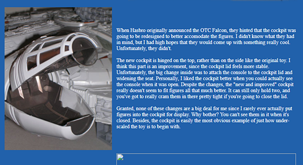
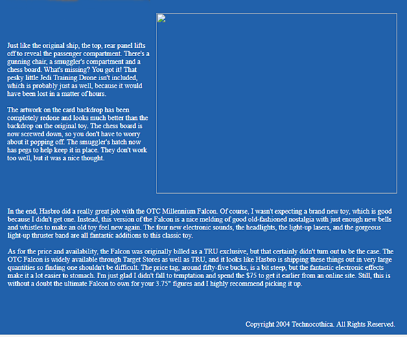
Today’s Transformers Thursday review is brought to you by the motto, “Better late than never.” I’ve had Hasbro’s latest beast of a figure since around Christmas time when Amazon had him as a very appealing Deal of the Day. He’s been out of the box and on my shelf since then, but reviewing these Titan Class figures takes a lot out of me, so I really had to build up to it. Also, I’m fresh out of other Transformers to look at right now, so it was either Trypticon or nothing. I also want to preface this review with the disclaimer I have up on my past two Titan Class figures. My staging area is not big enough to handle these guys, so I have to make do with a sheet for a backdrop and a lighting rig that is not at all ideal. Also, unlike the previous Titans, I’m doing this one all in one part. There were a few pictures I would have liked to retry, but time didn’t allow it. In other words… sorry for the picture quality on some of these. With that all being said, let’s check this guy out!

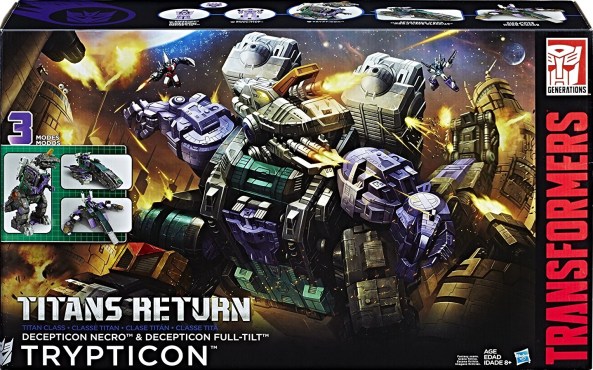
Like Metroplex and Fort Max before him, Trypticon comes in fully enclosed box with some really nice artwork on the front and plenty of pictures of him on the back. It’s collector friendly, but you have to be willing to risk pulling him apart again if you want to put him back in the box. For me, taking him out of the box was a one way trip. In addition to the big guy himself, you also get the Deluxe Class Full-Tilt figure and his Titan Master, Necro. Also included in the box is a character card, a folded instruction sheet, and a massive sheet of foil stickers. I put most of those stickers on, but there are a few that I didn’t bother with, and a few others that I’m just too scared to attempt. I may finish stickering him up someday, but for now I’m happy with what I’ve got. Let’s start out with a quick look at Necro and Full-Tilt!

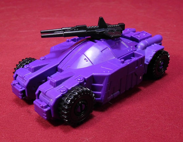
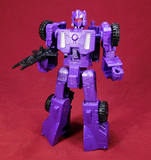
Full-Tilt’s alt mode is a pretty cool looking purple car. I’m assuming this is supposed to be a Cybertronian vehicle, because there are no windshields and it looks like a futuristic armored car. There’s a decent amount of sculpted detail here, mostly in the form of panel lines, some bolts, an engine on the back, and he’s got four rugged looking wheels. What’s missing? There’s absolutely no paint showing on this mode at all, which makes it feel rather unfinished to me. Trypticon is expensive, Hasbro, splash some paint on there, would ya, please? Full-Tilt comes with a black double barreled gun and it can be pegged right into the top of the vehicle.

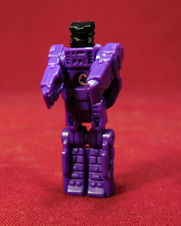
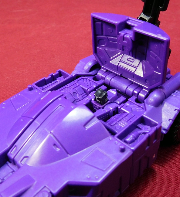
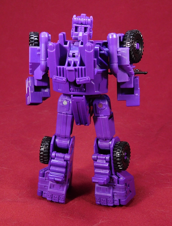
Necro is Full-Tilt’s Titan Master and he too escaped the factory without any paint, which is a shame. He’s cast mostly in purple, but his head is cast in black plastic. You get the usual points of articulation, with ball joints in the neck and shoulders. The legs are fused together, but they have hinges at the hips and knees. Full-Tilt’s auto mode does open up and has a compartment for Necro to sit in, but since he’s nearly all purple, he kind of blends in with the rest of the purple plastic.

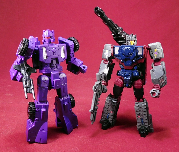
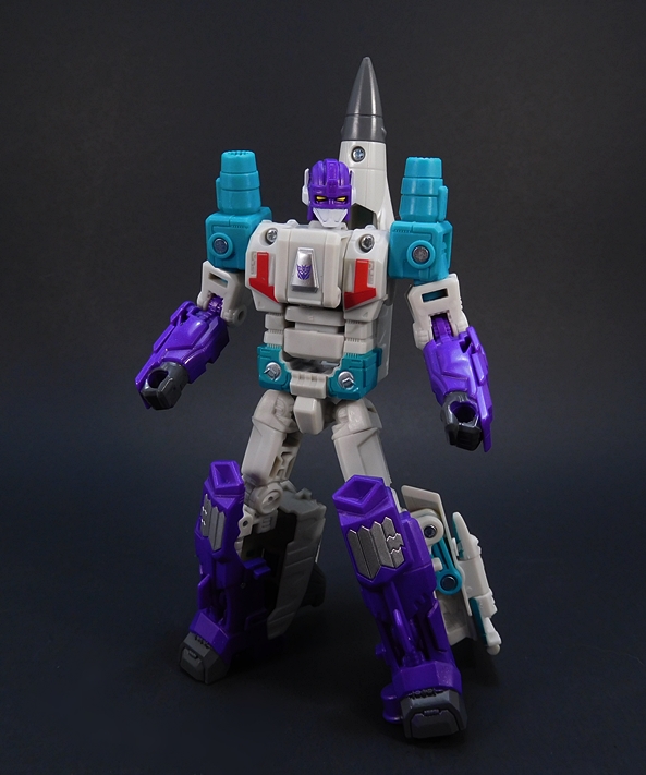
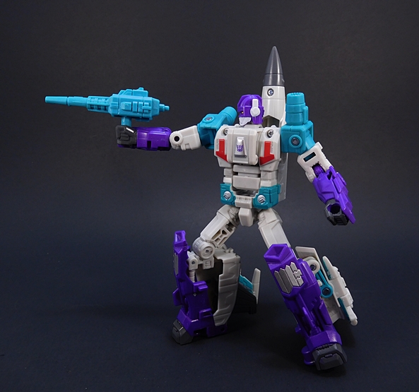
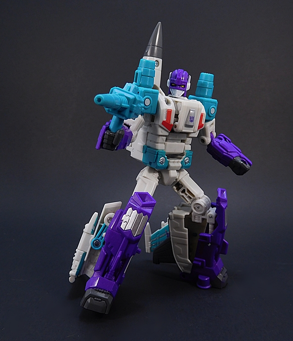
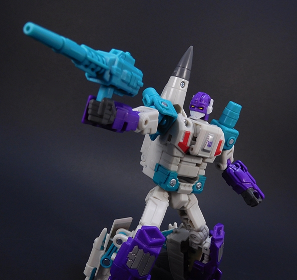
While I’m not overly impressed with Full-Tilt’s car mode, I really dig his robot mode. It’s still woefully lacking a lot of paint, you just get some silver on his chest grills, red for his visor, and a little silver on his “helmet.” But he’s a good, solid and clean design and kind of fun to play around with. He also displays really well with the other Deluxe Class figures on my shelf. So, yeah I dig him, but I can’t dwell on him much longer, because I’ve got a lot more to look at. So, let’s move on to Trypticon’s space cruiser mode!

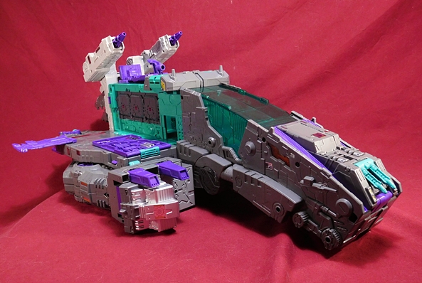
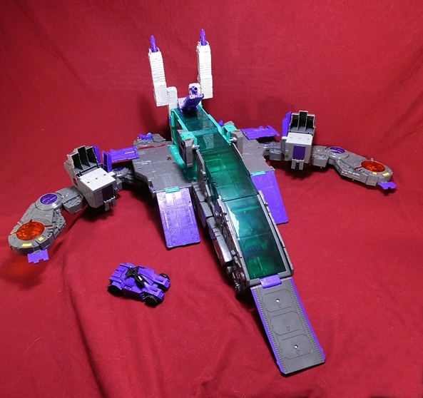
I have to be honest, I did not expect to like this nearly as much as I do. This is a bruiser of a ship and it’s bulky, ugly, no-nonsense design is exactly what I expect out of a Decepticon space cruiser. Forget the dainty curves of The Nemesis, Starship Trypticon looks like a warship that can take a beating, and it’s stacked with firepower and carrier capabilities too. There are just a few things I don’t care for about the design. First off, what’s the deal with those stubby wings? Who are you kidding Trypticon? Those can’t possibly serve any purpose! Also, the instructions show them angled up a bit, but the wings on mine are a little floppy and will only lay flat. Secondly, the gigantic translucent dome looks like a cockpit and that kind of throws off the whole scale of it. Indeed, it’s kind of hard for me to not see it as a cockpit, making this look more like a fighter-sized ship. At least until I start stacking it with Titan Masters. Oh, and how about the fact that the nose of the ship actually looks like Trypticon’s head. Wait, did I list that with the things I didn’t like? Forget that. It’s awesome!

Space Cruiser Trypticon is absolutely loaded with sculpted detail. There are vents, panel lines, cables, hatches, and Titan Master foot pegs littered all over this thing. He’s also got two massive cannons on his back, which can elevate, another cannon in the middle of his back, where you can also mount Full-Tilt if you want, and finally he has a set of two smaller guns right up front at the nose. He also has three massive reactors exposed on either of his broadsides. It’s probably a good idea put some armor up over those, but then I’d like to think they just piss out so much radiation that it’s better out then in. It’s also probably the bubbling molten hell where all the Titan Masters he eats go to be converted into fuel. But we’ll get to snacking on Titan Masters later on.

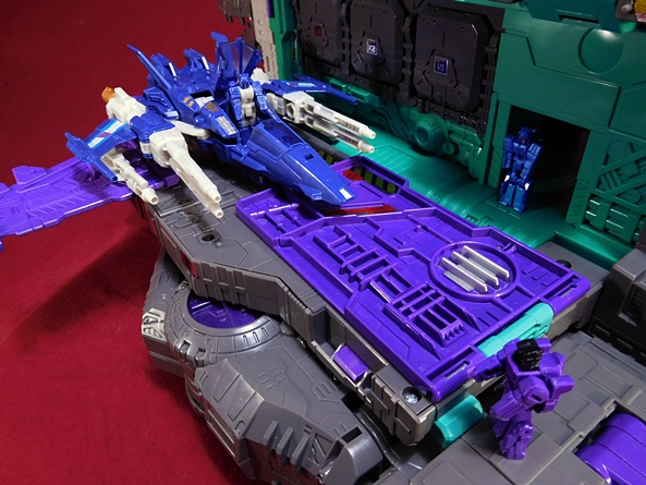
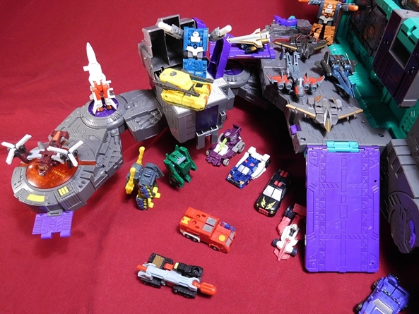
The sides of the space cruiser can be used to launch Deluxe Class Decepticon spacecraft, complete with ramps that can extend to make an elongated runway. Both Triggerhappy and Misfire fit really great in these areas. Here’s where you can also get a nice sense of the scale of this space cruiser mode. I particularly love the little doorway that leads into the ship. It’s just the right size for the Titan Masters to pass through. These two carrier sections really make the star cruiser mode a lot of fun to play with.

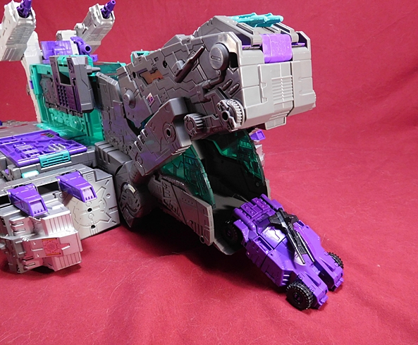
And just when you think you’ve seen it all the front of the ship can open up to transport Full-Tilt in his car mode. And since the front of the ship looks like Trypticon’s head, when Full-Tilt launches, it looks like he’s barfing him out. Simply awesome. Yup, I absolutely love this mode and it’s various little design elements. It’s fun to mess around with, but a little too big and heavy to be whooshing it around the room. All in all, I’d say this ranks better than most of the third modes on the Voyager Triplechangers in this line. Let’s move on to his city mode!

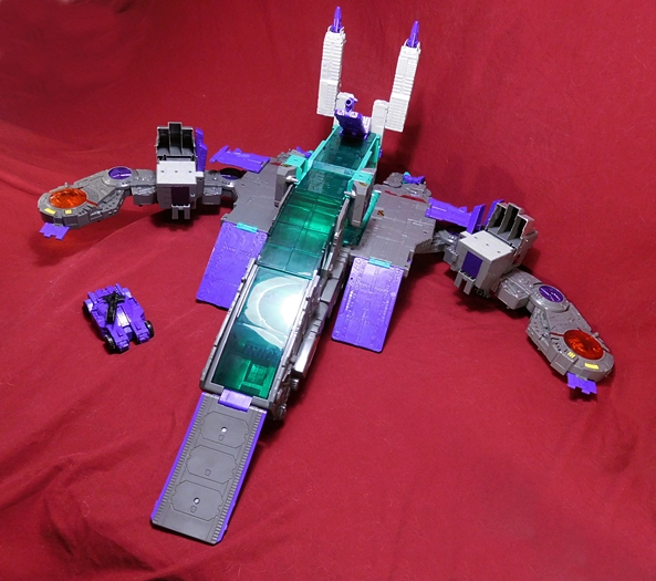
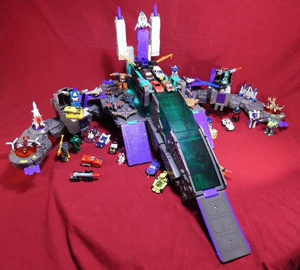
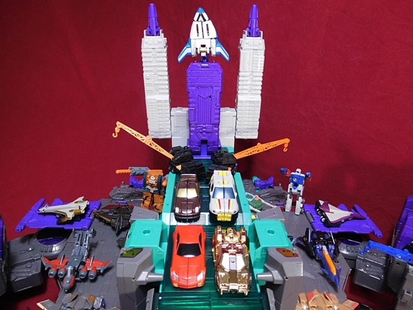
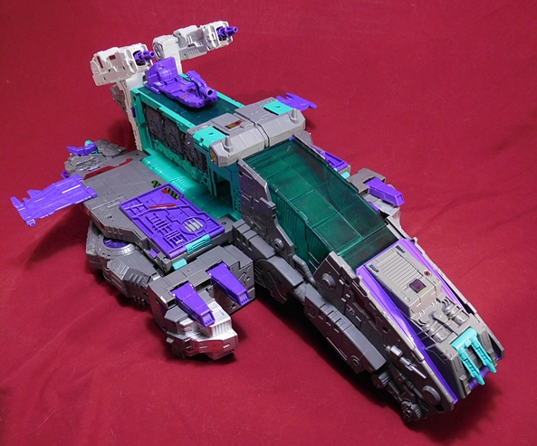
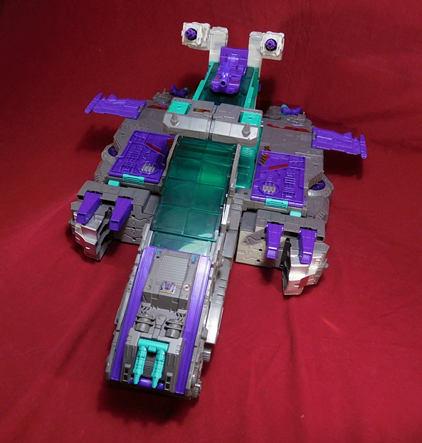
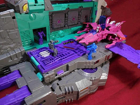
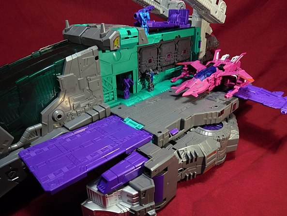
The city mode is not a whole lot different from the space cruiser mode, and I kind of dig that. It’s like Trypticon can just fly to another planet, transform while he’s landing and BOOM! There’s a Decepticon City in your neighborhood now, bitches! DEAL WITH IT! All he really has to do is unfold his legs into pylons, drop three ramps, raise the cannons into towers, and tweak a few other things. But despite it’s simplicity I think it’s definitely on par with the Fort Max/Metroplex cities, and probably even a wee bit better. High-Tilt can now launch from the top and roll all the way down the ramp and into battle. You can also park Deluxe Decepticons on the side platforms or continue to use them as aircraft strips. Honestly, while I really liked the interaction between the space cruiser mode and the Deluxes, this is a CITY mode, and to really show it off, I’ve just got to bust out the Mini-Cons!

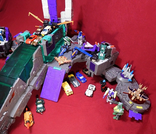
These Titan Class cities are just about the only occasion I get to use my giant bag of Mini-Cons any more. There are still plenty of sweet spots to pile them on, but Trypticon doesn’t really have the same amount of useful surface space as Metro or Fort Max. He’s still plenty of fun, though and while the Titan Masters are tinier, I think the Mini-Cons also do a nice job conveying the intended scale of this thing. Of course, you still have the option of converting the twin towers into cannons by angling them forward, and there are plenty of covered areas under him where you can park more cars.  So, while I’ll give the space cruiser mode a bit of an edge as my favorite of the two, I like this one quite a bit. But now that we’ve been through both the alt modes, as fun as they are, the real attraction here is Trypticon’s T-Rex mode, so let’s get him transformed and check him out.

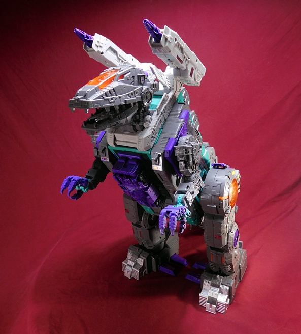
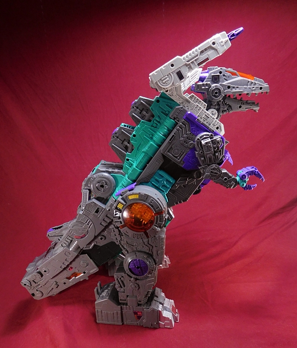
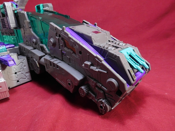
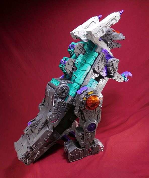
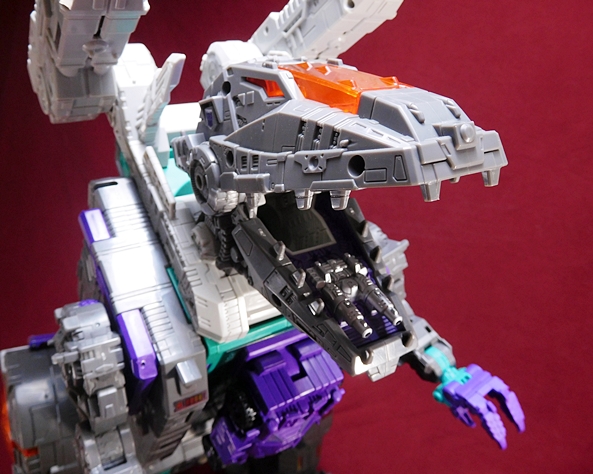
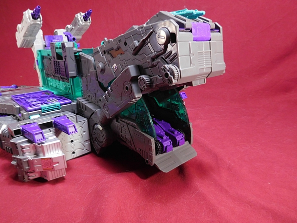
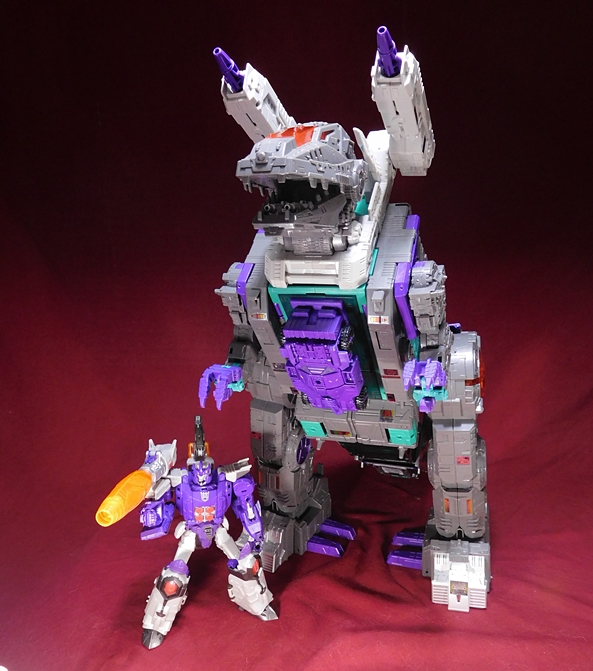
Oh, mama! As much as I dig the two alt modes, here’s what I bought my tickets for, and I am not disappointed. While Trypticon’s T-Rex mode is not as tall as Metro or Fort Max, he’s still a powerhouse of a figure and an absolutely spot-on update to the original toy. I know I made this comment when dealing with the space cruiser mode, but nearly every bit of his surface area is covered with some kind of sculpted detail. There’s so much going on with this guy that it’s easy to get lost in all the minutia, and I think the hyper-detail in the sculpt helps to accentuate just how big he’s supposed to be.  The deco is an instantly familiar combination of gray, teal, and purple that matches my memories of my old childhood friend, and he’s got all the points that I consider to be iconic, like the translucent orange discs on his hips, and the “teeth” on the insides of his feet that served the walking gimmick in the original toy. I’m also suitably impressed by the articulation in his not-so-little arms. They’re actually quite useful for picking up Autobot fools.

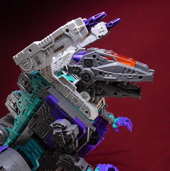
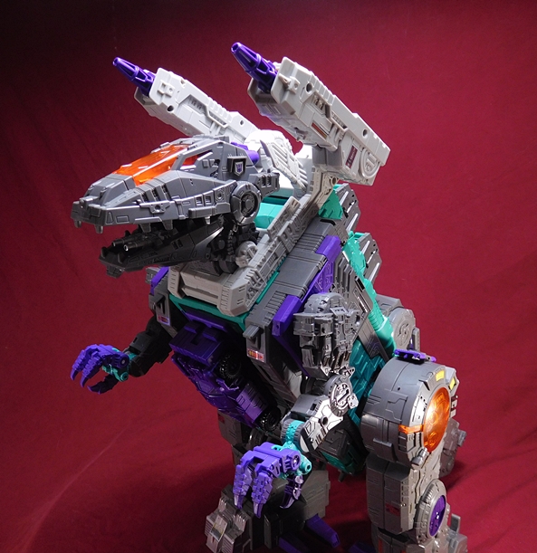
As awesome as the body is, the head is a damn work of art, with powerful jaws, light piping in the eyes which I did not want to cover up with stickers, and those massive shoulder cannons. Once again, all the detail in the sculpt blows me away. I really should have posted this review yesterday on Valentine’s Day, because I’m in love with this big guy. Trypticon’s noggin also holds a few fun play gimmicks.

For starters, if you plug Necro’s head mode into the little compartment on the top of Trypticon’s head, the translucent orange panel between his eyes flips up to reveal a hidden laser cannon. Sweet!

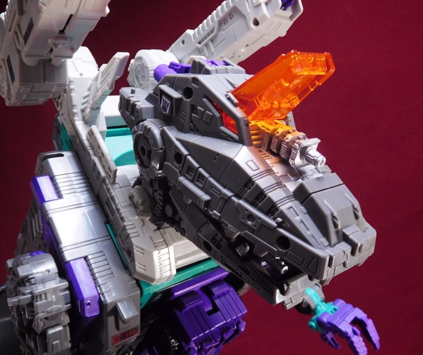
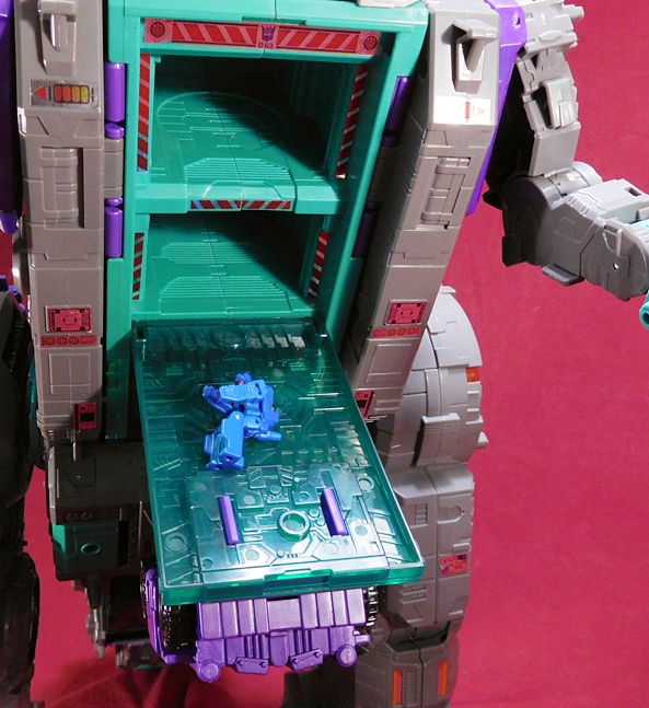
Next up, if you open his jaws up all the way he’s got a double barreled cannon hidden in his mouth. He also has a throat which lets him swallow Titan Masters, sending him to that hellish gut I mentioned earlier where they can be melted away into fuel. But not to worry, Hasbro knows those things cost $5 a pack, so you can open his chest and retrieve them from his stomach compartment easy-peasy. Above we see poor Fracas emerging in the fetal position muttering, “I’ve seen things!” I really love the hazard striping stickers that go around these chambers, even though they were a bitch to put on straight.

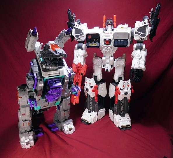
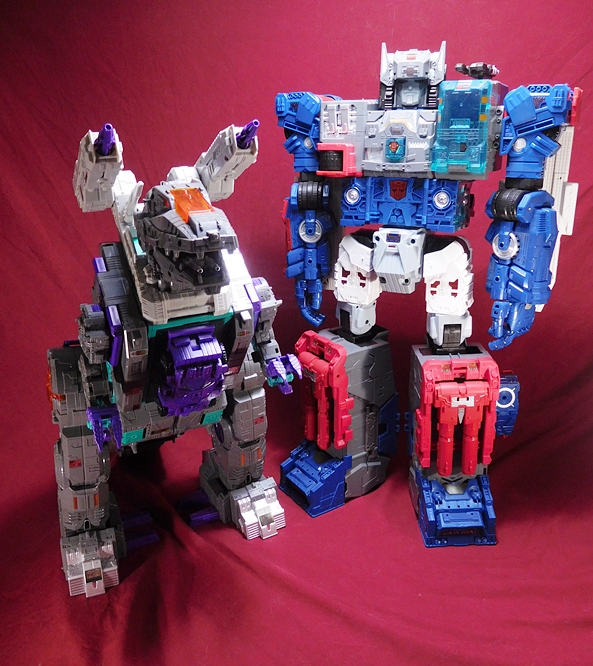
With three of these Titan Class figures on my shelves, you’d think the impact of their coolness factor would have waned a bit, but that is definitely not the case with Trypticon. Indeed, in a lot of ways he’s even more impressive than Fort Max, because he’s all new sculpting, and he’s everything I could have wanted in a modern Trypticon update. Every now and then I stare at him on the shelf and still can’t quite believe Hasbro is turning out toys this amazing. Hasbro gets a lot of shit from collectors, and sure some of it is deserved, but it’s hard for me to not acknowledge them as my favorite toy company when they’re turning out works of art like this guy, not through Kickstarters or Comic Shop Exclusives, but right on the shelf at your local big box. Will we get a Scorponok in this scale? That would be cool. But even if they retire the Titan Class line after this third release, nothing can take away the fact that they delivered this trio of amazing giants. I think I can speak for most of us when I say, Good on you, Hasbro! Unless you got a Trypticon with shitty hips. Then you’re probably pissed.

Star Trek (One:12 Collective) “Mirror Universe” Mr. Spock by Mezco

It’s a rare and funny thing when the exclusives in a line are the cheapest and easiest figures to find, but that’s been the case with Mezco’s One:12 Collective Star Trek line. Amazon has been blowing out an exclusive version of Mr Spock from The Cage at around $30 for a long while now and next up on the bargain bin chopping block is the exclusive version of Spock from Mirror, Mirror over at Think Geek. I was pretty impressed when I reviewed the  One:12 Judge Dredd figure, and I’ve been meaning to dip my toe in these Trek offerings for a while. I guess cheap exclusives are a good way to do it. I should be starting out with The Cage version that I got a while back, but since Mirror Universe Spock just showed up last week, let’s check him out.

I cannot deny that Mezco knows good presentation. After all, these are figures that retail between $60-80+ each and the packaging reflects that. Spock comes in a window box with a hinged front flap, all protected by a plastic wrapped cardboard sleeve. The sleeve also has the same artwork as the box itself. The front panel features the symbol of the Terran Empire along with the 50th Anniversary Trek logo. The back of the box has various shots of the figure itself. There’s no actual statement about the exclusivity of this release, but since I got him at Think Geek’s website, I’ll go ahead and assume that it’s their exclusive. Anyway, the artwork on the box isn’t flashy, but it has a clean and dignified spartan feel to it, and what’s important is that when I hold this box in my hand, I feel like I’m holding something special.

Inside the box the figure comes on a molded black plastic tray with his stand behind him and his accessories on each side. There’s also a tray nested underneath it with an optional hinged arm for the figure stand. Take note, this line don’t give a shit about your space concerns, as the package is way bigger than it needs to be. Now, these boxes seem to be standard throughout the line, so it’s possible that this is to accommodate some of the figures that come with a lot more stuff, but in the end, it’s still a space hog!

Here’s Mr. Spock straight out of the box and overall I’d say he looks pretty damn good. This version features high boots, black pants, which I presume are the same used for the regular releases, and a brand new tailored tunic with the Terran Empire symbol and some other emblems that are unique to this alternate version of the uniform. The tailoring on the outfit is very good and the stitching is immaculate. I also love the blue shimmery material they used for the tunic. With all that having been said, the tunic does feel a tad puffy on him and fits a little awkwardly at the collar. Part of the reason could be because the figure is also wearing another shirt under it. Also, the gold sash around his waist looks a bit cheap and the two loose ends tend to stick out rather than fall flat. I don’t want to make too big an issue about it, because I respect how hard it is to make clothing look right at this smaller scale, but this is certainly one of the pitfalls of this line of figures.

While I might nitpick a bit at the uniform, the head sculpt is magnificent, especially for this scale. Based on the official pictures I’ve seen, some of the One:12 figures use plastic for the faces that doesn’t quite look right to me, but that’s certainly not an issue here. The skin tone is quite good and the paintwork is excellent. Obviously, this is a brand new sculpt unique to this figure with the addition of the goatee and it really is a great likeness for the way Spock looked in the episode. This is quite simply superb work.

Spock comes with several sets of hands, including a pair of fists, a pair of relaxed hands, a phaser holding hand, a dagger holding hand, and one that looks like it might be designed to do the patented Kirk palm strike. The hands are very easy to swap in and out, and I didn’t feel apprehensive about snapping the pegs. I’m just happy that I can pose him with his hand out and asking for Mr. Kyle’s Agonizer. Unfortunately, the Agonizer is not included. Indeed, apart from the hands, the only accessories Spock comes with is a hand phaser and a dagger with a scabbard. Both items can be worn on the figure. There’s a loop on the pants where you can pass the handle of the phaser through. Fun fact, officially these were held on by “velcrite” but the loop works well. The dagger’s scabbard can clip onto the sash, but it doesn’t stay put very well. It frequently fell off while I was reposing the figure and there were a couple times where I was sure that I had lost it.

The dagger is unique to this release and it’s a great little sculpt. The hand designed to hold it definitely does the job. I was, however, a little worried about snapping the blade off as I was trying to get it in there.  On the back of the package, it looks like they used the phaser hand to hold it, but I found it was way too loose in that one. The phaser fits a lot more easily into the trigger finger hand and there’s some really nice detail and paintwork on it for such a small weapon. It seems rather cheap to me that Mezco couldn’t include a communicator in the box, since it would have just been a repack from the regular figures.

I’d like to run down the specifics of articulation here, but truth be told I have no idea what’s going on under all those clothes. What I do know is that the joints are very stiff and that he is not a lot of fun to play with. I’m not sure if the articulation is being restricted by the clothing, but since it’s hard to tell which way the joints are orientated, I don’t want to force them for fear of snapping a hinge or a peg. I can’t get a very tight elbow bend out of the arms and I wasn’t even able to get him to fist bump his chest to do the Terran Empire salute. I’m also afraid to go too wide on the stances as I might tear the seam in Mr. Spock’s space-trousers. The only exposed joints are the wrists and ankles. The wrists move fine, but all I can get out of the ankles is a swivel. I suspect there are hinges in there, but mine simply won’t budge.

Mezco has developed a standardized type of stand for the One:12 line, which is a large disc with a foot peg to hold the figure. In this case the disc is black and has the Terran Empire emblem stamped in blue. Like the packaging, the stand is a lot bigger than it needs to be, but it looks great and I think it definitely adds to the figure’s overall presentation. You also get a hinged arm with a grabbing arm that can be swapped out for the foot peg on the stand. The arm is very similar to the ones included with the Tamashii stands and is great for flying or extreme action poses. I didn’t pull out the arm for any pictures, because it seems unnecessary for Spock.

In the end, I’ve definitely got mixed feelings about this figure. There’s a lot of great stuff going on here, and there’s quite a few disappointments too. I’ve got nothing but praise for the work they did on the sculpting and painting of the portrait and, despite some minor issues with the fit of the tunic, I do believe this is about the best we can expect to see in tailored outfits in this scale. On the flip-side, the accessories feel really light for the original asking price and the restrictive articulation is just a real bummer. I’m hoping that doesn’t make me sound like a hypocrite, because I tend to expect and accept restrictive outfits on my Hot Toys and those are a lot more expensive, but the articulation on my One:12 Dredd felt better than this, so I expected more here. Now, for the $20 (including shipping) I paid for this figure, I’m perfectly happy with what I got, but this experience isn’t making me want to run out and spend $70 each on Kirk and Sulu and vanilla Spock. If they were closer to the $45 mark, I’d be considering it.

Marvel Legends (Man-Thing Wave): Jessica Jones by Hasbro

I’ve got a double dose of the Mondays today, because it’s my first day back at work after a vacation that went by way too fast. It sucks, but at least I get to open a new Marvel Legends figure to brighten my day and I’ve only got a few days until Black Panther! For now, I’m still pressing on through the Marvel Netflix figures in this Man-Thing Wave and today I’m checking out the ever charming alcoholic-gumshoe-asskicker, Jessica Jones.

Here she is in the box, with the giant Man-Thing torso and the series logo down at the bottom. I’m still surprised they didn’t work the Netflix brand onto the front, but I guess that wasn’t part of the licensing. While the tray seems pretty full thanks to the BAF part, I can’t help but think a couple of extra hands could have easily fit in that upper left corner, and I’ll come back to that later on.

If ever there was a figure that I thought Hasbro could screw up, it would be this one, but boy was I wrong. The outfit, the likeness, everything here is spot on and very nearly perfect. I could just shut down the review now, but I’ve got to keep up my average word count, so I’ll elaborate. Jessica comes wearing her blue jeans, boots, black t-shirt, and black leather jacket. This is about as close to an iconic look for her Netflix version as you can get. Maybe they could have added her gray scarf, but apparently the Star Wars Black Series Jyn Erso scarf makes for a good substitute with a little modification. The paint on the jeans is very well done and shows off some faded areas and an overall convincing denim finish. They also have sculpted pockets, seams, belt loops, and a teeny tiny silver painted button on the front. The tops of the boots are actually free-floating pieces to allow for the usual ankle articulation.

The jacket is my favorite piece of her ensemble. It just looks magnificent, right down to the rumples in the sleeves and the silver paint on the zippers. Yes, it’s the usual soft plastic vest with sleeves sculpted on the arms, and the effect works really well. It’s also easily removable, but I think the jacket sleeves are too bulky to pass as the sleeves to her t-shirt. Still, it’s an option.

What really surprised me about this figure was how good the likeness is to actress Krysten Ritter. Sure, Hasbro has been doing a solid job with most of their MCU portraits, but this one is up there with the best of them. It has to be noted, however, that while the portrait looks excellent in hand, it really breaks down as you get in super close. This will be a recurring gripe with me about Hasbro’s new facial printing method, but to be honest, I’d much rather have a great looking likeness in hand then one that looks great when I’m all zoomed in. Unfortunately, there’s one big flaw in this figure that keeps it from closing in on true excellence and that’s the hideous molding seam that runs right up the middle of her neck. Really, Hasbro? Was there no way to move that to the side, where it would have been covered up by her hair?

There aren’t any real surprises in the articulation here. Jessica’s arms feature rotating hinges in the shoulders, elbows, and wrists, but no bicep swivels. The legs are ball jointed at the hips, double hinged at the knees, and have thigh swivels. The ankles have both hinges and rockers. The torso features a ball joint under the chest, and the neck has both a hinge and ball joint. The figure is really good at high kicks, and like Daredevil, Hasbro has been delivering some bafflingly good balance on these figures.

Apart from her horribly scarred neck, the only other drawback here is a lack of extra hands. I like the fists. They make sense, as Jessica likes to hit things, but they’re rather limiting in what you could do with her. Some relaxed hands would have been cool. I would have also been happy with an accessory. I know, Hasbro isn’t going to give her a tiny bottle of whiskey, but maybe a laptop or a camera would have been cool. Without extra hands or accessories, I’ll confess that I felt a little strained just trying to come up with some different photos of her.

Nonetheless, I think Jessica Jones is another very solid figure in the Marvel Legends Netflix treatments and I’ll confess to be very surprised that this version of the character got a release. Not only is she a pretty ordinary looking person in street clothes, but I’ll bet the parents aren’t lining up to buy their kids action figures based on alcoholic private investigators. Not that I’m complaining, mind you. I’m hoping that these figures are selling well, because I really need a Netflix Kingpin, Killgrave, and yes I’d even happily take an Iron Fist to round out my Defenders. I’ll also take this time to gripe about Hasbro sticking the comic version of Jessica Jones in that Amazon Exclusive Defenders four-pack, because I already have the Luke Cage from The Thunderbolts set, and I don’t really need the other Iron Fist and Daredevil. Anywho, next week I’ll wrap up the Netflix portion of this wave with a look at Elektra!

Figma “Overwatch” Tracer by Max Factory

It’s Anime Saturday and cry foul if you must, but today’s figure is not from an anime series or Japanese video game. Nope, today we’re dealing with a Figma from the Western video game Overwatch, but it’s still a Figma, and so I’m sticking this review here. Also, I pre-ordered Tracer forever ago and once she arrived I really couldn’t wait to get her opened and check her out. And here’s a fun fact: I don’t even play the game, but I’ve watched a bunch of the videos and I love the character designs in general, and that goes double for Tracer.

While Tracer comes in a pretty standard Figma window box, the white and orange color scheme really makes this box stand out among the others on my shelf. She’s Figma #352, if you’re keeping track, but Lord know’s I’m not. I can’t even make any sense of their numbering scheme. As usual, there’s some English on the box, but a lot of it is in Japanese. The packaging is totally collector friendly, but if you don’t want to keep the box, you get a handy Figma-branded Ziploc bag to keep all those extra bits in.

Cheers, Love! The cavalry’s here! And oh, boy doesn’t she look like she just jumped right out of the screen? The creators did a beautiful job bringing her digitally rendered costume to plastic, from those tight pants with sculpted side panels to her very British looking bomber jacket with it’s high collar and flared sleeves. Even the Chronal Harness looks so good, if I didn’t know better, I’d swear it’s actually keeping my figure anchored in the here and now. I especially dig the translucent blue plastic used on the front and back to simulate the glow of the Accelerator. Her Tracer Bracers look really nice too, and for the record, they do not open up to hold her pistols, but then I wasn’t really expecting them to be able to make that work at this scale.

The paint quality and overall coloring on the figure is also excellent. One of the appealing things for me about the Overwatch designs are the beautiful vibrant colors and that’s certainly the case with Tracer here. The bright orange pants contrasts beautifully with the immaculate white and gray shoes and bracers and the matte brown and tan of the jacket. Everything about this figure just pops! Other great little touches include the immaculate shoulder patches on her jacket, the silver paint on the zipper, and the crisp “T-01” printed on her bracers.

Of course, this is a Figma, so you know you’re going to get extra hands and faces. Tracer comes with three different facial expressions. You get a regular smile, a more jubilant open mouthed smile, and a more determined expression with a wry little smirk. Whichever face you go with, each one includes the same orange tinted goggles, which are clear enough to see her eyes (at least when my studio lights aren’t reflecting off of them!) and I love the way they sculpted her spiky hair. It’s just perfect. The hands include a pair of fists, splayed hands, gun-holding hands, accessory gripping hands, a and a left hand offering a two-fingered salute. They’re all pretty easy to pop in and out, although I tend to just keep the guns in the gun-hands.

Apart from the hands and faces (and the ubiquitous Figma figure stand), Tracer doesn’t come with a whole lot of accessories, but she does have the essentials. Naturally, she has her trusty pair of pulse pistols, and these are indeed a beautiful set of guns with great sculpted detail and crisp paintwork. Maybe some effect parts for the guns would have been cool, but probably not necessary.

The other accessory is a Pulse Mine and this thing is super tiny. It’s so tiny, I almost missed it in the box. One of her accessory holding hands is perfectly sculpted to hold it and despite its size, there’s some really nice detail painted onto it.

If you can’t tell, I’m absolutely smitten with this figure. I’ve been waiting for Overwatch figures ever since the game first came out. It seemed like a sure thing that NECA would be the ones to do them, since they were partnering with Blizzard on the Heroes of the Storm line, but that line fizzled and I guess the cats at Blizzard cut a deal with Max Factory instead. There’s no doubt that the designs work well with the Figma format, and I’m sure we’re getting overall better quality product, but I can’t help but think NECA would have delivered more characters. As of right now, the only other Overwatch Figma that I know has been revealed is Genji, and he’s due out this Summer. While there are certainly some characters I’m looking forward to more than others, I’ll probably pick up whoever they release, if only to do my part toward seeing the line succeed. Because I definitely want more of this! And who knows, someday I may actually play the game!

DC Bombshells (DC Designer Series): Batgirl by DC Collectibles

It’s Friday and this week that makes me sad, because it means my vacation is just about over and it feels like it just began. But it’s also DC Friday and today that means I get to open up another of DC Collectibles’ Bombshells action figures. If you’re just joining me on these, I absolutely loved the first wave, but this second wave has been a little hit-and-miss. There have obviously been some cuts in the articulation and accessories, and Mera broke right out of the box. Hawkgirl was a big improvement, and I’m hoping that Batgirl can continue this line on the path to redemption.

The packaging is that very familiar DCC window box that they’ve been using with all their Designer Series figures. It’s collector friendly, has some great artwork on the side panel and it shows the figure off brilliantly. I’ll confess I was a bit stumped on Batgirl’s design for a while. At first, I thought it was some kind of vintage circus homage, but after actually reading some of the comics, it’s just meant to be an aviator outfit. Oh, yeah, she’s also vampire.

Sculpting and paintwork have never been an issue with this line, and Batgirl carries on that tradition quite nicely. From the waist up, Babs sports a corset-like half-top features a bat-motif, a pair of long gauntlets, and the straps to her parachute pack are sculpted onto the figure. Down below, she’s got a simple pair of purple painted pants, and high laced high-heeled boots. The utility belt got a lot of attention, with a bat-symbol on the belt buckle and various pouches for all her gadgets.

The coloring on the figure is also fabulous. I love the purple they used, and it’s accompanied by some bright yellow for the boots and belt pouches, plus you get some snappy gold paint on her chest and the belt buckle. Even the lacings on the boots are neatly painted and if you look really closely you can see tiny bat symbols on the sides in a slightly darker shade of yellow. There are some inconsistent spots on her pants, which could have been smoothed out, but I can just chalk that up to some weathering from action in the field and still be happy with it. Finally, I really like the plastic they’re using for the skin on these figures. It’s warm and even and looks great.

The headsculpt here is also pretty solid. It has a goofy charm to it, and I particularly like Babs’ wide, beaming smile. This is an example where I actually like the portrait on the figure better than the final production run of the original statue. The printing on the eyes is sharp and bright, and the glossy paint on the lips looks great. In addition to her aviator-style cowl, Batgirl has a scarf tied around her neck, and her trademark red hair blows off to the side in a ponytail.

The goggles are a separate piece, which was a great idea, as she can either wear them up on her cowl, or if you want to mimic the statue, you can slide them down over her eyes. They fit the figure perfectly, and I dare say they look as good if not better than what we got on the statue.

The articulation here is identical to what we saw in the last two figures in this wave. The arms have rotating hinges in the shoulders and wrists, double hinges in the elbows, and swivels in the biceps. The legs are ball jointed at the hips, double hinged at the knees, and have rotating hinges in the ankles. The torso features an ab crunch hinge down low in the waist, a ball joint under the chest and there’s also a ball joint in the neck. And yes, I still do miss those thigh swivels.

The parachute pack is a separate piece that pegs into Babs’ back, just like Hawkgirl’s jetpack. I’m not sure why anyone would want to display her without it, but I guess it’s nice to have options. I guess by putting it next to the figure, it looked like an extra accessory. The pack does actually open and you can put her cape on it, and that brings me to a quality control issue. The flap on my figure’s pack was painted shut. I tried heating it up and carefully razoring the edges, but when I finally got it open, the peg that holds it closed snapped off in the hole. Unfortunately, it’s also the peg that passes through the cape and holds it in place. On the bright side, the cape already hooks over the edge of the pack, so it doesn’t need it to hold it in place. It’s nowhere near as big an issue as Mera’s ankle breaking straight out of the package, but it’s still an issue worth noting.

I’ve mentioned how this second wave seems to be really light on the accessories and Batgirl here is rather deceptive about that. The goggles, parachute pack, and cape all fill up the bubble nicely, but they’re also all parts of her outfit, so they don’t go a long way for play value. I’m never going to display her not wearing her goggles or backpack, and I’m probably going to always have her cape on too, so as far as accessories go, they don’t feel much like bonuses. Not that I can think of much more to pack in with her, other than some extra hands.

Despite some minor gripes and another unfortunate QC issue, I think Batgirl here is another plus for this wave. She’s a great looking figure on every level, and I’m still delighted to see these designs getting their due in action figure form. Some extra hands would have gone a long way to adding to the fun, but even as she is, I had a good time posing and messing around with her. This wave still isn’t reaching the heights of the initial one, but I’m increasingly happy that I bought it. Next week, I’ll finish off the wave with a look at Katana!

Transformers “Power of the Primes” Dreadwind by Hasbro

The great New Jersey Philospher Anthony Soprano once said, “‘Remember When’ is the lowest form of conversation.” That may be true, but Lord Primus help me, I do love me some G1 Transformers homages and call backs. And today’s figure is especially cool for me, because I was getting out of Transformers back when the whole Power Masters thing was getting started, so this is a brand new opportunity to finally own a version of G1 Dreadwind. And no, that Botcon repaint of Classics Jetfire doesn’t count.

We’ve seen the PotP Deluxe packaging several times now, so there’s not much new to talk about. As always, we get some absolutely kickass character art at the top of the card. Also, I shot this one from a bit more of a top-down angle so you can see how they had to maneuver poor Dreadwind’s legs to get them to fit on a standard Deluxe bubble. But before we start talking about his robot mode, let’s check out with his alt mode.

Dreadwind’s alt mode is a passable approximation of an F-16 Falcon, and yup, he’s a remold of Skydive from Combiner Wars! At first glance, the look is similar enough that I actually had to dig out Skydive to see if there was any remolding. The biggest difference is where the wings meet the body, and it looks like the tail wings are new. Also, you can see the newly sculpted circular intakes peeking out from under the wings and near the body. The Prime/Titan Master peg holes on the new wing pieces are a nice touch. But does it really work as G1 Dreadwind? Yeah, apart from the split fins on the back, where he should only have one, it’s pretty damn solid.

The deco is right on the mark too. You get a very pale gray/off-white body with aqua colored wings and cockpit, along with a darker charcoal nosecone and rear quarter. The only major departure is that the rear wings are purple instead of charcoal, but that still fits in nicely with the purple in the original Dreadwind’s color scheme. The silver paint one wings and the Decepticon insignia do a nice job mimicking the stickers on the G1 toy. The red painted intakes are a little different, but they don’t really hurt the homage at all. It’s a great looking jet and just different enough from Skydive to make me happy.

By now, y’all know I’m not a big fan of this line’s Prime Armor pieces, but this one can actually be used to drive home the whole Power Master homage, by plugging it into the top of the jet. Yeah, it’s a lot bigger than the Power Masters were, but at least they painted this armor in something close to the original Hi-Test’s colors to make it an option. Dreadwind’s gun can also be pegged into the hole on the back of the jet, or if you’re not a fan of symmetry, you can plug it into either of the sockets below the wings. It looks pretty silly on the top, so I tend to just plug it into one of the wings. Alrighty, let’s get this guy transformed and check out his other half.

In robot mode we get to see a lot more of the remolding Hasbro did here. The torso, while still built around the same old Combiner post, is completely new. A good chunk of the legs and arms are recycled, but he has brand new shoulders and really shows off those circular intakes. And that’s a good thing, because those shoulders are some of the only real design call-backs to the original G1 Dreadwind in this robot mode, at least below the neck. The biggest difference is the lack of cockpit on his chest.  With that having been said, I really like the deco on the robot mode. You get more of that pale gray and snazzy purple plastic, as well as the aqua on the shoulders and hips. There are some silver paint hits on the shoulders and chest, some red applications on the chest, and his feet and hands are painted charcoal.

The back shows off some of the things I don’t like about him, and that’s the fact that he wears all his wings on his lower legs. I don’t mind so much that it isn’t faithful to the original design, but I just don’t think it looks good. Having three wings hanging off each leg is why they had to contort him to fit in the package, and while it looks fine from the front, it looks really awkward and ungainly from the back or sides. You can fold the primary wings forward to clean up the back a bit, but at the expense of the front. Don’t get me wrong, I think it was clever the way they engineered the wings to move down there, rather than on the back like Skydive, but having all that kibble on his legs and nothing on his torso makes him look a little oddly proportioned.

Moving back up to the head, I really dig this head sculpt. It’s a great update to the original toy’s rather distinctive look. The yellow eyes look especially cool set inside the purple “helmet.” But all those exposed screwheads so prominently on display? Eh, I could have done without that.

I’ve already shown off Dreadwind’s weapon attached to his jet mode. Here he is holding it. It’s a really long peg that doesn’t fit too well in his hand, which makes it look a tad awkward, but overall not bad. Plus it’s the height of Decepticon fashion to have your shooter color coordinated to match your shoulders.

Dreadwind is a really cool little figure. I will admit, I was not terribly keen on seeing Hasbro cram Combiner Wars remolds into this new line, especially not in the very first wave of Deluxes, but in hand, Dreadwind feels just fresh enough for me to give him a pass. There are some design elements that could have been tweaked, but in the end, I definitely like him. Of course, part of my goodwill towards this figure is based on the fact that he’s based on what I would consider to be a somewhat obscure character/toy, but that’s probably just because I got out of Transformers when I did. I’m sure someone out there considers Dreadwind a favorite and I hope this little homage lives up to their expectations.